The assignment is two parts- one, reading chapters 3-5 in Make It So, and two, examples of good and bad visuals.
Readings
Chapter 3: Visual Interfaces
The authors discuss visuals in the context of user interfaces and controls, identifying cinematic cliches such as the heavy use of blue glow, transparencies, and circular screens to suggest futuristic technology. The drivers coming from the needs of film include post-production work, legibility (movie watchers can only read so much text on a screen so fast), and narratives (communicating additional information about the scenario or cultures of of the users, dramatic tension, attractive/entertaining visuals for audiences).
Chapter 4: Volumetric Projection
The volumetric projection, aka projections of massless, moving 3d imagery, is used as a futuristic means of communicating, despite various practical drawbacks (need for stealth/privacy, and need for sorting out eye contact).. Authors address that 2d information representation may be better than 3d and challenges with VP, including that past VP remains very similar across time, and that deviating from the tried-and-true qualities may lead to confusing and failure to fulfill audience expectations.
Chapter 5: Gesture
The authors discuss examples of using gestures to provide input to a system and challenges associated with their use, given that gestural interface systems need to understand intent and need to be able to be manipulated to do a variety of tasks, many of which are abstract. Minority Report, which we discussed in class, was referenced. The authors list 7 major gestures used in Hollywood, which are intuitive to our understanding of working with tactile objects in the real world (the book says pinch and spread for scaling has no physical analog, but it is very commonly used today for the manipulation of touchscreens). They discuss the limitations of a ‘natural’ user interface working off of gestures- also, in class, we discuss how gestures can differ between cultures, even for gestures that we may consider ‘natural.’
Good and Bad Visuals
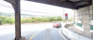
Unusual Stop Sign: On my commute, there is a stop sign at a mostly L-intersection that had a second sign beneath it saying “Except for Right Turn” – meaning that those approaching the T can turn. It is located at a unique condition, where the L-intersection has a fenced off road to one side (which gives it the look of a T-intersection). Given that the area is a bottleneck, this sign encourages that traffic continues to flow, especially since it seems the majority of people do turn right. I have thought it was weird since I first saw it, but I cannot think of a better way to communicate to drivers. It is good to show the STOP, in case the driver is turning left. Then, as the driver prepares to stop, they read “except for right turn” and those turning right keep moving.
3d or 2d: We had a seminar presentation about modelling hazards and infrastructural risks in the event of natural disasters. One student asked the presenter about 3d modelling and topography, and the presenter showed an example of using 3d, but also said that when one works with data in 3d (4d, really, if we are considering time as an integral dimension to these predictive models), the computational lag is so great that it cannot perform under the tight time constraints sometimes needed for natural disaster risk assessment and disaster response. Therefore, working in 3d may actually not be suitable or appropriate, depending on the scope and scale of the problem.