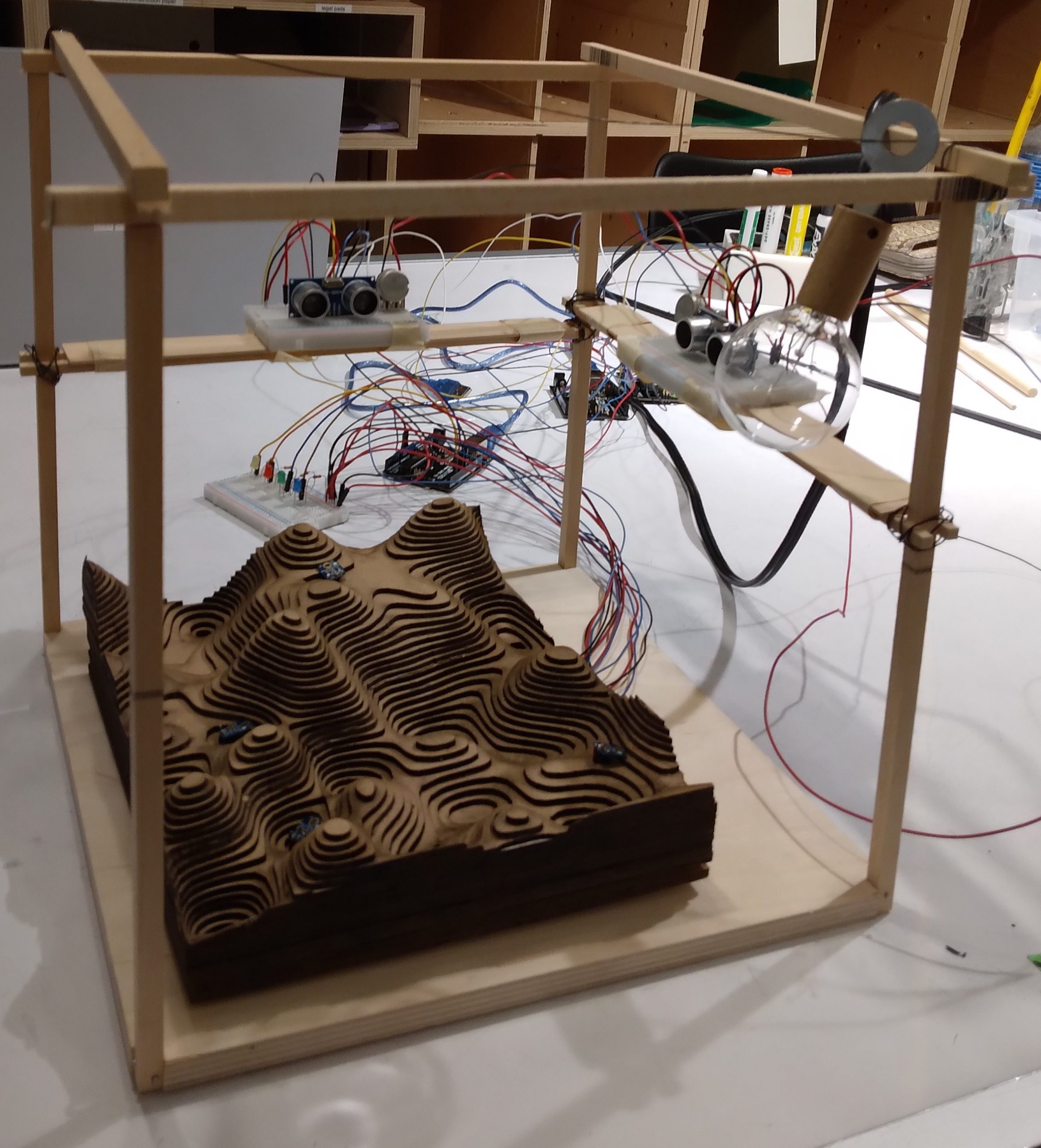
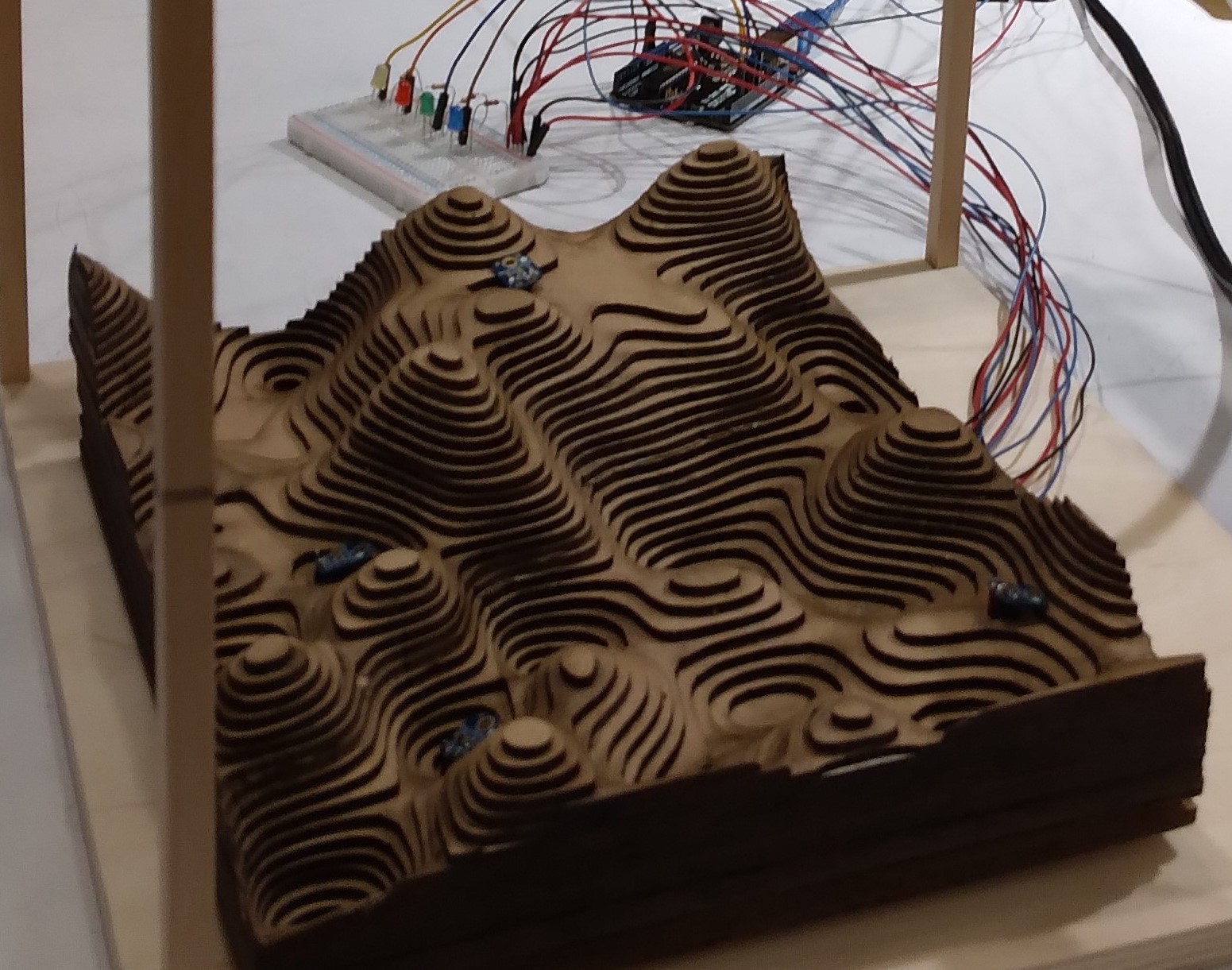
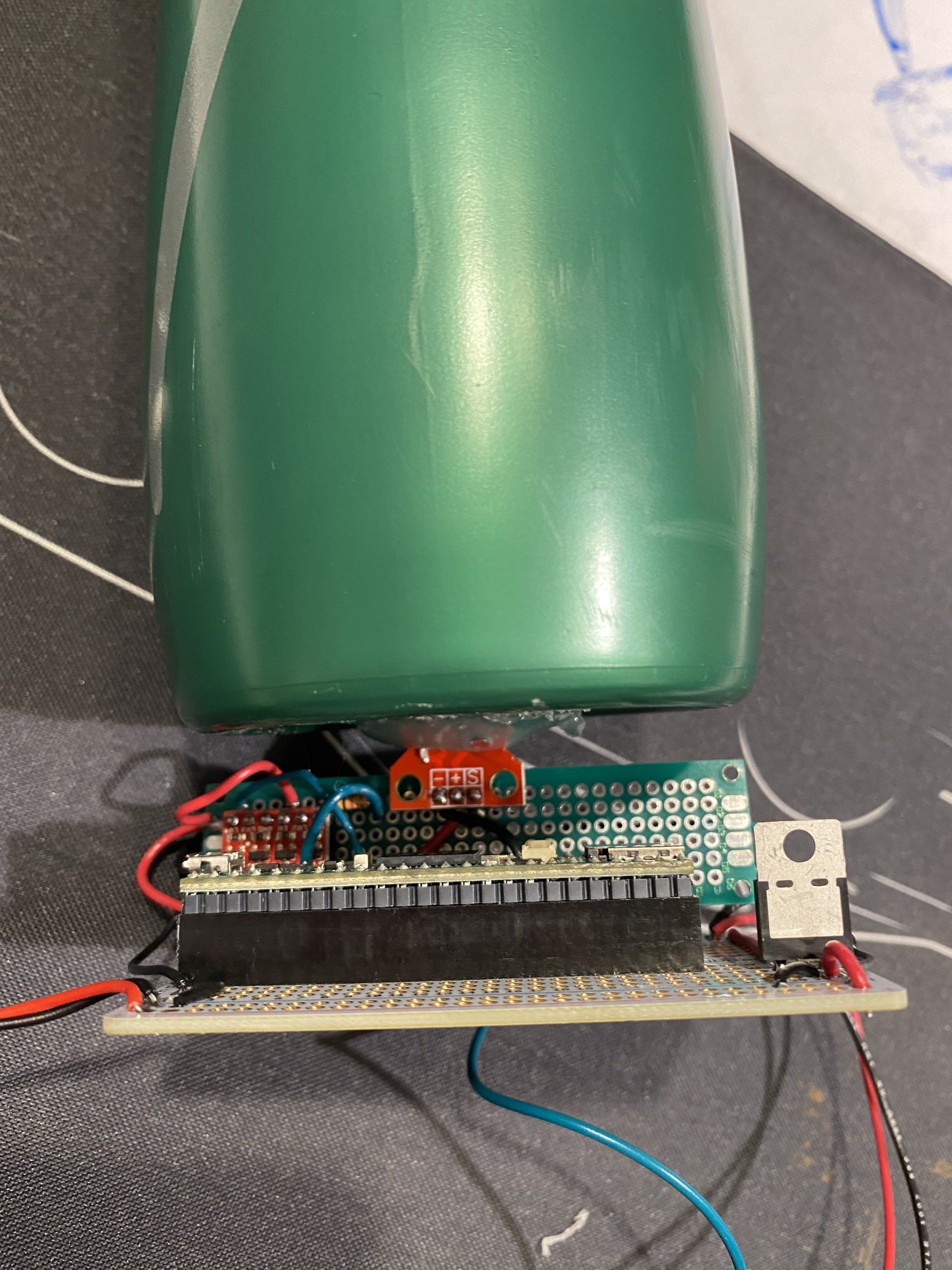
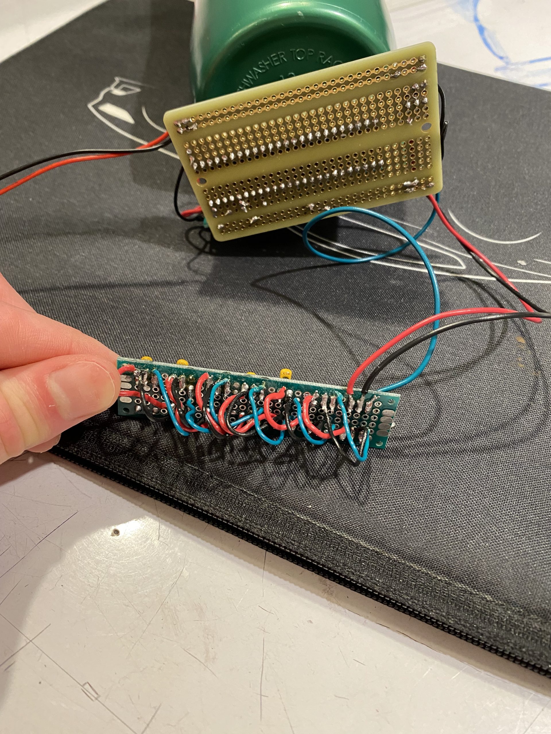
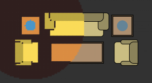
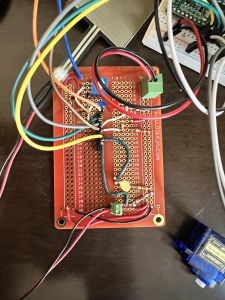
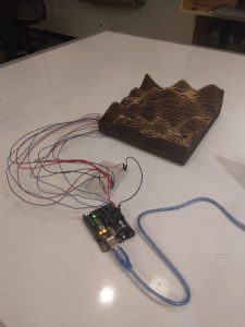
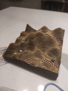
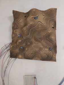
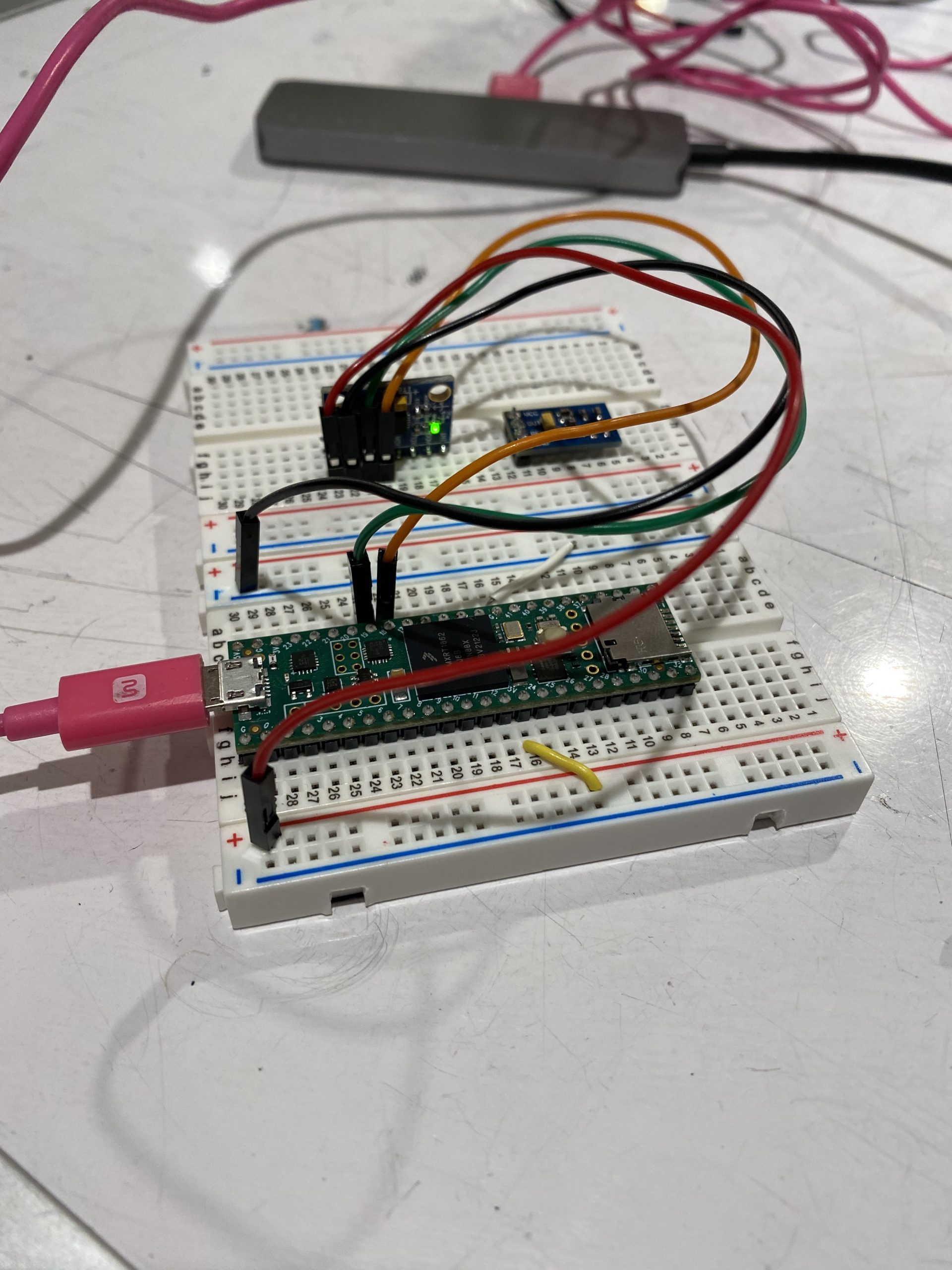
For the final project, I installed light sensors and ultrasonic sensors in and around a lasercut chipboard topography model to achieve several different objectives.
Landscape Topography Model
My final project consists of 4 parts:
Visualizing Light Sensor Data on a Digital Model
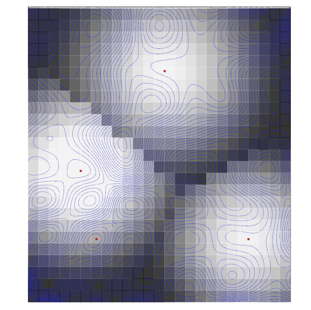
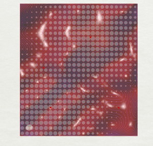
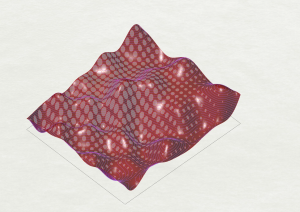
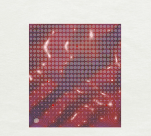
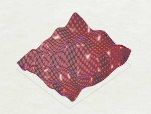
This exercise builds on previous work in the visual crit, in which data coming from light sensors influenced the visual patterns of the topography model in Rhino. In this version, light sensor data is used to create a gradient from white to black in Rhino/Grasshopper, which can either be viewed as a plan in 2d, or projected over the digital topography surface to be viewed in 3d. The data has been smoothed and remapped over a cellular grid, with data points mapped onto the digital topography model to correspond with the locations of the sensors on the physical model.
Views of 2d and 3d visualizations of the light gradient below:
2d Visualization of Light Sensor Gradient3d Visualization of Light Sensor Gradient
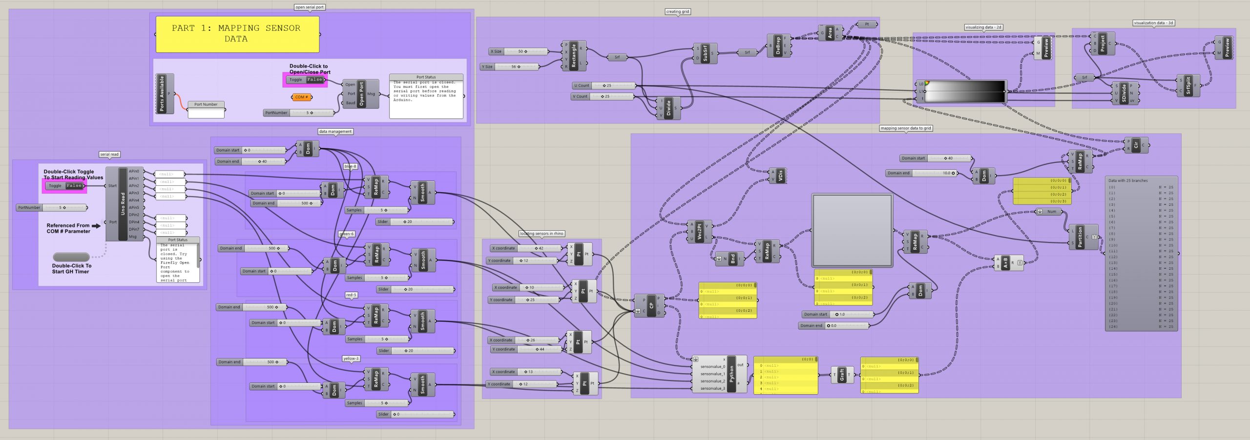
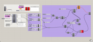
Part 1: GH Code
Demonstration of 2d visualization of light sensor data below:
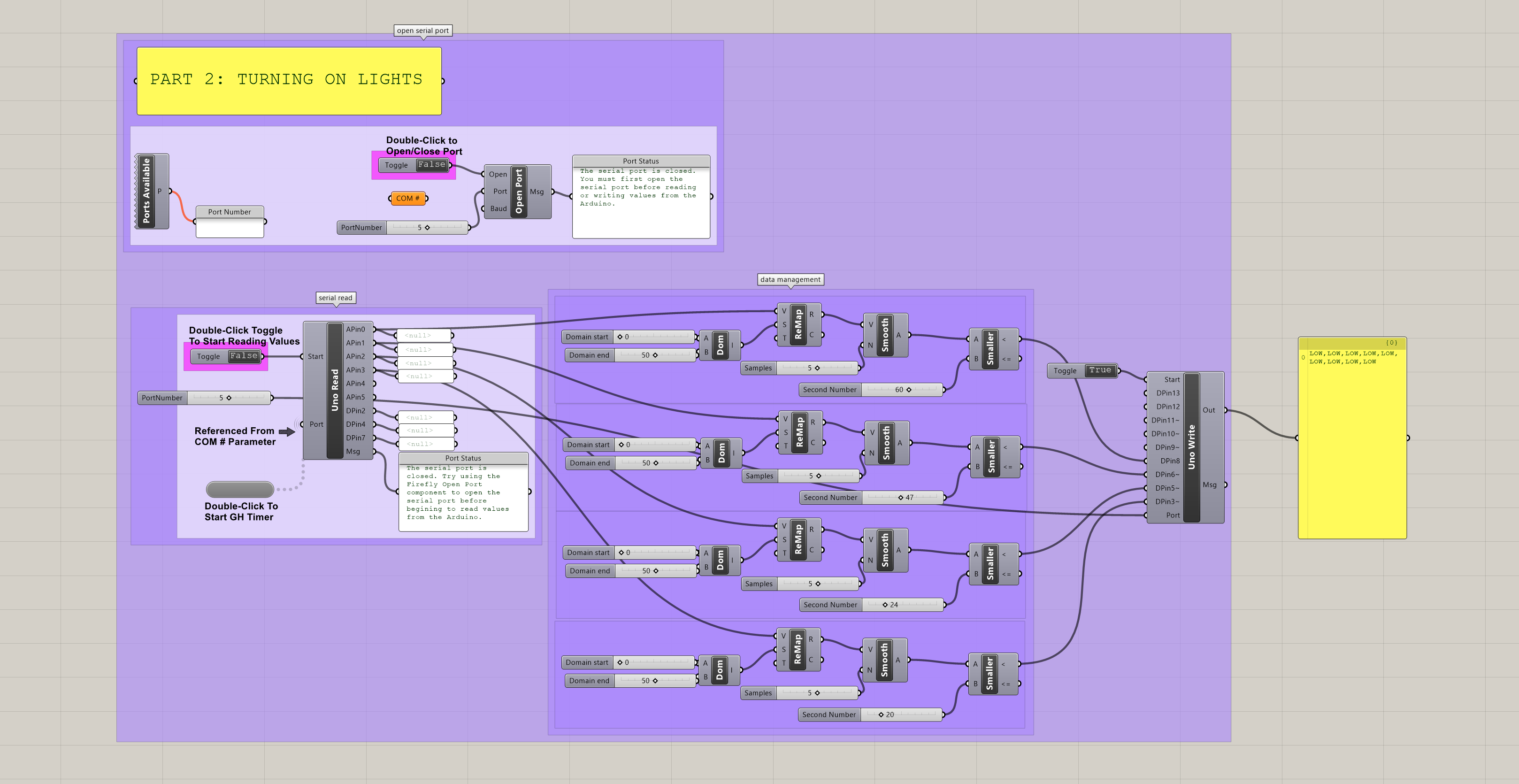
2. Turning LED Lights on Below a Given Light Level
When one of the light sensors falls below a certain threshold of light, the code shown below in Grasshopper will turn on the LED light corresponding to that particular sensor. When the light sensor value rises above this threshold, the LED light turns off. Depending on the way light is cast across the physical topography, one light may be turned on due to the surrounding low light levels, while the others are off. In this way, additional light is only provided when it is deemed necessary, based on the surrounding light conditions.
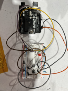
Model with mounted sensors and corresponding LED lights beyondPart 2: GH Code
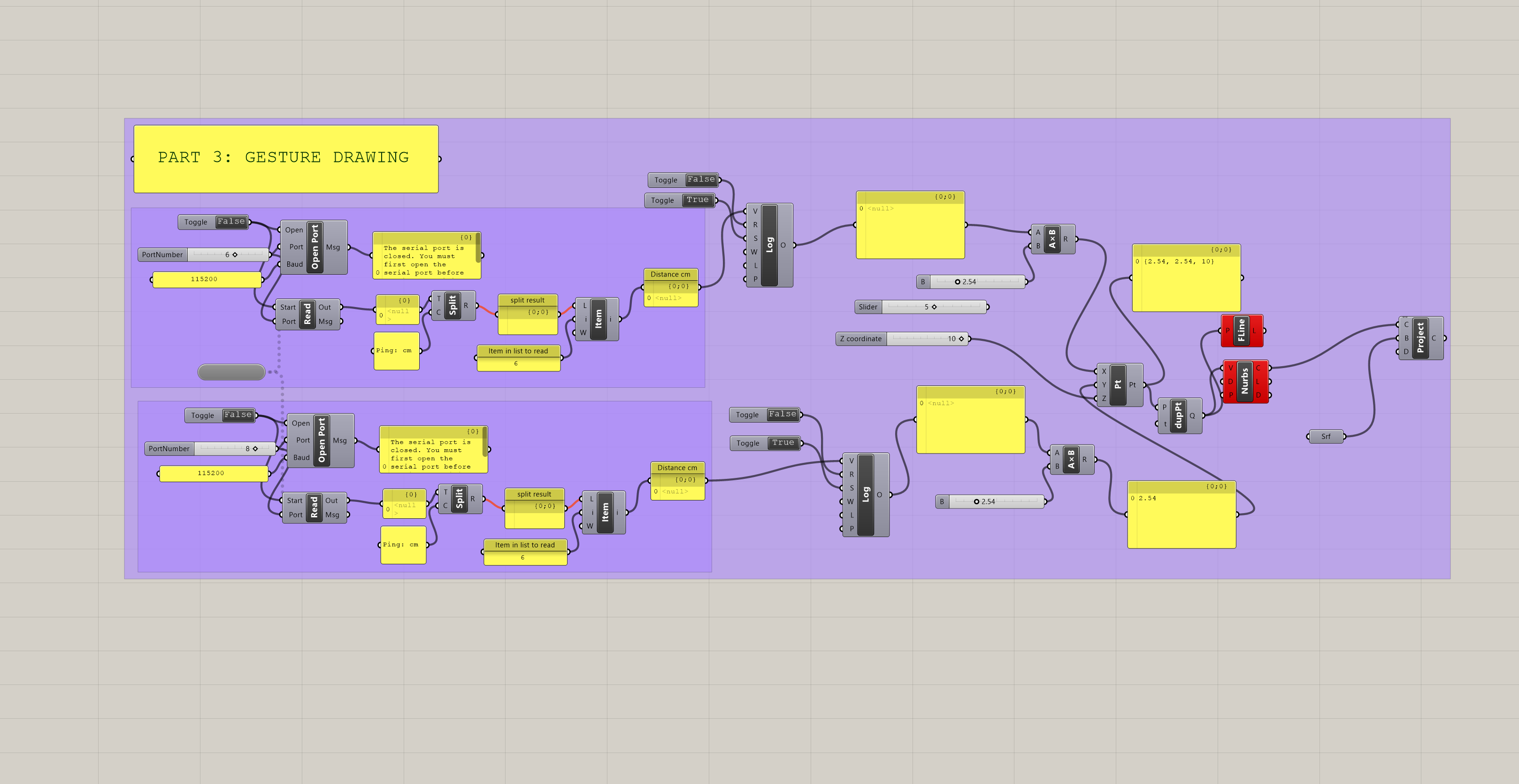
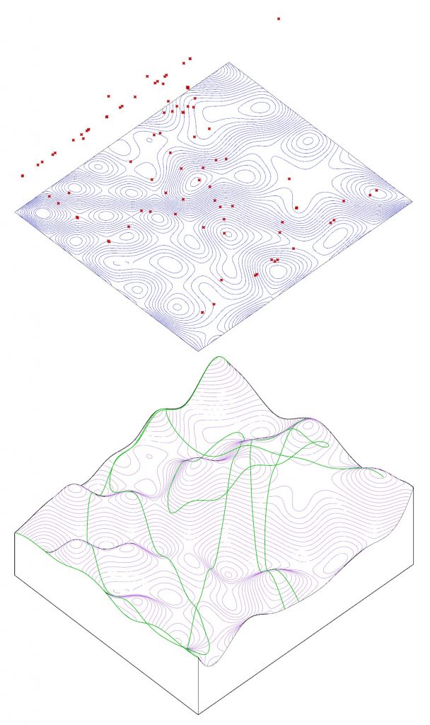
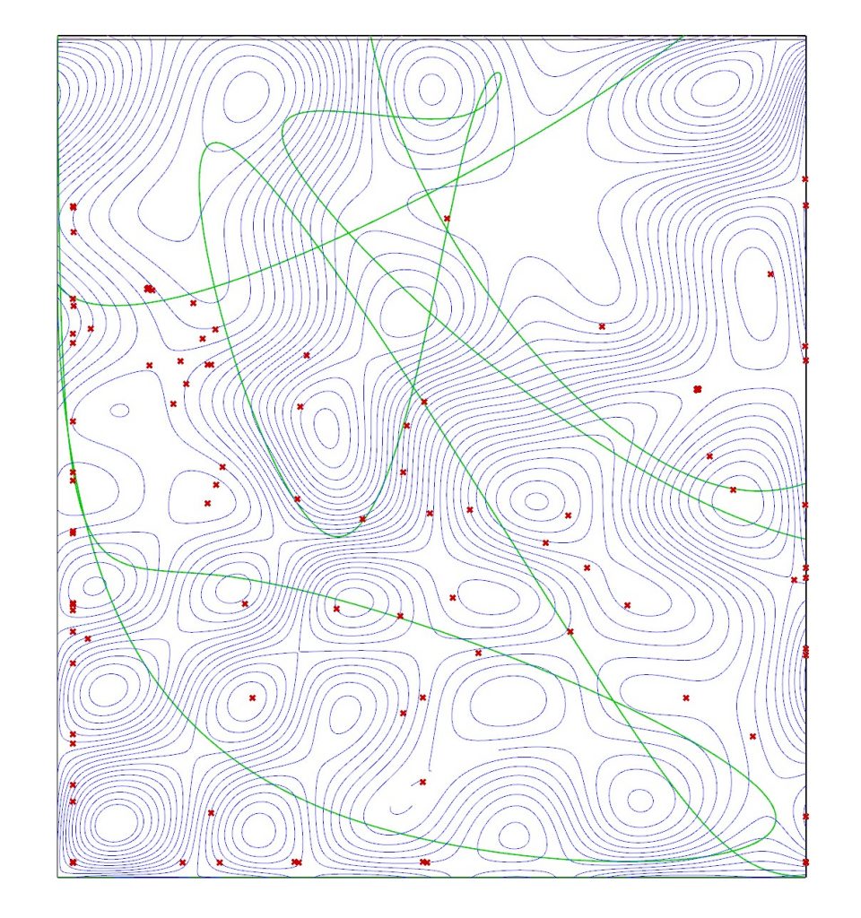
3. Digital Drawing with Ultrasonic Sensors
Using ultrasonic sensors mounted above the topography model, a pointer (such as a long dowel rod) can be moved across the physical terrain of the model. As the ultrasonic sensors pick up the location of the dowel, these locations are read in Grasshopper, logged, and construct points across the digital Rhino model, which can then be used to generate linework. One of the challenges with this project is the limited peripheral detection abilities of the ultrasonic sensors. Two were used in this demonstration, and when the dowel rod moved out of the range of one of the sensors, the code would interpret the coordinates in this area as “0” and the points and associated linework will “jump” to the edges of the model. One possible remedy would be to remove coordinates with “0” from the log, but this would not resolve the sensor range issue. Another possible solution could be to add more sensors. This would likely require multiple Arduinos, unless more complicated Arduino code could be developed to handle multiple ultrasonic sensors at a time (my preliminary attempts to combine 2 ultrasonic sensors on one Arduino were unsuccessful).
Part 3: GH CodeUltrasonic Sketch: 3d Projection, Drawing in GreenUltrasonic Sensors Sketch: 3d Projection, Drawing in Green
4. Digital Drawing with Potentiometers
To explore a second technique for digital drawing, I used potentiometers to guide the drawing across the physical model. This method allowed for greater range and control over the digital drawing (provided one is accustomed to the controls), but it is less intuitive than gesturing with a dowel rod.
Part 4: GH CodeDrawing with Potentiometers, 2d PlanDrawing with Potentiometers, 3d Projection
The Arduino set up for the light sensors and the potentiometer uses Firmata, written by Andrew Payne and Jason Kelly Johnson to facilitate communication between the Arduino and Rhino/Grasshopper/Firefly. A modification is required for 2022 Arduino:
/*
Created by Andrew Payne and Jason Kelly Johnson
Latest Update March 25th, 2015
Copyright 2015 | All Rights Reserved
version below modified for 2022 Arduino
This Firmata allows you to control an Arduino board from Rhino/Grasshopper/Firefly.
1. Plug Arduino boards into your USB port; confirm that your Arduino's green power LED in on
2. Select your specific Arduino Board and Serial Port (Tools > Board; Tools > Serial Port) *Take note of your Serial Port COM #
3. Verify (play button) and Upload (upload button) this program to your Arduino, close the Arduino program
4. then open ... Rhino/Grasshopper/Firefly
Note: The Firefly Firmata sets the following pins to perform these functions:
*****ON STANDARD BOARDS (ie. Uno, Diecimila, Duemilanove, Lillypad, Mini, etc.)*****
ANALOG IN pins 0-5 are set to return values (from 0 to 1023) for analog sensors
DIGITAL IN pins 2,4,7 will return 0's or 1's; for 3 potential digital sensors (buttons, switches, on/off, true/false, etc.)
DIGITAL/ANALOG OUT pins 3,5,6,11 (marked with a ~) can be used to digitalWrite, analogWrite, or Servo.write depending on the input status of that Firefly pin
DIGITAL OUT pins 8,9,10,12,13 can be used to digitalWrite, Servo.write, or analogWrite depending on the input status of that Firefly pin
*****ON MEGA BOARDS (ie. ATMEGA1280, ATMEGA2560)*****
ANALOG IN pins 0-15 will return values (from 0 to 1023) for 16 analog sensors
DIGITAL IN pins 22-31 will return 0's or 1's; for digital sensors (buttons, switches, on/off, true/false, etc.)
DIGITAL/ANALOG OUT pins 2-13 can be used to digitalWrite, analogWrite, or Servo.write depending on the input status of that Firefly pin
DIGITAL OUT pins 32-53 can be used to digitalWrite, Servo.write, or analogWrite depending on the input status of that Firefly pin
*****ON LEONARDO BOARDS*****
ANALOG IN pins 0-5 are set to return values (from 0 to 1023) for analog sensors
DIGITAL IN pins 2,4,7 will return 0's or 1's; for 3 potential digital sensors (buttons, switches, on/off, true/false, etc.)
DIGITAL/ANALOG OUT pins 3,5,6,11 (marked with a ~) can be used to digitalWrite, analogWrite, or Servo.write depending on the input status of that Firefly pin
DIGITAL OUT pins 8,9,10,12,13 can be used to digitalWrite, Servo.write, or analogWrite depending on the input status of that Firefly pin
*****ON DUE BOARDS (ie. SAM3X8E)*****
ANALOG IN pins 0-11 will return values (from 0 to 4095) for 12 analog sensors
DIGITAL IN pins 22-31 will return 0's or 1's; for digital sensors (buttons, switches, on/off, true/false, etc.)
DIGITAL/ANALOG OUT pins 2-13 can be used to digitalWrite, analogWrite, or Servo.write depending on the input status of that Firefly pin
DIGITAL OUT pins 32-53 can be used to digitalWrite, Servo.write, or analogWrite depending on the input status of that Firefly pin
DAC0 and DAC1 can be used to output an analog voltage on those pins (only available on DUE boards)
int WRITE_PIN_CONFIG[] = {0,1,2,3,4,5,6,7,8,9,10,11,12,13,32,33,34,35,36,37,38,39,40,41,42,43,44,45,46,47,48,49,50,51,52,53}; //Note: first two values correspond to the DAC pins
int READ_APIN_CONFIG[] = {0,1,2,3,4,5,6,7,8,9,10,11};
int READ_DPIN_CONFIG[] = {22,23,24,25,26,27,28,29,30,31};
* Initializes the digital pins which will be used as inputs
*/
voidInit(){
int len = sizeof(READ_DPIN_CONFIG)/sizeof(READ_DPIN_CONFIG[0]); //get the size of the array
for(int i = 0; i < len; i++){
pinMode(READ_DPIN_CONFIG[i], INPUT);
}
}
/*
* Reads the incoming ADC or digital values from the corresponding analog and digital input
* pins and prints the value to the serial port as a formatted commma separated string
*/
voidReadInputs(){
int len = sizeof(READ_APIN_CONFIG)/sizeof(READ_APIN_CONFIG[0]); //get the size of the array
for(int i = 0; i < len; i++){
int val = analogRead(READ_APIN_CONFIG[i]); //read value from analog pins
Serial.print(val); Serial.print(",");
}
len = sizeof(READ_DPIN_CONFIG)/sizeof(READ_DPIN_CONFIG[0]); //get the size of the array
for(int i = 0; i < len; i++){
int val = digitalRead(READ_DPIN_CONFIG[i]); //read value from digital pins
Serial.print(val); Serial.print(",");
}
Serial.println("eol"); //end of line marker
}
/*
* Retrieve the latest incoming serial value and split the string at the comma delimeter.
* When a comma is found, the value is offloaded to a temporary variable and written
* to the corresponding digital pin.
*/
voidReadSerial(){
char c; // holds one character from the serial port
if(Serial.available()){
c = Serial.read(); // read one character
buffer[bufferidx] = c; // add to buffer
if(c == '\n'){
buffer[bufferidx+1] = 0; // terminate it
parseptr = buffer; // offload the buffer into temp variable
int len = sizeof(WRITE_PIN_CONFIG)/sizeof(WRITE_PIN_CONFIG[0]); //get the size of the array
for(int i = 0; i < len; i++){
//parse all incoming values and assign them to the appropriate variable
int val = parsedecimal(parseptr); // parse the incoming number
if(i != len - 1) parseptr = strchr(parseptr, ',')+1; // move past the ","
WriteToPin(WRITE_PIN_CONFIG[i], val, SERVO_CONFIG[i]); //send value out to pin on arduino board
}
bufferidx = 0; // reset the buffer for the next read
return; // return so that we don't trigger the index increment below
} // didn't get newline, need to read more from the buffer
bufferidx++; // increment the index for the next character
if(bufferidx == BUFFSIZE-1) bufferidx = 0; // if we get to the end of the buffer reset for safety
}
}
/*
* Send the incoming value to the appropriate pin using pre-defined logic (ie. digital, analog, or servo)
*/
voidWriteToPin(int _pin, int _value, Servo _servo){
if(_value >= 10000&& _value <20000) // check if value should be used for Digital Write (HIGH/LOW)
{
if(_servo.attached()) _servo.detach(); // detach servo is one is attached to pin
pinMode(_pin, OUTPUT);
_value -= 10000; // subtract 10,000 from the value sent from Grasshopper
if(_value == 1)digitalWrite(_pin, HIGH);
elsedigitalWrite(_pin, LOW);
}
elseif(_value >= 20000&& _value <30000) // check if value should be used for Analog Write (0-255)
{
if(_servo.attached()) _servo.detach(); // detach servo is one is attached to pin
pinMode(_pin, OUTPUT);
_value -= 20000; // subtract 20,000 from the value sent from Grasshopper
analogWrite(_pin, _value);
}
elseif(_value >= 30000&& _value <40000) // check if value should be used for Servo Write (0-180)
{
_value -= 30000; // subtract 30,000 from the value sent from Grasshopper
if(!_servo.attached())_servo.attach(_pin); // attaches a Servo to the PWM pin (180 degree standard servos)
_servo.write(_value);
}
elseif(_value >= 40000&& _value <50000) // check if value should be used for Analog Write (0-4096) for DACs
{
if(_servo.attached()) _servo.detach(); // detach servo is one is attached to pin
pinMode(_pin, OUTPUT);
_value -= 40000; // subtract 40,000 from the value sent from Grasshopper
WriteToDAC(_pin, _value);
}
}
/*
* Parse a string value as a decimal
*/
uint32_t parsedecimal(char *str){
uint32_t d = 0;
while(str[0] != 0){
if((str[0]>'50')||(str[0]<'0'))
return d;
d *= 10;
d += str[0] - '0';
str++;
}
return d;
}
/*
* Send the incoming value to the appropriate DAC for DUE boards.
* Note: analogWrite resolution (default is 12 bits) is defined in the Setup function.
*/
//modification to original sketch to work with 2022 firefly and arduino
voidWriteToDAC(int _pin, int _value){
#if defined(__SAM3X8E__)
if(_pin == 0)analogWrite(DAC0, _value);
elseif(_pin == 1)analogWrite(DAC1, _value);
#endif
}
/*
 Created by Andrew Payne and Jason Kelly Johnson
 Latest Update March 25th, 2015
 Copyright 2015 | All Rights Reserved
 version below modified for 2022 Arduino

 This Firmata allows you to control an Arduino board from Rhino/Grasshopper/Firefly.
 Updates, Questions, Suggestions visit: http://www.fireflyexperiments.com

 1. Plug Arduino boards into your USB port; confirm that your Arduino's green power LED in on
 2. Select your specific Arduino Board and Serial Port (Tools > Board; Tools > Serial Port) *Take note of your Serial Port COM #
 3. Verify (play button) and Upload (upload button) this program to your Arduino, close the Arduino program
 4. then open ... Rhino/Grasshopper/Firefly

 Note: The Firefly Firmata sets the following pins to perform these functions:

 *****ON STANDARD BOARDS (ie. Uno, Diecimila, Duemilanove, Lillypad, Mini, etc.)*****
 ANALOG IN pins 0-5 are set to return values (from 0 to 1023) for analog sensors
 DIGITAL IN pins 2,4,7 will return 0's or 1's; for 3 potential digital sensors (buttons, switches, on/off, true/false, etc.)
 DIGITAL/ANALOG OUT pins 3,5,6,11 (marked with a ~) can be used to digitalWrite, analogWrite, or Servo.write depending on the input status of that Firefly pin
 DIGITAL OUT pins 8,9,10,12,13 can be used to digitalWrite, Servo.write, or analogWrite depending on the input status of that Firefly pin

 *****ON MEGA BOARDS (ie. ATMEGA1280, ATMEGA2560)*****
 ANALOG IN pins 0-15 will return values (from 0 to 1023) for 16 analog sensors
 DIGITAL IN pins 22-31 will return 0's or 1's; for digital sensors (buttons, switches, on/off, true/false, etc.)
 DIGITAL/ANALOG OUT pins 2-13 can be used to digitalWrite, analogWrite, or Servo.write depending on the input status of that Firefly pin
 DIGITAL OUT pins 32-53 can be used to digitalWrite, Servo.write, or analogWrite depending on the input status of that Firefly pin

 *****ON LEONARDO BOARDS*****
 ANALOG IN pins 0-5 are set to return values (from 0 to 1023) for analog sensors
 DIGITAL IN pins 2,4,7 will return 0's or 1's; for 3 potential digital sensors (buttons, switches, on/off, true/false, etc.)
 DIGITAL/ANALOG OUT pins 3,5,6,11 (marked with a ~) can be used to digitalWrite, analogWrite, or Servo.write depending on the input status of that Firefly pin
 DIGITAL OUT pins 8,9,10,12,13 can be used to digitalWrite, Servo.write, or analogWrite depending on the input status of that Firefly pin

  *****ON DUE BOARDS (ie. SAM3X8E)*****
 ANALOG IN pins 0-11 will return values (from 0 to 4095) for 12 analog sensors
 DIGITAL IN pins 22-31 will return 0's or 1's; for digital sensors (buttons, switches, on/off, true/false, etc.)
 DIGITAL/ANALOG OUT pins 2-13 can be used to digitalWrite, analogWrite, or Servo.write depending on the input status of that Firefly pin
 DIGITAL OUT pins 32-53 can be used to digitalWrite, Servo.write, or analogWrite depending on the input status of that Firefly pin
 DAC0 and DAC1 can be used to output an analog voltage on those pins (only available on DUE boards)
 */

#include <Servo.h>            // attach Servo library (http://www.arduino.cc/playground/ComponentLib/Servo)
#include <pins_arduino.h>     // attach arduino pins header file to determine which board type is being used

#define BAUDRATE 115200       // Set the Baud Rate to an appropriate speed
#define BUFFSIZE 512          // buffer one command at a time

/*==============================================================================
 * GLOBAL VARIABLES
 *============================================================================*/

char buffer[BUFFSIZE];        // declare buffer
uint8_t bufferidx = 0;        // a type of unsigned integer of length 8 bits
char *parseptr;
char buffidx;

int counter = 0;
int numcycles = 1000;

#if defined(__AVR_ATmega328P__) || defined(__AVR_ATmega168__)                                                // declare variables for STANDARD boards
  Servo Servo13, Servo12, Servo11, Servo10, Servo9, Servo8, Servo6, Servo5, Servo3;
  Servo SERVO_CONFIG[] = {Servo13, Servo12, Servo11, Servo10, Servo9, Servo8, Servo6, Servo5, Servo3};       // declare array of Servo objects
  int WRITE_PIN_CONFIG[] = {13,12,11,10,9,8,6,5,3};
  int READ_APIN_CONFIG[] = {0,1,2,3,4,5};
  int READ_DPIN_CONFIG[] = {2,4,7};
#endif

#if defined(__AVR_ATmega32U4__) || defined(__AVR_ATmega16U4__)                                               // declare variables for LEONARDO board
  Servo Servo13, Servo12, Servo11, Servo10, Servo9, Servo8, Servo6, Servo5, Servo3;
  Servo SERVO_CONFIG[] = {Servo13, Servo12, Servo11, Servo10, Servo9, Servo8, Servo6, Servo5, Servo3};       // declare array of Servo objects
  int WRITE_PIN_CONFIG[] = {13,12,11,10,9,8,6,5,3};
  int READ_APIN_CONFIG[] = {0,1,2,3,4,5};
  int READ_DPIN_CONFIG[] = {2,4,7};
#endif

#if defined(__AVR_ATmega1280__) || defined(__AVR_ATmega2560__)                        // declare variables for MEGA boards
  Servo Servo2, Servo3, Servo4, Servo5, Servo6, Servo7, Servo8, Servo9, Servo10, Servo11, Servo12, Servo13, Servo32, Servo33, Servo34, Servo35, Servo36, Servo37, Servo38, Servo39, Servo40, Servo41, Servo42, Servo43, Servo44, Servo45, Servo46, Servo47, Servo48, Servo49, Servo50, Servo51, Servo52, Servo53;
  Servo SERVO_CONFIG[] = {Servo2, Servo3, Servo4, Servo5, Servo6, Servo7, Servo8, Servo9, Servo10, Servo11, Servo12, Servo13, Servo32, Servo33, Servo34, Servo35, Servo36, Servo37, Servo38, Servo39, Servo40, Servo41, Servo42, Servo43, Servo44, Servo45, Servo46, Servo47, Servo48, Servo49, Servo50, Servo51, Servo52, Servo53};  // declare array of Servo objects
  int WRITE_PIN_CONFIG[] = {2,3,4,5,6,7,8,9,10,11,12,13,32,33,34,35,36,37,38,39,40,41,42,43,44,45,46,47,48,49,50,51,52,53};
  int READ_APIN_CONFIG[] = {0,1,2,3,4,5,6,7,8,9,10,11,12,13,14,15};
  int READ_DPIN_CONFIG[] = {22,23,24,25,26,27,28,29,30,31};
#endif

#if defined(__SAM3X8E__)                 // declare variables for DUE boards
  Servo FDAC0, FDAC1, Servo2, Servo3, Servo4, Servo5, Servo6, Servo7, Servo8, Servo9, Servo10, Servo11, Servo12, Servo13, Servo32, Servo33, Servo34, Servo35, Servo36, Servo37, Servo38, Servo39, Servo40, Servo41, Servo42, Servo43, Servo44, Servo45, Servo46, Servo47, Servo48, Servo49, Servo50, Servo51, Servo52, Servo53;
  Servo SERVO_CONFIG[] = {FDAC0, FDAC1, Servo2, Servo3, Servo4, Servo5, Servo6, Servo7, Servo8, Servo9, Servo10, Servo11, Servo12, Servo13, Servo32, Servo33, Servo34, Servo35, Servo36, Servo37, Servo38, Servo39, Servo40, Servo41, Servo42, Servo43, Servo44, Servo45, Servo46, Servo47, Servo48, Servo49, Servo50, Servo51, Servo52, Servo53};  // declare array of Servo objects
  int WRITE_PIN_CONFIG[] = {0,1,2,3,4,5,6,7,8,9,10,11,12,13,32,33,34,35,36,37,38,39,40,41,42,43,44,45,46,47,48,49,50,51,52,53}; //Note: first two values correspond to the DAC pins
  int READ_APIN_CONFIG[] = {0,1,2,3,4,5,6,7,8,9,10,11};
  int READ_DPIN_CONFIG[] = {22,23,24,25,26,27,28,29,30,31};
#endif

/*==============================================================================
 * SETUP() This code runs once
 *============================================================================*/
void setup()
{
  Init();                       //set initial pinmodes
  Serial.begin(BAUDRATE);       // Start Serial communication
  #if defined(__SAM3X8E__)      //if the connected board is an Arduino DUE
    analogReadResolution(12);   //Set the analog read resolution to 12 bits (acceptable values between 1-32 bits).  This is only for DUE boards
    analogWriteResolution(12);  // Set the analog write resolution to 12 bits (acceptable values between 1-32 bits).  This is only for DUE boards
  #endif
}

/*==============================================================================
 * LOOP() This code loops
 *============================================================================*/
void loop()
{
  if(Serial){
    ReadSerial();                       // read and parse string from serial port and write to pins
    if (counter >= numcycles){          // Wait every nth loop
      ReadInputs();                     // get input data and print data to the serial port
      counter = 0;                      // reset the counter
    }
    counter ++;                         // increment the writecounter
  }
}

/*==============================================================================
 * FUNCTIONS()
 *============================================================================*/

/*
* Initializes the digital pins which will be used as inputs
*/
void Init(){
  int len = sizeof(READ_DPIN_CONFIG)/sizeof(READ_DPIN_CONFIG[0]); //get the size of the array
  for(int i = 0; i < len; i++){
    pinMode(READ_DPIN_CONFIG[i], INPUT);
  }
}

/*
* Reads the incoming ADC or digital values from the corresponding analog and digital input
* pins and prints the value to the serial port as a formatted commma separated string
*/
void ReadInputs(){
  int len = sizeof(READ_APIN_CONFIG)/sizeof(READ_APIN_CONFIG[0]); //get the size of the array
  for(int i = 0; i < len; i++){
    int val = analogRead(READ_APIN_CONFIG[i]);  //read value from analog pins
    Serial.print(val); Serial.print(",");
  }
  len = sizeof(READ_DPIN_CONFIG)/sizeof(READ_DPIN_CONFIG[0]); //get the size of the array
  for(int i = 0; i < len; i++){
    int val = digitalRead(READ_DPIN_CONFIG[i]); //read value from digital pins
    Serial.print(val); Serial.print(",");
  }
  Serial.println("eol");  //end of line marker
}

/*
* Retrieve the latest incoming serial value and split the string at the comma delimeter.
* When a comma is found, the value is offloaded to a temporary variable and written
* to the corresponding digital pin.
*/
void ReadSerial(){
  char c;    // holds one character from the serial port
  if (Serial.available()) {
    c = Serial.read();         // read one character
    buffer[bufferidx] = c;     // add to buffer
    if (c == '\n') {
      buffer[bufferidx+1] = 0; // terminate it
      parseptr = buffer;       // offload the buffer into temp variable
      int len = sizeof(WRITE_PIN_CONFIG)/sizeof(WRITE_PIN_CONFIG[0]); //get the size of the array
      for(int i = 0; i < len; i++){
        //parse all incoming values and assign them to the appropriate variable
        int val = parsedecimal(parseptr);       // parse the incoming number
        if(i != len - 1) parseptr = strchr(parseptr, ',')+1;   // move past the ","
        WriteToPin(WRITE_PIN_CONFIG[i], val, SERVO_CONFIG[i]);         //send value out to pin on arduino board
      }
      bufferidx = 0;                             // reset the buffer for the next read
      return;                                    // return so that we don't trigger the index increment below
    }                                            // didn't get newline, need to read more from the buffer
    bufferidx++;                                 // increment the index for the next character
    if (bufferidx == BUFFSIZE-1) bufferidx = 0;  // if we get to the end of the buffer reset for safety
  }
}

/*
* Send the incoming value to the appropriate pin using pre-defined logic (ie. digital, analog, or servo)
*/
void WriteToPin(int _pin, int _value, Servo _servo){
  if (_value >= 10000 && _value < 20000)            // check if value should be used for Digital Write (HIGH/LOW)
  {
    if (_servo.attached()) _servo.detach();         // detach servo is one is attached to pin
    pinMode(_pin, OUTPUT);
    _value -= 10000;                                // subtract 10,000 from the value sent from Grasshopper
    if (_value == 1) digitalWrite(_pin, HIGH);
    else digitalWrite(_pin, LOW);
  }
  else if (_value >= 20000 && _value < 30000)       // check if value should be used for Analog Write (0-255)
  {
    if (_servo.attached()) _servo.detach();         // detach servo is one is attached to pin
    pinMode(_pin, OUTPUT);
    _value -= 20000;                                // subtract 20,000 from the value sent from Grasshopper
    analogWrite(_pin, _value);
  }
  else if (_value >= 30000 && _value < 40000)       // check if value should be used for Servo Write (0-180)
  {
    _value -= 30000;                                // subtract 30,000 from the value sent from Grasshopper
    if (!_servo.attached())_servo.attach(_pin);     // attaches a Servo to the PWM pin (180 degree standard servos)
    _servo.write(_value);
  }
  else if (_value >= 40000 && _value < 50000)       // check if value should be used for Analog Write (0-4096) for DACs
  {
    if (_servo.attached()) _servo.detach();         // detach servo is one is attached to pin
    pinMode(_pin, OUTPUT);
    _value -= 40000;                                // subtract 40,000 from the value sent from Grasshopper
    WriteToDAC(_pin, _value);
  }
}

/*
* Parse a string value as a decimal
*/
uint32_t parsedecimal(char *str){
  uint32_t d = 0;
  while (str[0] != 0) {
    if ((str[0] > '50') || (str[0] < '0'))
      return d;
    d *= 10;
    d += str[0] - '0';
    str++;
  }
  return d;
}

/*
* Send the incoming value to the appropriate DAC for DUE boards.
* Note: analogWrite resolution (default is 12 bits) is defined in the Setup function.
*/
//modification to original sketch to work with 2022 firefly and arduino
  void WriteToDAC(int _pin, int _value){
    #if defined(__SAM3X8E__)
    if(_pin == 0) analogWrite(DAC0, _value);
    else if (_pin == 1) analogWrite(DAC1, _value);
    #endif
  }
/*
Created by Andrew Payne and Jason Kelly Johnson
Latest Update March 25th, 2015
Copyright 2015 | All Rights Reserved
version below modified for 2022 Arduino
This Firmata allows you to control an Arduino board from Rhino/Grasshopper/Firefly.
Updates, Questions, Suggestions visit: http://www.fireflyexperiments.com
1. Plug Arduino boards into your USB port; confirm that your Arduino's green power LED in on
2. Select your specific Arduino Board and Serial Port (Tools > Board; Tools > Serial Port) *Take note of your Serial Port COM #
3. Verify (play button) and Upload (upload button) this program to your Arduino, close the Arduino program
4. then open ... Rhino/Grasshopper/Firefly
Note: The Firefly Firmata sets the following pins to perform these functions:
*****ON STANDARD BOARDS (ie. Uno, Diecimila, Duemilanove, Lillypad, Mini, etc.)*****
ANALOG IN pins 0-5 are set to return values (from 0 to 1023) for analog sensors
DIGITAL IN pins 2,4,7 will return 0's or 1's; for 3 potential digital sensors (buttons, switches, on/off, true/false, etc.)
DIGITAL/ANALOG OUT pins 3,5,6,11 (marked with a ~) can be used to digitalWrite, analogWrite, or Servo.write depending on the input status of that Firefly pin
DIGITAL OUT pins 8,9,10,12,13 can be used to digitalWrite, Servo.write, or analogWrite depending on the input status of that Firefly pin
*****ON MEGA BOARDS (ie. ATMEGA1280, ATMEGA2560)*****
ANALOG IN pins 0-15 will return values (from 0 to 1023) for 16 analog sensors
DIGITAL IN pins 22-31 will return 0's or 1's; for digital sensors (buttons, switches, on/off, true/false, etc.)
DIGITAL/ANALOG OUT pins 2-13 can be used to digitalWrite, analogWrite, or Servo.write depending on the input status of that Firefly pin
DIGITAL OUT pins 32-53 can be used to digitalWrite, Servo.write, or analogWrite depending on the input status of that Firefly pin
*****ON LEONARDO BOARDS*****
ANALOG IN pins 0-5 are set to return values (from 0 to 1023) for analog sensors
DIGITAL IN pins 2,4,7 will return 0's or 1's; for 3 potential digital sensors (buttons, switches, on/off, true/false, etc.)
DIGITAL/ANALOG OUT pins 3,5,6,11 (marked with a ~) can be used to digitalWrite, analogWrite, or Servo.write depending on the input status of that Firefly pin
DIGITAL OUT pins 8,9,10,12,13 can be used to digitalWrite, Servo.write, or analogWrite depending on the input status of that Firefly pin
*****ON DUE BOARDS (ie. SAM3X8E)*****
ANALOG IN pins 0-11 will return values (from 0 to 4095) for 12 analog sensors
DIGITAL IN pins 22-31 will return 0's or 1's; for digital sensors (buttons, switches, on/off, true/false, etc.)
DIGITAL/ANALOG OUT pins 2-13 can be used to digitalWrite, analogWrite, or Servo.write depending on the input status of that Firefly pin
DIGITAL OUT pins 32-53 can be used to digitalWrite, Servo.write, or analogWrite depending on the input status of that Firefly pin
DAC0 and DAC1 can be used to output an analog voltage on those pins (only available on DUE boards)
*/
#include <Servo.h> // attach Servo library (http://www.arduino.cc/playground/ComponentLib/Servo)
#include <pins_arduino.h> // attach arduino pins header file to determine which board type is being used
#define BAUDRATE 115200 // Set the Baud Rate to an appropriate speed
#define BUFFSIZE 512 // buffer one command at a time
/*==============================================================================
* GLOBAL VARIABLES
*============================================================================*/
char buffer[BUFFSIZE]; // declare buffer
uint8_t bufferidx = 0; // a type of unsigned integer of length 8 bits
char *parseptr;
char buffidx;
int counter = 0;
int numcycles = 1000;
#if defined(__AVR_ATmega328P__) || defined(__AVR_ATmega168__) // declare variables for STANDARD boards
Servo Servo13, Servo12, Servo11, Servo10, Servo9, Servo8, Servo6, Servo5, Servo3;
Servo SERVO_CONFIG[] = {Servo13, Servo12, Servo11, Servo10, Servo9, Servo8, Servo6, Servo5, Servo3}; // declare array of Servo objects
int WRITE_PIN_CONFIG[] = {13,12,11,10,9,8,6,5,3};
int READ_APIN_CONFIG[] = {0,1,2,3,4,5};
int READ_DPIN_CONFIG[] = {2,4,7};
#endif
#if defined(__AVR_ATmega32U4__) || defined(__AVR_ATmega16U4__) // declare variables for LEONARDO board
Servo Servo13, Servo12, Servo11, Servo10, Servo9, Servo8, Servo6, Servo5, Servo3;
Servo SERVO_CONFIG[] = {Servo13, Servo12, Servo11, Servo10, Servo9, Servo8, Servo6, Servo5, Servo3}; // declare array of Servo objects
int WRITE_PIN_CONFIG[] = {13,12,11,10,9,8,6,5,3};
int READ_APIN_CONFIG[] = {0,1,2,3,4,5};
int READ_DPIN_CONFIG[] = {2,4,7};
#endif
#if defined(__AVR_ATmega1280__) || defined(__AVR_ATmega2560__) // declare variables for MEGA boards
Servo Servo2, Servo3, Servo4, Servo5, Servo6, Servo7, Servo8, Servo9, Servo10, Servo11, Servo12, Servo13, Servo32, Servo33, Servo34, Servo35, Servo36, Servo37, Servo38, Servo39, Servo40, Servo41, Servo42, Servo43, Servo44, Servo45, Servo46, Servo47, Servo48, Servo49, Servo50, Servo51, Servo52, Servo53;
Servo SERVO_CONFIG[] = {Servo2, Servo3, Servo4, Servo5, Servo6, Servo7, Servo8, Servo9, Servo10, Servo11, Servo12, Servo13, Servo32, Servo33, Servo34, Servo35, Servo36, Servo37, Servo38, Servo39, Servo40, Servo41, Servo42, Servo43, Servo44, Servo45, Servo46, Servo47, Servo48, Servo49, Servo50, Servo51, Servo52, Servo53}; // declare array of Servo objects
int WRITE_PIN_CONFIG[] = {2,3,4,5,6,7,8,9,10,11,12,13,32,33,34,35,36,37,38,39,40,41,42,43,44,45,46,47,48,49,50,51,52,53};
int READ_APIN_CONFIG[] = {0,1,2,3,4,5,6,7,8,9,10,11,12,13,14,15};
int READ_DPIN_CONFIG[] = {22,23,24,25,26,27,28,29,30,31};
#endif
#if defined(__SAM3X8E__) // declare variables for DUE boards
Servo FDAC0, FDAC1, Servo2, Servo3, Servo4, Servo5, Servo6, Servo7, Servo8, Servo9, Servo10, Servo11, Servo12, Servo13, Servo32, Servo33, Servo34, Servo35, Servo36, Servo37, Servo38, Servo39, Servo40, Servo41, Servo42, Servo43, Servo44, Servo45, Servo46, Servo47, Servo48, Servo49, Servo50, Servo51, Servo52, Servo53;
Servo SERVO_CONFIG[] = {FDAC0, FDAC1, Servo2, Servo3, Servo4, Servo5, Servo6, Servo7, Servo8, Servo9, Servo10, Servo11, Servo12, Servo13, Servo32, Servo33, Servo34, Servo35, Servo36, Servo37, Servo38, Servo39, Servo40, Servo41, Servo42, Servo43, Servo44, Servo45, Servo46, Servo47, Servo48, Servo49, Servo50, Servo51, Servo52, Servo53}; // declare array of Servo objects
int WRITE_PIN_CONFIG[] = {0,1,2,3,4,5,6,7,8,9,10,11,12,13,32,33,34,35,36,37,38,39,40,41,42,43,44,45,46,47,48,49,50,51,52,53}; //Note: first two values correspond to the DAC pins
int READ_APIN_CONFIG[] = {0,1,2,3,4,5,6,7,8,9,10,11};
int READ_DPIN_CONFIG[] = {22,23,24,25,26,27,28,29,30,31};
#endif
/*==============================================================================
* SETUP() This code runs once
*============================================================================*/
void setup()
{
Init(); //set initial pinmodes
Serial.begin(BAUDRATE); // Start Serial communication
#if defined(__SAM3X8E__) //if the connected board is an Arduino DUE
analogReadResolution(12); //Set the analog read resolution to 12 bits (acceptable values between 1-32 bits). This is only for DUE boards
analogWriteResolution(12); // Set the analog write resolution to 12 bits (acceptable values between 1-32 bits). This is only for DUE boards
#endif
}
/*==============================================================================
* LOOP() This code loops
*============================================================================*/
void loop()
{
if(Serial){
ReadSerial(); // read and parse string from serial port and write to pins
if (counter >= numcycles){ // Wait every nth loop
ReadInputs(); // get input data and print data to the serial port
counter = 0; // reset the counter
}
counter ++; // increment the writecounter
}
}
/*==============================================================================
* FUNCTIONS()
*============================================================================*/
/*
* Initializes the digital pins which will be used as inputs
*/
void Init(){
int len = sizeof(READ_DPIN_CONFIG)/sizeof(READ_DPIN_CONFIG[0]); //get the size of the array
for(int i = 0; i < len; i++){
pinMode(READ_DPIN_CONFIG[i], INPUT);
}
}
/*
* Reads the incoming ADC or digital values from the corresponding analog and digital input
* pins and prints the value to the serial port as a formatted commma separated string
*/
void ReadInputs(){
int len = sizeof(READ_APIN_CONFIG)/sizeof(READ_APIN_CONFIG[0]); //get the size of the array
for(int i = 0; i < len; i++){
int val = analogRead(READ_APIN_CONFIG[i]); //read value from analog pins
Serial.print(val); Serial.print(",");
}
len = sizeof(READ_DPIN_CONFIG)/sizeof(READ_DPIN_CONFIG[0]); //get the size of the array
for(int i = 0; i < len; i++){
int val = digitalRead(READ_DPIN_CONFIG[i]); //read value from digital pins
Serial.print(val); Serial.print(",");
}
Serial.println("eol"); //end of line marker
}
/*
* Retrieve the latest incoming serial value and split the string at the comma delimeter.
* When a comma is found, the value is offloaded to a temporary variable and written
* to the corresponding digital pin.
*/
void ReadSerial(){
char c; // holds one character from the serial port
if (Serial.available()) {
c = Serial.read(); // read one character
buffer[bufferidx] = c; // add to buffer
if (c == '\n') {
buffer[bufferidx+1] = 0; // terminate it
parseptr = buffer; // offload the buffer into temp variable
int len = sizeof(WRITE_PIN_CONFIG)/sizeof(WRITE_PIN_CONFIG[0]); //get the size of the array
for(int i = 0; i < len; i++){
//parse all incoming values and assign them to the appropriate variable
int val = parsedecimal(parseptr); // parse the incoming number
if(i != len - 1) parseptr = strchr(parseptr, ',')+1; // move past the ","
WriteToPin(WRITE_PIN_CONFIG[i], val, SERVO_CONFIG[i]); //send value out to pin on arduino board
}
bufferidx = 0; // reset the buffer for the next read
return; // return so that we don't trigger the index increment below
} // didn't get newline, need to read more from the buffer
bufferidx++; // increment the index for the next character
if (bufferidx == BUFFSIZE-1) bufferidx = 0; // if we get to the end of the buffer reset for safety
}
}
/*
* Send the incoming value to the appropriate pin using pre-defined logic (ie. digital, analog, or servo)
*/
void WriteToPin(int _pin, int _value, Servo _servo){
if (_value >= 10000 && _value < 20000) // check if value should be used for Digital Write (HIGH/LOW)
{
if (_servo.attached()) _servo.detach(); // detach servo is one is attached to pin
pinMode(_pin, OUTPUT);
_value -= 10000; // subtract 10,000 from the value sent from Grasshopper
if (_value == 1) digitalWrite(_pin, HIGH);
else digitalWrite(_pin, LOW);
}
else if (_value >= 20000 && _value < 30000) // check if value should be used for Analog Write (0-255)
{
if (_servo.attached()) _servo.detach(); // detach servo is one is attached to pin
pinMode(_pin, OUTPUT);
_value -= 20000; // subtract 20,000 from the value sent from Grasshopper
analogWrite(_pin, _value);
}
else if (_value >= 30000 && _value < 40000) // check if value should be used for Servo Write (0-180)
{
_value -= 30000; // subtract 30,000 from the value sent from Grasshopper
if (!_servo.attached())_servo.attach(_pin); // attaches a Servo to the PWM pin (180 degree standard servos)
_servo.write(_value);
}
else if (_value >= 40000 && _value < 50000) // check if value should be used for Analog Write (0-4096) for DACs
{
if (_servo.attached()) _servo.detach(); // detach servo is one is attached to pin
pinMode(_pin, OUTPUT);
_value -= 40000; // subtract 40,000 from the value sent from Grasshopper
WriteToDAC(_pin, _value);
}
}
/*
* Parse a string value as a decimal
*/
uint32_t parsedecimal(char *str){
uint32_t d = 0;
while (str[0] != 0) {
if ((str[0] > '50') || (str[0] < '0'))
return d;
d *= 10;
d += str[0] - '0';
str++;
}
return d;
}
/*
* Send the incoming value to the appropriate DAC for DUE boards.
* Note: analogWrite resolution (default is 12 bits) is defined in the Setup function.
*/
//modification to original sketch to work with 2022 firefly and arduino
void WriteToDAC(int _pin, int _value){
#if defined(__SAM3X8E__)
if(_pin == 0) analogWrite(DAC0, _value);
else if (_pin == 1) analogWrite(DAC1, _value);
#endif
}
To use the ultrasonic sensors with Rhino/Grasshopper/Firefly, the NewPing library was used:
#define TRIGGER_PIN 12 // Arduino pin tied to trigger pin on the ultrasonic sensor.
#define ECHO_PIN 11 // Arduino pin tied to echo pin on the ultrasonic sensor.
#define MAX_DISTANCE 30 // Maximum distance we want to ping for (in centimeters). Maximum sensor distance is rated at 400-500cm.
NewPing sonar(TRIGGER_PIN, ECHO_PIN, MAX_DISTANCE); // NewPing setup of pins and maximum distance.
voidsetup(){
Serial.begin(115200); // Open serial monitor at 115200 baud to see ping results.
}
voidloop(){
delay(50); // Wait 50ms between pings (about 20 pings/sec). 29ms should be the shortest delay between pings.
Serial.print("Ping: ");
Serial.print(sonar.ping_cm()); // Send ping, get distance in cm and print result (0 = outside set distance range)
Serial.println("cm");
}
// ---------------------------------------------------------------------------
// Example NewPing library sketch that does a ping about 20 times per second.
// ---------------------------------------------------------------------------

#include <NewPing.h>

#define TRIGGER_PIN  12  // Arduino pin tied to trigger pin on the ultrasonic sensor.
#define ECHO_PIN     11  // Arduino pin tied to echo pin on the ultrasonic sensor.
#define MAX_DISTANCE 30 // Maximum distance we want to ping for (in centimeters). Maximum sensor distance is rated at 400-500cm.

NewPing sonar(TRIGGER_PIN, ECHO_PIN, MAX_DISTANCE); // NewPing setup of pins and maximum distance.

void setup() {
  Serial.begin(115200); // Open serial monitor at 115200 baud to see ping results.
}

void loop() {
  delay(50);                     // Wait 50ms between pings (about 20 pings/sec). 29ms should be the shortest delay between pings.
  Serial.print("Ping: ");
  Serial.print(sonar.ping_cm()); // Send ping, get distance in cm and print result (0 = outside set distance range)
  Serial.println("cm");
}
// ---------------------------------------------------------------------------
// Example NewPing library sketch that does a ping about 20 times per second.
// ---------------------------------------------------------------------------
#include <NewPing.h>
#define TRIGGER_PIN 12 // Arduino pin tied to trigger pin on the ultrasonic sensor.
#define ECHO_PIN 11 // Arduino pin tied to echo pin on the ultrasonic sensor.
#define MAX_DISTANCE 30 // Maximum distance we want to ping for (in centimeters). Maximum sensor distance is rated at 400-500cm.
NewPing sonar(TRIGGER_PIN, ECHO_PIN, MAX_DISTANCE); // NewPing setup of pins and maximum distance.
void setup() {
Serial.begin(115200); // Open serial monitor at 115200 baud to see ping results.
}
void loop() {
delay(50); // Wait 50ms between pings (about 20 pings/sec). 29ms should be the shortest delay between pings.
Serial.print("Ping: ");
Serial.print(sonar.ping_cm()); // Send ping, get distance in cm and print result (0 = outside set distance range)
Serial.println("cm");
}
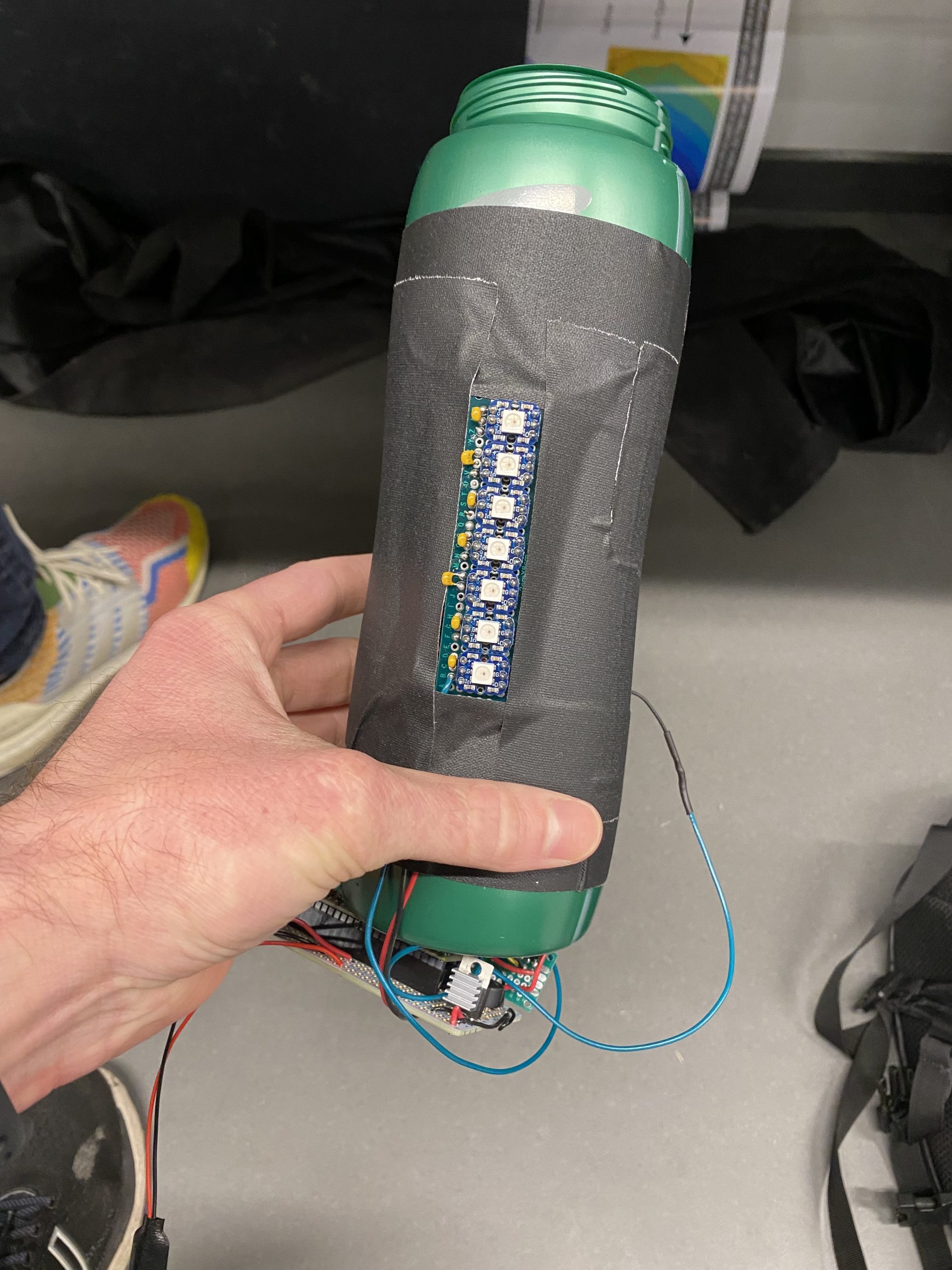
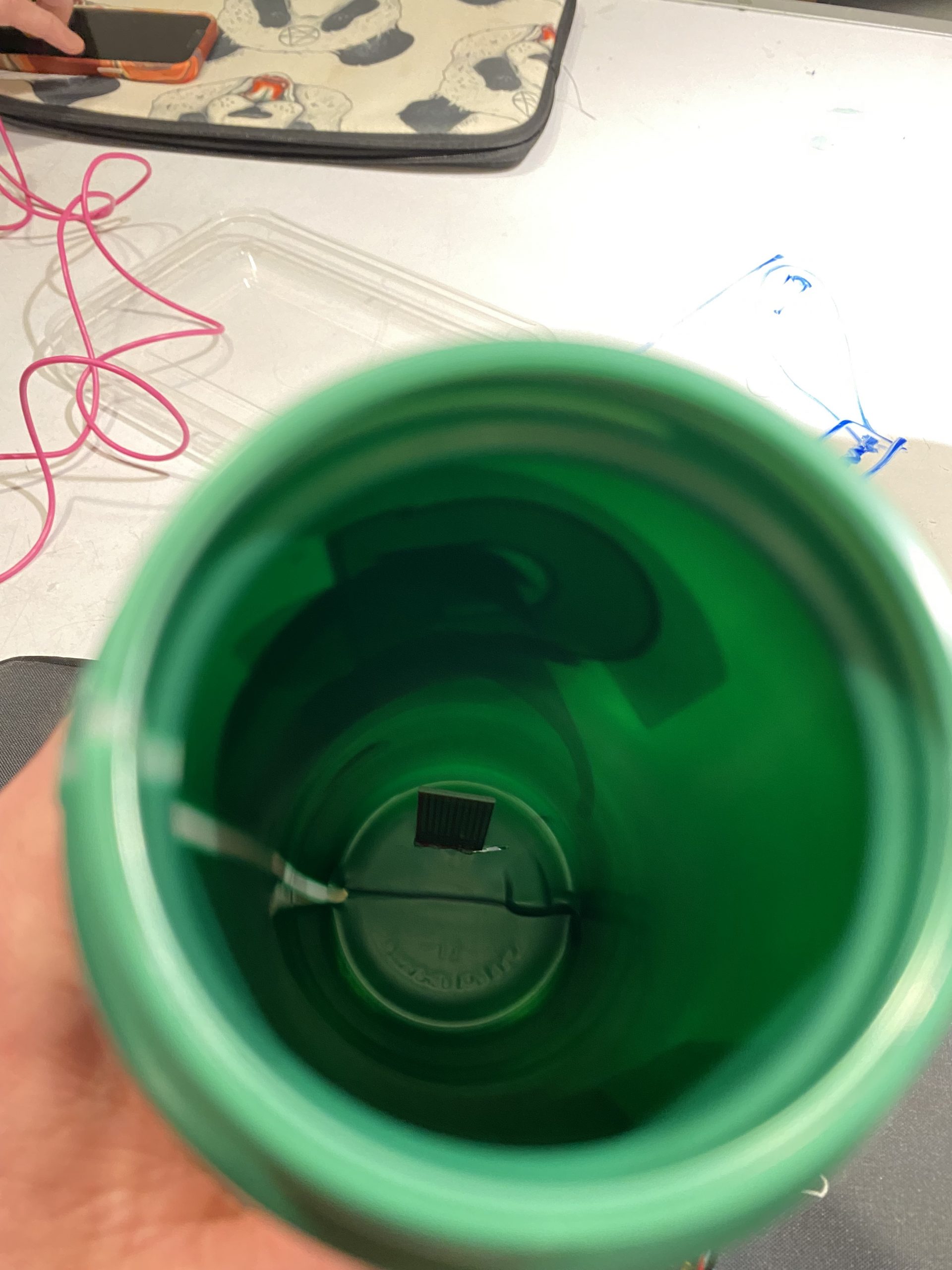
This device is meant to help remind the user how much water they have in their water bottle and give them helpful suggestions to drink water throughout the day. The main functionality of the system is a water sensor made of various wire endpoints on the inside of the water bottle that conduct electricity when they come in contact with the water. This signal is then read by the microcontroller which then calculates water level based on the number of sensor readings that are high. While the resolution of this sensor is only 7, this is all that is necessary for the 7 pixel display showing the water level. In addition to this main sensor, there is also an IMU on board sensing the current acceleration of the water bottle, a buzzer, and the LED light bar. Starting with the LED light bar, this is made of 7 LED pixels that indicate various things to the user including water level and when the user needs to drink water. The IMU on board is used for detecting when the bottle is at rest and thus the water level reading will be accurate. Finally, the buzzer acts in tandem with the light bar for indicating to the user when they need to drink water. All of these components add up to a device that is effectively able to let the user know how much water is in their water bottle and when they get dehydrated.
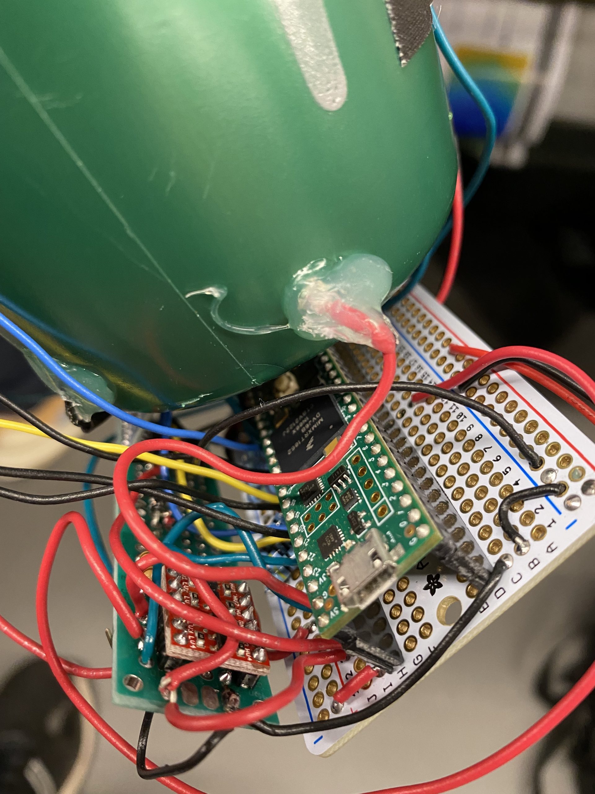
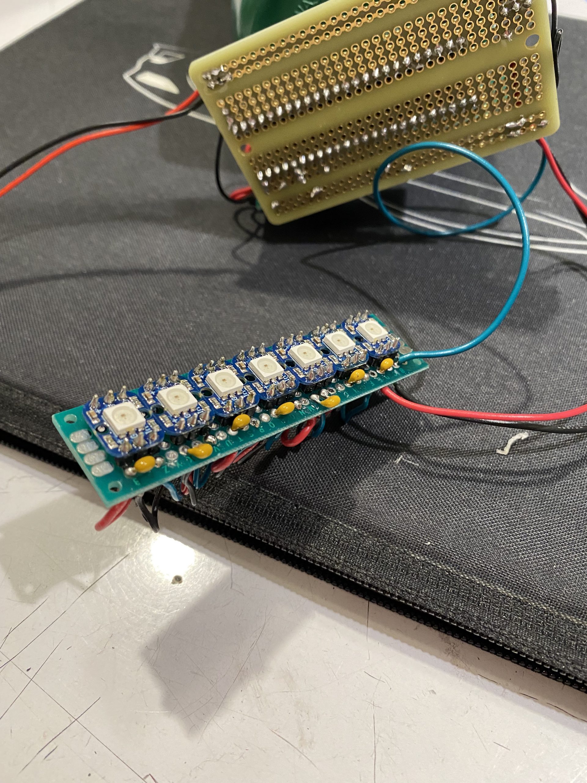
Side view of new digital water level sensorSide view of LED light bar indicator mounted to the side of the water bottleImage of final electronics
Process:
LED light bar used for indication of water levelImage of original water sensor that was too small for the whole bottleOverall image of first prototype with original analog water sensorLED panel backside
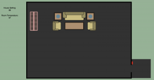
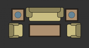
I decided to take my previous visual crit further for this final crit by adding more components from a typical house into the control scheme/visualization method. The idea is to create a little virtual world where the user can visualize and interact with things going on in their home related to electronics. The user has the ability to turn lamps on and off and the states of each lamp will brighten the virtual room accordingly.
Lamps both offOne lamp on and one lamp off
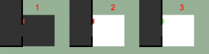
The user can also see whether someone is at the door and let them inside if they so choose. I did not know how to connect a camera to the Arduino so the system is not able to distinguish who is at the door but that is a future addition to theoretical implementation of this concept. Assuming the user knows the person present at the door, they can click the lock next to the door and unlock the door for the user.
Process for unlocking door
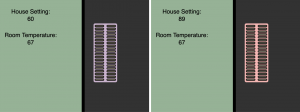
The user also has visual indications of the temperature and thermostat setting through a heater/ac unit. The color of the unit dynamically changes based on the difference between the goal temperature and current temperature in the room. If the room is hotter than it should be, the unit appears more blue to indicate that the ac is running. The same is true for the opposite scenario as well where the room is colder than desired.
Temperature settings and their color representation
Circuit:
Demo Video:
Code:
p5.js
/*
- RGB to HSV Conversion Function from http://www.javascripter.net/faq/rgb2hsv.htm
*/
let serial;
let latestData = "waiting for data";
var outMessage;
var prevOutMessage;
var message;
var currentMessage;
let goalTemp = 0;
let currTemp = 0;
let newFont;
let lightsEnable = true;
let x = 100;
let y = 100;
let width = 1700;
let height = 900;
let color = 300;
let baseSaturation = 40;
let baseBrightness = 30;
let table1X = 970;
let table2X = 630;
let table1Y = 200;
//Lightsource vector [on/off, x, y, Lamp Radius, Shine Radius]
let lightSources = [];
let updateLightSource = true;
//States
let heaterState = 0;
let acState = 1;
//Colors
let doorStepColor = [50, 50, 50];
let lockColor = [255, 0, 0];
let heaterColor = [255, 150, 173];
//Positions
let heaterX = 375;
let heaterY = 250;
let livingRoomWidth = width - 600;
let livingRoomHeight = height - 100;
let doorStepHeight = 200;
let doorStepWidth = 200;
let lockX = width/2 + livingRoomWidth/2 + 10;
let lockY = height/2 + livingRoomHeight/2 - doorStepHeight/2 - 60;
For the Visual Crit, I used Arduino, Rhino, Grasshopper, and GH plug-in Firefly to visualize sensor data over a topographical landscape. The topography model was initially generated digitally with Rhino and Grasshopper, so it could be used later in the model visualization. Contours were exported to 2d CAD to cut the physical model.
The physical model was constructed of lasercut chipboard, with enough variation in height to imitate a landscape that could plausibly have multiple microclimates, which can form due to differences in light, drainage, and airflow. Changes in topography can drive these shifts in environmental conditions. Light sensors will installed in different areas of the model.
Uploaded to the arduino is this Firmata code (which has been edited since the 2015 version to account for some differences in Arduino):
/*
Created by Andrew Payne and Jason Kelly Johnson
Latest Update March 25th, 2015
Copyright 2015 | All Rights Reserved
This Firmata allows you to control an Arduino board from Rhino/Grasshopper/Firefly.
1. Plug Arduino boards into your USB port; confirm that your Arduino's green power LED in on
2. Select your specific Arduino Board and Serial Port (Tools > Board; Tools > Serial Port) *Take note of your Serial Port COM #
3. Verify (play button) and Upload (upload button) this program to your Arduino, close the Arduino program
4. then open ... Rhino/Grasshopper/Firefly
Note: The Firefly Firmata sets the following pins to perform these functions:
*****ON STANDARD BOARDS (ie. Uno, Diecimila, Duemilanove, Lillypad, Mini, etc.)*****
ANALOG IN pins 0-5 are set to return values (from 0 to 1023) for analog sensors
DIGITAL IN pins 2,4,7 will return 0's or 1's; for 3 potential digital sensors (buttons, switches, on/off, true/false, etc.)
DIGITAL/ANALOG OUT pins 3,5,6,11 (marked with a ~) can be used to digitalWrite, analogWrite, or Servo.write depending on the input status of that Firefly pin
DIGITAL OUT pins 8,9,10,12,13 can be used to digitalWrite, Servo.write, or analogWrite depending on the input status of that Firefly pin
*****ON MEGA BOARDS (ie. ATMEGA1280, ATMEGA2560)*****
ANALOG IN pins 0-15 will return values (from 0 to 1023) for 16 analog sensors
DIGITAL IN pins 22-31 will return 0's or 1's; for digital sensors (buttons, switches, on/off, true/false, etc.)
DIGITAL/ANALOG OUT pins 2-13 can be used to digitalWrite, analogWrite, or Servo.write depending on the input status of that Firefly pin
DIGITAL OUT pins 32-53 can be used to digitalWrite, Servo.write, or analogWrite depending on the input status of that Firefly pin
*****ON LEONARDO BOARDS*****
ANALOG IN pins 0-5 are set to return values (from 0 to 1023) for analog sensors
DIGITAL IN pins 2,4,7 will return 0's or 1's; for 3 potential digital sensors (buttons, switches, on/off, true/false, etc.)
DIGITAL/ANALOG OUT pins 3,5,6,11 (marked with a ~) can be used to digitalWrite, analogWrite, or Servo.write depending on the input status of that Firefly pin
DIGITAL OUT pins 8,9,10,12,13 can be used to digitalWrite, Servo.write, or analogWrite depending on the input status of that Firefly pin
*****ON DUE BOARDS (ie. SAM3X8E)*****
ANALOG IN pins 0-11 will return values (from 0 to 4095) for 12 analog sensors
DIGITAL IN pins 22-31 will return 0's or 1's; for digital sensors (buttons, switches, on/off, true/false, etc.)
DIGITAL/ANALOG OUT pins 2-13 can be used to digitalWrite, analogWrite, or Servo.write depending on the input status of that Firefly pin
DIGITAL OUT pins 32-53 can be used to digitalWrite, Servo.write, or analogWrite depending on the input status of that Firefly pin
DAC0 and DAC1 can be used to output an analog voltage on those pins (only available on DUE boards)
int WRITE_PIN_CONFIG[] = {0,1,2,3,4,5,6,7,8,9,10,11,12,13,32,33,34,35,36,37,38,39,40,41,42,43,44,45,46,47,48,49,50,51,52,53}; //Note: first two values correspond to the DAC pins
int READ_APIN_CONFIG[] = {0,1,2,3,4,5,6,7,8,9,10,11};
int READ_DPIN_CONFIG[] = {22,23,24,25,26,27,28,29,30,31};
* Initializes the digital pins which will be used as inputs
*/
voidInit(){
int len = sizeof(READ_DPIN_CONFIG)/sizeof(READ_DPIN_CONFIG[0]); //get the size of the array
for(int i = 0; i < len; i++){
pinMode(READ_DPIN_CONFIG[i], INPUT);
}
}
/*
* Reads the incoming ADC or digital values from the corresponding analog and digital input
* pins and prints the value to the serial port as a formatted commma separated string
*/
voidReadInputs(){
int len = sizeof(READ_APIN_CONFIG)/sizeof(READ_APIN_CONFIG[0]); //get the size of the array
for(int i = 0; i < len; i++){
int val = analogRead(READ_APIN_CONFIG[i]); //read value from analog pins
Serial.print(val); Serial.print(",");
}
len = sizeof(READ_DPIN_CONFIG)/sizeof(READ_DPIN_CONFIG[0]); //get the size of the array
for(int i = 0; i < len; i++){
int val = digitalRead(READ_DPIN_CONFIG[i]); //read value from digital pins
Serial.print(val); Serial.print(",");
}
Serial.println("eol"); //end of line marker
}
/*
* Retrieve the latest incoming serial value and split the string at the comma delimeter.
* When a comma is found, the value is offloaded to a temporary variable and written
* to the corresponding digital pin.
*/
voidReadSerial(){
char c; // holds one character from the serial port
if(Serial.available()){
c = Serial.read(); // read one character
buffer[bufferidx] = c; // add to buffer
if(c == '\n'){
buffer[bufferidx+1] = 0; // terminate it
parseptr = buffer; // offload the buffer into temp variable
int len = sizeof(WRITE_PIN_CONFIG)/sizeof(WRITE_PIN_CONFIG[0]); //get the size of the array
for(int i = 0; i < len; i++){
//parse all incoming values and assign them to the appropriate variable
int val = parsedecimal(parseptr); // parse the incoming number
if(i != len - 1) parseptr = strchr(parseptr, ',')+1; // move past the ","
WriteToPin(WRITE_PIN_CONFIG[i], val, SERVO_CONFIG[i]); //send value out to pin on arduino board
}
bufferidx = 0; // reset the buffer for the next read
return; // return so that we don't trigger the index increment below
} // didn't get newline, need to read more from the buffer
bufferidx++; // increment the index for the next character
if(bufferidx == BUFFSIZE-1) bufferidx = 0; // if we get to the end of the buffer reset for safety
}
}
/*
* Send the incoming value to the appropriate pin using pre-defined logic (ie. digital, analog, or servo)
*/
voidWriteToPin(int _pin, int _value, Servo _servo){
if(_value >= 10000&& _value <20000) // check if value should be used for Digital Write (HIGH/LOW)
{
if(_servo.attached()) _servo.detach(); // detach servo is one is attached to pin
pinMode(_pin, OUTPUT);
_value -= 10000; // subtract 10,000 from the value sent from Grasshopper
if(_value == 1)digitalWrite(_pin, HIGH);
elsedigitalWrite(_pin, LOW);
}
elseif(_value >= 20000&& _value <30000) // check if value should be used for Analog Write (0-255)
{
if(_servo.attached()) _servo.detach(); // detach servo is one is attached to pin
pinMode(_pin, OUTPUT);
_value -= 20000; // subtract 20,000 from the value sent from Grasshopper
analogWrite(_pin, _value);
}
elseif(_value >= 30000&& _value <40000) // check if value should be used for Servo Write (0-180)
{
_value -= 30000; // subtract 30,000 from the value sent from Grasshopper
if(!_servo.attached())_servo.attach(_pin); // attaches a Servo to the PWM pin (180 degree standard servos)
_servo.write(_value);
}
elseif(_value >= 40000&& _value <50000) // check if value should be used for Analog Write (0-4096) for DACs
{
if(_servo.attached()) _servo.detach(); // detach servo is one is attached to pin
pinMode(_pin, OUTPUT);
_value -= 40000; // subtract 40,000 from the value sent from Grasshopper
WriteToDAC(_pin, _value);
}
}
/*
* Parse a string value as a decimal
*/
uint32_t parsedecimal(char *str){
uint32_t d = 0;
while(str[0] != 0){
if((str[0]>'50')||(str[0]<'0'))
return d;
d *= 10;
d += str[0] - '0';
str++;
}
return d;
}
/*
* Send the incoming value to the appropriate DAC for DUE boards.
* Note: analogWrite resolution (default is 12 bits) is defined in the Setup function.
*/
//modification to original sketch to work with 2022 firefly and arduino
voidWriteToDAC(int _pin, int _value){
#if defined(__SAM3X8E__)
if(_pin == 0)analogWrite(DAC0, _value);
elseif(_pin == 1)analogWrite(DAC1, _value);
#endif
}
/*
 Created by Andrew Payne and Jason Kelly Johnson
 Latest Update March 25th, 2015
 Copyright 2015 | All Rights Reserved

 This Firmata allows you to control an Arduino board from Rhino/Grasshopper/Firefly.
 Updates, Questions, Suggestions visit: http://www.fireflyexperiments.com

 1. Plug Arduino boards into your USB port; confirm that your Arduino's green power LED in on
 2. Select your specific Arduino Board and Serial Port (Tools > Board; Tools > Serial Port) *Take note of your Serial Port COM #
 3. Verify (play button) and Upload (upload button) this program to your Arduino, close the Arduino program
 4. then open ... Rhino/Grasshopper/Firefly

 Note: The Firefly Firmata sets the following pins to perform these functions:

 *****ON STANDARD BOARDS (ie. Uno, Diecimila, Duemilanove, Lillypad, Mini, etc.)*****
 ANALOG IN pins 0-5 are set to return values (from 0 to 1023) for analog sensors
 DIGITAL IN pins 2,4,7 will return 0's or 1's; for 3 potential digital sensors (buttons, switches, on/off, true/false, etc.)
 DIGITAL/ANALOG OUT pins 3,5,6,11 (marked with a ~) can be used to digitalWrite, analogWrite, or Servo.write depending on the input status of that Firefly pin
 DIGITAL OUT pins 8,9,10,12,13 can be used to digitalWrite, Servo.write, or analogWrite depending on the input status of that Firefly pin

 *****ON MEGA BOARDS (ie. ATMEGA1280, ATMEGA2560)*****
 ANALOG IN pins 0-15 will return values (from 0 to 1023) for 16 analog sensors
 DIGITAL IN pins 22-31 will return 0's or 1's; for digital sensors (buttons, switches, on/off, true/false, etc.)
 DIGITAL/ANALOG OUT pins 2-13 can be used to digitalWrite, analogWrite, or Servo.write depending on the input status of that Firefly pin
 DIGITAL OUT pins 32-53 can be used to digitalWrite, Servo.write, or analogWrite depending on the input status of that Firefly pin

 *****ON LEONARDO BOARDS*****
 ANALOG IN pins 0-5 are set to return values (from 0 to 1023) for analog sensors
 DIGITAL IN pins 2,4,7 will return 0's or 1's; for 3 potential digital sensors (buttons, switches, on/off, true/false, etc.)
 DIGITAL/ANALOG OUT pins 3,5,6,11 (marked with a ~) can be used to digitalWrite, analogWrite, or Servo.write depending on the input status of that Firefly pin
 DIGITAL OUT pins 8,9,10,12,13 can be used to digitalWrite, Servo.write, or analogWrite depending on the input status of that Firefly pin

  *****ON DUE BOARDS (ie. SAM3X8E)*****
 ANALOG IN pins 0-11 will return values (from 0 to 4095) for 12 analog sensors
 DIGITAL IN pins 22-31 will return 0's or 1's; for digital sensors (buttons, switches, on/off, true/false, etc.)
 DIGITAL/ANALOG OUT pins 2-13 can be used to digitalWrite, analogWrite, or Servo.write depending on the input status of that Firefly pin
 DIGITAL OUT pins 32-53 can be used to digitalWrite, Servo.write, or analogWrite depending on the input status of that Firefly pin
 DAC0 and DAC1 can be used to output an analog voltage on those pins (only available on DUE boards)
 */

#include <Servo.h>            // attach Servo library (http://www.arduino.cc/playground/ComponentLib/Servo)
#include <pins_arduino.h>     // attach arduino pins header file to determine which board type is being used

#define BAUDRATE 115200       // Set the Baud Rate to an appropriate speed
#define BUFFSIZE 512          // buffer one command at a time

/*==============================================================================
 * GLOBAL VARIABLES
 *============================================================================*/

char buffer[BUFFSIZE];        // declare buffer
uint8_t bufferidx = 0;        // a type of unsigned integer of length 8 bits
char *parseptr;
char buffidx;

int counter = 0;
int numcycles = 1000;

#if defined(__AVR_ATmega328P__) || defined(__AVR_ATmega168__)                                                // declare variables for STANDARD boards
  Servo Servo13, Servo12, Servo11, Servo10, Servo9, Servo8, Servo6, Servo5, Servo3;
  Servo SERVO_CONFIG[] = {Servo13, Servo12, Servo11, Servo10, Servo9, Servo8, Servo6, Servo5, Servo3};       // declare array of Servo objects
  int WRITE_PIN_CONFIG[] = {13,12,11,10,9,8,6,5,3};
  int READ_APIN_CONFIG[] = {0,1,2,3,4,5};
  int READ_DPIN_CONFIG[] = {2,4,7};
#endif

#if defined(__AVR_ATmega32U4__) || defined(__AVR_ATmega16U4__)                                               // declare variables for LEONARDO board
  Servo Servo13, Servo12, Servo11, Servo10, Servo9, Servo8, Servo6, Servo5, Servo3;
  Servo SERVO_CONFIG[] = {Servo13, Servo12, Servo11, Servo10, Servo9, Servo8, Servo6, Servo5, Servo3};       // declare array of Servo objects
  int WRITE_PIN_CONFIG[] = {13,12,11,10,9,8,6,5,3};
  int READ_APIN_CONFIG[] = {0,1,2,3,4,5};
  int READ_DPIN_CONFIG[] = {2,4,7};
#endif

#if defined(__AVR_ATmega1280__) || defined(__AVR_ATmega2560__)                        // declare variables for MEGA boards
  Servo Servo2, Servo3, Servo4, Servo5, Servo6, Servo7, Servo8, Servo9, Servo10, Servo11, Servo12, Servo13, Servo32, Servo33, Servo34, Servo35, Servo36, Servo37, Servo38, Servo39, Servo40, Servo41, Servo42, Servo43, Servo44, Servo45, Servo46, Servo47, Servo48, Servo49, Servo50, Servo51, Servo52, Servo53;
  Servo SERVO_CONFIG[] = {Servo2, Servo3, Servo4, Servo5, Servo6, Servo7, Servo8, Servo9, Servo10, Servo11, Servo12, Servo13, Servo32, Servo33, Servo34, Servo35, Servo36, Servo37, Servo38, Servo39, Servo40, Servo41, Servo42, Servo43, Servo44, Servo45, Servo46, Servo47, Servo48, Servo49, Servo50, Servo51, Servo52, Servo53};  // declare array of Servo objects
  int WRITE_PIN_CONFIG[] = {2,3,4,5,6,7,8,9,10,11,12,13,32,33,34,35,36,37,38,39,40,41,42,43,44,45,46,47,48,49,50,51,52,53};
  int READ_APIN_CONFIG[] = {0,1,2,3,4,5,6,7,8,9,10,11,12,13,14,15};
  int READ_DPIN_CONFIG[] = {22,23,24,25,26,27,28,29,30,31};
#endif

#if defined(__SAM3X8E__)                 // declare variables for DUE boards
  Servo FDAC0, FDAC1, Servo2, Servo3, Servo4, Servo5, Servo6, Servo7, Servo8, Servo9, Servo10, Servo11, Servo12, Servo13, Servo32, Servo33, Servo34, Servo35, Servo36, Servo37, Servo38, Servo39, Servo40, Servo41, Servo42, Servo43, Servo44, Servo45, Servo46, Servo47, Servo48, Servo49, Servo50, Servo51, Servo52, Servo53;
  Servo SERVO_CONFIG[] = {FDAC0, FDAC1, Servo2, Servo3, Servo4, Servo5, Servo6, Servo7, Servo8, Servo9, Servo10, Servo11, Servo12, Servo13, Servo32, Servo33, Servo34, Servo35, Servo36, Servo37, Servo38, Servo39, Servo40, Servo41, Servo42, Servo43, Servo44, Servo45, Servo46, Servo47, Servo48, Servo49, Servo50, Servo51, Servo52, Servo53};  // declare array of Servo objects
  int WRITE_PIN_CONFIG[] = {0,1,2,3,4,5,6,7,8,9,10,11,12,13,32,33,34,35,36,37,38,39,40,41,42,43,44,45,46,47,48,49,50,51,52,53}; //Note: first two values correspond to the DAC pins
  int READ_APIN_CONFIG[] = {0,1,2,3,4,5,6,7,8,9,10,11};
  int READ_DPIN_CONFIG[] = {22,23,24,25,26,27,28,29,30,31};
#endif

/*==============================================================================
 * SETUP() This code runs once
 *============================================================================*/
void setup()
{
  Init();                       //set initial pinmodes
  Serial.begin(BAUDRATE);       // Start Serial communication
  #if defined(__SAM3X8E__)      //if the connected board is an Arduino DUE
    analogReadResolution(12);   //Set the analog read resolution to 12 bits (acceptable values between 1-32 bits).  This is only for DUE boards
    analogWriteResolution(12);  // Set the analog write resolution to 12 bits (acceptable values between 1-32 bits).  This is only for DUE boards
  #endif
}

/*==============================================================================
 * LOOP() This code loops
 *============================================================================*/
void loop()
{
  if(Serial){
    ReadSerial();                       // read and parse string from serial port and write to pins
    if (counter >= numcycles){          // Wait every nth loop
      ReadInputs();                     // get input data and print data to the serial port
      counter = 0;                      // reset the counter
    }
    counter ++;                         // increment the writecounter
  }
}

/*==============================================================================
 * FUNCTIONS()
 *============================================================================*/

/*
* Initializes the digital pins which will be used as inputs
*/
void Init(){
  int len = sizeof(READ_DPIN_CONFIG)/sizeof(READ_DPIN_CONFIG[0]); //get the size of the array
  for(int i = 0; i < len; i++){
    pinMode(READ_DPIN_CONFIG[i], INPUT);
  }
}

/*
* Reads the incoming ADC or digital values from the corresponding analog and digital input
* pins and prints the value to the serial port as a formatted commma separated string
*/
void ReadInputs(){
  int len = sizeof(READ_APIN_CONFIG)/sizeof(READ_APIN_CONFIG[0]); //get the size of the array
  for(int i = 0; i < len; i++){
    int val = analogRead(READ_APIN_CONFIG[i]);  //read value from analog pins
    Serial.print(val); Serial.print(",");
  }
  len = sizeof(READ_DPIN_CONFIG)/sizeof(READ_DPIN_CONFIG[0]); //get the size of the array
  for(int i = 0; i < len; i++){
    int val = digitalRead(READ_DPIN_CONFIG[i]); //read value from digital pins
    Serial.print(val); Serial.print(",");
  }
  Serial.println("eol");  //end of line marker
}

/*
* Retrieve the latest incoming serial value and split the string at the comma delimeter.
* When a comma is found, the value is offloaded to a temporary variable and written
* to the corresponding digital pin.
*/
void ReadSerial(){
  char c;    // holds one character from the serial port
  if (Serial.available()) {
    c = Serial.read();         // read one character
    buffer[bufferidx] = c;     // add to buffer
    if (c == '\n') {
      buffer[bufferidx+1] = 0; // terminate it
      parseptr = buffer;       // offload the buffer into temp variable
      int len = sizeof(WRITE_PIN_CONFIG)/sizeof(WRITE_PIN_CONFIG[0]); //get the size of the array
      for(int i = 0; i < len; i++){
        //parse all incoming values and assign them to the appropriate variable
        int val = parsedecimal(parseptr);       // parse the incoming number
        if(i != len - 1) parseptr = strchr(parseptr, ',')+1;   // move past the ","
        WriteToPin(WRITE_PIN_CONFIG[i], val, SERVO_CONFIG[i]);         //send value out to pin on arduino board
      }
      bufferidx = 0;                             // reset the buffer for the next read
      return;                                    // return so that we don't trigger the index increment below
    }                                            // didn't get newline, need to read more from the buffer
    bufferidx++;                                 // increment the index for the next character
    if (bufferidx == BUFFSIZE-1) bufferidx = 0;  // if we get to the end of the buffer reset for safety
  }
}

/*
* Send the incoming value to the appropriate pin using pre-defined logic (ie. digital, analog, or servo)
*/
void WriteToPin(int _pin, int _value, Servo _servo){
  if (_value >= 10000 && _value < 20000)            // check if value should be used for Digital Write (HIGH/LOW)
  {
    if (_servo.attached()) _servo.detach();         // detach servo is one is attached to pin
    pinMode(_pin, OUTPUT);
    _value -= 10000;                                // subtract 10,000 from the value sent from Grasshopper
    if (_value == 1) digitalWrite(_pin, HIGH);
    else digitalWrite(_pin, LOW);
  }
  else if (_value >= 20000 && _value < 30000)       // check if value should be used for Analog Write (0-255)
  {
    if (_servo.attached()) _servo.detach();         // detach servo is one is attached to pin
    pinMode(_pin, OUTPUT);
    _value -= 20000;                                // subtract 20,000 from the value sent from Grasshopper
    analogWrite(_pin, _value);
  }
  else if (_value >= 30000 && _value < 40000)       // check if value should be used for Servo Write (0-180)
  {
    _value -= 30000;                                // subtract 30,000 from the value sent from Grasshopper
    if (!_servo.attached())_servo.attach(_pin);     // attaches a Servo to the PWM pin (180 degree standard servos)
    _servo.write(_value);
  }
  else if (_value >= 40000 && _value < 50000)       // check if value should be used for Analog Write (0-4096) for DACs
  {
    if (_servo.attached()) _servo.detach();         // detach servo is one is attached to pin
    pinMode(_pin, OUTPUT);
    _value -= 40000;                                // subtract 40,000 from the value sent from Grasshopper
    WriteToDAC(_pin, _value);
  }
}

/*
* Parse a string value as a decimal
*/
uint32_t parsedecimal(char *str){
  uint32_t d = 0;
  while (str[0] != 0) {
    if ((str[0] > '50') || (str[0] < '0'))
      return d;
    d *= 10;
    d += str[0] - '0';
    str++;
  }
  return d;
}

/*
* Send the incoming value to the appropriate DAC for DUE boards.
* Note: analogWrite resolution (default is 12 bits) is defined in the Setup function.
*/
//modification to original sketch to work with 2022 firefly and arduino
  void WriteToDAC(int _pin, int _value){
    #if defined(__SAM3X8E__)
    if(_pin == 0) analogWrite(DAC0, _value);
    else if (_pin == 1) analogWrite(DAC1, _value);
    #endif
  }
/*
Created by Andrew Payne and Jason Kelly Johnson
Latest Update March 25th, 2015
Copyright 2015 | All Rights Reserved
This Firmata allows you to control an Arduino board from Rhino/Grasshopper/Firefly.
Updates, Questions, Suggestions visit: http://www.fireflyexperiments.com
1. Plug Arduino boards into your USB port; confirm that your Arduino's green power LED in on
2. Select your specific Arduino Board and Serial Port (Tools > Board; Tools > Serial Port) *Take note of your Serial Port COM #
3. Verify (play button) and Upload (upload button) this program to your Arduino, close the Arduino program
4. then open ... Rhino/Grasshopper/Firefly
Note: The Firefly Firmata sets the following pins to perform these functions:
*****ON STANDARD BOARDS (ie. Uno, Diecimila, Duemilanove, Lillypad, Mini, etc.)*****
ANALOG IN pins 0-5 are set to return values (from 0 to 1023) for analog sensors
DIGITAL IN pins 2,4,7 will return 0's or 1's; for 3 potential digital sensors (buttons, switches, on/off, true/false, etc.)
DIGITAL/ANALOG OUT pins 3,5,6,11 (marked with a ~) can be used to digitalWrite, analogWrite, or Servo.write depending on the input status of that Firefly pin
DIGITAL OUT pins 8,9,10,12,13 can be used to digitalWrite, Servo.write, or analogWrite depending on the input status of that Firefly pin
*****ON MEGA BOARDS (ie. ATMEGA1280, ATMEGA2560)*****
ANALOG IN pins 0-15 will return values (from 0 to 1023) for 16 analog sensors
DIGITAL IN pins 22-31 will return 0's or 1's; for digital sensors (buttons, switches, on/off, true/false, etc.)
DIGITAL/ANALOG OUT pins 2-13 can be used to digitalWrite, analogWrite, or Servo.write depending on the input status of that Firefly pin
DIGITAL OUT pins 32-53 can be used to digitalWrite, Servo.write, or analogWrite depending on the input status of that Firefly pin
*****ON LEONARDO BOARDS*****
ANALOG IN pins 0-5 are set to return values (from 0 to 1023) for analog sensors
DIGITAL IN pins 2,4,7 will return 0's or 1's; for 3 potential digital sensors (buttons, switches, on/off, true/false, etc.)
DIGITAL/ANALOG OUT pins 3,5,6,11 (marked with a ~) can be used to digitalWrite, analogWrite, or Servo.write depending on the input status of that Firefly pin
DIGITAL OUT pins 8,9,10,12,13 can be used to digitalWrite, Servo.write, or analogWrite depending on the input status of that Firefly pin
*****ON DUE BOARDS (ie. SAM3X8E)*****
ANALOG IN pins 0-11 will return values (from 0 to 4095) for 12 analog sensors
DIGITAL IN pins 22-31 will return 0's or 1's; for digital sensors (buttons, switches, on/off, true/false, etc.)
DIGITAL/ANALOG OUT pins 2-13 can be used to digitalWrite, analogWrite, or Servo.write depending on the input status of that Firefly pin
DIGITAL OUT pins 32-53 can be used to digitalWrite, Servo.write, or analogWrite depending on the input status of that Firefly pin
DAC0 and DAC1 can be used to output an analog voltage on those pins (only available on DUE boards)
*/
#include <Servo.h> // attach Servo library (http://www.arduino.cc/playground/ComponentLib/Servo)
#include <pins_arduino.h> // attach arduino pins header file to determine which board type is being used
#define BAUDRATE 115200 // Set the Baud Rate to an appropriate speed
#define BUFFSIZE 512 // buffer one command at a time
/*==============================================================================
* GLOBAL VARIABLES
*============================================================================*/
char buffer[BUFFSIZE]; // declare buffer
uint8_t bufferidx = 0; // a type of unsigned integer of length 8 bits
char *parseptr;
char buffidx;
int counter = 0;
int numcycles = 1000;
#if defined(__AVR_ATmega328P__) || defined(__AVR_ATmega168__) // declare variables for STANDARD boards
Servo Servo13, Servo12, Servo11, Servo10, Servo9, Servo8, Servo6, Servo5, Servo3;
Servo SERVO_CONFIG[] = {Servo13, Servo12, Servo11, Servo10, Servo9, Servo8, Servo6, Servo5, Servo3}; // declare array of Servo objects
int WRITE_PIN_CONFIG[] = {13,12,11,10,9,8,6,5,3};
int READ_APIN_CONFIG[] = {0,1,2,3,4,5};
int READ_DPIN_CONFIG[] = {2,4,7};
#endif
#if defined(__AVR_ATmega32U4__) || defined(__AVR_ATmega16U4__) // declare variables for LEONARDO board
Servo Servo13, Servo12, Servo11, Servo10, Servo9, Servo8, Servo6, Servo5, Servo3;
Servo SERVO_CONFIG[] = {Servo13, Servo12, Servo11, Servo10, Servo9, Servo8, Servo6, Servo5, Servo3}; // declare array of Servo objects
int WRITE_PIN_CONFIG[] = {13,12,11,10,9,8,6,5,3};
int READ_APIN_CONFIG[] = {0,1,2,3,4,5};
int READ_DPIN_CONFIG[] = {2,4,7};
#endif
#if defined(__AVR_ATmega1280__) || defined(__AVR_ATmega2560__) // declare variables for MEGA boards
Servo Servo2, Servo3, Servo4, Servo5, Servo6, Servo7, Servo8, Servo9, Servo10, Servo11, Servo12, Servo13, Servo32, Servo33, Servo34, Servo35, Servo36, Servo37, Servo38, Servo39, Servo40, Servo41, Servo42, Servo43, Servo44, Servo45, Servo46, Servo47, Servo48, Servo49, Servo50, Servo51, Servo52, Servo53;
Servo SERVO_CONFIG[] = {Servo2, Servo3, Servo4, Servo5, Servo6, Servo7, Servo8, Servo9, Servo10, Servo11, Servo12, Servo13, Servo32, Servo33, Servo34, Servo35, Servo36, Servo37, Servo38, Servo39, Servo40, Servo41, Servo42, Servo43, Servo44, Servo45, Servo46, Servo47, Servo48, Servo49, Servo50, Servo51, Servo52, Servo53}; // declare array of Servo objects
int WRITE_PIN_CONFIG[] = {2,3,4,5,6,7,8,9,10,11,12,13,32,33,34,35,36,37,38,39,40,41,42,43,44,45,46,47,48,49,50,51,52,53};
int READ_APIN_CONFIG[] = {0,1,2,3,4,5,6,7,8,9,10,11,12,13,14,15};
int READ_DPIN_CONFIG[] = {22,23,24,25,26,27,28,29,30,31};
#endif
#if defined(__SAM3X8E__) // declare variables for DUE boards
Servo FDAC0, FDAC1, Servo2, Servo3, Servo4, Servo5, Servo6, Servo7, Servo8, Servo9, Servo10, Servo11, Servo12, Servo13, Servo32, Servo33, Servo34, Servo35, Servo36, Servo37, Servo38, Servo39, Servo40, Servo41, Servo42, Servo43, Servo44, Servo45, Servo46, Servo47, Servo48, Servo49, Servo50, Servo51, Servo52, Servo53;
Servo SERVO_CONFIG[] = {FDAC0, FDAC1, Servo2, Servo3, Servo4, Servo5, Servo6, Servo7, Servo8, Servo9, Servo10, Servo11, Servo12, Servo13, Servo32, Servo33, Servo34, Servo35, Servo36, Servo37, Servo38, Servo39, Servo40, Servo41, Servo42, Servo43, Servo44, Servo45, Servo46, Servo47, Servo48, Servo49, Servo50, Servo51, Servo52, Servo53}; // declare array of Servo objects
int WRITE_PIN_CONFIG[] = {0,1,2,3,4,5,6,7,8,9,10,11,12,13,32,33,34,35,36,37,38,39,40,41,42,43,44,45,46,47,48,49,50,51,52,53}; //Note: first two values correspond to the DAC pins
int READ_APIN_CONFIG[] = {0,1,2,3,4,5,6,7,8,9,10,11};
int READ_DPIN_CONFIG[] = {22,23,24,25,26,27,28,29,30,31};
#endif
/*==============================================================================
* SETUP() This code runs once
*============================================================================*/
void setup()
{
Init(); //set initial pinmodes
Serial.begin(BAUDRATE); // Start Serial communication
#if defined(__SAM3X8E__) //if the connected board is an Arduino DUE
analogReadResolution(12); //Set the analog read resolution to 12 bits (acceptable values between 1-32 bits). This is only for DUE boards
analogWriteResolution(12); // Set the analog write resolution to 12 bits (acceptable values between 1-32 bits). This is only for DUE boards
#endif
}
/*==============================================================================
* LOOP() This code loops
*============================================================================*/
void loop()
{
if(Serial){
ReadSerial(); // read and parse string from serial port and write to pins
if (counter >= numcycles){ // Wait every nth loop
ReadInputs(); // get input data and print data to the serial port
counter = 0; // reset the counter
}
counter ++; // increment the writecounter
}
}
/*==============================================================================
* FUNCTIONS()
*============================================================================*/
/*
* Initializes the digital pins which will be used as inputs
*/
void Init(){
int len = sizeof(READ_DPIN_CONFIG)/sizeof(READ_DPIN_CONFIG[0]); //get the size of the array
for(int i = 0; i < len; i++){
pinMode(READ_DPIN_CONFIG[i], INPUT);
}
}
/*
* Reads the incoming ADC or digital values from the corresponding analog and digital input
* pins and prints the value to the serial port as a formatted commma separated string
*/
void ReadInputs(){
int len = sizeof(READ_APIN_CONFIG)/sizeof(READ_APIN_CONFIG[0]); //get the size of the array
for(int i = 0; i < len; i++){
int val = analogRead(READ_APIN_CONFIG[i]); //read value from analog pins
Serial.print(val); Serial.print(",");
}
len = sizeof(READ_DPIN_CONFIG)/sizeof(READ_DPIN_CONFIG[0]); //get the size of the array
for(int i = 0; i < len; i++){
int val = digitalRead(READ_DPIN_CONFIG[i]); //read value from digital pins
Serial.print(val); Serial.print(",");
}
Serial.println("eol"); //end of line marker
}
/*
* Retrieve the latest incoming serial value and split the string at the comma delimeter.
* When a comma is found, the value is offloaded to a temporary variable and written
* to the corresponding digital pin.
*/
void ReadSerial(){
char c; // holds one character from the serial port
if (Serial.available()) {
c = Serial.read(); // read one character
buffer[bufferidx] = c; // add to buffer
if (c == '\n') {
buffer[bufferidx+1] = 0; // terminate it
parseptr = buffer; // offload the buffer into temp variable
int len = sizeof(WRITE_PIN_CONFIG)/sizeof(WRITE_PIN_CONFIG[0]); //get the size of the array
for(int i = 0; i < len; i++){
//parse all incoming values and assign them to the appropriate variable
int val = parsedecimal(parseptr); // parse the incoming number
if(i != len - 1) parseptr = strchr(parseptr, ',')+1; // move past the ","
WriteToPin(WRITE_PIN_CONFIG[i], val, SERVO_CONFIG[i]); //send value out to pin on arduino board
}
bufferidx = 0; // reset the buffer for the next read
return; // return so that we don't trigger the index increment below
} // didn't get newline, need to read more from the buffer
bufferidx++; // increment the index for the next character
if (bufferidx == BUFFSIZE-1) bufferidx = 0; // if we get to the end of the buffer reset for safety
}
}
/*
* Send the incoming value to the appropriate pin using pre-defined logic (ie. digital, analog, or servo)
*/
void WriteToPin(int _pin, int _value, Servo _servo){
if (_value >= 10000 && _value < 20000) // check if value should be used for Digital Write (HIGH/LOW)
{
if (_servo.attached()) _servo.detach(); // detach servo is one is attached to pin
pinMode(_pin, OUTPUT);
_value -= 10000; // subtract 10,000 from the value sent from Grasshopper
if (_value == 1) digitalWrite(_pin, HIGH);
else digitalWrite(_pin, LOW);
}
else if (_value >= 20000 && _value < 30000) // check if value should be used for Analog Write (0-255)
{
if (_servo.attached()) _servo.detach(); // detach servo is one is attached to pin
pinMode(_pin, OUTPUT);
_value -= 20000; // subtract 20,000 from the value sent from Grasshopper
analogWrite(_pin, _value);
}
else if (_value >= 30000 && _value < 40000) // check if value should be used for Servo Write (0-180)
{
_value -= 30000; // subtract 30,000 from the value sent from Grasshopper
if (!_servo.attached())_servo.attach(_pin); // attaches a Servo to the PWM pin (180 degree standard servos)
_servo.write(_value);
}
else if (_value >= 40000 && _value < 50000) // check if value should be used for Analog Write (0-4096) for DACs
{
if (_servo.attached()) _servo.detach(); // detach servo is one is attached to pin
pinMode(_pin, OUTPUT);
_value -= 40000; // subtract 40,000 from the value sent from Grasshopper
WriteToDAC(_pin, _value);
}
}
/*
* Parse a string value as a decimal
*/
uint32_t parsedecimal(char *str){
uint32_t d = 0;
while (str[0] != 0) {
if ((str[0] > '50') || (str[0] < '0'))
return d;
d *= 10;
d += str[0] - '0';
str++;
}
return d;
}
/*
* Send the incoming value to the appropriate DAC for DUE boards.
* Note: analogWrite resolution (default is 12 bits) is defined in the Setup function.
*/
//modification to original sketch to work with 2022 firefly and arduino
void WriteToDAC(int _pin, int _value){
#if defined(__SAM3X8E__)
if(_pin == 0) analogWrite(DAC0, _value);
else if (_pin == 1) analogWrite(DAC1, _value);
#endif
}
Next, with Grasshopper/Firefly, the serial data from the light sensors is read. This data is used to generate points, which act as attractors in a domain field. The brighter the light, the smaller the circle illustrated in the domain field.
The final results can be viewed as a plan, or project onto the digital model surface to be viewed in 3d.
In one of my other courses (Foundations of Intelligent Infrastructure), we went through an exercise today where we recorded sound and then used Matlab to map frequencies.
My group measured the sound of different shoes stomping on the concrete hall in Porter. Graphs showing frequency and sound below.
Our experiment reminded the professor of a project at CMU where floor sensors are used to measure movement across spaces. The specific application discussed is in elder care, but also may be a way to provide less invasive monitoring of spaces.
Matlab code (note: need to drop sound file into the same folder as the Matlab file):
%%
clear all; clc;
% Load signal in the time domain, x(fs is the sample rate in hertz)
[x,fs] = audioread('takeone.m4a');
tb = (0:1/fs:(length(x)-1)/fs); % Convert samples, k, to time base, t
plot(tb,x)
xlabel('Time (seconds)')
ylabel('Amplitude')
title('Sound')
%%
% Play the sound
sound(x,fs)
%%
% Use the fft command to compute the DFT of the signal.
m = length(x); % Window length, N
y = fft(x,m); % DFT of signal
f = (0:m-1)*(fs/m); % Frequency range
p = y.*conj(y)/m; % Power of the DFT
% Plot up to the Nyquist frequency:
plot(f(1:floor(m/2)),p(1:floor(m/2)))
xlabel('Frequency (Hz)')
ylabel('Power')
title('Five Shoe Stomps on Concrete Floor')
grid on;
xlim([01000]) % Zoom in on relevant range
%%
clear all; clc;

% Load signal in the time domain, x (fs is the sample rate in hertz)
[x,fs] = audioread('takeone.m4a');
tb = (0:1/fs:(length(x)-1)/fs); % Convert samples, k, to time base, t
plot(tb,x)
xlabel('Time (seconds)')
ylabel('Amplitude')
title('Sound')

%%
% Play the sound
sound(x,fs)

%%
% Use the fft command to compute the DFT of the signal.
m = length(x);         % Window length, N
y = fft(x,m);          % DFT of signal
f = (0:m-1)*(fs/m);    % Frequency range
p = y.*conj(y)/m;      % Power of the DFT

% Plot up to the Nyquist frequency:
plot(f(1:floor(m/2)),p(1:floor(m/2)))
xlabel('Frequency (Hz)')
ylabel('Power')
title('Five Shoe Stomps on Concrete Floor')
grid on;
xlim([0 1000])        % Zoom in on relevant range
%%
clear all; clc;
% Load signal in the time domain, x (fs is the sample rate in hertz)
[x,fs] = audioread('takeone.m4a');
tb = (0:1/fs:(length(x)-1)/fs); % Convert samples, k, to time base, t
plot(tb,x)
xlabel('Time (seconds)')
ylabel('Amplitude')
title('Sound')
%%
% Play the sound
sound(x,fs)
%%
% Use the fft command to compute the DFT of the signal.
m = length(x); % Window length, N
y = fft(x,m); % DFT of signal
f = (0:m-1)*(fs/m); % Frequency range
p = y.*conj(y)/m; % Power of the DFT
% Plot up to the Nyquist frequency:
plot(f(1:floor(m/2)),p(1:floor(m/2)))
xlabel('Frequency (Hz)')
ylabel('Power')
title('Five Shoe Stomps on Concrete Floor')
grid on;
xlim([0 1000]) % Zoom in on relevant range
Many rooms in the basements of buildings are very depressing and hard to work in because of the lack of windows and access to nature. Looking out the window is a very comforting and calming action that one can take for granted when working on floors where there is plenty of access to windows. Not only being able to look out the window and see what the weather is currently, but also being able to see nature outside is very helpful to productivity. In order to solve this problem, this project attempts to make a virtual window that allows you to see the outside environment and also interact with it. The p5.js script reads the weather of the desired location and inputs that into the script which then decides what to do based on what the weather is. For example, if it’s raining outside, the visual feedback will be a rain simulation with the rain droplets accumulating at the bottom to show how much it has actually rained. The same thing happens with snow and other weather events that have a physical element falling to the ground. In addition to the simulation of the weather, the device will have a gyroscope inside reading the current tilt angle and sending that back into the p5 script. With this tilt information, the accumulated physical weather element will then move around the screen to be level with the ground.
The following images and videos show part of the system working with light rain, heavy rain, and snow. The current script is able to read the weather and report back to the user what it is outside. The simulation of the physical weather elements are also able to move around corresponding to the tilt angle accumulating at the bottom until the weather type changes.
Images:
Image of snow weatherPhysical build of gyroscope sensor and teensy
For this project, I aimed to create an interactive 8-bit type representation of a house that the user could interact with and change stuff about their environment with the interface. I decided to go with lights and represent their states in the virtual p5.js environment. The user can click the lamps in the virtual world and turn them on/off in the real world. The states of the lamps are reflected in the p5.js environment as well brightening up the surrounding environment when they are on. The user can also turn the lights on and off in the physical world and the light states would be again reflected in the virtual environment so the information goes both ways from p5.js to arduino and back.
The idea for this project comes from an earlier project in this class from someone else involving sensing the weather outside and reporting it to the user. Where this project differs, however, is it will incorporate a visual representation of the weather inside a screen. The general functionality will include sensing the weather either through sensors or getting data from online and then interpreting that into visual representation that can either be displayed through p5.js or an LED screen controlled by a teensy. The two different styles will work the same way just with slightly different implementations.
In thinking about projects that I could do for the visual crit, I thought about two ways of representing information visually. The first idea I had was a different version of the ripe fruit detector from last crit. I was thinking it would be cool if you cold take color data from one spectrum and manipulate it/represent it in another spectrum to make colors “easier” to discern.
Another idea I had was somehow representing data about utility usage visually. This would probably require a combination of p5.js and maybe other sensing from utility meters around the house to give you a more continuous representation but I think it could be cool to take this data and map it to a tank of water or a thunderstorm for electricity (more electricity usage translating to a larger storm). I also think this could be used to represent usage compared to household averages or goals based on how green or efficient you would want your house to be (This idea may be outside the scope of a crit but would be really fun to think about).
We talked about how tiring gestural interfaces can be in class. I came across this project – the Holographic Theater- by Simmetrico while looking for some interactive design examples. I think it’s interesting that they choose to limit the gestures to a ‘portal’ area- maybe this kind of ‘area limit’ could support a type of ergonomics for gestural interfaces: https://www.leva.io/projects/holographic-theater