 Introduction
Following the presentation of our prototype last Friday, we received feedback that made us reconsider what features we wanted to include in the game, as well as how we’d introduce feedback to the player in the game. Taking into account that information, the team sat down and reevaluated all aspects of the game, determining what needed to cut out or changed in order to have a good final product at the end of the semester. For the remainder of the week, we continued finishing the main mechanics of the game.
Prototype Feedback
After showing our prototype in class, we were given some feedback on the features of the game and how understandable it was. First, the diegetic UI was found to be too confusing. Our prototype had the door and map as diegetic UI in the game. However, everything surrounding these elements are non-diegetic UI, which makes it confusing for the player. Second, the team was asked what function the map was serving, as opposed to just a list menu of what financial institutions the player could go to. Considering the same information can be portrayed in a simpler way, the map can be discarded as an element if there is not enough time to complete it. Other feedback given was that the indicators in the game may not be as obvious to the player as we intended. For example, would they see the number of stock decreasing and the amount of money increasing and associate that with product being sold. Lastly, we were given suggestions on how to increase the financial planning component of the game through advanced notice of deliveries (similar to real life businesses) and showing the decisions that led to certain outcomes in the storyline (which could also increase replayability).
Concept Rework
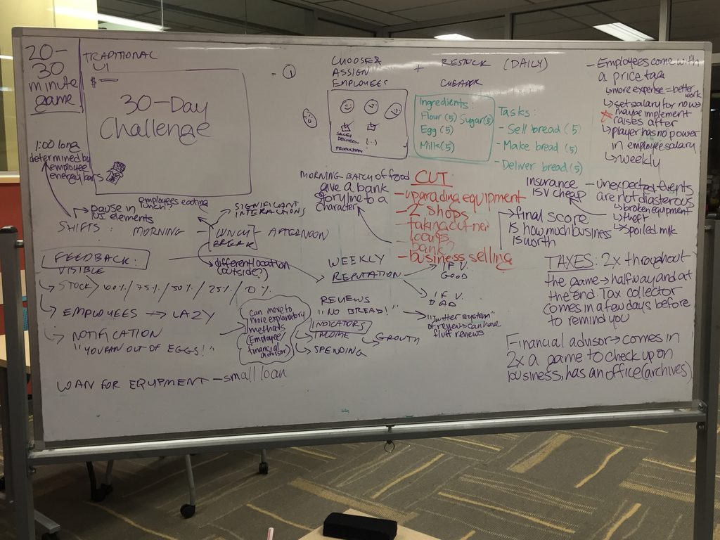
Taking into account the feedback that we got on the prototype, the team sat down and rescoped the project, figuring out the features that needed to be eliminated or changed. First, we really wanted to figure out the exact playtime of the game. The client has indicated that he would like either something that ran alongside school curriculum or something that tested knowledge at the end of a course, so we had worked keeping both options in mind. However, we decided that we wanted to make the game very similar to a 30-day challenge kind of game. Ideally, the game could be played in 2-3 20-30 minute game sessions in class, so that it could be again, either a supplement to lessons or as a final class activity. In line with this 30-day challenge, the events such as tax collection and salary payment will be on a weekly cycle. Because we thought it would be too much to have the player pay a large lump sum every few days, we decided that deliveries and employee salaries would be staggered weekly. In addition to those payments, the player will pay taxes twice in the experience, once at the 15 day mark and once at the end of the 30 days.
The structure of each day will be similar to what we were programming in the past. There will be a morning shift, a lunch break, and an afternoon shift. Each one of these states will be one minute in game time. Employees will be assigned to tasks at the beginning of each shift and the financial literacy story arcs will be explored during the lunch break. Within a day, we wanted to include different types of feedback for the player, taking the suggestions made during our presentation to heart. We decided to add a few main types of feedback. First, as stock diminishes, the sprites of the product being sold will decrease in 25% intervals. Second, if the employees have nothing to do, they will be shown doing nothing, hopefully indicating that the player needs to assign them to a new task. There will also be notifications about low stock on product or ingredients. Lastly, a new feedback mechanism the team wants to add is a reviews system, like what you would see on Yelp or TripAdvisor for a business. As the bakery’s reputation changes, there will be reviews added to the screen. These reviews can be positive or negative and also point to some problems of the shop, like low stock.
With the problems we had in the previous weeks, our rescoping of the game also forced us to reconsider the features we want in the game. We decided to cut a few things we originally had in the game, keeping in mind that there were some core mechanics needed for the game to work and everything else was appreciated, but not necessary. While upgradable equipment helped the player deal with money management, budgeting is covered in other aspects of the game. Some other features the team decided to cut include two other shops, taking out additional loans, and selling the business. Even though we are cutting a lot of features that would make the gameplay more interesting, we plan to shift the concepts taught through those features into other mechanics of the game. For the most part, we want to showcase the concepts in more character storylines and will be increasing the number of characters from 4-5 to 6-7. Hopefully, by doing so, the game is kept robust and interesting.

Rework of the different mechanics of BizWorks
Programming
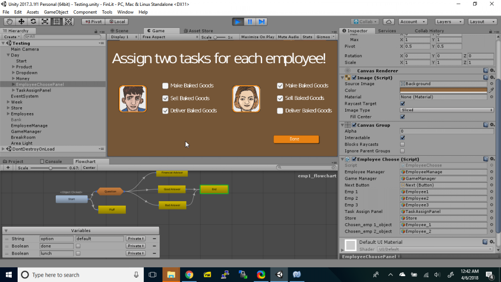
Programmers spent this week finishing the day and adding some smaller UI elements for the player to better understand the game. Players can now assign employees to tasks in order for the day to start. The UI in the corner also tracks how much product is available to be sold. Programmers also finished the ingredients panel and it now now includes a small inventory panel to indicate how much of each ingredient the player has. While the numbers are still subject to change after playtesting, everything works. We also started to put in reputation, which will help determine how much the store sells and just give feedback to the player. It will be used in conjunction with the reviews that we are writing. The money increments based on the store’s reputation to represent items being sold at some frequency, which again increases as the store’s reputation increases. Programmers are largely making good time with the main mechanics and expect to go into polishing going into the break.

Screen capture of employee task delegation
Art
Art spent this week finishing the assets for the store and polishing the existing assets. Working together with writers, they outlined all the employees for the game and will start on concept art for them. Art also spent this week making some UI assets that programmers requested. The goal is to add small details that make the experience enjoyable for the player, such as sounds and visuals that show the player is making money. Art discussed using the appearance of the store for feedback as well. For example, we are going to have the stock in the display cases disappear as the number of pieces of bread left goes down. Artists created the aforementioned assets and are starting to work on other feedback assets in the coming weeks. Furthermore, while the team will keep using bread for the moment, artists discussed making the product sold at the store some kind of fad dessert, partly in response to feedback received at our presentation. There have been no final decisions made on that, but ideas on the table are things like unicorn bread or sweet pierogies. In the coming weeks, artists will be focusing more on characters and UI, as the store design is pretty much final.

The progression of how the bread shelf asset changes as stock decreases.
Writing
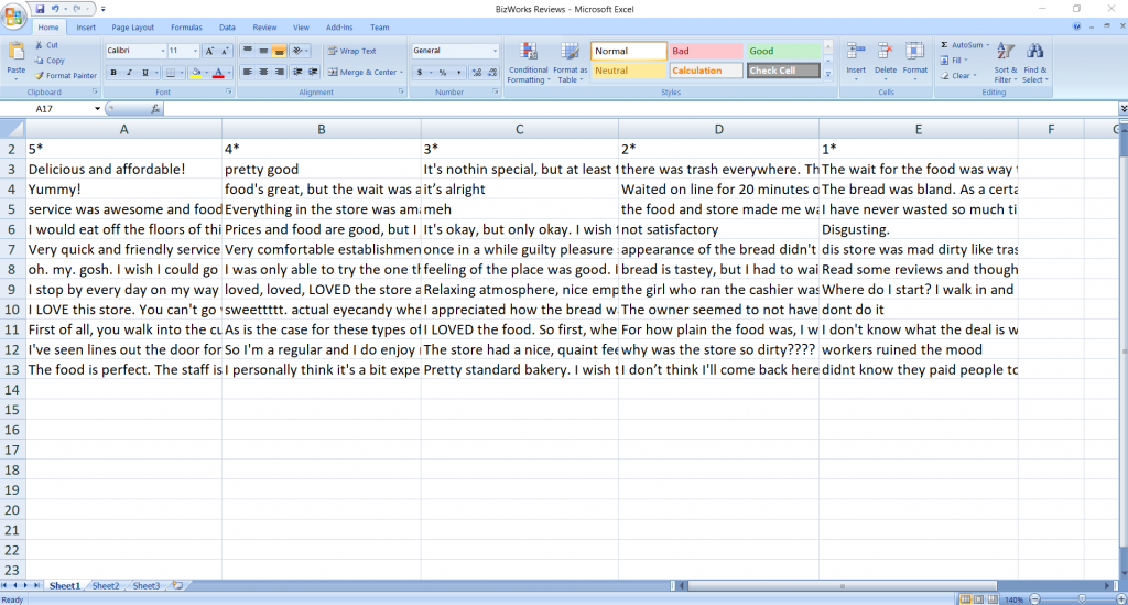
After rethinking the concept of the game, writers focused this week on the review system that will be used as feedback for the player. We decided that there would be three kinds of reviews– negative reviews, filler reviews, and positive reviews. Negative reviews would present themselves when the player has made mistakes with running the business. For example, if the player runs out of stock during a shift or has employees that are being negative because of personal issues, it will be reflected in the reviews. Filler reviews are reviews that are there to give some character to the review feature, but don’t really imply anything positive or negative about the experience in the way the other reviews do. Examples of this would be just a number of stars or statements like “Good food.” Positive reviews affirm that the player has made the right decisions. For example, a review stating that “The staff was helpful and really nice. You can tell they’re really enjoying their jobs! I got a baguette and not only was it tasty, it was also fresh out of the oven.” Hopefully, these reviews serve as something fun for the players to read, as well as give positive or negative feedback as needed for the game.

Working review database for the in-game review system