Moritz Stefaner’s Impfdashbord

Looking Outwards 07: Information Visualization

Alexia Forsyth

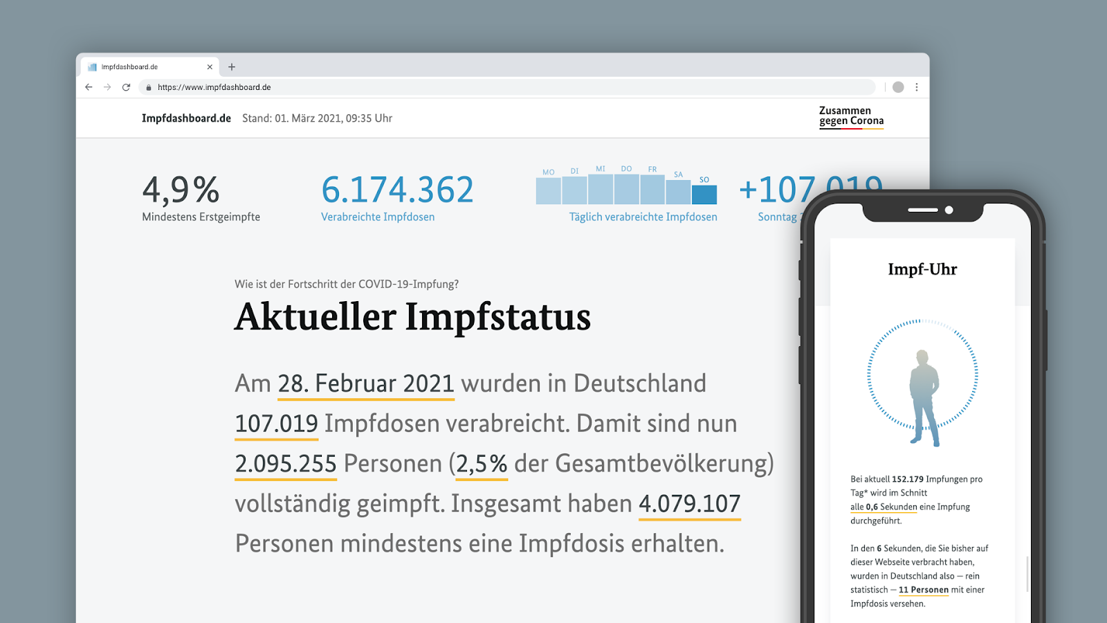
Moritz Stefaner is an independent designer and consultant that specializes in data visualization. She is dedicated to helping organizations develop research and data into something beautiful. I really admire the practicality of Stefaner’s work. This type of visualization seems like a useful skill to have in any career path. Her Impfdashbord describes Germany’s Covid-19 vaccine information. She prioritizes a mobile-first design approach, avoiding the common chart formats. As part of her design she even added a “vaccination clock” to help viewers visualize the  pace of vaccination. Her dashboard is really creative and seems to genuinely make an impact in how Germany, and world viewers see the success of covid vaccines. She uses social media preview images and utilizes favicon and puppeteer to generate a cohesive set of images that accurately represent the data

link: https://truth-and-beauty.net/projects/impfdashboard

Looking Outward 07

Rachel Binx, CA Coastline Ring, 2016

For this week’s Looking Outward, I looked at Rachel Binx’s CA Coastline Ring. In order to create the work, she appropriated the outline of the California coast, wrapped it into a circle, and used that pattern to create a ring. I find this so interesting because I have an intense curiosity about the interaction between the natural world and artistic practice as a whole: whether this be in medium, subject, or otherwise. I found it clever how Binx decided to cast the ring in gold, considering the history of the gold rush in California. I think that this is a great example of the way in which content can dictate form, and vice versa. In terms of its value as a visualization tool, I’m not sure if it would be recognizable as the coast of California to the average person. That being said, as a personal memento, or even as an object to someone with prior knowledge, I can see the ways in which this ring would more than successfully serve its owner. This unconventional application of the natural world without a doubt peaks my interest. 

Gold CA Coast Ring

cabspotting SF

animation of realtime GPS data from taxis in San Francisco

Cabspotting SF was created by Stamen Design for NYMoMA, originally as part of a research project called Invisible Dynamics (sponsored by the SF Exploratorium). This project was one of the first uses of realtime GPS data in data visualization. The movement of taxis is represented frame by frame as an array of semi-translucent yellow dots, which we can see intersect and densify in higher traffic areas. The concept is relatively simple, but the visualization is quite encapsulating (especially given that this project was done in 2008). The route of a single taxi can be singled out or compiled with the movement of all the other taxis at a given time and overlaid on a map that seems to glow. Stamen Design does many projects with a local focus, specializing in data visualization and cartography. They value aesthetics as well as thorough research, which is quite apparent in Cabspotting SF.

static map of taxi routes in San Francisco (2008)
compiled taxi movement

Looking Outward – 07

Project Ukko visualizes wind patterns and helps predict future patterns, creating a tool for clean wind energy industry and the fight against climate change.

Project Ukko visualizes and helps predict future wind patterns which can be helpful in clean energy endeavors in the wind farm industry. Moritz Stefaner, a designer and researcher who focuses on data visualization, encoded prediction skills into visuals in Project Ukko to make this data accessible to others. Opacity represents precision accuracy, wind strength connects to line thickness, and trends of wind speed change with line tilt and color. The color, visual language, and design is really well done and very user-centered, making it easy for anyone to begin understanding and deciphering patterns. I appreciate that this gives experts a practical tool, along with sharing new techniques into how to share data. This browser allows people to interact and find out how the wind will change over the next few months. I really admire this project because it makes information more accessible to people, along with considering how code can be used in the fight against climate change.

Title: Project Ukko
Artist: Moritz Stefaner
Link: https://www.project-ukko.net
https://truth-and-beauty.net/projects/ukko

Looking Outwards 07: Information Visualization

Wind Map is a live visualization of the current direction and wind speeds across the United States. The wind vectors combine to appear almost as smoke churning at different speeds across the country. This project appeals to me visually because it captures the idea of constant change. It can at times be a peaceful flow and at other times it appears agitated and angry. It can appear both ways on the same map depending on where attention is focused.

This project is not limited to weather. It is aesthetically pleasing and useful. It is beautiful and intriguing enough to be on display at the MoMA. At the same time, diverse groups have found its data useful. Birdwatchers have used it to track migration patterns, and cyclists have used it to plan trips. Conspiracy theorists have even used it to track “chemtrails”. This visualization allows this vast, changing dataset to be useful in ways that are impossible with the raw data.

The underlying data for the Wind Map is from the National Digital Forecast Database which provides near term forecasts that are updated once per hour. The visualization was created by Fernanda Viégas and Martin Wattenberg, engineers from the visualization research lab at Google. The entire project is written in html and javascript. A live link to the Wind Map can be found here.

Looking Outwards 07

This week I looked at CMU alum Chris Harrison’s project Search Clock. He created an algorithm that mapped what people use the internet for the most during every hour of the day. This stood out to me because we just made clock looking devices with code, this is just way cooler. I also have just spent the semester in an intense mapping class and am impressed by his visual simplification and efficiency in descriving multiple changing factors so consicely. He somehow found hourly data on average time spent on certain websites and generalized them into catagories, and converted the scale to years. I think it’s super visually stunning and am impressed with how innovative this representation of data is.

https://www.chrisharrison.net/index.php/Visualizations/SearchClock

Blog 07: “BikeCycle”

By Ilia Urgen
Section B

This week, I came across a cool app called BikeCycle. It was developed by Nicholas Felton back in 2014, which is a visual display of everything an avid biker needs. However, this app will only work in New York City, as the coordinates were pinpointed on a map of Manhattan and Queens.

When you launch the app, you can see various interactive REAL-TIME visual maps, which are not limited to bike-sharing locations, different bike routes, cyclist demographics, and density of bikers in a certain area.

I find Felton’s app BikeCycle intriguing because I, myself, am an avid biker! Although I’m from Long Island, NY, and not the city, it’s very interesting to see real-time stats for different biking variables. If I were to go to the city for a ride, the app would help me optimize my bike route, see which areas to avoid, and find popular scenic routes in Manhattan!

6 different maps showing 6 different real-time biking variables!

Looking Outwards-07

Graham Murtha

Section A

One of the most fascinating visually represented datasets is perhaps one of the largest single-website collections of information on the internet- OneZoom’s tree of life Explorer. This website graphically represents all of science’s current understanding of biology in the universe, starting from eubacteria, eukaryotes and biota. As you can imagine, there is a ridiculously expansive number of species included in this data set, and the tree emphasizes that by it’s scale- human beings and most familiar mammals happen to take up .001% of the tree’s entire figure, according to the resources’ “about” info. The more you zoom out from where we are in the tree of life, the more you come to realize how insignificant we are in the grand scheme of biology- our species is in no way special, despite the leaps and bounds we’ve come. Only a vectorized graphic such as this could convey such a shockingly accurate scale of life as we know it, and how puny humanity is to nature. The graphic conventions of the tree itself is also fascinating- each species is represented as a circular leaf on a tree, and the closer two species are in evolution, the closer their leaves are on their respective branch. The branches are represented as bending curves that spiral off of their larger parent, which emphasizes the connection between all living things, rather than just linear branches shooting off in their own direction.

It really is an incredible and informative dataset- I recommend everyone to explore it a little!

https://www.onezoom.org/

Blog 07 – Data Visualization – srauch

I enjoy these data visualizations of the 2021 summer olympics, conceived by designer Eden Weingart and created by the New York Times graphic department. This one is specifically for swimming, the 400-meter freestyle.

To make these animations, the graphic team created a program that can apply the raw data of the race onto animations, allowing twitter users to see a sped-up version of the race’s events (not just the results!). This raw data included each swimmer’s time for every meter of the race, the time they hit the end of the pool and turned around, and the time they finished. The program then mapped this data onto an animated avatar for each athlete.

I find this approach to sports reporting really cool, since it provides a different way for us to interact with the data of the sport. It can be quite tempting to throw all of the data out the window once we know who won, but an approach such as this allows casual readers to see those intricacies – who led at first, any surprising turnovers, etc. – in a consumable and exciting way.

Information Visualization – Gun Deaths

A particular computation information visualization project that I found and admire is Periscopic’s “U.S. Gun Deaths” visualization. This project was overseen by Kim Rees, who is a co-founder of Periscopic. This project was created in 2013, and has been continually updated through 2018 data about gun deaths. This project uses data from U.S. Law Enforcement that voluntarily reported gun homicide deaths. The data does not include suicide deaths by guns.
What I admire most about this project is the simplicity of it. It isn’t a hard graph of data to look at visually, nor is it hard to grasp what it is showing. The data is shown prominently with the total people killed on one side counting up, and the years that were stolen on the other side. I liked showing the years stolen as it is a very large number and really highlights the impact guns have on people in the US, specifically male black Americans. The graph also shows what age each person was killed at, and the predicted age they could have lived to. The last figure is interesting as it highlights how many years they could have had to live. They calculated that data based on the morality rate data from the WHO. I am not sure what algorithms they used to generate the work, but I think it was mostly just loops for each set of data they had, and then a counter for each value they wanted to keep track of.
The creator’s artistic sensibilities of illustrating what potential was lost due to gun deaths, is very prominent and apparent in the final form. The colors highlight the flames of life that were extinguished by guns, and how far they could have gone with the arcs of life. It is a very easy graph to view as well and to understand, making it easily digestible to the regular audience.

U.S. Gun Deaths in 2018 by Periscopic, created in 2013