post

Week 6 Update

PROGRAMMING

Multiple-choice Interaction (Bryan)

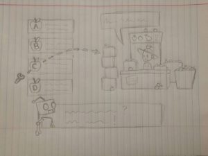
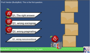
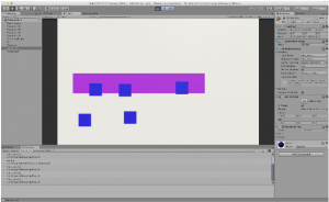
This week Bryan has been updating and ironing out the multiple-choice setup. The first iteration was a lot of testing different ideas and a lot of messy code. This week was spent to create something neater and more easily utilized for a larger project. So far we have a script that handles multiple multiple-choice questions, keeps track of which answers are correct/incorrect and why, provides unique and appropriate feedback for each answer (through dialogue, currently represented through basically the grossest little green text box imaginable), and has some semblance of the silly physical ramifications we wanted to incorporate into the practice sections.

We were planning to have the “challenge” portion of the game set up alongside this practice section as the next step, but after a group meeting it seems like we might want to spend a bit more time on how the practice scenario handles questions to make it more analogous to the real deal. We want to have the system set up to handle questions exactly the way we want it to before we start creating a second scenario, because any changes made after that will essentially have to be duplicated. It seems we’re setting the real scenario up somewhat differently, which means we have got some course-correcting to do before we set this up in both practice and challenge mode.
Drag-and-drop Interaction (Ryan)

Ryan has been working on how to implement drag and drop responses into our game. Part of our game consists of having Chinese learners create their own responses to questions as a way to be more interactive, so we have been working on a simple word bank and having an answerfield determine which “answer units” have been selected and in which order they are in, which we can use to construct the player’s intended chinese statement and compare it with the given answer.

Additionally, We have been working a bit on integrating SQL with Unity. Since we have a lot of dialogue, a way to effectively store and read lots of dialogue as well as edit and add to it without parsing through the code. As such, we have been looking into SQLite plugins for Unity and C#, and we’ll see if we can get it up and running before the next blog update!
CONCEPT ART (Andrew and Sarah)

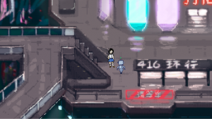
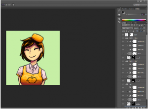
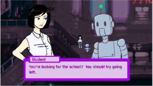
We’ve experimented with style and layout and we’ve decided on a couple things: Less cyberpunk, more solarpunk, first person view during conversations instead of third person. Having decided on these points, we’re ready to move forward with designing actual game assets.
Production Schedule

By next Friday (3/2), we will build a full scenario (fruit vendor) consisting of the practice phase and the challenge phase. For art, we will have the background and characters with different facial expressions (upset, confused, awkward faces of the vendor, robot). For programming, we will have multiple-choice questions (positive and negative feedback) and Drag-and-drop (positive and negative feedback) questions.


We will begin playtesting the prototype next week and see what people think about the interactions (multiple-choice and drop-and-drop) as well as the art style. We will move forward with full production in March with the goal of building four social scenarios (Street + Bank + Department + Fruit Vendor) by the end of March.

post

Studio Mar: Week 6 Update

This week, Studio Mar focused on designing and developing Vuforia markers for use in our game, while continuing work on the headsets and playable prototype.

Markers

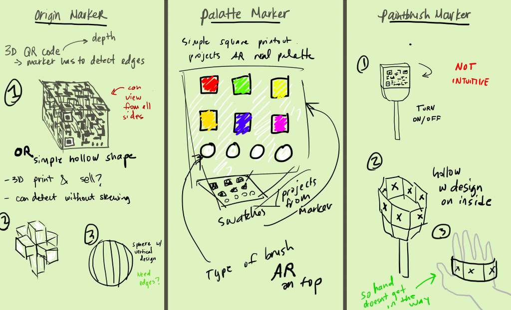
Sketches of marker design concepts by Adrienne Cassel.

We discussed a few different designs for markers: the origin marker, which represents the center and flat plane of the play space; the palette marker, which allows the player to select brush colors and textures; and the paintbrush marker, which the player uses to draw the line in 3D space.

3D Markers

We tested Vuforia’s 3D Object tracking to see if a 3D marker is a viable option for the origin and paintbrush markers. We want a 3D marker to be accessible by anyone who plays the game, and so looked into objects that could be printed out and put together. Vuforia needs multiple points to recognize a specific object, so a complex 3D printed object works better than a folded paper shape. We are also testing Vuforia’s cube recognition.

We hope that a 3D origin marker will be easier to track as players walk around it, and that a 3D paintbrush marker will support natural drawing in 3D space (by rotating and twisting the marker).

Paintbrush Controllers

We discussed possible solutions to a problem we discovered last week–how to turn the “painting” on or off without changing the paintbrush marker, which would require re-tracking. We came up with two different solutions: a gaze-based on/off button in the virtual UI, and an on/off button on a physical handheld controller. To that end, we hope to acquire some Google Daydream controllers to use with our Pixels, since we believe the handheld controller is a better design solution than the gaze-based UI.

Improved prototype

Last week we were able to start drawing in 3D space using Vuforia and 2D markers. This week we added the ability to draw with multiple strokes–whenever the software stops tracking the paintbrush marker, like if the paper is turned over or goes offscreen, it stops drawing the line. When the marker is re-tracked, it treats it as a new line. The brush texture demonstrated above is “Rainbow” from the Tilt Brush SDK, edited to be all red.

We also have begun working on adding multiplayer to the prototype, so that multiple people can view the same drawings at the same time.

Headset

We tested the three-strap headset design and added foam padding to our modified Google Cardboard to make it more comfortable to wear.

next Week

Next week is our prototype presentation! We hope to have working versions of the headset and markers, with designs that we plan on moving forward with for the rest of development. That way, our guests can have an experience as close to the final game as possible.

Keep checking back here for more updates on Studio Mar!

Week 6 Update

Summary

This week, the team continued developing the core mechanics of the game. Like last week, we’re still struggling with balancing the concepts the client wants to teach and what we think makes a game appealing to those in our target demographic. To help solve this problem, this week, we gathered information from our target demographic and from an expert in educational games. We hope to use this information to make any changes needed to our core mechanics in the coming week.

Programming

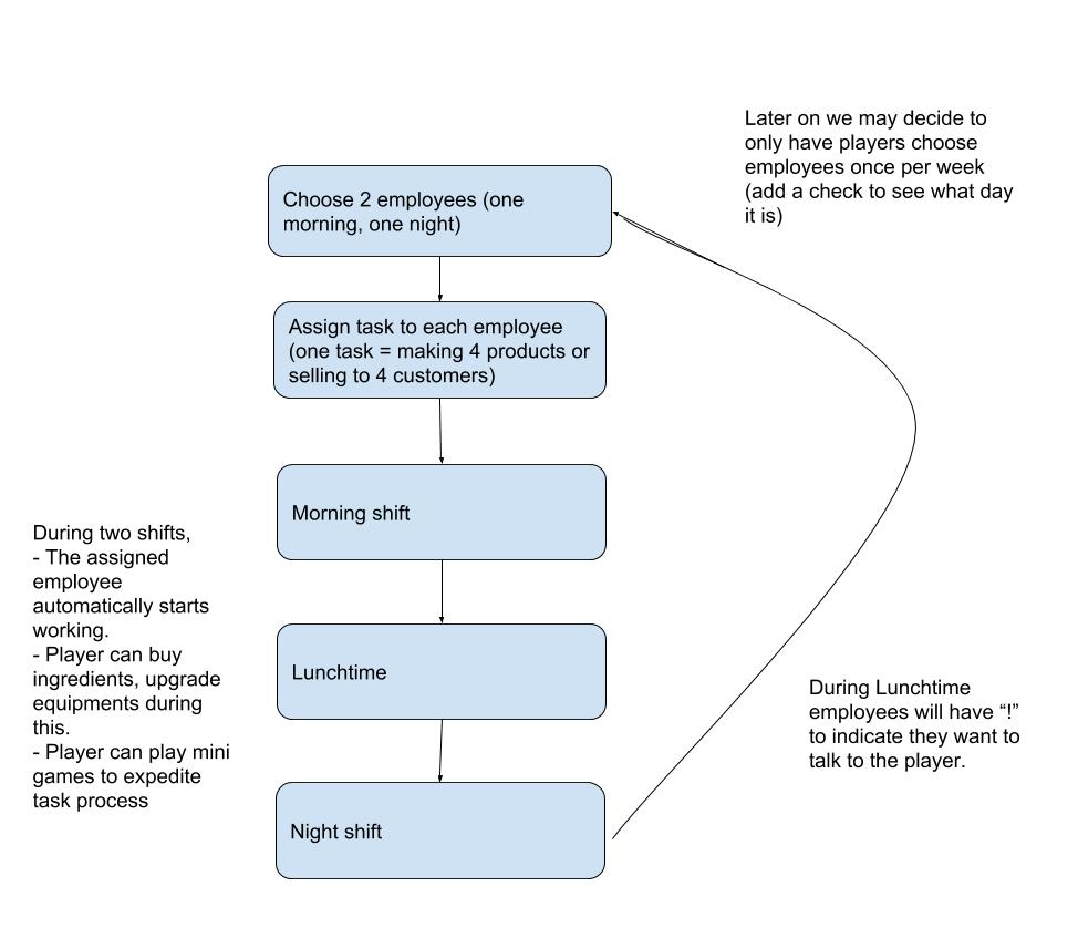
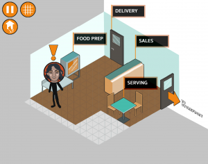
Programmers finalized the game’s main cycle, which now includes a day and night portion as well as lunchtime. Taking into account the feedback from different experts, we determined this would be the best way to make time pass in the game. Tasks will be assigned to employees now rather than the player. Programmers also made more progress on the store interior scene, although it is still mostly programmer art. Tapping on on the door marked “Delivery” now triggers a pop-up panel that details an ingredients list that is programmatically generated. We are working to have a similar mechanic for the store employees. Much of the programming work will be dealing with UI in Unity, as programmers decided that loading a new scene for each menu will be too time consuming. Below is how we envision the game cycle to function:

How we expect the game cycle to play out in a given day

Art

This week, artists continued working on the in store assets and started on employee assets. One of the main struggles that the artists have had this week is getting all the assets needed for the game in the small space that we have. Since the game is being developed for a mobile platform, there is already a limited amount of space for the player to interact with. Specifically, we’re trying to incorporate the sitting area and cooking area on the same screen, but the limited amount of space available is making it seem a bit cluttered. In order to get around this problem, artists have considered creating a scroll screen, but are hoping to keep the player on one screen. Artists have also worked on the menu and map assets for the player to do different tasks on.  

PlaytestinG

Along with last week’s paper playtesting, this week, the team was able to go to an event at the Carnegie Science Center. There, we were able to distribute a survey for students in our target demographic about the way they approach video games and what they thought about our ideas thus far. While we did not get as many people to fill out the survey as we had wanted, there was enough information to obtain an answer to some questions we had about the appearance of the game.

The survey was organized into three sections. In the first, players were asked some demographic questions, including their age and what kind of movies and books they consume. We wanted to make sure that we were getting responses from a wide range of people. In the second section of the survey, we asked more specifically for the respondent’s video game preferences for the same reason. The third section of the survey dealt specifically with BizWorks and some of the concerns we had discussing the game with our client. We wanted to make sure that the art assets and existing UI we had made sense. We also wanted to address the question of whether we should make a more realistic game or a more fantasy game, so we presented responders with more fantastical themes, like steampunk and magic fantasy and asked them if they preferred those themes over the realistic concept art that we have. Lastly, we wanted to know what aspects of a game make it fun for the players.

With all our respondents coming from an engineering fair, we had anticipated the data being extremely skewed, but there was a wide range of interests within the respondents. In general, most of the respondents were interested in action/adventure media, including video games. Half of the respondents reported playing games for over ten hours a week, while half played significantly less. Regarding our questions, we found that most of the respondents would be interested in a fantasy or steampunk style game, but didn’t necessarily prefer it over the existing style we have been using. Therefore, we decided to keep continuing with the art style that we have been using. While we got valuable information from the playtesting, we only got six respondents, so ideally, we’ll get more information in the future from the target demographic when we have a working prototype.

Research

This week, we were also able to speak to Erik Harpstead, a professor at CMU that specializes in educational games. We explained the mechanics of our game, as well as some of our concerns and how we planned to implement the different financial literacy concepts that we wanted to teach. His feedback came in the form of a few large points. He suggested that we take everything we wanted to implement and only include about half of them, with his reasoning being that we should try to make the game as simple as possible so that the players could process it more easily. He also suggested that we don’t have a hard end goal for the game and instead allow the player to choose when to restart the game. After speaking with him, the team decided to change a few aspects of our game. First, players will have the option to sell their business after a set amount of time, but will not need to. Instead, they can keep playing the game. However, no new interactions will be introduced, so ideally, the players will eventually want to restart the game on their own. Second, we changed the structure of the day so that it has a morning and evening shift, with a break in the middle of the day for employee interaction. Lastly, we’ll be trying to make all the calculations involved in the game to be as simple as possible, to make the game not overwhelming for the player.

post

Studio Mar: Week 5 Update

This week we continued research and design, focusing on three main aspects: designing UX concepts, playtesting our game concept, and testing the technology we plan on using. We acquired two Holokits as well as two Google Pixels to use for development, and so were able to start playing with those.

Designing UX Concepts

Our designers spent some time researching AR/VR UI design guidelines, and came up with a few guidelines of our own. Chiefly, we want to make sure that UI elements and interactions are anchored in physical space and actions, and avoid 2D menus. To that end, we developed a few concepts for micro-interactions, based on using hands as the primary interaction tool.

Unfortunately, we haven’t heard back from Manomotion about acquiring a license for hand recognition. While we will continue reaching out to them, we also started designing concepts for marker-based interaction–using a marker for painting, as well as a marker in the opposite hand for a palette or prompt card. We incorporated some of the gestures conceived for hand-based interaction into our marker concepts, like attaching a marker to a strap to slip over the flat part of the hand so that a player can flip their hand over like viewing a card.

We tested wearing the Holokit headsets, as well as a modified Google Cardboard headset. The Holokit headsets are top-heavy, because of the placement of the phone, and so we began developing concepts for a multi-piece strap that goes over and around the head to keep the headset on.

Playtesting the game

We also spent some time playtesting our game concept, as much as we can without having developed the game itself. Two of us played Pictionary using Tilt Brush on the Vive, and noted what about the game works well in VR, and what doesn’t. We concluded that the most fun out of playing Pictionary in 3D space involves 1) using the physical space fully, like drawing items of clothing on yourself or drawing a trampoline and then jumping on it; 2) taking advantage of the different brushes and textures available in Tilt Brush, like using the fire texture to draw real fire; and 3) watching your friend draw in the space and the excitement of the reveal of what they’re trying to draw.

Our other concepts–like drawing something that your friend describes–weren’t as fun as straight-up guessing a word that your friend is drawing. As one of our team members put it, what makes it fun is the combination of Pictionary and Charades.

Testing the tech

Since we finally acquired the Holokits and phones for testing on, we were able to start fully testing the capabilities of the different hardware and software we’re considering using.

Tilt Brush sdk

The Tilt Brush SDK supports importing Tilt Brush drawings into AR, not drawing them. Still, it gives us access to the brushes and textures used in Tilt Brush, so we plan on incorporating those into our own painting system.

AR CORE

With the Pixels, we were able to test the capabilities of AR Core, Google’s AR platform for Android devices. While its plane recognition capabilities are far better than Vuforia’s, it doesn’t support markers. Since we need to use markers to draw in 3D space, we have to pass over AR Core for now.

Holokits

We downloaded the Holokit app and tested some of the demos in the headset. As far as we can tell by running the demos, the Holokit app appears to first recognize a plane using the phone camera, place an object on the plane through the phone camera, and then remove the camera feed and switch to a binocular view for the user to finally put their phone in the headset. The result is that the object (or objects) is reflected off the glass in the headset to appear like a hologram projected onto the real world.

Without viewing the world through the camera feed, the projected object is a little offset from the real world, and the in-app plane recognition isn’t that great. While those errors could be fixed by using a different plane recognition and aligning the video reflection with the real world, a more concerning problem with the Holokits is how the edges of objects are clipped by the edge of the phone’s camera. While this wouldn’t be a problem if one was viewing it through the phone directly, when reflected onto the real world the effect is odd.

Regardless, developing the game for the Holokit or a Google Cardboard-like direct view experience will be mostly the same, as will the UI/UX and headstrap design. We plan to keep testing with the different headsets once our prototype is more developed.

Vuforia

Vuforia supports plane recognition as well as marker recognition. While its plane recognition is buggy, it is functional, and its marker recognition works well. Using Vuforia and markers, were able to successfully draw in 3D space!

Granted, the drawing was limited to a small space, as the camera has to be very close to the plane marker for the software to recognize it. On top of that, if the plane marker is obscured in any way, the device loses track of the positions in 3D space and prevents the drawing from being rendered in 3D. Because our paintbrush marker was just a printed-out marker on a sheet of paper, this was problematic–but can definitely be solved by designing a better paintbrush marker.

Summary

This week, we learned that the most fun out of a 3D Pictionary game comes from adding in a Charades-like physical action element to it. We developed some UI design principles and began designing straps to create a hands-free AR headset. We also tested Holokits and were able to do some rudimentary drawing in 3D space using markers.

For next week, we plan to keep pushing on developing this game with markers. Can we make it possible for the fun interactions with physical space that we discovered in playtesting to work using marker recognition? If not, can we make the game fun in other ways? We also plan to continue developing headset and paintbrush+palette marker designs, to make the interactions as straightforward as possible.


Keep checking back here for more updates on Studio Mar’s development!

Game Concept Update

Over the course of this week we made more finalized plans on the structure of our game overall. We discussed visual inspiration, potential storyline plots, and various alterations to the game that could make the overall experience more interesting for the player.

GAME CONCEPT UPDATE

For the finalized structure we decided to split the game into two phases, a Practice phase and a Challenge phase. A new scenario will be presented, but beforehand, the player will be pulled aside and be given a Practice session for the scenario. The player will be rewarded/given positive feedback if they answer the practice questions correctly (through more fun interactions, like throwing apples, etc.), but if they don’t do well enough the Practice phase will start over, allowing repetition, but also a low stakes environment. When this is completed, the Challenge phase will begin, where the player engages in conversation with the real social scenario. There will be no rewards/points and the player cannot progress without choosing the correct answer.  

To help facilitate the learning of the player, along with adding a feedback outlet and reason for repetition, we have decided to implement a companion who will help guide the player’s avatar through their journey in the game. The companion is the one who pulls you aside for the Practice phase and assists in learning. It is also the one that gives feedback on your choices during both the Practice and Challenge phase. Hopefully, the introduction of a companion will cause the player to have more emotional investment in the game.

The UI is beginning to move forward to the final design. We have decided to keep a top-down view for environment navigation, but have made slight changes to the question phase with the implementation of more interactive elements.

THINGS WE HAVE LEARNED

Through our discussions this week, we’ve learned more about what we are expecting for the final product of this game, along with strategies for effective teaching in a gaming environment. A Practice phase will be added to facilitate learning-by-doing. In the Practice phase, players will be able to practice and learn target Chinese expressions and concepts (speaking appropriately in different contexts) through a lot of questions and positive/negative feedback. The Practice phase is also full of fun interactions so that players can learn in an engaging playful environment. After the Practice phase, the players actually get to use and apply what they have learned in the real social scenarios (Challenge phase) in a higher-stake environment.

Week 5 Update

Introduction

This week, our team continued to develop the concept of the game, focusing specifically on the tone we wanted the game to have and balancing entertainment and education. We ran our initial concepts through with some playtesters to make sure we were on the right track and started programming the progression of the day. We also continued developing the art assets for the store and starting drafting an outdoor map for where the financial institutions would be.

Playtesting

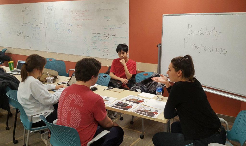
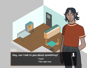
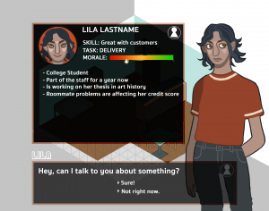
While we didn’t have access to many people in our target demographic, the team wanted to test the ideas that we developed for the game on a group of people to make sure that we are on the right track. Therefore, we created some paper mockups of how the game would run, with employee interaction and the basic store screen to show to some freshmen at CMU, who were the closest people we could get to the target demographic.  We sat down with each playtester for 10-15 minutes and ran them through the game, explaining how the different mechanics would work in the final product. We also gave an example of what kind of employee interactions there could be using the employee Lila, who we designed. After we walked the playtesters through the experience, we asked for verbal feedback and administered a post-experience survey that they had to fill out, essentially asking how clear the game was in meeting its financial literacy goals.

Sitting with freshmen playtesters on Tuesday

The feedback received from the paper playtesting was positive, for the most part. Most of the playtesters said that they understood how the game was going to run and thought that the game would be enjoyable. One of the biggest problems we had last week was finding out if we wanted to make the game more realistic or fantastical. The paper prototype we showed took a more realistic approach, which seemed to be received well, although two playtesters said that they’d prefer something more high fantasy. However, in general, there doesn’t seem to be a large problem with the approach we are taking. Additionally, the team was concerned that the game would not be fun, especially given the topics that it is trying to teach. Playtesters told us that the idea of including minigames to make the game more engaging and using storylines to present the financial problems was a good way to make the game interesting, but not boring. Some playtesters also gave feedback about the UI elements and said they weren’t intuitive, since they asked us to explain some of them, so we’ll be changing some of the graphics to make them easier to understand. Overall, the playtesting session gave us a lot of good information.

Game images used for paper playtesting

Game images used for paper playtesting

Programming

Most of this week was spent setting up the project on GitHub and getting the preliminary classes set up in Unity. Earlier in the week, programmers ran into a little trouble getting the GitHub project set up. Therefore, the first few days of the week were dedicated towards trying to get it running on every team member’s machine. Afterwards, programmers spent the rest of the week focused on getting all the classes set up and started programming some of the UI elements of the game. The two main goals of this week was to start running the game through a day iteration of the game and working on money decrementation as well as supply incrementation based on deliveries. Both were started and are expected to be completed by the next week.

Art

For the first few days of this week, artists focused on making the art assets for the playtesting event that we held on Tuesday. They worked on some separate buttons assets and put together screenshots of the game screen. Not much was polished on the store layout, but after showing the store to playtesters, they gave our artists some ideas on what to add. We’ve decided to add a display case that can show stock diminishing, as a way to help players understand that they may need to stock up on ingredients. We also decided to add more appliances to the store, likely with simple animations, to show the store running during the day. Artists also started creating the assets for the delivery menu.

Inside of the store

Art for the menu buttons. From the top right, clockwise as follow: pause, balance sheet, menu

Next Steps

In the coming weeks, we want to continue implementing the main mechanics of the game. While we appreciated the playtesting we were able to do, we have an additionally opportunity to playtest some more with students actually in our target demographic. Therefore, we will be issuing a survey to them to collect more information on what makes a successful financial literacy game. We’ll also continue working on the script and art to bring the narrative aspect of the game to life.

post

Introducing Beefy Chicken Stewdios

WHO WE ARE

Hi everyone! We are Beefy Chicken Stewdios. We will be developing a RPG game for Chinese learning this semester. Our team members are:

  • Andrew Chang – Artist, UI/UX Designer

I am Junior in the School of Art with a Game Design Minor. I am mostly an illustrator with a passion for making, playing and modding games.

  • Ryan Eckert – Programmer, Interaction Designer

Hello, I’m a Sophmore in the Information Systems major, with a minor in Game Design. I’m mostly a programmer, but I’ve been more of a sound designer on previous projects. (Though since we have a person that can actually make music on the team I’m hoping that the sound for this game will be better than anything I can pull off). I’m excited to work on a “full scale” game that’s more than just a demo, and something that’s hopefully actually going to be played by people outside of demos and playtesting!

  • Xiaofei Tang – Producer, Learning Content Developer

I am a PhD candidate in Second Language Acquisition in the Modern Languages department. I believe in the potential of using digital games for language learning. Games can provide a fun immersive environment to practice using language in context. I am very excited to develop a Chinese learning game for my dissertation study entitled “Digital game-based learning for Chinese formulaic expressions”. The study will examine the effectiveness and learner perception of game-based language learning.

  • Bryan Tiggs – Artist, Interaction Designer, Programmer

I am Bryan, Game Designer with Beefy Chicken Stewdios, Master of Art and Unity, Manipulator of Sprite Sheets, Devourer of Bugs, Champion of the 2018 Global Game Jam! The elves know me as a senior Biology major, the dwarves know me as a Biomedical Engineering minor, and I am known in the northeast as a potential Game Design minor, and there may be other secret titles you do not know yet, titles so powerful I dare not utter them to mere mortals such as yourself…

  • Sarah Wang – Artist, UI/UX Designer

I am a junior Information Systems major with a double in Statistics and a minor in Game Design. Despite my technical background, I have a love of art and illustration, and primarily act as an artist in my projects. I’m looking forward to learning more as both an artist and game designer through this semester-long project!

Game Concept

We are developing a RPG Fetch Quest Game for second language Chinese learners to practice using Chinese in different social scenarios in a fun engaging environment.

Plot Synopsis

You are a robot of an older model who has worked for a restaurant for as long as you have been functional. One day, your boss leaves you temporarily on a trip. “Take a vacation for once!” These words are completely foreign to you, so you open shop anyway. Due to your lack of personal skills, you don’t realize that when customers talk to you about their small requests or problems, they aren’t asking you to fix them. However, you try to help them anyway, and are sent through a series of jobs and tasks before finally returning to the restaurant.

By the end of your journey, you obtain much better social skills and the restaurant’s ratings skyrocket. You’ve even made some new friends along the way, who are now motivated to come to the restaurant and visit!

The main phases of the plot are:

  1. The exposition — the leaving of the owner, the introduction of your character
  2. Journey through the world
  3. More journey
  4. The return of your owner and a reflection on what you’ve learned

Game Aesthetic

The game will be set in the future, aesthetically lending itself to a combination of VA-11 Hall-A: Cyberpunk Bartender Action and Gravity Rush. Sprites will be stylized and have dramatized poses/actions during conversation.

The layout of the game will be top-down for world traversal, and character sprite conversation overlay (akin to Fire Emblem).

Key conversations (conversations that prompt response options) between the player and NPCs will have a music shift and feel more like an event compared to just normal conversation from non-key NPCs.

Conversation — Chinese Learning

The robot will go through a series of day-to-day scenarios, in order to experience all aspects of society. Each scenario will have a series of Chinese questions that have appropriate answers based on the social connotations (i.e. some answers are too formal, have improper grammar, etc.). Correct answers will grant positive reactions from the sprites, along with continuation of conversation and plot. Incorrect answers will grant various negative reactions from the sprite, depending on what the player chose and why it was incorrect.

Scenarios

  • Fruit Vendor
  • University
  • Bus
  • Train
  • Taxi
  • Bank
  • Street
  • Mall
  • Restaurant


End Goal

Our goal is to make a game that engages learners of Chinese to practice Chinese expressions in an immersive environment. One challenge of making an educational game is that we want to motivate learners in a fun gameplay experience, but we also do not want to distract their attention from learning. Our end product will be used in Xiaofei’s dissertation study to test if the game promotes better learning outcomes and learner motivation compared to an online learning environment that delivers the same learning materials but without gaming elements.


post

Introducing Studio Mar

Who WE ARe

Hey there! We are STUDIO MAR, a mobile AR development team. “Mar,” in addition to standing for Mobile Augmented Reality, is the Spanish word for “sea” — hence our low-poly whale logo. You can also check out our separate development site here.

Studio Mar’s team members are:

Game Concept

We are developing a tabletop AR multiplayer 3D drawing game (title still in development). Drawing inspiration from Tilt Brush, Pictionary, and Taboo, in our game players take turn drawing an object in 3D. One player views a pre-made 3D model, like a bird, and describes it without using the name of the object of itself; the second attempts to draw the object based on their description. Players can also draw in different colors and with different brush styles, and possibly save their drawings to view later in a gallery. Players can have fun drawing and watching their friend draw in 3D space!

Hardware + Software

We plan on using Holokit or another head-mounted AR headset so that the player’s hands are free to draw. Player’s hands will be tracked using Manomotion, for drawing and interacting with the game. We are also working on developing an alternate tracking method, using a one-dimensional clicker or a two-sided marker.

All development will be done in Unity. Software-wise, we plan on incorporating the Tilt Brush SDK so that players can draw in a range of colors and brush styles. While we have various constraints in using either ARCore or ARKit, at present we plan on developing in ARKit because our only devices that support mobile AR are Apple devices. And finally, we’ll use Vuforia for tracking markers, placing one on a tabletop to anchor players’ drawings in space.

We are currently exploring the possibility of acquiring Android devices to support ARCore, as well as acquiring additional Macs to support building to iOS in Unity.

Mvp + end goal

Our Minimum Viable Product (or MVP) is a game that:

  • Can be played from beginning to end without crashing
  • Supports drawing a line in 3D space in AR
  • Supports another player viewing that drawing AR

Our ideal end goal, however, would also include:

  • Extending the game to support more than two players
  • Drawing in color and with different brush widths and options
  • A fun set of prompts to base drawings on
  • The ability for anyone to download and play our game (given they have supporting devices)

Tentative production Schedule

Based on the class schedule and our own milestones, we have tentatively developed the following production schedule. At present, our primary concern is acquiring and experimenting with our technology (Tilt Brush SDK, Holokit, Manomotion) to make sure that we can use it in our game. Besides that, we are confident in our planned schedule until Week 10, but expect the plan and our features to change during development.

Week 5 / Feb 16 Research & experimentation Test Holokits, hardware/software capabilities
Week 6 / Feb 23 Begin development Have hardware/software settled, begin designing UI
Week 7 / Mar 02 Prototype due Drawing a line in 3D space
Week 8 / Mar 09 Multiplayer [Mid-sem break] Other players can see the drawing live
Week 10 / Mar 23 Alpha Stable release of multiple people taking turns drawing
Week 11 / Mar 30 Prompts Limited set of prompts for player to base drawings on
Week 12 / Apr 06 Progress presentation due Beta: Stable release of drawing + objectives
Week 13 / Apr 13 Brush options If not yet incorporated, color + line width + animation
Week 15 / Apr 27 Stable release Pre-final: No new features to be added
Week 16 / May 04 Final presentation due Flex week, presentation/final release prep


We are excited to work on this project and look forward to how it will develop! For more updates on our game development, check back here every week!

Introducing Stuido Calibrate

Who We Are

Hi! We are Studio Calibrate. We will be making a game focused on teaching various aspects of financial literacy on a mobile platform. Our team members are:

Kimberly Huang- Producer, Sound Designer

Toya Rosuello- Lead Programmer

MinSun Park- Programmer

Adela Kapuścińska- Lead Artist, Financial Expert

Oliver Tan- Artist, Financial Expert

Client’s Goals

Our client is a professor that works with a non-profit organization that deals with teaching high-schools financial literacy. He wants us to create a game that teaches financial literacy to children in the 8th to 10th grades. He foresees the game to be used either as a supplemental tool to a financial literacy course taught in school or as a final assessment kind of assignment. Therefore, he wants to emphasize scoring and replayability for the game, where students can go back and improve on previous scores after the game is finished. He also wanted the game to be a mobile game, so that it is accessible to more people.

In terms of how he wanted the game to be structured, our client wanted something that is very similar to The Game of LIFE, without the RNG that predetermines how the player progresses through the game. He wanted students to pick a career path and then manage their money while living out their life. Within that structure, players would have to learn about taxes, credit cards, and other forms of debt and financial management. The amount of money accessible to the player would change depending on the career they chose. Our client was very adamant about having different careers for the students to take and trying to make the financial concepts taught as detailed as possible. He also stressed the realism that he wanted in the game, focusing on real-life issues that the students may encounter.

The team decided that we did not want to recreate The Game of LIFE, so we asked the client what mechanics he definitely wanted in the game. The client came back with a few features that’d he’d like. First, as mentioned earlier, he wants a game that has replay value, especially one that allows the player to increase their score and learn from past iterations. He wants to focus on some key financial concepts and their consequences. Players should also be taught the ideas of immediate versus delayed gratification. Therefore, we want to put in a mechanic that gives the player a choice to get a smaller reward immediately or wait until another incident occurs to reap the benefits from their decisions. Going hand in hand with that idea, the client wants to make sure that the students are budgeting their money in game, as that is one of the things that he wants them to take away for the future. Lastly, he wants the students to explore various professions and understand that not every job produces the same amount of money or issues. Taking these ideas into account, the team created three initial game ideas to pitch to the client.

Initial Concepts

While thinking of initial designs of the game, the team wanted to think of a variety of games that could be both engaging and educational. Also considering the diverse range of interests in our target demographic, we wanted to

    1. Minigame-based Game– Players would have the opportunity to play a variety of minigames that would focus on different financial literacy concepts. After the player finished all the minigames, they would play a final game that combined all the concepts learned in the previous games. The inspiration for this idea came from games like Mario Party, where there isn’t necessarily a large overarching story, but quick-paced engaging small games. Some examples of games that could be included are card games and simple tycoon games. The advantages of this kind of game include being able to move through games quickly, high replayability, and being able to emphasize individual concepts. However, some disadvantages include the possibility that the player will ignore minigames they don’t like and that the games may be too shallow to teach financial literacy.
    2. Business Simulation/Resource Management– In this kind of game, the player would run a business or startup. At the beginning of the game, there will be a randomized set of economic scenarios, taking into account things like war and inflation, and then use that to set the stage for various unforeseen circumstances. Players would have to manage their business, but ultimately success would be determined by how they react to the randomized circumstances. Financial literacy would be taught through the mechanics of managing the business and the interaction between the player and the employees of the business. The inspiration for this kind of game came from games like Roller Coaster Tycoon and Oregon Trail. Advantages of this game involved a highly personalized game for the player and the opportunity to test knowledge by talking to employees. The disadvantages of this kind of game include a repetitive game loop and an unwillingness to replay.
    3. Branching Story Game– In this kind of game, the player would explore financial concepts through an immersive story. One example the team was thinking of was having the player play as the breadwinner of a family. With the money that the player makes, they have to budget how much of it is used, taking into account their children and parents. Some issues that could arise are like needing to save money for textbooks or being faced with unexpected medical costs for an elderly parent. The inspiration for this came came from games like Until Dawn. The advantages of this game are that it would create empathy in the player for the characters, thus making them more invested in making the right financial decision, and the high realism of the game so that the stakes of financial decisions can be applied outside the game. Disadvantages of the game include the hit or miss idea of a family situation that may not apply to the student and the discontinuity teaching financial concepts may bring to the narrative.


Finalized Concept

After getting advice from the instructor of the course, the team decided that a hybrid approach to the game would be the best way to incorporate everything the client wanted in a fun way. One of the struggles of creating this concept was reconciling what the client requested with what can actually be included in a game and still be fun. Since we are unsure how much exactly we should include, the team plans to conduct paper playtesting in the next few weeks to find the right balance of educational and enjoyable. The final concept the team has for this game keeps in mind the aforementioned issue and combines the three individual ideas from the above section. We decided to create a game where the main game is to run a business of the player’s choosing (of three). Within that, there would be employee interactions where the player will advise the employees on any financial problems they have, which is where we intend to place the financial concepts that we want to teach the students. Minigames will be incorporated to break up the narrative and make the game more engaging. We’ve also considered using the minigames to speed up the progress of tasks that may come with managing the business. By combining the three, we can create a game that is engaging for a wide range of people and have the player invest emotionally in the business.

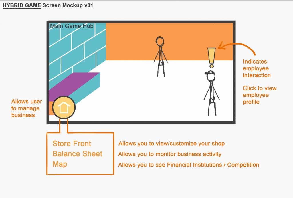
A preliminary layout of what we’d like the game to look like.

Programming

Programmers decided on the first iteration of a class diagram for the game objects. Functions still need more planning as well as main game logic. Since minigames will be included, programmers decided to handle mini-game logic and main game logic in separate game managers. In the coming weeks, the plan is for programmers to finish the main business game mechanics first and then move on to implementing the minigames.

Concept Art / Writing

Artists made a few iterations of the main game hub. They’ve also started making concept art for the characters and outlining some of the character stories. We decided a 2.5D space would be the most engaging way for the game to be played. Artists have also started thinking about the character designs for the employees, working in conjunction with the writers.

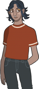
Concept art for one of the store’s employees

Goals for Coming Weeks

Programmers should work on main game mechanics, allowing for the easy addition of minigames in later weeks. Ideally, a working prototype of the game including just the bank and buying and selling mechanics. Our production schedule is as follows:

Week 4 (2/9-2/16): Basic mechanics (bank, buying resources, equipment upgrades, etc.), written stories for the employees, main store screen, menu assets
Week 5 (2/16-2/23): Basic mechanics (con’t), character assets, equipment assets
Week 6 (2/23-3/2): Employee interaction, basic tutorials, storefront, sounds, storefront assets

Welcome to Advanced Game Studio

Welcome to the initial offering of 53-399 Advanced Game Studio.   In this course, students will be split into teams to form “game studios” and will spend the entire semester bringing a game idea from concept to full delivery.  This course qualifies as part of the IDeATe Game Design minor.

Please watch this space in the coming weeks for addition information, links, and resources!