post

Studio Mar: Week 11 Update

Sorry for the delayed update! It’s been a hectic weekend for your producer.

This week, Studio Mar focused on preparing a playable Beta for the presentation on Friday 4/6. To do this, we started getting the Daydream controller working with Unity and making basic UI assets. We also discussed the results from the word prompt survey released last week.

Programming

We started trying to get the Google Daydream controller working with our game in Unity. While we managed to get Unity to recognize the controller, we ran into problems with Unity recognizing when you press a button on the controller. We haven’t figured out a workaround yet, but we’re reaching out to past ETC students who worked with Daydream to see if they can help us.

We also now have the ability for the game to assign turns to players–that is, the game cycles through the players in the game and decides who is the artist. Only the artist can see the palette with the brush options, word prompts, and other options.

Art & Design

UI assets

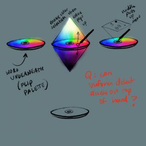
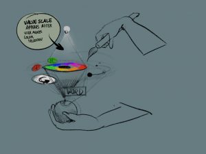
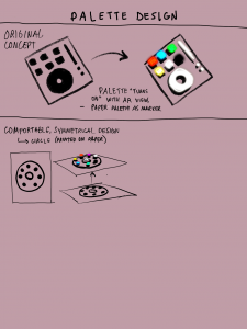
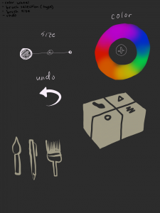
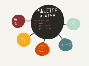
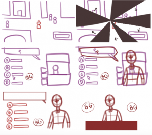
For this week, we shifted our art focus away from the experience to creating rough UI assets for the presentation on Friday–the 3D models seen in virtual space. Marisa and Adrienne worked together to design the assets. Some of Adrienne’s concept sketches for the palette are pictured above.

Besides the palette, the other assets to make before the presentation are the paintbrush, as well as the join and host buttons that for multiplayer that are pressed before you put the headset on. The palette supports all other UI options: not just the brush texture, color, and width options; but also the undo button and word prompt.

Second headset

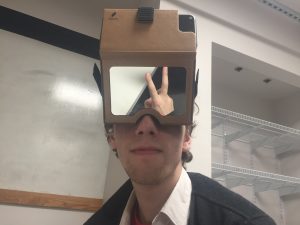
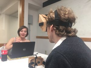
Bobbie donated her personal Google Cardboard headset to the project, and Marisa used the velcro strap and foam that came with it to modify it into a hands-free headset that would support the game like the other headset. The velcro strap is smaller than the buckle strap on the other headset, so it feels pretty tight; we might change that later to make it more comfortable to wear.

Marker prototypes

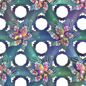
Studio Mar logo fractal pattern by Anna.

With our final marker shapes decided, we started creating prototypes of the final markers. Anna designed some marker patterns based on the logo to test with the paintbrush marker (the cylinder), which we tested. Unfortunately, Vuforia doesn’t recognize different colors, just shapes, so the repeating fractal-like patterns don’t work too well.

By Friday, we plan to have working versions of our final marker prototypes (paintbrush/cylinder, origin/rectangular prism, palette/2D marker).

Word Prompts

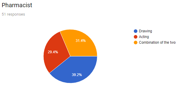
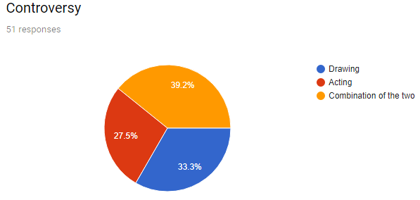
Last week, Marisa created a survey with a set of words like “crying,” “bruise,” and “Spiderman” (among others), that asked, “what’s the easiest way to communicate [each word] nonverbally for you? Only Drawing needed, acting, or doing both?” The survey was completed by fifty people from MechanicalTurk.

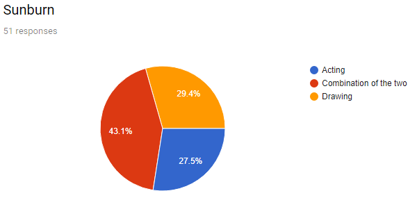
Some of the words were overwhelmingly better for drawing (like “house”), and some for acting (like “shivering”). Some of them received a more even mix between the two (like “Spiderman”). Below are the three words that received the greatest number of “combination” answers. These words, as well as the ones with mixed responses, are the ones we looked at as better LineAR prompts–we want the word prompts to encourage both acting and drawing. We want the fun of “Charades with props” to be self-evident, rather than forcing players to try to draw words that they’re more inclined to act, or vice versa.


We discussed the possible shared characteristics among the “good” words (mixed or mostly “combination” responses) and the “bad” words (overwhelmingly acting or drawing). Our list for “good” words ended up looking like this:

  • Complex
    • Multiple/series of actions
    • Specific/specialized
  • More than one actor
  • Abstract
  • Not common knowledge
    • No common symbol
  • Action + object
  • Self-referential

A word or phrase that has many or mostly these characteristics could be considered good for LineAR. For example, “sunburn” is complex (happens over time), involves more than one actor (in this case, the sun is acting on a person to give them sunburn; the person is not the actor), and does not have a common or well-known symbol.

Next Steps

We are a bit behind on our production schedule, mostly due to technical problems (testing markers, trying to get the Daydream controllers to work) which in turn impeded art progress (it’s difficult to design UI assets when we don’t have a good idea of what the physical controllers they’re going over will look like). Our goal is to try to catch up this week, so that we have an as-close-to-final playable beta for the presentation on Friday. That includes:

  • A working Daydream controller
    • Allows player to make multiple strokes, undo the last stroke, and select options from the palette
  • Displaying word prompts
    • On the palette
  • Creating basic UI assets and adding them to the game
    • Paintbrush, palette
  • Making close-to-final prototypes of all markers
    • Paintbrush wand (cylinder, mounted on controller)
    • Palette (flat, held in hand)
    • Origin (large, rectangular prism)
  • Creating a list of basic words/prompts to use for the demo
    • Don’t have to be “good” words (like from the survey)
  • Creating and releasing a follow-up survey testing our hypothesis of what makes “good” prompt words


Thanks for reading, and keep checking back for more updates from Studio Mar!

post

Beefy Chicken Stewdios Week 10 Update

PROGRAMMING

Programming wise, work has been put in on making code more modular and populating scenes from the database as intended. For the moment, we’re currently a bit behind schedule as we’ve been intending to make more scenes such as moving in the overworld also integrated from the database. However, we’re keeping focus on the evaluation scenes so we can demo them on 4/3.

Within the Evaluation scene, we’ve been working on developer tools as well as the results screen.

We’ve added mouseover text so hovering over a piece of Chinese text gives you the PinYin (pronunciation) for the Chinese dialogue. This is helpful for both players and developers. For developers, since there is no guarantee that people on this team or future development teams know Chinese, having PinYin, and in the near future English, helps developers know what’s going on in-game. For Players, since the game intends to teach social scenarios as opposed to language, having a PinYin option would make the game more forgiving and not test for the wrong concepts.

ART

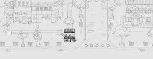
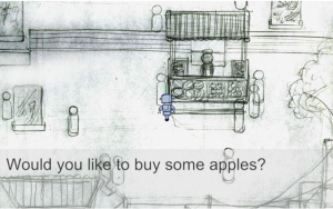
We came up with a sketch of the overworld environment. In this environment, the player can interact in four social scenarios: fruit vendor, department store, bank, and street (all at the left of the picture). The homebase (restaurant) is located on the right part of the picture. The player starts from the restaurant scenario (practicing with the buddybot) and rotates from practicing with buddybot in the restaurant to interacting with build-in characters in real-life social scenarios.

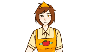
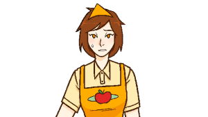
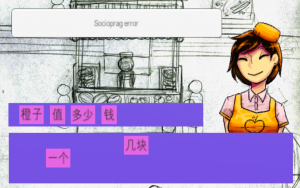
In terms of build-in characters, we have completed five different expressions of the fruit vendor (award, confused, happy, mad, neutral).


PRODUCTION SCHEDULE

    For production, we have adjusted our goal to completing 3 social scenarios (bank, department store, street) by the end of the semester. For the coming week (by 4/6), we are aiming to have a polished version of the fruit vendor scenario, including multiple-choice practice with buddy bot, multiple-choice challenge with the vendor, and drag-and-drop challenges.

The programming challenges include adding rewards system and tracking player data. Having finished the sketch of the environment, the next steps will be creating UI, refining the environment, and creating buddy bot.

Week 11 Update

Introduction

This week, programmers and artists focused on implementing some of the features we discussed in previous weeks. Due to some technical issues, we were not able to progress as much as we’d like on getting all the mechanics in. Thus, we will have to postpone the minigame creation until after the next checkpoint. Essentially, programmers focused on feedback UI in the game. They also started adding placeholder sound clips for the game, although the bugs associated with putting it in were not resolved this week. Artists, on the other hand, focused on redrawing the key assets in the store, as well as creating some assets for the feedback UI. Writing for the characters is going along smoothly and the team is talking about possibly adding more characters into the game.

Programming

This week, programming focused on improving the feedback UI for the player. However, a lot of the work had to be-implemented due to major merge conflicts with Git. Therefore, programmers could not put in everything they wanted to. Some mechanics implemented include the aforementioned sprite changes to the shelves. Bread on the shelves now visibly depletes as employees sell and increases as employees make more product, still in 25% increments. Some other feedback includes preliminary auditory feedback and visual in the form of employee energy bars. Right now, the bars are programmer art, so when artists finish making the assets for it, they will be replaced. Additionally, the auditory feedback will be accompanied by visual feedback in the coming week. Programmers fixed bugs regarding the employees’ energy bars and now the employee sprites themselves show up in the scene. For the prototype next week, programmers want to polish this feedback UI and fix any lingering bugs with the main components of the game before moving on to the minigame and some additional features.

Programming of the employee energy bars and the visual feedback

Art

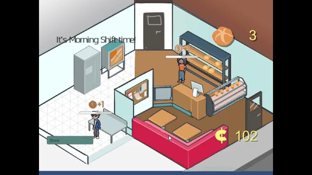
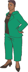
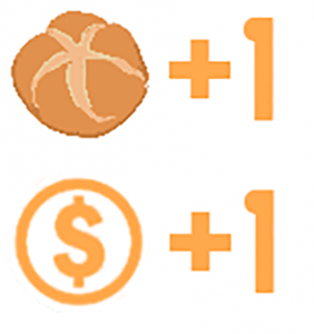
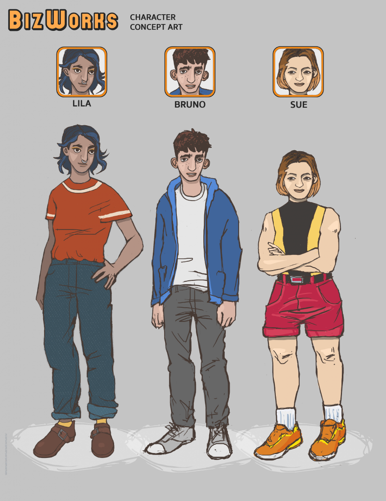
Art worked on getting in all visual elements to facilitate playtesting and balancing, assisting the programmers with what they needed for the prototype. Prototype sprites for the employees (Lila, Bruno and Sue) and financial advisor were made. The team polished many current assets, like character icons and everything located in the main game hub. They also started adding assets for the clarity of the UI/UX, raising the quality of its graphic elements. For example, for feedback purposes, whenever bread gets made and bread gets sold, there will be a small “+1” pop up that gives visual confirmation that stock is changing (in case the player does not see it changing in the corners).

The character design for the financial advisor

The visual feedback for when bread is produced and sold

Next Steps

Going into the next week, now that most of the main aspects are finished, we’d like to implement employee dialogue and polish the visual and auditory feedback in the prototype. Once all the back end work is completed, we want to start adjusting the numbers for minimum payments, costs of ingredients, and how much employees are making and selling. Therefore, all the mechanics that we’ve been working on will be visible, especially all the back end work that we just did not previously have the assets for.

post

Studio Mar: Week 10 Update

This week, Studio Mar focused on finalizing our markers and getting multiplayer support working. In addition, while moving forward with our installation concept, we decided to showcase/playtest our game at a few different campus opportunities.

Finalizing Markers

We finally finished testing all of Vuforia’s targeting types, including cylinder targeting, which works well as long as we have a distinct enough pattern on the cylinder. Now that we have a better idea of the marker tracking capabilities available to us, we tested all our different options for the origin marker: a big 2D marker projected on the wall or floor, and a 3D marker in the center of the room.

We found that using a 2D marker on a screen causes problems with extended tracking, which treats the moving RGB channels of the screen as part of the background and causes the origin marker to drift. This rules out using a projector or screen for any markers, so we decided to go with a large 3D marker in the center of the play room. This also allows the players to walk around the room, rather than be restricted to facing one direction. This does require that we print out a very large version of the marker design, so that it can be seen from farther away and applied to a large 3D object–we plan on using a rectangular prism, such as the plinth used in museum exhibits (for reasons that will be explained below).

We also plan on moving forward with a cylinder marker for the paintbrush, to create a wand for users to draw with. A cylinder can be easily affixed to the top of the Daydream controller or another handle, and we’re thinking about using PVC pipe or something similar as a sturdy base to wrap the printed marker design around.

Multiplayer

We finally got the multiplayer working! Our main game demo now supports multiple players drawing and seeing the drawing update live. One player has to host and the others join, but visually–in-game–the experience looks the same.

Installation Demos

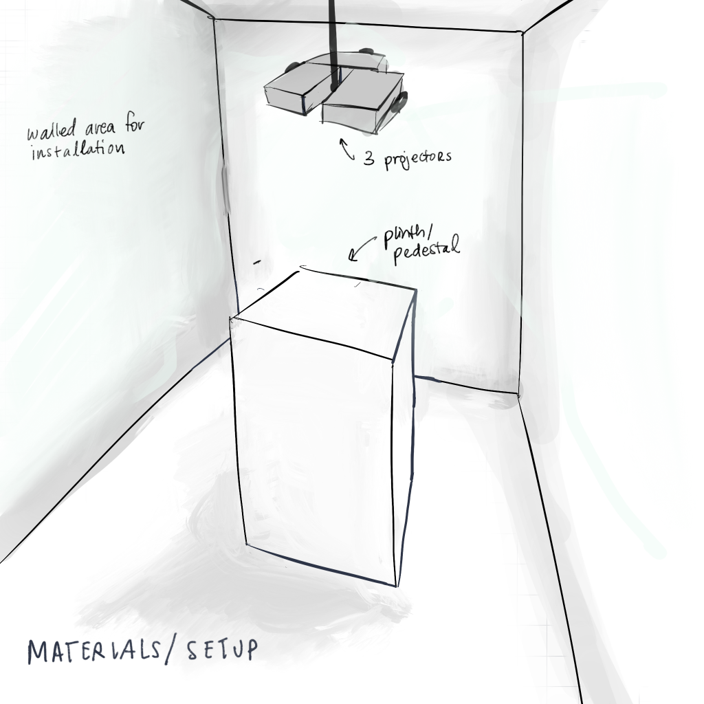
Adrienne’s sketch for a possible LineAR installation setup at the Senior Art Exhibition.

Having decided to lean into an installation rather than a play-anywhere game, we discovered multiple opportunities to host, demonstrate, and/or playtest LineAR. Firstly, Adrienne is excited to show off our game as an installation in the Miller Gallery during the 2018 Senior Art Exhibition, which opens on May 5. We can use one of the plinths used to display pieces as the origin marker, provided we print out the marker designs for the various faces, and place it in the center of the designated alcove.

We also have the opportunity to demonstrate LineAR during Carnival, which is April 19-21, at a booth or other location that IDeATe hosts. While our game won’t be as polished for Carnival as it will be for the art show, we can still demonstrate what we have and get feedback from players. Tom also discussed the possibility of showing the game at Meeting of the Minds at the end of the semester.

With actual spaces in mind, we can consider how to design an installation in more detail. From a technological point of view, our devs are confident that the game can work outside of an installation experience, although perhaps not as well, if anyone would like to play it outside of one of our installations.

3rd-party viewing

With more concrete ideas for installations, we also began thinking about how to show the gameplay experience for anyone watching, but not playing, the game. This is largely important for the art exhibit, since that will be less of a gameplay experience and more of a showcase. We were inspired by Uncorked Studio’s use of projection mapping to show 3D drawing in a VR experience on the walls of a room using perspective tricks, and with Anna’s previous experience with projection mapping we’re confident we could recreate a similar experience.

A problem with projecting the drawings–or any other visual effects–on the walls of the game room is the same problem mentioned above with extended tracking, that it assumes moving parts of the background are stationary and moves the drawings with it. A possible solution would be to create separate viewing and play rooms. Another option is to forego projection mapping and show the gameplay view on a separate screen, or provide 3rd-party observers with a large tablet like a “window” to walk around and look at the drawings. We’re still discussing our options while we work on building our core gameplay.

Word Bank

We are also beginning work on building a bank of prompts for the Pictionary aspect of the game, since we want our core gameplay to demo at Carnival. We’re considering what makes a prompt better to draw vs. act out, hoping to hit the middle ground, as a combination of the two is what we hope to encourage in our game. To that end, we’re curating existing prompt lists and have also sent out a survey with a few example words to see what people are more likely to draw or act.

We’re also discussing curating multiple word banks–not just a generic, family-friendly one to use in gameplay, but also lists that would encourage discussion on more controversial topics or that explore certain themes, like abstract terms that are hard to illustrate (i.e. “ennui”, “angst”, etc.). This would help adapt the game to the different showcase environments, such as the art show vs. Carnival, and would be a good basis to help develop the game past this semester.

Next Steps

For this week, our next immediate steps are:

  • Testing Daydream controller compatibility with Unity and our game
  • Building up the word banks
  • Finalizing our marker face designs and building prototypes

We need to develop a list of materials and equipment for the various exhibitions very soon, so knowing what we need to print, build, use, etc. for our installation is high on the priority list. We are also going to modify a second Google Cardboard to use for playing, since even after lowering the camera aperture on the Holokit, it still feels too distant from the natural point of view.


Thanks for keeping up with Studio Mar, and check back next week for another udpate!

Weeks 9+10 Update

Introduction

With the team’s spring break causing a slight lull in work, members mostly focused on polishing some of the assets in game and finishing the basics of the daily cycle. Programmers were able to get the dialogue system into the game, using placeholder dialogue while writers continue to write character arcs. Art also laid out new characters for the game and continued working on environmental assets. The goal for the next two weeks is to polish all of the in game assets and present a working prototype to the client, as well as get a preliminary version of the game up and running so that we can playtest with students on campus.

Programming

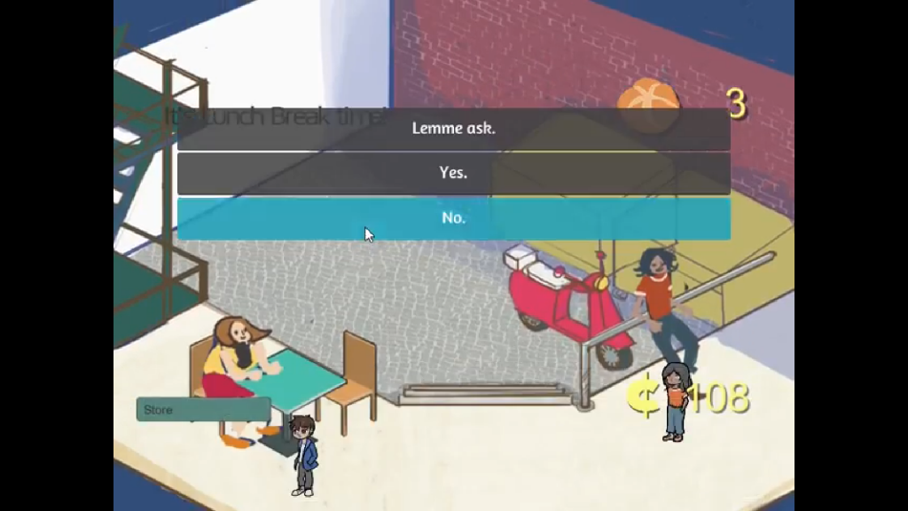
The skeleton of the daily cycle has been finished with programmer art and UI elements. For the purposes of playtesting and programming, each shift is thirty seconds in game time, which represents a week in the game. During the shift, depending on the tasks assigned to the employee, the bakery sells bread. There are a few mechanics built into the game regarding employee task delegation. For example, if there is no one assigned to run the cash register, there will be no product sold. Likewise, if there is no one assigned to make bread, stock will not be replenished. During the lunch shift, the player can tap on an employee, which triggers a dialogue. This dialogue can either be part of the employee’s character arc or just fluff interaction. Employee interaction is implemented using the Fungus plugin for Unity. Placeholder dialogue is currently being used but can be easily replaced with real dialogue once that is finished. The daily cycle will be polished in the upcoming week. Working with artists, programmers designed a weekly summary panel. The purpose of this weekly panel is to give a place for the player to pay loans, taxes, and insurance, as well as show the player how they have earned money and lost in expenses. The mechanics have been planned out and are in the process of being implemented.

An example of how dialogue choices will be given to the player

Art

Over the break, the artists worked to finalize the designs of the characters and further prototype the environment. For example, we wanted to add a back area to the store for the lunch break, in order to reinforce the idea that the lunch shift is different from the morning and afternoon shifts. The styles for the first 3 employees Lila, Bruno and Sue have been updated and are now more detailed to generate more player investment. When making these characters, we kept in mind how much diversity we could bring out in them and how we could get the students to identify with the characters. Therefore, we made the first three characters close to the target demographic in age and tried to give them relatable issues to work through, such as roommates, credit cards, and athletics. Visually, the characters are also diverse, as being able to make everyone feel included was a large goal of the artists. The artists also started planning a 4th employee and a financial advisor, which are at the stages of concept art.

Designs of the first three employees

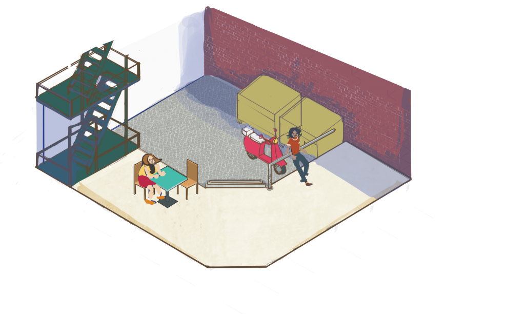
The lunch and storefront areas have also also been outlined. As mentioned we wanted to add a back area to the store for the narrative portion of the game. The lunch area, which is essentially a back alley, connects to the back door of the main game hub, allowing for a smooth pan during gameplay, which programmers should be implementing in the next week. The lunch area’s purpose is primarily visual and is intended to evoke relaxation, as that is the designated time for when you can interact with the NPC employees in a more thorough manner. In order to leave this back section, the player has to interact with the employees. Additionally, in the back of the lunch area, there is a bike that will move in and out for employees who go out on deliveries. Artists are going to spend the next week polishing this area as well.

Initial sketch of the lunch area

Moving Forward

Keeping in mind the next checkpoint is in the next two weeks, the team is moving into making a fully playable prototype. Artists will move into finalizing design for the environment, as well as starting the process of animating the three to four employees. Programmers will start to create the weekly panel and focus on getting all the main mechanics in and working. In terms of writing characters, the goal is to have at least one fully written character for the prototype, although we’d like to try and have more than one for it done. Although we were supposed to have started implementing a minigame by this point, the team is focusing on getting the main mechanics that teach financial literacy in first, and then move to the minigame if we have time.  

Week 7 Update

Summary

This week, we focused on getting at least one iteration of a day in the game done to present as a working prototype. Also this is really late, sorry it’s completely my fault.


Programming

This week, programmers worked on getting the main game logic working with regards to buying ingredients, selling product, and assigning tasks to the employees. Unfortunately, programming wasn’t able to implement employee interaction and a lot of the logic isn’t obvious because of the lack of UI elements to represent it.


Art

Art worked on finalizing the design of the bakery, with the assumption that it would present most playable features within one screen. The game would function on the basis of diegetic UI: to assign an employee to sales, the player would have to click on the cash register. This sort of environmental interaction would increase player engagement.


Additionally, two new characters and the outside map had been created for the purpose of the prototype demo.


Prototype Build

The working prototype that we created allowed players to go through the first shift of a day. On the first screen, players would choose two of three employees to work for the day. After that, they would choose what tasks the employees would be doing for that shift, such as taking orders or making bread. When each employee has been set up, the screen transitions to the store screen where a timer starts to count down to the end of the shift. On that screen, players can also click on the door to receive deliveries and when they do so, they lose money as they buy more supplies. While the prototype has a few bugs and does not necessarily reflect the timeline we want the game to have yet, it shows that the features we want to implement in the game are possible. Playing the game on a phone, the team realized that the placement of some of the UI elements was strange and that some of the art assets needed to be polished. Furthermore,

The diegetic UI was found to be too confusing.

post

Studio Mar: Week 8 Update

This week, we discussed the feedback we received from last week’s prototype and experimented with possible solutions to the origin marker tracking problem. We also continued working on palette/UI concepts and multiplayer support.

Installation

After our presentation, Tom suggested that we consider making our game part of an installation, rather than a print-out-and-play-anywhere game like we’d been thinking about. Creating a dedicated playspace might help circumvent some of the technology limitations, and facilitate the fun of the game–playing Charades with, as Tom put it, virtual props. Adrienne and Anna are particularly excited about the art and gameplay possibilities of an installation, and Adrienne is happy to volunteer her studio for an installation.

Right now, our version of the game mainly has problems with the origin marker, which is small and placed on a tabletop. Because of that, the headset has to be very close to the marker and constantly keep it in view to keep tracking 3D space, which makes the player have to awkwardly bend over the tabletop for the 3D drawing to work. The solutions to this problem that we’ve tried are better suited for an installation than a tabletop print-out-and-play experience, so we are currently moving toward an installation for our final game.

Marker Updates

origin Wall Marker

We tried putting a large version of the origin marker up on a wall, in this case, on a large TV screen. The larger marker can be tracked from across the room, and can be tracked from most angles relative to it, even when the marker’s in the camera’s peripheral version. The downside to this is that it prevents players from walking all the way around the origin, limiting gameplay to a more stage-like experience: one person standing before the origin marker drawing, and the others arrayed around the origin watching them. We haven’t tested drawing with the big wall origin marker yet, but we’re optimistic about its capabilities.

Extended Tracking

We also tried Vuforia’s Extended Tracking, which was surprisingly easy to implement, and works fairly well. The caveat is that the surroundings can’t change too much or else Vuforia can’t track where you are relative to the origin. It works best with a very flat, similar background. For example, if you draw something over the origin marker on a tabletop, look away to a different part of the tabletop, and then return to your original drawing, it’s still there. Drawing something with the origin marker not in view is a little more finicky, as without anything to anchor it to, the drawing can jump around in space.

We plan to keep trying different origin marker methods, like a big marker on the floor or a big 3D marker in the middle of the room, or pairing extended tracking with one of these different origin markers.

Paintbrush marker

Vuforia’s cube tracking seems to work reliably, albeit a bit jittery when it tracks from face to face, and it stops tracking if your fingers are blocking too much of the cube face. We plan to test a “cube on a stick” paintbrush to see if not having fingers blocking improves tracking, and if it’s a viable paintbrush option. We’re also going to test Vuforia’s cylinder tracking, to see if that produces any better or similar results to a cube, because we think a “cylinder on a stick” will at least look nicer than a cube.

We have a Google Daydream controller but haven’t gotten the chance to test how it works with Unity. Our hope is that if it works well with Unity and our game build, we can mount our paintbrush marker, cube or otherwise, on top and use the controller’s buttons for things like turning drawing on and off and selecting options from the palette.

Other updates

Palette Designs

Adrienne sketched some palette and UI design concepts. The main palette concept uses a 2D marker that looks like a blank palette, but when viewed in AR, the blank spaces for colors and other options “pop out” in 3D and color for the player to interact with. She also came up with a list of UI elements we need to include, either in the palette or elsewhere in the UI (for example, on the walls of an installation), as well as some sketches of how they might appear: a color wheel, brush size slider, brush type/texture options, and an undo butotn.

Multiplayer

Everi has continued working on adding multiplayer to the game, and it’s mostly working except for a problematic bug. She’s going to continue tackling the bug, with the goal of having multiplayer working by the end of the next work week.

Next Steps

This week is CMU’s Spring Break, which means it’s not a work week for Studio Mar! If anyone has the time and inclination to work on the game, we’re going to keep working on what we’ve been working on this week. Our goal for the end of the next work week, March 23rd, is to have an Alpha version of our game. The Alpha should include:

  • Final origin marker
    • Supports using physical space for drawings
  • Multiplayer support
  • Drawing with our final paintbrush marker
    • A 3D marker mounted on a controller, not a 2D piece of paper
  • Basic UI
    • Let user make multiple strokes, undo, start/exit game

To that end, what we’re working on this week and next is:

  • Continuing testing different origin marker solutions
  • Continuing work on multiplayer
  • Testing drawing with different paintbrush markers
  • Integrating the Daydream controller into our Unity project
  • Designing and implementing UI


This post should be updated with video and images of our progress later this week. But after that, we’ll see you on March 23rd! Have a great Spring Break!

Week 8 Update

Introduction

Following the presentation of our prototype last Friday, we received feedback that made us reconsider what features we wanted to include in the game, as well as how we’d introduce feedback to the player in the game. Taking into account that information, the team sat down and reevaluated all aspects of the game, determining what needed to cut out or changed in order to have a good final product at the end of the semester. For the remainder of the week, we continued finishing the main mechanics of the game.

Prototype Feedback

After showing our prototype in class, we were given some feedback on the features of the game and how understandable it was. First, the diegetic UI was found to be too confusing. Our prototype had the door and map as diegetic UI in the game. However, everything surrounding these elements are non-diegetic UI, which makes it confusing for the player. Second, the team was asked what function the map was serving, as opposed to just a list menu of what financial institutions the player could go to. Considering the same information can be portrayed in a simpler way, the map can be discarded as an element if there is not enough time to complete it. Other feedback given was that the indicators in the game may not be as obvious to the player as we intended. For example, would they see the number of stock decreasing and the amount of money increasing and associate that with product being sold. Lastly, we were given suggestions on how to increase the financial planning component of the game through advanced notice of deliveries (similar to real life businesses) and showing the decisions that led to certain outcomes in the storyline (which could also increase replayability).

Concept Rework

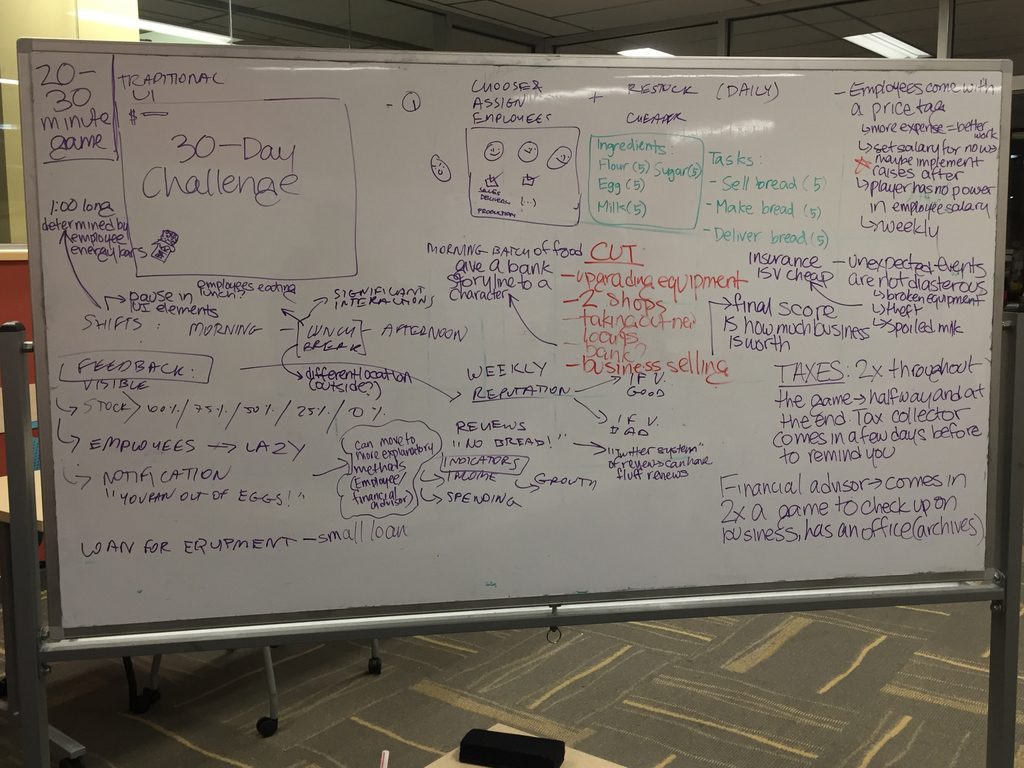
Taking into account the feedback that we got on the prototype, the team sat down and rescoped the project, figuring out the features that needed to be eliminated or changed. First, we really wanted to figure out the exact playtime of the game. The client has indicated that he would like either something that ran alongside school curriculum or something that tested knowledge at the end of a course, so we had worked keeping both options in mind. However, we decided that we wanted to make the game very similar to a 30-day challenge kind of game. Ideally, the game could be played in 2-3 20-30 minute game sessions in class, so that it could be again, either a supplement to lessons or as a final class activity. In line with this 30-day challenge, the events such as tax collection and salary payment will be on a weekly cycle. Because we thought it would be too much to have the player pay a large lump sum every few days, we decided that deliveries and employee salaries would be staggered weekly. In addition to those payments, the player will pay taxes twice in the experience, once at the 15 day mark and once at the end of the 30 days.

The structure of each day will be similar to what we were programming in the past. There will be a morning shift, a lunch break, and an afternoon shift. Each one of these states will be one minute in game time. Employees will be assigned to tasks at the beginning of each shift and the financial literacy story arcs will be explored during the lunch break. Within a day, we wanted to include different types of feedback for the player, taking the suggestions made during our presentation to heart. We decided to add a few main types of feedback. First, as stock diminishes, the sprites of the product being sold will decrease in 25% intervals. Second, if the employees have nothing to do, they will be shown doing nothing, hopefully indicating that the player needs to assign them to a new task. There will also be notifications about low stock on product or ingredients. Lastly, a new feedback mechanism the team wants to add is a reviews system, like what you would see on Yelp or TripAdvisor for a business. As the bakery’s reputation changes, there will be reviews added to the screen. These reviews can be positive or negative and also point to some problems of the shop, like low stock.

With the problems we had in the previous weeks, our rescoping of the game also forced us to reconsider the features we want in the game. We decided to cut a few things we originally had in the game, keeping in mind that there were some core mechanics needed for the game to work and everything else was appreciated, but not necessary. While upgradable equipment helped the player deal with money management, budgeting is covered in other aspects of the game. Some other features the team decided to cut include two other shops, taking out additional loans, and selling the business. Even though we are cutting a lot of features that would make the gameplay more interesting, we plan to shift the concepts taught through those features into other mechanics of the game. For the most part, we want to showcase the concepts in more character storylines and will be increasing the number of characters from 4-5 to 6-7. Hopefully, by doing so, the game is kept robust and interesting.

Rework of the different mechanics of BizWorks

Programming

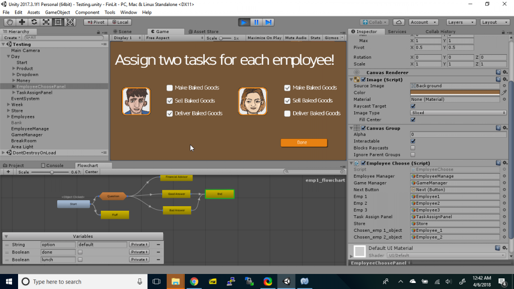
Programmers spent this week finishing the day and adding some smaller UI elements for the player to better understand the game. Players can now assign employees to tasks in order for the day to start. The UI in the corner also tracks how much product is available to be sold. Programmers also finished the ingredients panel and it now now includes a small inventory panel to indicate how much of each ingredient the player has. While the numbers are still subject to change after playtesting, everything works. We also started to put in reputation, which will help determine how much the store sells and just give feedback to the player. It will be used in conjunction with the reviews that we are writing. The money increments based on the store’s reputation to represent items being sold at some frequency, which again increases as the store’s reputation increases. Programmers are largely making good time with the main mechanics and expect to go into polishing going into the break.

Screen capture of employee task delegation

Art

Art spent this week finishing the assets for the store and polishing the existing assets. Working together with writers, they outlined all the employees for the game and will start on concept art for them. Art also spent this week making some UI assets that programmers requested. The goal is to add small details that make the experience enjoyable for the player, such as sounds and visuals that show the player is making money. Art discussed using the appearance of the store for feedback as well. For example, we are going to have the stock in the display cases disappear as the number of pieces of bread left goes down. Artists created the aforementioned assets and are starting to work on other feedback assets in the coming weeks. Furthermore, while the team will keep using bread for the moment, artists discussed making the product sold at the store some kind of fad dessert, partly in response to feedback received at our presentation. There have been no final decisions made on that, but ideas on the table are things like unicorn bread or sweet pierogies. In the coming weeks, artists will be focusing more on characters and UI, as the store design is pretty much final. 

The progression of how the bread shelf asset changes as stock decreases.

Writing

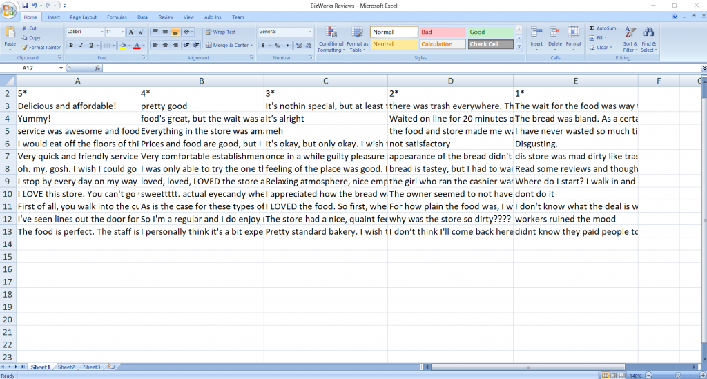
After rethinking the concept of the game, writers focused this week on the review system that will be used as feedback for the player. We decided that there would be three kinds of reviews– negative reviews, filler reviews, and positive reviews. Negative reviews would present themselves when the player has made mistakes with running the business. For example, if the player runs out of stock during a shift or has employees that are being negative because of personal issues, it will be reflected in the reviews. Filler reviews are reviews that are there to give some character to the review feature, but don’t really imply anything positive or negative about the experience in the way the other reviews do. Examples of this would be just a number of stars or statements like “Good food.” Positive reviews affirm that the player has made the right decisions. For example, a review stating that “The staff was helpful and really nice. You can tell they’re really enjoying their jobs! I got a baguette and not only was it tasty, it was also fresh out of the oven.” Hopefully, these reviews serve as something fun for the players to read, as well as give positive or negative feedback as needed for the game.

Working review database for the in-game review system

post

Week 7 Update

Programming

We have scaffolded all of our different scenes; We have multiple choice scene which Brian has been iterating on and improving, a drag and drop construct your own sentence that Ryan improved on to catch partial correctness such as Sociopragmatic or grammatical errors, which will help give more constructive feedback to players and reduce frustration. Additionally, we have constructed an over-world scene, which the player can navigate using directional keys or WASD, as well as interact with people and strike up conversation.

We’ve also ran into a number of setbacks. One in particular was that upon presenting our checkpoint progress report, a guest industry specialist pointed out that our interactions differ from practice to challenge mode. Before the protagonist of our story set out into the real world, they have an opportunity to practice their Chinese with a buddy bot, providing a stakes free learning environment. The original plan was to have a fun interaction during practice mode like throwing that would help spice up the dull action of selecting multiple choice and help engage  people starting up this game, and remove it later in the game where situational context is more important. However, concerns were raised as to establishing misleading “rules” for the player and giving them false expectations.

As to where we’re going for here, addressing the concern raised above. However, the big focus moving forward will be constructing our database and game manager so that we can start populating our database and resource folders and really streamlining the process of creating scenarios and story before we start making them.

Art

As said last week, we’ve established a more focused and concrete aesthetic of solarpunk rather than cyberpunk. We’ve brought a stronger focus on the Chinese aspects of the environment. We finalized the visual layouts of the game, with the four key views being the Practice View, Challenge View, Conversation View, and Overworld View. Reactions and feedback given by the NPCs who are being questions will involve large talksprites sliding into view with the proper expression for a reaction, to emphasize the feedback being given to the player.

Going forward we will be creating polished art assets that can be used for the upcoming playtestable scenario.

Key Game Views:

MOVING FORWARD

This week we will focus on finalizing the prototype so we can move to full production in March. We need to come up with a new idea for the fun interaction during the practice phase. We need to set up “rules” so that the player will experience the same rules through different social scenarios (instead of throwing apples). We also need to build a playable sample of the game so we can start playtesting. By the end of March, we will complete four social scenarios (street, bank, department, fruit vendor) with both practice and challenges phases.

Meanwhile, Xiaofei will communicate with her dissertation committee members about the game plan to make sure that she can use the game for her research study. The goal is to minimize the variables on the interaction and learning experiences in the game and the web-based comparison environment.

Production schedule for March

3/9 Street scenario + storyline
3/16 Department scenario + playtesting
3/23 Bank scenario + playtesting
3/30 Street + Bank + Department + Fruit Vendor
post

Studio Mar: Week 7 Update

This week, Studio Mar focused on creating a playable demo and revising our production schedule, for the prototype presentation on Friday. We also decided on our game name: LineAR (pronounced “linear”)!

FInal Concept

Our final concept is a mobile augmented reality game for two or more players, that is a combination of Pictionary and Charades. One player gets a prompt like “picture frame” or “pirate,” and has to draw that word in 3D space so that the other player can guess it. The fun of playing this game in AR comes from the ability to use the physical space around you, as well as yourself and other players, when drawing. For example, to illustrate the word “trampoline,” you draw a circle on the ground and then jump up and down on it; for the word “sleeve,” your friend draws a sleeve around their arm. This way, the game becomes a kind of Charades with props that you draw yourself.

Extended features

If we have time, we have a few extended features we’d also like to include:

  • A gallery of saved drawings overlaid on the real world that you can physically walk through
  • Saved drawings are reanimated in the gallery
  • Markers on headsets to track and draw on other players
    • For example, if you get the prompt “pirate”, you could draw a pirate hat and eyepatch on your friend.

Software: Vuforia + Tilt Brush

After exploring all the technology options, we are moving forward with Vuforia and marker tracking for our software. Unity doesn’t support using more than one AR software at a time, so unfortunately we can’t integrate AR Core or any other AR support with Vuforia. We are still exploring Vuforia’s 3D object tracking and extended tracking, to push the limits of what Vuforia supports and allow for the best play experience that uses the whole room.

We are designing and testing Vuforia markers for the origin marker, the point that allows the drawing to be done in 3D, and allows synchronizing across multiple users; the paintbrush marker, which players use to draw; and the palette marker, which players use to select Tilt Brush paint textures and colors. We are moving forward with using the Tilt Brush SDK for players to have different brush options when drawing.

headset

We are continuing to develop for both the Holokit and Google Cardboard, since it is straightforward to make prototypes for both at once. One problem with the Holokit that we discovered during our demo is that the phone camera is placed well above the wearer’s eyes, meaning they have to bend over awkwardly to see something below them that they can see easily without the headset.

Progress update

This week, we:

  • Added adjustable straps to the Cardboard and Holokit headsets, so they can be worn hands-free
  • Developed multiplayer: multiple players viewing the drawing at once
  • Created some palette/non-paintbrush UI design concepts
  • Tested Vuforia’s cube targeting: which works pretty well!
  • Tested the Merge Cube dev kit
  • Made our demo game stereo, so it can be viewed in a headset

We found one major issue with Vuforia’s marker tracking is that it requires the players to keep the origin marker in camera-view at all times, which is awkward, and doesn’t support the use of physical space like we want our game to have. We’ve begun testing potential solutions to the origin marker: a large marker on the wall or the floor, a 3D cylinder or cube marker, and extended tracking.

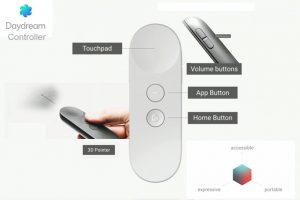
Diagram of Daydream features, from the blog Above AR.

We also acquired a Google Daydream controller, which we plan on testing to use as a paintbrush controller. We hope that we can use the controller to turn drawing on and off, allowing the user to control drawing multiple strokes, as well as selecting options and increasing brush size. Whichever marker we end up using for the paintbrush would be mounted on top of the controller.

Revised Production Schedule

We updated our production schedule, which is mostly the same as before, but with more consideration for working with markers and UI designs.

Week 8 / Mar 09 Multiplayer [Mid-sem break]
  • Other players can see the drawing live
  • Finalize 3D obj
  • Non-paintbrush UI designs: palette, prompts
  • Origin tracking solutions
  • External playtesting (continuing for rest of sem.)
Week 10 / Mar 23 Alpha
  • Stable release of multiple people taking turns drawing
  • Finalized & working physical paintbrush (marker + controller)
  • Basic UI implemented
Week 11 / Mar 30 Prompts
  • Limited set of prompts for player to base drawings on
  • Refined UI
  • Changing turns supported in-game
Week 12 / Apr 06 Progress presentation due
  • Beta: Stable release of drawing + objectives
  • Prompts integrated into refined UI
Week 13 / Apr 13 Brush options
  • If not yet incorporated, color + line width + animated brushes
  • Full palette support
  • Start work on gallery
Week 15 / Apr 27 Stable release
  • Pre-final: No new features to be added
Week 16 / May 04 Final presentation due
  • Flex week: bug fixes, presentation/final release prep

Next Steps

Our next immediate steps are:

  • Find a better way to track the origin that allows for the use of physical space
  • Decide on a paintbrush marker (hopefully 3D, whether cube, cylinder, or other)
  • Design UI (what we see in virtual space, without relying on markers)
  • Implement multiplayer support
  • Test and implement Daydream controllers
  • Create a bank of Pictionary-style prompts (test which ones work better in AR)

And, as soon as possible, we want to begin external playtesting, to help build our prompt bank and test the game concept.


Thanks for checking in, and keep checking back for more updates on Studio Mar!