Process
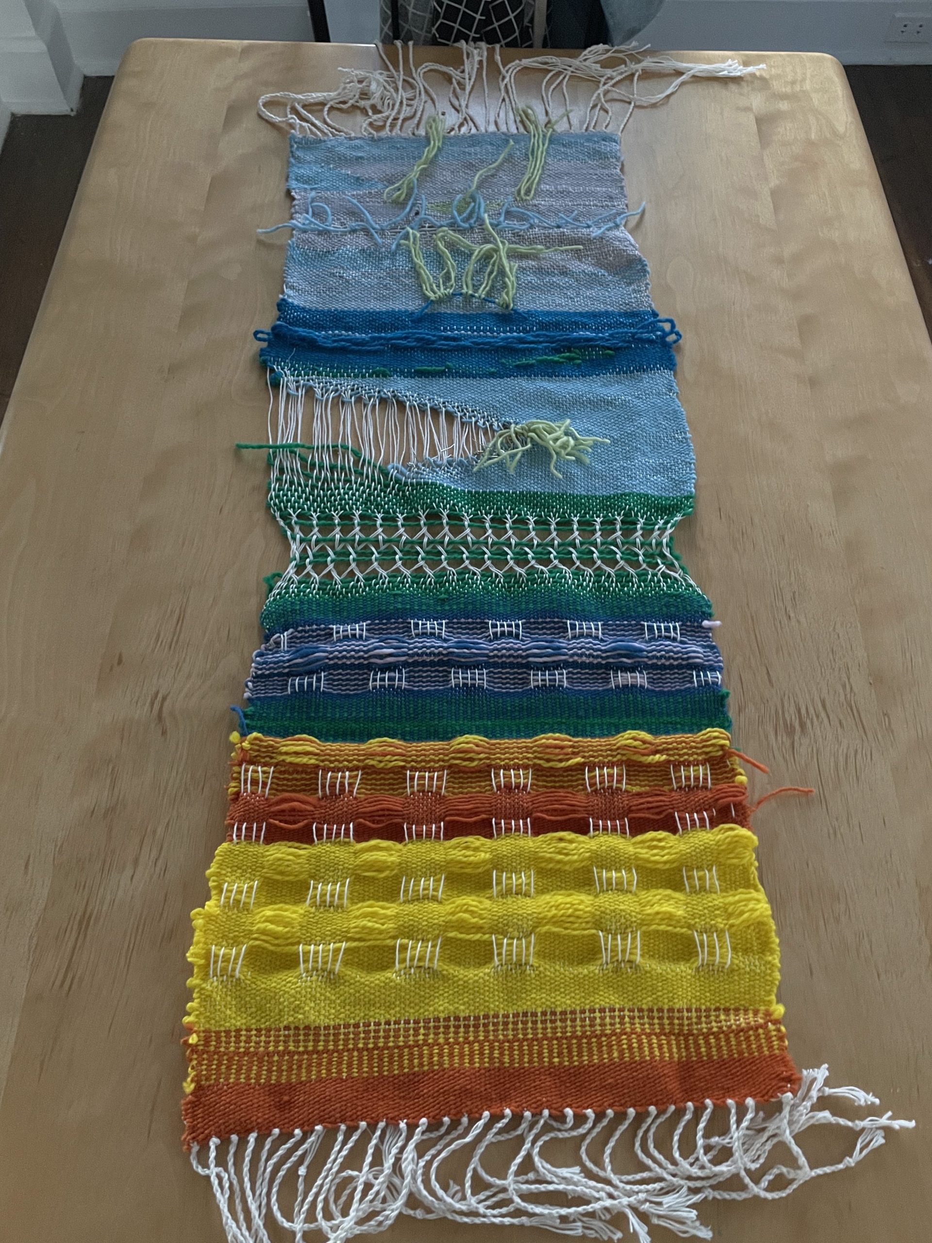
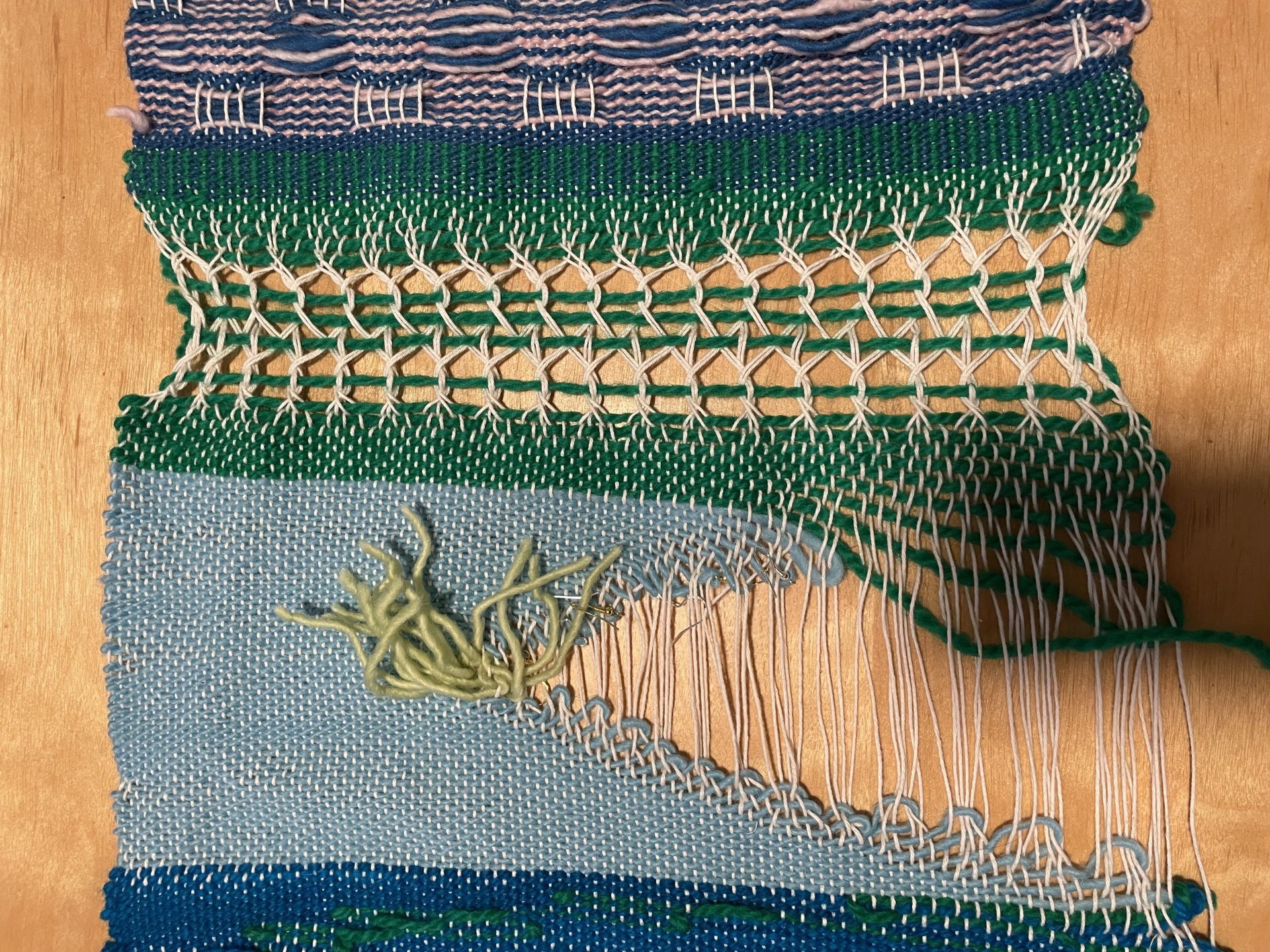
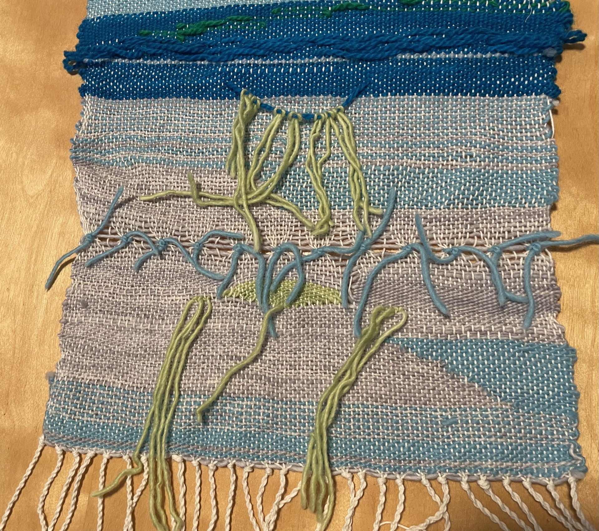
Rather than having a specific image in mind that I wanted to create, I let the tools, fabric, and mood determine where my piece will go for the beginning of the weaving. I thought that if I had a goal in mind, it would restrict the creative process too much. I wouldn’t be able to discover new techniques or interesting combinations. I also didn’t want to force my weaving into something that I wasn’t sure if I’m technically able to do yet. Since this is my first weaving, I wanted to learn about what different techniques would look like and potentially use them in another project.
I particularly like the look of having warps showing rather than hiding it. I wanted to learn more about ways that I can let the warps coexist in harmony with the weft.
After the exploration phase, I wanted to do something more regular and pattern-based. The beginning of the weaving looked very abstract and that represents the more creative side of me. The checker pattern represents the part of me that is very organized. I see myself as someone who needs routine and a plan or else I’ll be too stressed.
What worked well
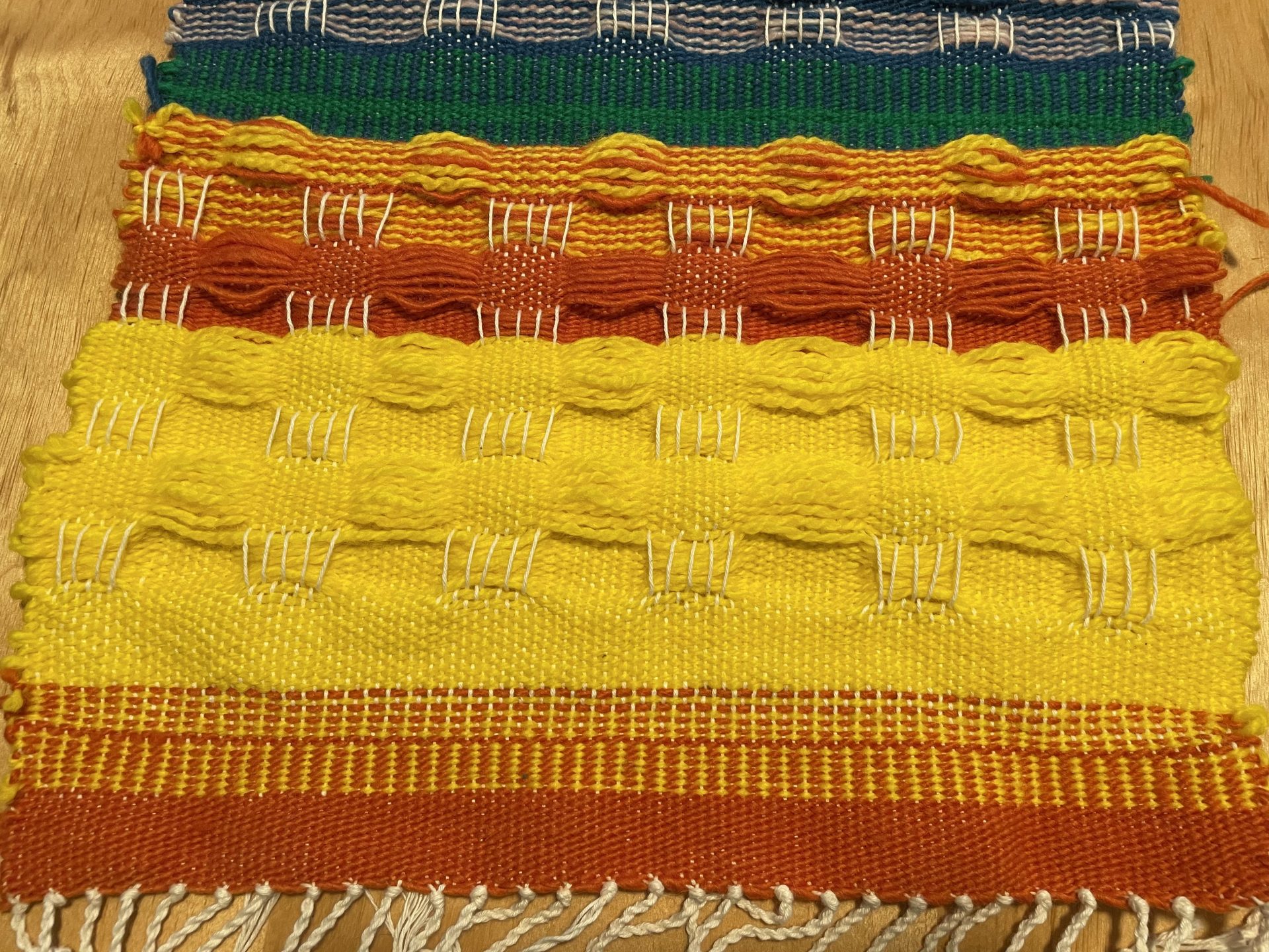
The checker pattern worked better than expected. I liked how it is also reversible: the back shows the same pattern in a different sequences. I also tried color combinations that I wouldn’t have thought would go well with each other such as blue and pink. The color contrasted each other nicely and I was pleasantly surprised. I also enjoyed how the pattern is still visible even when I only used one color (yellow). The pattern created 3 different types of texture although I only used 2 techniques.
What I would improve
I want to be better at controlling the sides of the weaving. Some parts of the weaving were wide and some parts were tight. I was trying to make the width consistent throughout, but I was having difficulties with that.
I originally had very muted colors in the weaving. I didn’t think it contrasted with each other or the warp well. After adding bolder colors, I feel like the weaving was more “powerful.” It stood out much better than before.
What I learned through this project
- Don’t be afraid to use vibrant colors together. It could actually be complementary and make both colors stand out.
- Even if you’re only using one color, other elements can also make the piece interesting.
- I enjoy doing things more experimental at first and learning the techniques.
- Things may not turn out exactly as how you imagined, but you still might get something cool or at least learned a technique.
Five Directions
- I could use the same pickup stick technique throughout the weaving in order to create long rectangular stripes rather than checkers.
- I could try bold colors for experimental and muted colors for the pattern.
- I could braid the rya knots together so that they are not just dangling threads. This would also make it less chaotic.
- I could make the contrast between regular and chaotic vertical instead of horizontal. (Left and right rather than top-down)
- I could use varying lengths for each section of the pattern. (Instead of square shapes, maybe long rectangles with short rectangles.


