Digital Repeat Pattern – Erica Final

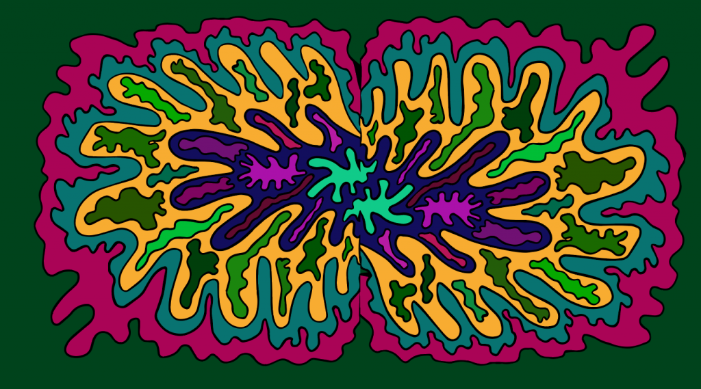
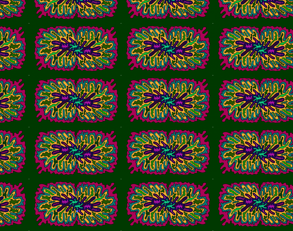
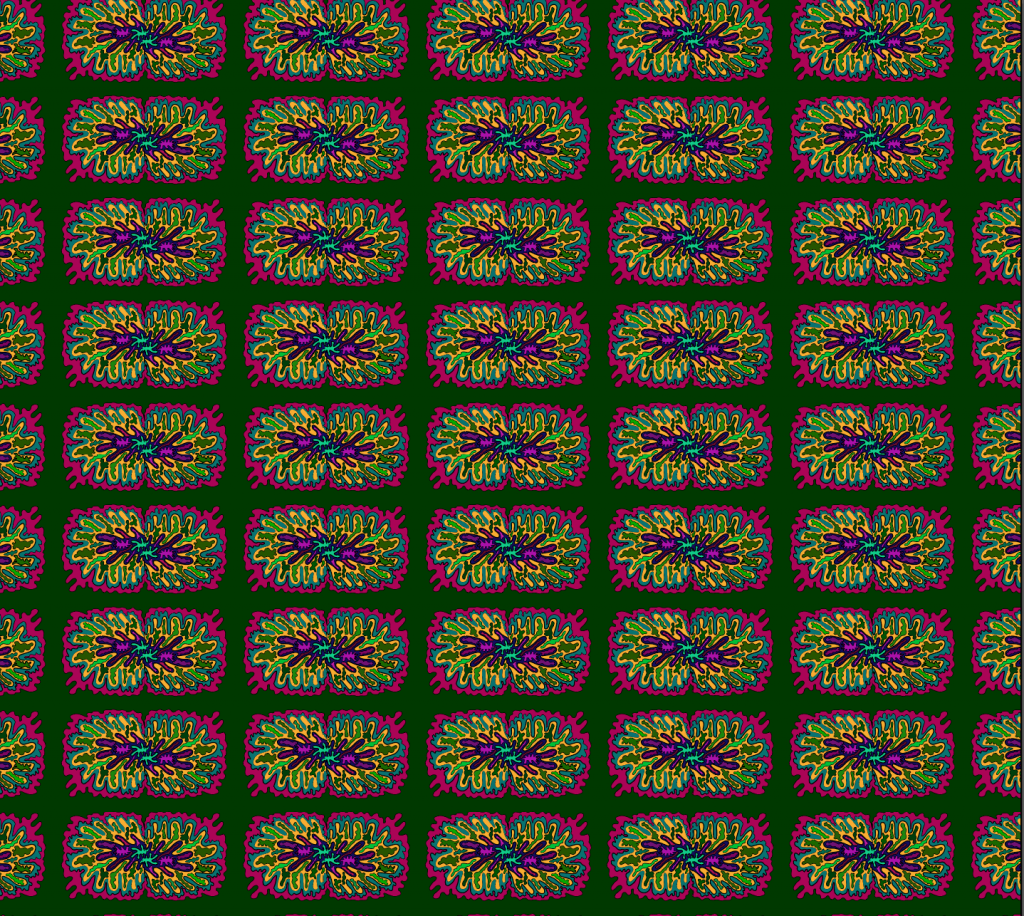
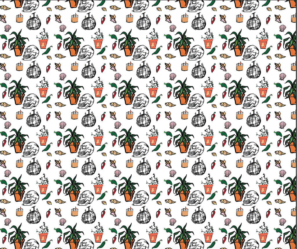
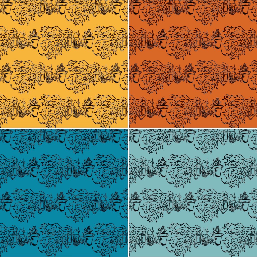
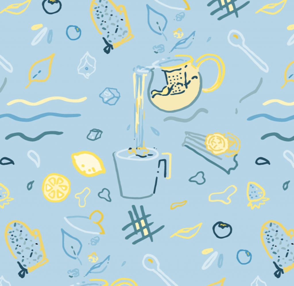
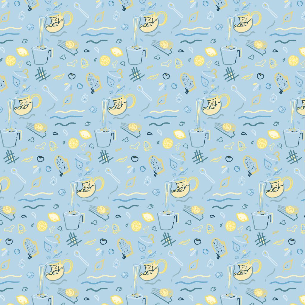
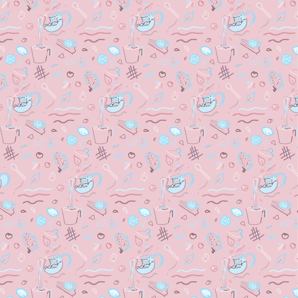
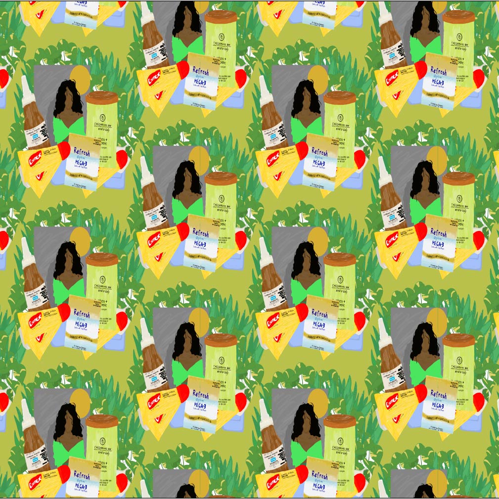
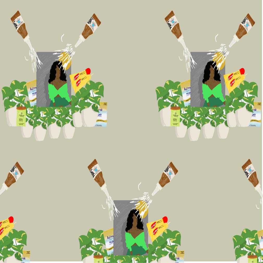
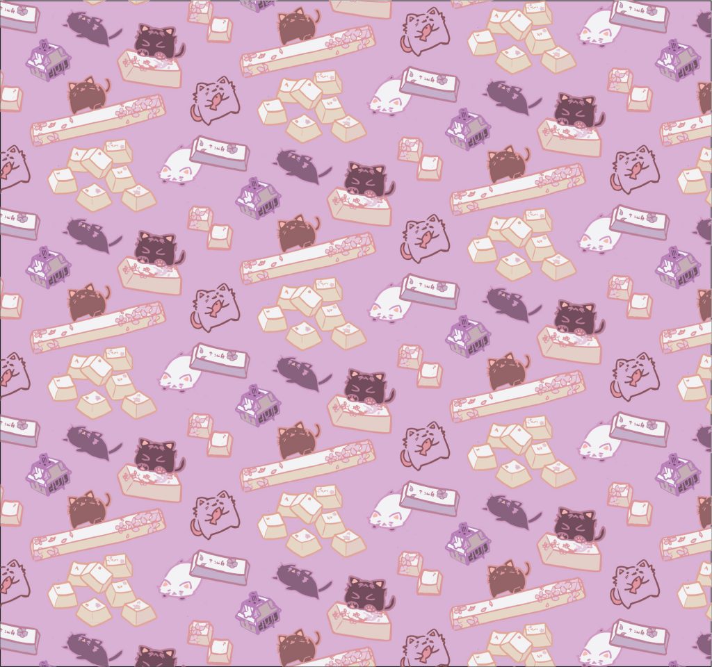
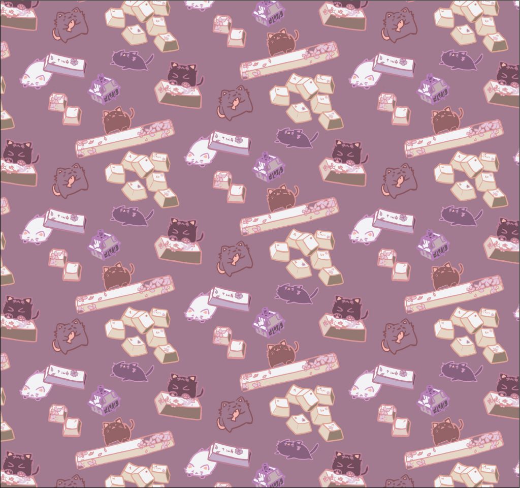
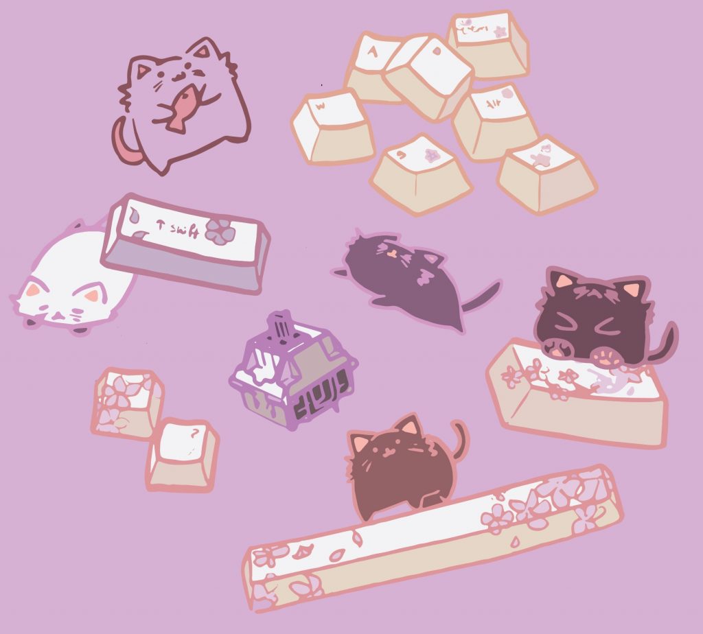
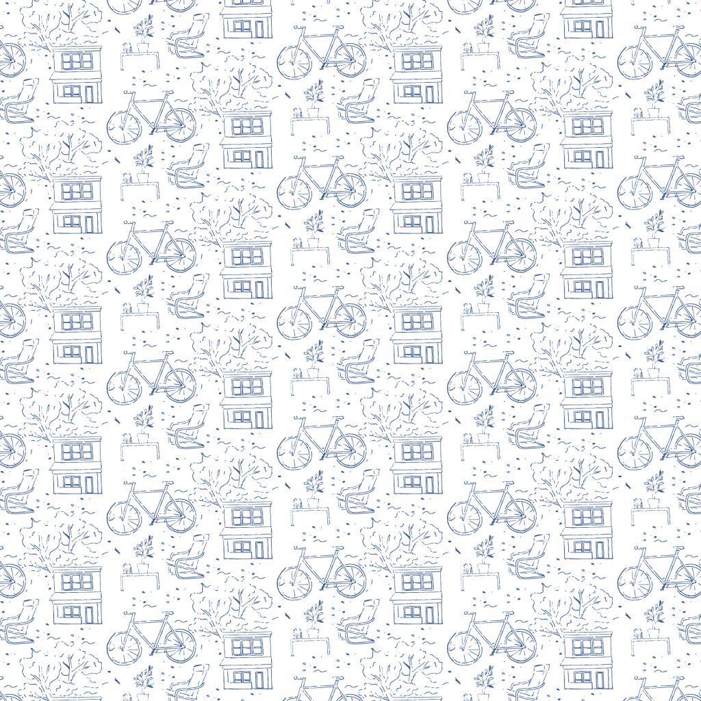
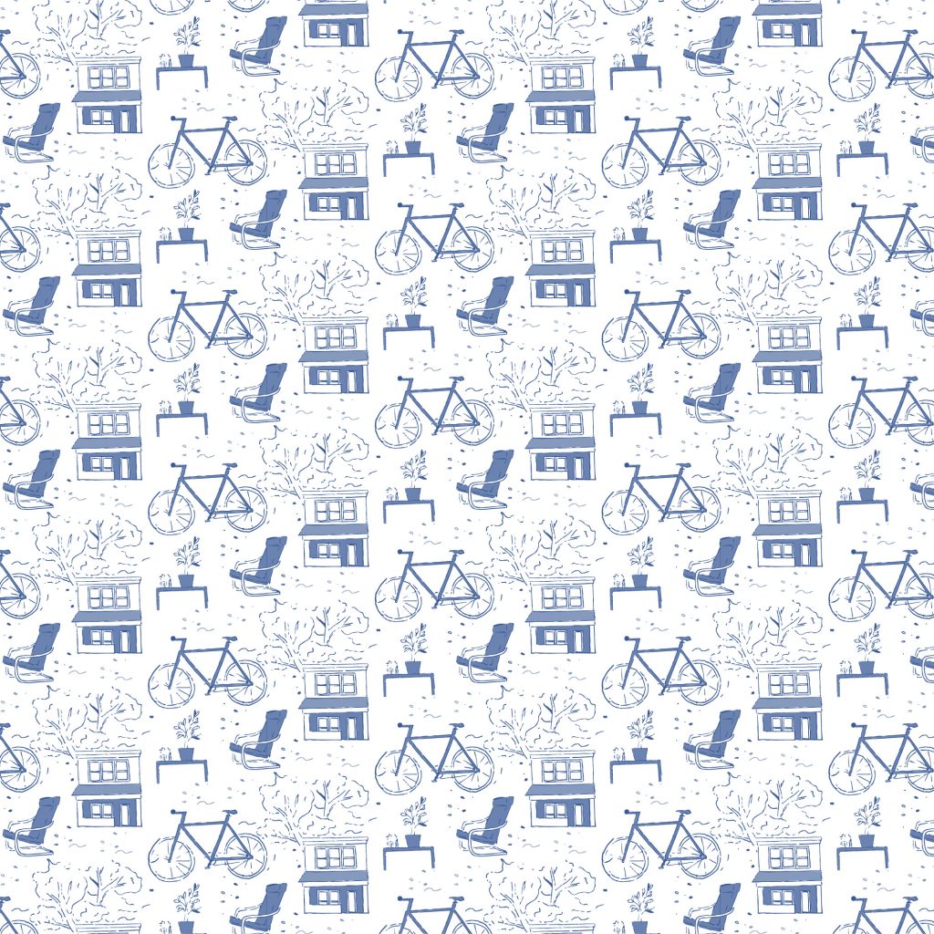
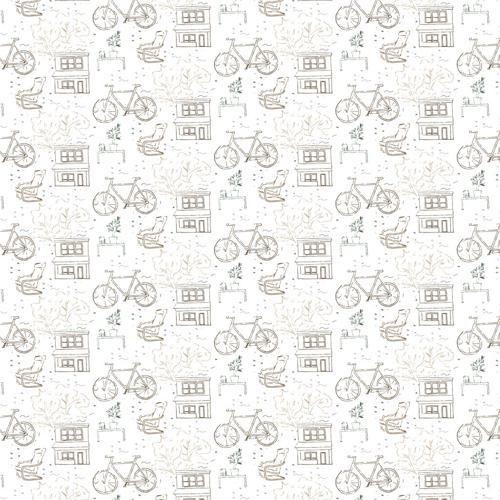
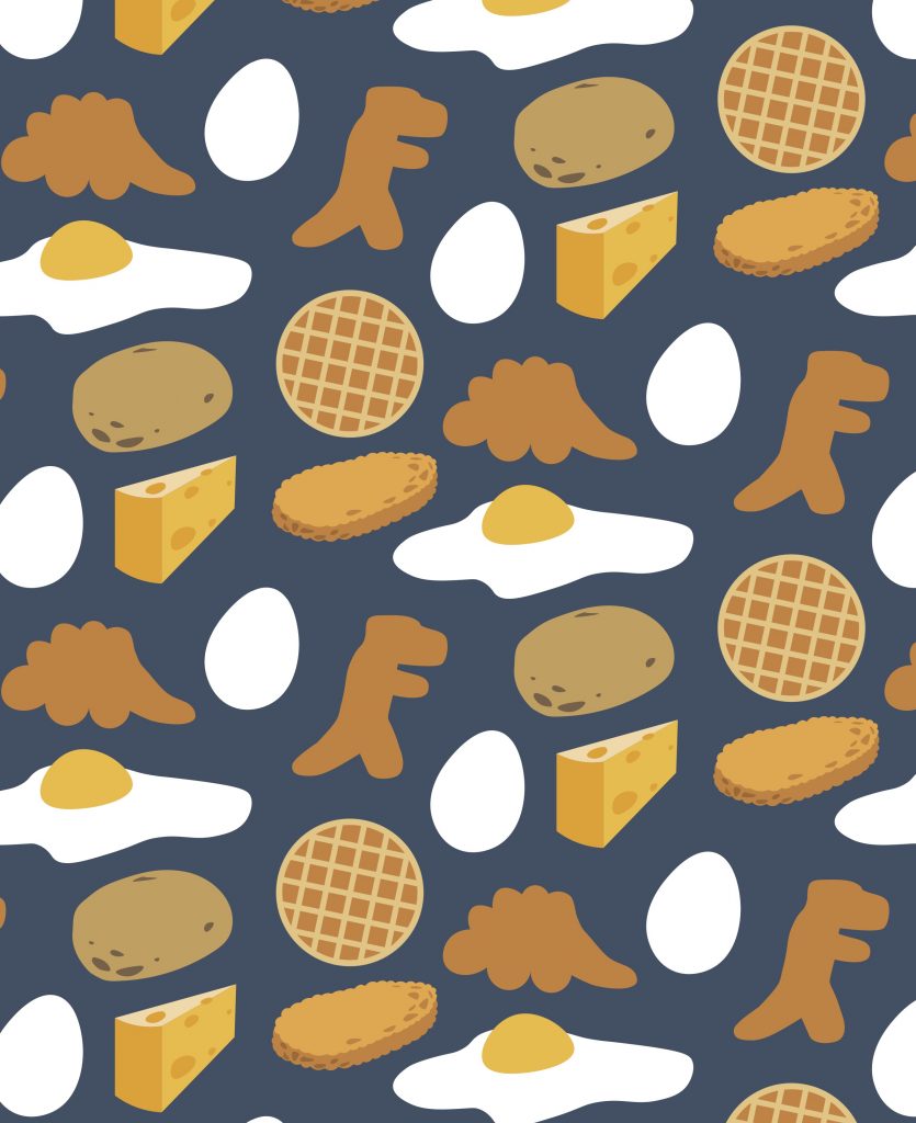
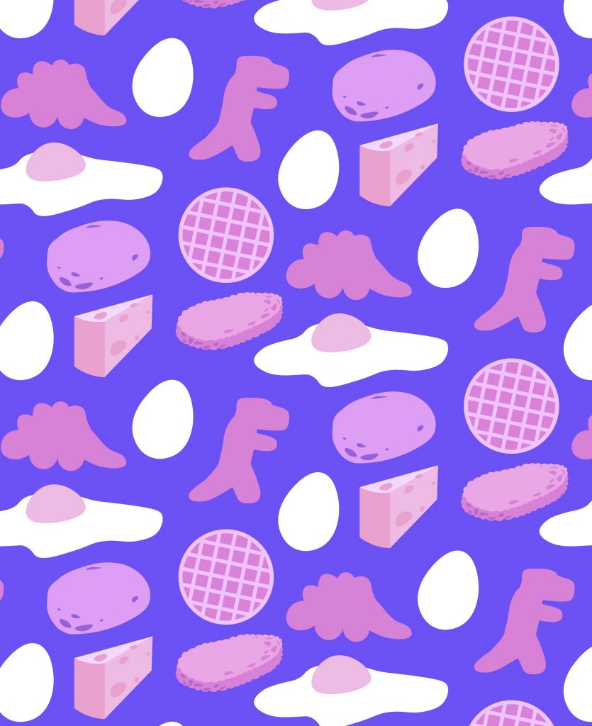
I ended up using this digital repeat the represented the things around me in my life right now. All of my friends really love all these kinds of foods so I associate many people with the food displayed above. The first color way I used was more normal and highlighted the food in the front. The second color way uses more pastel colors that makes the food a little less appetizing but creates a very different tone.

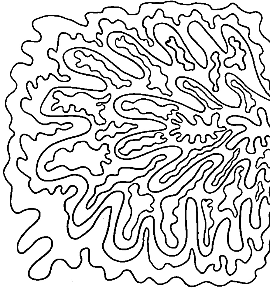
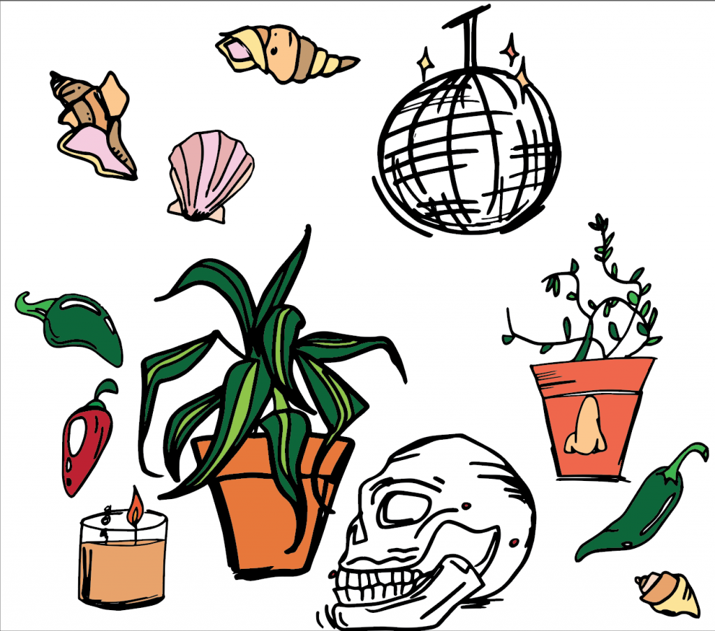
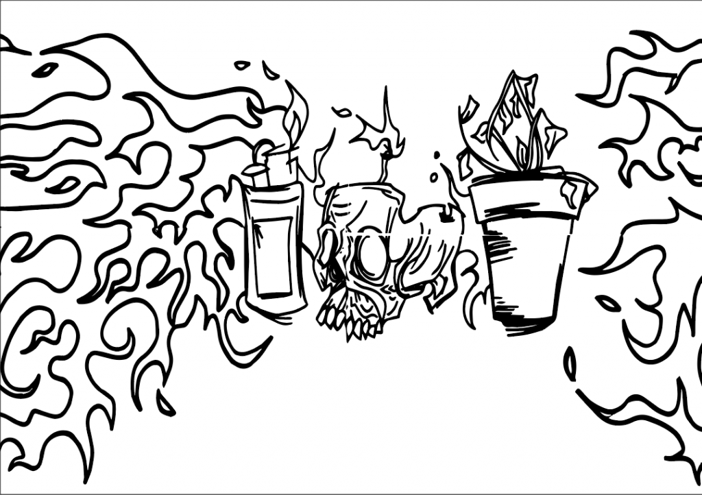
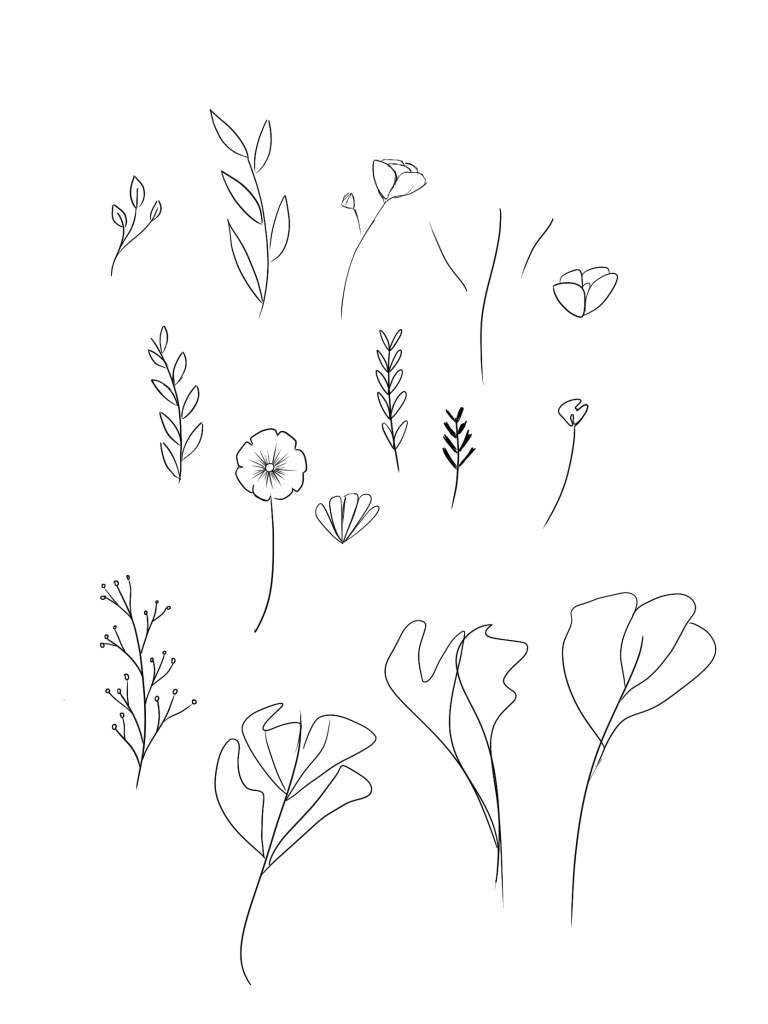
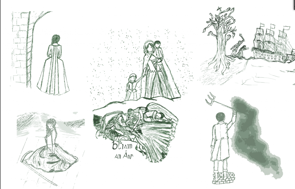
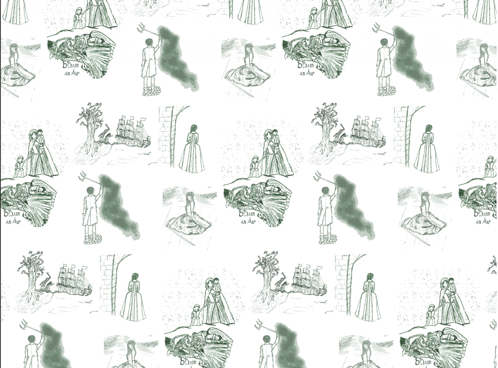
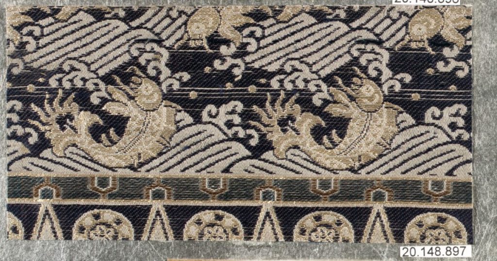
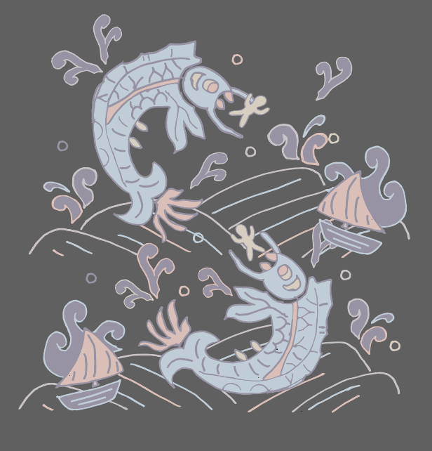
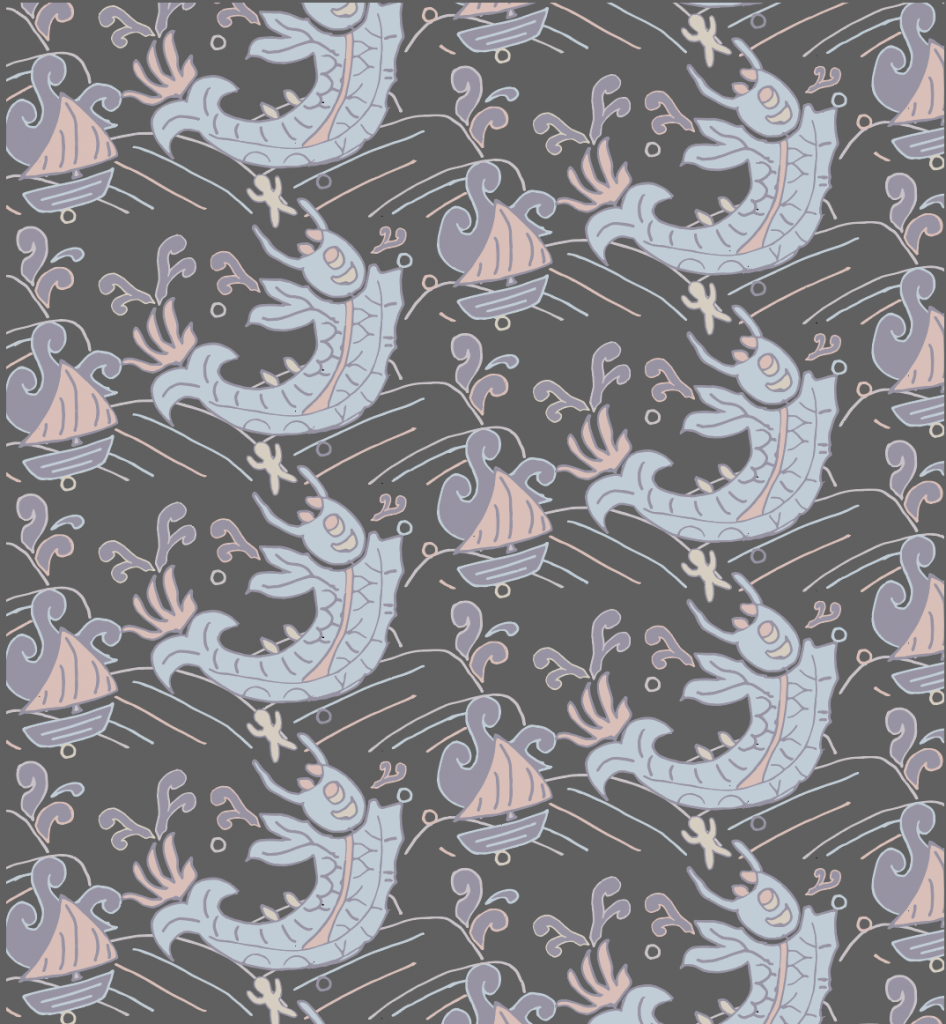
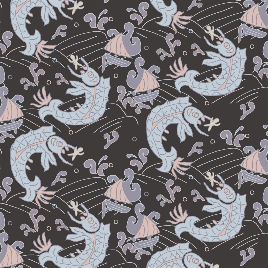
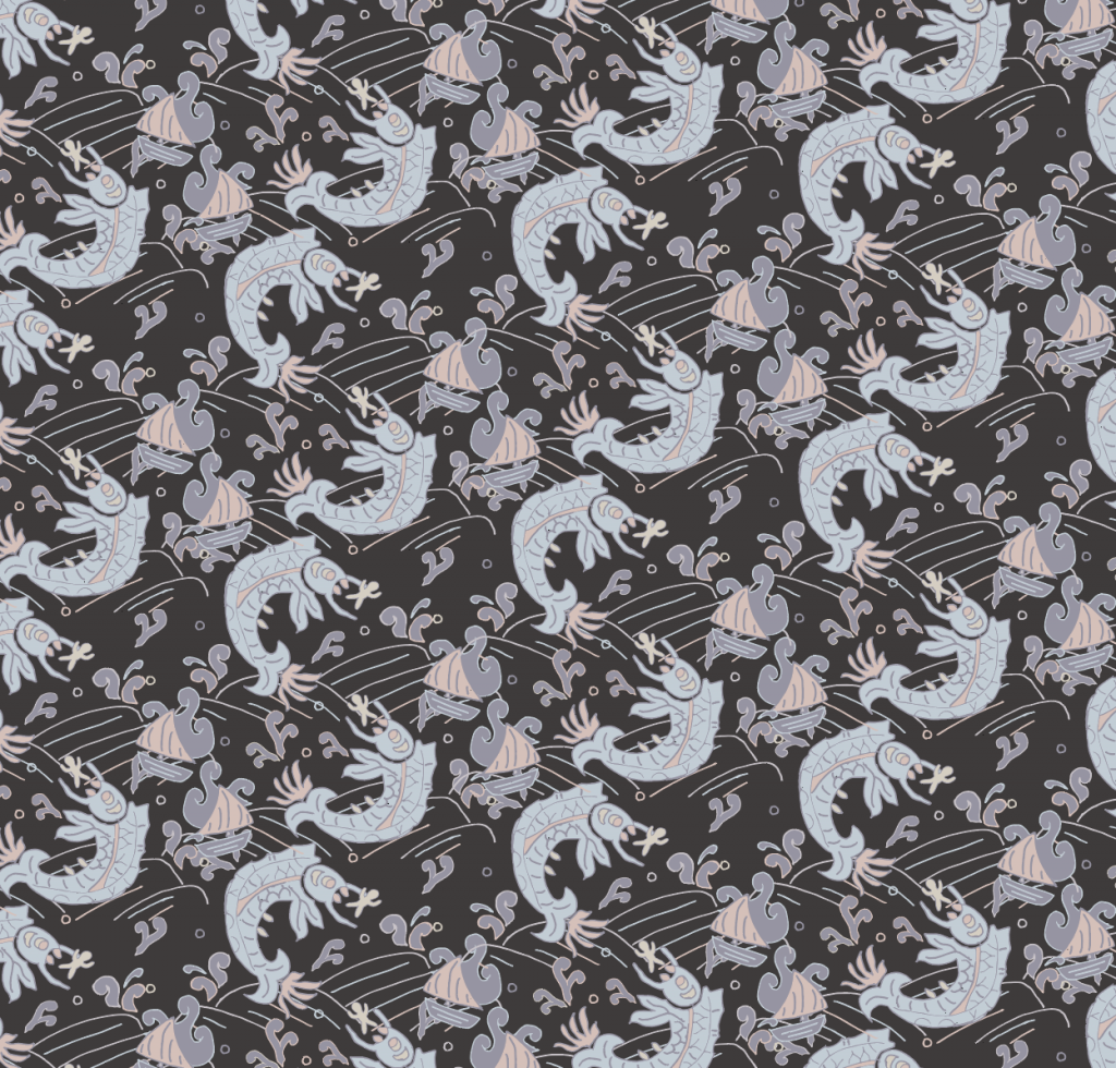
I used vectors to create all of my drawings so I do not have intermediate sketches for them. However, figuring out how to use vector graphics and adjust shapes was very exciting and I hope to explore that more.

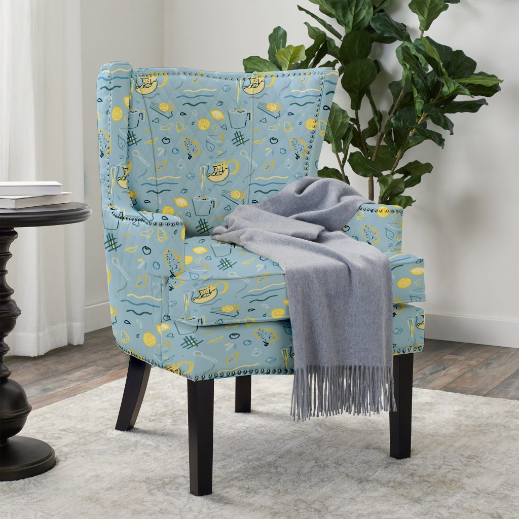
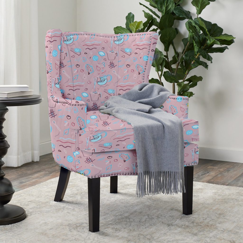
This print could be a blanket that I give to my friends within that friend group. Since we all associate each other with these foods, having matching blankets could be a very cute idea. Furthermore, this could be a wallpaper within a nursery since the print is more playful and child-like especially with the dinosaurs.

Digital Repeat Pattern – Jesse Wallace

After initially getting stuck on my repeat pattern work, I managed to teach myself some illustrator skills while completing a bright and abstract pattern that I am really happy with. The process is shown below, starting with my initial sketch:

Initial sketching

I wanted this project to be more abstract and bright, and I wanted the audience to interpret this in a less concrete way. This pattern isn’t a direct one from my surroundings, but instead the energy it exudes represents the energy of my apartment and the people I live with – absolute chaos. The colors emphasize this even more:

Final design

The next step was to pattern this design, which is shown below in various sizes:

Pattern 1
Pattern 2

This project was exciting to me because I learned how to implement a design like this. I also felt as if this more abstract piece captures the bright and chaotic energy that I am lucky enough to say surrounds me in life.

Digital Repeat Pattern 3- Marissa

Final Vector Images

I wanted to create a pattern that had more overlap and integration between each repeated piece. I made new sketches drawing inspiration from my apartment including the potted plants on my windowsill, the decorative shells on my bookshelf, and the halloween lights that have become a staple wall decoration. I then colored and arranged these vector components in an effort to blend feelings of stress and release.

Pandemic! At The Disco Final Pattern

My environment has become both a place to take exams and to relax. It’s a place to seriously work and to seriously socialize. It can be both overwhelming and comforting, and the objects and colors I chose to repeat convey this duality. I also played around with the placement of my components in order to make the best use space and to create additional patterns. I can see this pattern working nicely as a tablecloth that complements my surroundings.

Skull Candle & Dying Basil Vector Image

I also made a secondary repeat pattern using the technique we first tried in class. I focused on the same elements of my environment as the first pattern, but I cut the new design into 4 squares so that I could create a continuous flame. This effect of this reminds me of the fan airflow pattern we looked at in class, and I was pleased with the final result. I found it challenging to decide how to lay the tiles, but I discovered through trial and error that the Brick by Row tile type allowed me to create the most natural pattern overall.

I’m really enjoying how changing the background from warm to cool colors shifts the energy of the pattern. I think this pattern would work well on a bandana or other wearable.

Completed Digital Repeat Pattern – Kimberly

After doing the first swatches, the more I looked at my pattern, the more I disliked it which led me to starting over. I was inspired by a bouquet of flowers and the somewhat “sketchy” art style that I really love.

The following photo were my starting elements for the pattern. I left them simple so that I could drag and drop pieces around one another and sort of mismatch leaves and stems.

starting flower and leaf elements

From there, I created a large number of swatches, mixing color schemes and playing with negative spaces/colors. I love the one in the top middle since it’s very toned down, clean, and simple but I had a random stem in the top left of the patter that really bothered me.

swatches from illustrator

My final pattern is that on the bottom right where I was able to fill in the space to create more of a full, meadow effect rather than a bouquet of flowers. This was using a hex by column repeat that allowed me to get each individual swatch very close together.

single block
final print

I can see this being on a planner in Target which is very niche theme but it really does give me that feeling.

Digital Repeat Pattern (Final) – Jasmine

For my digital repeat pattern, I ended up with these two bright colorways.

Close-up
Pattern in blue and yellow
Pattern in blue and pink

Although I had more neutral tones in some of my iterations, I decided that bright colors would be the best way to match some of the excitement in the pattern, with its wavy lines and splashes and floating fruit.

This pattern was created out of objects in my environment, and curated to make a sort of “teatime” pattern, with drinks and snacks. I also imagined how it might look like in use, on an an armchair.

Digital Repeating Pattern

Remi Adeoti

For my Digital Print I decides to pick object that were around me and were keeping me sane.

One thing I enjoyed about this project was my attention to detail with each sketch. Most of the elements in this print are products, so I tried to imitate the fonts and the texture of each element for it to be as realistic as possible. I do wish those details could be more visible so that they could be appreciated more. The image above was my first draft, which I wasn’t satisfied with because it looked super busy and reminded me of a Christmas wreath.

I added slight changes to the elements, for example I included a carmex that was opened and showed the jelly substance that comes out of it and for my nail spray I tried to depict it spraying everywhere to give action to these inanimate objects.

Another challenge I found was the significant effect spacing and order had. Where I put the elements, how I stacked them onto of each other and the spacing of the pattern really made a difference in what the pattern looked like.

I would probably make this pattern a sticker and put it on my laptop or water bottle because I think its too busy for it to be a wallpaper or something hung up or even worn.

Digital Repeat Pattern – Elle

Here is the final pattern of my Toile, colored in the second colorway. In the end I did 5 vingettes of the 1740 famine, two of individuals, two of actual loss of food, and one of the lives lost.

The top left shows a member of the Protestant Ascendency turning their backs on the after, top right shows food from Ireland being shipped away by the England, lower left shows an empty field come time to harvest, and lower right shows a individual rioting in Dublin. At the center is a mass grave below the snow, with a mother and her children walking past. The gaeliege text, “Bliain an Air”, is what the Irish called the famine – “The Great Slaughter”

Digital Repeat Pattern (Final) – Annie

I had decided to go the third prompt: drawing from my surroundings. I had recently got a mechanical keyboard, and decided to base my ideas off of that. The fat cats are based off of cats of a youtuber who I was watching while doing this assignment.

Choosing a color scheme was especially difficult, since I had wanted to make each cat unique in their own way, but I still wanted to stick to a bit more monotonous color scheme. I am a bit iffy about the shading though, since it was difficult to get certain patches colored in properly. I also wanted to give this a more cartoonish feel, so the line widths of the keys and the designs of the cats were chosen specifically to match that. I feel like overall, the calmer scheme of what I was aiming for definitely worked.

Since the review, I added a background color and integrated the cats and the keycaps a bit more. One of the color patterns is much more subdued and darker, with more shadows on the keys. Meanwhile, the other one is more lighthearted.

In terms of where I might see this, I think this would be really cool on the inside lining of a jacket, maybe on a mask.

digital repeat pattern – maddie

Historical pattern

For my digital repeat pattern, I am interrupting a historical pattern. The pattern above, found in the Met collection, was the inspiration for my pattern. By taking central elements from this historical pattern, I was able to create a similar pattern.

This is the final swatch / block design for my pattern. To “interrupt” the historical pattern, I took key elements like the fish, the waves, and the splashes and added a boat and a person. I added a boat because of the history in mythology of giant sea creatures endangering fishermen and destroying boats.

For the final swatch, I combined these two patterns that I had previously created so that there is more variety throughout the pattern. The pattern on the left is featured essentially the same and the pattern on the right was partially mirrored to create more balance between the two.

sample for print

Once patterned, I put a darker background so that the light pastels pop more. I chose to use a light color scheme to mimic the original historic pattern. I didn’t make the waves a solid color so that the darkness could be seen more and bring out the contrast with the lightness much more.

larger scale of pattern

I wanted to make the two patterns more offset from each other, but I found that making the block offset did not work when I went to create a pattern. I also had a little bit of trouble trying to fill some of the blank space in the top right corner of the swatch. In the end, I added another little splash in the corner to fill the negative space. Overall, I am happy with how the pattern turned out :))

Digital Repeat Pattern – Rachel

My digital repeat pattern is of things drawn from my environment of my past couple of months being home. I have my house in Pittsburgh with the huge tree that blocks my window, my bike which I have been riding more since quarantine, and a lounge chair in front of a table of plants where I sit to work sometimes. This pattern is envisioned to be for wallpaper, or possibly someone’s (my) bedsheets?

Original hand sketch
Digital Swatches

There are three color patterns- the first two using the blue often found on fine China, and other of fall colors as my choice of color palettes but is easily adaptable. The pattern was designed for a brick pattern, that way the objects in the pattern fit together better. The leaves help fill in the gaps as well.

Looks like a sketch, not filled in for a more subtle look on walls
Objects starting to be filled in for a stronger pattern
Outline with fall colors, maybe the pattern for a notebook

Even though I had been using Adobe Illustrator for 4 years now, this was my first time making a pattern! It was not as hard as I thought it would be, and will be using this skill more often.

Render of the wallpaper pattern in a restaurant