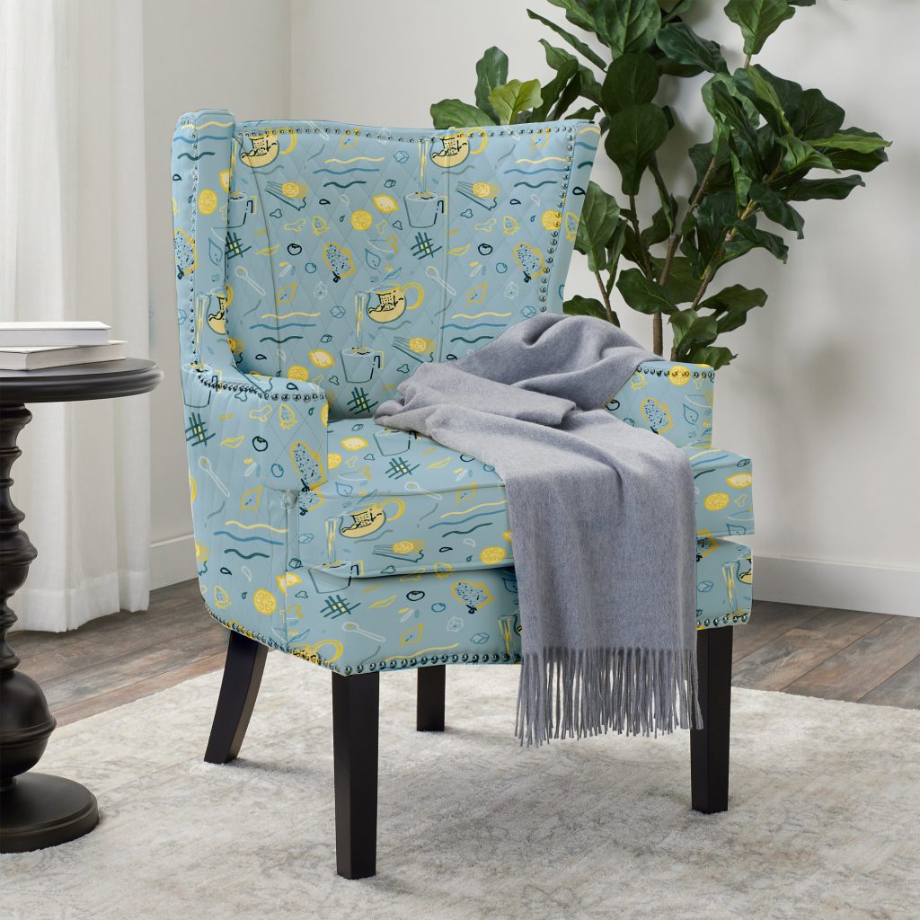
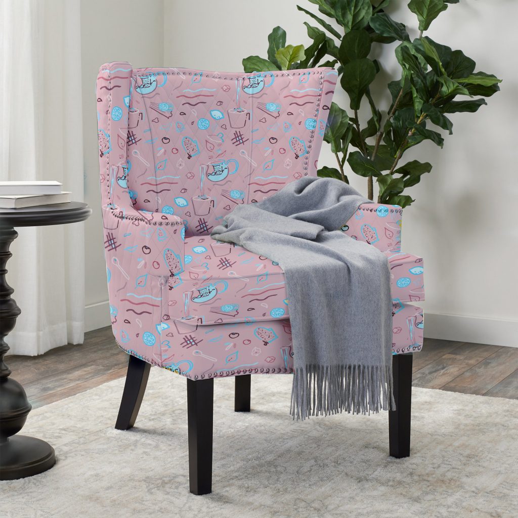
For my digital repeat pattern, I ended up with these two bright colorways.
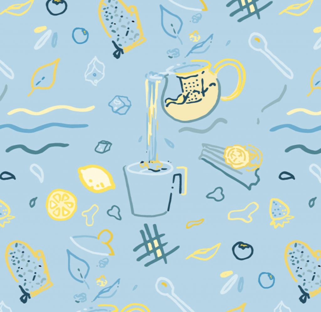
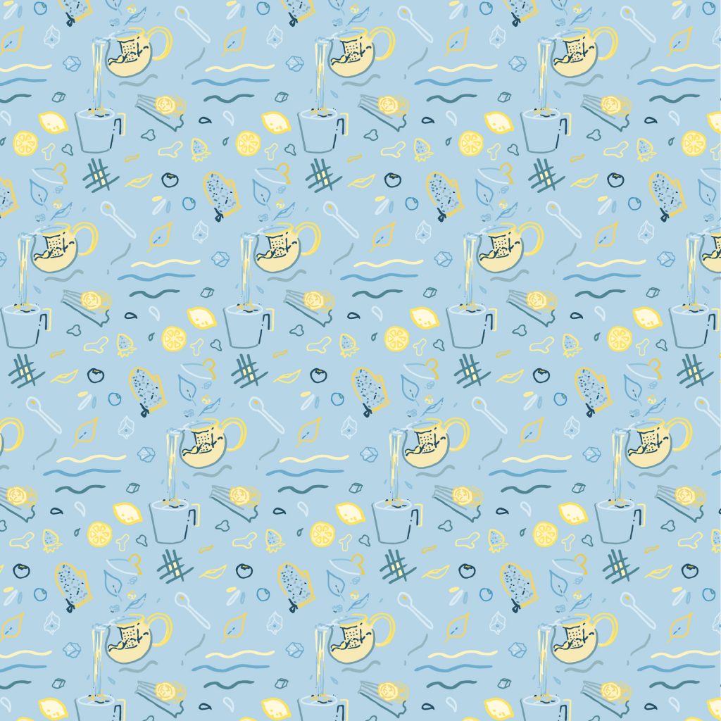
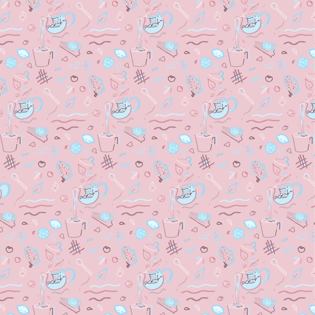
Although I had more neutral tones in some of my iterations, I decided that bright colors would be the best way to match some of the excitement in the pattern, with its wavy lines and splashes and floating fruit.
This pattern was created out of objects in my environment, and curated to make a sort of “teatime” pattern, with drinks and snacks. I also imagined how it might look like in use, on an an armchair.

