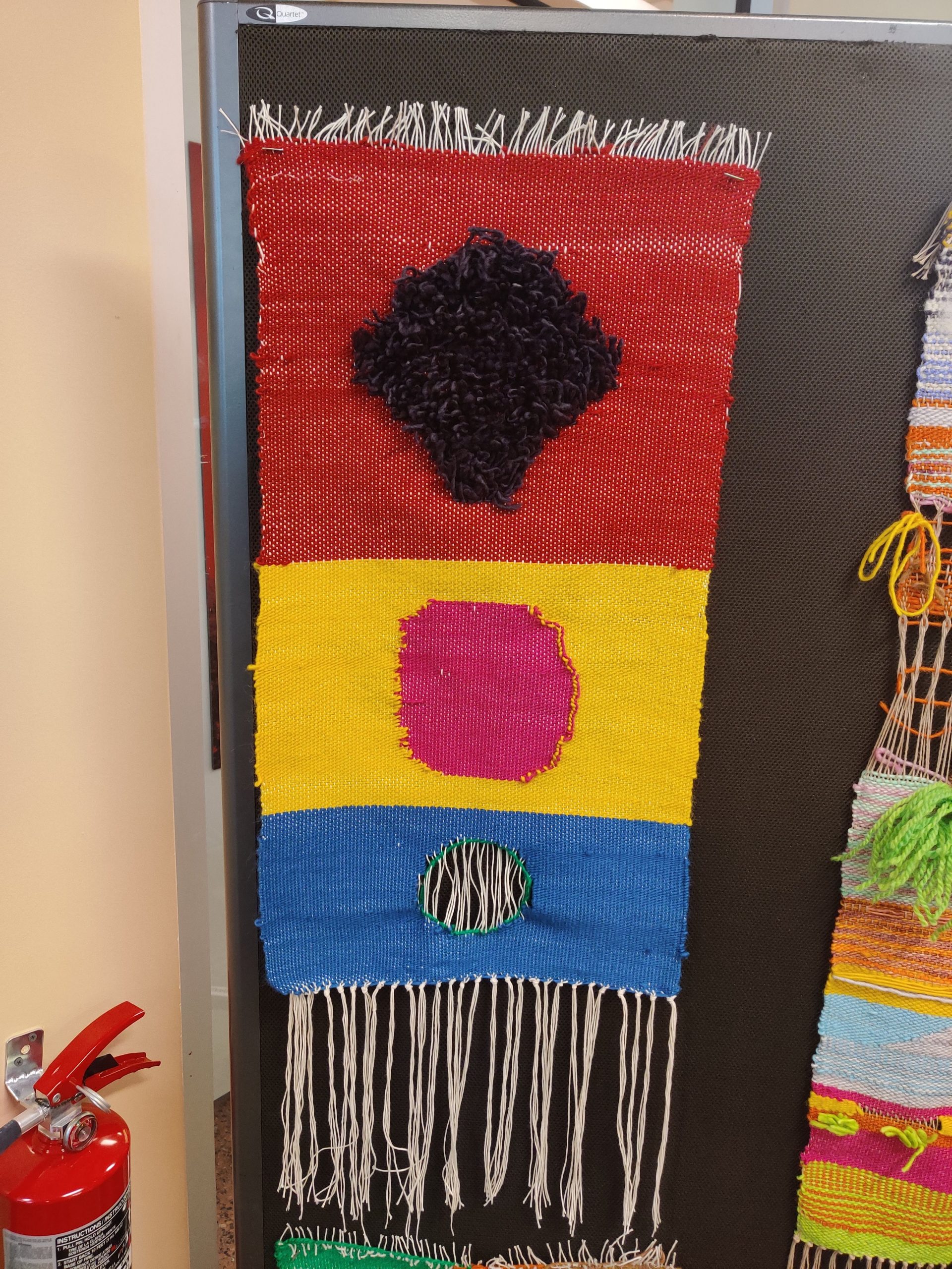
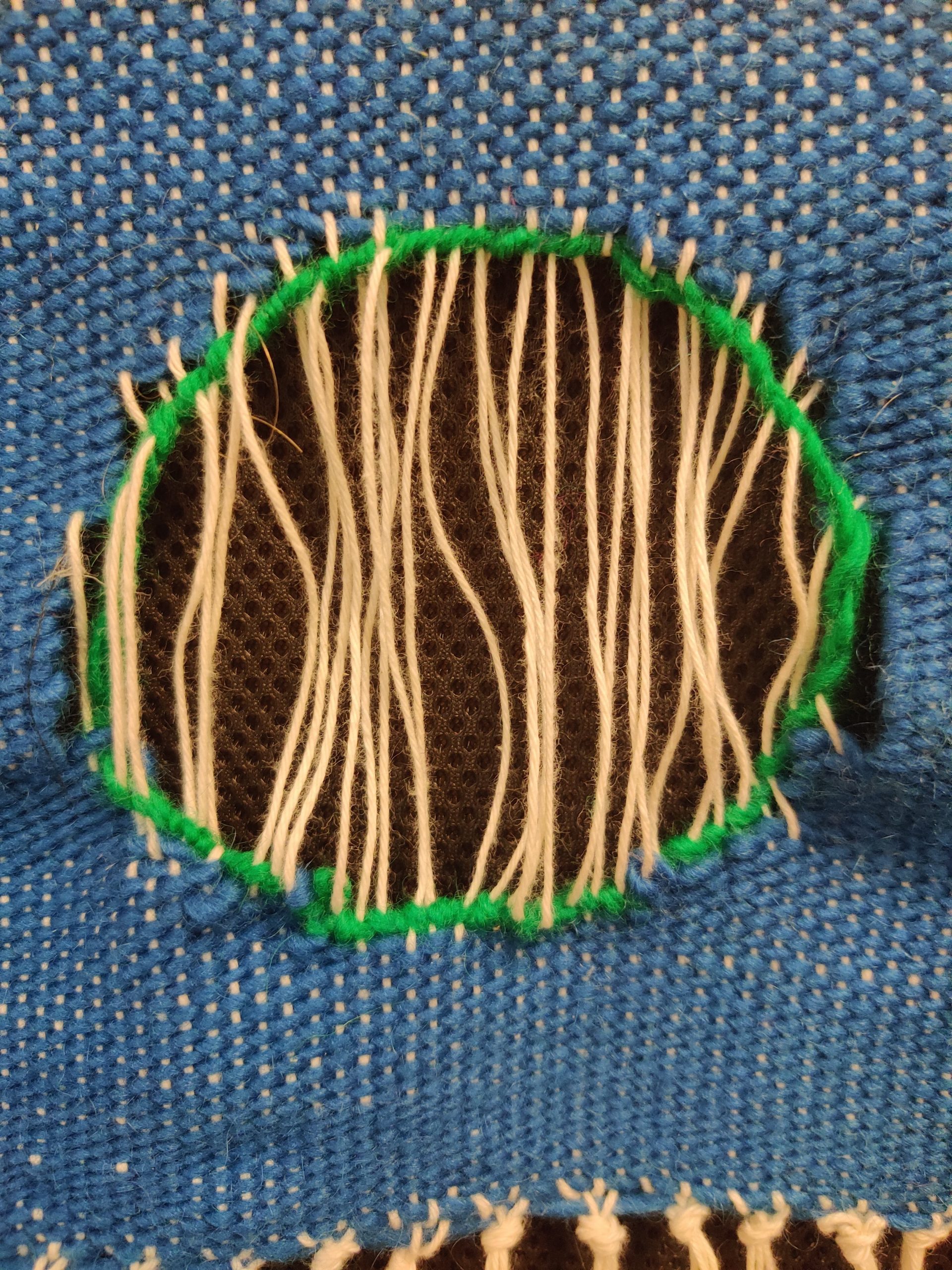
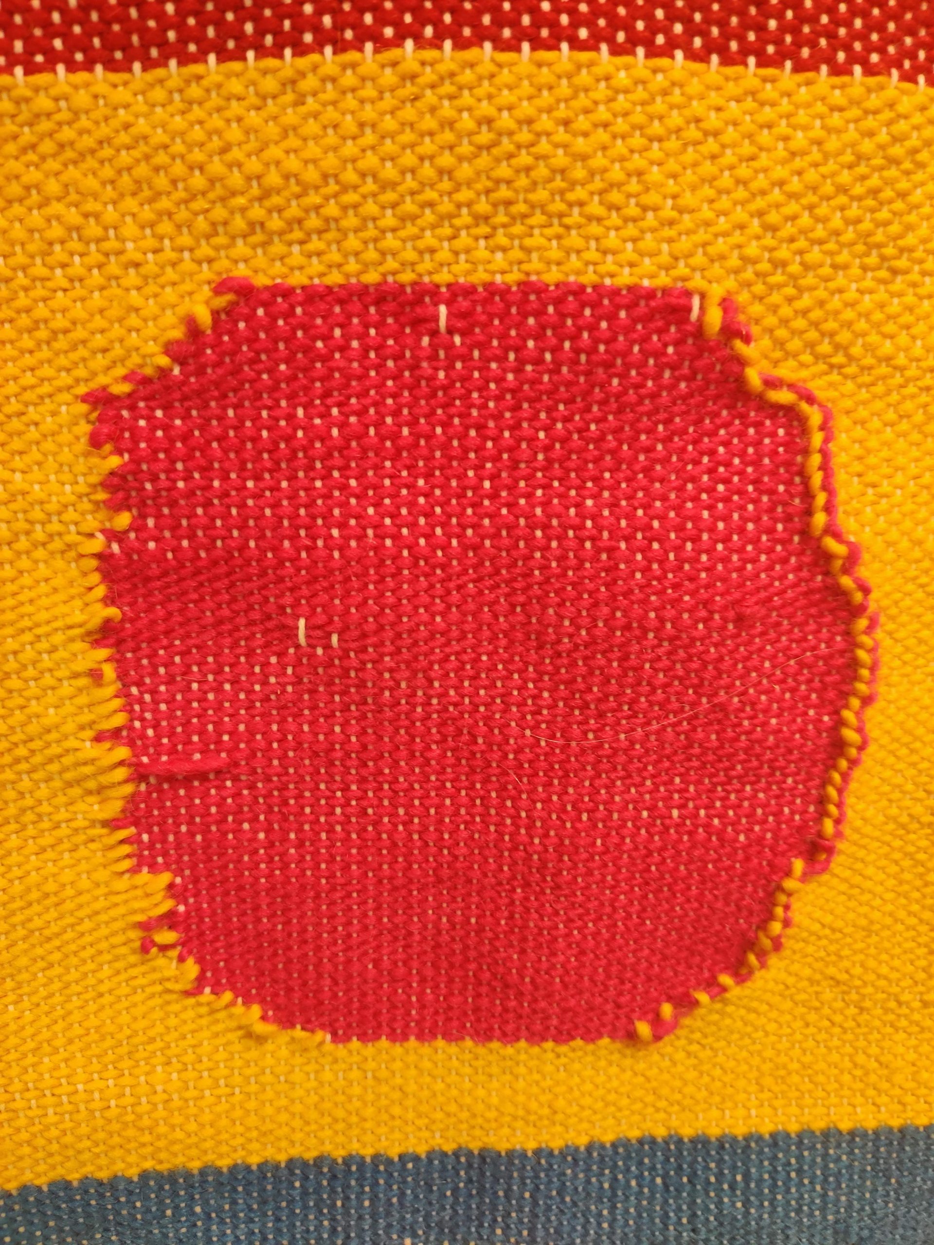
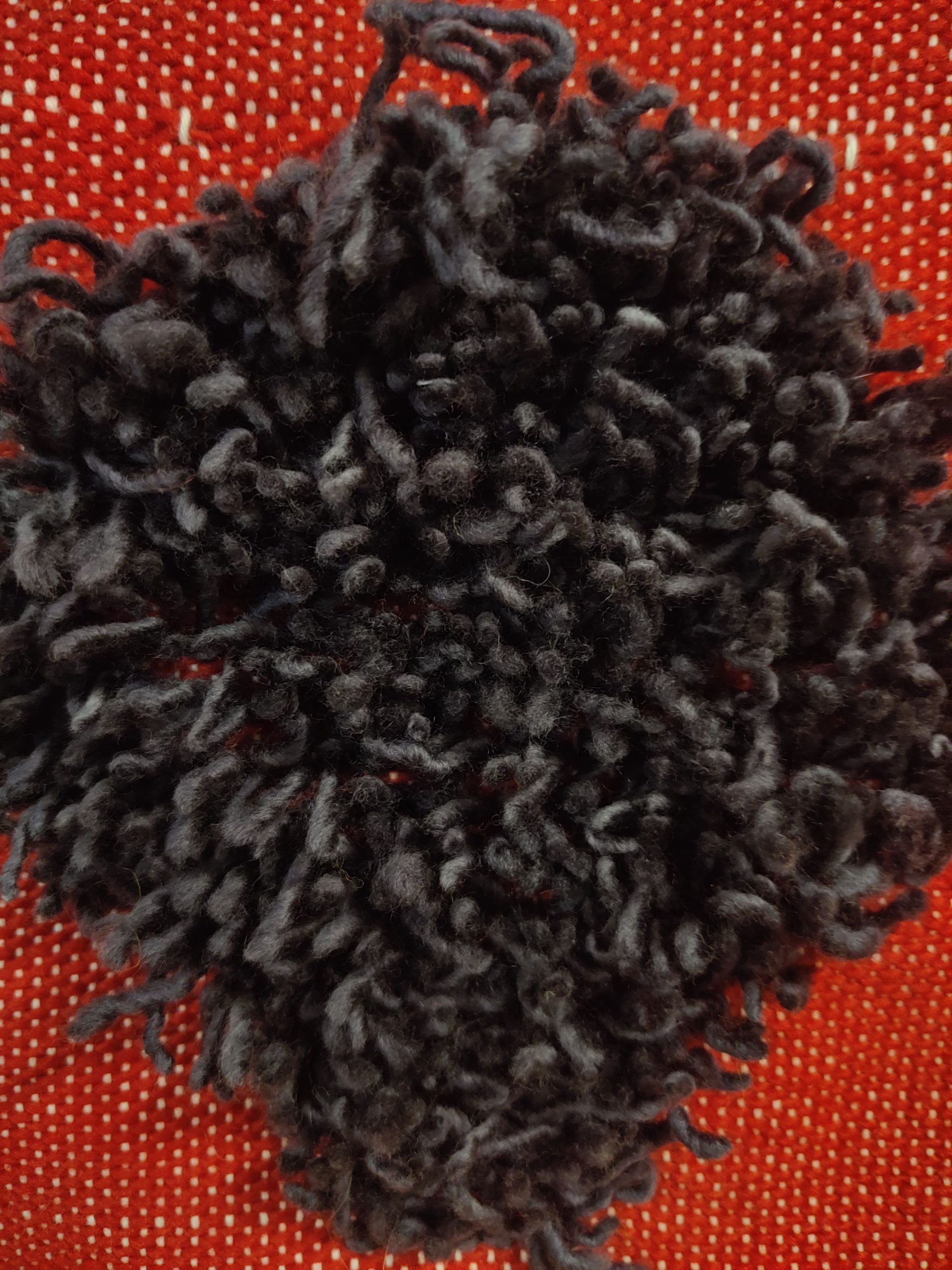
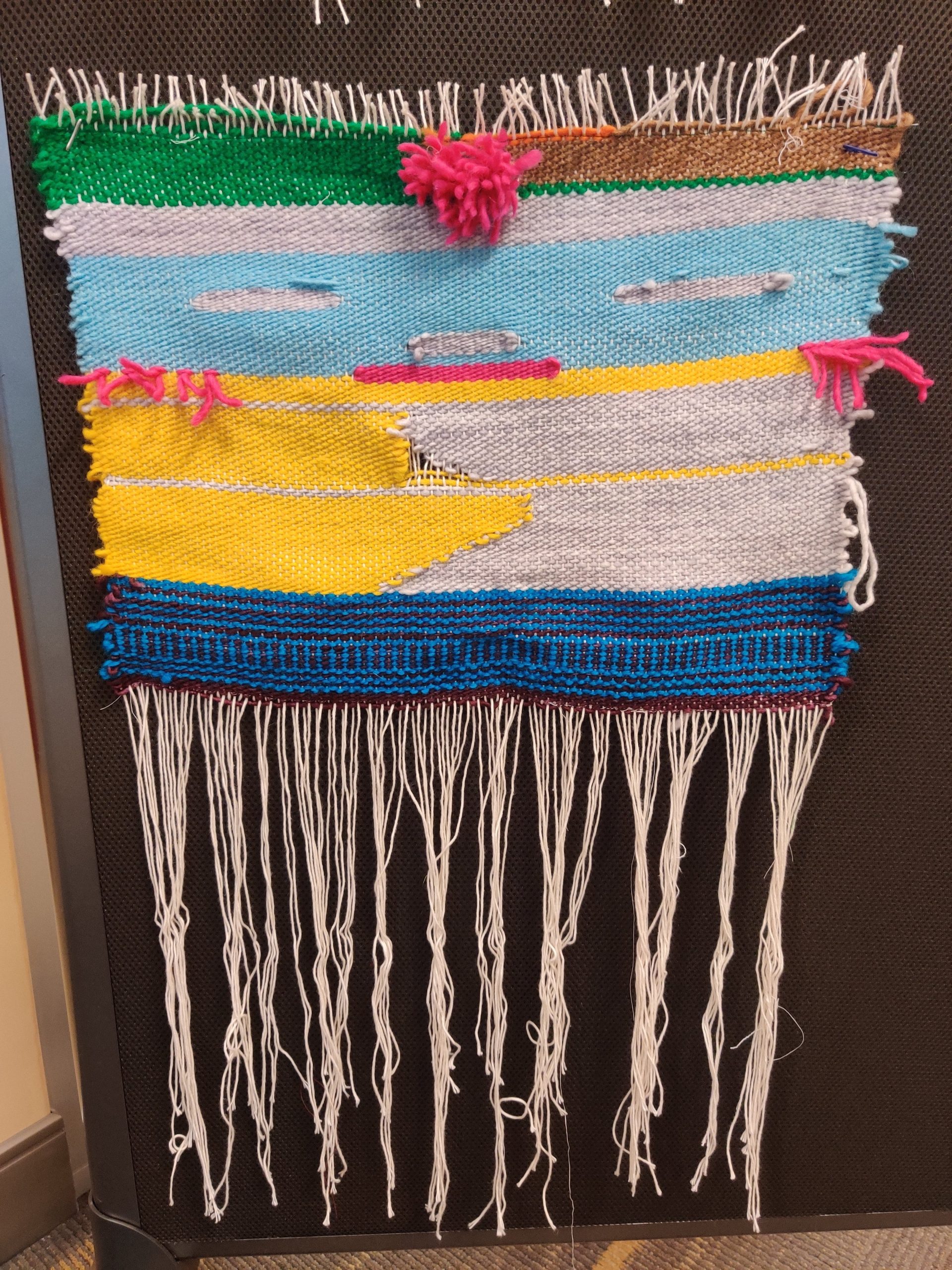
During the experimental portion of the project, when I was getting a feel for weaving and what I liked about it, I especially enjoyed the contrast that you could make with the dyed wool. This helped clarify what I wanted to do for my final piece, which would highlight contrasting color fields that each featured a different method of weaving I particularly enjoyed. I wanted to create a 3D effect with the rya knots in the first field, jumping out of the page in a mess. Then, I moved towards the flat interlocked section and eventually a window through the piece.
I think that the contrast between the sections worked well, especially when coupled with the different methods of making a circle (rya, flat, window). I think this works well because the sections are clear cut and each have their own feeling/brightness to them. However, I think I would put more thought into the solid fields in the future and possibly try a pattern like horizontal/vertical stripes within them. Also, my “circles” didn’t exactly look like circles and I would’ve liked them to be more planned out.
From doing this project I have a greater appreciation for clean lines/perfection in professional weavings. Even the smallest mistake, like not having a tight selvedge or skipping a warp had a permanent impact that was hard to fix after moving forward a few lines. In the future, I think I would like to explore more with different techniques and using the warps in interesting ways rather than hiding them.
FIVE DIRECTIONS
- Different shapes, possibly hearts or stars in the middle of the fields rather than circles
- Swap out colors of warps to highlight the window portion/multicolor possibilities
- Eliminate the sections in favor of a gradient with shortening rya knots going to flat interlocking to a widening window that eventually takes up the whole loom
- Change colors to be less contrasting and more complementary/pleasing to the eye
- Alter the window portion to have a weblike structure “supporting” it, sectioning off parts of the warps like Jennifer’s piece that go towards the center window
