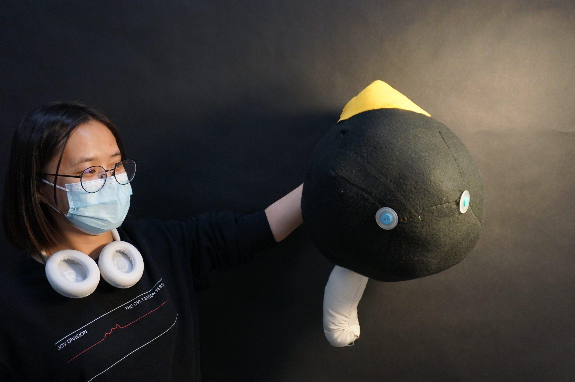
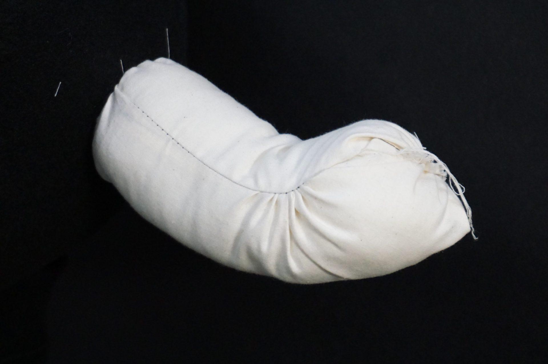
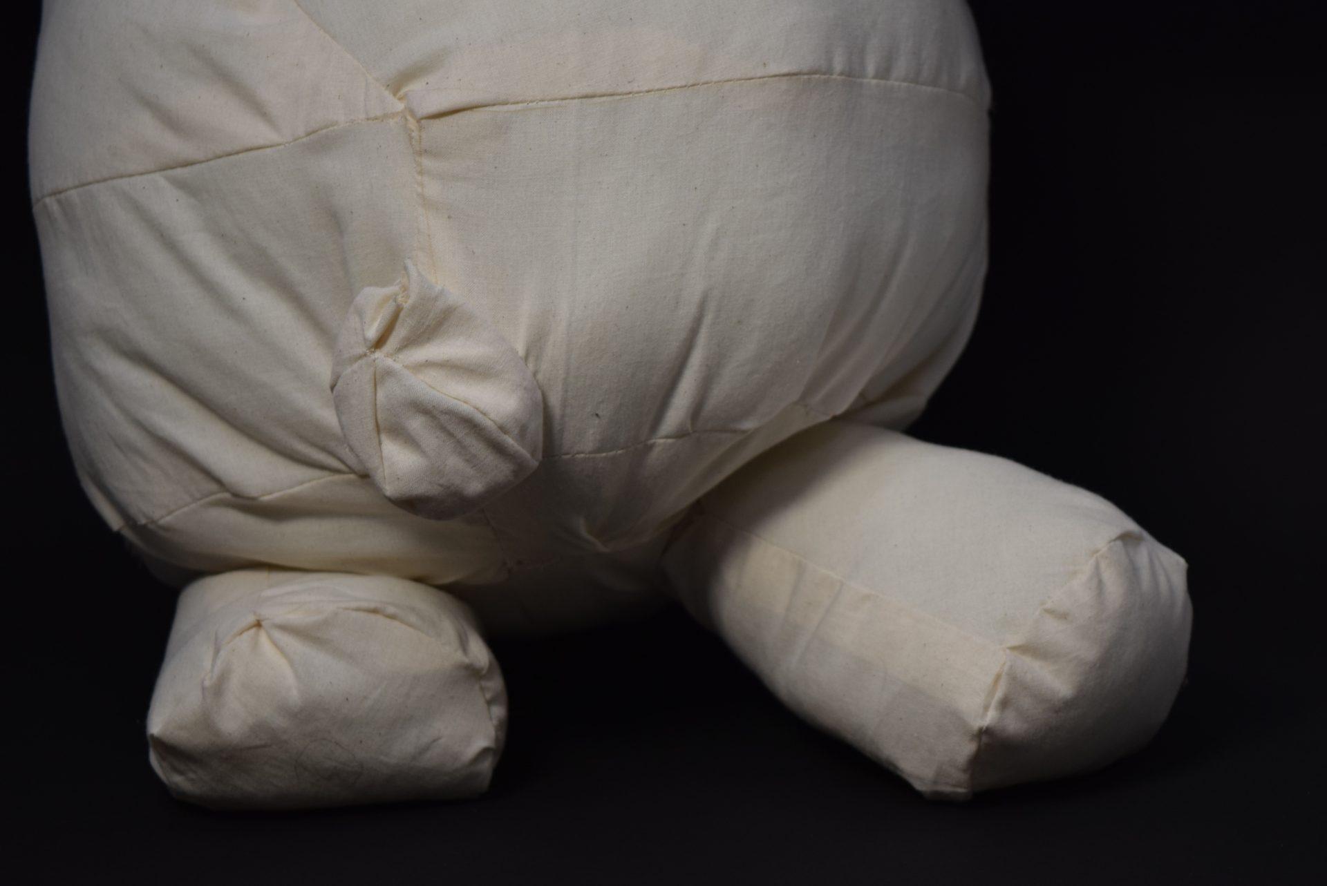
This first object takes a primary form of a sphere. I added a yellow ‘hat’ at the very top and a white ‘tail’ at the bottom. The white ‘tail’ is supposed to have some curvature in itself to make it look more interesting. I put two pieces of rectangular shape fabric together, with one piece much shorter then the other one. It turns out to have some curvature when the object is set on a table. When lifting in the air, however, the curvature is not as obvious. A possible improvement can be made by putting wires inside the white ‘tail’ part so it stays rigid and the audience could interact with the ‘tail’ by bending it. Two ‘eyes’ are sewed on to the black sphere. That is where I closed the whole object. It is interesting because I was not thinking to have them look like ‘eyes’. Lots of people commented that this object looks like a penguin. I might work towards that direction in the future.
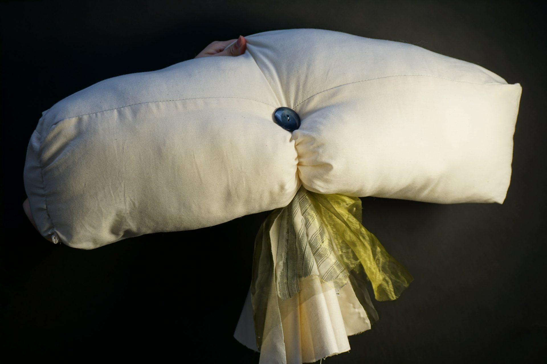
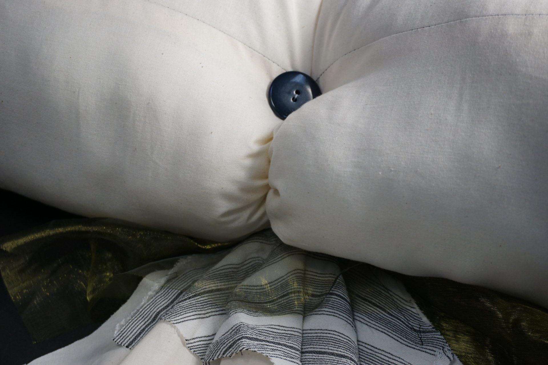
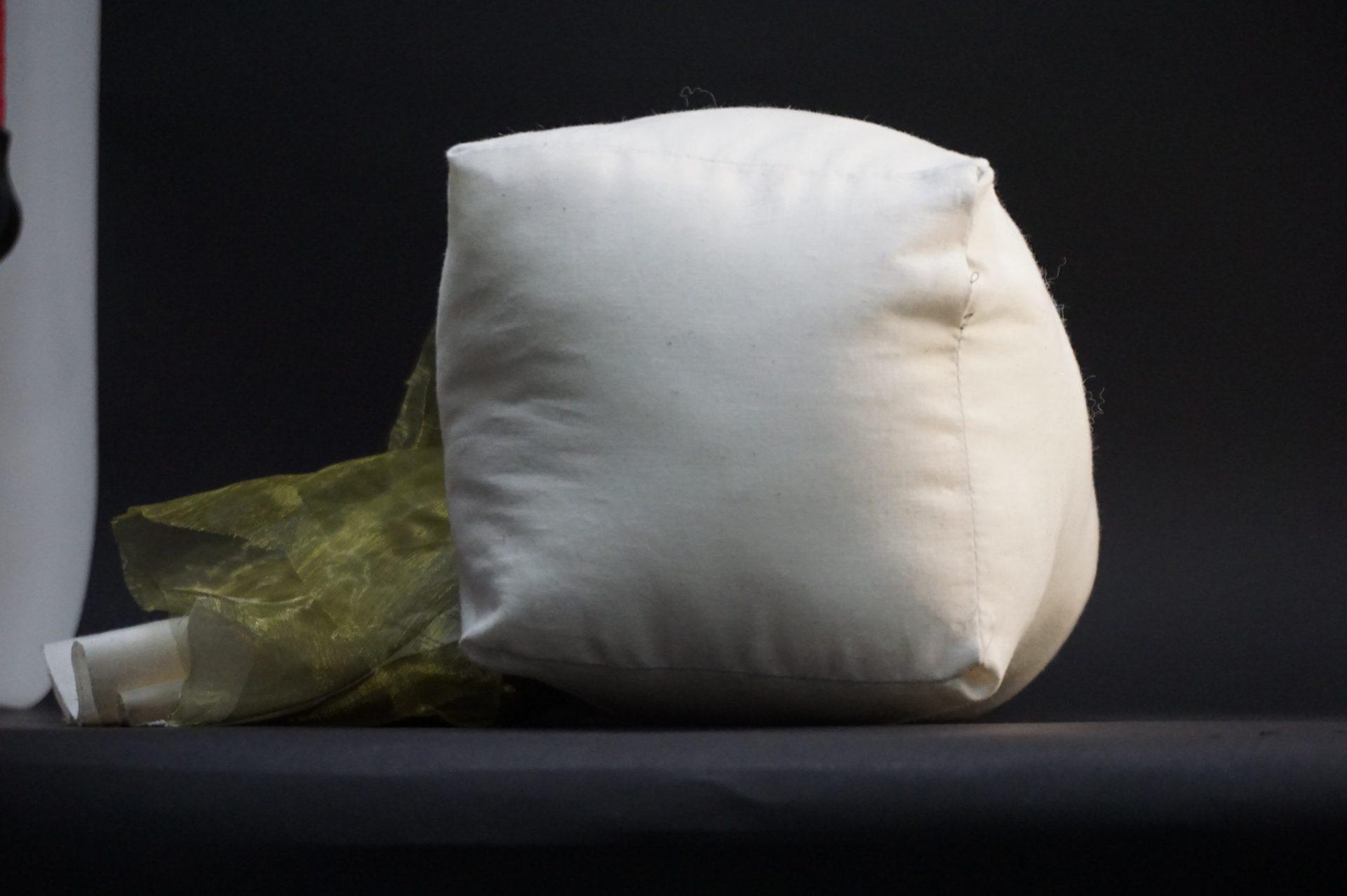
The second object is my favorite. It takes a rectangular shape as its primary shape. I put three layer of different fabrics together to make two wrinkling pieces. It probably does not turn out well because the wrinkling effect I want to have is not very obvious. For further improvement, I could iron those fabrics first and sew them afterwards. I then attach these two pieces on to the primary shape and pulled it with a strong string. The button was attached later on to the knot where that strong string came through. My favorite part about this object is that two attached pieces. I appreciate how the light shines through the green web-like fabric and how its texture differs from the rest. I also like the detail of this one. The wrinkles near the button (picture 3) and the tension at the side (picture 4) show how the fabric deforms under pushing and pulling.
The third one is my Rhino piece. I made a mistake when assembled the bear’s head and body together. Lots of people told me that this mistake was actually interesting and had its own artistic value. Probably it’s because I am an engineer, I find it super hard to convince myself this mistake is not just a mistake. I am so used to build or solve problems with steps and try my best to avoid mistakes. And I definitely should try to work with some randomness and enjoy that. I spent around 7 hours on this object since it had so many pieces. I also lost several pieces so I had to laser cut again to make up for that loss. Some possible improvements can be done in the future: better and more patient sewing, colorfulness, take care of my pieces and so on.

