Looking Outwards 07: Information Visualization

Creator’s name: Stamen
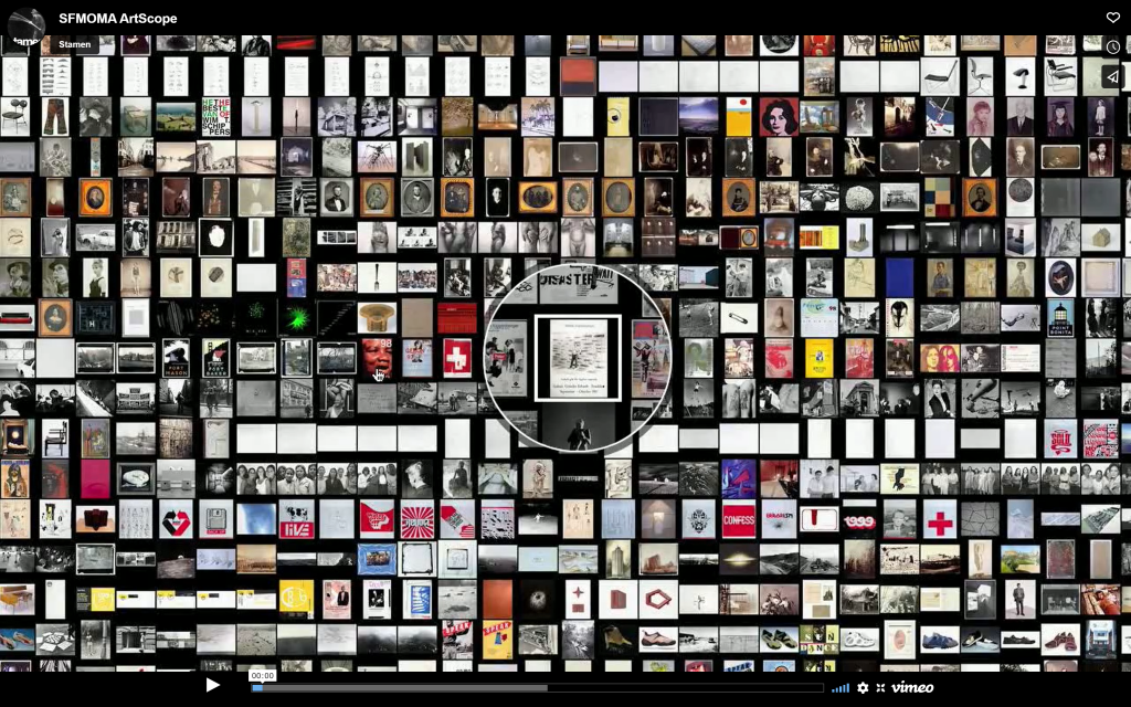
Title of work: SFMoMA Artscope
Year of Creation: 2020

This project by Stamen is an interesting take on a museum map. It maps everything in the San Francisco Museum of Modern Art’s collection through images of the displays that are currently in the museum. Using an interactive mapping technology known as “Modest Maps ”, this software creates a virtual environment where individuals can zoom and pan through artworks that are arranged depending on when and where they were bought to be displayed in the museum. I find this design to be quite a unique way of displaying information organized chronologically. As opposed to a website where the user scrolls down, this format instead creates a much more interactive and easy-to-understand approach. I would assume that the algorithm used to generate this work involves arrays that organize the works by date of purchase. In addition, I would assume that there is another array that considers where the artworks were bought since there must be a way to store such a large amount of information in order to organize it. The designer’s artistic sensibilities are present in this work since it complements their other work to create a cohesive style and approach to visual communication. This style is even present in the design of the website itself.

https://stamen.com/work/sfmoma-artscope/

Screenshot of the map

anabelle’s blog 07

http://manovich.net/index.php/exhibitions/on-broadway

One work I found inspiring was Lev Manovich’s “On Broadway.” It resonated with me for two reasons: one, I’m writing this blog while in NYC (hence, Broadway) and two, I appreciate the lack of numbers and traditional data in the project. Overall, I’m not too big on STEM and mathematics, so this feels like a unique approach that tries to broaden the statistical audience to the average math hating person. I also think this approach was generally successful — anyone who views this gains a comprehensive survey of Manhattan even without the physical data (I mean, I find that when I’m reading actual statistics, I generally gloss over the figures and take away the big idea more than anything else anyways). I also liked this project because I felt as if it was something even I could recreate (albeit on a smaller scale). It seems like a lot of data storage (and we’ve learned about NUMEROUS ways to represent and store data already) and visual representation (and this is a creative computing class!). It’s inspiring to think large projects like this are within my reach

LookingOutwards-07

This week I am looking at the work of Lev Manovich. Manovich is a digital culture theorist, writer, and artist. A lot of his work looks at media and technology. His project On Broadway, is an interactive application and pubic installation piece. The piece looks at data from Broadway in New York City, however, the data is not presented in a normal way with maps, numbers, and charts. In this project numbers are secondary to data in the form of images grabbed from social media and the internet. These images were taken from six months in 2014. The project showed how the city can be represented through the view of the hundreds of thousands of people posting images.

http://manovich.net/index.php/exhibitions/on-broadway
http://on-broadway.nyc/

LookingOutwards-07-UCSF Health Atlas

The UCSF Health Atlas is an online software that visualizes Covid 19 pandemic cases in all the counties in California. I admire its purpose, which is to explore the influence of “socioeconomic and environmental factors” during the pandemics, which means the project is based on census tract at a county level, and it allows us to see the detrimental influence of pandemics with our eyes.

For the Algorithm, I believe that it imports census Datas and data of covid cases into the website. Then the web divides the cases into different data sets on a county level and uses different coloration to represent the severity of the pandemic. The blue the county is on the map, the more covid cases it has, and yellow represents the amount of people who died from the pandemic in that county.

The artistic sensibilities manifest in the final form of a map of blue California that shows the number of the covid cases based on its lightness, because the darker colors mean more cases. I hope it becomes a map of the whole planet in the future, so people all over the world can know when to be cautious about pandemics.

Link: UCSF Health Atlas Author: Collaboration of UCSF School of Medicine Dean’s Office of Population Health and Health Equity led by Debby Oh and Stamen Design Year of Creation: 2020(To my best Knowledge)

Looking Outwards: 07

The Atlas of Moons by National Geography is a mesmerizing set of all the moons currently present in our solar system (which I personally had no idea about). National Geographic is no stranger to beautiful images of the world around us. This visualization is a much-needed reminder of how lucky we are to be able to witness and live amongst something like this in our lifetime. According to National Geographic, our solar system hosts over 200 moons that we currently know of, including our own. The purpose of National Geographic is to broadcast nature and space as we currently know it, making it accessible to the average person. This visualization is scrollable, starting with background information to the various moons that exist in the solar system. Viewers can scroll through, compare, and get lost in space from their own homes.

Looking Outwards-07

I really admired Patricio González Vivo and Jen Lowe’s map “Guayupia”, which is created for their son, and it’s a great example for discovering about data visualization. They think beyond typical standard and restrictions in creating a map: they want to use this map to tell their son where he comes from and the unlikely fact of his existence. So this is a map exploring about culture and history rather than simple numerical information. They explore South America and Argentina history from different aspects, and there are many different components in this map. The thing I found is interesting is that they also make their map become a symbol of culture: they combine stars with human, creatures and god, and they even incorporates the mass migrations of the Tupi-Guarani people.

Lowe uses basic lines and shading to construct this map. They use lines to show star, land and coastline based on history research, shading is used to show migrations. I like the color of this map and how they use uniformed ways to represent different things.

link: http://themapisnot.com/issue-iv-patricio-gonzalez-vivo-jen-lowe

Looking Outwards 07: Information Visualization

Stefanie Posavec created art at the Papworth Hospital, which was an Inpatients Ward. She was commissioned to create artwork that considered the human body and was human-scaled. Most importantly, she wanted it to be calming to patients who had just come out of surgery. I admire her work as she chose to show important computational information through understanding of the heartbeat, breath and lungs, and the blood and blood vessels that connect the two. Then, by incorporating “calming” nature she focused on aesthetics which showed waveforms (which is shown in ocean waves and heartbeats), branching (which is shown in the lungs and trees) etc. This ended up fulfilling the needs of both the patients and the staff as if offered patient privacy as well as a clear line – of-sight for nurses and staff. It was also really cool how she mapped data to concept showing how “medical data relevant to either the heart, lungs, or blood” was used as a ‘seed’ for that floor’s specific artwork.

Link

Stefanie’s Wavelike Art showing the connection between nature and the human body

Looking Outwards 07: Information Visualization

Flight Patterns

http://www.aaronkoblin.com/work/flightpatterns/index.html

Aaron Koblin, Scott Hessels, and Gabriel Dunne

Celestial Mechanics–Flight Patterns

Flight Patterns

The Project is an exploration and visual representation of flight patterns in North America.

What I admire a lot about the project is that the project not only provides status images to show the overall patterns and frequency of flights in different cities but also a video to show the dynamic routes of the flights.

The data used is from Federal Aviation Administration and the Processing programming environment and Adobe After Effects and/or Maya are applied for the visualization and representation of data.

The background is set in black and the flights are set in lighter colors, and the denser the lines or the more frequent the flight routes, the brighter the colors and closer the colors to white. This use of contrast of dark background and light lines creates strong contrast and makes the flights more prominent. It is also easy to identify the places where flights are more frequent by comparing the line weights and colors. On the aesthetic aspect, the overall effects of both the diagrams and the video are very visually appealing and the lines remind the audience of lightning or fireworks.

Flight Patterns–Southwest
Video of Flight Patterns

Looking Outwards 07 – Data Visualization

One data visualization project that really impressed me is the work of Chris Harrison piece Word Associations Visualizing Google Bi-Gram Data. The piece portrays words on a spectrum based on a frequency. It definitely relates to the notion of arrays and traversing through different groups of data and finding different calculations (namely average and mode I’m assuming). This piece really stuck to me because it touches on a cultural/linguistic phenomenon of word association, and how the frequency of words contribute to its societal perception/usage (a feedback loop that directly influences how much a word is used).

What I especially appreciate about this piece is how natural the integration with technology and graphics was undertaken. The whole point of data visualization is to present information in a more impactful and comprehensible way. While there are many ways the idea of frequency of a list can be pretty standard, the way they organize the words in a curved composition with focal points towards the edges of the canvas really draws your eyes to see all the words and the transition between them.


https://www.chrisharrison.net/index.php/Visualizations/WordAssociations

Project 07

logarithmic spirals!

sketch
// Sowang Kundeling skundeli Section C Project 07

var theta; // angle from x-axis
var r; // dist from the origin
var nPoints = 700;

function setup() {
    createCanvas(480, 480);
    angleMode(DEGREES);
}

function draw() {
    background(28+mouseY, 74, 55+mouseX); // green

    strokeWeight(2);
    startAngle = constrain(mouseY, 100, 100);
  
    // spirals
    stroke(110, 53, 140); // dark purple
    logSpiral(mouseY, startAngle);
    stroke(199, 129, 227) // light purple
    logSpiral(mouseY, startAngle+20);
    stroke(76, 63, 152) // dark blue
    logSpiral(mouseX+25, startAngle+40);
    stroke(136, 128, 224) // light blue
    logSpiral(mouseX+50, startAngle+60);
    stroke(176, 69, 149) // pink
    logSpiral(mouseX+75, startAngle+85);
    stroke(224, 110, 196) // pink
    logSpiral(mouseX, startAngle+95);

}

function logSpiral(r, theta, color) { // logarithmic spiral
    noFill(); // use noFill or else only one line is shown
    var a; // arbitrary constant
    var b; // arbitrary constant
    
    beginShape();
    for (i=0; i < nPoints; i++) { // apply nPoints onto spirals
        a = (width/2) + (r+i) * cos(theta+3*i);
        b = (height/2) + (r+i) * sin(theta+3*i);
        vertex(a, b);
    }
    endShape();
}