![[OLD SEMESTER] 15-104 • Introduction to Computing for Creative Practice](../../../../wp-content/uploads/2023/09/stop-banner.png)
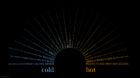
One data visualization project that really impressed me is the work of Chris Harrison piece Word Associations Visualizing Google Bi-Gram Data. The piece portrays words on a spectrum based on a frequency. It definitely relates to the notion of arrays and traversing through different groups of data and finding different calculations (namely average and mode I’m assuming). This piece really stuck to me because it touches on a cultural/linguistic phenomenon of word association, and how the frequency of words contribute to its societal perception/usage (a feedback loop that directly influences how much a word is used).
What I especially appreciate about this piece is how natural the integration with technology and graphics was undertaken. The whole point of data visualization is to present information in a more impactful and comprehensible way. While there are many ways the idea of frequency of a list can be pretty standard, the way they organize the words in a curved composition with focal points towards the edges of the canvas really draws your eyes to see all the words and the transition between them.
https://www.chrisharrison.net/index.php/Visualizations/WordAssociations