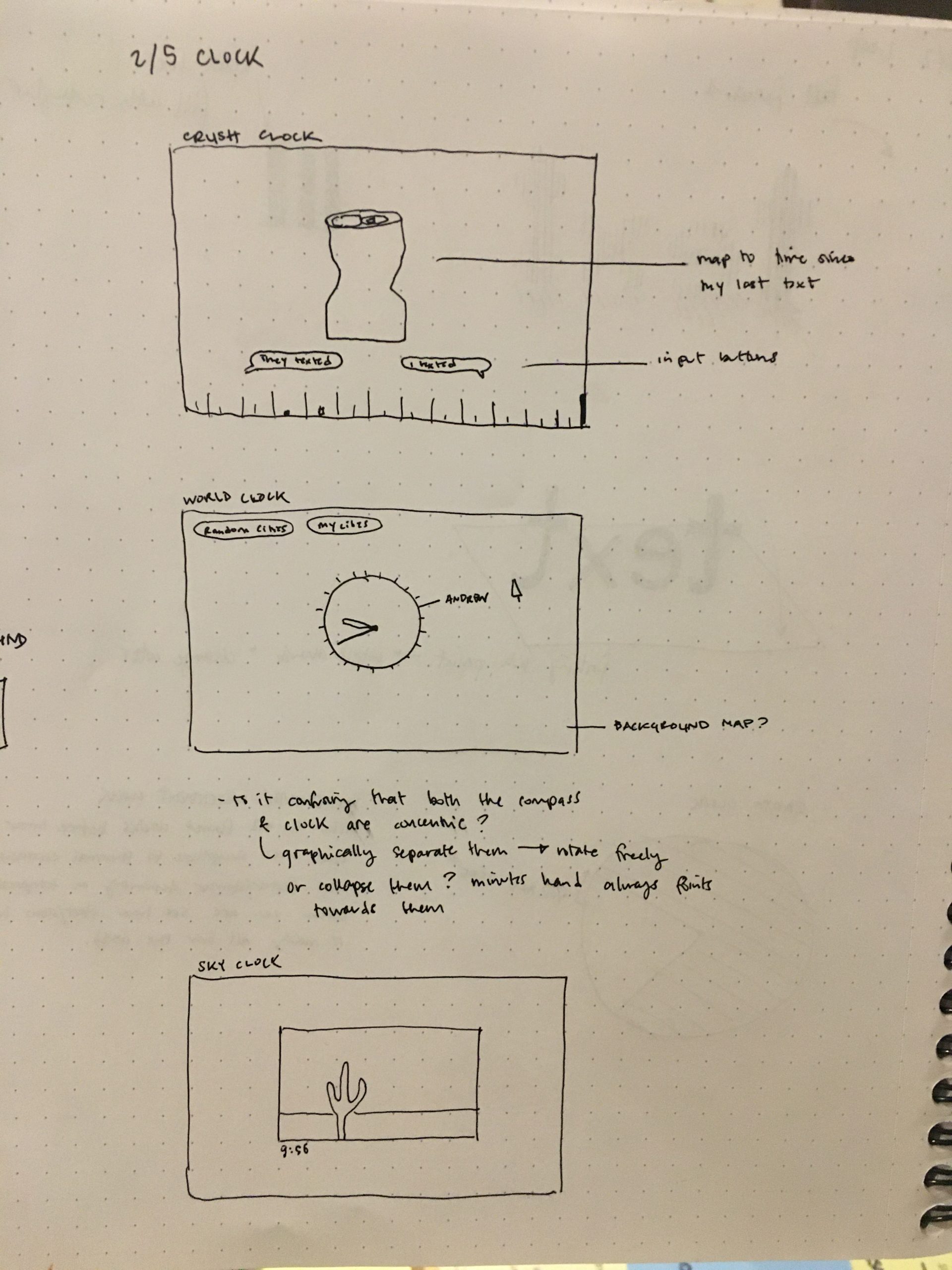
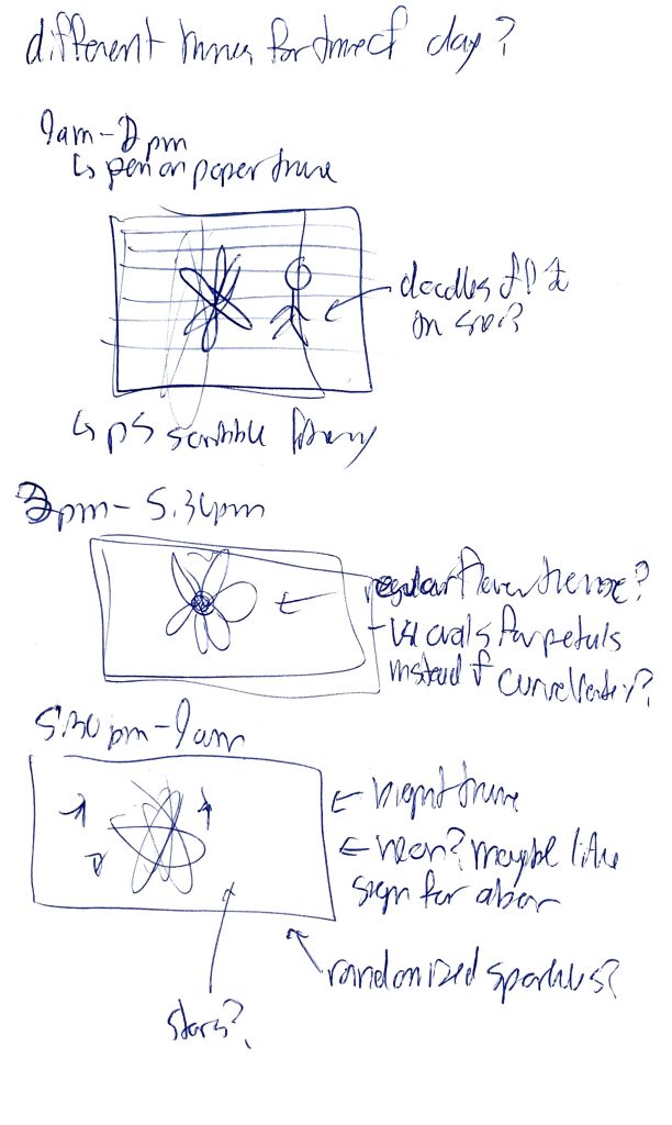
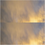
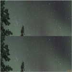
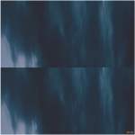
qazxsw-timepiece

At around 22:16.

At around 11:00.

Link

I didn’t have much time to create this piece, so it is just a simple clock that presents the time we are familiar with.

The shape in the center represents the hour, the position of the circle around represents the minute, and the number of smaller circles represents seconds. The color of the background changes throughout the day to match the color of the sky.

Sketch


Wormtilda-timepiece

Link to the sketch: https://openprocessing.org/sketch/1476237


My project is a clock that measures time through the petal-like formation of a cosine polar equation. The highest petals count the hours, the medium count the injures, and the small ones are the seconds. Additionally, the background changes overtime, from a right blue during the day to a deep purple at night.  I had somewhat been introduced to the concept of polar equations back during the assignment to make a spiral in p5.js, and it really opened my eyes to how useful and interesting they could be. I had learned about them in my calculus class in high school, but seeing them used in this creative coding environment led me to see them in a new light.
I found using these polar equations to be surprisingly difficult, as I for all three shapes I had to modify the start and end angles in order to make the radius of petals start at zero and end at zero. I couldn’t really find a consistent pattern so I had to eyeball it, but I think it works pretty well and is pretty accurate and legible. One thing that I definitely think can be improved about this piece is its presentation. I did spend a lot of time on it, but right now it’s pretty plain. I did had ideas to implement different “themes” depending on the time of day, like it would look neon at night and more like a regular flower strong the day, but I didn’t get to chance to really flesh this out. I definitely  do want to go back and implement those ideas.


This is what the clock looks like during the day:

and this is it at night:

Here are my sketches:

Koke_Cacao-timepiece

https://openprocessing.org/sketch/1476045

Let me introduce to you the greatest invention in the century: distributed time. Have you ever experienced inaccurate time displays when you just got off the airplane from another time zone? Do you know that the time display on your phone, laptop, or even on the wall can be manipulated maliciously by a third party and therefore would cause you to miss a meeting or make your code crash? Take a step further, do you really trust that the location of the sun and the moon is not controlled by an alien civilization (since all physical processes are turning complete and can be simulated) It is the “time” to solve all these problems! Distributed Time Project is a project to enable global time consensus based on distributed blockchain technology. It provides you with the most accurate time regardless of your location on earth (as long as it is on earth, negligible space-time dilation). You can literally speed up the time if you wish to make your meeting earlier in the day (how convenient that is), but of course, that comes with a cost. This is just one application. The other important thing about Distributed Time Project is its convenience for space travel. If you are at Alpha Centauri, it is painful and unmeaningful and stupid for you to keep earth time. It will be more annoying to find out time un-sync if you are a delivery person who doesn’t want to make Amazon delivery late. Put it simply: the current time tracking consensus breakdown during space travel. Also, if Twitter wants to serve both people on earth and on the planets of Alpha Centauri, it is more intuitive for the server to display posts’ Distributed Time relative to the poster rather than the time of either planet or time of the server since distributed servers are on different location of the Universe. For centuries, time was governed by the sun and the moon. In Distributed Time Project, we believe that time is created by the people and for the people.
It is made simply, designed for color blindness as the color can be read in grayscale. It strikes for simplicity design while carrying an artistic taste. The browser queries a blockchain node for the current block time. Because blocktime, although in consensus, is not linear with respect to the time of nature, the graphical interface needs to be responsive about predicting when the next block will be mined.
This project is focused more on the conceptual aspect. It would be best if you can view it on a spaceship of some sort that can travel fast enough to experience time dilution.
I did not have a chance to finish the project as I originally projected. This is a cut-down version as I did not implement a full eth2 node based on PoS. If I did that, the clock will look more interesting as eth2 introduced heartbeat and sharding mechanisms. I spend about 15 hours on the project and this might be considered the most unsuccessful part of the project.


kong-Timepiece


Time Universe on Openprocessing

Time Universe was inspired by Superlocal made by cw&t and the new concepts of time that I encountered during time research. As I learned that time is a concept that was created by humans, I wanted to create a timepiece that presents time in an abstract way. Thus, I created my final piece which consists of big circles, medium circles, and small circles with the number of each type of circle being reflective of the current hour, minute, and second. When a user clicks on the canvas, the user is able to add a single circle of a random size; when a user drags the mouse on the canvas, the user is able to add multiple circles of random sizes. The user is able to return to the current time by pressing ENTER and change the colors of the circles by pressing any other keys. By allowing the user to change the number of circles and their colors, I intended to convey a sense that the users themselves have control over the current time. Further, I intentionally created a clock that is hard to read in order to sway the users away from being constrained to the exact measurement of time. By using this clock, I hope for the users to be more relieved from any pressure that may have arisen from time and take more initiative on the pace of their own lifestyles.

I believe my work was successful in conveying my general concept that we do not need to be pressurized or anxious about time. I enjoy how the colors change depending on the position of each circle and that my work includes several elements of interactivity, which I would like to continue to bring into my future works. Yet, I see many aspects of my work that could be altered or changed, which I wasn’t able to implement mainly due to the time constraint. A major feature that I would like to add is allowing the users to remove a circle by clicking on it, which would work with my current element of adding the circles. I believe this would further strengthen my current concept by allowing the user to not only lengthen time but also shrink time. Moreover, when the user returns to the current time by pressing ENTER, the transition could be smoothed out by adding a fading out effect to the circles. I also wanted to add a shadow to each circle and add a background image to enhance the visual depth. Nonetheless, I enjoyed working on this prompt and getting to deeply think about the meaning of time; I would like to also try out my other project ideas later on.

CrispySalmon-timepiece

Anxiety Clock

screenshot:

Animated GIF:

Link to OpenProcessing: https://openprocessing.org/sketch/1475909 

Ideation Process :
initial idea

I initially wanted to make a geometric clock that uses polygon to represent second/minute/hour. But I didn’t continue with this idea because it’s  too simple and doesn’t have much meaning to it.

I then continued to brain storm and settled on the idea of creating a clock that triggers the feeling of anxiety/frustration with the passing of time. The inspiration of the design comes mainly from this picture: 

final sketch

This clock is meant to make people feel anxious. I tried to make it so that it captures the feeling of me running out of time and feeling frustrated(eg. when the deadline of a project I barley started is hours away).

The most challenging part for me was to figure out how to  make the lines seem random enough, while still maintain some type of order. They needs to still have some level of legibility so a person can still tell time from this clock. I initially wanted all the points to be at a random location, but that ended up being too chaotic. As a result, I chose to map the points into a circle instead.

duq-timepiece


https://openprocessing.org/sketch/1475212

Triple is meant to be experienced first as a triple star system and second as a clock. The large, red star to the bottom left is a sun-like star that has entered it’s supergiant phase . Near the middle, a second sun-like star is earlier in its life and therefore still has its signature yellow color and smaller size. Finally, further away is the center of the triple system. A rapidly spinning blue giant that pulses as its magnetic poles intersect with the camera and then move away. The other, less bright circles are planets and moons trapped in the chaotic motion created by a three-body equation (as seen here: https://www.goodreads.com/book/show/20518872-the-three-body-problem). Furthermore, a small asteroid belt is visible in the upper left. As a clock, each fast moving white dot is a tenth of a second, each time the small blue dot fills or the small pale blue dot completes its motion is one second, each time the larger blue dot fills, or the larger pale blue dot completes its motion is one minute, each time the yellow dot completely fills or the pale yellow dot completes its motion is one hour. Each time the orange dot fills or the dark orange dot completes its motion is one day, and each time the red circle completely fills is one year.

I feel like my work was successful in not immediately giving away the fact that it keeps to the human constructs of time units (hours, days, seconds, etc) and instead looking like it reflects a natural phenomenon. This begins a dialogue between the raw nature and physics that this piece denotes, both of which are completely independent of human constructs, and our quanta of time, something completely created and perpetuated by our shared belief in it. It is also successful in relatively clearly denoting time once one knows how to read it. It is however lacking in being able to read how much of a year has been completed as we cannot see the entire circle. I think that I could have also added more interesting motion such as actual orbits instead of just straight lines. Given more time, this is the direction that I would take this project in.

spingbing-timepiece

I had many different ideas for this piece, which was ultimately the primary cause of my failure. I spent too much time thinking of new ways of interpreting the prompt and came up with a plethora of half-ideas (which i will list below), but no fully fledged ideas. I am disappointed because I really like this prompt, but I will definitely revisit this prompt and create a nontraditional timepiece at some point in the near future.

My half-ideas:

  • something to do with individual perceptions of time: I wanted a clock that moved as fast as the viewer thought time moved. However, the only way I could come up with to gauge this was for the user to manually put it in, which i really disliked. I wanted it to be less obvious/literal. I did not want them to realize the time was incorrect, which would be impossible if I directly prompted them to provide an input.
  • something to do with the relationship between time and work/play: I thought about making the canvas look like a computer screen with two tabs: One more work/school related(document?) and the other a game. The time at the top left of the screen would increase faster when the game was played and slower when work was being done. I also did not like how literal this was. I think it would be more effective if it were not in p5?… or, if the screen size matched an actual computer screen resolution so it looked more real?
  • a clock that fell asleep: similar design as the previous idea, but the time would stop changing after a long period of no mouse movement, and would continue when the mouse was moved aggressively (to “wake up” the clock)
  • a clock that looks like the clocks used to teach children how to read time: but I didn’t want to use actual roman characters because they are too recognizable, but asemic numbers also look too foreign. The clock hands would move at nonlinear speeds but still end up accurate at each minute/hour.

My final timepiece is extremely basic. I came up with the idea while walking around the Hunt library to try and come up with ideas when I walked past the portrait of the man on the first floor. It felt like he was looking at me sentiently. I then went to create this time piece that looks like a normal painting, but slowly blinks/smiles/looks around at certain points in the day. I think this is an extremely cheap copout response to the prompt, but could perhaps be somewhat effective as an installation (it would be more effective if J.K. Rowling hadn’t led everyone to associate moving paintings with Harry Potter). I am fully aware that this piece is so impressively unimpressive, but one high five I will give myself is that one main goal I had with this project was to make it extremely not clock-looking and I did achieve that.

merlerker-timepiece

Sky Clock

The Sky Clock shows an image of the sky every minute, that was captured at that minute. I first wrote a Python script (here) to get photos using the Flickr API that matched the search “sky,” which were then parsed to only use photos with EXIF metadata (to get the actual capture time, not the time the photo was uploaded to Flickr), and then saving into a json with keys for each ‘HH:MM’ time and values with the urls of matching photos. I loaded this json into my p5 sketch to then display an image matching the current time. If there is more than one image for the current time, a random one is chosen.

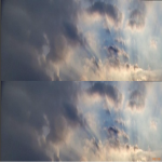
My hope was this would give a real-time sense of the sky that would shift throughout the day, from sunrise through daytime, sunset, and night. It was in part inspired by this post sent to me by a friend a few months ago:

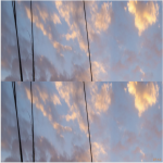
I think the concept is a poetic contribution to the genre of crowdsourced clocks we saw in examples like The Human Clock, especially if it worked as described above: a shifting image of the sky throughout the day, along with (charmingly imperfect) intrusions of cropped bits of things that are not the sky. Unfortunately, I quickly ran into problems that challenged this vision. I knew 1) that the same time of day will look differently depending on the season and latitude at which is was taken, but did not anticipate 2) getting the actual time a photo was captured is incredibly difficult. Flickr’s API provides a “date_taken” but they also state “The ‘taken’ date represents the time at which the photo has taken. This is extracted from EXIF date if available, else set to the time of upload.” Ok, so to tell if date_taken is the actual time at which the photo was taken, I check if that photo has EXIF data. EXIF data is basically all the metadata you see that comes along with photos, sometimes including GPS coordinates, the camera model it was taken on, and camera settings, as well as a number of date fields. This is where I really got into trouble…

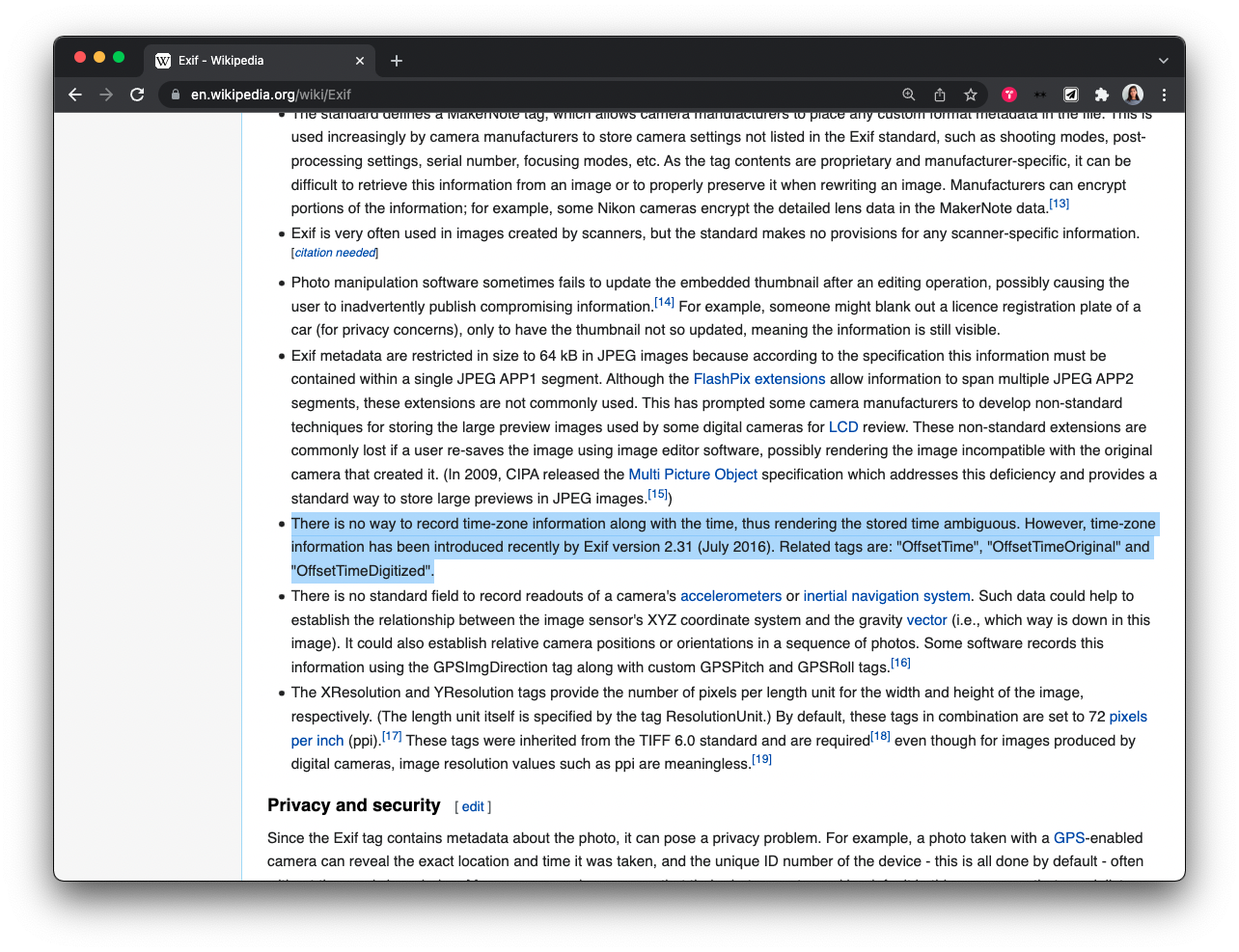
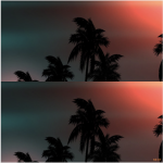
In short, there is NO RELIABLE STANDARD for getting the local time at which a photo was taken. In addition, actually going through all the data to cross-check EXIF data added tons of computation time (it was going to take upwards of 17 hours to process before I killed it).

I put in quite a few hours learning about XML parsing and then trying to figure out the EXIF timezones, and I couldn’t find a way to consistently get the local capture time of an image. I found the best solution I could given the time constraint, but it disrupts that vision of a smoothly shifting sky. Perhaps a lesson is that you can’t have specific of a vision when it comes to crowd-sourced data, or else you need to be prepared to put a lot of time in!

Solar-timepiece

  1. In your blog post, embed at least two images of your clock, showing what it looks like or how it behaves at different times of day. If your clock involves animation, embed an animated GIF or a brief video recording, which you can make with the OpenProcessing screen-recording feature.

(day version: when mouse hovers over center)

(night version: another minute)

https://openprocessing.org/sketch/1472355

The idea for my project stems from the concept of psychological time—how we each experience time differently when watching youtube compared to listening to a boring podcast. Hence, it was my goal to experiment with the movement of circles that move at different speeds and follow different paths (representative of how we experience time differently) but still operate according to the standard time (hours, minutes, and seconds). The outer circles move according to the hour’s hand, aligning every minute. The number of outer rings with which the circles reflect the number of minutes passed in the hour. Hence, when the moving circles align with each other, the rings will experience a shift to welcome the new minute. The inner circles more clearly present the minute hand, with the same workings of the circles that represent the hour hand. When the viewer hovers their mouse over the very inner circle, the surrounding circles will start rotating at a constant angle. I did so to actively demonstrate the interruption of our personal experience with time whenever we check the clock. Finally, the colors of the clock become more monotoned and dormant when it is nighttime.

It was a challenge to find a method for the circles to move at different speeds but still manage to align at a certain time. I also had many ideas that I wanted to experiment with and found it difficult to narrow them down. At the same time, it was difficult to figure out what I could accomplish with p5js given my skills and the time that I have. However, I am happy with how my project turned out as I did a few trials which helped lead the direction to how I wanted my timepiece to look. I’m glad the circles were able to sync nicely and thus able to successfully visualize my concept.

Hunan-Timepiece

World Clock/Production Clock/I don’t know how to name my art

http://oppr.org/s/0xxf6cZM

this clock traces the sum of 10 vectors with constant but unique lengths and rates of rotation. The ten vectors each represent a watch hand controlled by ten unique rates: [car produced, bike produced, computer produced, baby produced, newspaper circulated, TV sold, phone sold, emails sent, Tweets sent, ton of CO2] per sec. Inspired by the 2D visualization of Fourier transform, this clock can achieve unique looks by tweaking the radius of each vector. Which this particular setting, the clock draws a ring every 12 hours and clears every 24 hours so you can still tell the rough time. The coefficients can be tuned in ways that make it impossible to tell time.

Another set of coefficients:

Sketch: