bookooBread – LookingOutwards04

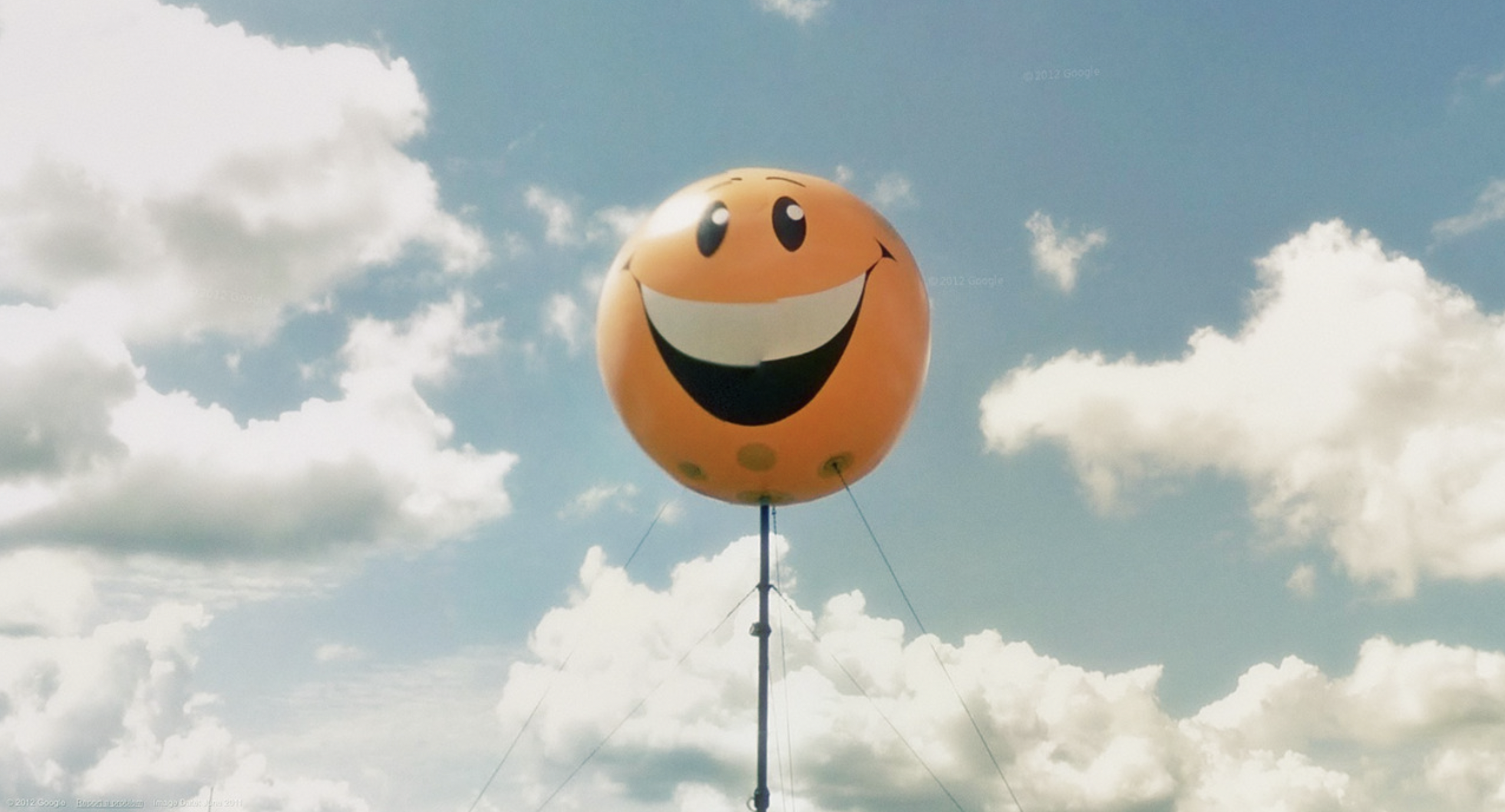
Nine Eyes of Google Street View by Jon Rafman
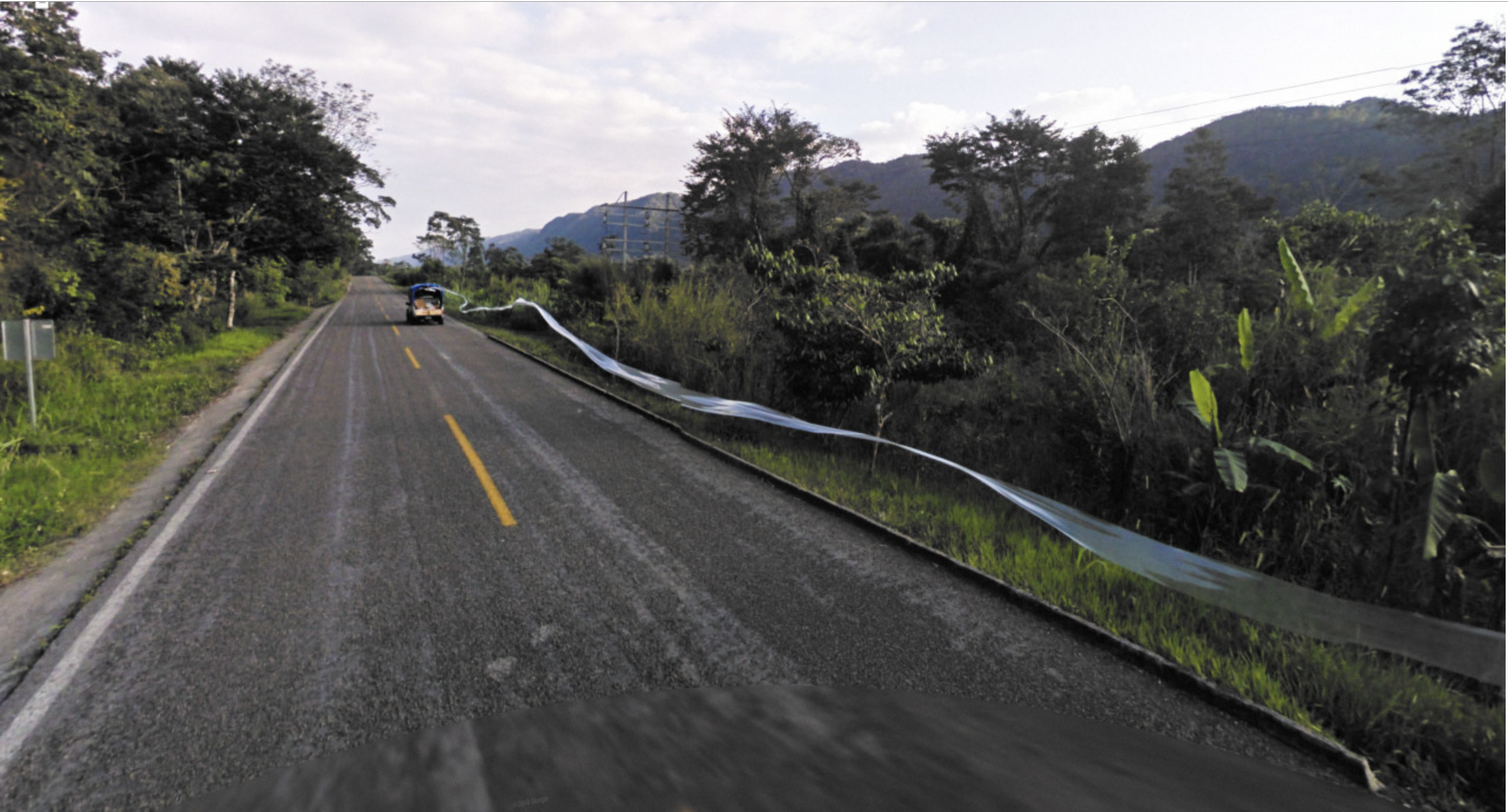
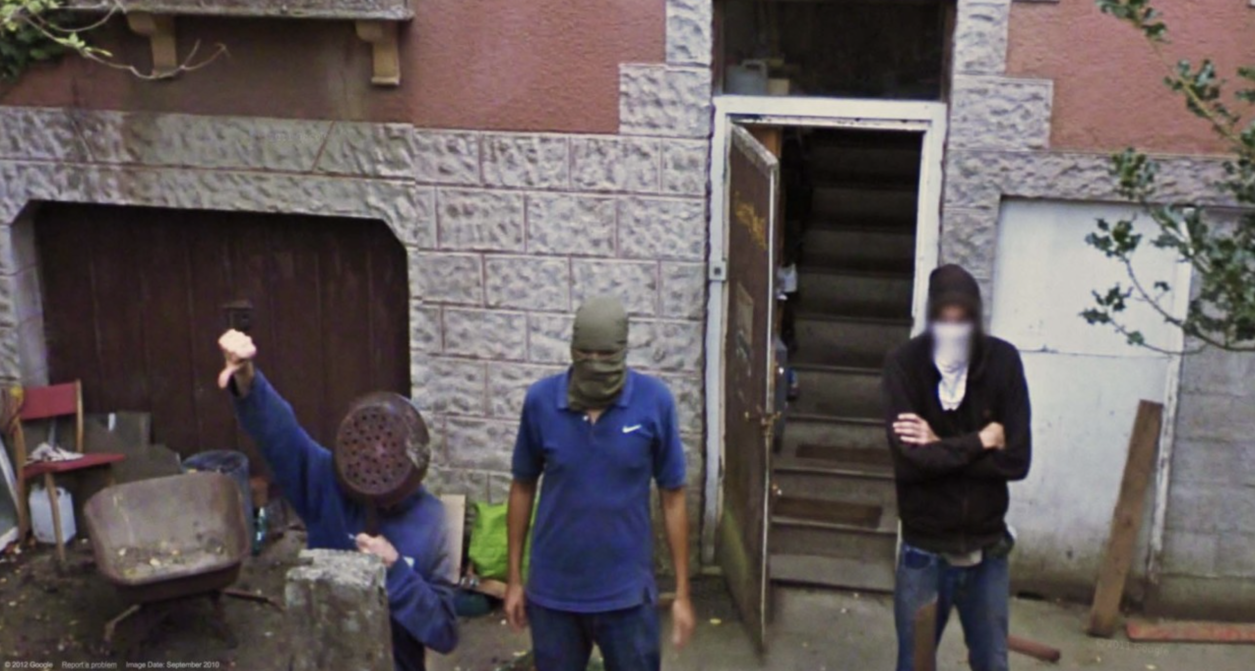
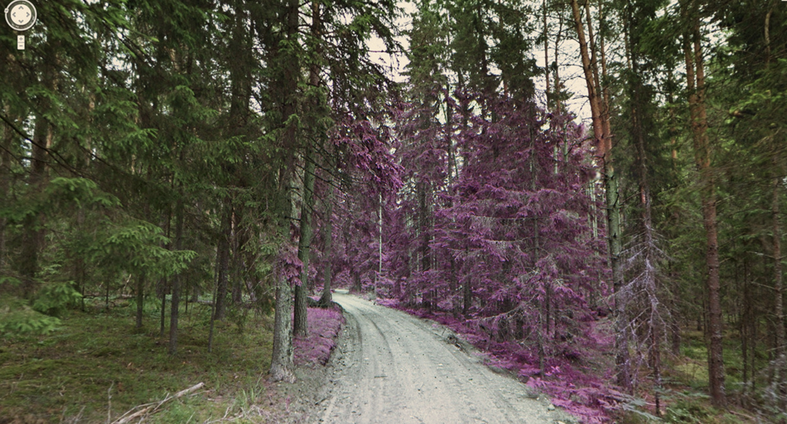
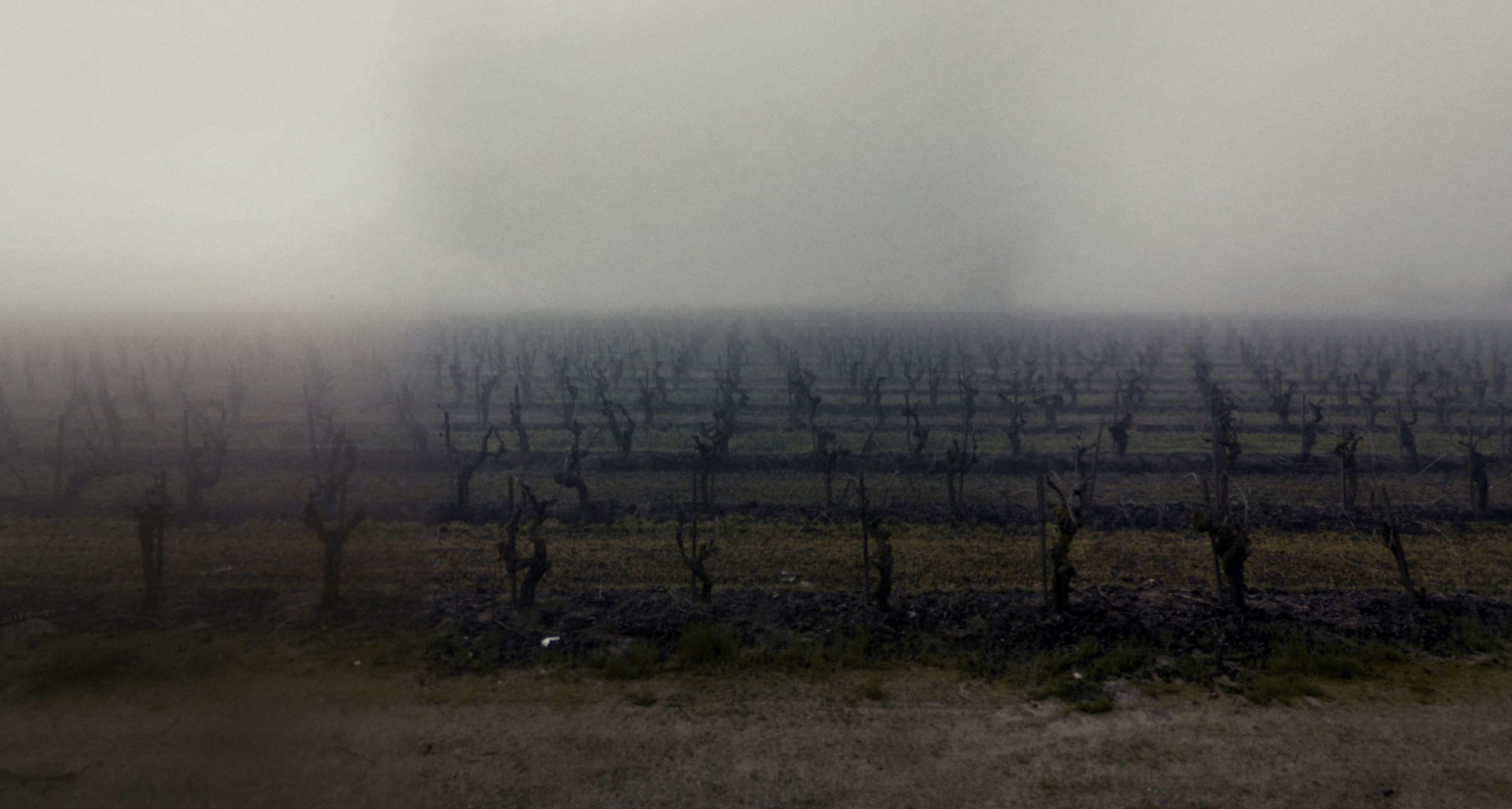
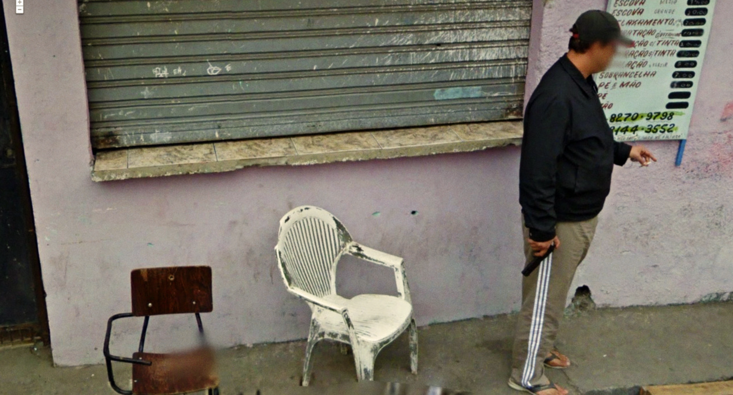
This work is an archival and conceptual project started in 2008 by artist Jon Rafman. These images are all screenshots from Google Street View’s image database, back when it was a new initiative without the kinds of regulations that it has nowadays. At that time it was (and still somewhat is) “A massive, undiscerning machine for image-making whose purpose [was] to simply capture everything, Street View takes photographs without apparent concern for ethics or aesthetics, from a supposedly neutral point of view.” The work meditates on the implications of this kind of automation of image-making, and at this kind of scale.

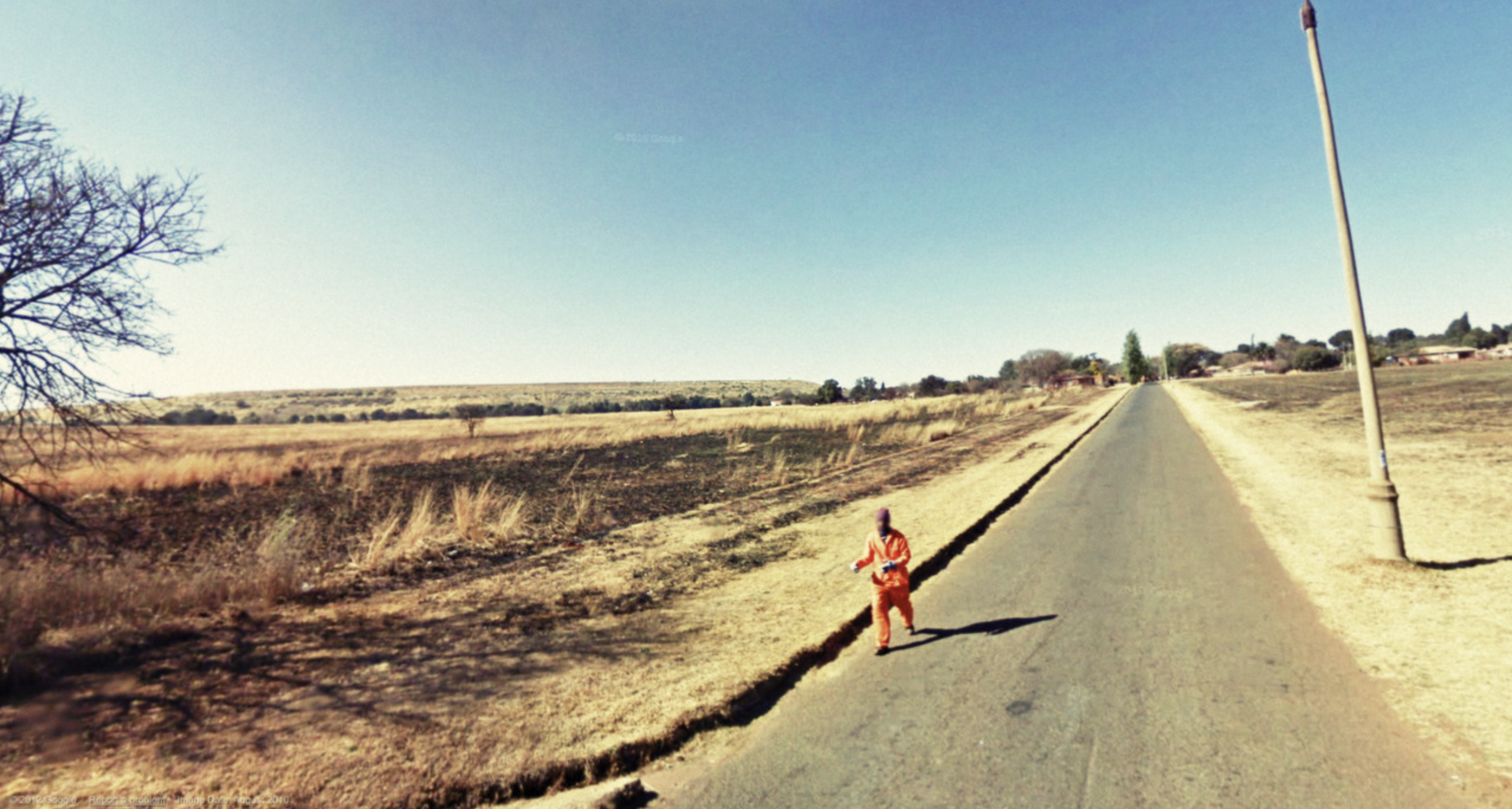
I am so glad I came across this project. It really struck me going through all of these images, I just could not stop looking. As a collection for photography’s sake, they work together to really poetically capture subtle moments of life, whether it be ugly, mundane, funny or really beautiful. But as you look through these photos, it feels really eerie too. It feels like you shouldn’t be looking at a lot of these (I mean.. because we shouldn’t) and yet here they are, moments of life captured with no regard for its subject. Some of these photos made me audibly gasp, like the one of an inmate running or one showcasing what looks like a kidnapping. And then in the same collection you have a guy mooning the camera. Or a set of white laundry billowing in the sun. It’s just strange and so eerie. I really, really love it though.

I think this also holds up so well in our current times with the development of computer vision and artificial intelligence. The technology is certainly developing and yes, the ethical side is too – but definitely not enough considering many of the issues posed in Rafman’s work are still relevant today.

Here is the image collection:

https://conifer.rhizome.org/despens/9-eyes/20180103101851/http://9-eyes.com/

spingbing-LookingOutwards04

A work of net art that I came across during my research was Cyberfeminism by Cornelia Sollfrank. This piece of art consisted of Sollfrank generating 200+ fake female artist profiles to submit work in an early net art competition held by a museum in Germany. With the addition of her fake profiles, the museum reported that over 2/3 of the applicants were female. Even so, the top three winners were male artists. This piece was a statement to show how art was primarily judged by the profile of the artist rather than the piece itself.

I really enjoyed this piece because first, it was a very creative way to enter art into a competition – the pieces submitted were not the art, but rather, it was the profiles submitting them. Additionally, I appreciate that the profiles were generated rather than individually created by hand. I also appreciated that the statement comes across very clearly because the results speak for themselves. Sollfrank’s concept was proven and facilitated by the judges; she did not have to say anything in order for her statement to be said.

CrispySalmon-LookingOutwards04

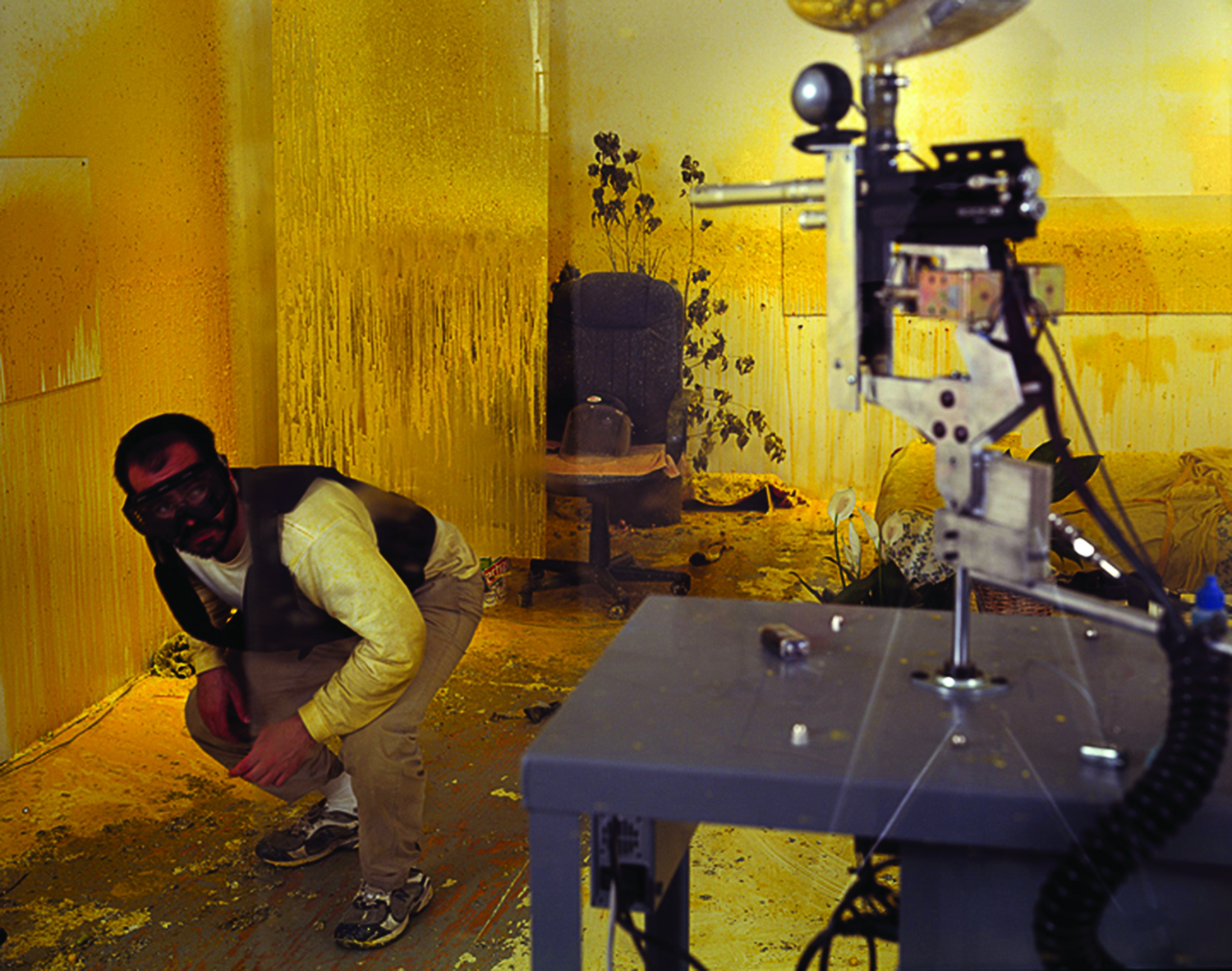
Domestic Tension by Wafaa Bilal, 2007

This is a networked durational performance. The artist confined himself to a gallery space and broadcasted himself to the internet. The audience can view, chat with him, and is also given the power to control the pinball gun to shit him. Through this work, Bilal intended to highlight the violence and racism of US culture after 9/11.

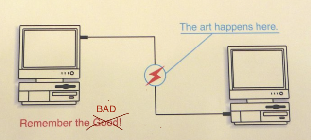
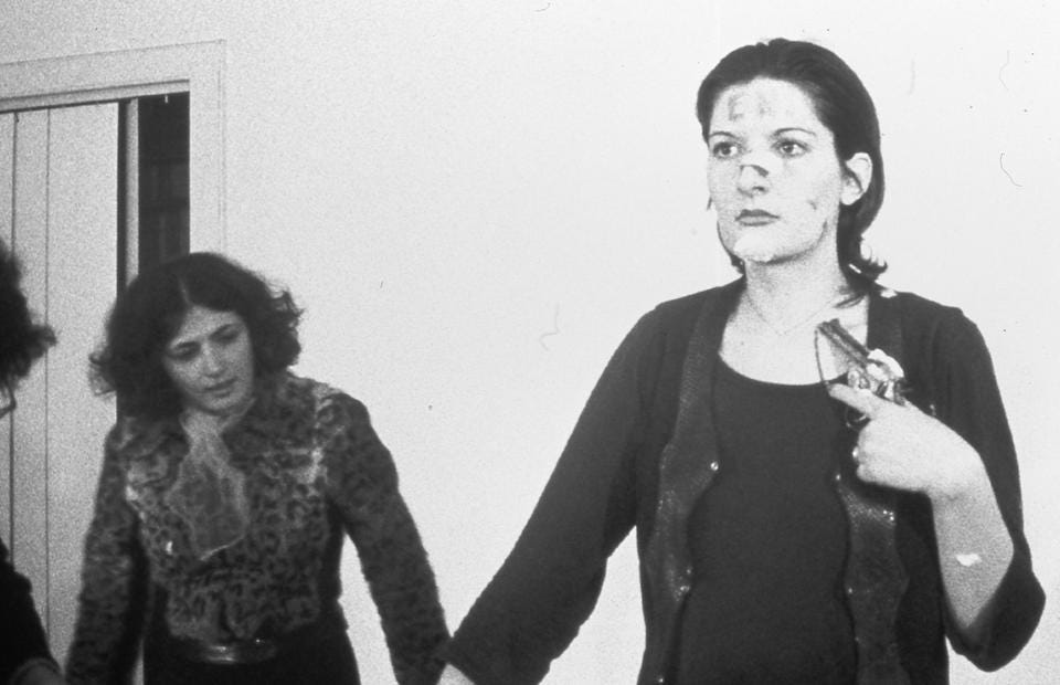
This work is different from many other net arts in that it’s using ‘network’ to portray violence, disconnect, contradiction and the BAD. This work reminds me a lot about Marina Abramovic’s Rhythm 0, 1974. In both works, the artists themselves serve as the medium/net to provoke audience interaction and reveal the underlying BAD. 

starry – LookingOutwards04

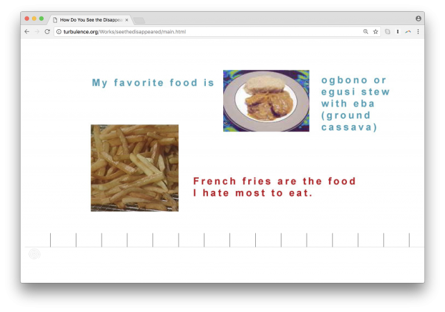
How Do You See the Disappeared? A Warm Database (Mariam Ghani, Chitra Ganesh, 2004)

Link  | Video

This project was developed in response to the U.S. government detaining immigrants, most of whom were Muslim, following 9/11; many others were also subject to questioning. The “warm data” in the project’s title stands in opposition to the data generated from such questioning; it is “deeply personal but non-identifying”, as opposed to common forms of data categorization such as place of origin or birthday. The project is currently inaccessible, but is separated into 4 parts; I liked the 3rd and 4th parts, which was the questionnaire that collected the “warm data” and the interface for viewing such responses. I thought this project was really interesting because of how it utilized databases and data that focused on humanizing and turned its focus away from categorization, and how it can evoke an emotional response from the viewer despite the fact that there is nothing known about the person who submitted the response.

kong-LookingOutwards04

IMAGE OBJECTS by ARTIE VIERKANT

Image Objects responds to the shift in art-making practices and the definition of the work of art, where contemporary art began focusing on its online representation. It is composed of sculptural works placed in between the physical objects and the digital image in order to place emphasis on the fluid boundary between them. The digital images were created by printing image-based works on aluminum composite panels so that they would appear three-dimensional. Then, the altered digital documentation of them was circulated online, which means that each documentation is a unique work of its own.

At first, I was drawn to this artwork because of its appealing visual qualities with simple yet vibrant colors. Yet, as I got to know more about the idea behind it, I was intrigued by its focus on the online circulation of the artwork. As my artwork in the future could also be digitally circulated, it led me to consider the interactions of my artwork through the audience’s lens (ex. phone camera).

Solar-LookingOutwards04

https://brianhouse.net/works/joyride/

Joyride reenacts the perspective of a stolen iPhone, over five days, using images from Google Street View.

I found the project Joyride, created by Brian House, especially interesting and also humorous. The ability for the artist to be able to determine the path of a stolen phone emphasizes the dystopian implications behind pieces of advanced technology: with a smartphone at hand, anyone’s location is trackable. At the same time, the reenactment of the thief’s journey is humorous in that it seems to mock the thief in that even though they have stolen the phone, everything is still under control and surveillance. The fact that the project was done through google map street view furthers the profound control and web of information on the internet.

qazxsw-LookingOutwards04

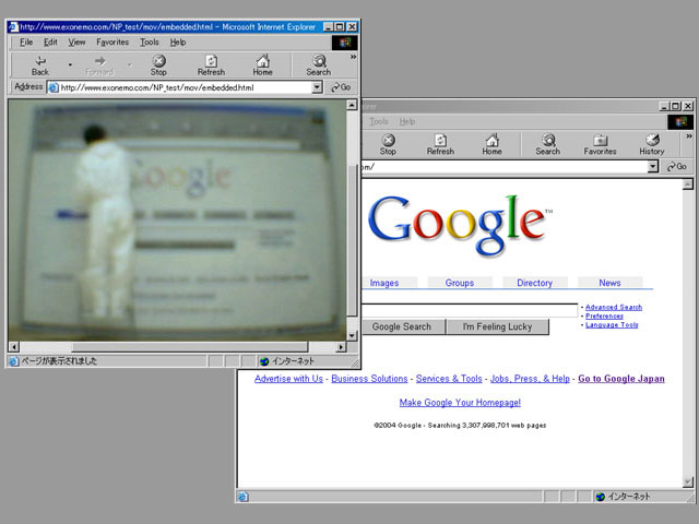
Natural Process

Link

Natural Process is an installation that translates the Google search engine homepage to a painting, and then takes the painting back to digital media through webcam. The painting was purchased by Google.

I find it really interesting because it blurred the boundary between digital media and physical media. It also makes the Google homepage unfunctional, forcing the audiences to notice the design of the page, which is usually overlooked.

bumble_b-LookingOutwards04

No Fun (2010)

Link to project with video, pictures, and more details

The project: A Chatroulette performance piece, where they simulated a suicide and recorded people’s reactions. This video artwork is then staged on a laptop on an inflatable mattress for people to see.

Why I found it intriguing: I found it intriguing in that I absolutely despise this project LOL. I don’t know why anyone thought this was a good idea for art. I’m not sure if they were going for a What Would You Do? style piece where they wanted to get people’s reactions to find humanity in this world, but the medium they used just makes no sense for that. The point of Chatroulette is that you’re paired with a random person anywhere in the world. You don’t know who they are, where they are, anything about them. What the hell are you supposed to do if you see someone who has committed suicide other than be traumatized and literally have no ability to do anything about it at all? You can’t call the police, you can’t help in anyway, and then all you’re left with is trauma and guilt. The fact that these people are unknowing participants to this just really rubs me the wrong way. I just find it really disturbing and for no reason at all.

I guess, if I was trying to understand, I can see the point of this artwork being that websites like Chatroulette are just overall “No Fun” and able to turn pretty messed up pretty quickly in these ways where you’re totally unable to help, but I just can’t really get behind the fact that they’d subject a bunch of people to this.

The Chatroulette project shown in class, where people’s faces were turned upside down, was so harmless and fun, whereas this one just seems somewhat unethical to me. But, I’m open to being proven wrong on that.

Koke_Cacao-LookingOutwards04

Shiftspace's Main Interface
Shiftspace’s Main Interface
Shiftspace's Shifts
Shiftspace’s Shifts
Shiftspace's Network of Shifts
Shiftspace’s Network of Shifts

Shiftspace: A browser extension (by Dan Phiffer and Mushon Zer-Aviv, ShiftSpace) that enables collaboratively annotating, editing and shifting the web.

Comments:

  • What is it: Shiftspace, like my project, was inspired by the control over how users interact on the Internet. In 2007, the Shiftspace team managed to implement 4 different styles of interaction on the meta-layer created by Shiftspace. Users can put “Notes”, highlight text, replace images, and even edit the source code of a website collaboratively. The project didn’t last till today. In fact, their official demo page and website are not accessible.
  • Good: When I came up with the idea of my project, I had a sense that someone must already made something that enables web-space-specific comments. Here it is: a chrome extension made just for that. Users can develop new plugins for Shiftspace. User can make a “shift” that connect other pages of the website, forming a network of links. The shifts show some relevent information such as the time when something is posted. The idea can be revolutionary, it is worth thinking about why such a promising project failed eventually.
  • Bad: The interface is not very convenient as users had to press SHIFT and SPACE and then click one of the buttons to use it. The big note can cover important contents of the webpage (they should be made transparent when the cursor is near). The image-swap and sourcecode edit is too invasive and will eventually make users confused about whether it is the original content of the website. The extension does not intend to store any information about the author of the comments, which disables making personal connections between website commenters.
  • Inspirations: There are of course many challenges to this idea. The most important one is how can one know the two website links are pointing to the same content. Taking the Youtube link, for example, two distinct videos are stored under a query ?v=xxxxxx of video id, but other queries are about giving Youtube metadata. We would like two notes about the same video, although browsed in slightly different url, to appear together. It is challenging to achieve this. Other problems involve the long-tail distribution of visitors. How do you manage comments on https://www.google.com the main page? How do you balance comments with original content? A seemingly simple extension would take a lot of effort to make.
Shiftspace's Source Editing Interface
Shiftspace’s Source Editing Interface

Sneeze—LookingOutwards04

PSYCHO NYMPH EXILE

Website | CG-poem | Hyper Poem

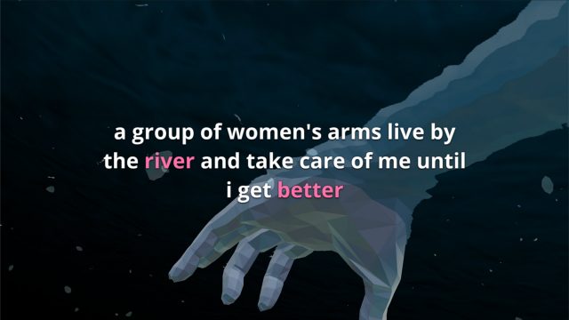
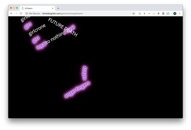
The Psycho Nymph Exile CG-poem project is part of a larger trilogy of narratives ranging from books to sticker sets. Its focus is on telling the story of trauma in multiple medias. The CG-poem is an interactive 3D world that lets the user choose their path through the story. I found this interesting because of the great visuals and deep meaning. I also liked how the visuals matched with the text on screen to create an immersive experience. The Hyper Poem is an interactive poem on the web browser. Clicking words triggers different effects, either revealing more text of the poem or resetting the experience with a metaphoric meaning. I thought that traversing through the different paths was enjoyable and that I wanted to spend more time to uncover easter eggs or secret interactions I had not discovered yet.