spingbing-FinalProject

This final project is an attempt at using the Looking Glass HoloPlay Unity plugin to create an interactive animation/mini installation. The animation is of a character I created using Google’s TiltBrush application (that I made for an earlier project, found here) which I exported into Blender to rig and keyframe.

My concept was to create a story where the Looking Glass was a sort of window into a box that the character was trapped in. It sulks in the box alone until the viewer interacts with it by pressing a button–this causes the character to notice the existence of the viewer and to attempt to jump and attack the viewer, only to be stopped by the constraints of the box.

To break it down, I needed one idle animation, and one “reaction” animation that would occur with the button press. In this process, I made a preliminary walk cycle animation:
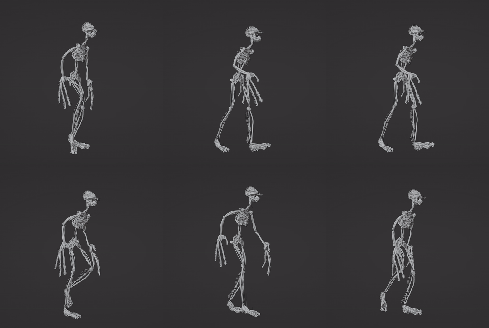
To give it more character, I added some random twitching/jerking:
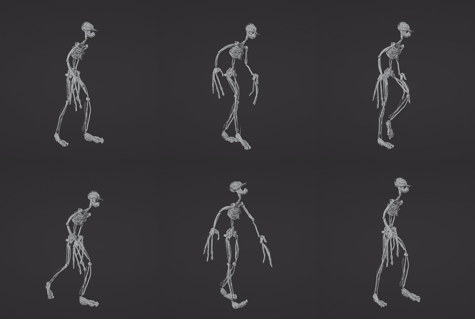
I did these animations as practice, but also because I thought I would use them in my final project as part of my idle animation. I tried to mess around with Blender’s Action Editor, NLA Editor, etc. to piece together multiple animations but it didn’t come out the way I wanted to.

At the end, I was able to make an idle animation + reaction animation that I liked and that worked in Unity, so the only thing left was to put it on the Looking Glass. However, I ran into an issue immediately:

[Error] Client access error (code = hpc_CLIERR_PIPEERROR): Interprocess pipe broken. Check if HoloPlay Service is still running!

Looking up this issue led me to delete and reinstall the HoloPlay plugin, restart Unity, duplicate my project, delete certain files off of my computer, and many other things that other suggested online. However, nothing worked. I did see a comment from someone who I believe worked on the Looking Glass which said that they would be fixing this problem in a new update.

Without the Looking Glass, here is my final project:

https://youtube.com/shorts/MKlnXfXNzsc?feature=share

Just the idle state:

Just the reaction:


hunan-FinalPhase4

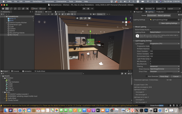
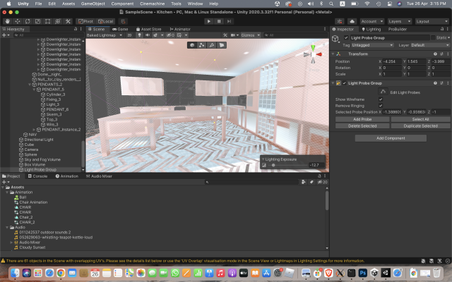
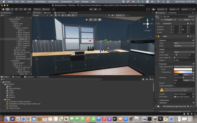
I was working on procedural terrain generation for the first half of this project but because I found a really good package for that, there’s very little left for me to do apart from learning how to use that package. Since my goal was to learn unity, I decided to make something that requires more scripting. So I made a 3D in-game builder (the best way to explain it would be the combination of Kerbal Space Program’s user interaction combined with the mechanics of Minecraft.)  I got to explore scripts, material, audio sources, UI, character controller, physics ray casting, box collider, and mesh renderer. The environment is the HDRP sample scene in Unity. It only took 150 lines of code for the builder and another 50 for a very naive character movement controller, which is quite amazing.


Solar-FinalPhase2

Monument Valley 2 is all about a mother, her child, and the world around  them - Android Authority

I’m inspired by the video game monument valley 2 created on Unity. The 3D-made environment, when presented to the players, looks moreso 2D, creating an illusion that distorts the perspective of the players and their understanding of the map. This element adds to the surreal, magical atmosphere of the game which I love and appreciate. I love how illustrative and fairytale-like the game is and how it doesn’t seek to imitate reality. After some research, I found out how the 3D-2D effect was created and it was through building custom extensions for Unity. This prompts me to look into Unity extensions in the future and what effects I’ll be able to create with them. In my work, I hope to create something surreal, dream-like, and ambient like the scenes in monument valley.

kong-FinalPhase2

Inspirational Work

Ines Alpha

I find the textures used in Alpha’s work to be inspirational–and how the fluid yet superficial texture flows out of the eyes. I also noticed that the fluid sometimes disappears into the space and sometimes flows down along the surface of the face. It seems to differ depending on the angle of the face, and I wonder how Alpha achieves such an effect.

Aaron Jablonski

I found this project captivating as it had similar aspects to my initial ideas in that it places patches of colors on the face (it reminded me of how paint acts in water). Further, this filter was created using Snap Lens Studio, which led me to recognize the significant capabilities of this tool.

Snap Lens Studio

To implement my ideas, I’m planning on utilizing Snap Lens Studio, which I was able to find plenty of YouTube tutorials for. Though I will have to constantly refer back to the tutorials throughout my process, I was able to learn the basics of Snap Lens Studio, how to alter the background, and how to place face masks by looking through the tutorials. I also found a tutorial regarding the material editor that Aaron Jablonski referred to in his post. I believe this feature would allow me to explore and incorporate various textures into my work.

kong-FinalPhase1

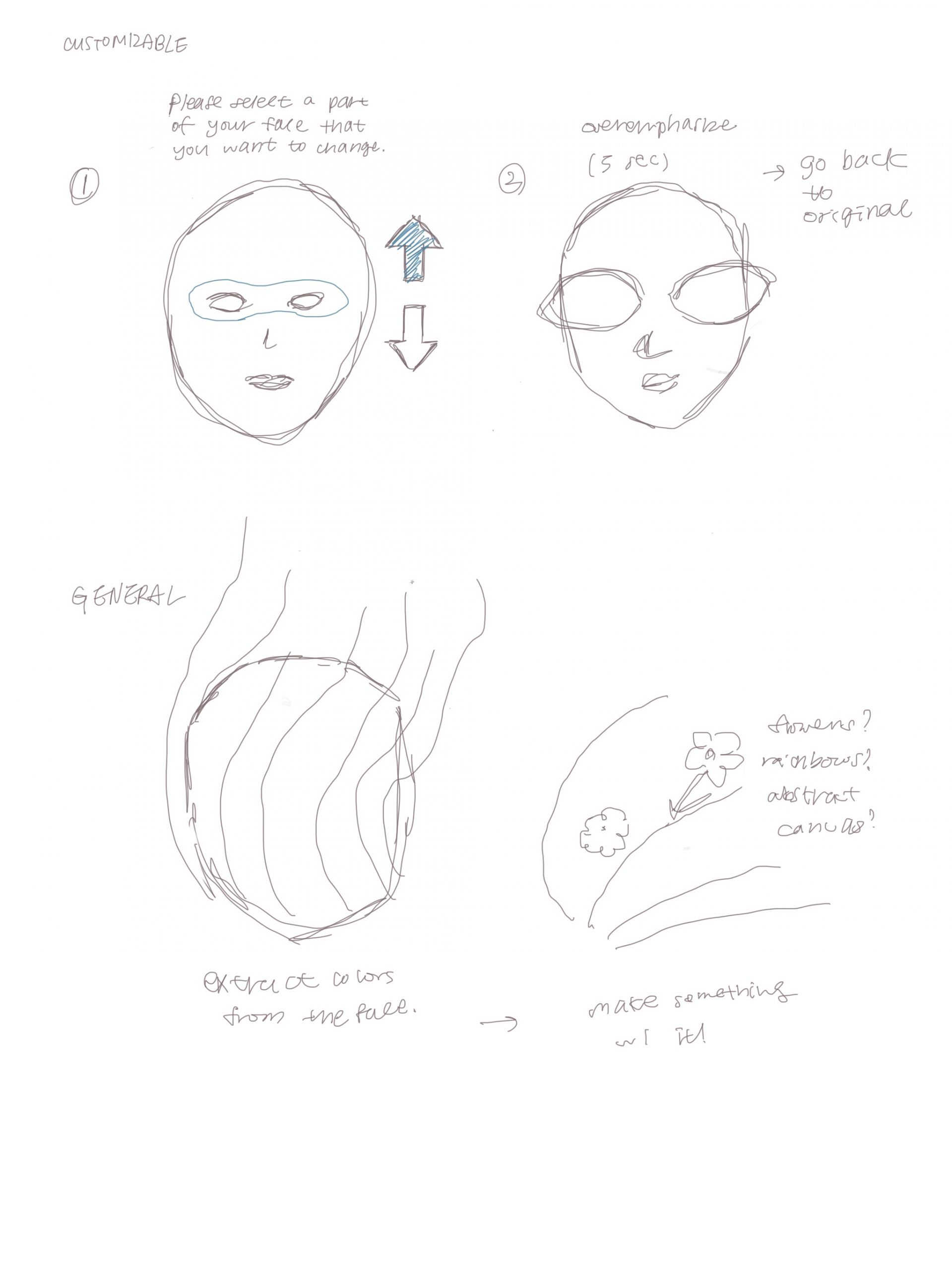
An idea that I have is making an augmented mirror with Snap Lens Studio. As these filters are popular on social media, it reminded me of a trend on social media where people would put on a filter that makes them “ugly” and then take it off to boost their self-confidence. My concept is similar in that I want people to recognize their beauty by using my augmented mirror. As everyone has different insecurities about their physical appearances, I think I would either have to make a customizable or a very general augmented mirror, which I will solidify after conducting more research about Snap Lens Studio.

Dr.Mario-FinalPhase1

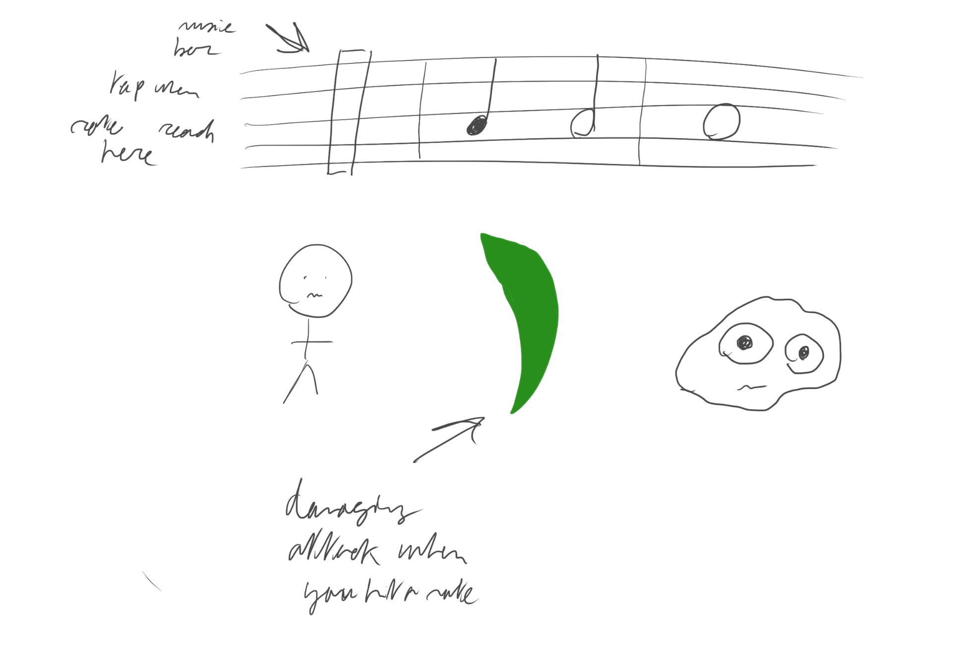
I wanted to go for Golan’s idea of making a one button game. For this I wanted to maximise the fun for this minimal input, my initial reaction was to do something rhythmic or reaction based like geometry dash. However, the mechanics there are a little too simple and basic to the point I’d mostly have to focus on the looks of the piece instead which isn’t what I want to do.

The conclusion was to mix up this rythmic aspect with a combo game, inputs could be based on timing with a moving bar or sheet music where holding or tapping a note could make a difference in full damage attacks or weakened ones. I think the hardest part would be getting all the sound effects for the notes to play when you tap, I’d have to figure out if there was an open database with notes to use already. I think timing wouldn’t be too difficult with the use of timers and maybe an overarching metronome that controls all the time in the game.

Some reach goals could be adding a defending part where you match the notes of the enemy, a fury attack which could  be similar to a solo (but with no way to control the pitch of the sound it would just be a one button mash), making it look nice (proper effects on hit, a pulse metronome in the corner, etc…)

CrispySalmon-FinalPhase1

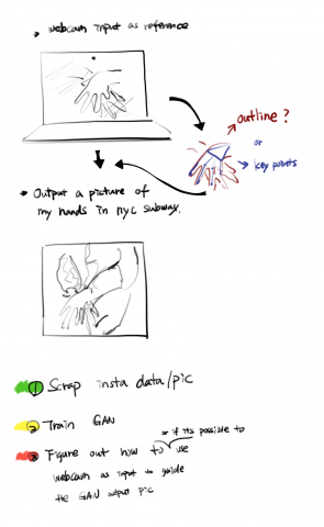
I want to make a tool-centric final project, experimenting with training a GAN with images scraped from this ig account:subwayhands.  This was originally an idea for the body tracking project, but I was unable to execute it for that project, so I want to continue with it for the final project.

I think the main reason for wanting to do this project is that after COVID , I became more conscious and paranoid about nyc subways.  While I was in nyc this Christmas I tried to avoid taking the subways, mainly because of health and other safety concerns.  But I still think that nyc subway has its own unique vibes and holds lots of stories. I have followed the Instagram account: subwayhands for a while now, each picture holds a lot of imaginative potentials.

The main challenges for my proposed project are scraping instagram for enough photos to train the GAN, and  whether its possible to make it similar to pix2pix, using webcam captured picture of my hands as the guiding input to generate an nyc subway hand picture.

project sketch: 

spingbing-LookingOutwards04

A work of net art that I came across during my research was Cyberfeminism by Cornelia Sollfrank. This piece of art consisted of Sollfrank generating 200+ fake female artist profiles to submit work in an early net art competition held by a museum in Germany. With the addition of her fake profiles, the museum reported that over 2/3 of the applicants were female. Even so, the top three winners were male artists. This piece was a statement to show how art was primarily judged by the profile of the artist rather than the piece itself.

I really enjoyed this piece because first, it was a very creative way to enter art into a competition – the pieces submitted were not the art, but rather, it was the profiles submitting them. Additionally, I appreciate that the profiles were generated rather than individually created by hand. I also appreciated that the statement comes across very clearly because the results speak for themselves. Sollfrank’s concept was proven and facilitated by the judges; she did not have to say anything in order for her statement to be said.

spingbing-telematic

Leah (bookooBread) and I worked collaboratively on this project. Most of our time was spent brainstorming ways to create something less technical and more conceptual. Immediately we decided to make a website that would give a sense of relief/a break — a first idea was to create a website similar to https://smashthewalls.com/, a game which allows users to “break” the wall of their screen to lean more into the cathartic side of our main concept of relief. However, we decided that our prediction for what the experience would be like was not satisfactory in terms of the cathartic element as well as in terms of the telematic aspect, so we quickly moved on.

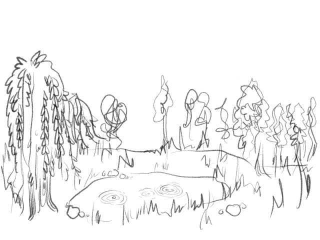
After many other short-lived ideas, we decided to pursue the calming side of relief rather than the more aggressive one we had previously been considering. This resulted in the idea of creating a quiet forest/pond scene in which the interaction would consist of user clicks which would result in ripples in the pond water. Some initial sketches:

While the idea of a pencil-drawn-esque environment with “animated” “rain” is nice, this format severely limited where the users would actually move to just the small portion of the screen where the water was. This idea is cute and could be effective, but I would rather it be an actual animation with no or at least different form of interaction.

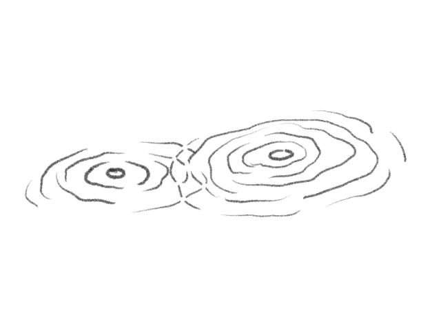
The lack of space in the idea which included the environment in the background led to the decision to omit it completely. We then were confronted with the decision to keep the visuals hand drawn or to use code. The hand drawn ripple sketch is shown here:

While the hand drawn style is nice, it disallowed the possibility of two ripples overlapping each other. Also, if it were hand drawn and code was just used to cycle through an animation, there would be no point to use code.

Thus, the final product:

https://grizzled-south-shoe.glitch.me

After the presentation, I think a good next step would be to add sounds (either raindrops, ambient music, or both) to make it more immersive. Another thing would be to limit the number of clicks a user can make per some time increment so that it does not crash.