spingbing – FinalProject

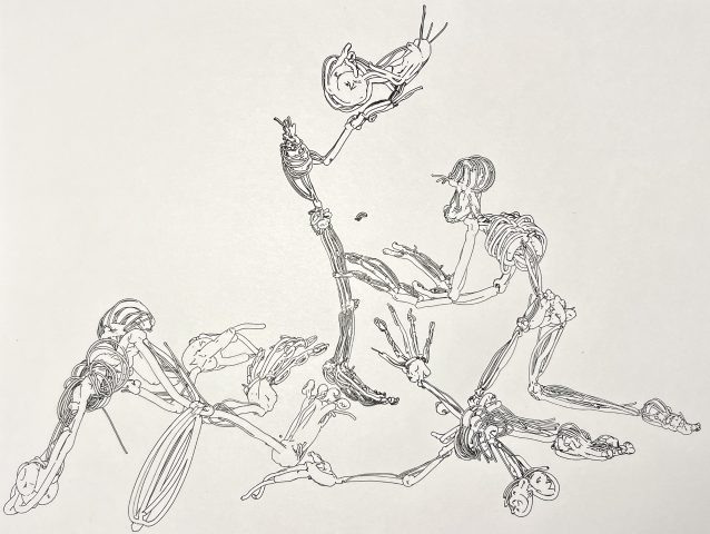
My final project for this class was a collection of several different plots of these skeleton-esque creatures in assorted configurations.

Inspiration

I am very drawn to artworks with busy, indiscernible compositions. Annabelle Gao’s Bicycle piece is a great example of this. What strikes me with these kinds of artworks is that most of its greatness/value is only found after some time has been spent appreciating the fine details.

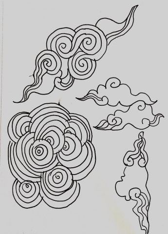
I have also been interested in depictions of pain, longing, and any other pessimistic emotion. Kay Seyoung Lee’s hellscapes, specifically Harvest(2021), is another notable inspiration piece for me. The warped perspective is very intriguing, and I considered including this element in my pieces as well. I also love how non-distinct the subjects are.

Process

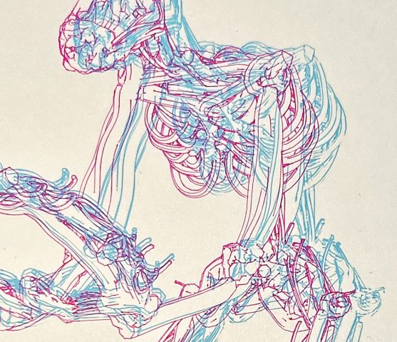
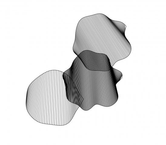
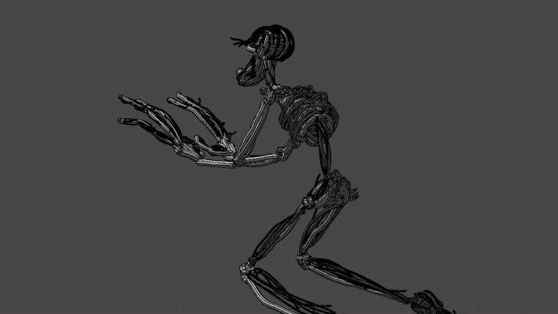
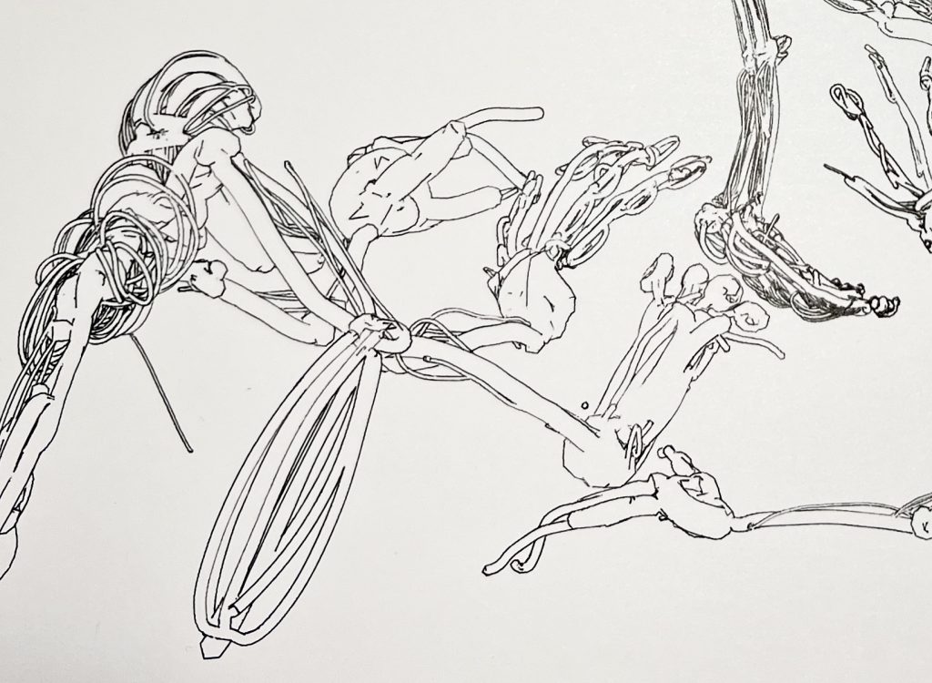
The piece began with my discovery of the Google Tiltbrush (discovery facilitated by Golan Levin). My practice usually lies in the realm of 3D CGI. However, drawing in VR gives what most 3D programs cannot do in that it allows for the act of drawing in 3 dimensions. This could be seen as a hindrance, but using this feature to my advantage, I created a skeleton-like creature made up of thin tube-like ropes:

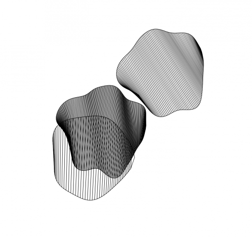
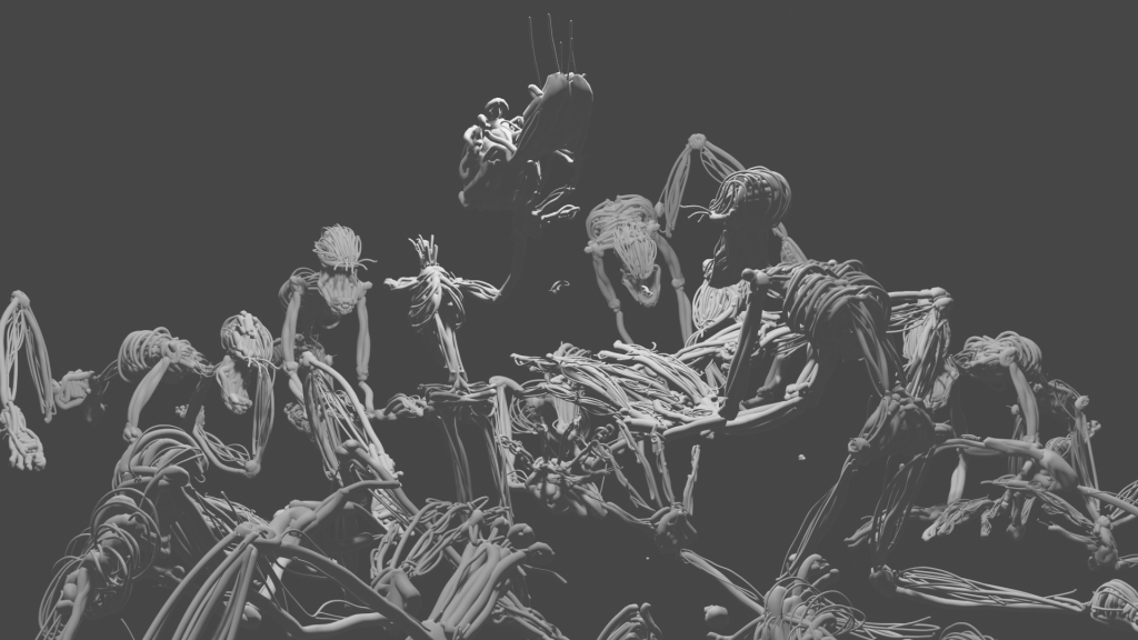
From the Tiltbrush application, I was able to export my creation into Blender. Here I was able to set up a compelling composition.

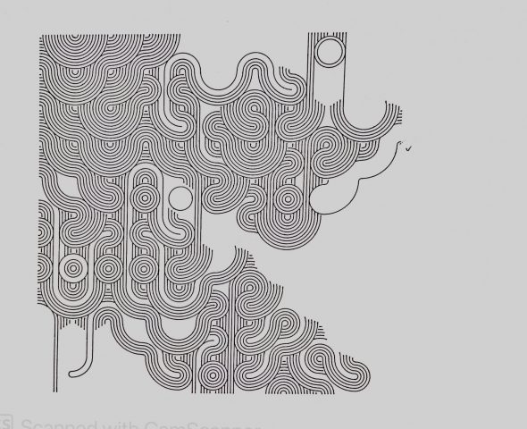
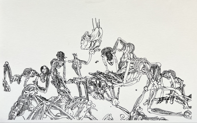
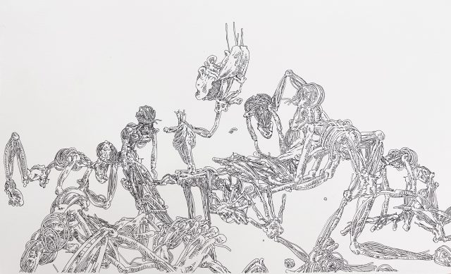
Then I exported this as a plottable SVG.

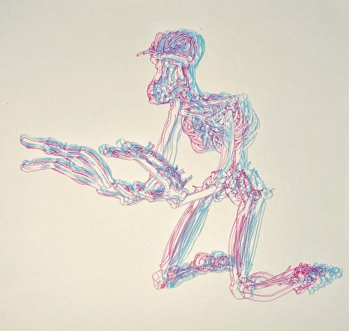
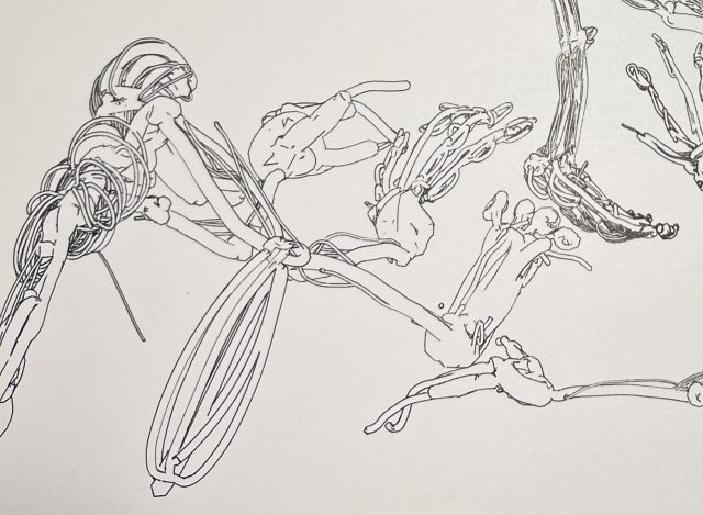
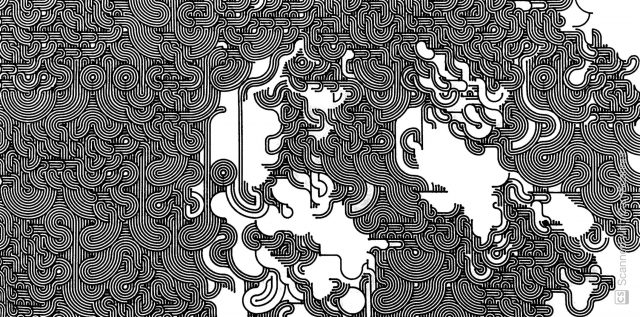
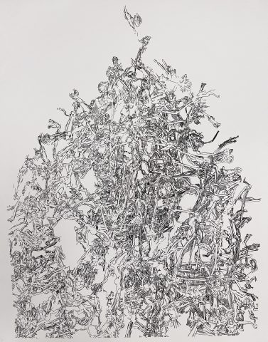
Lastly, I took the same pen the plot was done in and added some detail. This was an intriguing idea to begin with, but I got carried away. The problem here is that it missed the busy, indiscernible effect and went more towards unfinished looking. The business looks accidental here placed next to the overbearing white space.

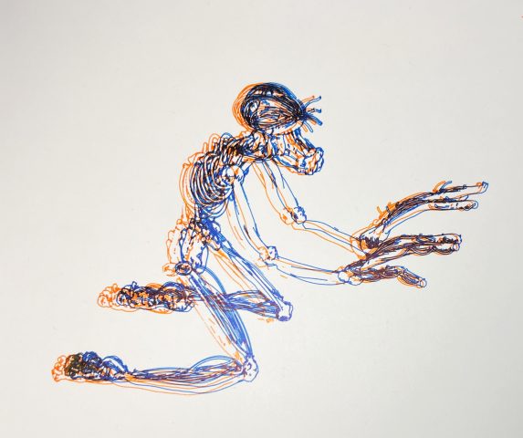
Another thing I was considering was drawing outside of the lines of the subjects in the background. This was an interesting idea as it further blends the distinction between machine-drawn and hand-drawn lines. However, my main qualm with this was that the objects I was drawing in the background did not match the original skeleton subjects. While perhaps visually similar, they themselves turned the story of the piece and made it confusing and wrong.

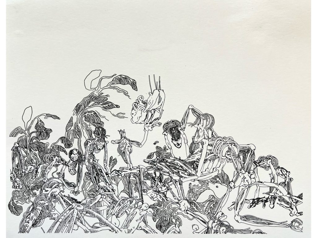
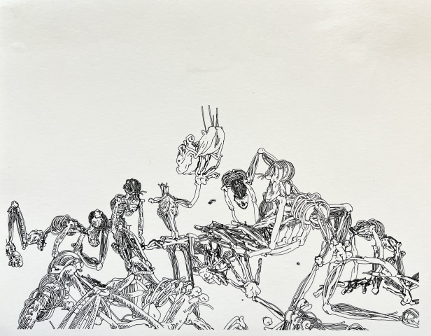
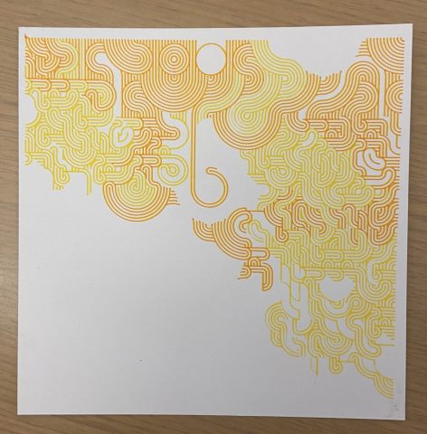
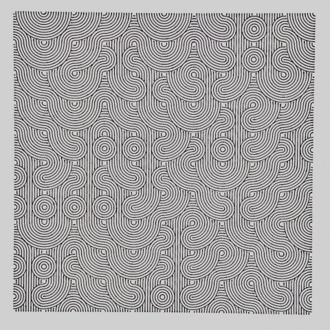
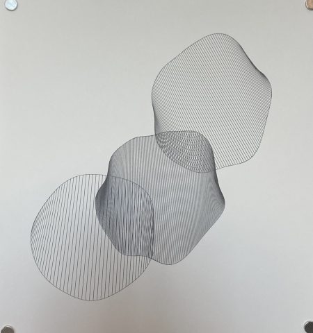
For my final composition I took care to achieve my desired busy effect, done with the help of Shiva Peri and Nikolas Diamant. The subjects were piled using physics in Blender. In a sentimental moment, or because I liked the white space, or maybe just because I was in a rush, I stopped the plot before it finished. This resulted in a nice variation of tone in the bottom half of the image to make the contrast between the top and bottom less intense.
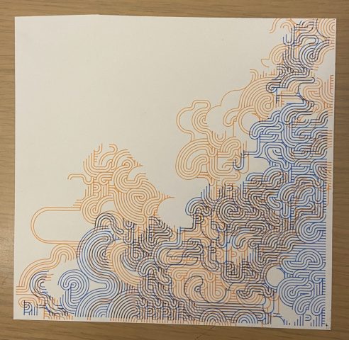
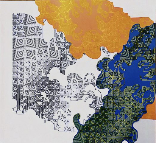
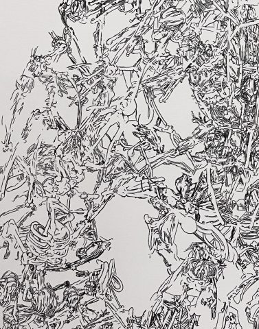
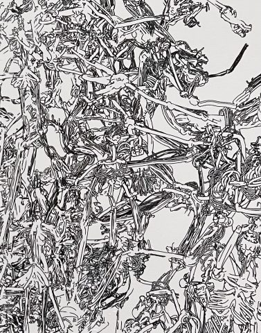
More Images


Final Takeaways

This project was influential for me personally in that it allowed me to explore the usage of machines in the drawing process without having to code. I was able to familiarize myself with one new medium rather than two at once. It also forced me to be very uncharacteristically precise and intentional with my materials, something I had to learn the hard way(evidenced by my many failed plots). Another influential aspect was the usage of Tiltbrush as a part of my creative workflow.

I appreciate that the ambiguity of the precision of the linework contrasted with the manmade feel of the subjects themselves hints at the process I went through to actually make the piece; However, I wish it was a little more clear. Overall, the entire process was very inspiring, and I am excited to see where these new mediums take me.


wip

progress, inspiration, etc

PROGRESS:
Initially, I messed around with blue/red 3D stereoscopy by plotting different angles of one object on top of each other. I thought it was funny that I went from 3D (TiltBrush) -> 3D (Blender) -> 2D (plotting the SVG) -> “3D” (stereoscopy). Even though this experimentation was not enough to be a final piece, it was useful to do because I realized I liked the layering of color. I may or may not go further into the use of contrasting colors in my final.

Finally, I have decided to create a sort of hellscape. It is also an experimentation with different mediums and a really funky workflow. Below is the SVG of a draft version. From here, I want to fill the background with more scenes by adding more 3D objects in Blender as well as drawing on top of the plot by hand. I also would like the use the big Axidraw to be able to add more detail.

Plotted:

Original image:

However, this looks more like an up close view of a traditional hellscape. While I like the perspective, I am also intrigued by art that ignores perspective such as seen in The Hellscape Garden of Earthly Delights by Hieronymus Bosch:The Garden of Earthly Delights - Wikipedia

3 dimensionality exists within each object and their surroundings, but it is overall flat-looking. I think using the giant Axidraw to create this type of scene would be interesting.

spingbing-FinalWIP

The concept of my project was decided after deciding the medium. Making a smooth 3D object in Tiltbrush (like one possibly made in a 3D rendering software) I think is theoretically possible but very hard to do, so the physical form of my object is a result of me working with Tiltbrush instead of against it.

Initially, I messed around with blue/red 3D stereoscopy by plotting different angles of one object on top of each other. I thought it was funny that I went from 3D (TiltBrush) -> 3D (Blender) -> 2D (plotting the SVG) -> “3D” (stereoscopy). Even though this experimentation was not enough to be a final piece, it was useful to do because I realized I liked the layering of color. I may or may not go further into the use of contrasting colors in my final.


Finally, I have decided to create a sort of hellscape. It is also an experimentation with different mediums and a really funky workflow. Below is the SVG of a draft version. From here, I want to fill the background with more scenes by adding more 3D objects in Blender as well as drawing on top of the plot by hand. I also would like the use the big Axidraw to be able to add more detail. This scene is currently being plotted.

Prior draft of the scene:

Newer draft:

However, this looks more like an up close view of a traditional hellscape. While I like the perspective, I am also intrigued by art that ignores perspective such as seen in The Hellscape Garden of Earthly Delights by Hieronymus Bosch:

The Garden of Earthly Delights - Wikipedia

3 dimensionality exists within each object and their surroundings, but it is overall flat-looking. I think using the giant Axidraw to create this type of scene would be interesting.


spingbing-Proposal

I am going to do a combination of ideas put into one idea:

  1. I was inspired by  Xu Bing ‘s Book from the Sky to create Korean asemic writing.
  2. I liked exploring tiling in my last project, so something like this with Korean characters or fake Korean characters would be visually interesting.
  3. I have done work in the past about my grandfather’s artwork:

I would like the end product to be in a similar shape or layout.

Things I want to explore further to perhaps integrate into my piece:

    1. Houdini geometry packing
    2. CJKV characters and how asian written language was created -> apply those in making my asemic writing


spingbing-MidSemester

For my midsemester project, inspiration came from many places. First, the concept of manipulating concentric circles came to mind after a failed hatch pattern. This concept was furthered by seeing Madeline Gannon’s circular truchet pattern . Upon seeing her plot, my mind immediately connected her arcs to the style of clouds drawn in traditional Korean art. With that initial interest, another aspect that struck me about this plot was how the contrast between how organic the repeated arcs looked against each other versus how structured and rigid tiling can look. I recreated a version of this in my tiling project, so for MidSemester I revamped that plot by making it a multiscale Truchet pattern that used Perlin noise to influence the scale of the size of each tile. A previous iteration of this project used Perlin noise to influence the placement of specific tiles. One way I interacted with this piece more personally was that I also made the choice to stop the plotter before it finished drawing in an attempt to attain an organic feel as well. Another was the use of color-the way I had originally intended to use it was a failure, as the paint marker “ran out” of paint midway through the plots. To work around this, I ended up collaging the successful parts of the plots together.

Initial iteration:

  • black micron pen on Bristol
  • the pen was not calibrated correctly or some other error was happening with the machine which resulted in wobbly, sometimes intersecting lines (seen best in the waves near the bottom)

Using color:

  • orange and blue microns, yellow paint pen on Bristol
  • the blue and orange one was mistakenly lined up incorrectly, which to me makes it look like the colors are fighting

Collage:

  • blue micron on Bristol and yellow paint pen on construction paper
  • Different colored papers were attached to the white plot with a glue stick. The placement intentionally hides errors in each one’s original plot

Final project:

  • black thin sharpie on drawing paper
  • The plot was interrupted last minute, resulting in less whitespace than the others. this as well as it being monochromatic worked to give this final piece a much different vibe.


spingbing-TilingPattern

  • In my hatching offering I ended up creating a pattern that more resembled a tile than it did a hatching method (seen below in the second row). I really enjoyed how it looked, however, so I decided I wanted to build off of that circular pattern for this assignment.
  • I was also quite obviously very inspired by Madeline Gannon’s circular truchet pattern . I really loved how organic the repeated arcs looked against each other and how it reminded me of how clouds are sometimes drawn in Korean traditional art, especially in the image of the unfinished plotter drawing. I decided that I wanted to try and recreate it to see if my pattern, in the midst of plotting, would turn out like hers did. I started with two tiles and was finished pretty quickly, but it looked very gridlike still.  I decided to add a third to try and remove the grid quality, and I am pretty satisfied with how it turned out.
  • These are some doodles I draw sometimes when I’m bored or trying to stay awake, and also serve as loose ideas or sketches for my piece. The crowded circle bunch is most similar to my pattern, and the clouds are what I drew after seeing Madeline Gannon’s unfinished plot.

  • My work in progress plot that I like more than the final plot:

  • My final plot:

spingbing-PatternReading

In the excerpts, it was mentioned how patternmaking is typically seen as an ornamental type of art and is therefore overlooked. I definitely agreed with this sentiment prior to reading and creating my pattern; I had no idea how much thought could go into making any pattern. One part of the Graphic Games excerpt that I found very intriguing was the section on the “Adinkira” pattern and how simple transformations of the single shape could create vastly different effects for the viewer by changing the relationship between light and dark.

spingbing-BlobFamily

  • I spent a lot of time trying to figure out how to make a blob with just my previous knowledge, but every attempt resulted in a very sharp-edged polygon that wouldn’t even come near the definition of a blob. I then decided to watch Dan Shiffman’s video on Perlin Noise loops; with that and the help of some smoothing done with averaging and noiseDetail() with Golan, I was able to create my blob family. The fill is not even in each blob, which resulted in a bendy look. I actually quite like how it looks because I think it adds some movement to the image.
  • One thing that stuck out to me from Entering the Blobosphere reading was the de-categorization of the blob from the physical shape that it is so commonly associated with. In defining it as a conceptualization of progress and/or potential, its scope becomes much broader, and offers much more to contemplate.
  • Here are some screenshots of my blobs:

Here is the SVG of my final blob family:

Here is the final plot:

spingbing-Hatching

With the first and third designs, I found that it was actually more difficult than I thought it would be to accurately depict the percentages, as sometimes the tweaks I made would end so that the darkness would increase exponentially instead of linearly like how I wanted it to. The second hatch looks more like a pattern or a tile than a hatch, as the attention is drawn more towards the flower shape that resulted from the overlapping circles than it is towards the changes in value. The fourth hatch would have been more hatch-like and less tile-like if the spaces between the squares were even, but after spending too much time on it I decided to reroute and add randomness, as seen in the fifth. This is in fact me giving up, but I think I like the random one better anyway (whether that be because it made my life easier or because I actually appreciate the aesthetic, I do not know).

spingbing-Drawingbots

Something I found interesting was the Great96 software featured as a tool in the Drawingbots website. This tool’s function is to make Islamic geometric tiling patterns. This caught my attention because it is interesting to me to think about the interaction of machines with culture. Cultural practices such as planning and designing these tiling patterns was once a laborious task done by hand, and now with this tool it can be organized and physicalized within a fraction of the time it one did. I am compelled to think about how the labor involved in personally making cultural crafts such as this gives it more value, and inversely how this being done by machines might take away from it; or, on the other hand, could it being made by machines give it a new type of edge or interest?