stickz – FinalProjectDocumentation


Jittery, an interactive drawing app that generates lines that draw for you. Glitch + Phone Sensors + p5.js

Inspirations 

Initially, I was inspired by Inkspace, a drawing app created by Zach Lieberman that lets users draw in 3D, where swiping horizontally and vertically across the screen “rotates' ' the canvas to another dimension, while keeping previous marks in other planes. I was interested in creating a drawing tool that allows one to create 3D forms, and approached it in a different way. 

I was intrigued by the idea of being able to generate lines and mechanisms that draw for you. Fourier drawing machines was another inspiration, where a couple of circles attached together can create intricate, and accurate drawings. I decided to do something in this ball park, creating drawing mechanisms and tools that are simply lines connected to one another, but have a unique behavior that shows in how fast they travel (different “masses” travel at different speeds) and how much energy they possess (altering the damping of each mechanism). 

I was also interested in the concept of painting and mark-making with a non-traditional medium like a bouncy ball, where applying paint on the ball and having it roll around on a canvas was another idea that I could implement. The ball moves on it’s own, but is ultimately controlled by the user in the way he tilts or shakes the canvas, or how he applies forces to the ball that leaves different marks, such as bouncing the ball on the canvas (create harsher marks) or rolling the ball slowly (generates fainter marks). 

How it works

The user decides where these “jittery”, drawing tools exist on the screen; placing them on the canvas portion of the screen results in instantaneous marks that are left behind as the generated drawing tools meander and travel based on the device orientation. When drawing off-canvas (black portions of the screen), you can see the form of the drawing tool much clearer, where drawing marks aren’t created. By rotating, flipping, tilting, and shaking the device, the user is able to control the direction and speed that the generated line-mechanisms move, resulting in different stroke-widths and patterns that are left as marks on the canvas. Using the device’s accelerometer data, forces are applied to the drawing physics, mainly the tilt angle (affects the magnitude of the force) and direction of the tilt (decides the direction of the force). Shaking the device generates circles that take the shape of the drawing tool, where the size of circles drawn are based upon how vigorously the device was shaken (force applied on the device in the z-plane).


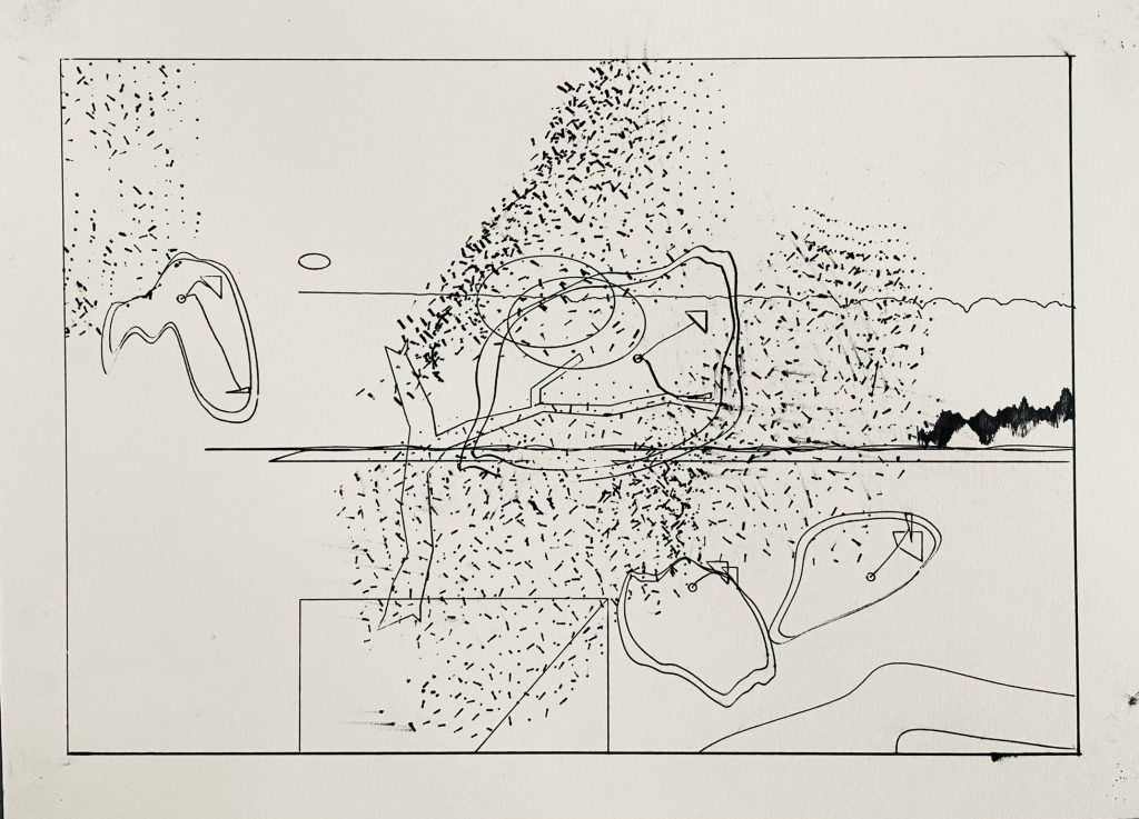
Process

A large part of the problem was perfecting the physics that the drawing mechanisms moved in. On a basic level, the drawing mechanisms are essentially springs that move and rotate with forces applied to it. Using a template created by LingDong Huang, I was able to access the device’s accelerometer data, along with the current orientation and position of the screen, and had different forces applied to the way the springs moved across the screen. For example, tilting the screen downwards applies a gravity-like force, where the springs fall towards the bottom of the screen. 

Adjusting the appearance of the drawing mechanisms (the springs) was another part that needed to be sorted out. I decided to stick with a set of 3 color themes (warm colors, cool colors, and a combination) and wanted to figure out: What kind of marks look best? I initially enjoyed thicker lines, but realized that smaller lines and marks can generate much more complex shapes, specifically drawing “Fake-3D” forms that can create forms that look like topographic maps or 3D models of flowers. 
Initial Version with larger drawing mechanisms and marks

[videopack id=”2485″]https://courses.ideate.cmu.edu/60-428/f2021/wp-content/uploads/2021/12/RPReplay_Final1638348340.mov[/videopack]

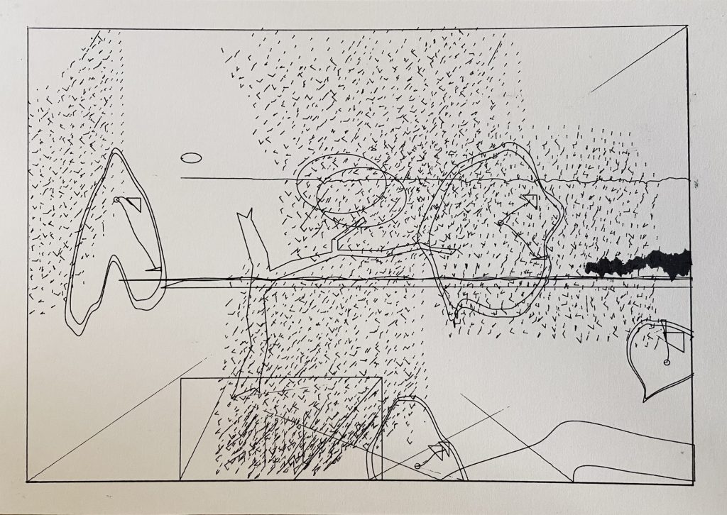
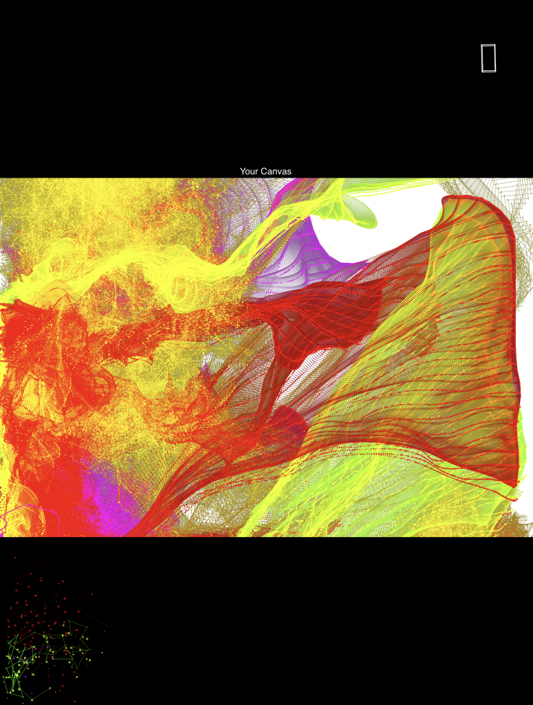
Versions without the "clear"and "theme" button

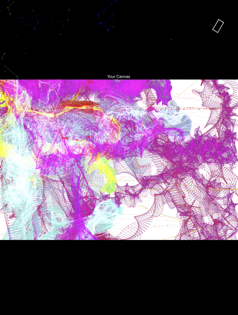
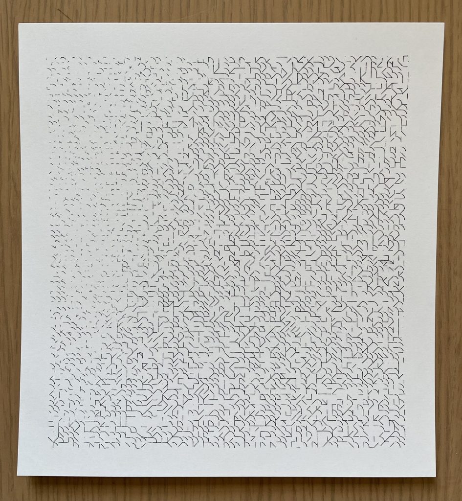
Example with many layered marks

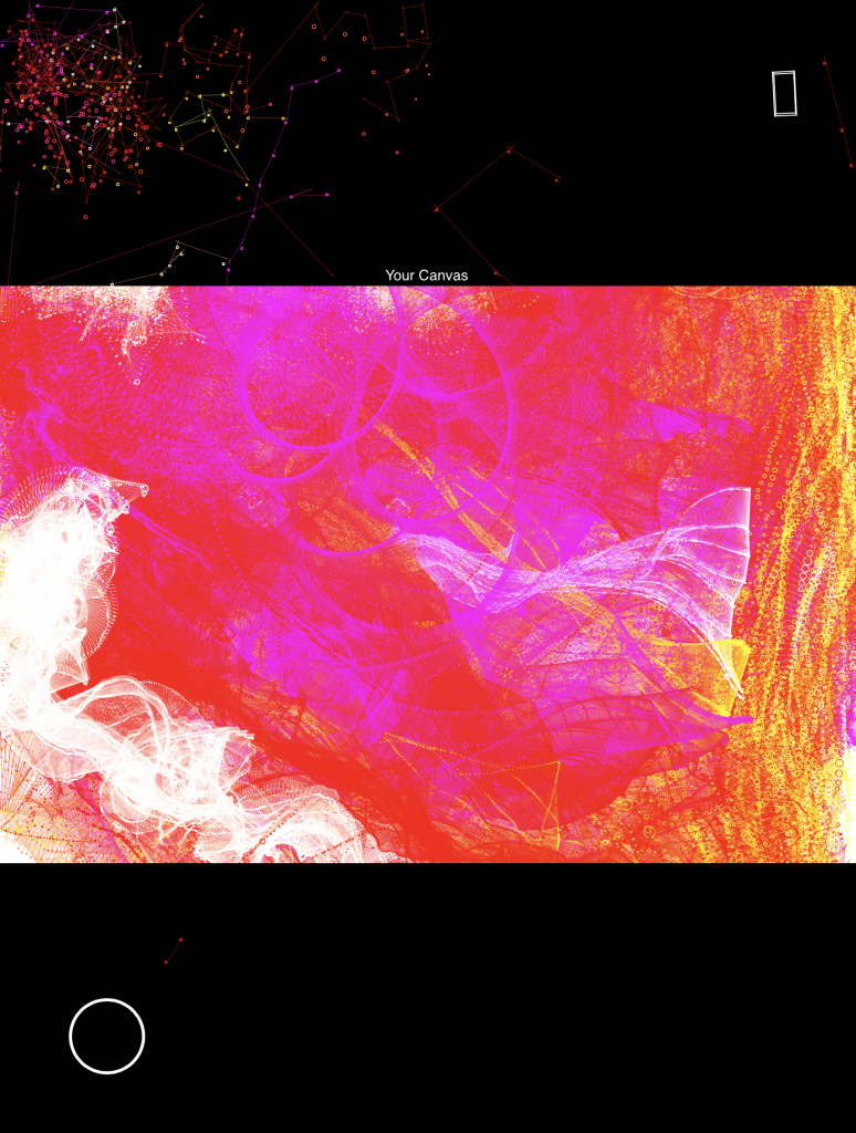
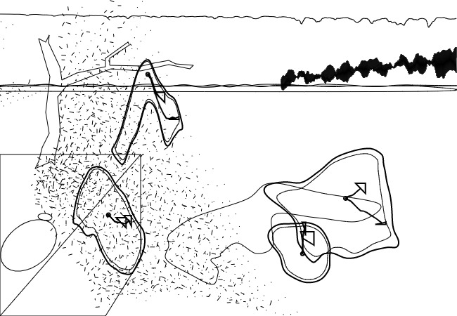
Example of "flower pedal" forms

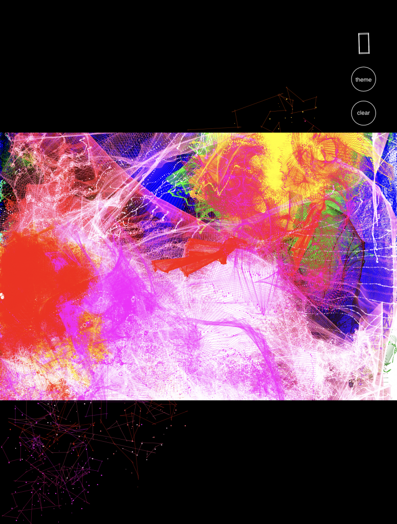
In the final form, I implemented buttons to clear the canvas and change colors, which I felt were important additions for a more functional drawing app. I placed those two buttons under the accelerometer diagram in the top right corner of the interface. 

Looking back, I’m quite satisfied with the way the drawing project turned out. I’m impressed by the visuals that can be created (3D forms), and the way the physics turned out. Though, the art and marks generated look mathematical, and can pass off as “too random” or “too repetitive”. In the future, I’m interested in adding more features to the project, and changing the forms so that they look more intentional, and less mathematical. I hope to create more recognizable 3D forms, as in its current stage, the marks left are still quite abstract and look similar. Adding more variation, through color choices and controlling the personality of the drawing machines would really benefit the drawing app. 

stickz – FinalProject

Jittery Line Drawing App 

I changed the direction of the final project to be a drawing app that interacts with the orientation of the user’s phone that can draw in 3D. I’ve been able to get multi-color lines working, where I implemented them as springs, and got some basic physics working. Wasn’t able to implement the phone orientation into the springs last night as planned, but I’ll get that up and running 🙁

Inspiration: https://experiments.withgoogle.com/ink-space 

Stuff I’m thinking about : 

  • Implementing Multi-touch for drawing – using LingDong’s template 
  • Different color themes for drawing lines 
  • Phone orientation that messes with the physics of the lines (then 3D orientation) 
  • More sophisticated 3D line forms

Screenrecordings of the Glitch Drawing App So Far

Stuff to work on:
- Different color themes for drawing lines 
- Phone orientation that messes with the physics of the lines (then 3D orientation) 
- More sophisticated 3D line forms


Stickz – ProjectProposal

For my final project, I want to implement an AR drawing app, similar to that of Just a Line app created by Google (https://justaline.withgoogle.com/).  I want to use the app as a backbone for the spatial detection and AR rendering, but want to change the simple white line so that it becomes a lot more visually interesting (i.e. more lively and colorful forms instead of a generic line ). I want to bring in an organic behavior to the lines, where the lines feel alive and move around within the space they were drawn in. I’m thinking about implementing flocking or something like that to illustrate motion within the stroke (sliding your finger across the screen). Definitely hope I can get the 3D rendering to look good, as that would be the hardest part of the assignment. More of what I’m talking about is illustrated in the sketches, which hopefully gives a better sense of the visuals that I want to accomplish. 

Timeline
  • 11/3 Project Proposal
  • 11/10 Getting draw a line to work on my phone, implementing a similar version with code 
  • 11/17 Implementing the floating, abstract lines that
  • 11/29 Have the entire app working and functional, essentially just a line + fancier/lively lines
  • 12/1 adding extra details and perfecting features, fixing potential bugs in the augmentation 

stickz – MidSemester

1 Version with Marker and Paint additions

Close-up Shots


Another Version without additions

I altered my previous blob assignment for my mid-semester project, where I was really interested in adding elements like paint and mark-making to improve upon my Dalí inspired clocks. Some major changes were that I altered the sizing of the drawing, resizing the elements and scaling up the work, along with adding more clocks with variable clock-times and bringing more elements into the composition. Of 40 variations of generated, updated blobs, I selected 2 that I thought looked the most interesting on screen, and plotted them. I then added a plastic covering that serves as protection and also a layer to preserve the drawing, while being able to add color and paint to the drawings. 
The inspiration behind the paint and markers that I added to the artwork had to do with Dalís exploration of texture, specifically ideas that play with softness and hardness in The Persistence of Memory. I approached the painting process with a focus on emphasizing the hardness, yet softness of acrylic paint, creating the 3D effects of the clock hands by squirting out paint from a tiny piping bag, while adding texture and paint to reveal the texture and dimensionality of the paint through protruding and layered surfaces. With the paint and neon markers, I made the decision to go crazy on the colors to create a more playful painting. I didn’t want to copy the color scheme, but I definitely could have benefitted from testing color combinations and making the best color scheme possible.
Looking back, the plotting and the painting did not come out as desired. The paint lost a lot of its dimensionality, where the hands of the clocks flattened out and a lot of the 3D texture that existed when the paint was wet flattened out in the drying process. I also should have been more intentional with color, and should have gone all the way with the paint or have more intentional areas; it was difficult trying to keep some elements of the hatching (not covering up the plotter marks) and choosing where to put paint. Along with the plotters, I realized sizing up is difficult, where material changes and the physical properties of the drawings can change. I think my smaller iterations were more successful, where material choices and composition of lines and line-width should be reconsidered. I realized that viewing the image from the computer screen and what comes out from the plotter certainly matters a lot, and needs to be tinkered with.
Some other versions (SVGS)

Original Blob's Assignment


Stickz – FieldReading

The collection of algorithms by Jason Webb were definitely surprising in the way generative forms can get really organic. This is especially true with the Physarum algorithmic model, where it generates organic web-like patterns recursively that look natural. It reminds me of close-up, magnified images of leaf veins.

Stickz – TilingPattern


Plots (Black Pen on White Paper, White Pen on Black Paper)

SVG (50:50 Lines to Arc)

SVG (30:70 Lines to Arc)

My inspiration for this project was to create a pattern out of straight lines and arcs that create strange irregular forms, while paying attention to how a plot could differ with varying ratios of line to arc generation within the piece. I found that messing with the ratio resulted in a sweet spot in the drawing that has a “brain-like” patterning. This is more evident in the black on white version, and with a larger stroke when the lines are more contrasted and touch edges with one another. 

I think I could’ve added more pattern-like qualities to this project, as it falls short on having larger forms that exist in the tilling. Part of me wanted to do something from scratch that was different from the approach to Wang tiles, that could also generate a somewhat organized pattern. 


stickz – PatternReading

I really enjoyed both texts, and felt that breaking down the process of how each type of pattern generation opened some “cheat codes” to this assignment. In general, I really enjoy working with randomness, and the aesthetics of organic shapes and forms, and the idea of predictable “unpredictableness”. 10PRINT talked about quotes that have to do with the idea of gestalt within stellar pattern work, where the whole pattern is much more impressive than the sum of its parts. I think this idea that great patterns depend on not the complexity or how great each individual pattern “part” is, but rather how all of it becomes combined as one. Another big idea from the text was that the most “delightful” work lies between “boredom and confusion”. This is something that I will keep in mind to guide my process, and I think it applies to the greater sector of generative and visual art. It’s definitely not going to be that simple to just make a piece “less boring”, but tinkering and making adjustments to find the happy medium is going to be crucial for this project.

stickz – BlobFamily


One of the first things that came into my mind when we were assigned to create “blobs” for me was “what can a blob resemble”. After seeing a couple of blobs from the lecture, especially ones that illustrate a  “melting” kind of effect, I thought of Salvador Dali’s La Persistencia de la Memoria and the melting clocks within the painting. I didn’t realize how blobby those clocks actually were, but their form and shape were beautiful and were great representations of real objects turned “blobby”. My initial goal was to replicate the work, but realizing how difficult it was to get the details right, I decided to make a similar interpretation of the painting that alters that keeps the clock motif, and certain defining shapes in the painting, but simplifying a lot of the complicated forms. 

When converting to SVG mode in p5.js, I discovered that my code had a bug that existed and took me FOREVER to find. I ended up creating a more abstract version of the initial product, one that is more chaotic and I think diverges more from Salvador Dali’s painting. 
Sketches

Another SVG

Another SVG

Original Non-SVG version

Blob Reading Notes: 

In Laura Hyunjhee Kim’s A Blobafesto, I found the following line to be a great definition of how I see blobs: 

My initial idea of defining a blob was defining it by what it could not be, which was that it cannot have sharp edges, as it interferes with how we understand language and characterize words based on it’s pronunciation and syntax (I think this still somewhat stands true for me).

I really enjoyed the reading's introduction, where she mentions the term blobosphere and how it “transforms and transcends expectations from all shapes and forms”. I think this is also a phenomenal definition that I agree with, where the potentiality of blobs as a form seems to be endless, and that's the beauty of it. 

stickz – DrawingBots


City Roads  is a cool SVG generator that creates a “SVG map” of the inputted city. I’ve never realized how mapping, and creating art about maps, to be such an appropriate way to use the plotters, where I think map generation and doing that with plotters feels like a match made in heaven. I generated a SVG (well over 1000 megabytes) of my hometown San Jose, CA. Here is a PNG of it which I downloaded, since the SVG was too large. The detail is impressive, and it’s interesting to think about how accurate exactly is the SVG. Could a map like this be useful (without street names or addresses)


I also snooped through the discord group for DrawingBots and came across an SVG Optimizer – an svg optimizer that uses node.js-based tools in optimizing SVGs. The program can be installed at https://github.com/svg/svgo.

Software related information and tools are linked in the channel ‘software’ section under ‘PLOTTERS’, where people share a lot of helpful resources like plug-ins and programs that make plotting more efficient. 

I also found a vpype plug in – called deduplicate – that removes overlapping lines in SVGs

GitHub – LoicGoulefert/deduplicate: Remove overlapping lines in SVG…

stickz – Hatching

My set of hatches:

Sketches of hatching ideas

Comments:
I wish I spent a little more time this week refining the hatches and improving the details, and personality, of them. I think they are a passable representation of the 3 sketches that I picked from. Not completely satisfied with this work, but it responds to the prompt.