Jittery, an interactive drawing app that generates lines that draw for you. Glitch + Phone Sensors + p5.js
Inspirations

Initially, I was inspired by Inkspace, a drawing app created by Zach Lieberman that lets users draw in 3D, where swiping horizontally and vertically across the screen “rotates' ' the canvas to another dimension, while keeping previous marks in other planes. I was interested in creating a drawing tool that allows one to create 3D forms, and approached it in a different way.

I was intrigued by the idea of being able to generate lines and mechanisms that draw for you. Fourier drawing machines was another inspiration, where a couple of circles attached together can create intricate, and accurate drawings. I decided to do something in this ball park, creating drawing mechanisms and tools that are simply lines connected to one another, but have a unique behavior that shows in how fast they travel (different “masses” travel at different speeds) and how much energy they possess (altering the damping of each mechanism).

I was also interested in the concept of painting and mark-making with a non-traditional medium like a bouncy ball, where applying paint on the ball and having it roll around on a canvas was another idea that I could implement. The ball moves on it’s own, but is ultimately controlled by the user in the way he tilts or shakes the canvas, or how he applies forces to the ball that leaves different marks, such as bouncing the ball on the canvas (create harsher marks) or rolling the ball slowly (generates fainter marks).
How it works

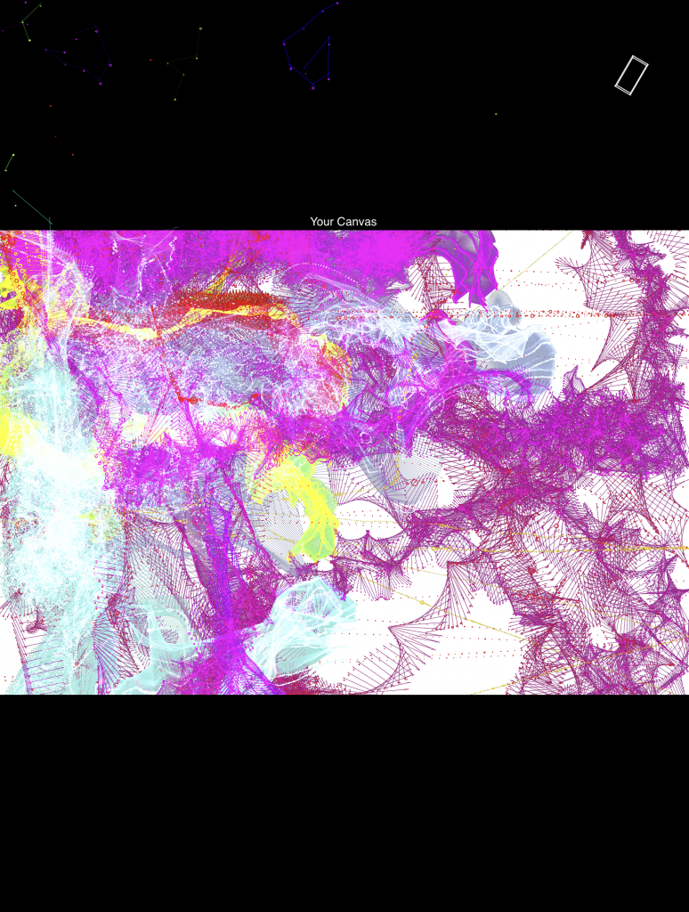
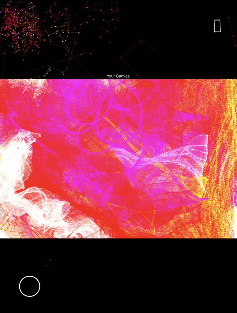
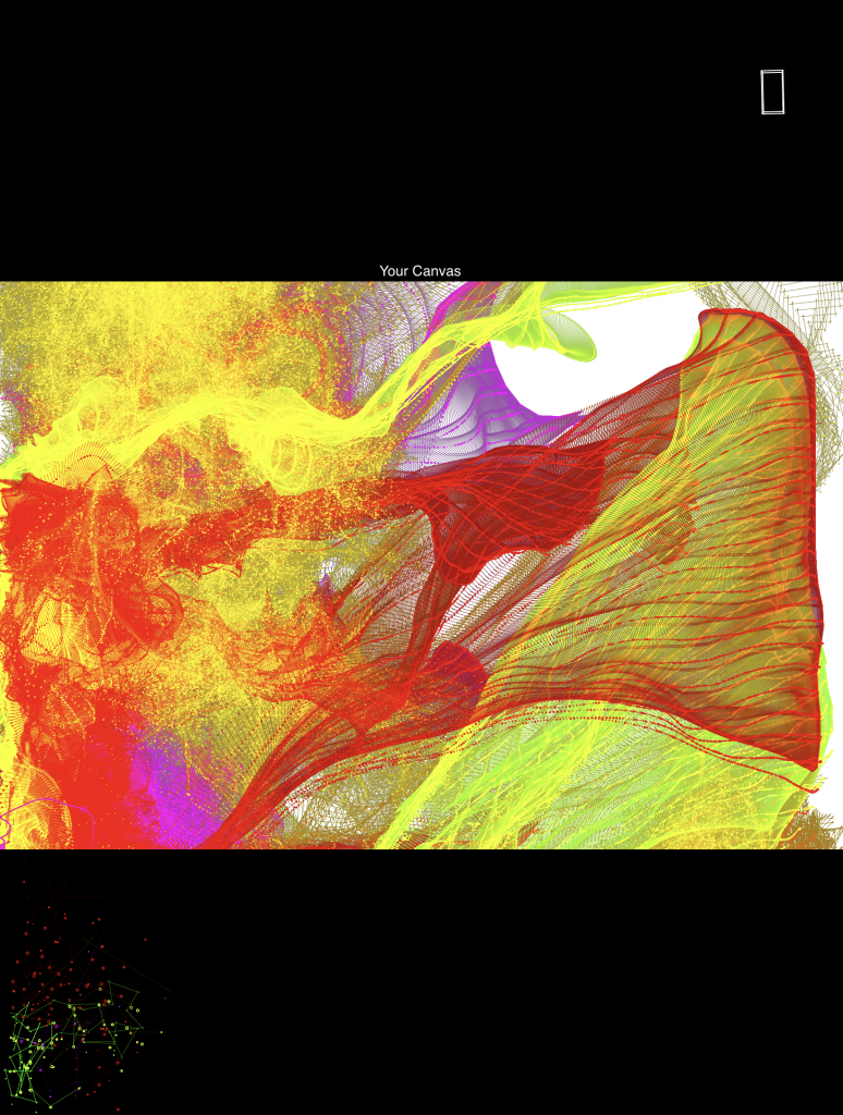
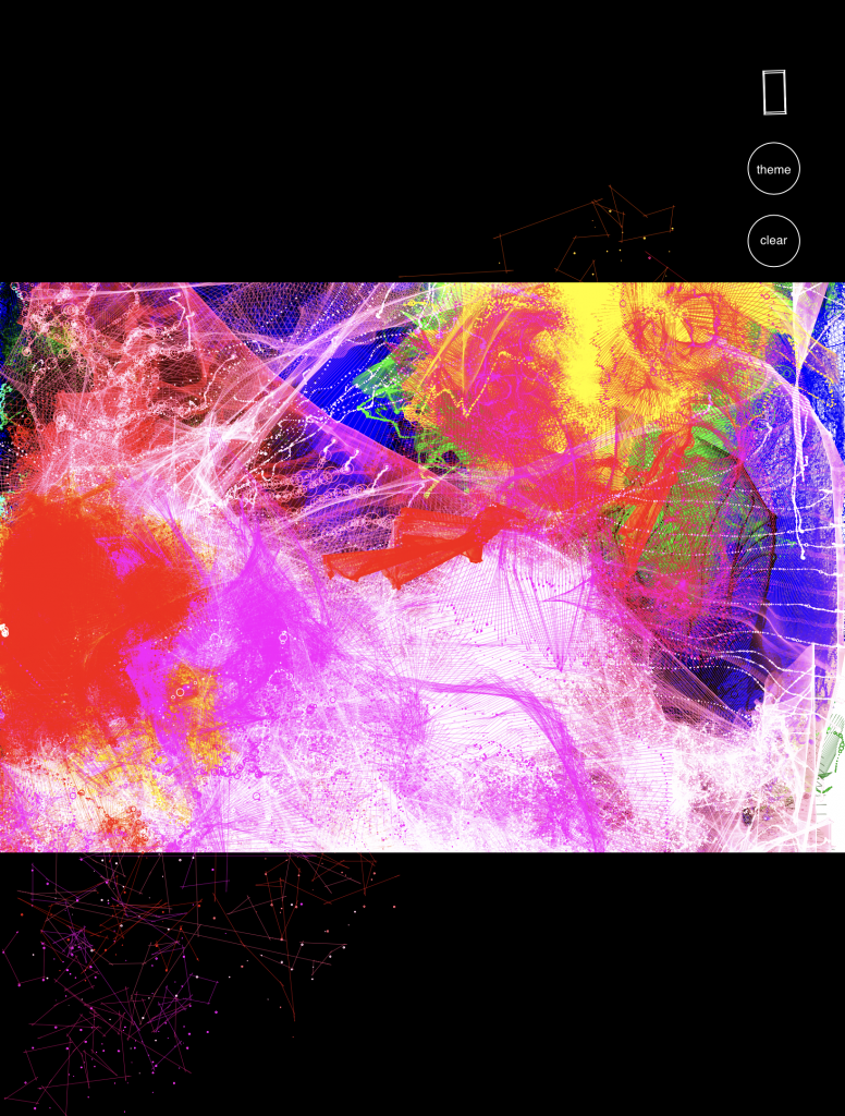
The user decides where these “jittery”, drawing tools exist on the screen; placing them on the canvas portion of the screen results in instantaneous marks that are left behind as the generated drawing tools meander and travel based on the device orientation. When drawing off-canvas (black portions of the screen), you can see the form of the drawing tool much clearer, where drawing marks aren’t created. By rotating, flipping, tilting, and shaking the device, the user is able to control the direction and speed that the generated line-mechanisms move, resulting in different stroke-widths and patterns that are left as marks on the canvas. Using the device’s accelerometer data, forces are applied to the drawing physics, mainly the tilt angle (affects the magnitude of the force) and direction of the tilt (decides the direction of the force). Shaking the device generates circles that take the shape of the drawing tool, where the size of circles drawn are based upon how vigorously the device was shaken (force applied on the device in the z-plane).
Process

A large part of the problem was perfecting the physics that the drawing mechanisms moved in. On a basic level, the drawing mechanisms are essentially springs that move and rotate with forces applied to it. Using a template created by LingDong Huang, I was able to access the device’s accelerometer data, along with the current orientation and position of the screen, and had different forces applied to the way the springs moved across the screen. For example, tilting the screen downwards applies a gravity-like force, where the springs fall towards the bottom of the screen.

Adjusting the appearance of the drawing mechanisms (the springs) was another part that needed to be sorted out. I decided to stick with a set of 3 color themes (warm colors, cool colors, and a combination) and wanted to figure out: What kind of marks look best? I initially enjoyed thicker lines, but realized that smaller lines and marks can generate much more complex shapes, specifically drawing “Fake-3D” forms that can create forms that look like topographic maps or 3D models of flowers.
Initial Version with larger drawing mechanisms and marks
[videopack id=”2485″]https://courses.ideate.cmu.edu/60-428/f2021/wp-content/uploads/2021/12/RPReplay_Final1638348340.mov[/videopack]
Versions without the "clear"and "theme" button

Example with many layered marks

Example of "flower pedal" forms

In the final form, I implemented buttons to clear the canvas and change colors, which I felt were important additions for a more functional drawing app. I placed those two buttons under the accelerometer diagram in the top right corner of the interface.

Looking back, I’m quite satisfied with the way the drawing project turned out. I’m impressed by the visuals that can be created (3D forms), and the way the physics turned out. Though, the art and marks generated look mathematical, and can pass off as “too random” or “too repetitive”. In the future, I’m interested in adding more features to the project, and changing the forms so that they look more intentional, and less mathematical. I hope to create more recognizable 3D forms, as in its current stage, the marks left are still quite abstract and look similar. Adding more variation, through color choices and controlling the personality of the drawing machines would really benefit the drawing app.