Port Explorer: Macro photogrammetry of personal electronics

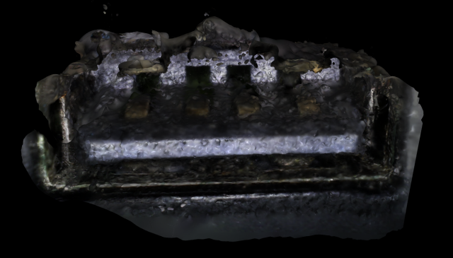
Port Explorer is a typology of personal electronics utilizing macro photogrammetry to capture and model unseen spaces that we carry with us daily. The collection presented is comprised of the charging ports of people’s personal devices: USB-C, Apple Lightning, and USB-A.

Rather than a reflection of an individual, I believe these captures to be a refracted representation. Not much personal information may be derived from these images, but the use and collected grime, lint and dust found in these spaces has unique personal ties and presented as a typology they become the personality of the images.

It was my aim to capture and represent these spaces as micro-verses that the viewer could navigate and explore. Using the Bebird otoscope and compiling into Agisoft’s Metashape, I brought the resulting 3d models into TouchDesigner to create a gallery of 3d responsive models. The viewer can control and navigate each model by clicking and dragging with a 3 button mouse.

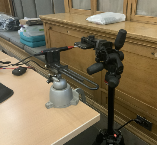
Macro Photogrammetry is quite difficult. The Bebird Otoscope has a very narrow depth of field, and I was also trying to capture cavities externally given the size of the Otoscope. Below is a picture of the set up I used, which did stabilize and to a certain extent mechanize the capture so that I can adjust and line up my next shot somewhat accurately. A more precise rig that could hold the subject and Camera, while also having full 3 axis manipulation of both,  as well as controlling distance would have been the most ideal. Given the challenges of this type of capture I did scale up from phone ports to USB ports, which proved less challenging given the extra space and larger cavity.

I believe there is more to explore around this project. By understanding the limitations of my set up and my methodology, and was there more time, I would have liked to further investigate computer cables (DVI, VGA, etc.) as a typology that presents and abstracts their various topographies as micro-verses. There is a gendered component to this work that I am also interested in further exploring. Specifically investigating, colloquially termed “Male” cables that at macro scale are unique bodies and cavities that are not dis-similar from their “female” counterparts.


Typology Project- Salivation of Salvation

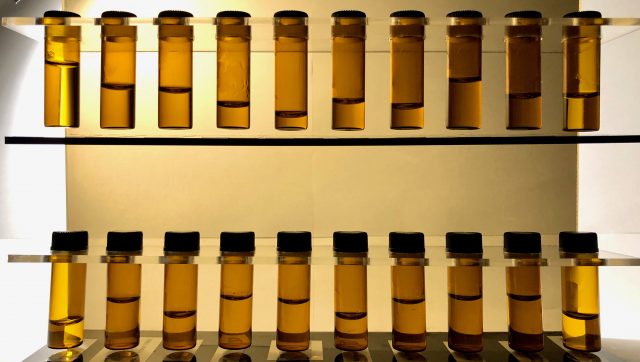
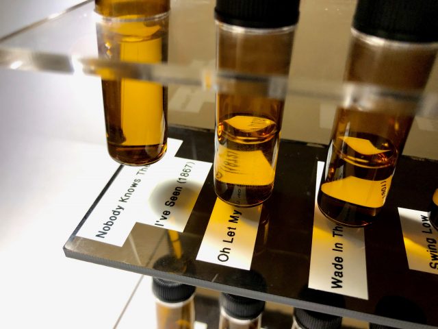
Salivation of Salvation is an experimental capture of the amount of saliva produced while performing songs created during periods of black oppression to uplift or bring attention to wrongdoings. The 20 songs span from 1867 to 2018 through american slavery, the Jim Crow era, black power movements, the civil rights movement, and the black lives matter movement. The chosen songs include the genres of slave songs, gospel, jazz, pop, and hip hop. Inspired by Reynier Leyva Novo’s The Weight of History, Five Nights, “Salivation of Salvation” combines black DNA with black history.

Featured Songs:

      1. Nobody Knows the Trouble I’ve Seen (published 1867)                              – African American Spiritual originating from slavery
      2. Oh Let My People Go (published 1872)                                                                – Song of the Underground Railroad
      3. Wade In the Water (published 1901)                                                                     – Song of the Underground Railroad
      4. Swing Low Sweet Chariot (1909)                                                                           – Popularized as a Negro Spiritual by the Fisk Jubilee Singers
      5. When the Saints Go Marching In (1923)                                                             – Negro Spiritual
      6. Follow the Drinking Gourd (published 1928)                                                   – Song of the Underground Railroad
      7. Strange Fruit (1939)                                                                                                     – In response to lynching in Indiana
      8. This Little Light of Mine (written 1920/popularized 1950)                       – Popular Song of the Civil Rights Movement
      9. We Shall Overcome (1959)                                                                                        – Anthem of the Civil Rights Movement
      10. Oh Freedom (1963)                                                                                                       – Song of the American Civil Rights Movement
      11. Respect (1967)                                                                                                                – Civil Rights, Equal Rights, and Black Panthers movement anthem
      12. Say It Loud! I’m Black and I’m Proud (1968)                                                   – Unofficial anthem of the Black Power movement
      13. Black Is (1971)                                                                                                                 – Hip hop fore fathers popularizing modern pro black poetry as music
      14. Get Up Stand Up (1973)                                                                                               – About taking action oppression, written in observation of Haiti
      15. They Don’t Care About Us (1995)                                                                           – Protest song made by one of the biggest icons of black music
      16. 99 Problems (2003)                                                                                                      – Known for illustrating Stop and Frisk and driving while black incidents
      17. Be Free (2014)                                                                                                                 – Response to Michael Brown shooting
      18. Alright (2015)                                                                                                                  – Unifying soundtrack of the Black Lives Matter Movement
      19. Freedom (2016)                                                                                                              – Song of the Black Lives Matter Movement dedicated to black women
      20. This Is America (2018)                                                                                                – Chart topping song against gun violence, racism, and police brutality

Salivation of Salvation is based on the study of sialometry, the measure of saliva flow. Sialometry uses stimulated and unstimulated techniques to produce results from pooling, chewing, and spitting. Although the practice is more commonly used to investigate hypersalivation (which would be easier to measure due to the excess of non-absorbed liquid), I realized I would need a more sensitive system to record the normal rate of saliva production.

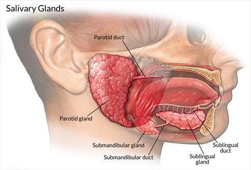
In the mouth there a three salivary glands: Sublingual, Submandivular, and Parotid. The Sublingual glands are the smallest glands and on the floor of the mouth; they constantly excrete. The Submandivular glands are at the triangle of the neck, below the floor of the mouth and also constantly produce saliva. The Parotid glands are largest glands located in front lower molars parallel to the front of the ear. These glands produce through stimulation.

A majority of saliva gets absorbed into the gums and tongue, the remaining fluid rolls back down your throat. Thus making the tongue the target area for my project since it is the pathway to the throat and makes contact with the gums.

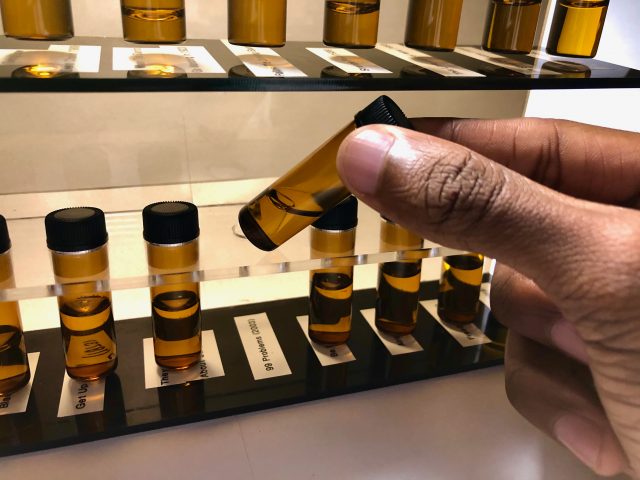
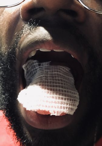
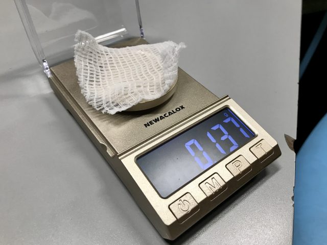
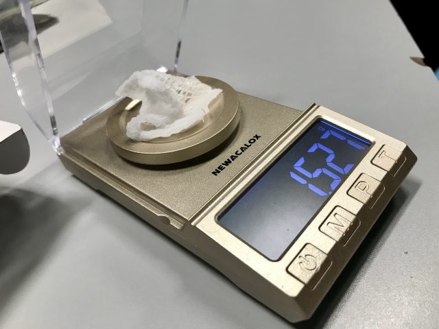
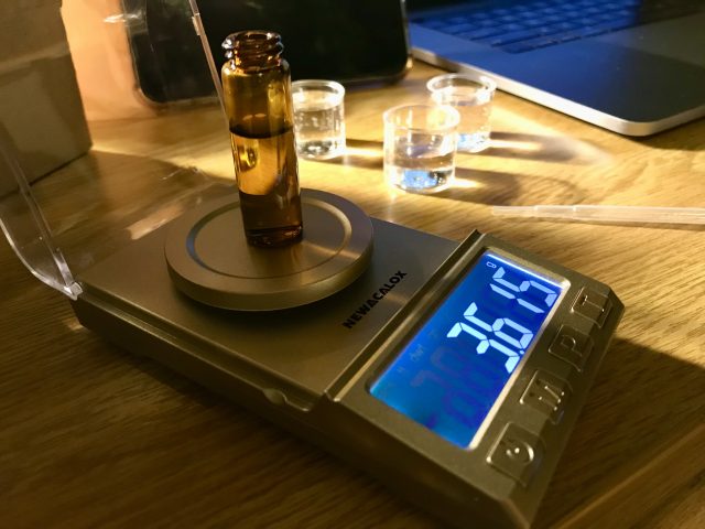
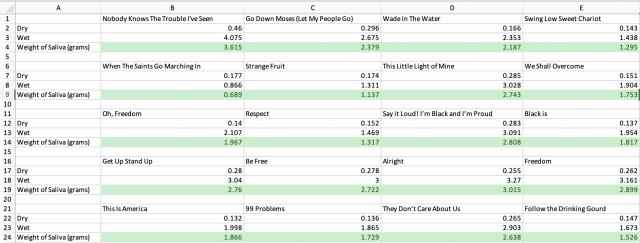
The system developed was an artificial tongue that could be weighed dry then weighed wet, the difference in values would be the weight of the saliva collected. This process was simply and effectively produced by laying a strip of gauze the covered the entirety of the tongue (the foreign object also helped trigger the Parotid Glands). The gauze was weighed with a jewelry scale which can display weight to the milligram. The conversion from weight to volume was simple since 1 mg = 1 ml. The recorded weight difference was then transferred in 5 ml vials through drooling, which had to be produced after measurements were taken.

The purpose of Salivation of Salvation was to make a tangible representation of history. Saliva holds our genetic composition and by tying together this constantly self-producing liquid with a song that marked a specific moment, a general and personal “historical” object is developed. Collaterally, patterns of history became shown through the collected data, as well. Below is a list of observations:

      • The trend of black music went from gospel to jazz to pop to hip hop.
      • Songs with more words produced higher volumes of saliva, thus jazz songs with breaks produced way less than rapping.
      • Performances with the mouth mostly open did not enable the Parotid Gland as much.
      • Orientation of the tip of the tongue influenced the pooling of saliva; therefore words starting with “t” would cause saliva to roll back, while a “b” word would pool underneath the tongue.
      • The songs appear to become more direct and aggressive over time.

Reference:

https://www.hopkinssjogrens.org/disease-information/diagnosis-sjogrens-syndrome/sialometry/

Typology – Population Flux

Population Flux is a typology machine that measures the different population trends of people in rooms and how people tend to move in and out of rooms (individual/group) in order for viewers to see how busy rooms are at certain times. I built a machine that would save the relative times when people would enter a given room, and use a graphics API to visualize the data.

Check out the GitHub Repo here.

– Setup – [TLDR Shorter Setup Description in Discussion Section]

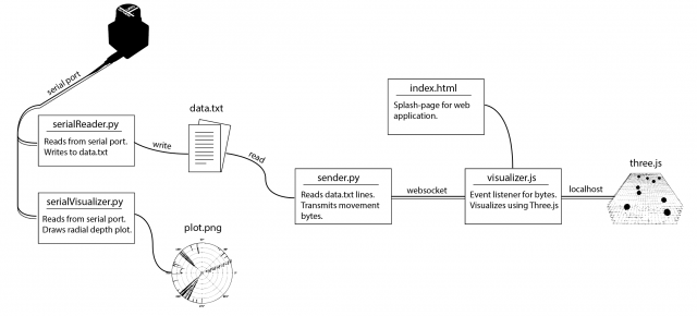
The entire operation only requires 3 terminal launches! (serial port reader, web socket connection, localhost spawning). A roadmap of the communication layout is provided below.

Layout of the data-transfer operations. Terminals need to be set up to listen from the serial port, transmit data over a web socket, and launch a localhost to view the visualization. The serial port terminal can be run independently to first capture the data, while the other two terminals can be run to parse and visualize the results.

The involved setup was a Hokuyo URG Lidar connected to a laptop. The Lidar provided a stream of ~700 floats uniformly around 270 degrees at a rate of 10 times a second. In order to capture the data, I used the pyURG library to read directly from the serial port of the USB-hub where the Lidar was connected to. Unfortunately the interface is written for python2 and required substantial refactoring for python3 (the serial library that pyURG uses requires users to send bit-encoded messages with python3, which requires additional encoding/decoding schemes to get working with python3).
On startup, the program averages 10 captures in order to capture the room’s geometry. While the program reads from the Lidar, any data captured will have the initial room’s geometry subtracted from it so that all distances are negative (this is based on the assumption that the scene’s geometry does not change over time).

When a person walks at degree angle d in front of the Lidar, then region around d will return closer distances than before, and the resulting data after subtracting the scene’s geometry will be a wide negative peak at degree d. In order to get this exact location d, the data from each frame is sequentially parsed in an attempt to find the widest peak. Thus, at each frame, we can capture the location (in degrees) of any person walking in front of the Lidar.

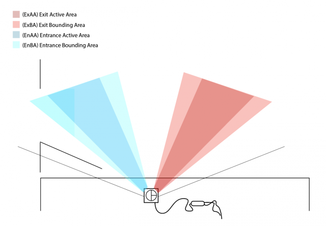
Field of View of Lidar. EnAA and ExAA add the current timestep to the respective enter and exit queue when a person walks by. EnBA and ExBA prevent multiple writes to each queue when a person stands in the corresponding active area by preventing any additional writes to either queue until the person leaves the bounding area.

The next step is to determine the direction of movement, as it can be used to determine whether a person enters or exit a room. The Lidar’s view was discretized into 2 regions: the Entrance Active Area (EnAA) and Exit Active Area (ExAA), each containing a range of valid degrees that the area encased. When the user walked into EnAA, the program would push onto an entrance queue the timestamp of the detection, and when the user walked into ExAA, the program pushed the timestamp onto the exit queue. When both queues had at least one value on them, the first values were popped off and compared. If the enter timestamp was less than the exit timestamp, then the program would write the action as an “enter”. Otherwise, it would be written as an “exit”, along with the most recent timestamp of the two.
The biggest errors that would arise from this is getting multiple entrance timestamps added to the queue everytime a person stood in EnAA. To resolve this, a few steps were taken:

    • Include booleans indicating if you are in EnAA or ExAA. The boolean would be turned on when first entering the area, and kept on to prevent multiple timestamps to be added to the queue.
    • Add an Entrance Bounding Box (EnBA) Exit Bounding Box (ExBA) that were wider than EnAA and ExAA respectively. The booleans would only turn off when you exit these areas as to prevent multiple timestamps from being added to the queue if you’re on the edge of EnAA.
    • Clear the queues once a person leaves the field of view of the Lidar. Originally if a person walks into EnAA, but turns around and leaves before reaching ExAA, then another person walks from the ExAA towards EnAA, then the program would misclassify it as an “enter” since it would compare the first EnAA timestamp of the person who turned around to the ExAA timestamp. Resetting the queue would prevent this issue.
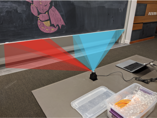
Physical setup of device. Active and Bounding Areas are visualized to show the detective region. These regions are intentionally made wide so that fast movement can still be picked up by the sensor. Each room has a unique geometry, and the span of each area can be adjust per room (if room entrances are more narrow or wider than others).

The resulting data was written to a text file in the form “[path,timestep]” where path was a boolean [0,1] indicating an enter or exit, and timestamp was the frame number in which the detection was made. Another python file would then read from the text file. It would then connect over web socket to the javascript visualization file and send over a series of bits denoting the number of enter and exit movements at any given timestep. The python script would do this by keeping track of the time of execution of the program, and anytime the timestamp of a particular datapoint was surpassed by the program’s time, then that point (0 for enter, 1 for exit) was added to the data stream and sent over web socket to the javascript file. This would allow users to replay pre-captured data in realtime, or speedup the playback by scaling up/down timesteps.
The javascript visualization was done in Three.js. Using a web socket listener, any incoming data would trigger the generation of new spheres that would be animated into the room. This way, viewers could see not only the number of people, but at what points people enter/exit the room, and if they move individually or all at once.

– Data –

The following data was captured over ~1-1.5 hour periods to measure the population traffic of rooms at different times.

Dorm Room [30x speedup]

Studio Space (Class-time) [30x speedup]

Studio Space (Night-time) [30x speedup]

– Discussion –

  • What was your research question or hypothesis?
    • What is the population density of a specific room at any given time? Do people tend to move in groups or individually? When are rooms actually free or available?
  • What were your inspirations?
    • This project was inspired by many of the building visualizations in spy movies and video games where you could find how dense certain rooms were at certain times.
  • How did you develop your project? Describe your machine or workflow in detail, including diagrams if necessary. What was more complex than you thought? What was easier?
    • The setup involved parsing incoming Lidar data to detect peaks, which would indicate the location of any passing people. The Lidar’s field of view was divided into an entrance and exit side, where if any peak passed through the entrance first, then it would classify the result as an “entrance”, otherwise an “exit”. The resulting data was stored in a text file and parsed by another python file before transferring over to a javascript visualization built on Three.js. The complex part was trying to get the data, as I was never able to get the OSC data outside of the receiver, so I ended up building my own layout for reading and transmitting the data. The easier part was getting the web socket set up considering it worked on the first try.
  • In what ways is your presentation (and the process by which you made it) specific to your subject? Why did you choose those tools/processes for this subject?
    • Determining if a person walks by isn’t very difficult, but determining the direction requires at least two datapoints. Luckily, Lidar offers more than 700 datapoints that can be divided into an entrance/exit region. This provides multiple points for each region, so if the subject moves quickly, the Lidar has a large field of view to detect the person. Three.js was used as the visualization scheme since it was easy to set up and convert to a web app.
  • Evaluate your project. In what ways did you succeed, or fail? What opportunities remain?
    • The project succeeded in being able to communicate the data from the Lidar all the way to the visualizer (and in real time!). This was overall tricky since there was a lot of processing done to the data, yet in the end there was a continuous stream of data with low latency being provided to the visualizer. One of the hardest part of the project was getting clear data from the Lidar. The device itself is very noisy, and I spent a lot of time trying to de-noise the output, but noise would still remain. One opportunity that still remained is advancing the visualization aspect. If I had more time, I would make a more complex room layout that would be more representative of the room geometry than just a green rectangle. This wouldn’t be difficult to do, just time consuming since it would require modeling.

Bubble Faces

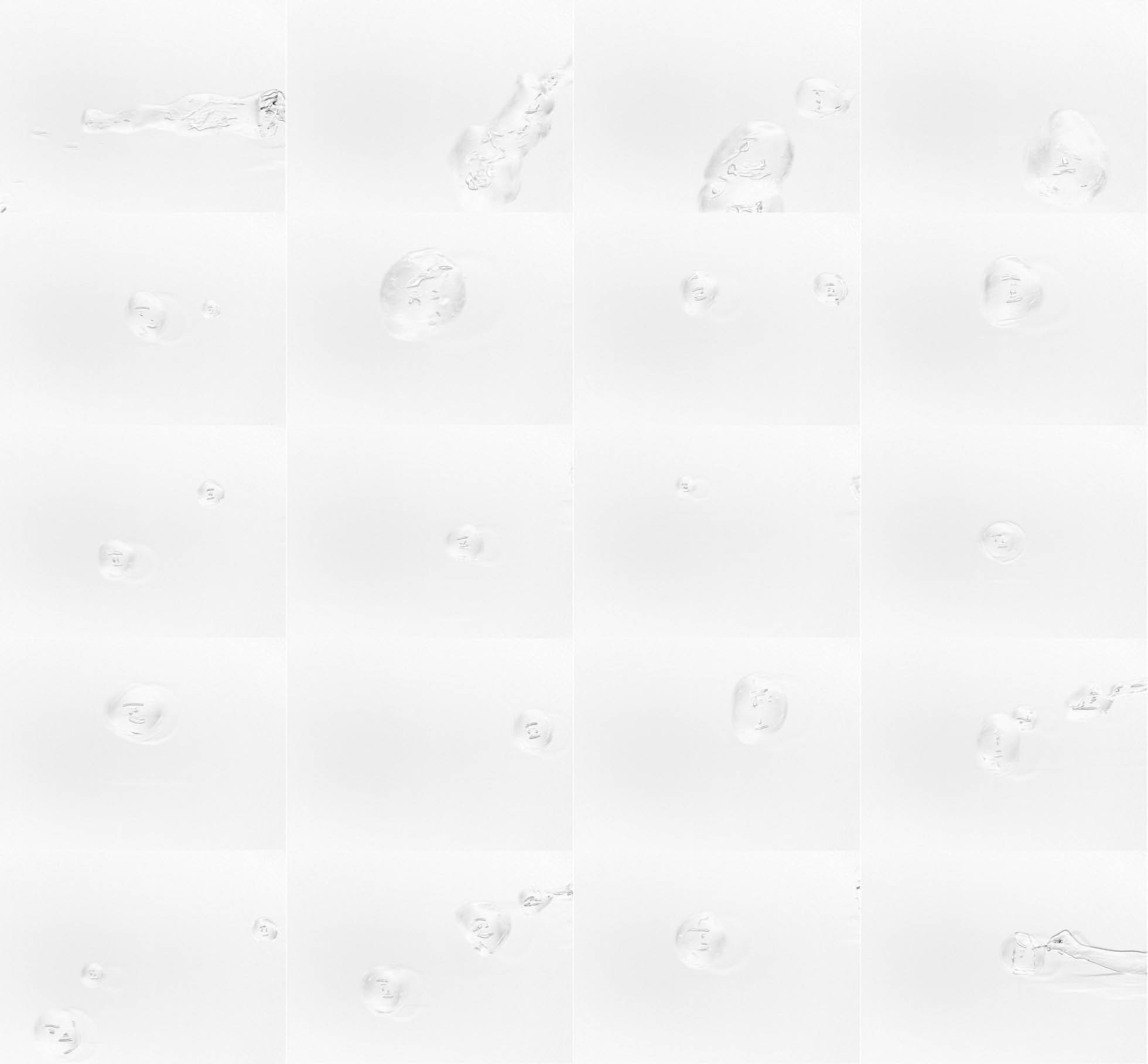
Photographing bubbles with a polarization camera reveals details we don’t see when we look at them with our bear eyes, details including strong abstract patterns, many of which look like faces.

I wanted to know what bubbles looked like when photographed with a polarization camera. How do they scatter polarized light? I became interested in this project after realizing that the polarization camera was a thing. I wanted to see how the world looked when viewed simply through the polarization of light. The idea to photograph bubbles with the camera came out of something I think I misunderstood while digging around on the internet. For some reason I was under the impression that soap bubbles specifically do weird thing with polarized light, which is, in fact, incorrect (it turns out they do interesting things but not crazy unusual things).

To dig into this question, I took photographs of bubbles under different lighting conditions with a polarization camera, varying my setup until I found something with interesting results. As I captured images, I played around with two variables: the polarization of the light shining on the bubbles (no polarization, linear polarized, circular polarized), and the direction the light was pointing (light right next to the camera, light to the left of the camera shining perpendicular to the camera’s line of sight).

I found that placing the light next to the camera with a circular polarization filter produced the cleanest results, since putting the camera perpendicular to the camera resulted in way too much variation in the backdrop, which made a ton of visual noise. The linear polarization filter washed the image out a little bit, and unpolarized light again made the background a bit noisy (but not as noisy as the light being placed perpendicular to the camera).

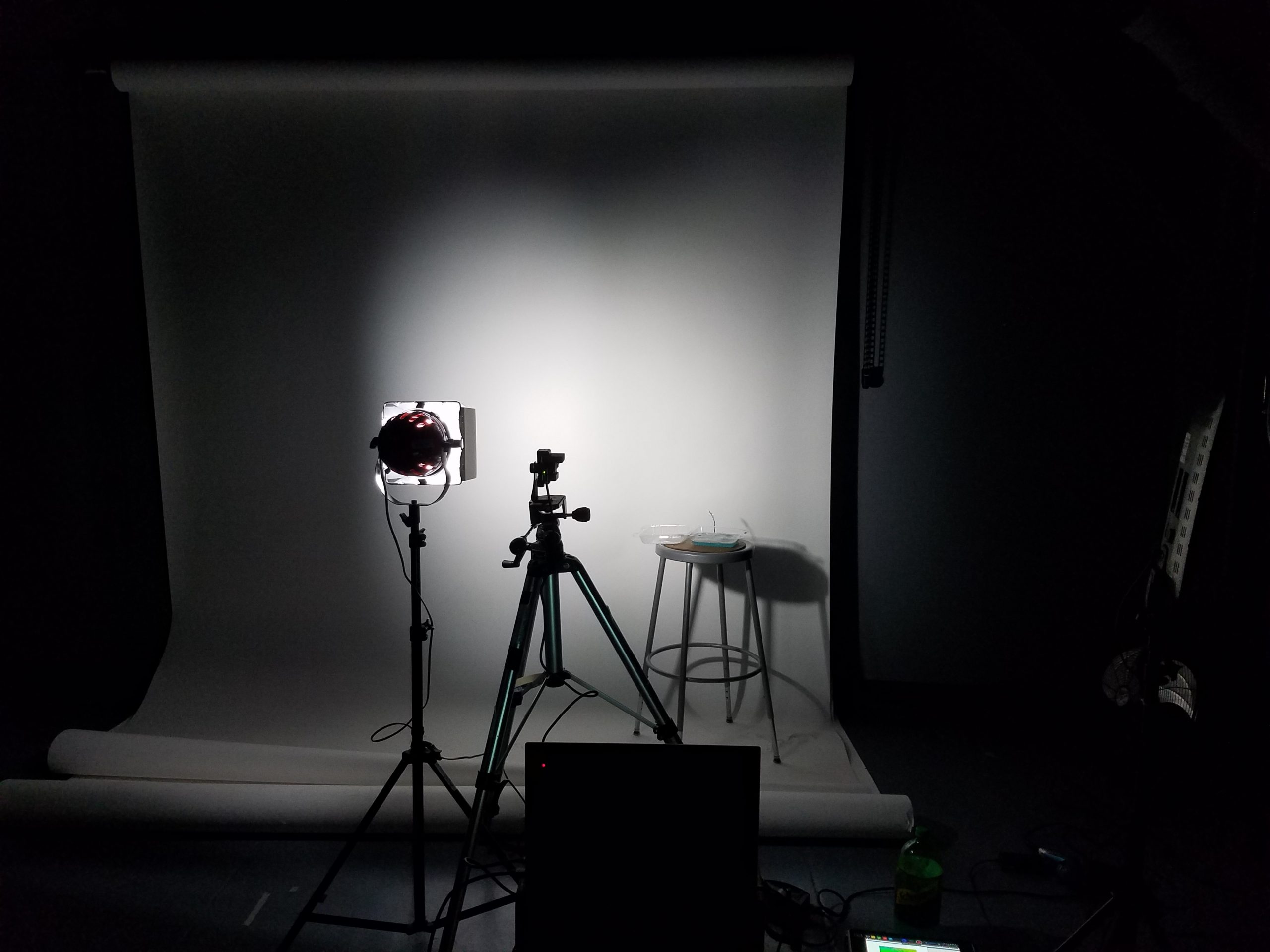
The photo setup I ended up using with the polarization camera, light with circular polarization filter, and my bubble juice.

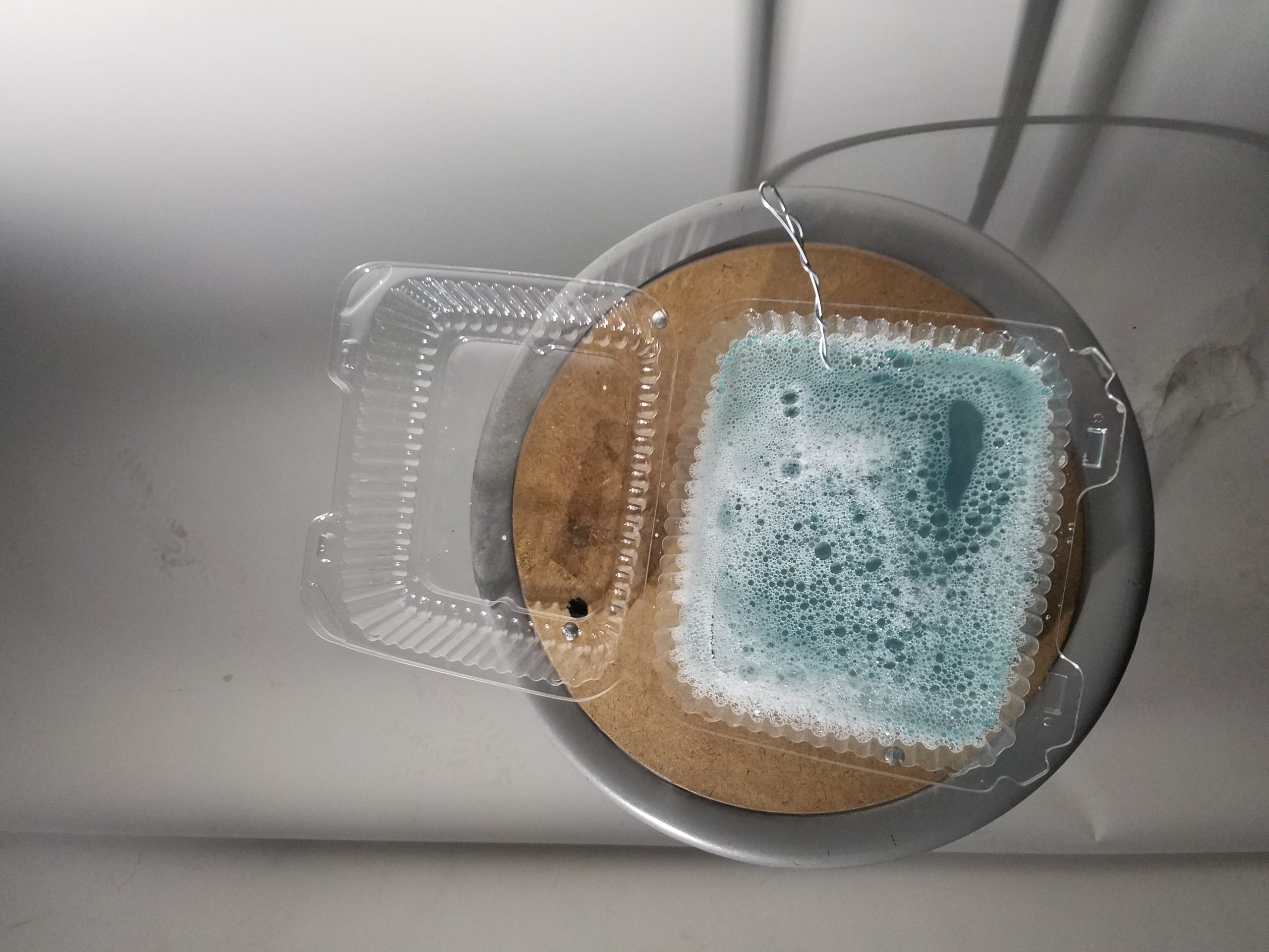
My bubble juice (made from dish soap, water, and some bubble stuff I bought online that’s pretty much just glycerin and baking powder)

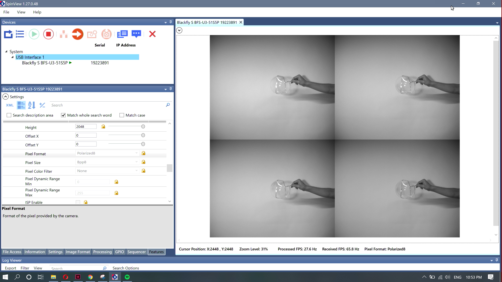
I recorded a screen cap of the capture demo software running on my computer (I didn’t have enough time to actually play with the SDK for the camera). I viewed the camera output through a four plane image showing what each subpixel of the camera was capturing (90, 0, 45, and 135 degrees polarized).

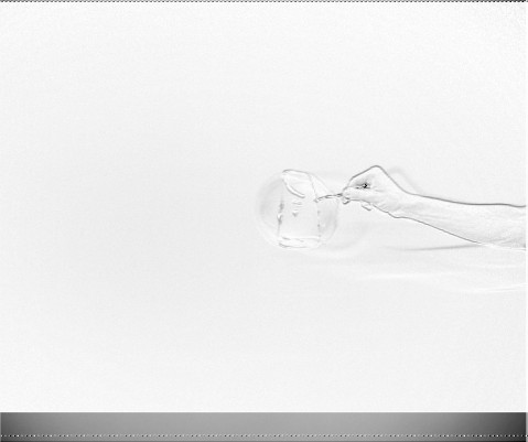
An image of my arm I captured from the screen recording.

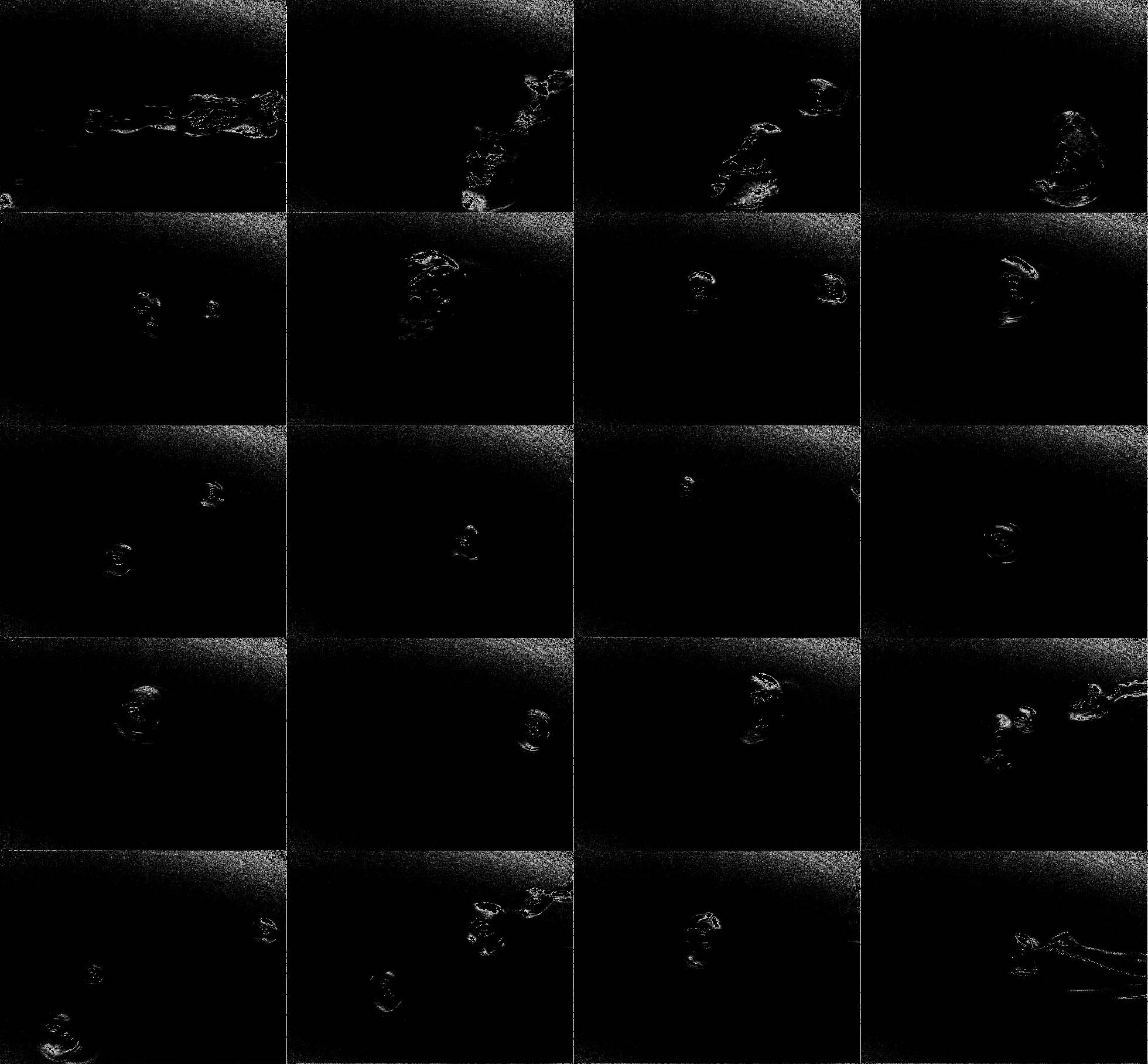
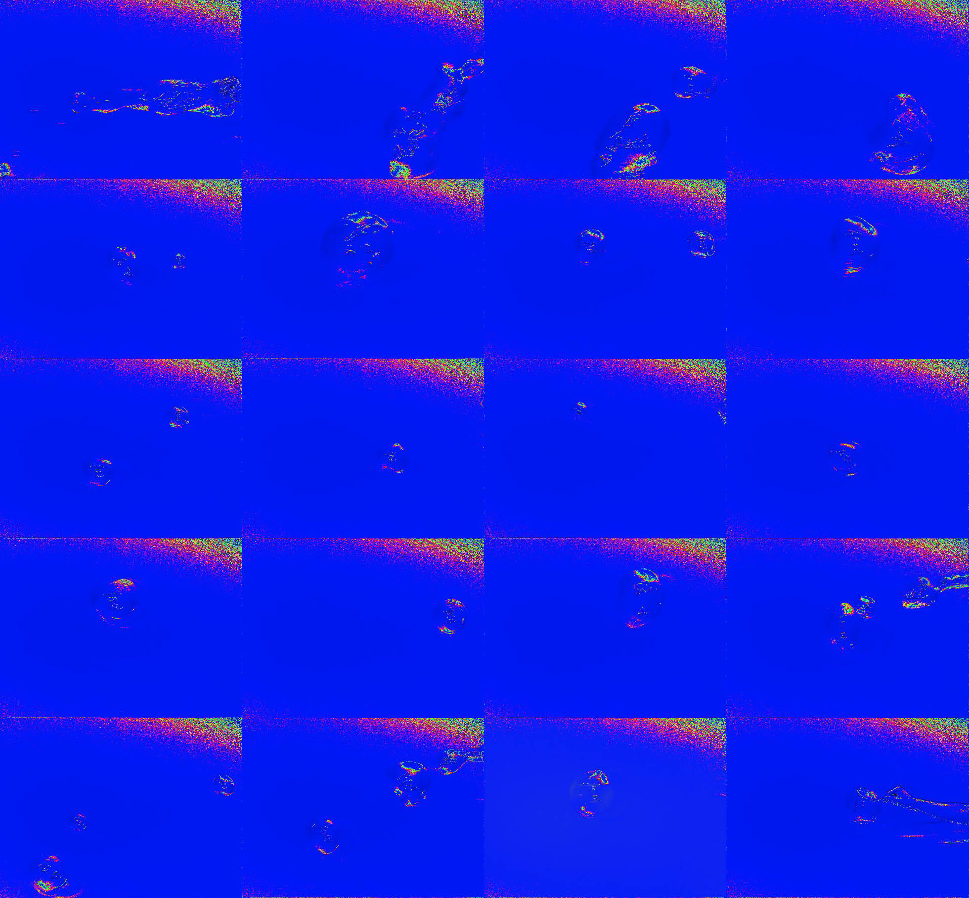
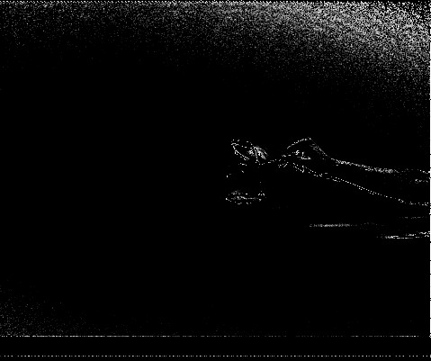
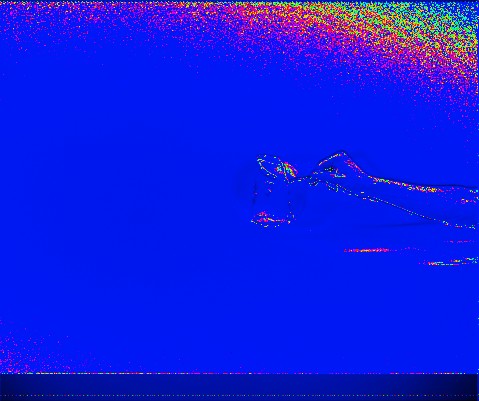
I grabbed shots from that recording and then ran those shots through a Processing script I wrote that cut out each of the four planes and used them to generate an angle of polarization image (black and white image mapped to the direction the polarized light is pointing), degree of polarization image (black and white image showing how polarized the light is at any point), and a combined image (using the angle of polarization for the hue, and mapping the saturation and brightness to the degree of polarization)

degree of polarization image of my arm

angle of polarization image of my arm

combined image of my arm

It ended up being a little more challenging than I had anticipated to edit the images I had collected. If I was actually going to do this properly, I should have captured the footage with the SDK instead of screen recording the demo software, because I ended up with incredibly low resolution results. Also, I think the math I used to get the degree and angle of polarization was a little wacky because the images I produced looked pretty different from what I could see when I looked at the same conditions under the demo degree and angle presets (I captured the four channel raw data instead because it gave me the most freedom to construct different representations after the fact).

While I got some interesting results (I wasn’t at all expecting to see the strange outline patterns in the DoLP shots of the bubbles), the results were not as interesting or engaging as they maybe could have been. I think I was primarily limited by the amount of time I had to dedicate to this project. If I had had more time, I would have been able to explore more through more photographing sessions, experimenting with even more variations on lighting, and, most importantly, actually making use of the SDK to get the data as accurately as possible (I imagine there was a significant amount of data loss as images were compressed/resized going from the camera to screen output to recorded video to still image to the output of a Processing script, which could have been avoided by doing all of this in a single script making use of the camera SDK).

Small Spaces

Small Spaces is a survey of micro estates in the greater Pittsburgh area as an homage to Gordon Matta-Clark’s Fake Estates piece.

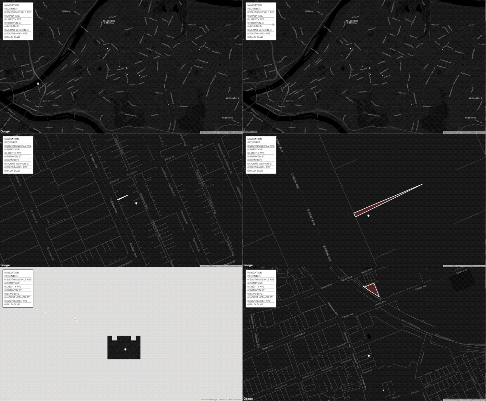
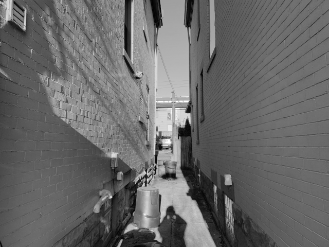
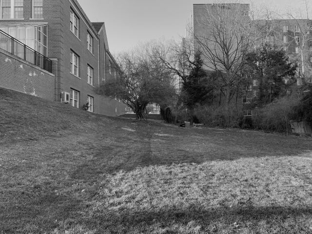
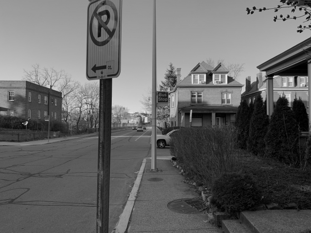
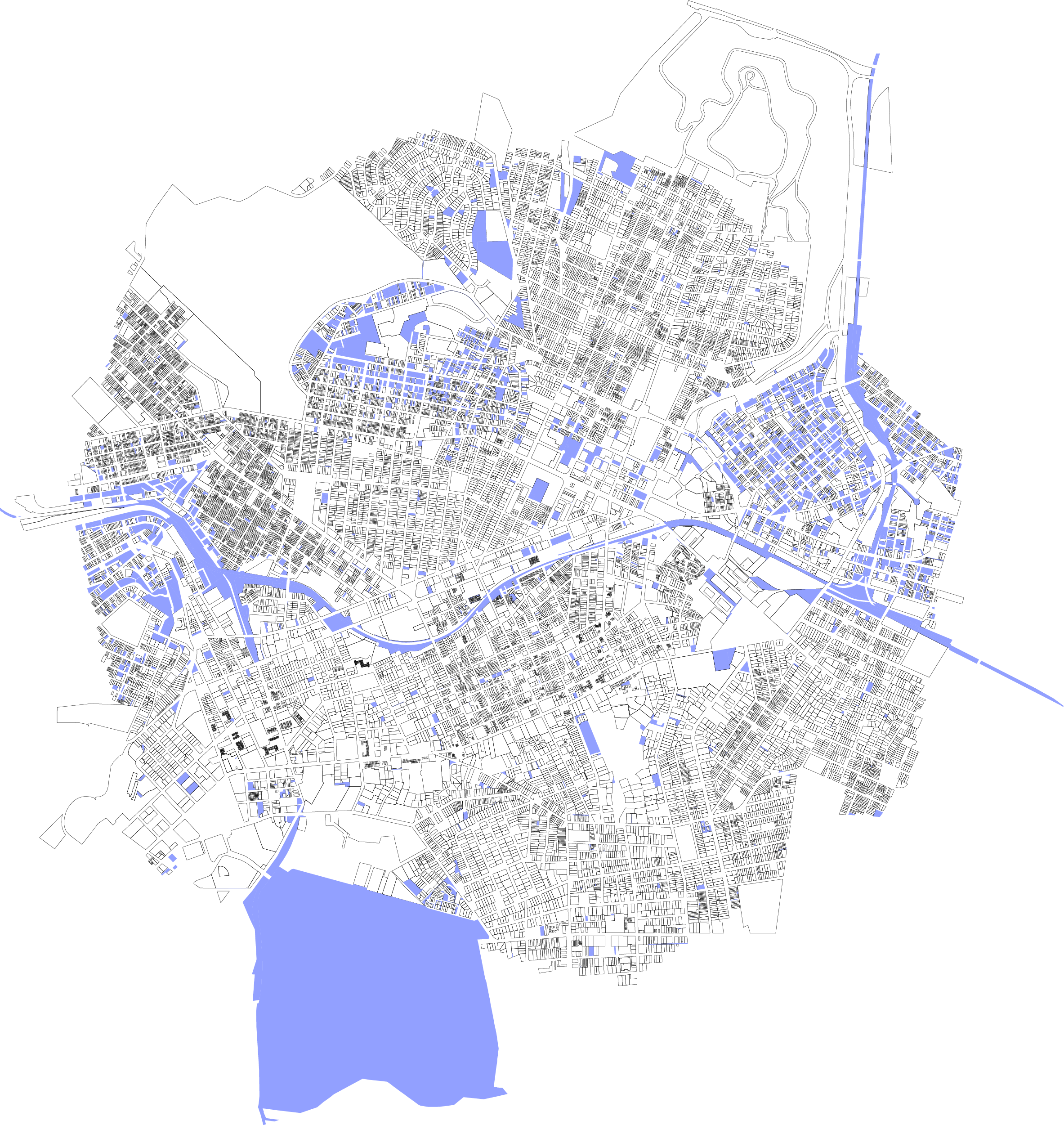
Through this project, I hoped to build on an existing typology defined by Gordon Matta-Clark when he highlighted the strange results of necessary and unnecessary tiny spaces in New York City. These spaces are interesting because they push the boundary between object and property, and their charm lies in their inability to hold substantial structure. It’s interesting that these plots even exist—one would assume some of the properties not owned by the government would be swallowed up into surrounding or nearby properties, but instead they have slipped through bureaucracy and zoning law. To begin, I worked from the WPRDC Parcels N’ At database and filtered estates using a max threshold a fifty square feet lot area. After picking through the data, I was left with eight properties. I then used D3.JS and an Observable Notebook to begin parsing data and finding the specific corner coordinates of these plots. At this point I reached the problem of representation. The original plan was to go to these sites and chalk out the boundaries, then photograph them. As I looked through the spaces, I realized many of them were larger than the lot area listed on the database. They were still small spaces, but large enough that the chalking approach would be awkward, coupled with some existing on grass plots, and one being a literal alley way. Frustrated, I went to the spaces and photographed them, but I felt that the photos failed to capture what makes these spaces so charming. Golan suggested taping outlines of these spaces on the floor of a room to show that they could all fit, which would definitely include some of the charm, but also lose all of the context. In an attempt to get past this block, I made a Google map site to show off these plots, hoping to strike inspiration from exploring them from above. Talking with Kyle led to a series of interesting concepts for how to treat these plots. One idea was to take a plot under my own care. What seemed to be a good fit was drone footage zooming out, so one can see these plots and their context. By the time I reached this conclusion, Pittsburgh had become a rainy gloom, so as a temporary stand in, I also made a video using Google Earth (as I was not able to get into Google Earth Cinema). Overall, I would call this project successful in capturing and exploring the data, but I have fallen short in representation. I hope to continue exploring how best to represent these spaces, and convey why I find them so fascinating using visual expression.

Website Map

0 South Aiken Street
0 Bayard Street
0 South Millvale Avenue

POST CRITIQUE FOLLOW UP:

As something Kyle and I discussed earlier, the question of what lots have the address of zero is an interesting one, given all of these spaces bear that address. I decided to make a small change to my filter script to find out the answer. Below is the result. Feel free to check out the Observable notebook where I filter this data.

An Exploration of Grima – Typology Project

A audio and video exploration into the popular phenomenon of grima (the creeps) which is sounds combined with textures that create repulsion and disgust unique to an individual.

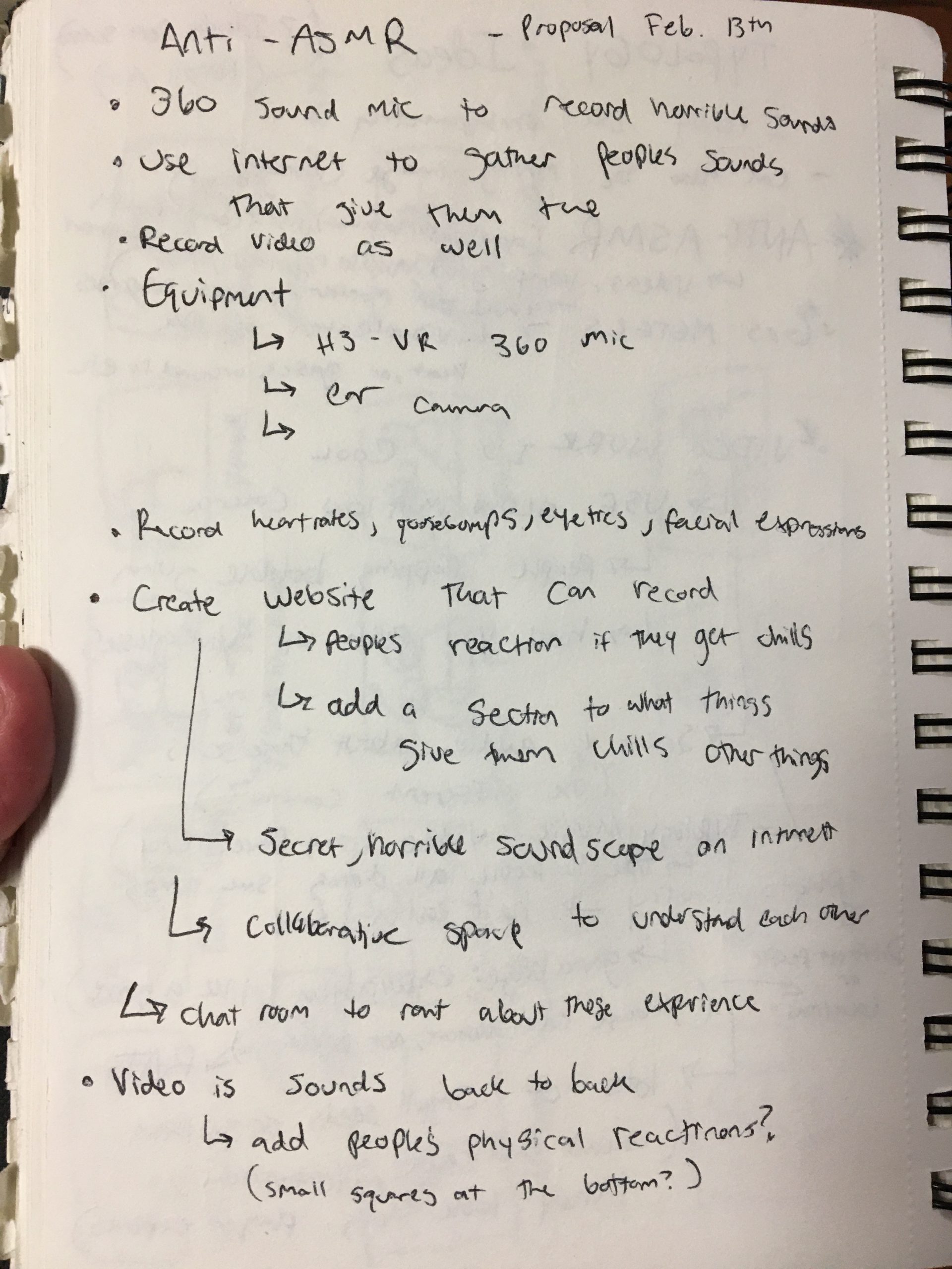
My goal was to try to offer a more tangible definition to the phenomenon of grima to see if see if there can be some joy found in this shared disgust. Grima is related to misophonia, but it is a different experience. Not everyone experiences the same reaction to the same grima triggers; however, there are certain experiences which many people claim as a trigger which are the experiences documented in the video. So my goal was to make a video to document these grima inducing sensations and then also use the video to see who is affected by what sounds/textures.

This project was inspired by the trend of ASMR, research by Francis Fesmire, and several projects discussed in class about unspoken phenomenon that humans share such as Stacy Greene’s lipstick photography.

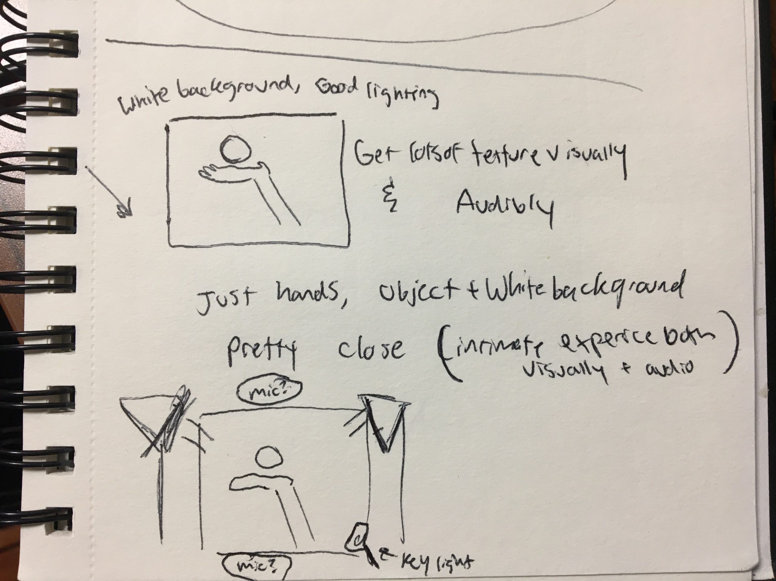
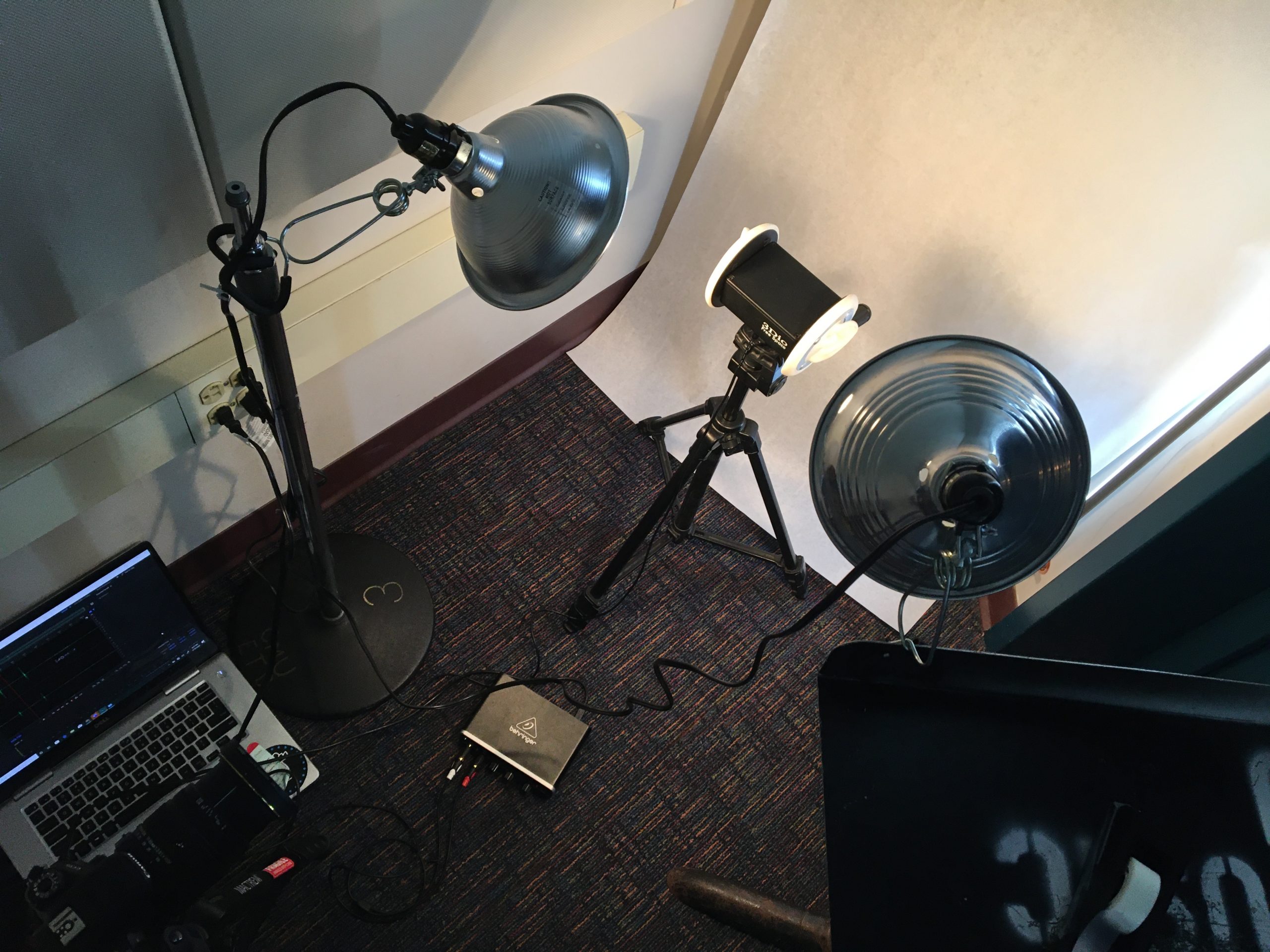
First, I collected a list of grima inducing sensations via social media, word of mouth, and online websites such as Reddit. I gathered all the materials and tried to group them into similar groups while recording (such as all fork videos). It was important to record these sounds as realistically as possible, so I used the binaural microphone in the recording studio to capture the best sound quality. Capturing texture was also important, but I struggled with lighting so the color correction is a little off.

I wanted to compile these sensations into a format that was easily shareable, since this bonding experience is important to the foundation of the project. Being able to use this as a fun game to test yourself or see others who share the same triggers I think is a unique experience that should be talked about more. Additionally, having it in such a format will make it easier to conduct further research on what triggers affect people in the future. This was the final result: An Exploration of Grima

The next steps of the project are still in the drafting phase. Using the video created, I wished to capture data from people watching the video. I did a couple of tests and created some mockups but they are not great yet. I tried to capture users heartbeats while watching the video to see if heartbeats increased while watching their own triggers; however, I ran into some technical issues using the stethoscope and translating that data into visuals.

HEARTBEAT MOCKUP:

Next, I tried having people watch the video and tap on a microphone whenever they disliked a noise. They were suppose to tap faster the more they did not like a noise. I took the data from 2 people and compiled it in a visual alongside the video.

PHYSICAL TAPPING MOCKUP:

There is definitely more to be improved on regarding lots of aspects of this project. Technically, I would like to improve lighting conditions, keep these conditions consistent, and highlight the textures of the objects better. I think the execution and format of the project worked well for my goal, but I think increasing the scale in both experiences and participants would be ideal. Lastly, I would love to solidify a participatory aspect to this project where people can record their data while watching the video, whether that be figuring out the heartbeat monitor, updating a counter of sensations disliked in real-time etc.

f(orb)idden orb

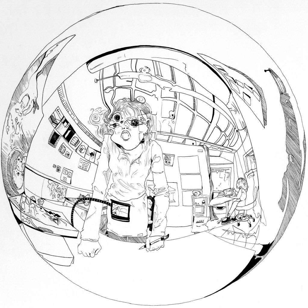
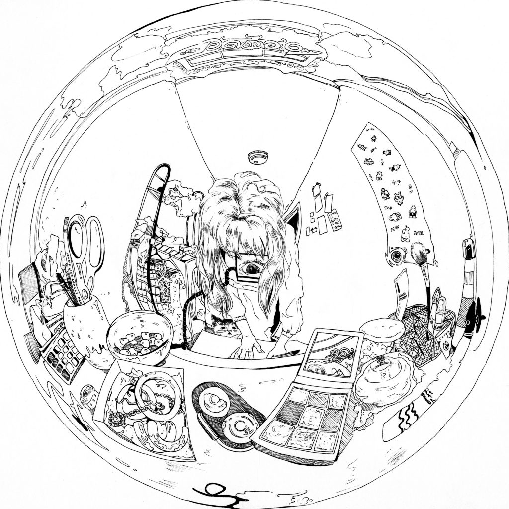
A completely self-centered world emerges from a mirrored sphere. You cannot escape the center of the orb.


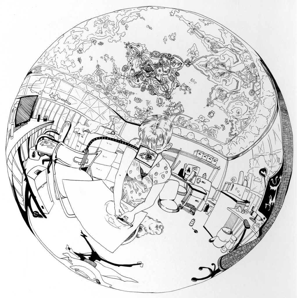
Cognitive neuroscience researchers studying spatial cognition have identified two frames of reference that humans use to understand space: allocentric (world-based) and egocentric (self-based.) These drawings depict the ultimate egocentric frame of reference: a spherified world emanating from the viewer at its center.

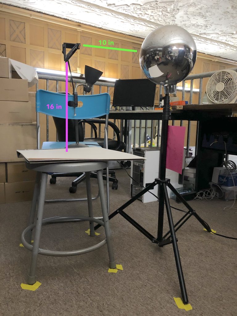
I used the NeoLucida portable camera lucida to project the contents of a mirrored sphere onto paper. I traced the projection in pencil to capture the rough location and distortion of objects in the world. Then, I inked in the sketch freehand, filling in details as I had seen them in the camera lucida and the photographs I took through it.

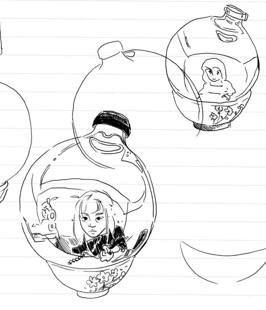
Objects perpendicular to my gaze (i.e. to the side of the orb) became stretched beyond recognition. Even small things, like the bottle in the third image, were spaghettified, as if the image were an inverse black hole. Some objects, no matter how hard I looked, were simply unidentifiable. Dents and other imperfections of the orb distorted the image, creating miniature whorls and spirals throughout the scene.

Preliminary sketch of the orb as it sat placidly in a floral porcelain bowl.

I wanted to see how different environments would appear in the orb, and how it would distort the human form into something unnerving yet familiar. Golan pointed out the unintuitive (at least to me) fact that one’s vantage point (eye or camera lucida) will always be located at the exact center of the sphere. This is oppressive, but unfortunately cannot be stopped.

Pathological mental states like anxiety separate the brain user from their environment, creating a whirlpool of self-centered obsessions and paranoias. Sometimes, one’s own brain is the only thing that doesn’t feel distorted and unfamiliar, when in fact it is more beneficial for the self to open up and bleed into the environment. The second image shows how sheer force of will allowed me to escape the reverse singularity of the orb. Unfortunately, my facial features did not stay intact and it was somewhat painful.

Measurements used to draw a circle 9″ in diameter. Also note that the camera lucida should be level with the equator of the orb in both dimensions. Lights can be used to equalize illumination; in this picture I have several lights pointed at the ceiling.

If I were to do this project again, I’d have a more methodical setup from the start. I’d also develop a more portable/generalizable and less opportunistic rig, although clipping the camera lucida to whatever was available in the environment did help immerse it into the scene. Each drawing was relatively time-consuming, but I would love to make some more.

Shapes of Love

For my typology, I objectified “I love you”.

(I would have separated the models into their own 3D viewers, but Sketchfab only allows one upload per month.)

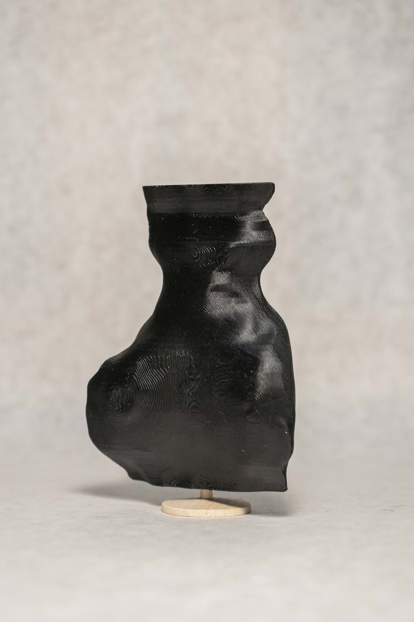
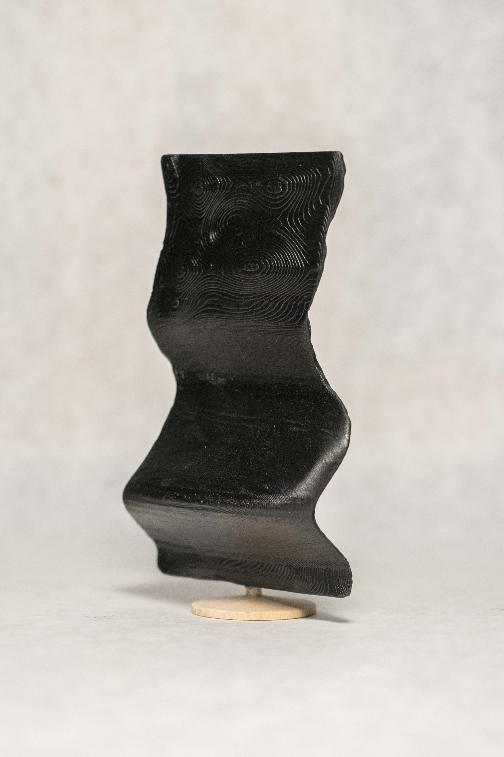
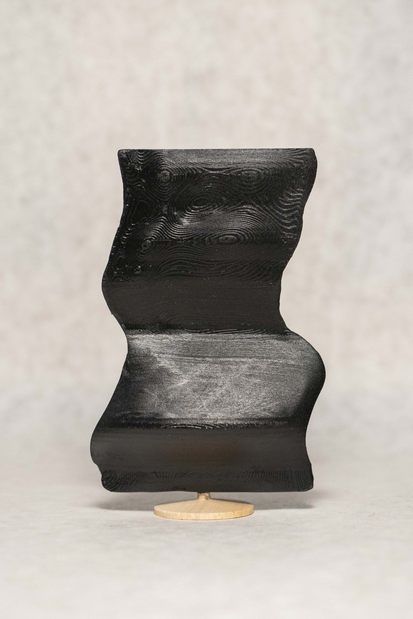
I created 3D sculptures out of the shape that one’s mouth makes over time as they speak the words “I love you” in their first language.

Background

As I’ve watched myself fully commit to art over the last few months, I’ve realized that my practice—and, really, my purpose as a human—is about connecting people. I love people. I love their feelings and their passions, listening to their stories, working together, and making memories. I love love. I want people to experience the exhilaration, sadness, anger, jealousy, and every single powerful emotion that stems from love and empathy.

Having this realization was quite refreshing, as for the last year and I half I have been debating over various BXA programs, majors, minors, and labels. But no longer–I am proudly a creator, and I want to create for people.

Therefore, this project represents both my introduction to the art world as a confident and driven artist and a symbol of my appreciation for those who have helped me get to this point in my life. The people I love are the reason I live, so I wanted to create something that allowed other people to express that same feeling.

method

My typology machine is quite obnoxious, and the journey I took to figure it out was long.

First, I tested everything on myself.

I recorded myself saying “I love you”.
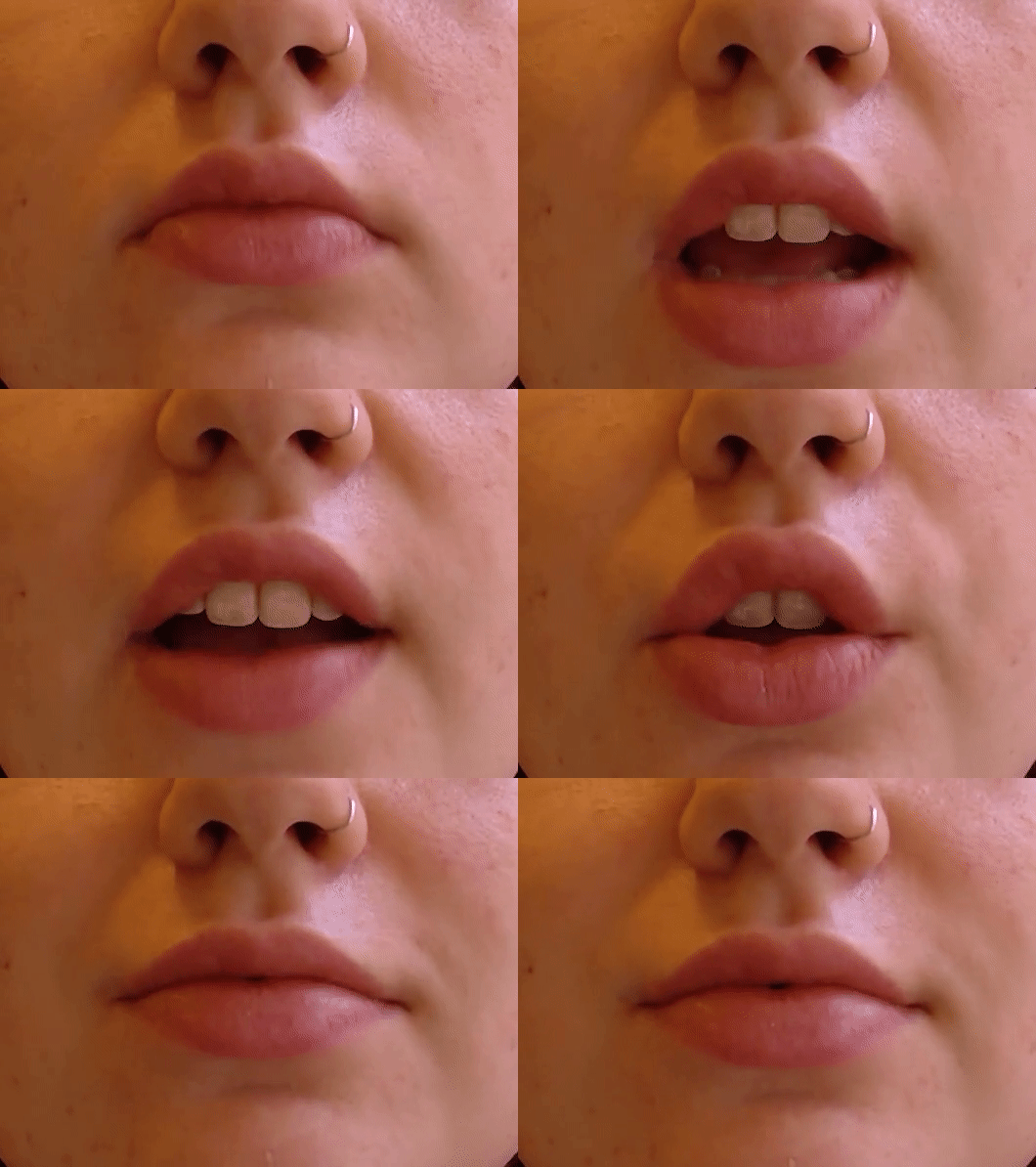
I originally wanted to do everything with a script based on FaceOSC. I wrote such a script, which took a path to a video file and extracted and saved an image of the shape of the lips and the space inside the lips for every frame.
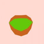
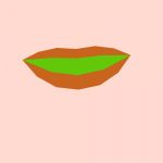
My fear for this method was true: I felt there were not enough keypoints around the lips to provide distinct enough lip-shape intricacies from person to person. Plus FaceOSC is not perfect, so some of the frames had glitched and produced incorrect lip-shapes. This would not do when it came to stitching everything into a 3D model. From here I decided to do it all manually.

Most of these “I love you” videos broke down into about 40 frames, and if not I used every other frame to trim it down.

I opened every single frame of each video in Illustrator, traced the inside of the mouth with the pen tool, and saved all the shapes as DXF files.
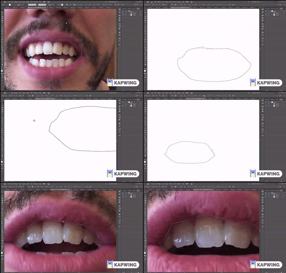
I did this on my own mouth first, but here is Pol’s. At this point I wasn’t sure whether I would be laser cutting or 3D printing for the final product, but I knew laser cutting would be the fastest way to create a prototype, so I compiled all the shapes of my mouth onto one DXF and laser cut them all in cardboard.
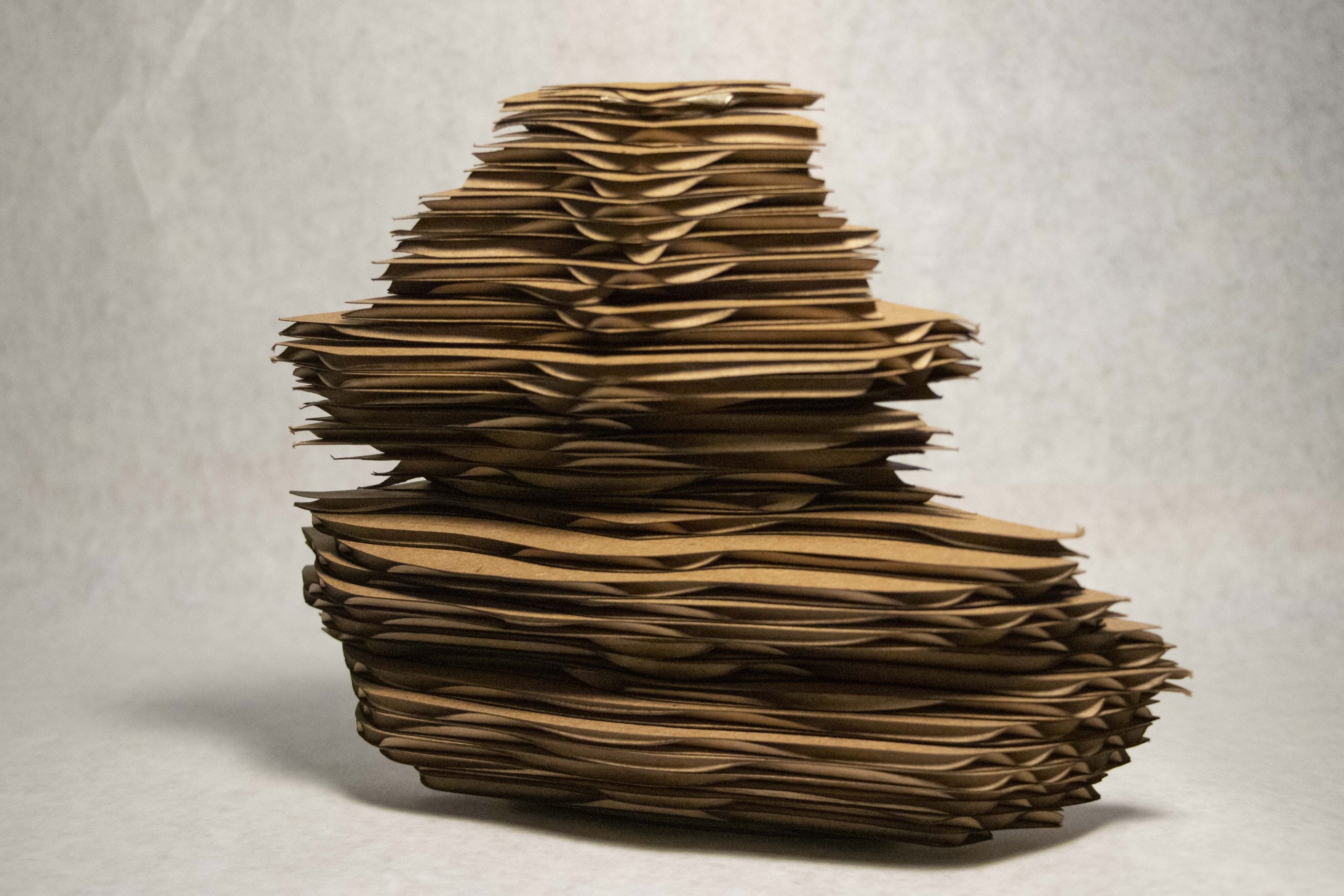
I thought the stacking method would be cool, but it was not. I did not like the way this looked. At this point I buckled down and prepared myself for the time required to 3D print.

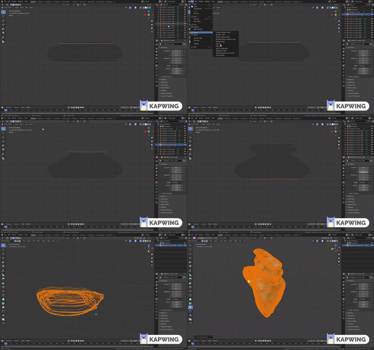
To do this, I manually stacked all the lip-shapes in Blender and stitched them together to create a model.
With the first two models I made, I printed them at a very small scale (20mm).
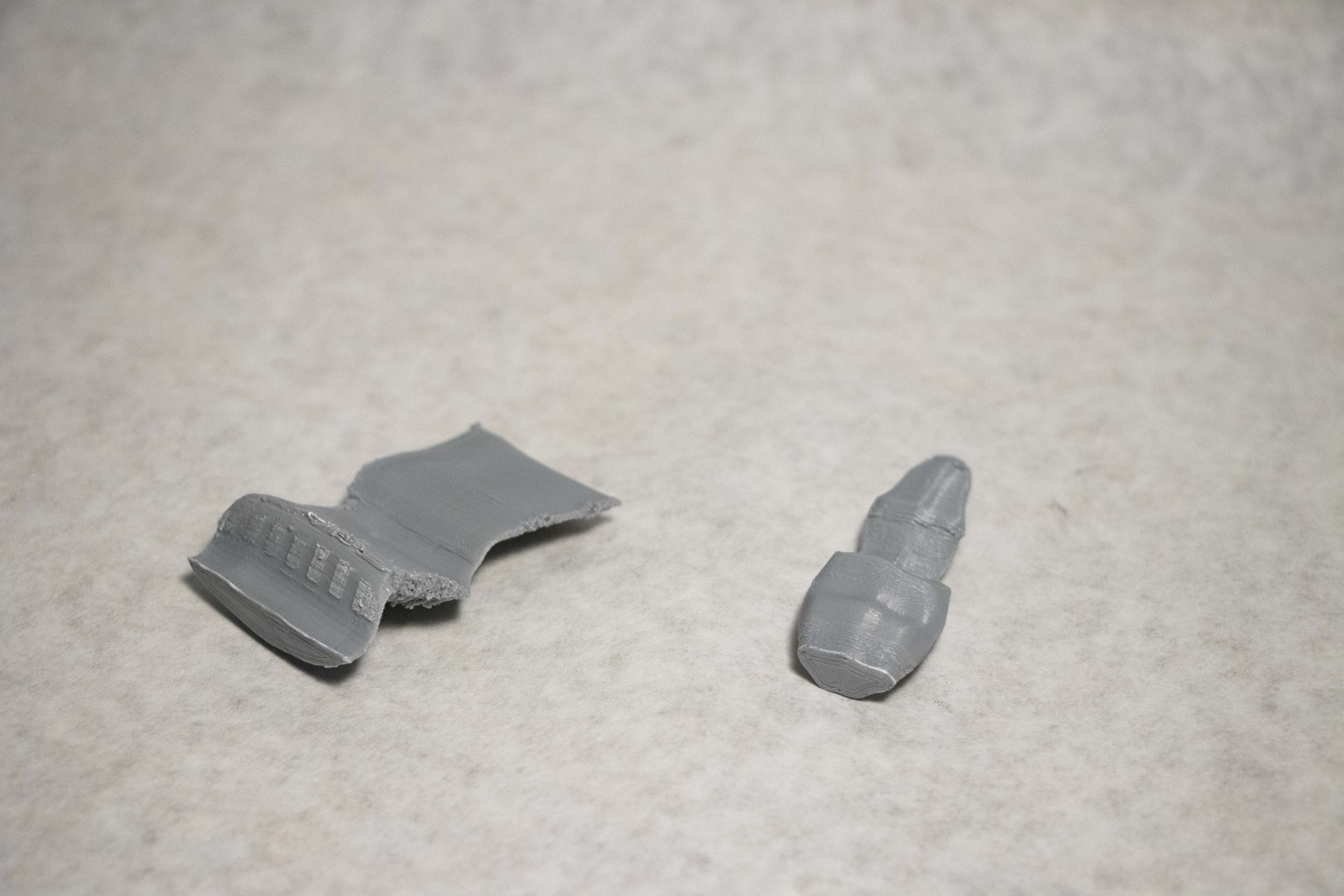
I was definitely happier, but they needed to be bigger.

Finally, I printed them at the size they are at now, which took 12 hours. One incredibly frustrating thing I did not document was the fact that the scaffolding accidentally melded to the actual model, so I spent an hour ripping off the plastic with pliers and sanding everything down. And for the finishing touch I spray painted them black, and attached them to little stands.

Cassie (English)
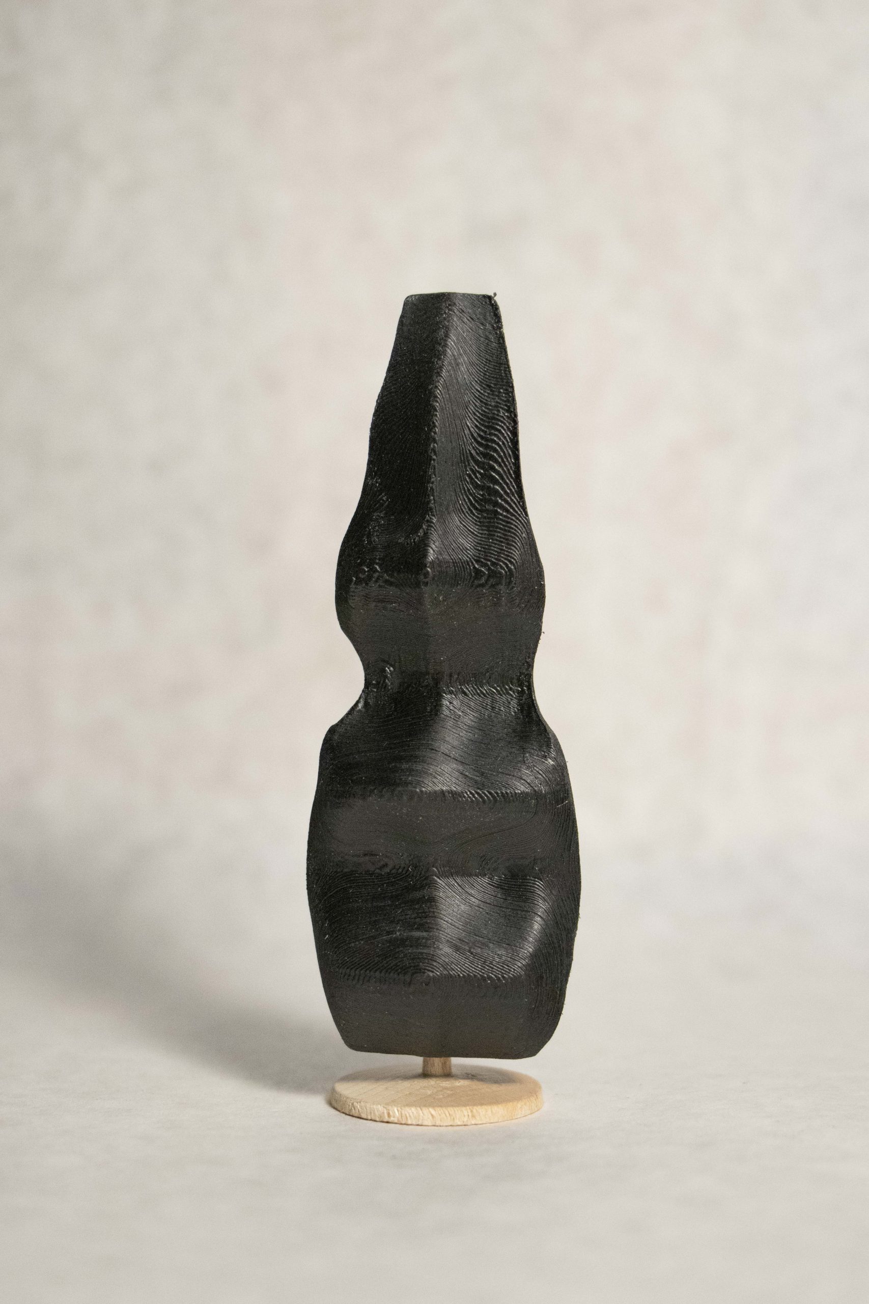
Policarpo (Spanish)
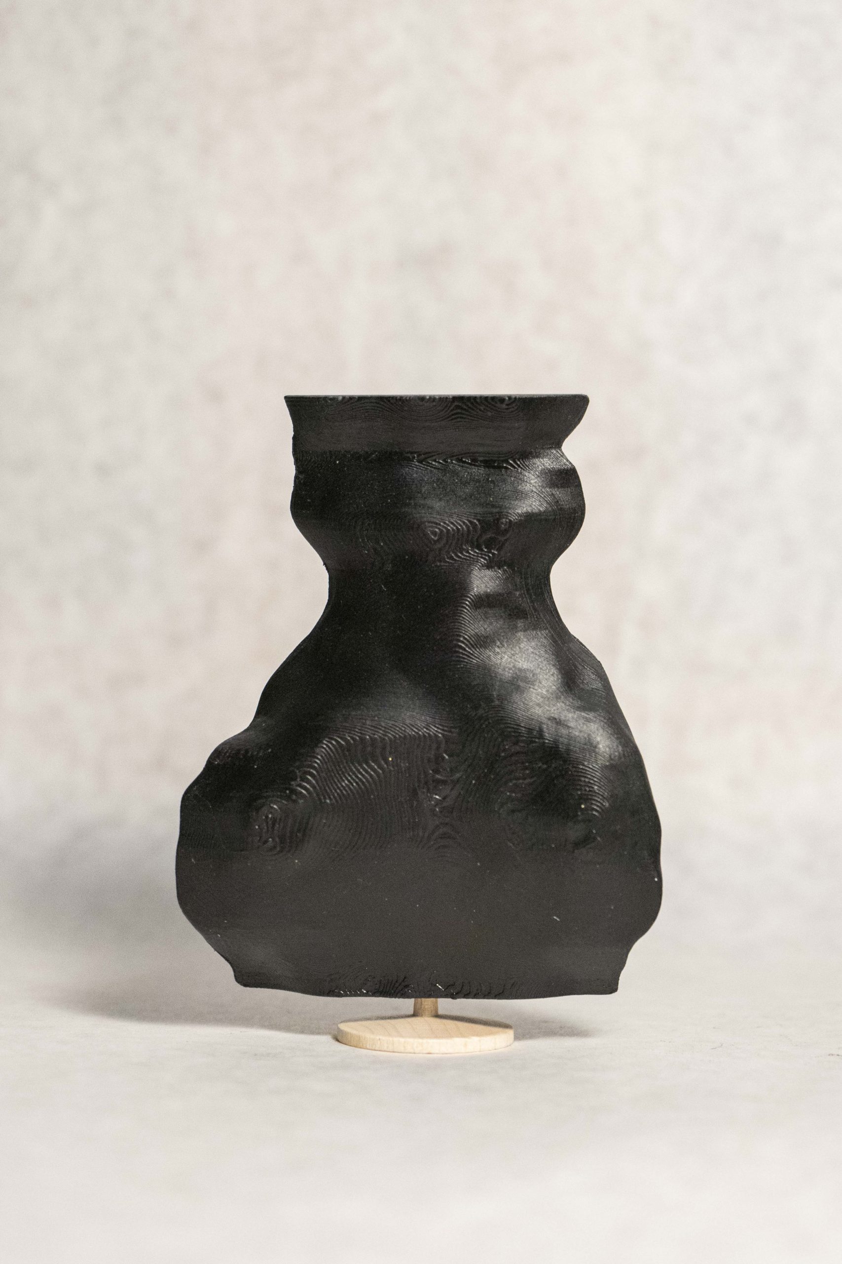
Ilona (Lithuanian)
discussion

One of the most interesting aspects of this project is that it exemplifies the idiosyncrasies of the ways we communicate. As you can see, some people’s mouths are long and some are short; some enunciate a lot while others don’t; some talk symmetrically while others don’t. So not only are the sculptures physical representations of a mental infatuation, love, but they almost become portraits of the people from which they came. This is a look into the tendencies of the owner–the emotions they feel, the lies they tell, the passion with which they speak, the culture from which they come all influence the shape of their mouths. These sculptures tell the unique story about a person and their connection with the recipient of their “I love you”. As a result, no two sculptures can be the same.

Unfortunately, the manual nature of this process, plus waiting for the 3D printing, allowed me to create only 3 sculptures for the deadline. However, I am definitely not finished with this project.
Memorabilia Before Impact: A Collection of Objects the Moment They Hit the Ground

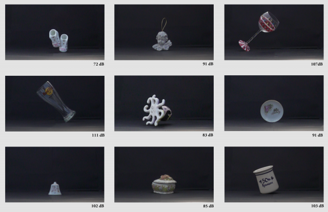
The goal of my project was to develop a machine whose process of capture would a destructive one. I was inspired by quantum physics research, for the moment any data is collective, the object of interest has changed or has been destroyed as a result. I wanted to develop a machine that illustrated this concept in a more tangible processes that was connected to a more human experience. This project takes objects that are marketed to be of sentimental value and captures these objects the moment before they shatter. By filming them using a 960-fps camera and recording the sound I capture the image of the object as whole but allude the sound of its death implying the object is no longer in existence.

I wanted to present my objects as small snapshots of each moment. The objects that I am presenting aim to tell a story of a single individual is has gone through life purchasing these objects dedicated to capturing special moments. The object that were meant to hold a memory now live in a digital shelf where they no longer exist in the physical realm.

The end result of my project still has room to grow. I think an opportunity that I could explore is to have several groups of objects that could be linked to multiple people and their objects. This single set, I believe appears to be a single person of a specific taste, but I would love to have multiple collections that go to tell a variety of memorabilia. Another improvement could be to rather than use a high-speed camera is to take this concept a step further and step up a camera to a pressure plate and link the drop of the object to the camera to only capture a single frame the moment it hits the ground. In this collection method, the machine can only document and remember the object has whole and has no evidence that it was changed or broken in the process.

Typology Machine – Tahirah Lily

This machine was designed to help break tunnel-vision college students out of their mundane daily commute by encouraging them to notice their surroundings and awaken their imagination.

  • What was your research question or hypothesis?

I wanted to know if I traveled on the busiest routes on campus, could I find something in them that would make the journey more lively?

  • What were your inspirations?

I was really inspired by children and how they view at the world through curiosity and wonder. As young adults, I find we’re losing this whimsical way of looking at life, and I wanted to challenge myself and others to bring that back into our day to day.

  • How did you develop your project? Describe your machine or workflow in detail, including diagrams if necessary. 

I began by identifying common activities children did and then looking at common activities on campus to try and find any potential for a project. I eventually decided to walk the busiest routes on campus and pay attention to any defects or irregularities in my surroundings. I then photographed these elements and ran students from various majors and years through my machine, asking them to tell me what they saw in the images.

  • In what ways is your presentation (and the process by which you made it) specific to your subject? Why did you choose those tools/processes for this subject?

I chose to use a Nikon D3300 and an Ipad and Apple Pencil for this project. The Ipad and Pencil allowed me to record the pencil strokes of the student, so I could combine this with the video footage later in editing. I was initially planning on using a Cintiq tablet, but I figured it was more powerful and complicated than the students in my project needed. The Ipad and Pencil are also more familiar to a notebook and crayon used by children, and since that was the spirit I was trying to invoke, I felt that would be more appropriate.

  • Evaluate your project. In what ways did you succeed, or fail? What opportunities remain?

I think the overall idea was successful! The students that went through the machine laughed a lot and mentioned that they wanted to look out for fun irregularities more often.

I also wanted the pen tracking to be synced to the students visual pen strokes in the video, but I realized after the fact that the time-lapse feature I used on the Ipad sped up the capture so when I brought it into Premiere and tried to edit the time back to match it just became a little choppy.

I think technically I could have edited the footage better if I had more knowledge of Premiere Pro and filmography. I still can’t figure out why the video will only export in vertical form. I think maybe it had something to do with my camera settings. I don’t think this is a failure exactly, but a steep learning curve I’m still on the way up from.