Digital Repeat Pattern – Test Designs (Erica Fu)

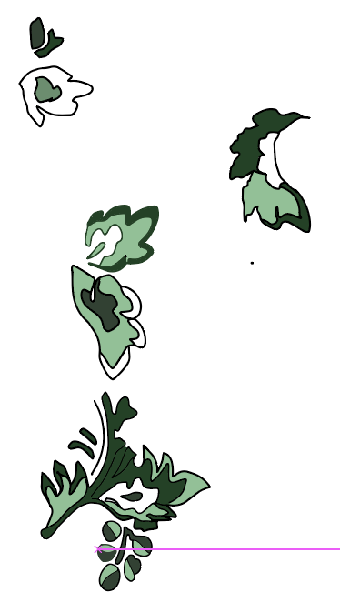
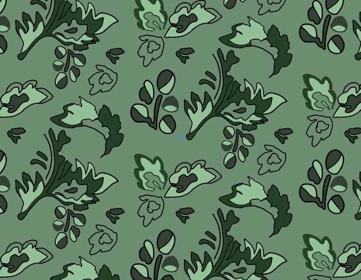
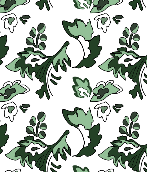
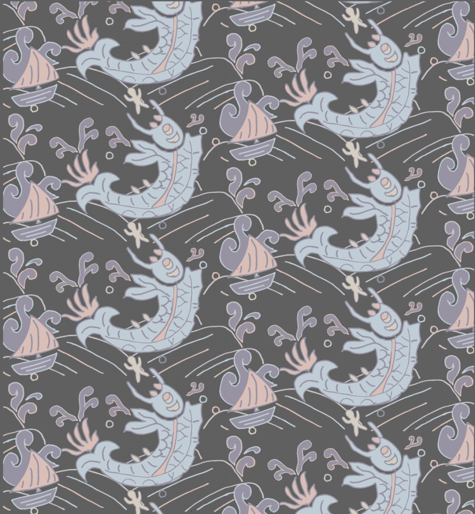
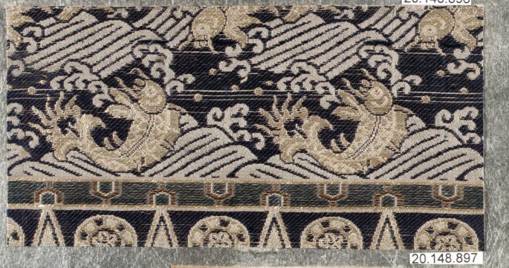
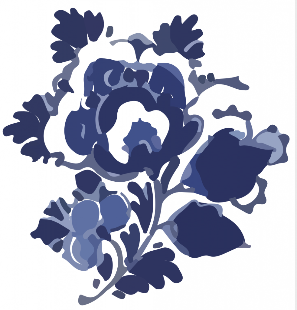
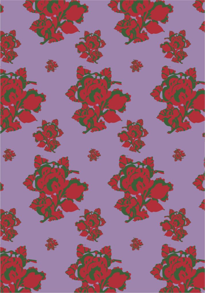
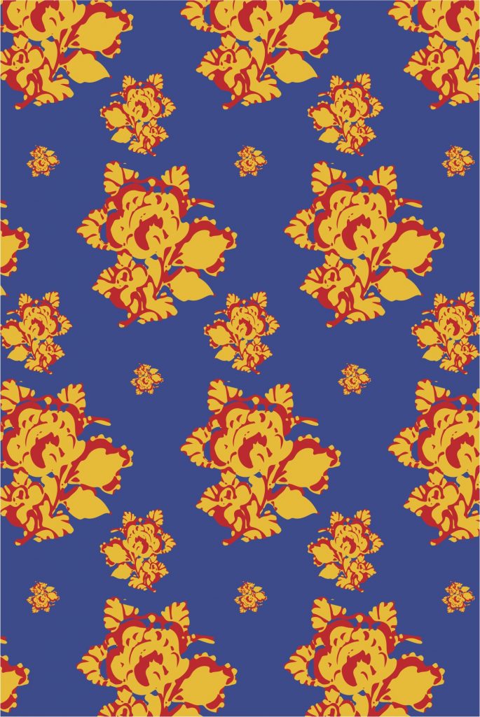
My original design was inspired by china plates. I really enjoy the blue and white combination and wanted to experiment with variations of a very classic design. This image was something I found online and then edited within illustrator to create the patterns below.

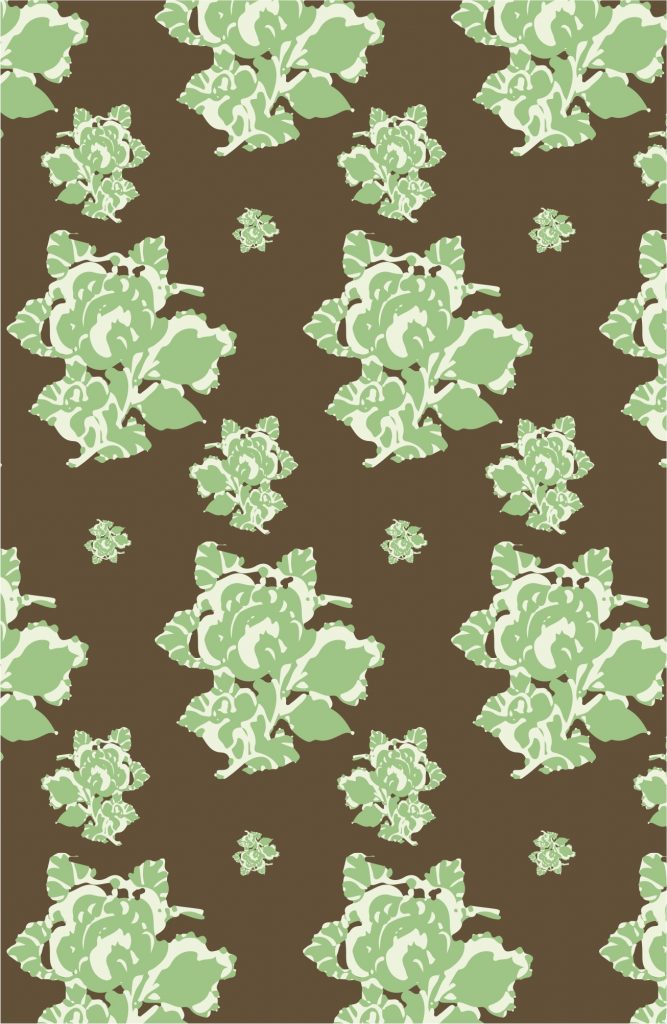
  1. The green and brown combination was inspired by the similarity of the design to cabbages.
  2. The red and green combination was inspired by roses.
  3. The red, blue, and yellow combination was inspired by pop art.
  4. The blue and white combination was inspired by china pottery.

All of these were very fun to experiment with and I tried to add some different sizes of flowers to experiment with adding more to swatches.

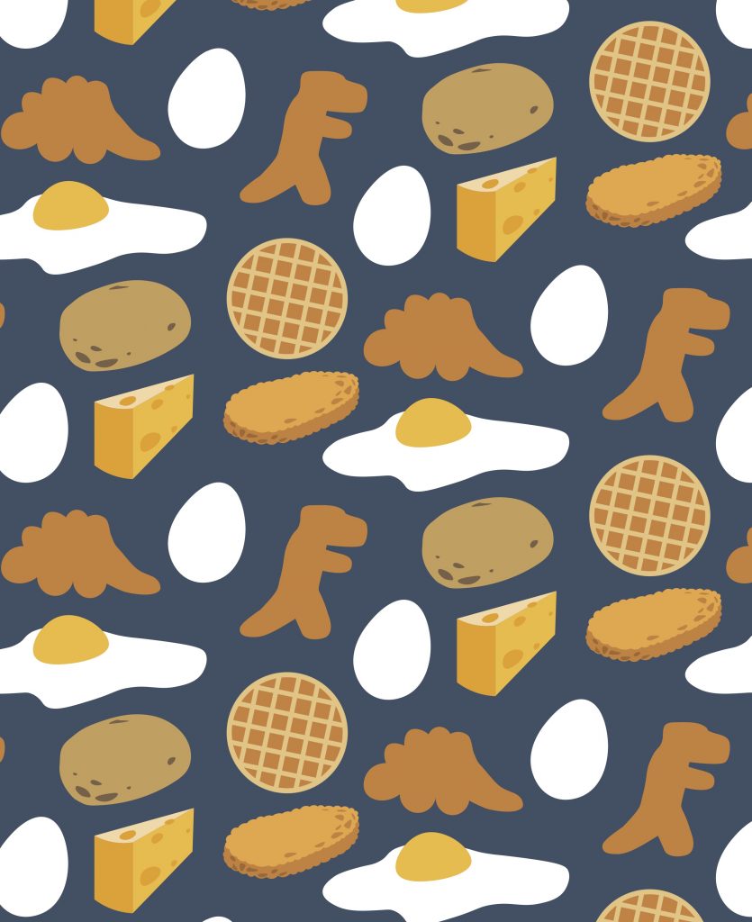
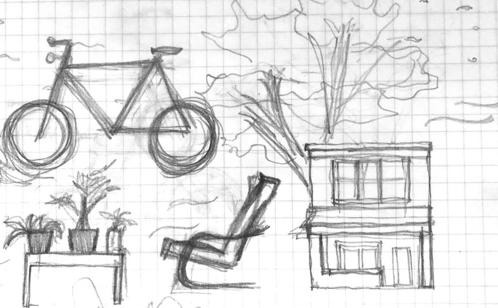
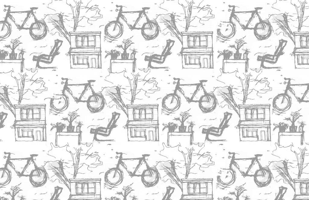
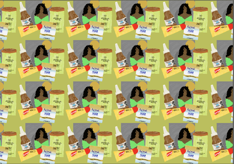
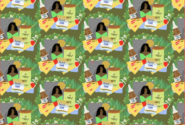
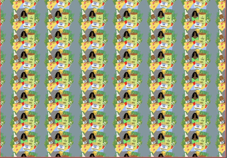
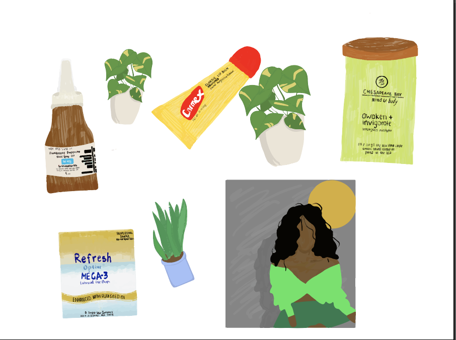
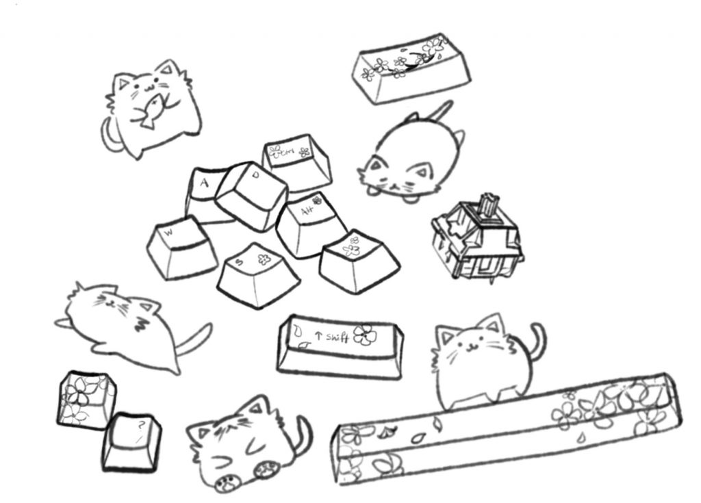
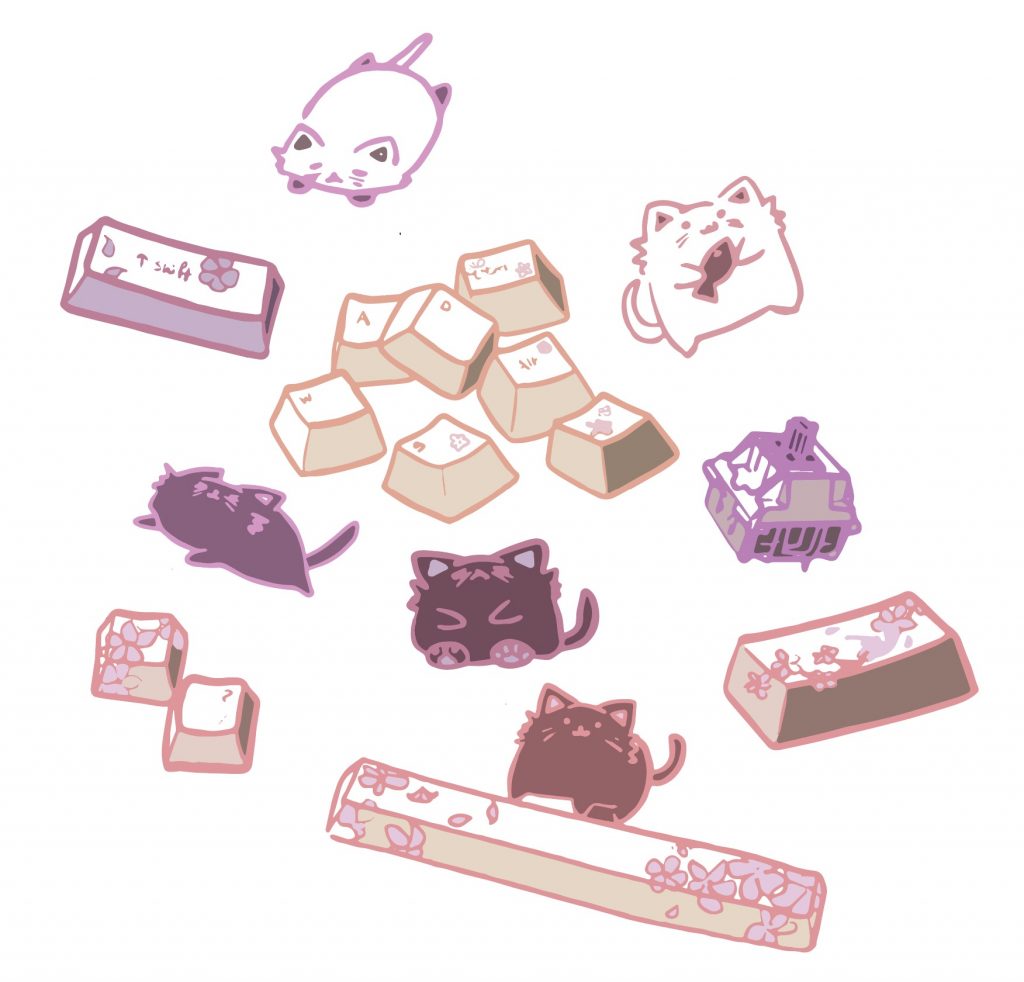
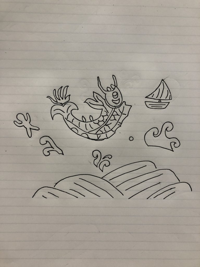
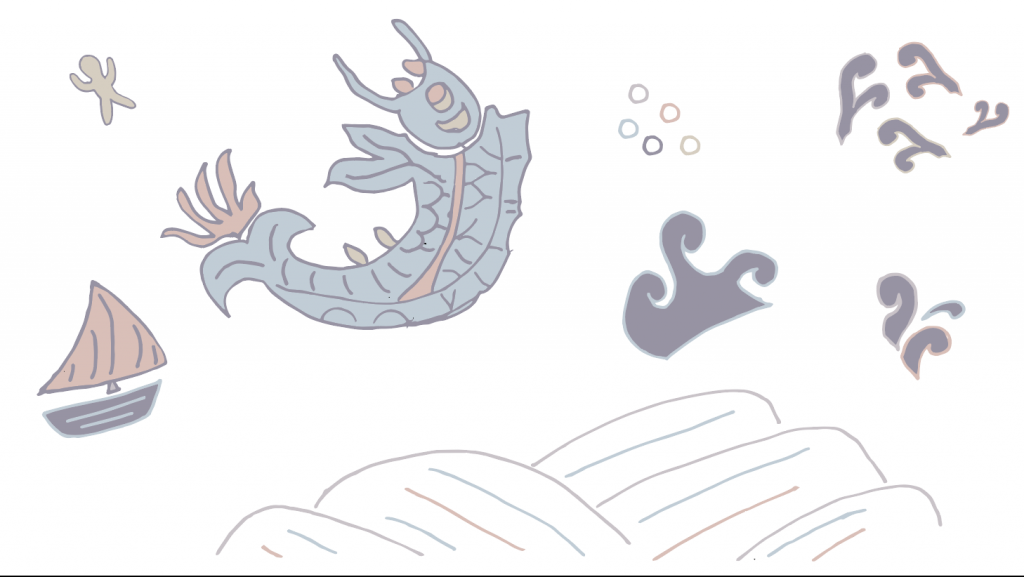
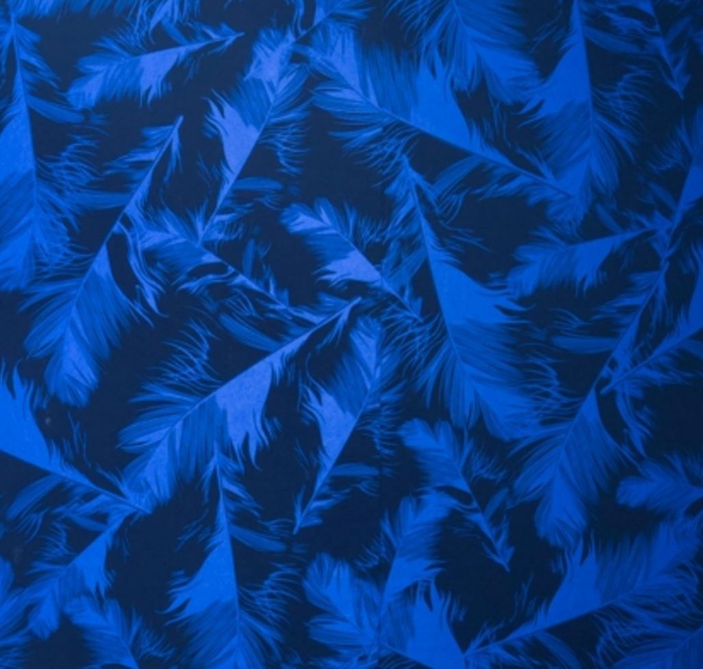
I also made another vector illustration for fun.

Digital Repeat Pattern – Rachel

I was intrigued by the prompts of interrupting historical patterns and drawing from your environment, so I thought maybe a bit of both.

This is a woven textile from the Met Collection that I liked. It feels calming and like a leisurely day. So what if I made a pattern with similar colors or in the same style, but more modern and from a leisurely day in my life.

Here is quick sketch of my house, bike, chair, and table of plants.

This is a first draft of what the repeating pattern looks like. I still have to refine the lines and colors, but I like the effect so far!

Digital Repeat Pattern – Elle

So For my pattern, I am playing around with Toile and history. Since toile tended to be manufactured in Ireland for England and France, I decided to depict vingettes of Irish history. I only have completed one such vingette so far, showinng the 1740-41 famine (one of many irish famines) and the little food that was produced being shipped over to England.

Digital Repeating Patterns

By Remi Adeoti

I chose the third prompt to make a pattern using drawn sketched of objects around us. During this project I was experiencing zoom fatigue and allergies, which inspired me to pick my artificial tears and allergy medication. From there I wanted to pick more of my everyday objects that I look to and interact with everyday. I then chose my Carmex and included multiple because I am never only using one. I also sketched a painting that I had done that I look to everyday because it made the collection of objects feel more personal. Finally, I sketched my snake plant and pothos and created a background for this collection of objects.

A challenge I had was learning how to use illustrator and getting through my upload issues and my laptops inability to process so much at once. Thankfully I had Olivia’s help as well as my design and architecture friends to help me through the questions that were not answered through google.

One discovery I found was that using adobe draw to sketch my objects was much more work than I expected. I tried to play with opacities, different stroke levels, and colors to create textures, but all that work is translated into the pattern because they are such minuscule details. Most of them can be seen in a blown up image of the elements used to create the pattern. However, for example the different colors and strokes I used for my snake plant to get the realistic look of the plant cannot really be seen.

Digital Repeat Pattern – Annie

I had decided to go the third prompt: drawing from my surroundings. I had recently got a mechanical keyboard, and decided to base my ideas off of that. The fat cats are based off of cats of a youtuber who I was watching while doing this assignment.

Choosing a color scheme was especially difficult, since I had wanted to make each cat unique in their own way, but I still wanted to stick to a bit more monotonous color scheme. I am a bit iffy about the shading though, since it was difficult to get certain patches colored in properly.

I also wanted to give this a more cartoonish feel, so the line widths of the keys and the designs of the cats were chosen specifically to match that. I feel like overall, the calmer scheme of what I was aiming for definitely worked.

The type of repeated pattern was also easier to choose than I thought it’d be, though I mostly went by instinct. I didn’t want the final pattern to be too crowded, but I also didn’t want to make the repeat block too obvious.

Beginning Repeat Patterns – Maddie

These were the two digital repeat patterns that I made for the beginning portion of the project. I chose to go with the first prompt which was about interrupting historical patterns.

Historical pattern

This is the historical pattern that I based my components of the pattern off of. I redrew the fish and the waves with some of the splashes so that I captured the main elements, but added some of my own as well. I added a little sail boat and a person with their arms up. In the patterns my intention was to make it look like the boat is sailing towards to giant fish and the person tossed in the air and within grasp of the fish. There are many historical tales of sea monsters that attack fishermen so I thought that I would implement that into my repeat pattern.

These were my drawings before I did the image trace in Adobe Illustrator. Once I put the image into Illustrator, I made copies of some of the waves and the small circle so that I could add them to the texture of the pattern. I intended for this to be on a dark background, so some of the colors are very light and hard to see on the white art board.

Digital Repeat Patterns – Jesse Wallace

In order to find a patterned cloth from the past, I looked through The Met online gallery to find one. I chose the one below from the late 18th-early 19th century from Thailand. I really appreciated the symmetry in the pattern because of how it made

Thai tapestry from the late 18th-early 19th century

The modern day pattern I found is shown below. I also really appreciated the symmetry in the pattern and how the pattern reflects itself. It would be interesting to incorporate that with my piece.

Digital Repeat Pattern – Erica

This textile work caught my eye because of the colors and detailed patterns. I really enjoy the boldness of the colors, yet the subdued quality that the whole piece has as a whole. Furthermore, I found it interesting that this was actually an American or European textile, despite the clear asian inspiration with the subject matter and patterns.

This floral pattern with the pops of color was very eye catching and reminded me of the bold and subdued colors of the textile above. Also, as I look more at this piece, I notice more details in the print like the cameras and wires that I think make it even more interesting.

Digital Repeat Pattern – Jasmine

For my patterned cloth from the past, I chose Sarah Lipska’s textile design. This sample is a piece of embroidered cloth by the Polish artist, originating from 1927.

I was interested in this design mainly because of the interest created by the repeating pattern of lines. The choice of color also allows the pattern to pop. While the pattern is just something as simple and continous lines, there is depth created by turning them in right angles. When we look closer, we can notice that there is an intention in whether the threads cross over, go under, or intertwine with the other threads.

Featherlight” is the pattern I chose for my contemporary pattern reference. It has a similar color scheme to the previous pattern, but the blue is even more striking due to the sheen of the materials used.

I was especially interested by this pattern because of how it doesn’t even seem like a repeating pattern. The pattern has a sense of figure-ground, and the way that they overlap each other also create a sense of depth with the black background. When looking at the pattern up close, it can easily be seen that they are feathers. However, when looking from further away, the pattern becomes more of a pattern of colors and makes it harder to distinguish what the objects are.