Digital Repeat Pattern- Marissa

Russian Textile 1700-1899

Link: https://www.metmuseum.org/art/collection/search/173409?searchField=All&sortBy=Relevance&ft=textile&offset=180&rpp=20&pos=182

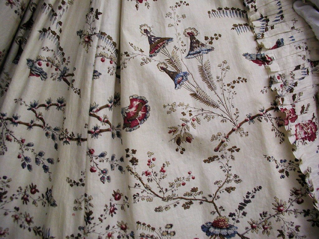
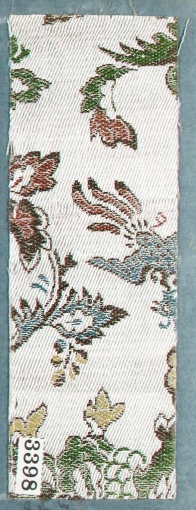
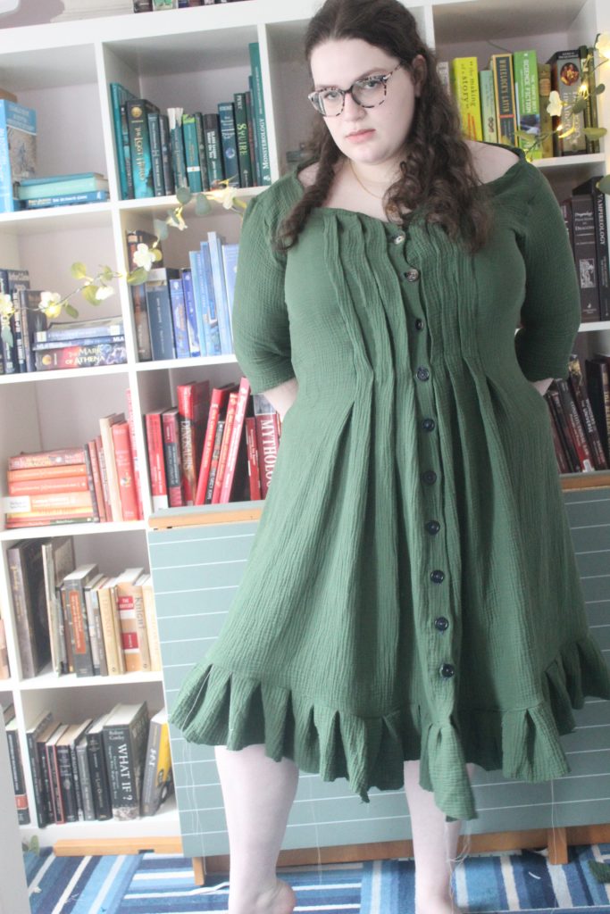
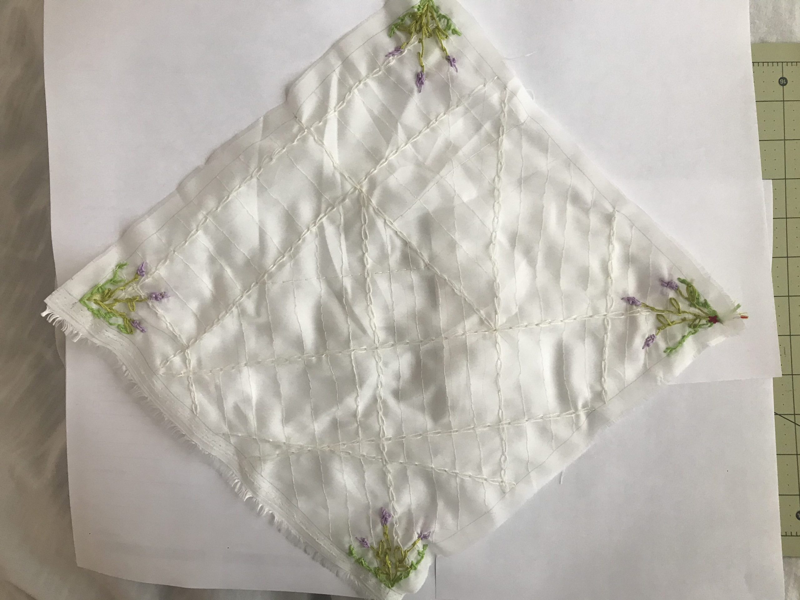
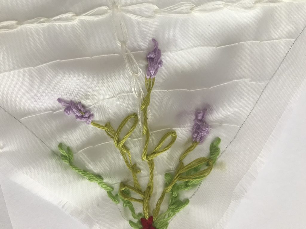
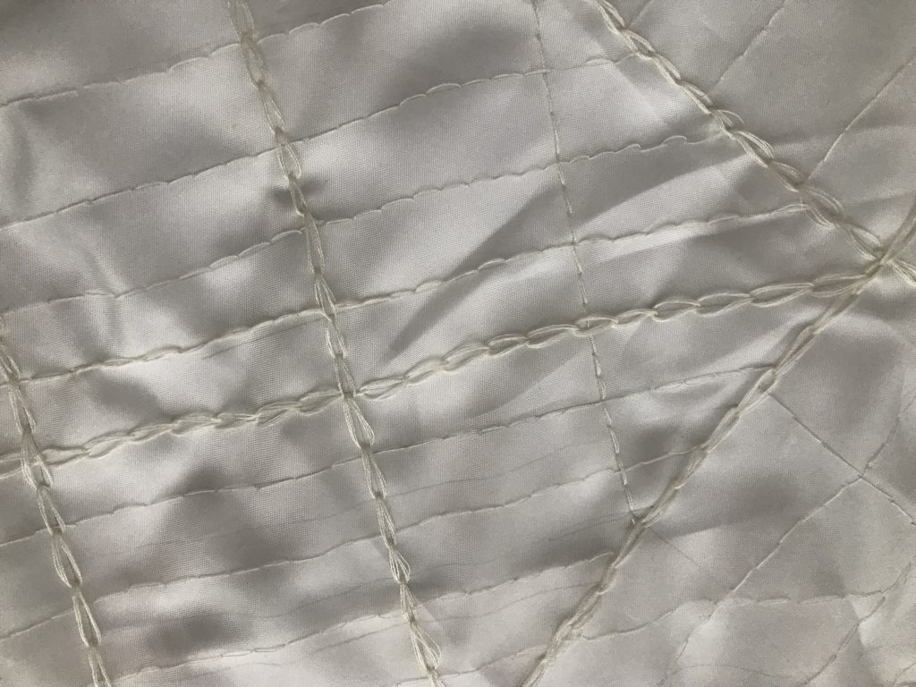
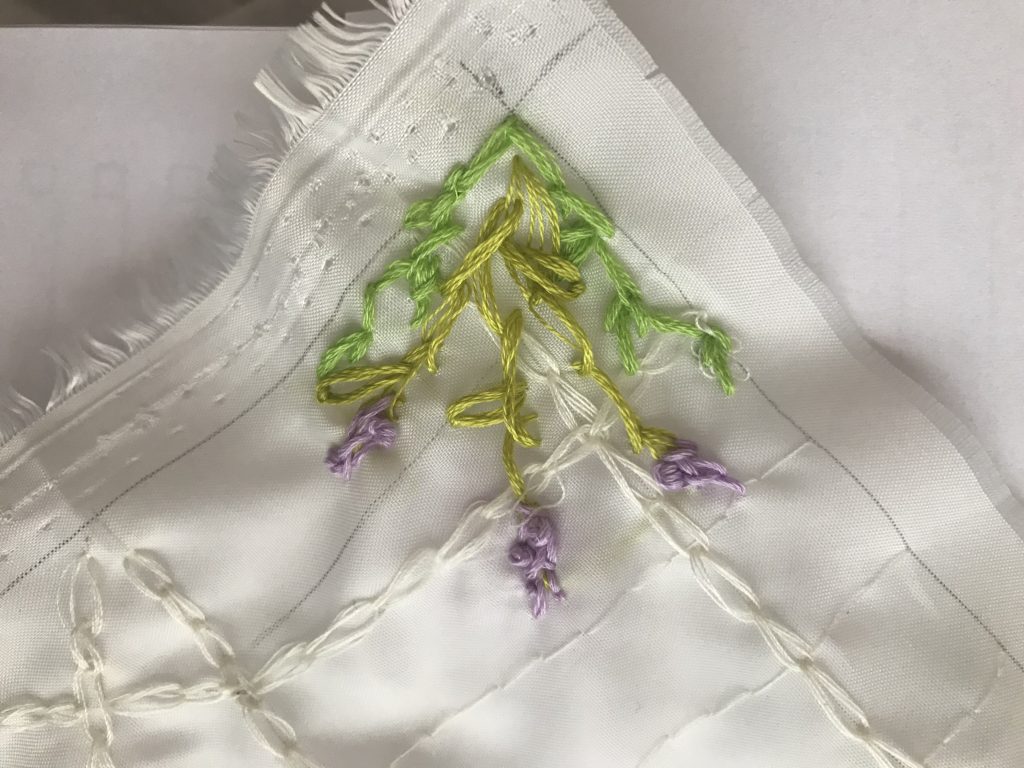
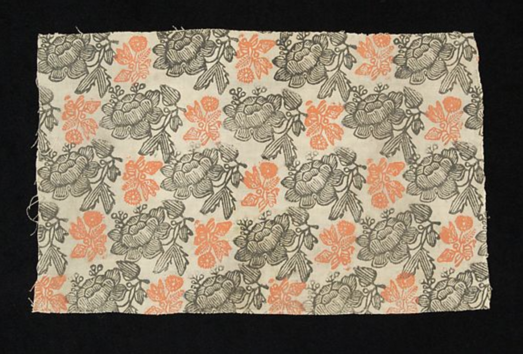
I was drawn to this textile because of the contrasting colors and diagonal orientation of the flowers. I think the shifted repeated pattern is interesting, and I enjoy the way my eye is able to move along the paths created. I was also engaged with this piece because the flowers appear to be stamped, and I love the handmade feeling.

Vigilant Floral

Link: https://www.flavorpaper.com/wallpaper/patterns/handscreened/vigilant-floral

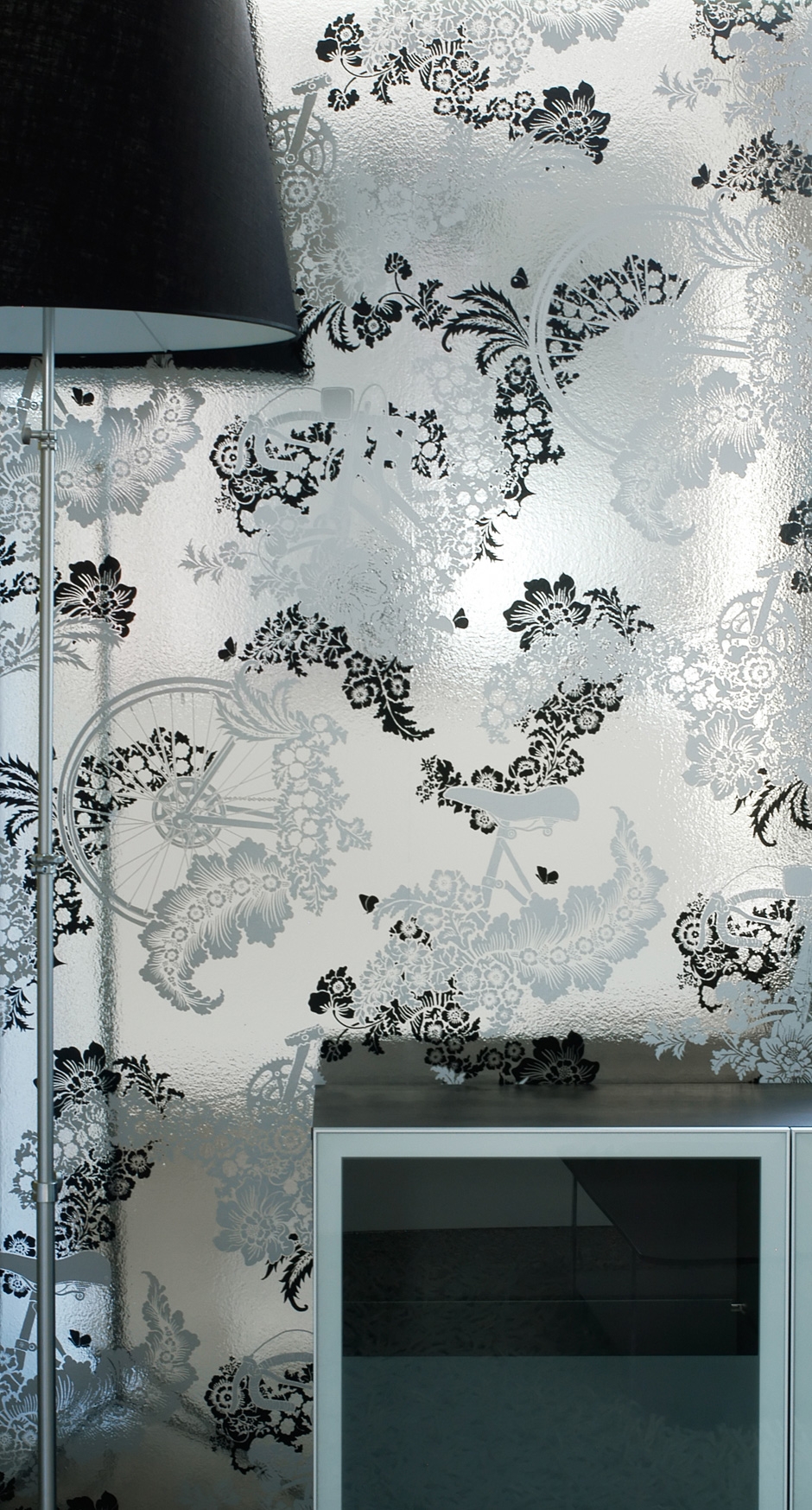
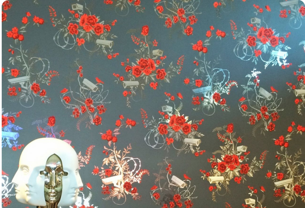
This repeated pattern was captivating to me because it felt like a modern take on the Russian floral pattern I found. The repeated pattern is also offset at a diagonal that I appreciate, and I enjoy the elegant delicacy of the design. I like how the video surveillance cameras add an element of surprise that adds another layer to the pattern. Another surprising feature that pulls the floral pattern out of the traditional realm is the razor wire. Upon first glance, I assumed the razor wire was vines, but I like the added commentary to this design.

Digital Repeat Pattern – Maddie

https://www.metmuseum.org/at/collection/search/53674?searchField=All&sortBy=Relevance&ft=textile&offset=200&rpp=20&pos=202

This textile that I found from the Met museum collection has a repeating pattern of the fish and the waves. This is an 18th century textile of Chinese or Japanese culture. I chose this as my inspiration because I really enjoy the movement of the waves and the details on the fish. At the bottom there also appears to be an edge pattern that its pretty interesting.

Elysian Field https://www.flavorpaper.com/wallpaper/patterns/handscreened/elysian-fields

This wallpaper designed by Dan Funderburgh was found on the Flavor Paper website. The design is an intricate mix of carnivorous plant and bats instead of robins and typical flowers. I really like that the designer changed the elements of a typical floral pattern to use unexpected elements that you wouldn’t really notice unless you were paying close attention.

Digital Repeat Pattern – Rachel

This is a woven textile from the Met Collection from the 18th century, “from China or Japan.” I am drawn to how the pattern is nested in each other, and the hierarchy of different elements- the main fish, the waves its sits on, the splashing of the waves, then the drops of water in the air. Together, it is well composed and create an intriguing figural negative space. In addition, there is also the pattern below it that seems very different, but of similar colors and contrast.

Brownstoner

In contrast to the textile above, this is called Brownstoner designed by Ian “Hydeon” Ferguson, found on Flavor Paper. As an architecture student from Brooklyn that likes to draw facades, of course I was drawn to a pattern of Brownstone building fronts in Brooklyn. There is an intense amount of detail, and lack of white space that makes it almost seem like it is a never-ending amount of different variations of buildings. When the pattern repeats, it fits right into the one below it.

Pattern Inspiration – Kimberly

I found two patterns originating from Japan, both of which I really enjoy and would like to draw inspiration from. From the first one, I think the colors used are extremely interesting where the larger pieces somewhat blend into the background and the highlighted parts are all pretty much one color with details using the background color. For the textile on the right, I really enjoy the style of the work in which the there’s a lot of movement and select colors in the textile. It kind of draws your eyes around.

I found this digital pattern wallpaper where I really like to colors used where the accents pop but are covered by the harder to see bike patterns. As it’s titled “Flower Pedal” which I think is super cute and creative, I enjoyed the contrasts between all the details of the flowers and the wheels/gears of the bike.

https://www.flavorpaper.com/wallpaper/patterns/handscreened/flower-pedal

Found Patterns – Annie

Panel with the five poisonous creatures – Ming Dynasty, China, Silk in patterned simple gauze

For the patterned cloth, I chose this one from the Ming Dynasty in China. I found this one interesting since it seemed very delicate and the patterns almost seemed floral until you look in closer. Then you’ll notice the snakes, scorpions, and other poisonous creatures on the pattern. The deception in it really interested me.

Featherlight

I picked this contemporary repeat pattern since I really like feathers. I also found finding the repeat very difficult since it crosses over itself a lot, but eventually doable.

Digital Repeat Pattern

This is a small embroidery by Sarah Lipska. I chose the first textile because I appreciated the color contrast and how striking the combination of these two colors were. I also think along with the contrast, the intricacy and nonuniform direction of all the lines makes this piece even more captivating. As simple as it is it still finds a way to draw it’s audiences eyes and I found myself wanting to trace the lines or follow the many direction they go in.

This piece is called Mermaid Legend by Sorosilutu Ashoona. I chose this second textile because I liked the fantasy of it. The first image I could interpret was the mermaid, or what looks like and aquatic human. The next image I could grasp onto was the intimidating bird that connected and feels like it is terrorizing the aquatic animal. This piece was interesting because the mixing of reality and fantasy ideas. On one hand humans are real, aquatic animal are really and there are birds that eat and terrorize those aquatic animals (fish), all of that are real things, events, ways of life. But the inclusion of this semi aquatic, semi human animal is a fantasy and is inputed into real event (birds eating fish), which takes this real event and turns it into the impossible by simply changing the subject.

Encoded Cloth From the Future – Part 3

My future, like many others, was split into two, one of a dystopian sprawling wasteland and one a pastoral utopia. I made two pieces, each representing one part of the world, and the way the two work together.

The first part is the corset, representing the distopia. I drafted a 1890s underbust corset pattern, and cut it entirely out of a old blazer. The lining is also the blazer lining, and the boning of the corset is from old zip ties which makes it mostly recycled.

The corset is meant to look fast made. I would normally do alot of hand sewing on a project like this, but this is entireliy machine sewed, which leads to to some oddities in construction.

Normaly flaws like the ones above would be mended, but they are honestly quite loveable in the piece. The pop of the neon zip tie that lies within the bleak exterior is quite meaningful.

The corset is meant to represent the understructure, a foundation which the dress on top of it is tied to.

This dress was a CHALLENGE. The fabric did not want to do what I wanted it to do. So It went through quite a few iterations before it finally became this. This dress is suppossed to be nautral and pastoral. So I really tried to lean into this motif. Unlike the corset, it doesn’t pull from any historical period.

By contrast, this dress has alot of hand worked details: the finishing on the neckline is done by hand, the buttonholes are hand worked with a blanket stitch and there are a lot of pleats. The buttons that I had on hand were arranged to they fit a ombre pattern.

The overall irony of the two pieces is that this pastoral farmland haven dress is far more wasteful than they corset (and the dress is honestly more uncomfortable since the neckline is very wide). Its made of six yards of new fabric, much of its details are purely aesthetic, and it is built on the foundation of the corset.

Encoded Cloth from the Future – Jesse Wallace

For this project, I wanted to express the absolute hopelessness that comes along with living in the world today. I brainstormed imagery of nuclear war, climate change, or even another outbreak because I wanted to convey the grim reality of the inevitable destruction that will come in the coming years. However, in brainstorming, I faced the reality that we will all likely be trying to navigate our individual lives during that. There will be new fashion trends and phases and new trendy food to eat and new people in all of our lives. The uncertainty is overwhelming, and that feeling is exactly what I wanted to capture in this piece.

My encoded cloth – capturing the uncertainty of inevitable doom.

I chose to use a jean jacket as a connection to the things in life that won’t change – Jean is such a classic fashion material and I doubt it will ever go “out of style”. I don’t know anything in life for sure, but I’m almost positive 2030 will have jeans.

Wearing my Doom Jacket.

The biggest piece of this textile was the tapestry. I have really enjoyed weaving and chose to connect the weaving theme to the theme of uncertainty. The overall look is of destruction and explosive doom, but there are hints of green and yellow to indicate climate change as well.

Finally, I added a heart that is slowly turning black, to represent the inevitable heart-wrenching challenges we will all have to face in 2030.

One aspect of this project that surprised me- I went for a hopeless, destructive piece, but in putting my energy into weaving I felt as if I created something beautiful from the pain I was expecting to portray. It was honestly really heartwarming, and made me think about my mentality about the world.

Encoded Cloth from the Future – Jasmine Lee

For my encoded cloth, I was inspired by the idea of freedom quilts on the Underground Railroad, and the idea of hiding a secret in plain sight. I chose to use embroidery for this project, and traditional motifs of flowers and greenery that are normally associated with women. My vision of 2030 was pessimistic, and I was frightened by the idea of womens bodily autonomy being even more limited in the future. This handkerchief / neck scarf that I “brought back from the future” is part of a movement by women in their local communities to help spread information and news to women who may need help.

At first glance, the handkerchief is quite plain. I was inspired by the idea of whitework to create it this way. The white threads are actually a map of my neighborhood, with the chain stitches being avenues and the straight stitches being streets.

The lavender flowers symbolize healing, meaning that this handkerchief shows information related to medical help and doctors. The little red flower in one of the corners is a nod to the red arrow on a compass that traditionally points north. It is part of a code meant to help other people part of this community understand the map. Red points east, so the map would be quite hard to understand without prior knowledge.

In addition, there are red beads attached to the underside of the handkerchief. They will be concealed with a second thin layer of fabric and hemmed with an iron-on adhesive. When the handkerchief is dry, all you can see is the white textured lines and the traditional flower motifs. When wet, however, the red beads show through and show relevant locations for women who are looking for help.

This concept, while controversial, was mainly based off of my support for women’s pro-choice and the fear that accessibility would be greatly limited in the future.