![[OLD SEMESTER] 15-104 • Introduction to Computing for Creative Practice](../../../../wp-content/uploads/2023/09/stop-banner.png)
Maps and globes always intrigue me because there are so many different versions of them, visualizing and emphasizing different categories of information. This version of a digital globe by UnstableGround that shows the temperature rise due to climate change came to me as a very strong example that appropriately uses color and dimensions to convey information to the viewer.
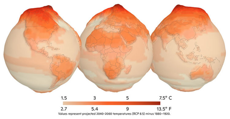
Before taking this course, I had no particular thoughts about how these projects would be created, but now I wonder what kind of code would be used to create this. The algorithm for color would surely be associated with the data of climate change (the higher the temperature, the darker the shade of red), but I wonder how the 3D aspect of the project would be coded, and if it would be possible with p5.js.