![[OLD SEMESTER] 15-104 • Introduction to Computing for Creative Practice](../../../../wp-content/uploads/2023/09/stop-banner.png)
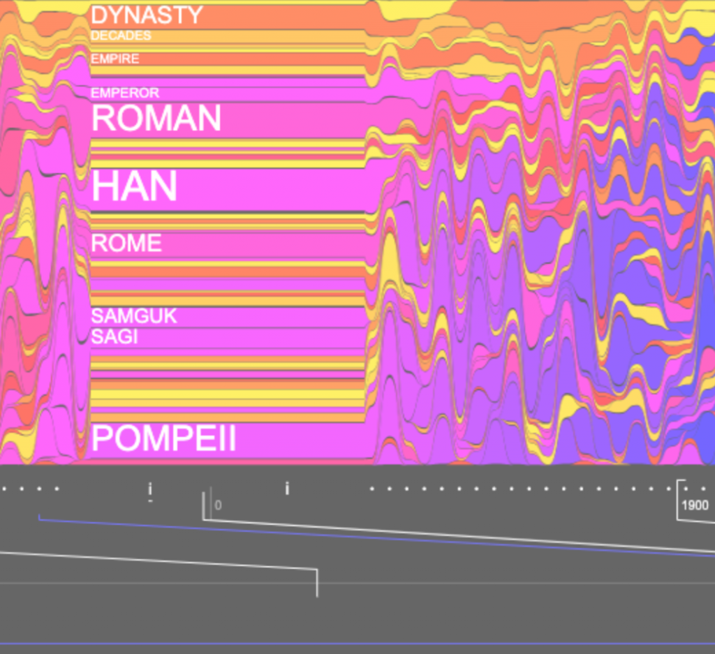
I looked at Santiago Ortiz’s work for this week’s blog, and I admired his History Words Flow project. John B. Sparks’s Histomap in 1931 inspired Ortiz to create this interactive project. The project depicts a colorful background and a timeline at the bottom; when users move the cursor horizontally along the timeline, words that describe that period in history will pop up. Also, when the viewer moves the cursor up and down, the text size changes. I think these features create a more interactive learning experience instead of just reading raw text and data. Ortiz did not share much about his process, except that he selected the words based on Wikipedia’s article list, organized in chronological order. I love how the project is in conversation with previous historical visualizations, which allowed me to see how advancements in technology made different ways of representing information possible. Ortiz’s research in information visualization is an excellent example of how various academic fields can benefit from clear and interactive visualizations.