![[OLD SEMESTER] 15-104 • Introduction to Computing for Creative Practice](../../../../wp-content/uploads/2023/09/stop-banner.png)
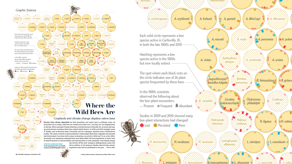
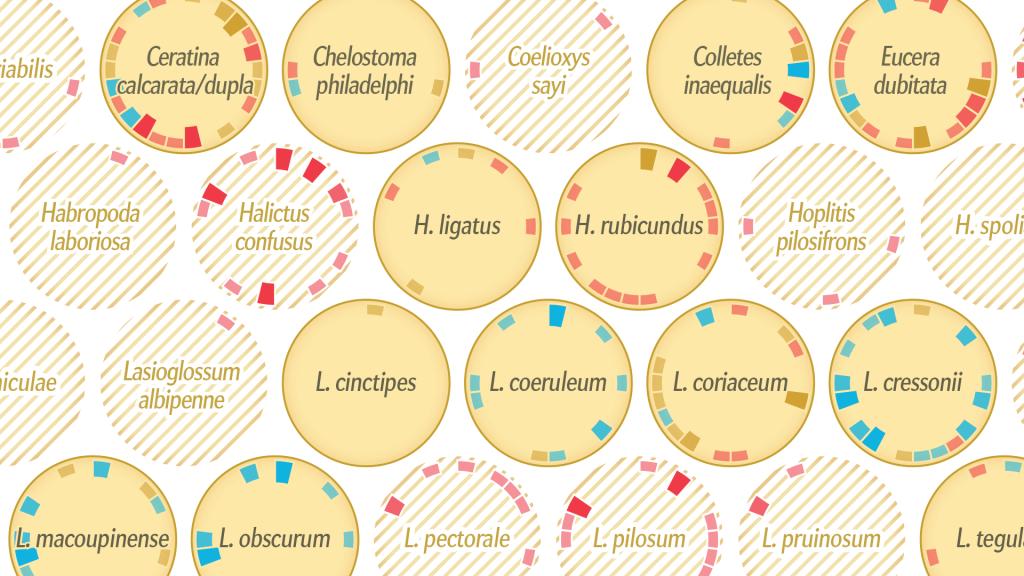
Where the Wild Bees Are
Moritz Stefaner (+ Jen Christiansen + Jillian Walters)
Nobember 28, 2013
Please discuss the project. What do you admire about it, and why do you admire these aspects of it?
What do you know (or what do you suppose) about the algorithms that generated the work?
It what ways are the creator’s artistic sensibilities manifest in the final form?
The project I have chosen to discuss is ‘Where the wild bees are” by Mortiz Stefaner (+ Jen Christiansen + Jillian Walters). It is an information graphic showing the status of various bee species and the relationship between each bee species the plant species they frequently interact with. One thing I admire is the sheer quantity and complexity of data the graphic is able to succinctly and clearly communicate on a single page. Great care has also been put into establishing a visual language of circular charts, each representing a single bee species, that is reminiscent of the hexagonal bee comb structure to emphasize the bee theme, allowing the graphic to feel clean and coherent. A short explanation of the various visual elements and their meaning can be found on the left, but it is split into short sentences that are easy to parse.
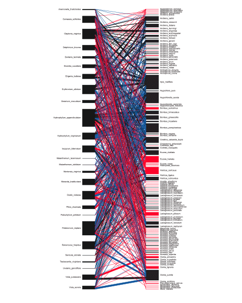
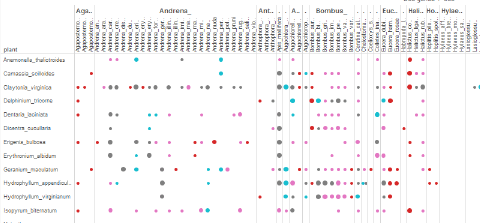
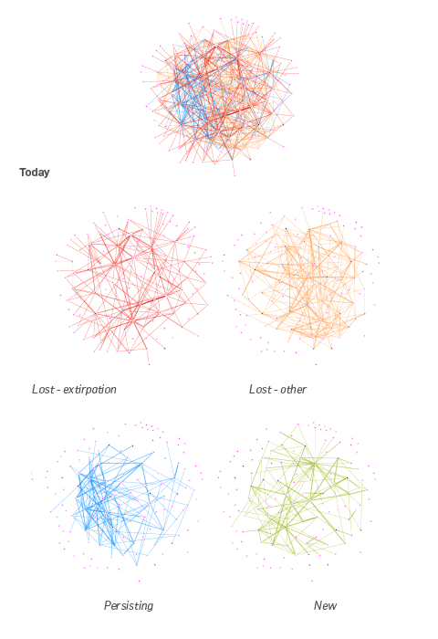
According to Stefaner’s blog post detailing their progress, the first and most crucial step was understanding the feel of the texture of the data – “understanding what can be done with it, and which views seem to generate the most interesting insights.” They first entered the data into a spreadsheet-style program called Tableau and produced a matrix view, which allowed to them to judge the denseness of connectivities between different network links and identify connection patterns. They then investigated the topology of the network (via gephi, an open graph visualisation platform), trying to see if there were any emergent commonalities between bee species that had gone extinct.
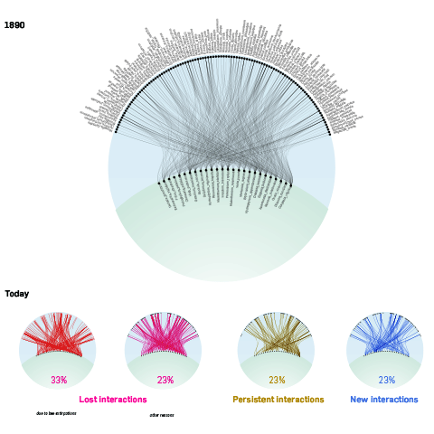
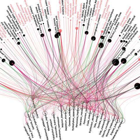
Organising the plants on the ‘ground’ and the bees in the ‘air’, they then connected the different data sets. However, it became complicated very quickly and difficult to read, prompting them to adopt a more general ‘plant visitation profile’ that highlighted each bee species individually.
“In this case, shifting the view from the macro-patterns to the micro-level… was crucial to untangle the mess and make sure the basic statistics about the bees – the main story = came across well.”