lampsauce-ARSculpture

Augmented Creatures

I ended up using Blender for the entirety of this assignment instead of Unity. It is not really AR in that it is not realtime. Instead, I used image tracking within Blender to map certain image targets. Then, I rendered the animation I wanted superimposed over the original video. I definitely think using Unity probably would have been easier to do than what I did. However, I still learned a lot about FBX files (the main reason I did use Unity is because I could not properly make an FBX of the creature asset I made).

Process

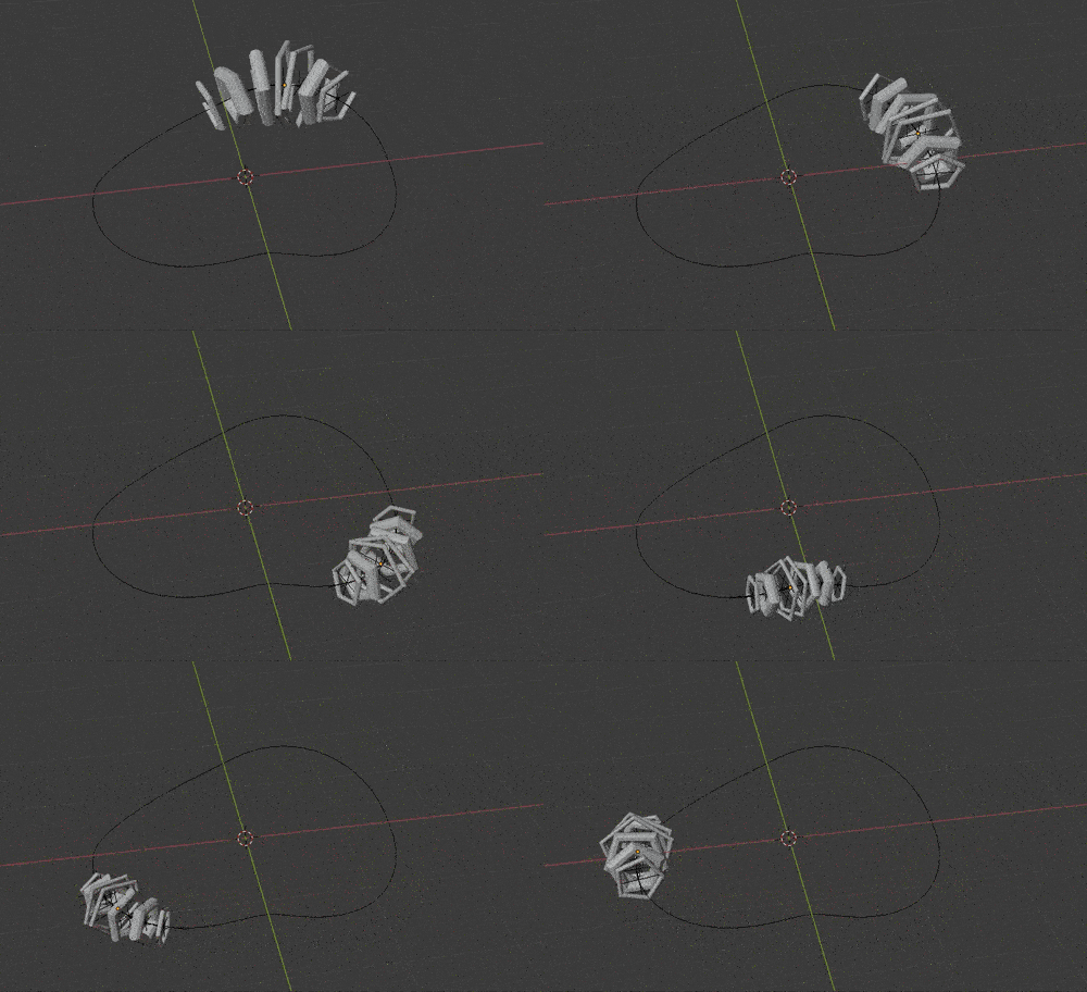
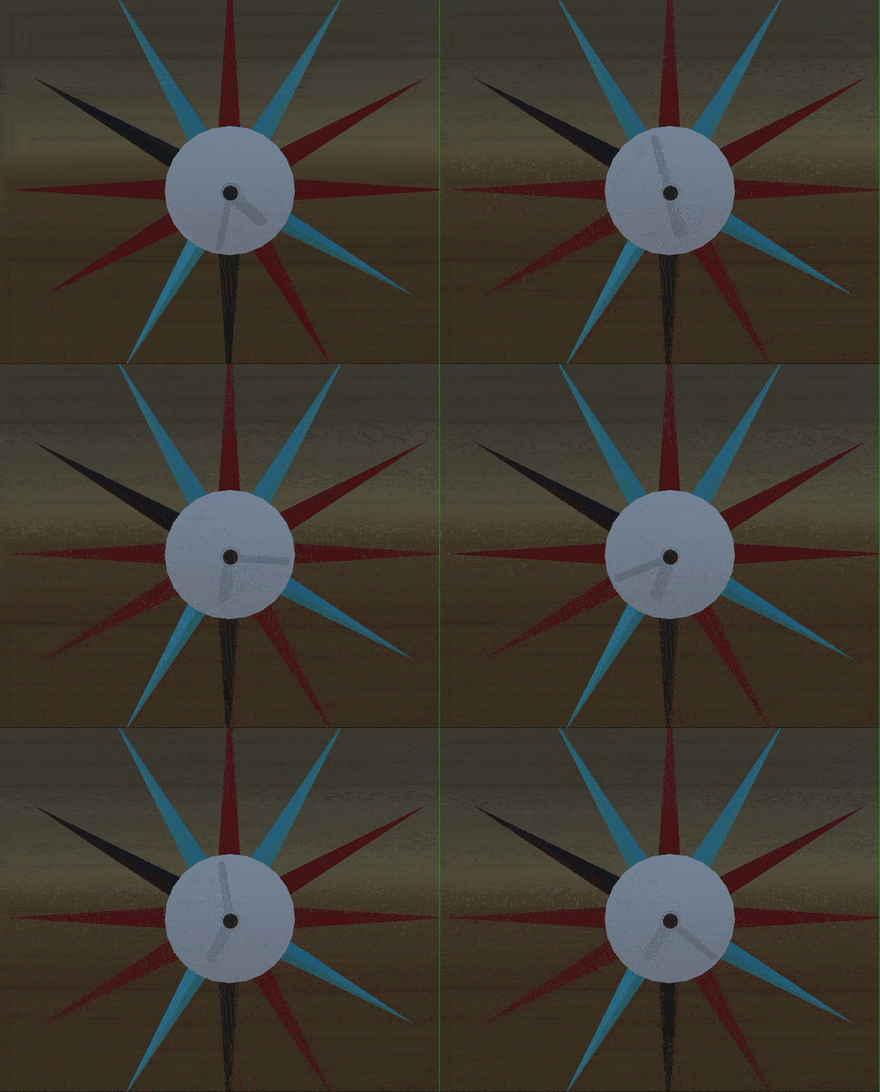
Creating the creature: I made one generic creature in Blender using a series of pentagonal toruses. I animated them as I wanted and the style is inspired by my Creature Clock for deliverable03.
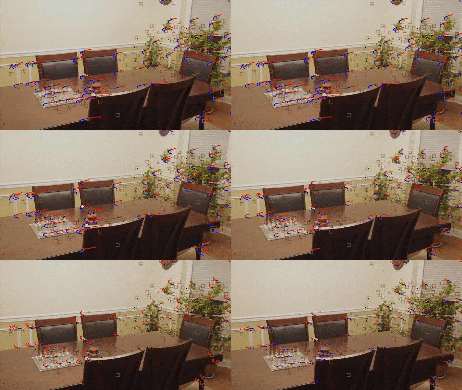
 

Image tracking demo

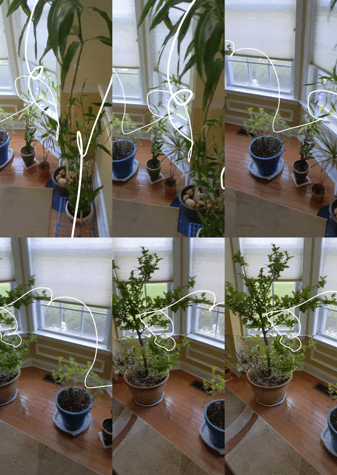
Tracking the video: I prerecorded this rather mundane scene of my family’s dining table (honestly, we never eat here tho). Using the Movie Clip Editor within Blender, I detected the features and tracked them throughout the clip. Then, I assigned a plane and a scene using the trackers so that I could map my assets onto that plane.
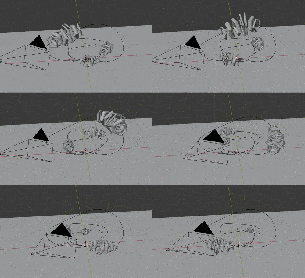
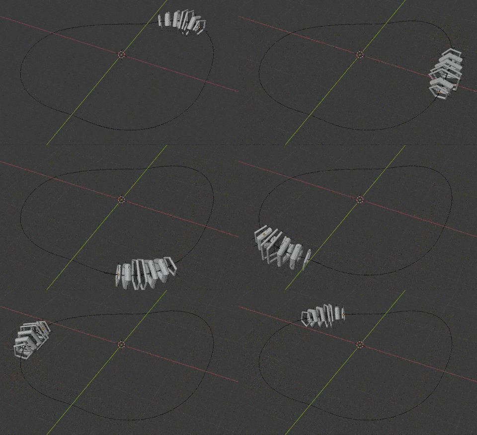
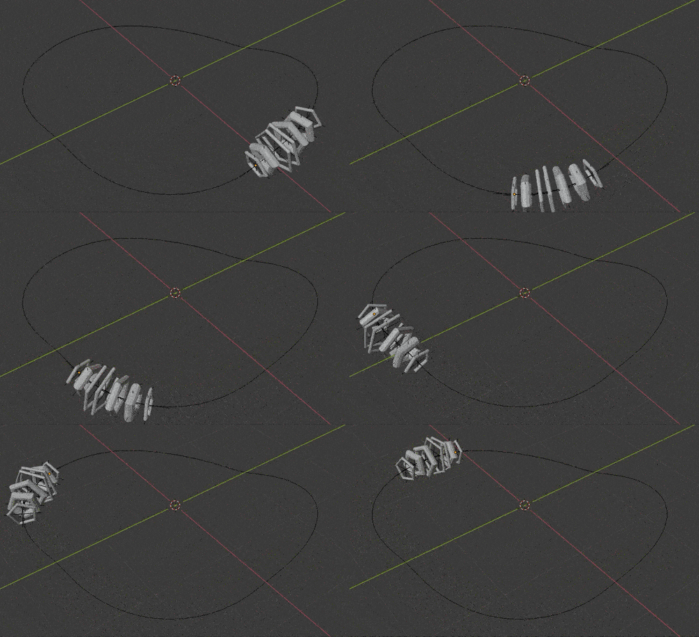
AR scene arrangement

Arranging the scene: I then created multiple copies of the original asset. Here, you can see the camera movement is calculated based on the previously mentioned tracking.
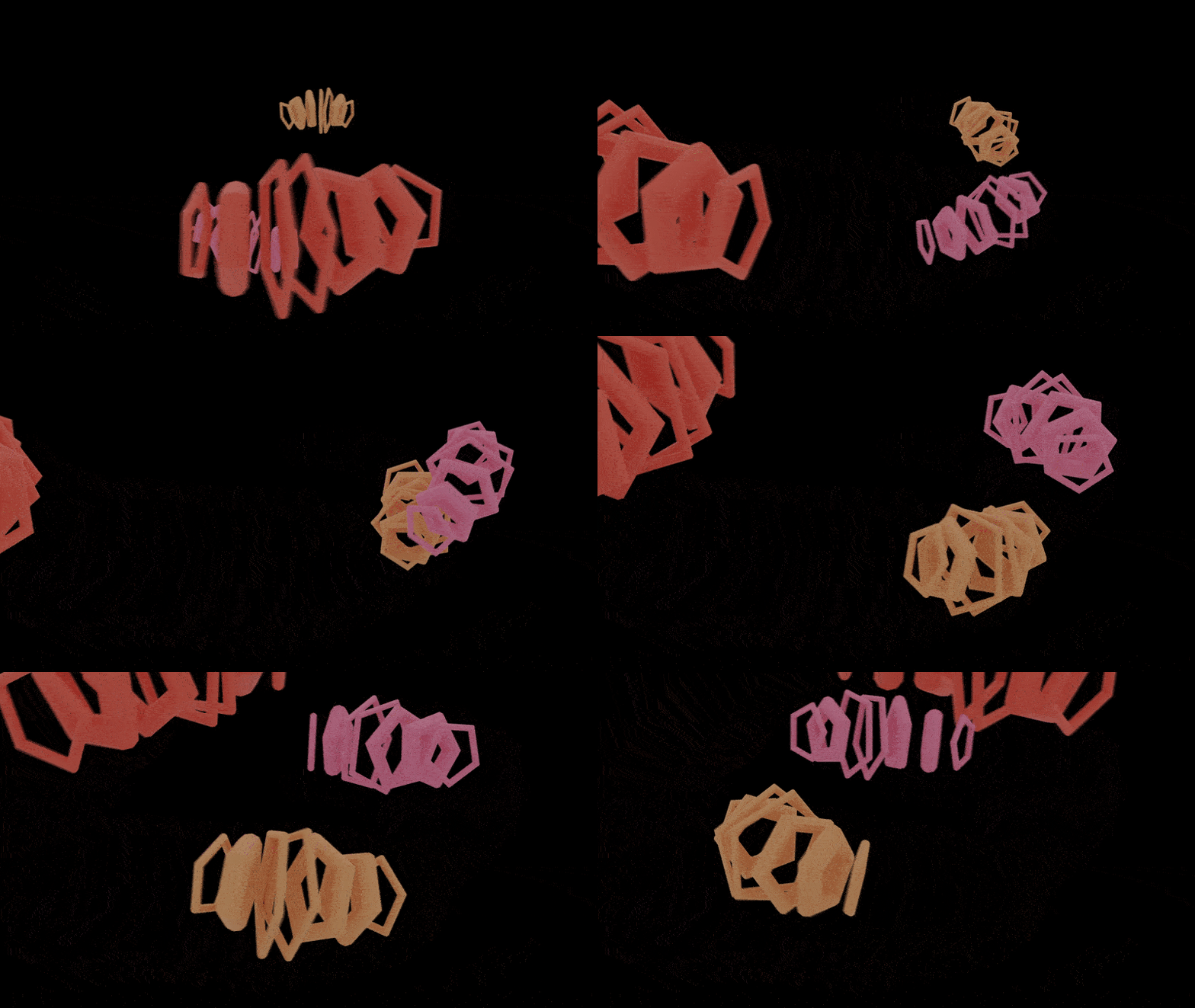
Rendered animation

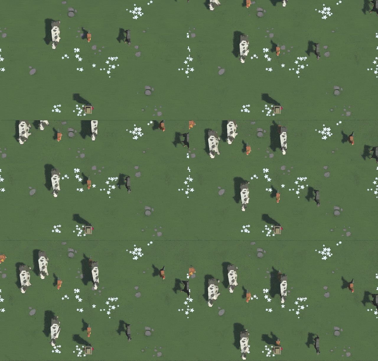
Time to render: Because I wanted the shadows of the objects to be realistic, I used the cycles renderer. Unfortunately, these measly 372 frames took close to 12 hours to render. Each image here is actually a PNG (ie. it has a clear background)
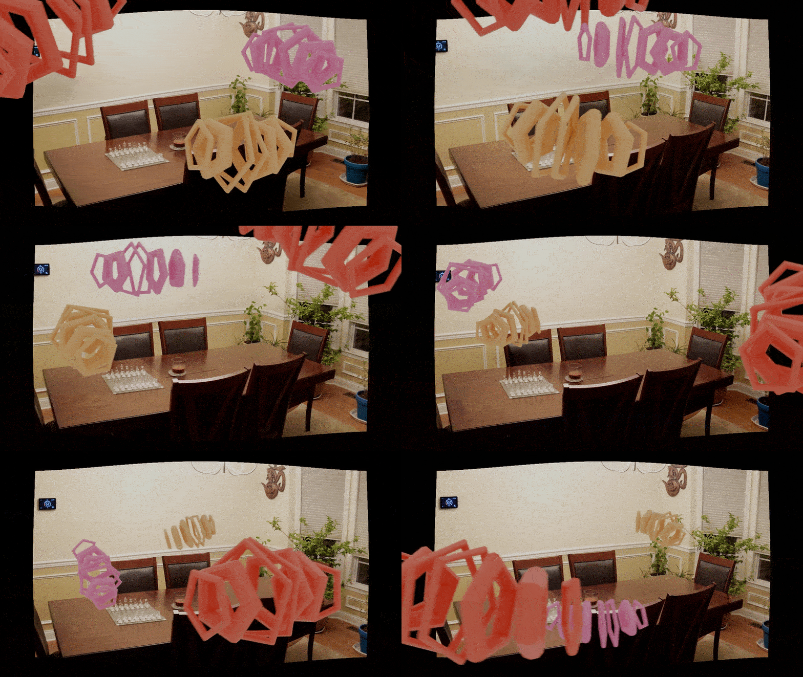
Composited animation

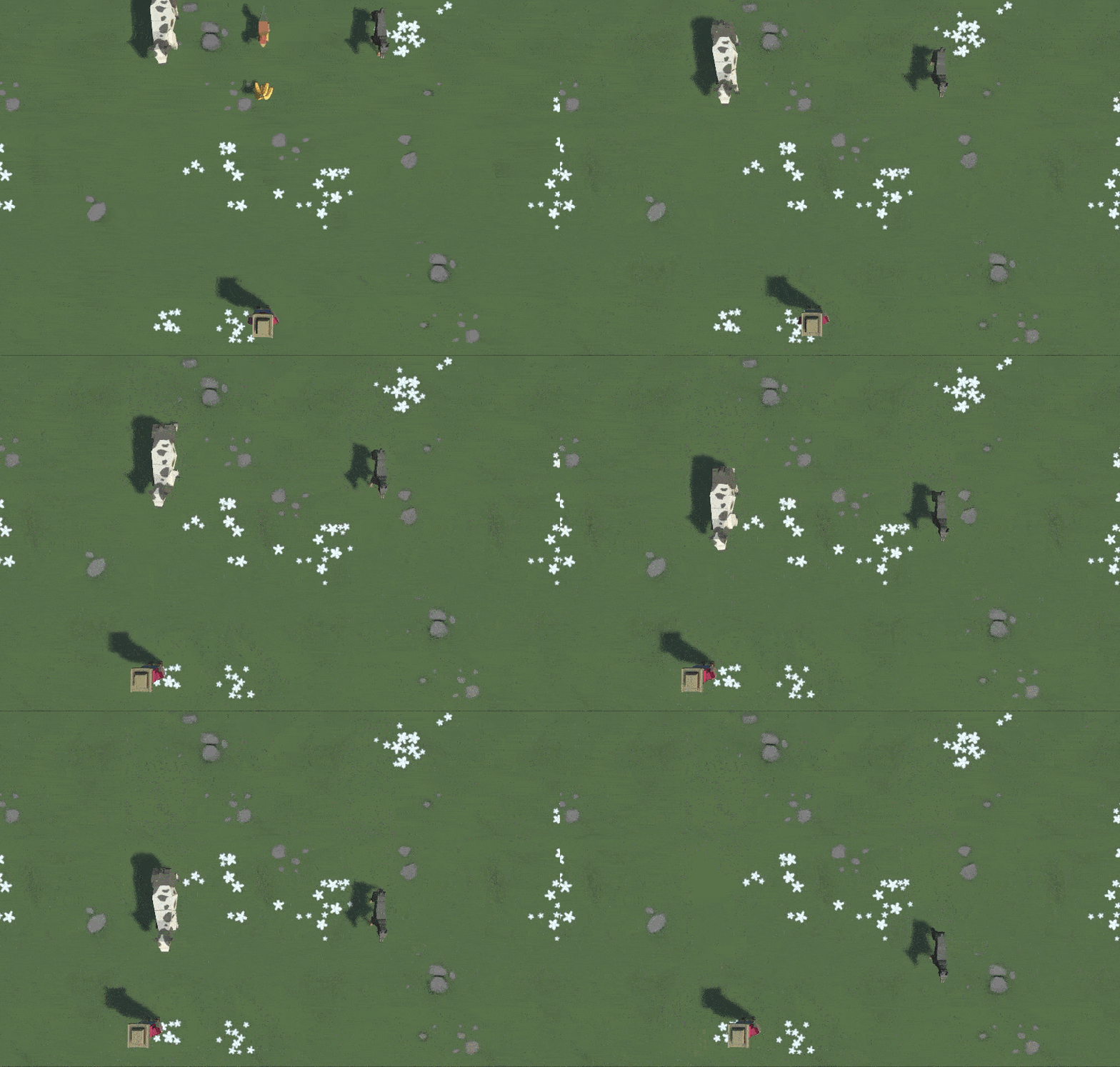
Putting the two parts together: This was honestly a tad disappointing because after 12 hours of waiting, seeing that black border was not a fun time. I still think it looks cool but, no need to worry because cropping is a thing.
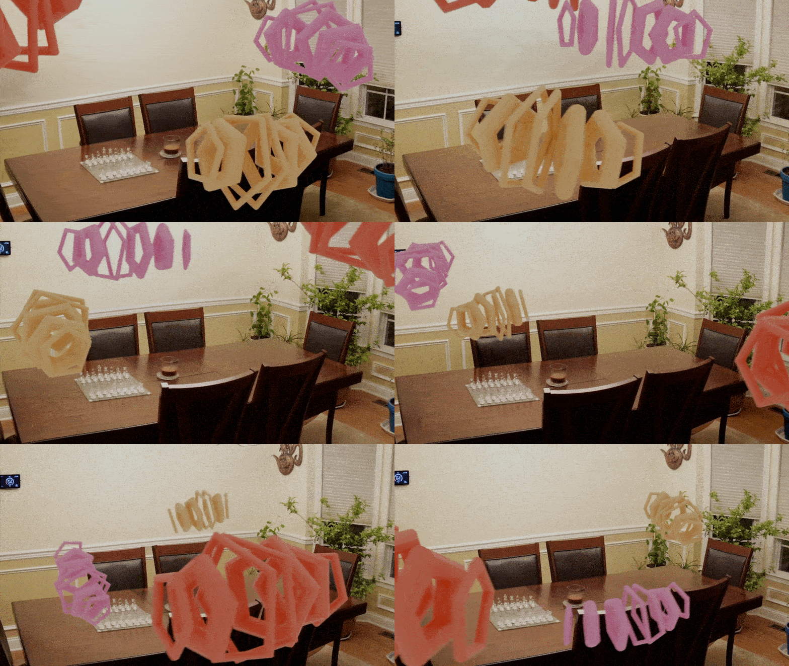
Cropped final render

Cropping: After the final cropping, there is a bit of compression, so the quality is a bit reduced, but I am super satisfied with how the shadows appear on the table and the wall.
lampsauce-ARSketch

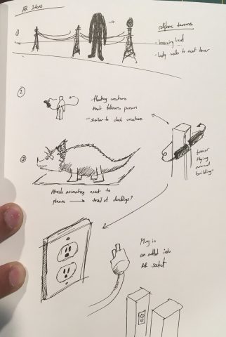
I had several ideas for AR projects, though I am not sure how feasible they are. I want to use AR to play with the scale of large structures such as cellphone towers or skyscrapers.

  1. Giant electrical outlet, map asset to planes on building exteriors. User can “plug in” a giant cord into the socket
  2. flying companion. Sort of along the lines of my clock creature, I think it would be cool to have an AR companion that sort of floats around people
  3. The top of the sketch shows a large headless figure running past telephone poles, while its head bounces forward. I think this would be really cool/erie if I could get it to work, however, it would require working across a great depth considering how far apart the poles/towers are

lampsauce-Assemblage

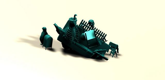
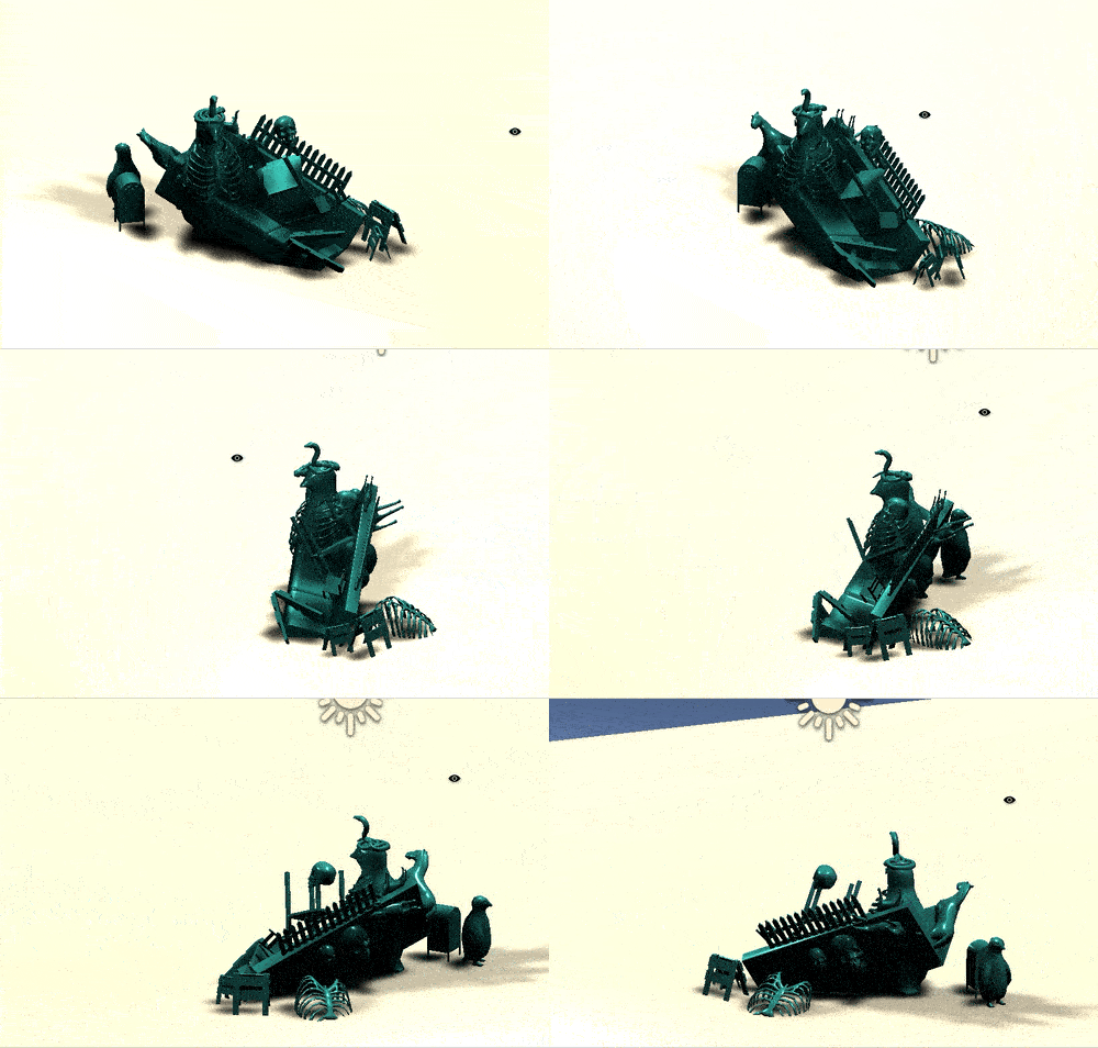
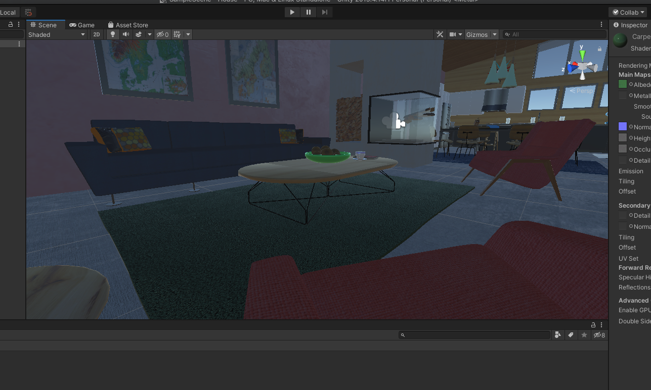
I used David O’Reilly’s Everything_Animals and Everything _Furnishings Assets. I think the lighting and materials could have been much better. I think that the way the assets are combined are a bit boring, but there are some good aspects (such as the penguin with the ribcage). Also, I think I fell for the common trap of making the composition very ‘front-facing’ in that there is only one-ish interesting sides.

lampsauce-UnityScripting

Primitives Exercise

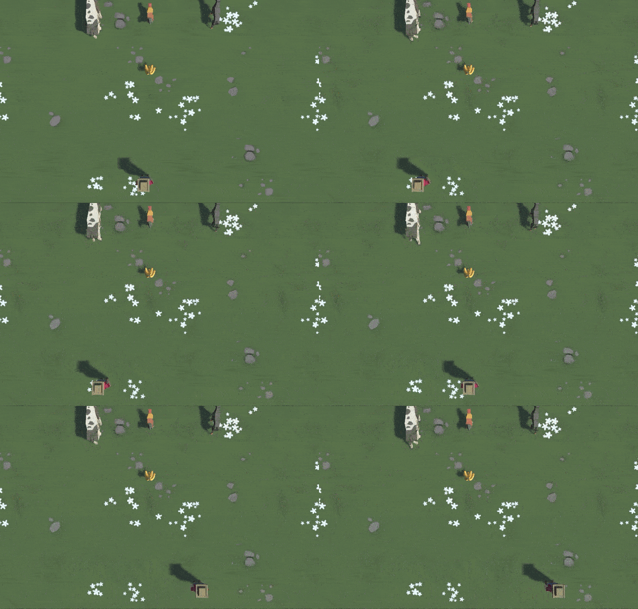
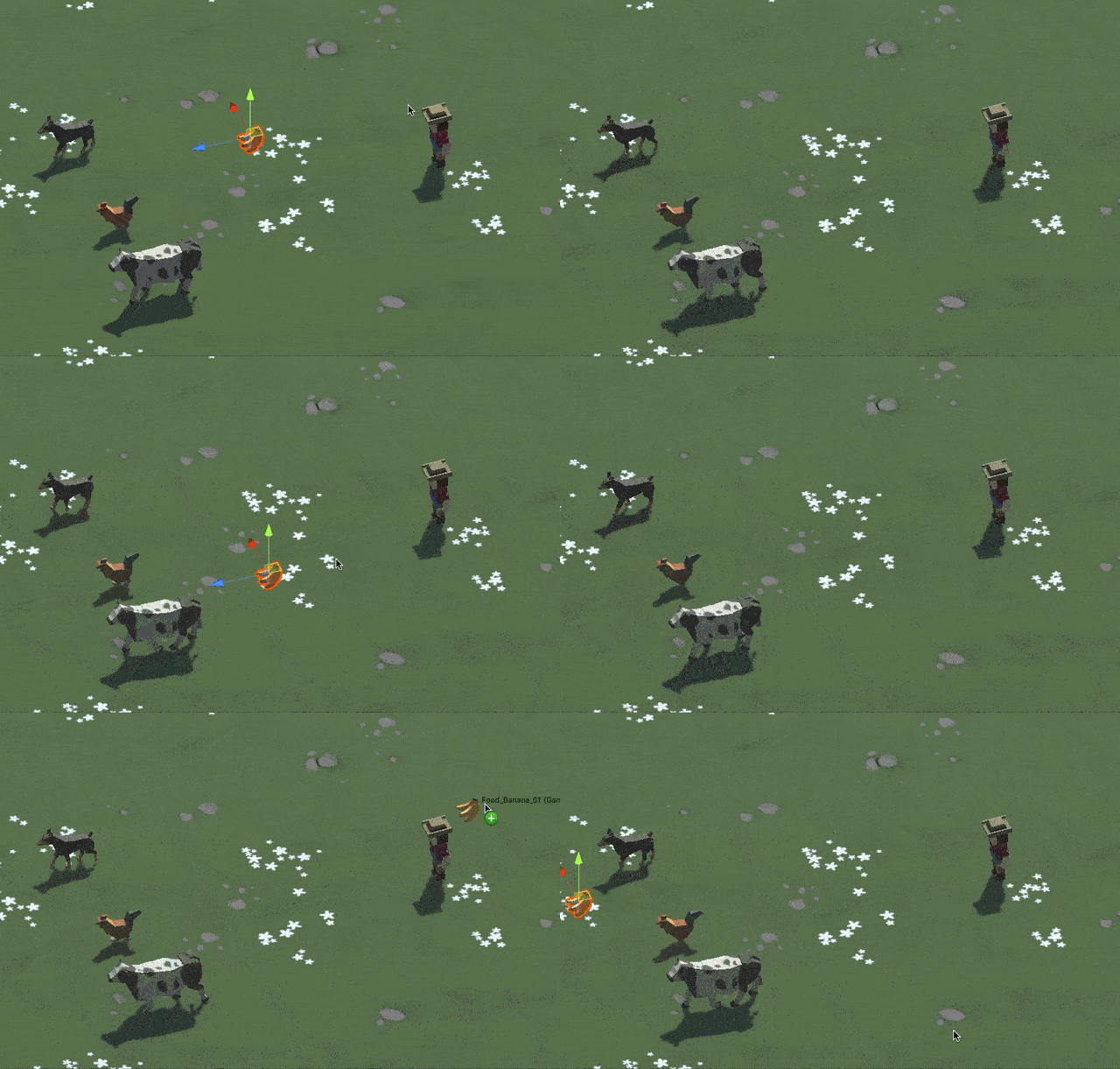
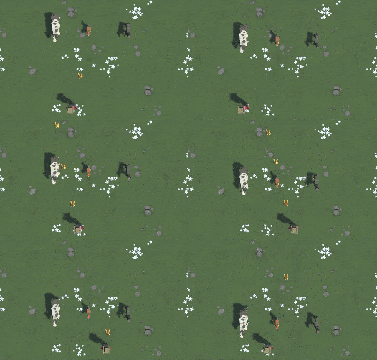
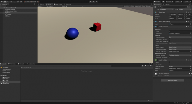
For my primitive game, I am planning to make a game in which the user jumps over incoming obstacles instead of shoots at them. I’m in the process of making my own assets

lampsauce-UnityEssentials

I was not able to move past baking lighting, though I watched the remaining videos. The calculation would have taken 2 hours. Overall Unity seems pretty cool, but that tutorial was pretty annoying (especially because the starter files worked only half of the time).

lampsauce-PhazeroVideo

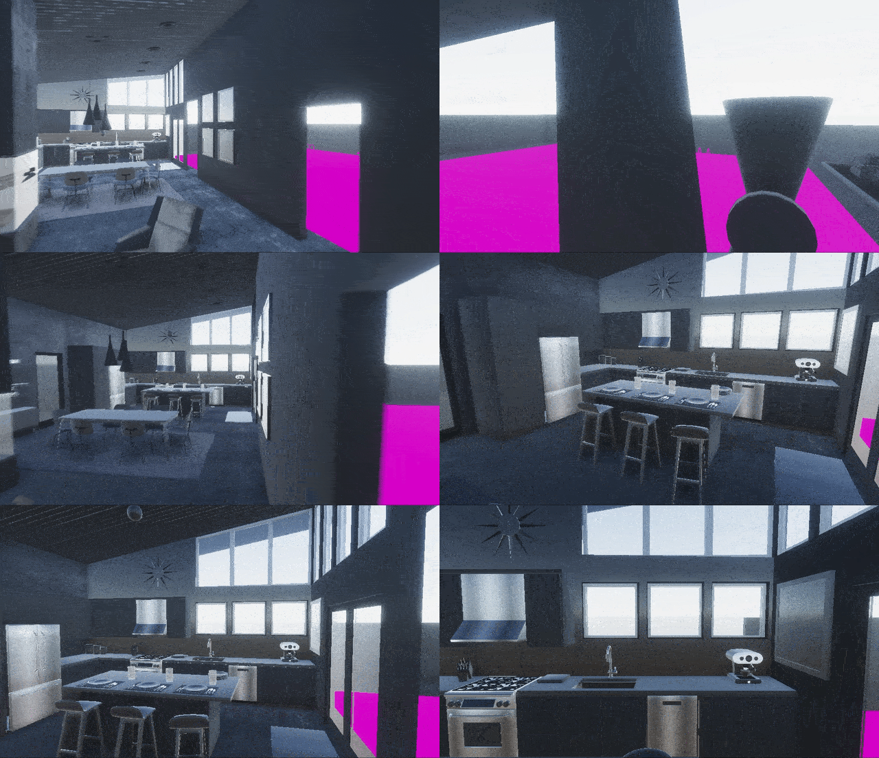
One thing that interested me was Phazero’s work Artifacts I. I think that using their fine arts perspective to challenge game design conventions allows their games to inhabit really unique virtual spaces. Artifacts I is also really cool because it is not random, rather it is a carefully curated assemblage. The resultant experience also has unique interactions. I suppose what I like most about Artifacts I is that it blurs the line between a VR experience and a traditional 3D FPS game.

lampsauce-LookingOutwards05

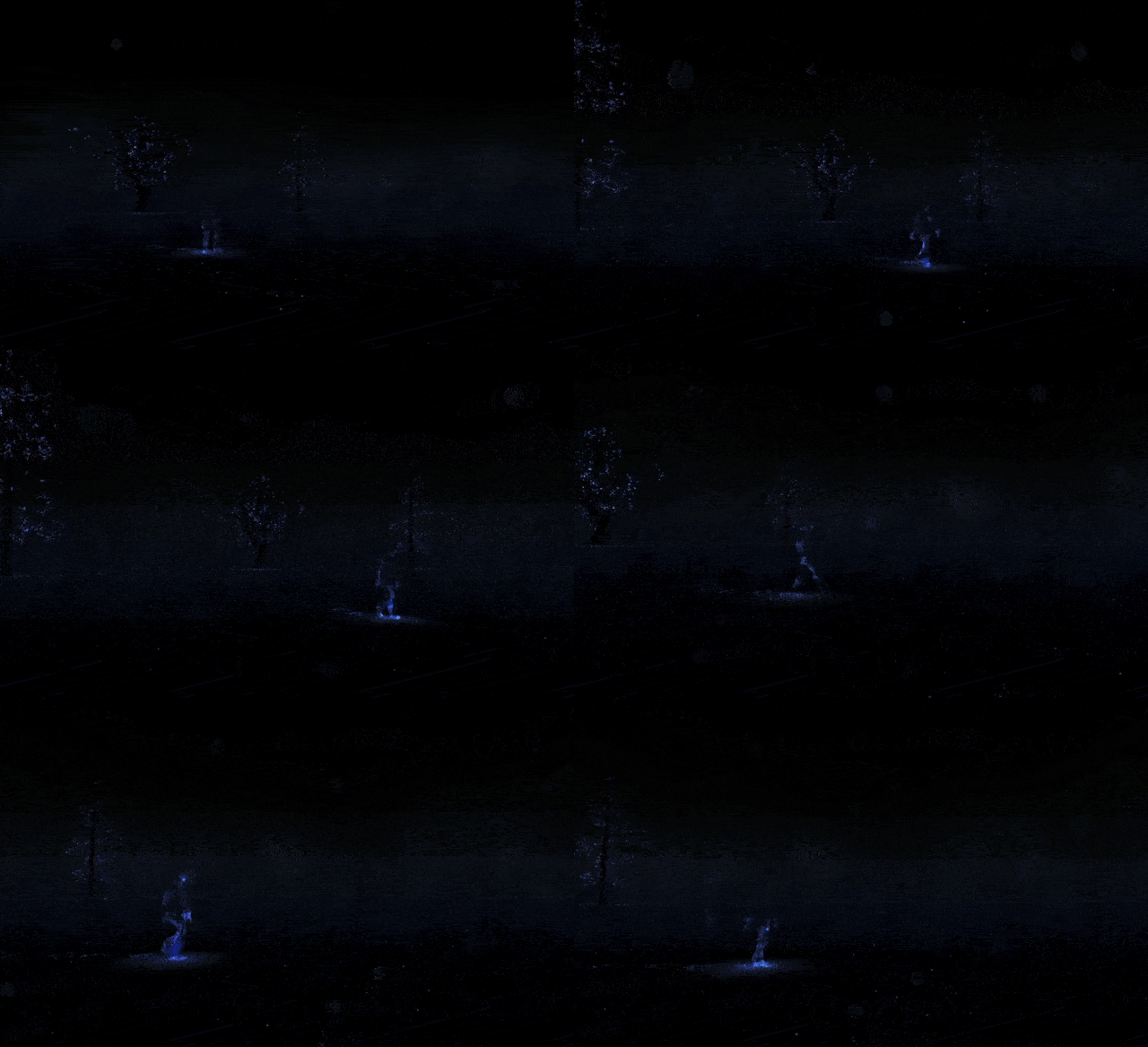
Person walking past a blind ‘viewer’

This project is called Notes on Blindness. I chose this project because it demonstrates how VR can provide a new perspective to people who have not considered other points of view. In this case, the visualization of sound and the experience of it when one is blind is extremely profound. What I like about this project is that it puts a keyhole in front of the reality of non-blind people. What is interesting is that by seeing less, you see more, which is really powerful. One part of the project that I really enjoy is the visual take on the human voice and how it fills a virtual space differently than footsteps, for example.

lampsauce-TeachableMachine

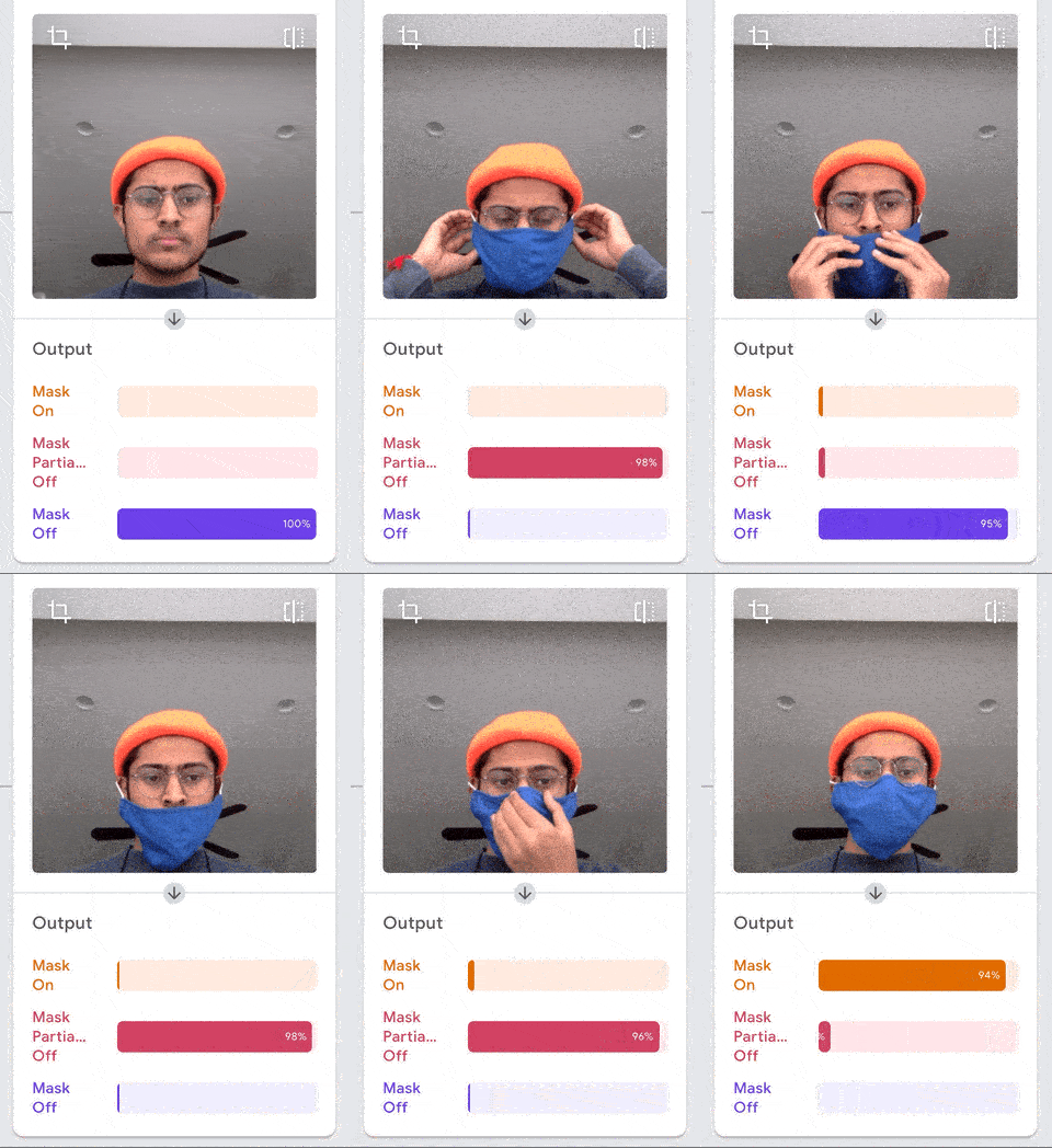
I trained a model (view here) to detect if someone is properly wearing a mask or not. It’s a huge pet peeve of mine when someone is wearing a mask, but their nose holes are out, defeating the purpose of the mask. The classes the model detects are mask on, mask partially off, and mask off.

I originally tried to make a model detect if I was wearing different kinds of glasses, but I think that was too nuanced.


lampsauce-LookingOutwards4

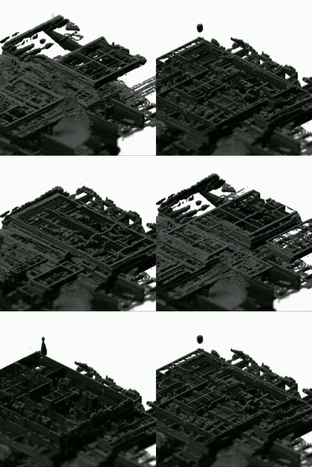
This work by Erik Swahn depicts many floor plans stacked on top of one another. It was made using a StyleGAN (generative adversarial network). I chose this work because it is really satisfying to look at cross sections of things you wouldn’t normally see. I think that this work is especially imaginative because it paints a picture of a building that does not exist, so legitimately trying to imagine what this creation would look like from how we normally interact with buildings is a fun challenge. I think this technique of interpolated layers has a similar aesthetic to Robert Hodgin’s Meander that we saw earlier this year. I also just really like how this looks because of the way it is rendered; normally floor plans are so boring