yanwen-Reading02

Where do you locate your interests along this spectrum?

I see my interests and creations more aligned with the category of “last word art”. My design works are mainly created with tools and rules that are already set up by previous designers, and my digital media creations are also based on the established form of creative coding environments and forms of expressions. 


What are some ways in which new technologies shape culture? What are some ways in which culture shapes technological development?

In my view technology and culture affect each other and develop depending on the influences that they receive from each other. Technology developments in fields including entertainment, daily workspaces, living environment, all have helped shape how the culture is like in the digital age. Similarly,  feedback and preferences from people as users decide what types of technology would continue to live on for further developments.  


We might aspire to make stuff of lasting importance, but when our work is technologically novel, it doesn’t always age well.

To me “doesn’t age well” might be either the technology that was once novel became familiar (or much more widely used) so the work is no longer novel in contemporary view, or the novel technology went discontinued and became obsolete. For the first scenario, all works should be viewed within its context. Even if the technology is no longer new, the work could still represent a turning point or important experimentation within the history of digital technology. For technology that became obsolete, it still preserve a part of the digital history and a possible direction that technology might have taken.
thumbpin-Reading02

I think my interests and tastes are a combination of both “first word art” and “last word art”. In high school, I studied classical music and primarily made realistic looking drawings and paintings, which made me comfortable with creating “last word art”. Both first word art and last word art have the potential to be impersonal, and when they become that way that are less interesting to me. When I took Concept studio for the first time, I realized that sometimes first word art becomes almost pretentiously inaccessible.

I think that new technologies shape human behavior, which then adapts the way people look at art. New technologies expose me to a vast amount of information and media in a short amount of time. My perspective when I look at visual content is not the same as it was years ago because I am used to fast paced, visually flashy content. When I look at art online, I rarely take the time to slow down and spend time on a single piece like I would if I were looking at art in person.

miniverse-reading02

I know this is late, bear with me.

My interests are broad but most of them are art forms where “last word” works” have been produced. I love japanese anime and manga, which reached its hey day in 1980s where movies like Papirika  came up with original and experimental ideas and characterful animation. (Papirika was a forerunner for Inception). Other interests, like drawing people, reached their “last word” phase with cave drawings eons ago. I can’t make a dent in those artforms. Instead I must try and live up to the body of work produced.

What are some ways in which new technologies shape culture? What are some ways in which culture shapes technological development?

Present day tech has reached a point where it manufactures homogenous culture on a global scale. Algorithmic decision making combined with innovative marketing can export cultures such as marvel films to billions. When users try to find their own community online the algorithm is working in their favor. Watching and predicting, in the hopes that if it can predict the user’s next move it can keep them engaged. Our culture shapes the direction of new tech. Investment into neural networks and related areas are to create as close to the perfect algorithmic predictor as possible.

We might aspire to make stuff of lasting importance, but when our work is technologically novel, it doesn’t always age well. Discuss.

Replicating rudimentary exploratory works in tech is not going to gain traction as viewers have seen it before. The original artist who produces these works are gaining exposure through the novelty of the work and the story of the creation process. Looking at their work and making similar quality rudimentary work won’t cut it. The effort required to create experimental work when a medium is semi-explored isn’t worth the potential traction. At that point, the obvious exploratory paths for the medium are well explored and the less interesting and more difficult paths are left untouched. The middle phase of a new medium’s introduction feels like a hard to manage slump.

miniverse-LivingWallpaper


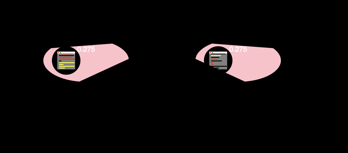
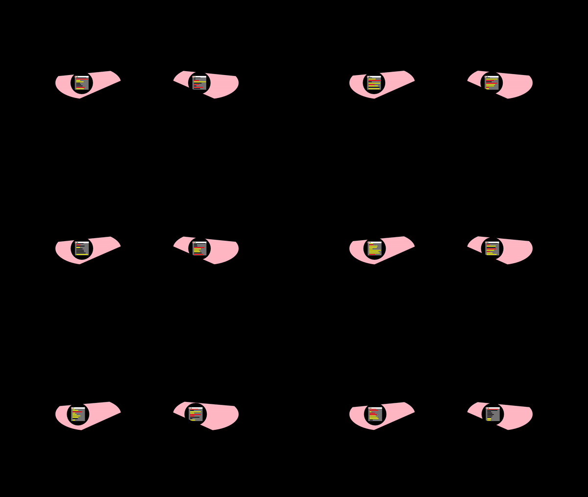
I made the wallpaper to be my mental state during this pandemic. I spend most days on a  wonky sleep scheduale trying to make 5:00 AM EST lectures. When I’m not, I’m staring at my computer doing work: writing code, talking to classmates online, working psets, rewatching lectures. I’ve become the virtual and I’ve been doing this in the darkness of my own room, bloodshot eyes.
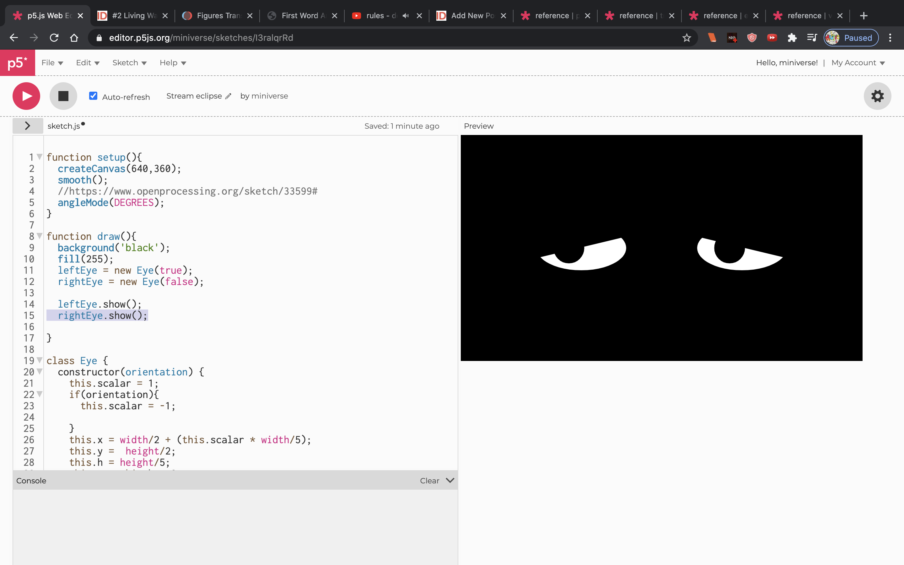
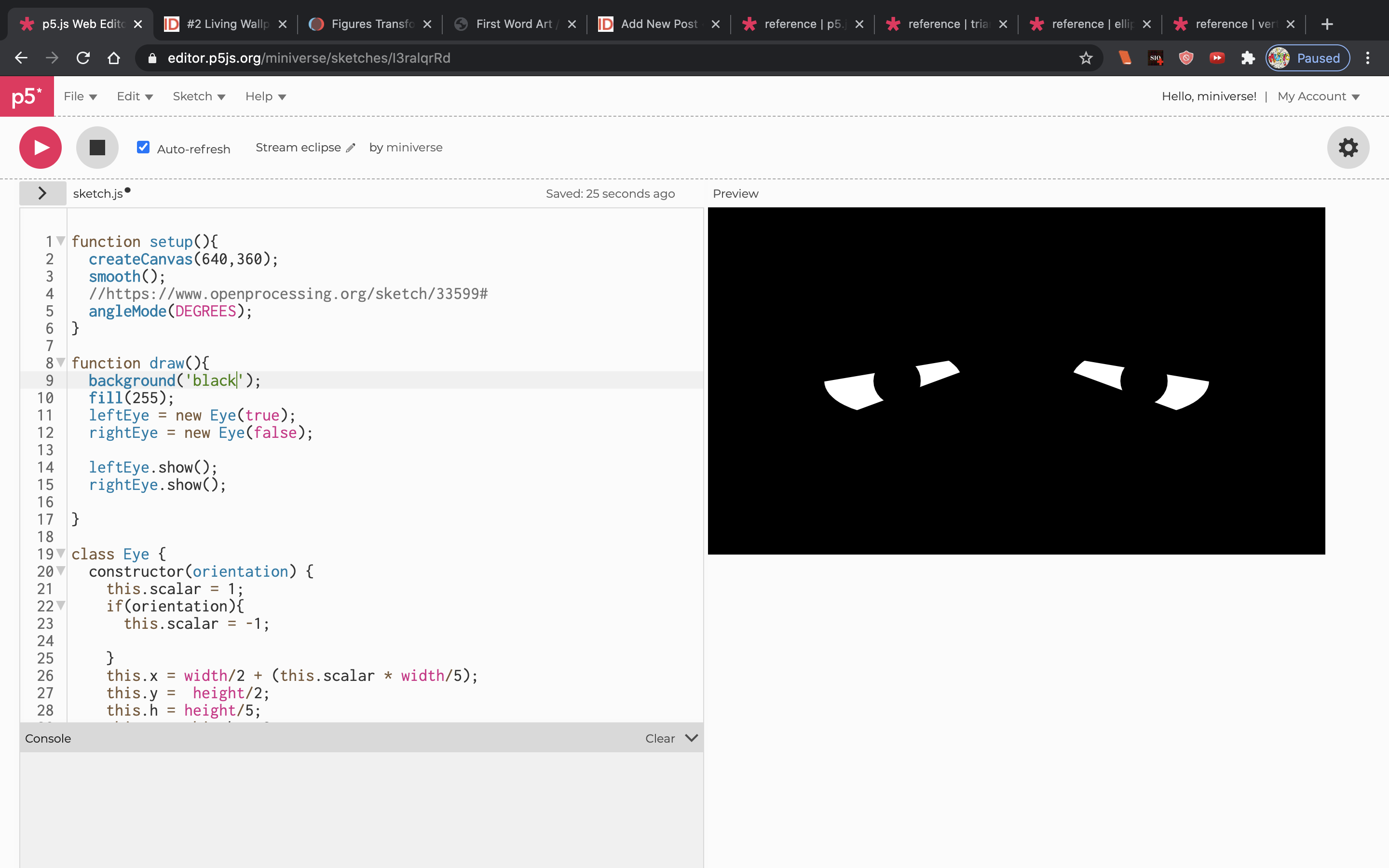
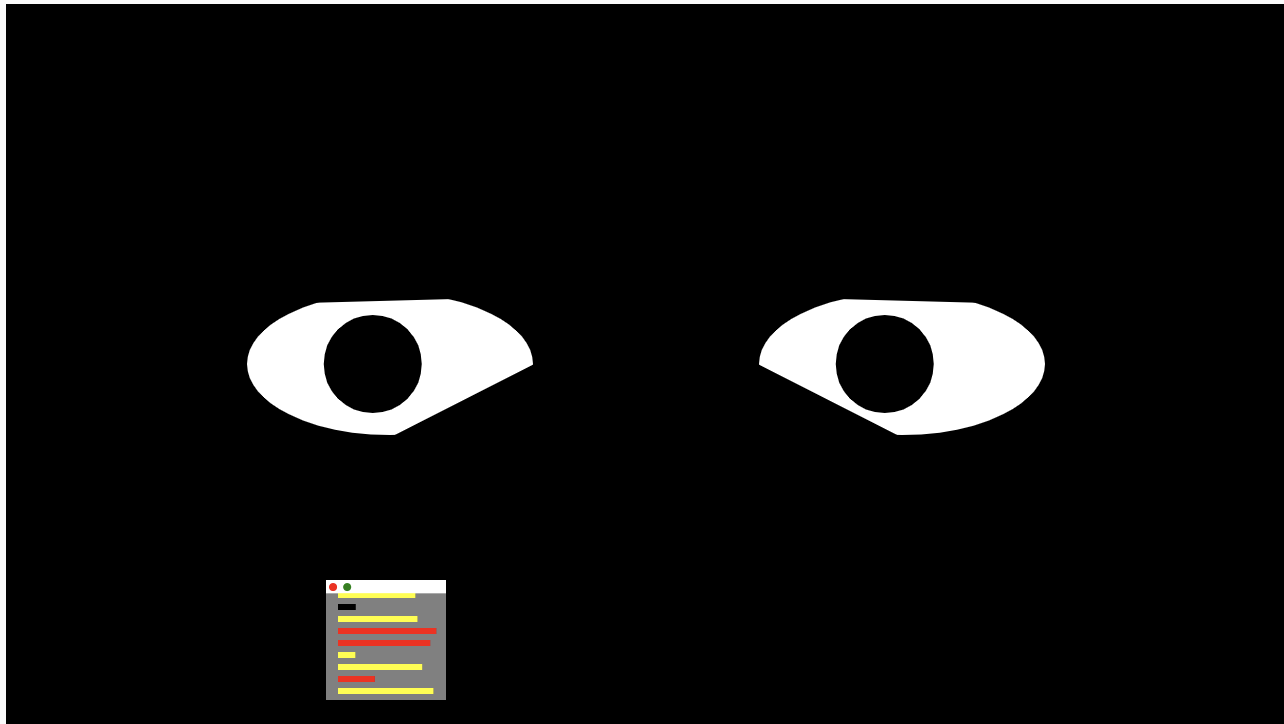
 

Here are some pics from my process:

I settled on the exponential out easing function, which was pushing all the high values from the perlin noise to 1 and causes the eyelids to “droop” and look like they are fighting sleep.


tale-LivingWallpaper

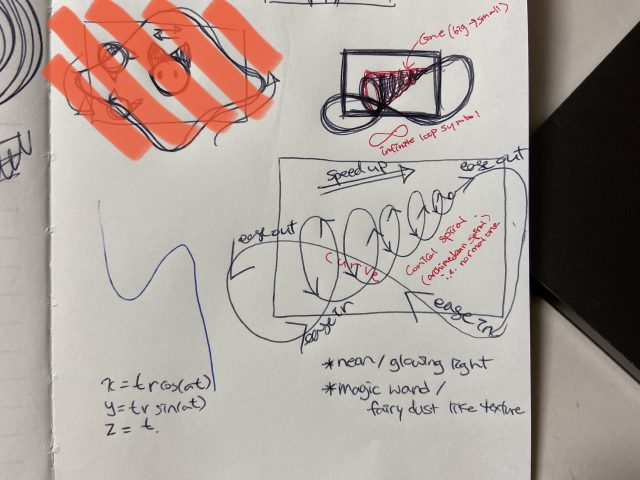
I initially designed and planned something totally different to what I end up making as the living wallpaper. My initial plan heavily leans on 3D parametric equation, as the main object of the wallpaper is the 3D curve, a conical spiral. I think I spent almost half of the total time I spend on project to figure out how to create a 3D curve in p5.js. Although I ended up barely making a use of the new functions in my final moving wallpaper, this project was a great opportunity for me learned a lot about creating 3D space/objects using translate(), rotateX/Y/Z(), and sin/cos functions in p5.js. Regarding the initial plan, I could only get my curve to a helix, which definitely didn’t satisfied me; However, in the future, I’d like to figure out the code and bring my initial plan to life.

Initial design:

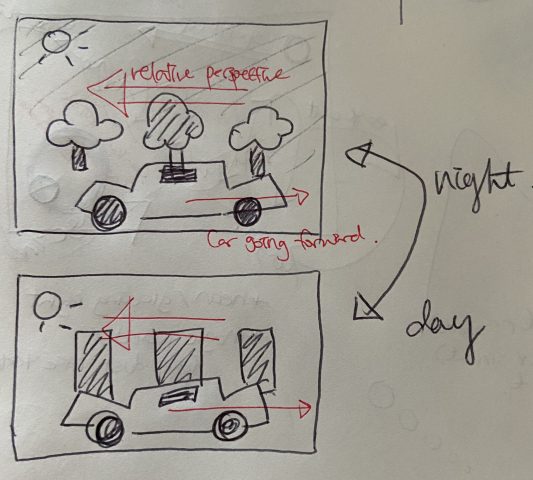
In exchange, I’ve decided to go with the alternative that describes my current lifestyle. Due to the time difference between school and home, my class schedule begins late evening and continues overnight to the following morning. I wanted to create a motion where day and night flips, yet things continue to function without a rest. Since I’m currently in a bustling city that never goes to sleep, I decided to have a car as my main object that continues to run. It’d pass the trees and the buildings at the different time of the day: The trees overnight to depict nature around the school campus, and the buildings throughout the day to describe the busy city where I live.

Here’s the sketch I made:

To give an impression that the car is moving constantly, I made the trees and buildings behind the car to move past the car, while the car itself would have a small motion of moving up and down as if it’s driving past those trees and buildings.

I used Double-Exponential Sigmoid easing function to give speed to the trees and the buildings passing by, and BoundInOut easing function to create the body of the car moving up and down as it drives. All the trees and the buildings are drawn in the position with respect to the first tree using translate().

link2code

yanwen-LivingWallPaper

This was actually completely different from what I was attempting to create at first. I watched this fluid simulation video by the Coding Train and tried to implement my interpretation with the code, but was getting low frame-rates and not so interesting results. I guess the main reason is because the original code was in Processing, but running the sketch in a browser dragged down the frame-rates.

To quickly switch from my initial idea, I decided to continue playing around with primitive 3D objects and their movements. I tried to implement the “DoubleQuadraticSigmoid” function and attractor-mover behavior. Also to add some characteristics to the 3D objects, I attempted to apply a fragment shader as texture to the spheres and drew the shapes with different detail values based on their sizes.

In terms of the visual outcome and presentation, I switched from a 2D scene to a 3D environment (in a rush actually :”) ), and attempted to create this space like environment filled with floating orbs (or planets?). Is it a wallpaper? I guess since every work that has been done for now are viewed on flat screens, so even if the scene itself is 3D, it inhabits in a 2D plane and need to have a sense of flatness. But comparing to standard wallpapers that have repetition of shapes and patterns, it does look different and not so wallpaper-like 🤔.

shoez-LivingWallpaper

Organized Chaos

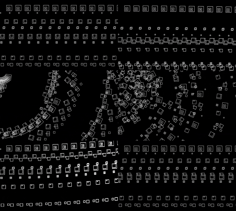
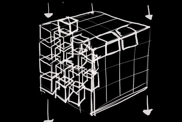
It was tough to execute my initial vision due to my limited capabilities. I was really inspired by Zach Lieberman’s black and white art pieces, so I wanted to create a similar environment. I’m still amazed Lieberman can achieve such organic shapes, but I eventually had to compromise and tried creating a dynamic environment with 3D shapes. I used a ton of different easing functions, but my favorite has to be the bounceOut function. I like the use of movement, but visually, I wish I had added more. I tried for a while to delay the rotation of some of the other cubes, but I couldn’t figure it out. I wanted it to look like a moving creature made of geometric shapes, but it was too difficult to individually program the movement of every square. I think I learned so much about what not to do during this project and I think that’s just as helpful as discovering something new.

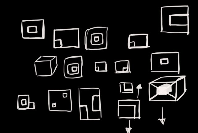
Sketches

A lot of my initial concept relied on having cubes instead of squares, so when I changed my design to 2D, I experimented with the squares and tried to make things visually interesting.


axol_Reading02

Michael Naimark proses the idea of first word art (“First word art is groundbreaking and exploratory”), and last word art ( “Last word art is virtuosity after the rules have been fixed” and has to withstand the test of time).

When a work is technologically novel, then it has to eventually face the challenge of new technologies. The old Doom game was considered a peak in its graphical performance, or the old FF7 adding 3D graphics and was considered as a technological jump. The two examples above are both “first word” works from a technological point of view. But what made them withstand the test of time was their content, and not their graphics.

New technology can bring new additions, new experiences to the work. It’s hard mark what’s a “last word” art on a certain technology. Technology is constantly evolving, and certain aspects  that maybe considered “last work” at the time– because that’s the best the technology had enabled them to do– will no longer be considered so when the technology evolves(good example is graphics). Thus the novelty of work, if wished to withstand the test of time– should not merely be the technology, but how you use it, and what you’re creating with it.


gregariosa-Reading02

In the article “First Word Art /Last Word Art,” Naimark distills the contrasting reception between work that pioneers new technology and work is more developed by building upon its predecessors. I found myself nodding at every sentence while reading it, as I had had this dilemma for quite a while as a Design student at CMU. I’ve always been fascinated by projects that deal with emerging technologies, but became easily frustrated with the low level of fidelity those technologies offer when trying to design around it. On the flip side, the more traditional mediums have allowed me to “perfect” the design to its fullest potential, but the perfection felt undeserving, knowing that it wasn’t anything very novel.

I think I am continuing to mediate between the two ends of the spectrum. While I am fascinated by technologies that bubble up tons of different ideas for design and application, I have become more cautious in going head over heels, as I know that many of the pathways in my head would not be very successful upon trial and error. Not only that, the implications of new technology are a double-edged sword. Paving the right, ethical pathways is a heavy and often not a ‘fun’ task, as the “novel and exciting” opportunities can yield too many consequences. As such, understanding why certain artifacts transcend over time seems to be crucial when approaching new technology, such that we can minimize the irrevocable mistakes that are so easy to make when diving into novel tech.

gregariosa-LivingWallpaper

Graphic design meets Code

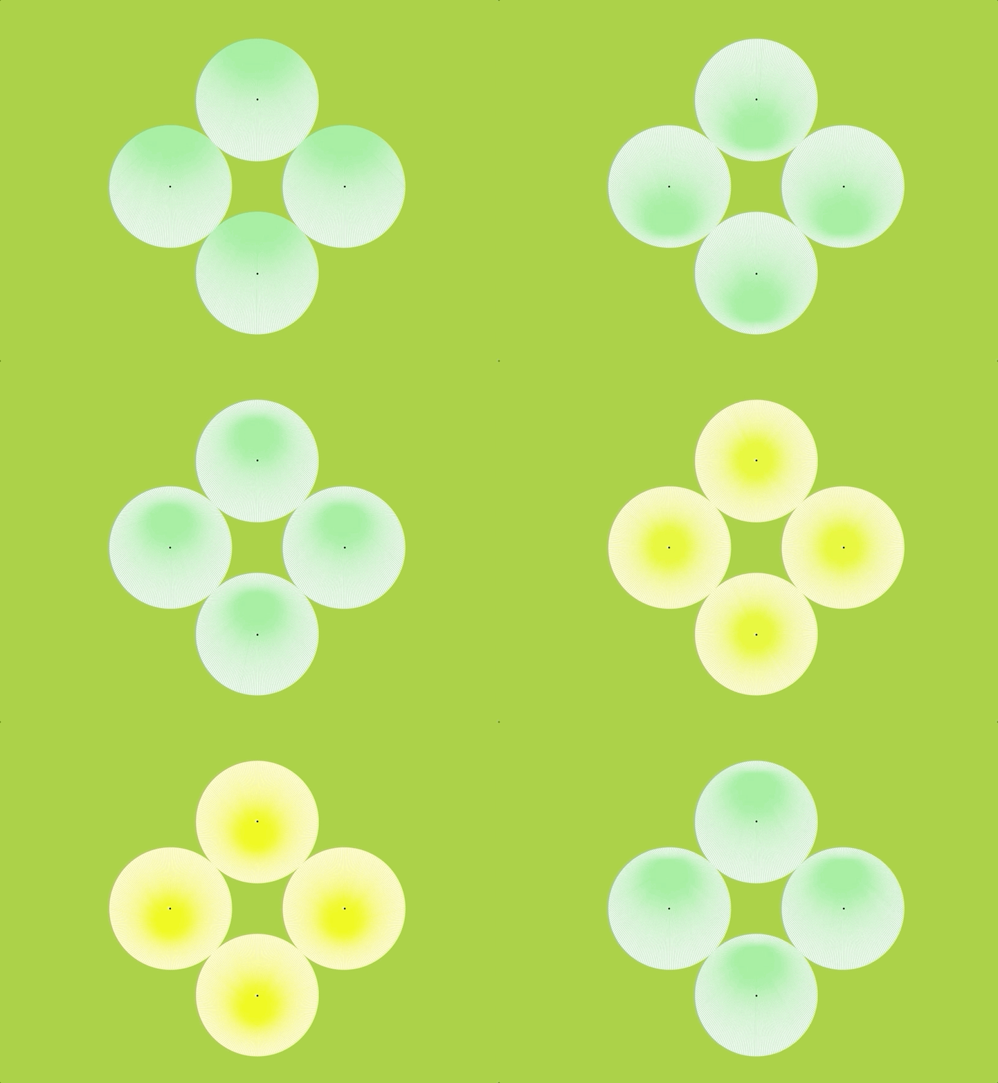
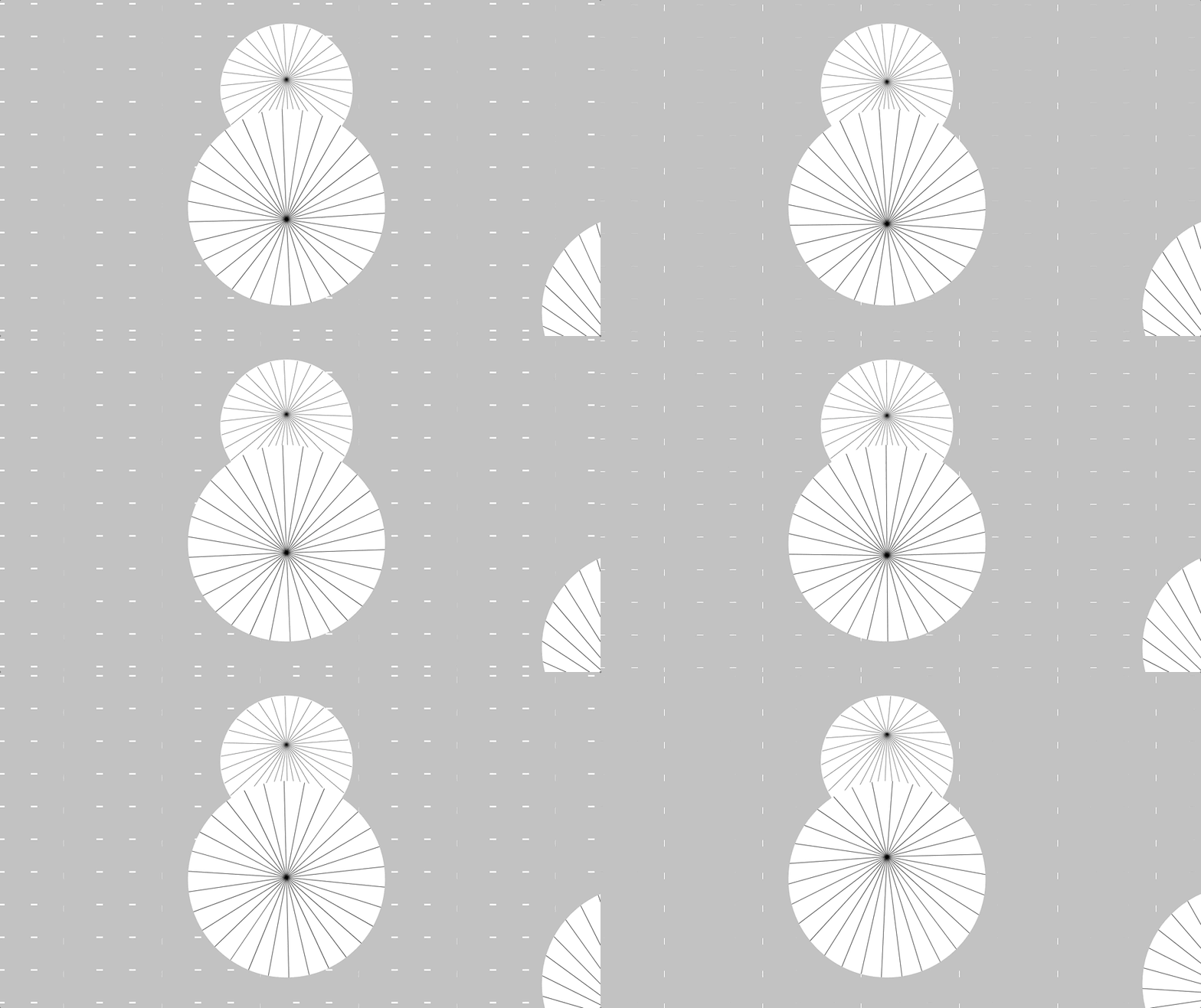
I’ve always liked making clever graphic design pieces out of simple shapes. The living wallpaper project was a good opportunity to dive deeper into visual illusions by adding in motion to the mix. (I tried a variety of different ease functions in the process of my project – I chose the cubicBezierThrough2Points function for the rotating circles, to give the satisfying pause when the circles join in the middle. I also used the cubicIn function to make the endpoints of the lines rotate with ease along the circumference of the circle.)

Overall, I’m happy with the visual illusion I was able to achieve with this project. I’m especially happy with the gestalt circle that form with every loop – revisiting trigonometry was painful but worth it in the end.

While the motion and precision of this piece is good, I wish that I had developed a more sophisticated layout for this piece. I followed the circle packing tutorial from Coding Train to apply to this project, but I ended up abandoning it due to technical constraints. I hope to revisit the algorithm again in the future and understand the actual problem I was tackling, and hopefully make my projects more tasteful.

Process

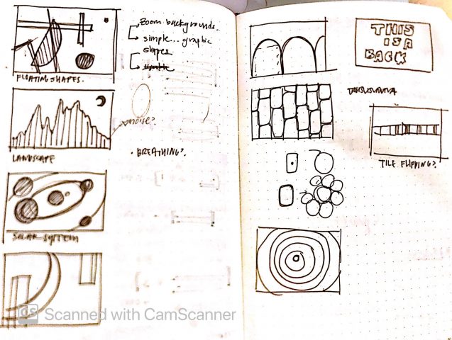
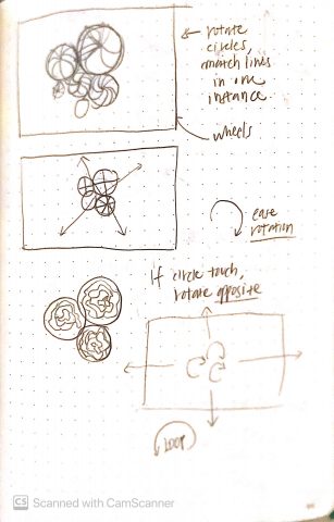
I was initially quite lost when starting this project. I sketched out different ideas but had little idea as to how to make each piece feel interesting.

Initial sketches – little direction

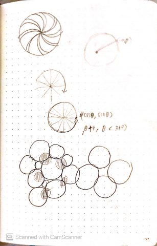
To get myself out of the rut, I reviewed the example code carefully and learned more about looping animations to feel more equipped in starting the project. In doing so, I was able to develop a more concrete idea and methods of execution, like the sketches below:

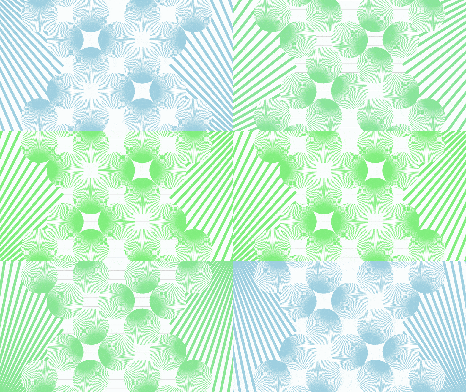
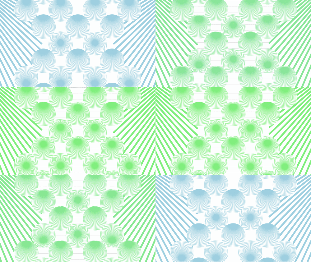
I went through a lot of iterations to test out different visual forms. Below are some interesting results that came out of the bag.