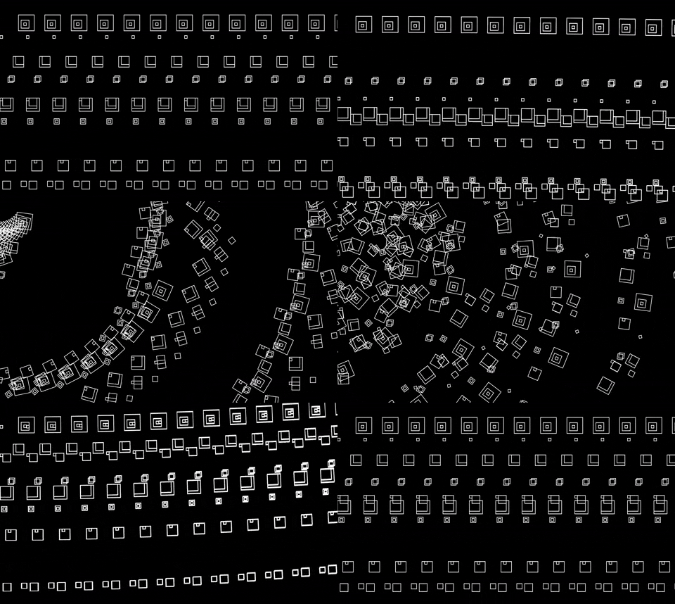
It was tough to execute my initial vision due to my limited capabilities. I was really inspired by Zach Lieberman’s black and white art pieces, so I wanted to create a similar environment. I’m still amazed Lieberman can achieve such organic shapes, but I eventually had to compromise and tried creating a dynamic environment with 3D shapes. I used a ton of different easing functions, but my favorite has to be the bounceOut function. I like the use of movement, but visually, I wish I had added more. I tried for a while to delay the rotation of some of the other cubes, but I couldn’t figure it out. I wanted it to look like a moving creature made of geometric shapes, but it was too difficult to individually program the movement of every square. I think I learned so much about what not to do during this project and I think that’s just as helpful as discovering something new.
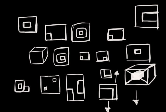
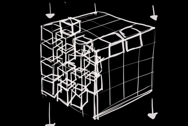
Sketches
A lot of my initial concept relied on having cubes instead of squares, so when I changed my design to 2D, I experimented with the squares and tried to make things visually interesting.


