Toad2 – LivingWallpaper

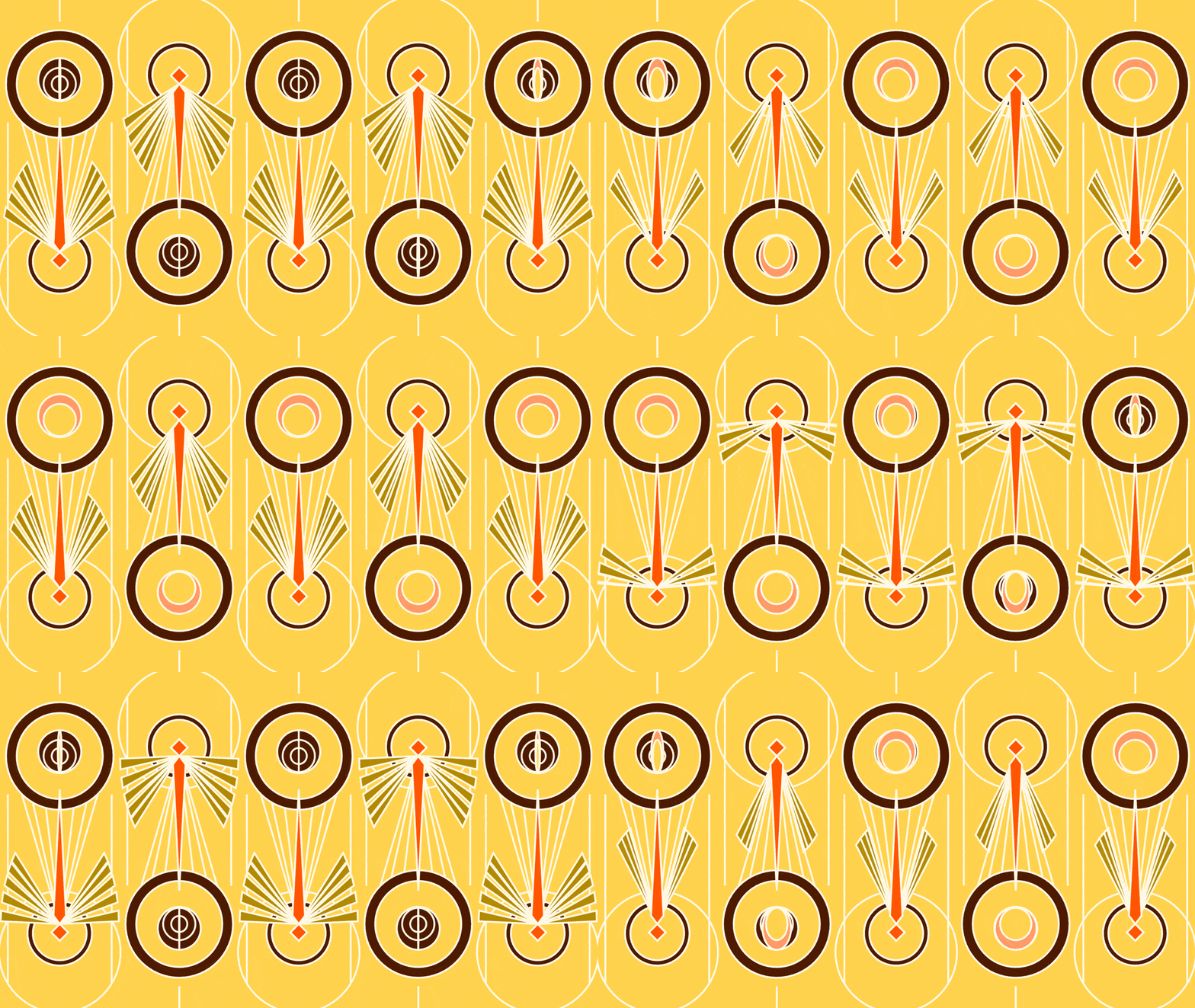
For this project, I wanted to focus upon the idea of making the best of a bad situation given the current state of the world as well as the serenity of impending dread. So, I decided to create something I dislike, wasps, in a pleasing manner and portray the image in way that could make the viewer anxious. Creating this project was definitely a challenge as I had to decide which I features I wanted to move and how I wanted each feature to move using new topics such as easing functions and rotating and translating the canvas. However, I enjoyed this project as I got to focus upon working with a art deco and experimenting with a subject of my choice. I think my color choice and composition turned out nicely and like the way circles rotate like there’s a gust of wind blowing through them. However, I think I should have made each wasp’s wings be at a different stage of opening and perhaps pause a little bit longer on the closed position to put more emphasis on when fluttering motion of the wings. I used the doubleExponentialSigmoid function in order to place emphasis on the open and closed positions of the rings as they turned. Upon reflection, I think I could have incorporated that function into how the wings flap.
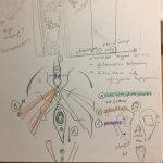
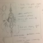
         

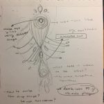
Sketches – I initially wanted to make a more ornate art nouveau design with curving lines, but I had to settle for a simpler art deco style instead.
Code, Best Viewing Experience, Video Download

sticks-LivingWallpaper

Living Wallpaper

GIF

screen recording with better quality: 

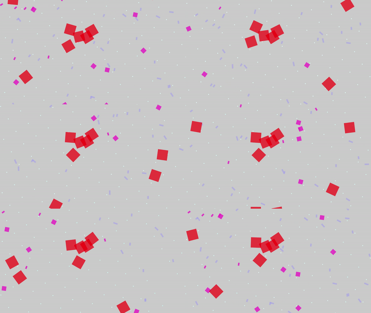
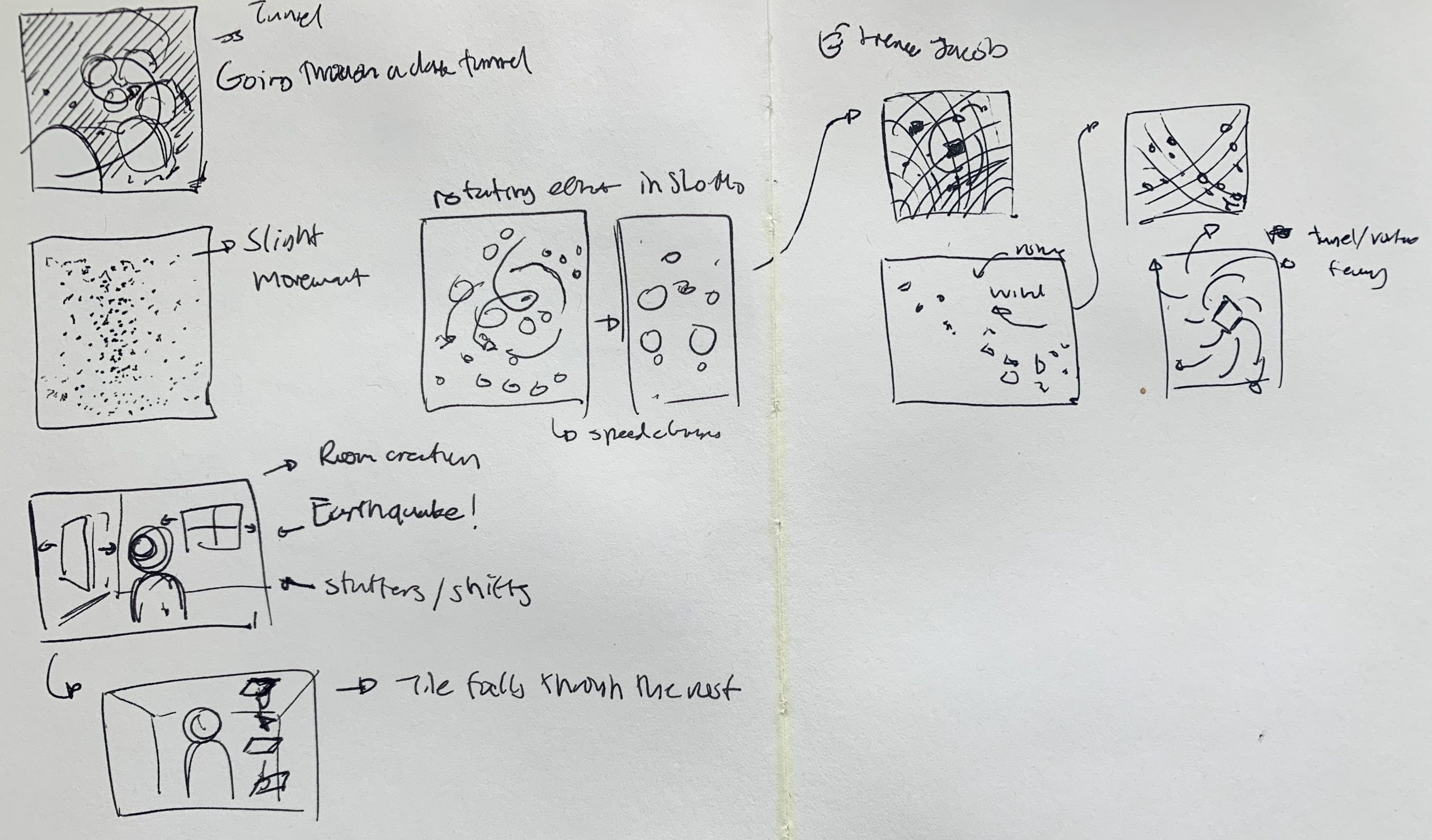
My initial goals for this project was to create a mesmerizing space with shapes, so I wanted to focus a lot on creating an animation that has objects flying through and out of the frame and one that felt less static. I wanted to implement rotation as part of my infinite loop, where shapes will loop out of the frame, and then loop back in. I also wanted to create a funnel-like and vortex kind of motion with the shapes, where the distance from the center of the vortex allows objects to behave differently. I later chose to use rectangles for every object, as every different kind of rectangle had its own behavior. The paths of the flying rectangles were defined by various equations, where I combined the sin, cos, and tan equations while adding rotation to create different orbit behaviors.

I think my living-wallpaper is a good starting point as a living wall-paper, but I could have added better rotational elements and visuals to create more character within each of the objects. I think playing with color, and how color and value changes as the objects rotate would’ve made this project more successful, since it still reads as a 2-D twirl and less of a 3-D vortex. I think the background could also be further developed and strengthen the the warping of a vortex and containing more depth in color.

Link to my project

sketch


mokka – Reading 02

First-word art vs. Last Word art: One is about exploration and the unexpected, the other is about accepting what has been done and respecting such through practice. I think of the first-word art as a practice that requires acceptance of risk, experimenting, problem-seeking, while the last-word art requires discipline, knowledge-seeking, and respect to culture and legacy.

In my practice, I find it important to be exploring in both ways by experimenting constantly whether it be through concepts or materials, and also find it important that I know where these ideas may have originated and understood the culture and past usages of the materials I am interested in. The main point that stuck with me in Naimark’s article, “First Word/Last Word Art” is the struggle of finding the permanent in-between with these two spectrums especially in the qualities of real-time. There is no doubt that technology is constantly evolving and as creators, we become very aware of how it affects the durability or importance of the things we make as time passes by.

mokka – Living Wallpaper


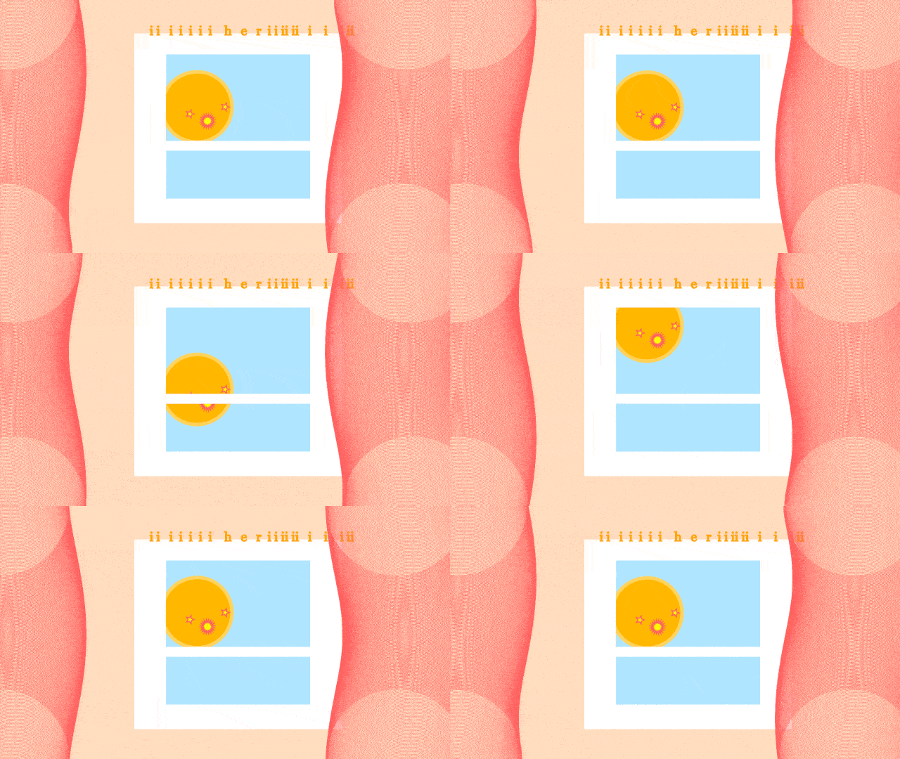
i’m still here – iiiiiii her iiiiiii i i ii

i'm still here, mokka 2020

In these times, I miss being in the studio the most and seeing people work near me while we struggle silently or maybe excitedly together. Lately, instead of playing through my Spotify playlists, I’ve been drawn to listening to Youtube Live Music playlists as they normally have animated visuals to go along with the music and they make me feel as though someone/something is existing beside me. Since I have this intense feeling of stillness in my home that sometimes buffers my productivity for school, I decided to make something that emulates the same feeling as those live playlists that help me feel a little more comfortable in the space that I currently work in.

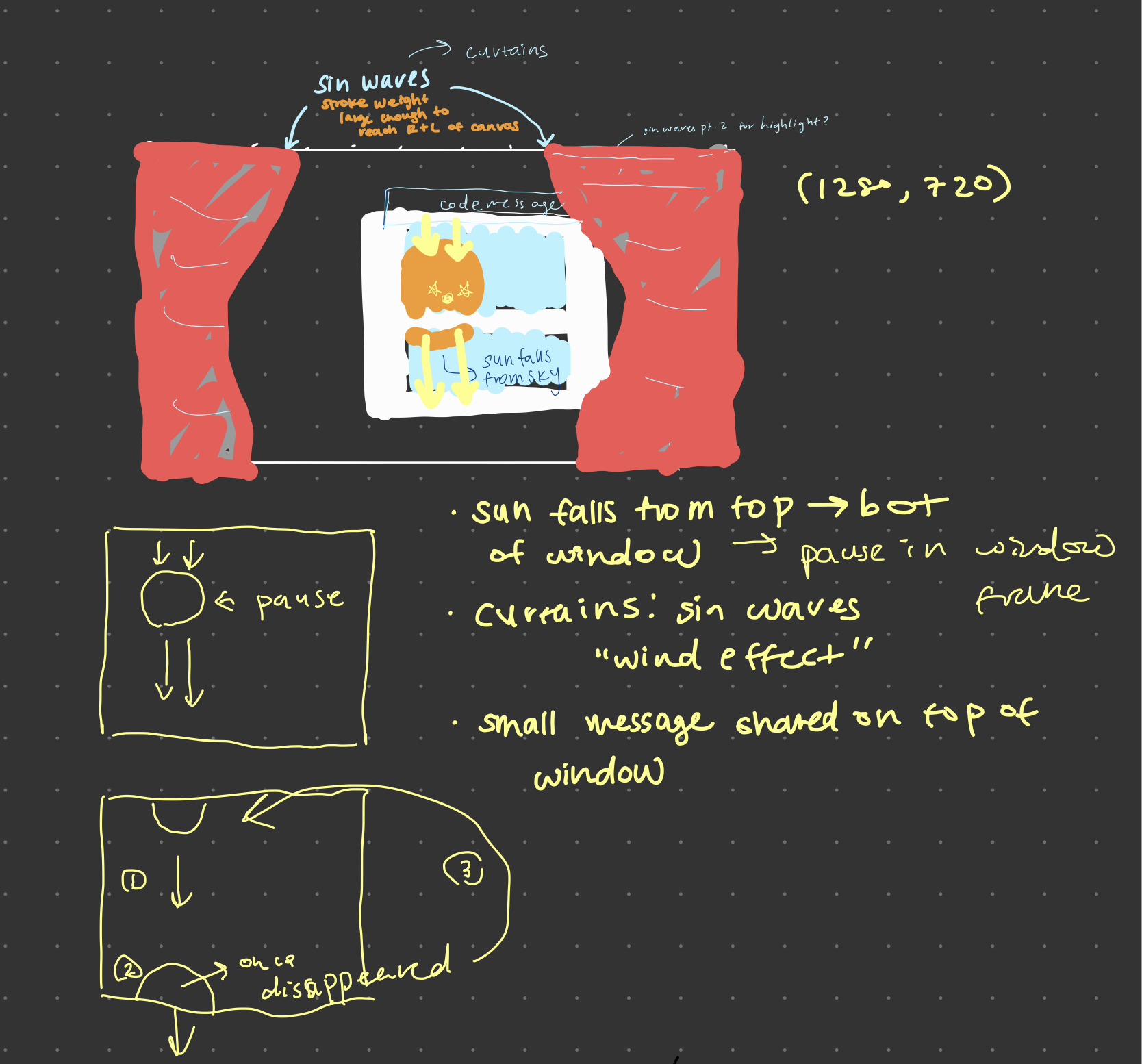
This assignment most definitely taught me many different things to consider whether it was the code itself or the process of exporting files and documenting this type of work. I used the Double-Exponential Sigmoid easing function to have the sun be able to pause and have its moment in the window frame and then continue on its merry way. The text above the window frame is something very personal to me and my best friend who I have known since I was 4 yrs old. It transcribes to “I am still here”; it’s something we know want to say to each other often but find it cringy and uncomfortable typing in a normal manner. The more “i”s there are, the more emphasis and eagerness in the message.

Visually, I am not all that satisfied with how it turned out. In fact, it irks me because I’m not sure what else to do with it. Although the curtains look complicated enough as they are right now, I wish I utilized a different technique to try and add dimension to them.

Despite my unsatisfactory, I’m glad to have fulfilled what I planned in my sketch below.

sweetcorn-Reading02

If I’m using Naimark’s framework, I guess I do often find myself thinking in terms of first word art. I admire the art I admire usually because it pushes into some new territory. I would say that isn’t by my own volition. At an institution which poses itself as cutting edge and groundbreaking or whatever words the Carnegie Mellon marketing team adopts, the narratives will always center these kinds of groundbreaking works. It’s no surprise that the school of art does the same.

Of course new territory isn’t homogeneous. In the past year, I’ve been focusing on art that pushes conceptually and pushes away from performance as this thing that goes on in some amount of time. I’m not sure why I haven’t focused as much on new technological territory—perhaps I subconsciously feel that’s a BCSA major’s place and not mine. I think to some extent “nostalgia” has been imposed on my work because I’ve refused to engage with even the current non-first-word state of technology in any real way. These are points to reflect on for me and things I see necessary to change for myself.

sweetcorn-LivingWallpaper

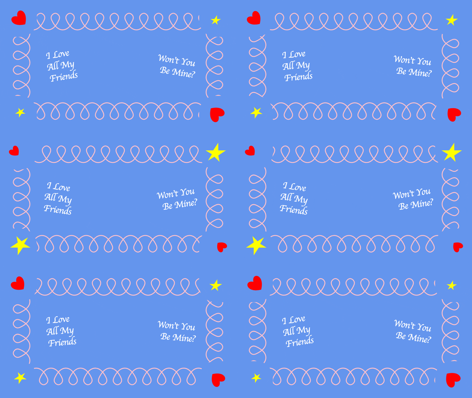
Zoom Background for Lovely Friendships

I miss building lovely friendships with lovely people in classes as I did last year. Accordingly, I wanted to make a background that invited friendship over zoom classes. I’ve been watching a little bit of Blue’s Clues recently and really enjoy its graphics.
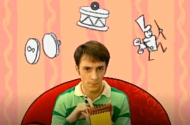
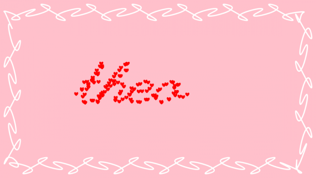
I wanted to recreate the playful and goofy and welcoming aspects seen in children’s shows like this (excuse my poor documentation), using the circular in out easing function from p5.func as well as a simple linear function for the curly frame.

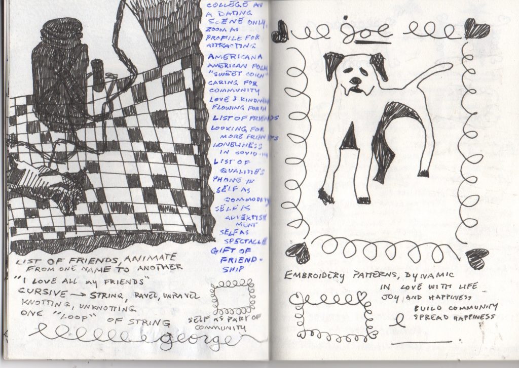
I would have liked to include elements that were customizable by the user, perhaps a list of current friends that cycles on the screen or a phone number where they may be reached to build these friendships. I experimented with this a bit early on, but it was going poorly :~(. Here’s a screenshot from that stage, showing the name of my best friend and partner ;~).

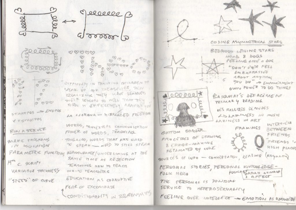
The curls were hard to get right using curveTightness() alone, as I had originally planned. You can see above one of the many experiments I had in making these curves before settling on manually creating a loop with curveVertex() and repeating it across the screen. The sideways motion I ended up with was easier to create with this method as well. Once I had that figured out, the main difficulty I had was not knowing how much space someone is going to take up in the frame and having to arrange visual elements accordingly. More technically, my heart shapes (lifted from previous projects) seem to be anchored at their left side and scale oddly because of that. Some of my technical notes are evident below ;~) (Excuse the unrelated notes + drawings)

If you would like to build lovely friendships by using this as your Zoom background, please be my guest :~) Zoom only accepts videos as backgrounds so you’ll have to download below.

Download video here <3

xoxoxo

~sweetcorn

tale-Reading02

I would locate myself as more of the first word art artist, at least as for now, because I’m still experimenting with different tools and ideas to see what I like & suits me the most. A year in college has already greatly expanded my understanding of the field art+tech; In specific, I now know that media art isn’t limited to filmmaking/3D animation/ games, and that there are thousands of machines, algorithms, and codes that we can implement to create art. Since I haven’t tried out the majority of the implementations in my practice, I’m currently located at the front of the spectrum, at least in my perspective of media art.

I find the development of industries be the main factor that shapes media art tools and practices. For example, media art and www based art were initialized when the devices began to generalize. Drawing on the canvas that cannot be physically seen or touched without a help of a device probably felt weird and hard to understand to people back in the 20th century. The new technologies shaped our culture in such way that visualization of an idea became easier and clearer to deliver to others, helping the artists to express themselves better with fewer hindrance.

At the same time, I find those development in culture and artistic practices to shape the technological developments; The more people begin to use the new technologies as their tool of expression, the more people find and realize the limitations of these technologies. Hence, it is the thirsty one that digs the well, i.e. these artists begin to develop their own customized softwares that can help them visualize their ideas.

marimonda – LivingWallpaper

link to project!

link to the GIF in case the one above breaks!

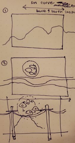
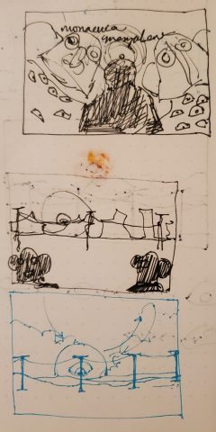
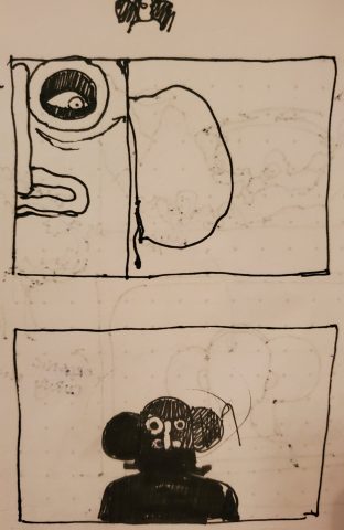
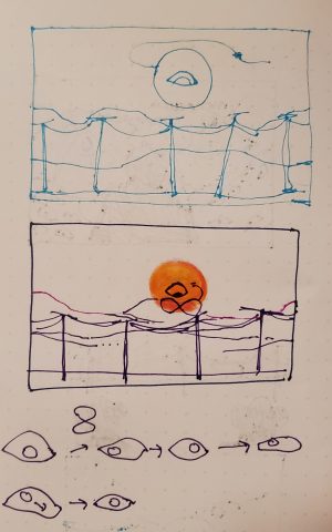
I had a lot of pain making this, in part because I had issues in trying to figure out what it was that I wanted to make. I went through a lot ideas surrounding type and marimonda masks but I eventually decided in doing something more representational as I approached the prompt. I have been thinking a lot about the internet as a sort of panopticon and the whole bunch of privacy concerns that zoom brings in. So it seemed fitting to do something related to this as the background I’d be wearing on Zoom. In terms of technical elements, I used mainly gradients, blends and and simple trigonometric motion while making my objects loop. In terms of motion specifically, I used Lissajous figures in terms of tracking the movement of the eye and I used the Double-Exponential Sigmoid for the camera movement of the poles! I really liked making the eye specifically, especially since I was able to make it seem like the eye got bigger and smaller by resizing different parts of it. Overall, I really wish I had figured out a better way to shift the mountains (like a motion parallax effect) on the background while maintaining noise and randomness. As it is, the mountains are not moving and are made very simply with noise. My colors are a bit different on my monitor than in other displays so I wish I had taken that into consideration while picking colors.

pinkkk-02-LivingWallpaper

Computationally exported gif. Super pixelated 🙁 Loses all the details and subtleties 

Screen Capture (Better quality) 

Sketch

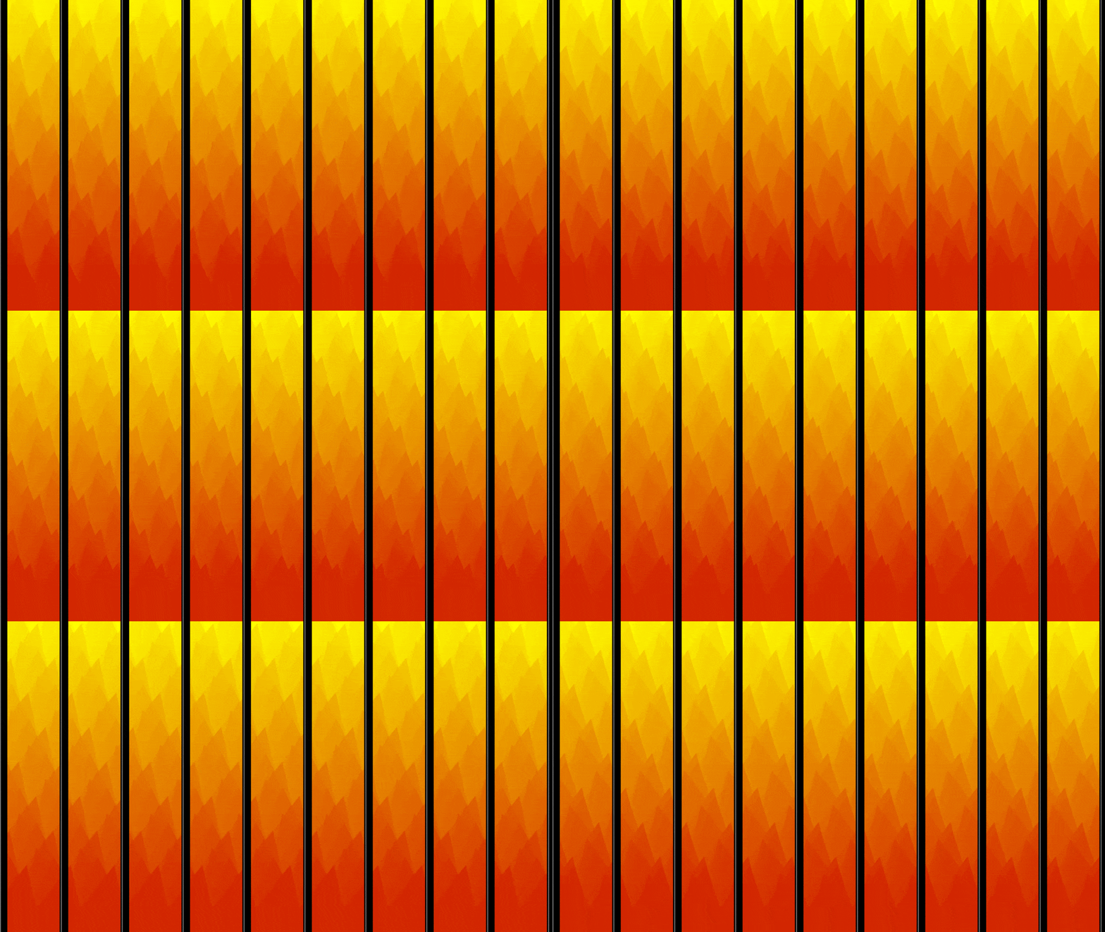
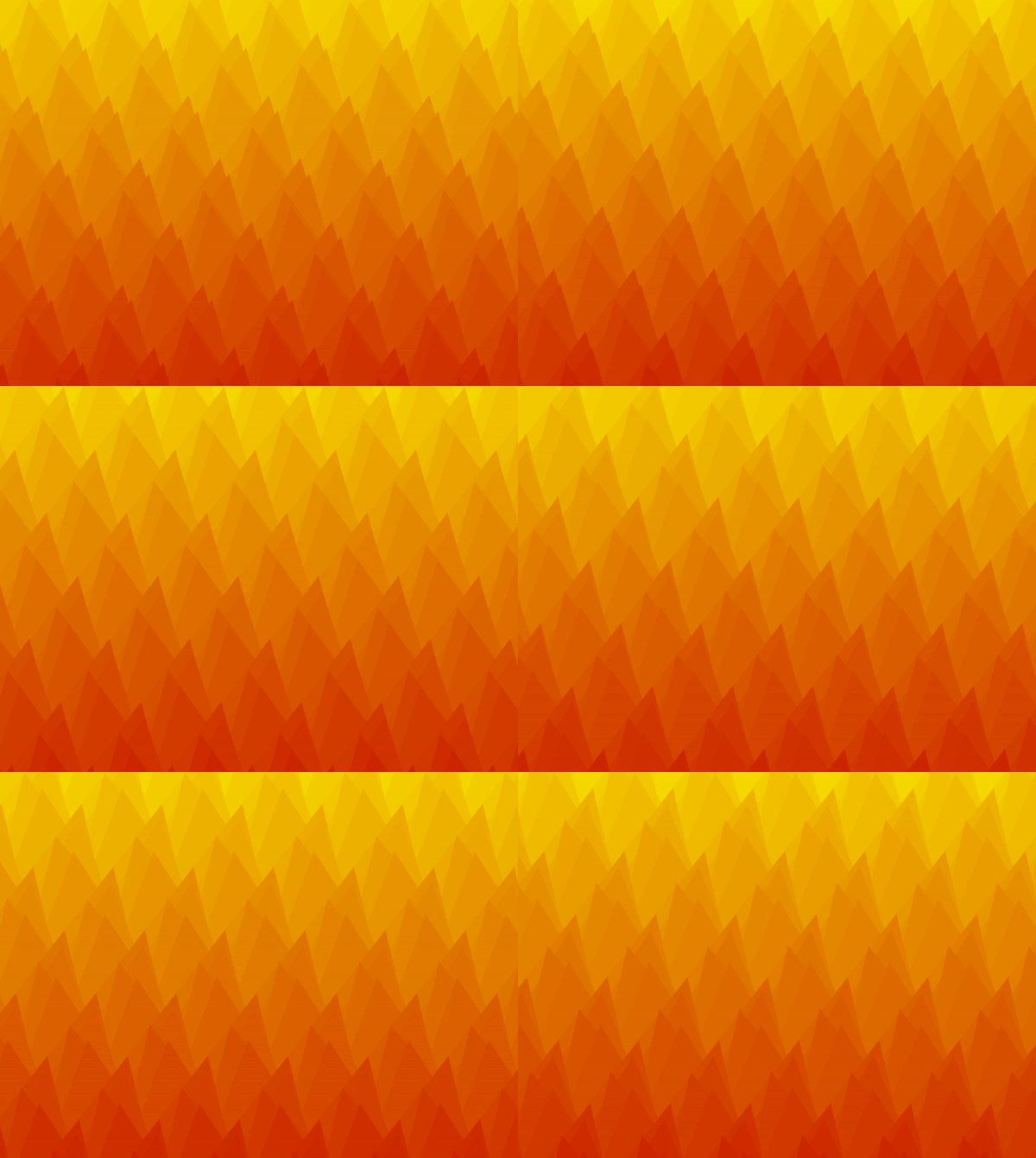
I am not satisfied with what I have, but it is due to my inefficient time management skills this week .. :/ I couldn’t get my smoke to look nicely with the fire. Also, I really felt my lack of basic skills in constructing very foundational shapes. It takes me forever to create a really simple shape.

I used the exponentialInOut, sineIn and sineOut from p5.func to animate the movement of the fire.

CODE


axol-LivingWallpaper

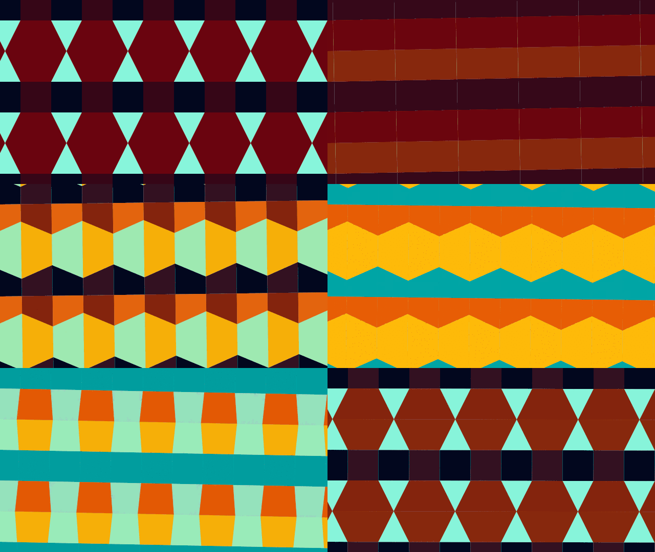
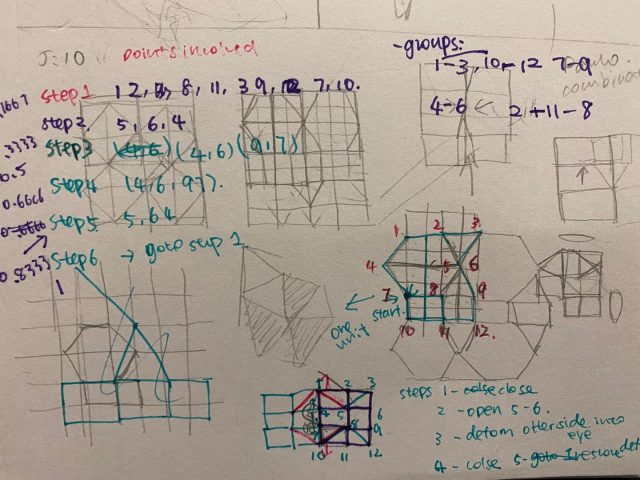
I wanted to make a transforming tiling pattern that continuously transforms into different shapes. With a little more research I realized it’s actually kind of hard to transform between tiling patterns. I am not very satisfied with the end product because I really don’t like the colors. But this was my best attempt after trying many color palettes so I had to stick with it 🙁

The shapes are described as a series of points, and I used multiple transformation functions to go between shapes and colors, such as exponentialIn, circularInOut, normalizedInverseErf, etc.