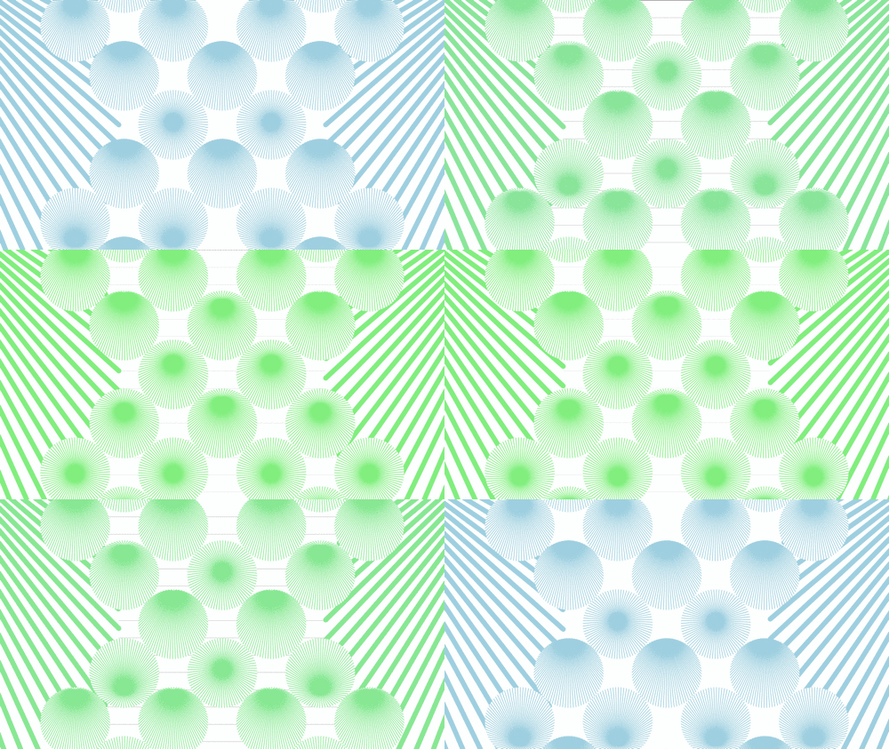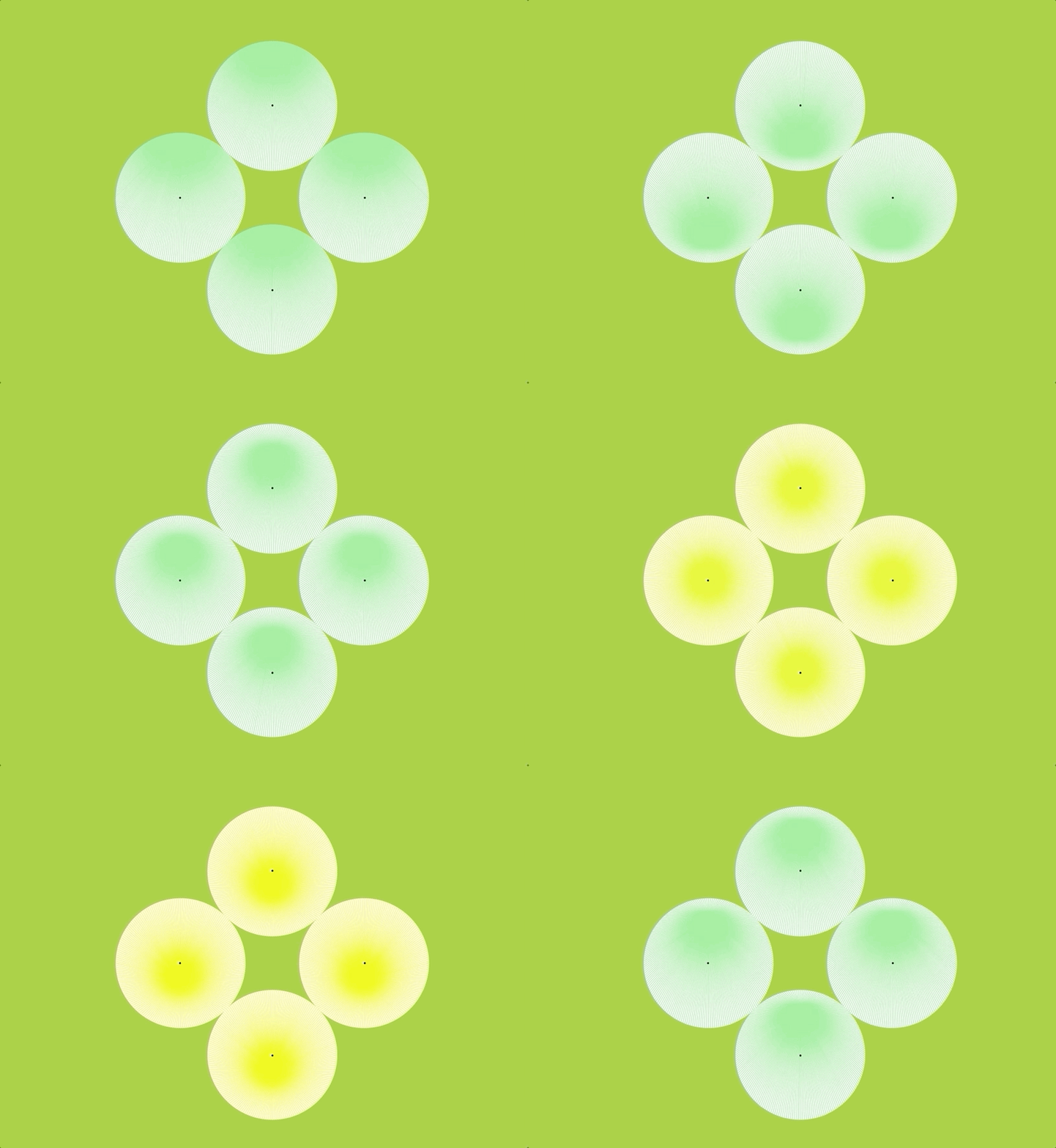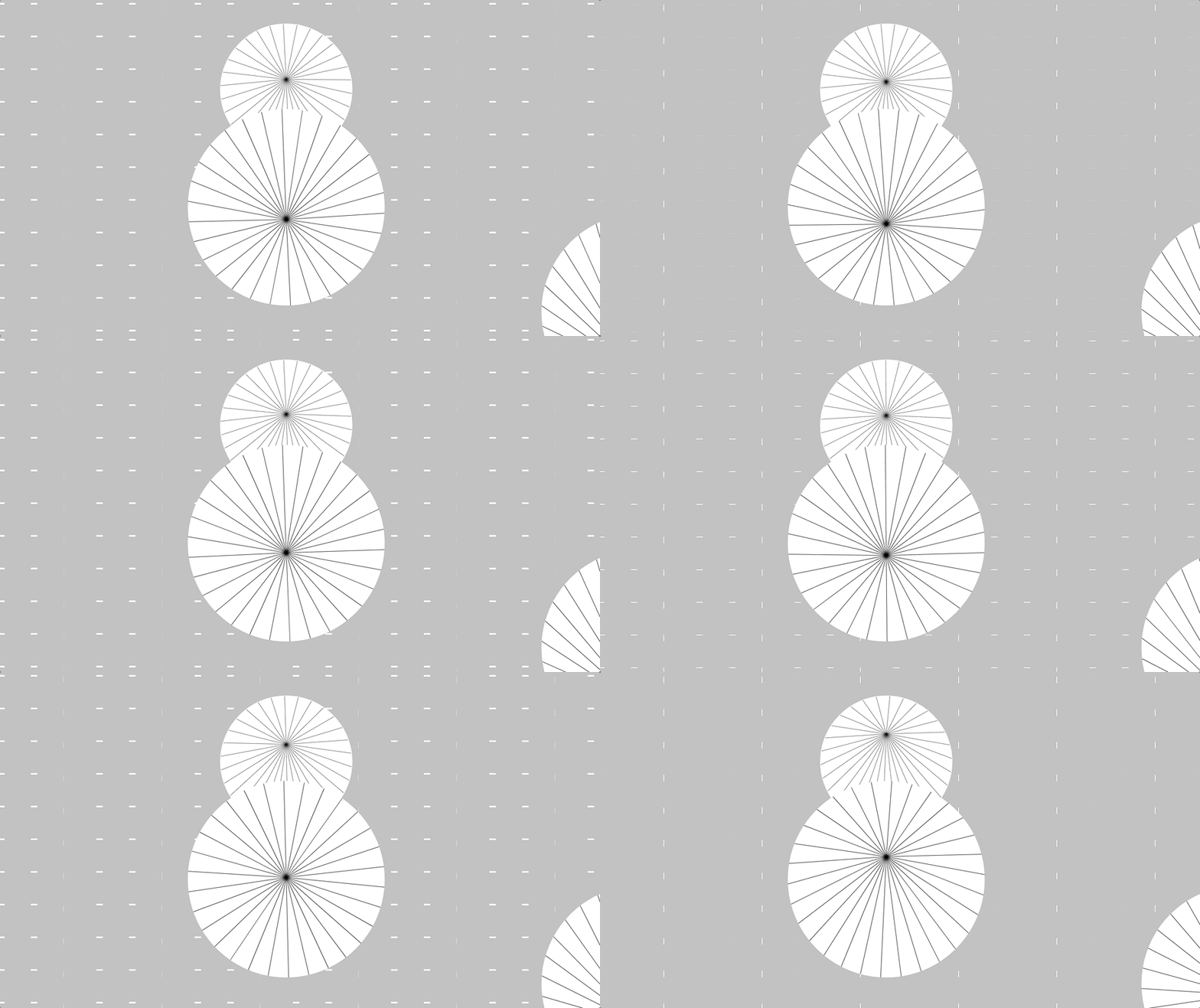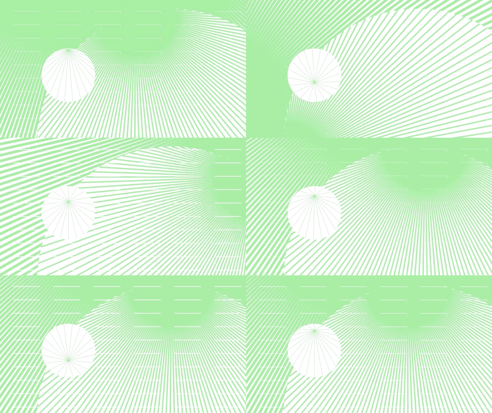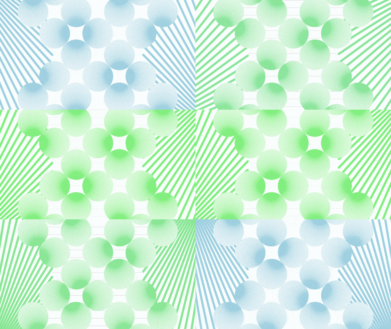
Graphic design meets Code
I’ve always liked making clever graphic design pieces out of simple shapes. The living wallpaper project was a good opportunity to dive deeper into visual illusions by adding in motion to the mix. (I tried a variety of different ease functions in the process of my project – I chose the cubicBezierThrough2Points function for the rotating circles, to give the satisfying pause when the circles join in the middle. I also used the cubicIn function to make the endpoints of the lines rotate with ease along the circumference of the circle.)
Overall, I’m happy with the visual illusion I was able to achieve with this project. I’m especially happy with the gestalt circle that form with every loop – revisiting trigonometry was painful but worth it in the end.
While the motion and precision of this piece is good, I wish that I had developed a more sophisticated layout for this piece. I followed the circle packing tutorial from Coding Train to apply to this project, but I ended up abandoning it due to technical constraints. I hope to revisit the algorithm again in the future and understand the actual problem I was tackling, and hopefully make my projects more tasteful.
Process
I was initially quite lost when starting this project. I sketched out different ideas but had little idea as to how to make each piece feel interesting.
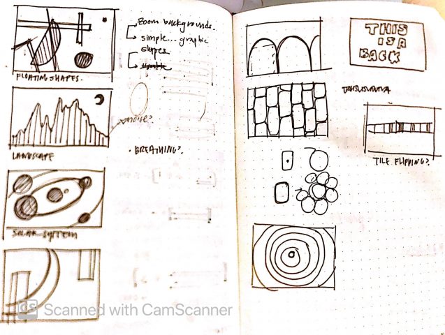
To get myself out of the rut, I reviewed the example code carefully and learned more about looping animations to feel more equipped in starting the project. In doing so, I was able to develop a more concrete idea and methods of execution, like the sketches below:
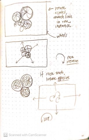
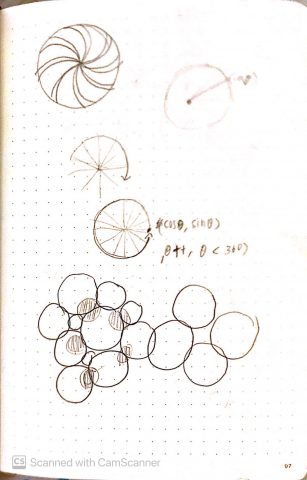
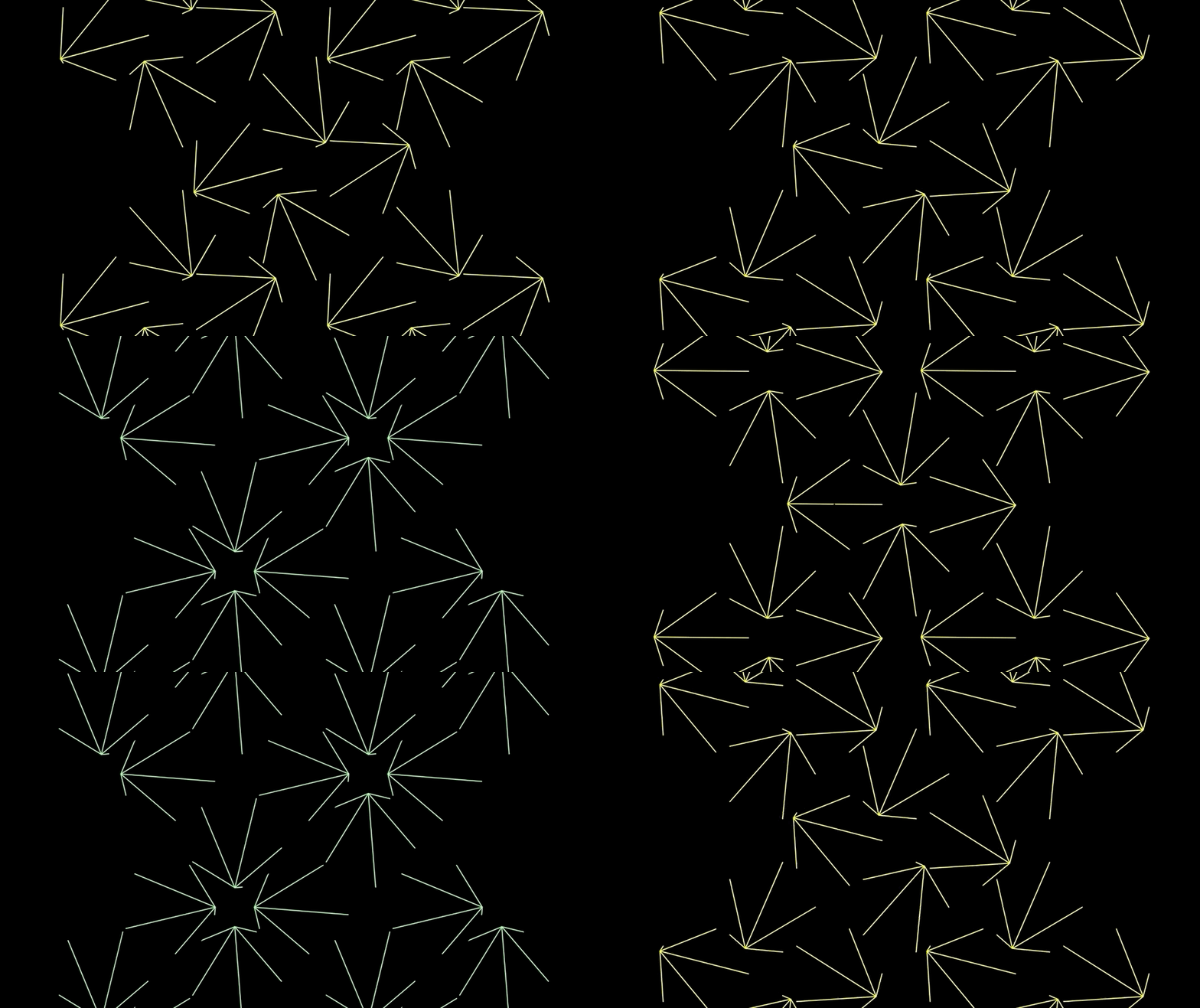
I went through a lot of iterations to test out different visual forms. Below are some interesting results that came out of the bag.
