Millennialism
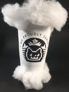
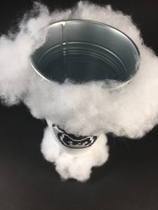
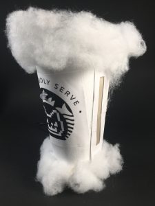
As a millennial myself, I feel like our generation is very vulnerable to our obsession and addiction to things. As the world evolves at an exponential rate, our generation tries its hardest to keep up with the changes. But sometimes we lose track of what we really want, which makes us want to hold onto certain things in our lives or follow certain ritual/routine that we believe without which our lives would fall apart.
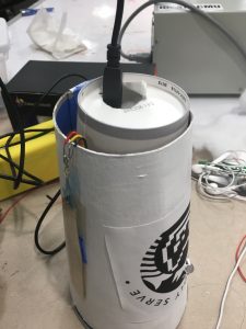
This piece explores the millennial lifestyle with a focus on coffee, cats, and cat cafes. The enlarged coffee cup is a symbol of the amount of stimulant ,like caffeine, that millennials need to start off a day. The logo is a combination of starbucks logo and the internet-famous nyan cat, a product of the meme culture. The user has to “pet” the cup so that it can change color. This interaction symbolizes how the millennials are enslaved to their obsessions. The cup also looks like floating in the air, which is a symbol of this generation that dreams and always has their minds in the air.
Key Features:
- Activate with hot water/beverage
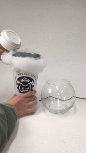
- While activated, touch the cup to make the Cat happy (LED changes color)
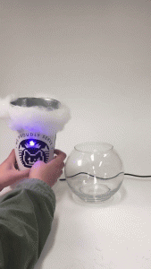
3. When beverage in the cup is being consumed/leaving the cup, the cup animates
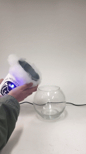
Full Video:
https://drive.google.com/file/d/1Z7xNZy0JsYe7m7_NSSXNuARZIdpRJpfC/view?usp=sharing
Process:
Following my previous post (Assignment 7 rough crit: smart cup), I added the temperature sensor. And instead of trying to use a teensyduino, I decided to make a bigger paper cup that can hold my hardware.
By chance, I found a flower pot from ikea that I could use as the top part of the cup. It was an ideal choice because it can hold liquid and is sensitive to temperature change.
Shoving everything into the cup:
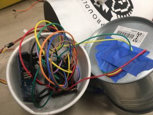
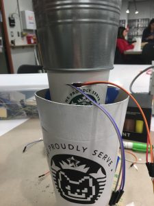
In addition, instead of a traditional potentiometer with a rod, I decided to use a soft potentiometer that I can tape to the side of the cup to change the color of my neopixel. This not only solve the problem of limited space, but also made the user experience more interesting (petting the cup to please the cat).
Lessons learned:
- Instead of trying to fit everything into a constrained space, I can change the form to make the hardware fit more naturally and securely.
- Before, I have never spent that much time on the form of the project. This time, I took my time to make the paper cup and design the logo using Illustrator, which made the project looked a lot nicer and secure.
- If I had more time, I would add sound to enhance the user experience. Right now, all the user feedback relies on the change in color of the neopixel, which is quite limiting. I would also add a proximity sensor to make cups interact with each other to furthermore show the social interaction among millennials.