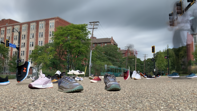
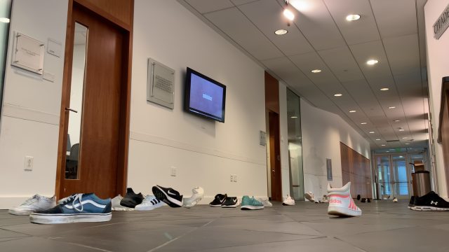
For this project, I conducted a study of bathroom deserts around CMU campus.
Process:
The research question: How long does it take to find a gendered vs gender-inclusive bathroom on campus?
I was particularly inspired by the NYT’s Ten Meter Tower project and Meaghan Kombol’s The Subway Lines, which both explore the experience of performing daily/non-daily tasks, such as diving off of a ten meter diving board or riding the subway. These projects compelled me to think about what tasks I do on a daily basis that I personally don’t pay much attention to. This is how I decided on going to the bathroom.
After talking with Nica about this project, the aim changed from just exploring areas of the campus where I go to the bathroom to figuring out and engaging with areas with severe bathroom deserts. By bathroom deserts, I mean floors or sometimes even whole buildings that do not offer a gender-inclusive facility, which are usually single-stalled rooms with appropriate signage (a toilet, no reference to “men” or “women” at all). This was a more compelling juxtaposition, since I still remember in my freshman year (circa fall 2019), I didn’t see any gender-inclusive bathrooms – they were all gendered.
This inaction extends further than CMU’s slow transition to better bathrooms; as acts of vandalism still occur (according to my friends even so far as last semester in the Gates Hillman Centers, and last year in Maggie Mo) against gender-inclusive signage. So this project transformed into a campus-wide search for both gendered and gender-inclusive restrooms.
To do this, I borrowed a GoPro HERO9 Black from SoA’s lending center as well as a GoPro harness. I then looked to an online interactive map of CMU’s campus which pointed out areas with single-stall gender-inclusive facilities (compiled by the All-Gender Restroom Access Committee, not really CMU). I wanted to search for locations + experiences I could see any student frequenting + having, like studying in the library, waiting in a classroom, going to a football game, or eating at a dining hall. So by looking both for common experiences + bathroom deserts, this project culminated in 8 total experiences, displayed in a 3 channel format, of me walking to and from bathrooms around campus.
While this project was less technical/computer based than my previous projects (which is a success in my book, since I needed to getmy ass away from my computer, according to some), the process was just as long and stressful. There were many points during this project I got lost in the buildings on campus. Inclusive bathrooms were tucked away behind office suite doors, wood shops with chainlink fences, some even in different buildings altogether. I tried to faithfully find these bathrooms by following two rules.
If there exists a bathroom in the same building as the one you are in currently (according to the map), seek out that restroom. Try to use elevators and ramps, but if there are stairs, note that there are stairs.
If there does not exist a bathroom in the same building, try to find the closest bathroom (according to the map), and seek out that restroom.
and keep looking for that bathroom until you find it.
I added in a half humorous/half jarring voiceover which reflected my thoughts while walking, reflecting both my anxiety in trying to find the bathroom but also the helplessness and ridiculousness of the paths I had to take, when all I wanted was to take a piss. A video in particular is a powerful medium because I can show my experience in real time. This is the actual time it took for me to find this bathroom. Now imagine if I really needed to go and watch the video again.
Takeaways:
Overall, I think I was successful with this project given my time constraints (stemming from personal circumstances which led to me missing three weeks of school). Time was not on my side during the production of this project, which in a way was communicated to my classmates during my critique on Sept 29.
I failed in terms of metrics. I initially wanted a pedometer to measure my steps taken, and perhaps a heartbeat monitor to measure my heart rate (I know for a fact it was higher trying to find the single-stall restrooms). A Map detailing the routes I took might have also been nice, but given the time constraints, I reduced this project to just the experience.
I’d do this project again with more time. There’s so many more bathroom deserts than just the 8 I recorded here, and so many metrics I could have added to enhance the experience of watching it.
This project reveals the discrepancy between auditory and visual perceptions of humans by exploring a collection of contrasting experiences in perceiving the world with or without visual information.
Seeing is believing.
As the saying goes, vision dominates how we perceive the world for many of us. When the visual channel is not available, we rely on other sensory channels such as the auditory sensation, often attempting to visualize the scenes in mind based on these signals.
But how accurately can we reconstruct the world without vision? How reliable is the auditory channel as a medium to perceive the world? How dominant is vision really in how we experience the world?
Typology Machine
To answer these questions, I built a typology machine (Figure 3) to capture these contrasting experiences, which functions in three steps.
Real-world scene construction with auditory and visual out-of-place cues.
360° spatial capture.
Interactive Virtual Reality (VR) software.
1. Real-world scene construction with auditory and visual out-of-place cues
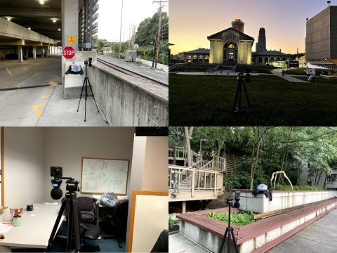
I set up a real-world scene where an out-of-place cue exists in both visual and auditory channels. For example, in a grass yard, there is an angry stuffed seal and the sound of flushing the toilet. I placed the visual out-of-place cue in the scene, and I played the auditory out-of-place sound from a smartphone placed at the same location as the visual cue. I constructed four scenes (see Figure 1 and 3). In all scenes, the visual out-of-place cue remained the same — the angry stuffed seal, but the audio cue varied.
A. Parking lot: There were ambient bugs and car sounds. As an auditory out-of-place cue, the sound of seagulls and waves was used.
B. Grass yard: There were ambient birds and people sounds. As an auditory out-of-place cue, the sound of toilet flushing was used.
C. Office with no windows: Quiet space with no ambient sounds and no natural lighting. As an auditory out-of-place auditory cue, the sound of birds singing was used.
D. Patio with pathways: There were ambient birds and people sounds. As an auditory out-of-place cue, the sound of angry dogs barking was used.
Figure 1. Spatial capture setup using dual-mounted 360° camera and ambisonic microphone. First row left: (A) parking lot, right: (B) grass yard. Second row left: (C) office with no windows, right: (D) patio with pathways.
2. 360° spatial capture
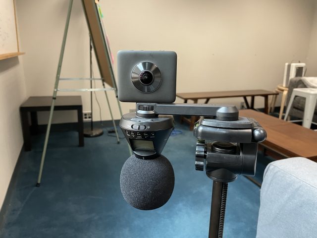
In the center of the scene is placed dual-mounted 360° camera (Mi Sphere Camera) and ambisonic microphone (Zoom H3-VR) to record 3D spatial scape of the world, as shown in Figure 1 and 2. (An ambisonic microphone captures the full 360° around the microphone, representing the surround soundscape at a point.)
Figure 2. Close-up of dual-mounted 360° camera and ambisonic microphone setup.
3. Interactive Virtual Reality (VR) software
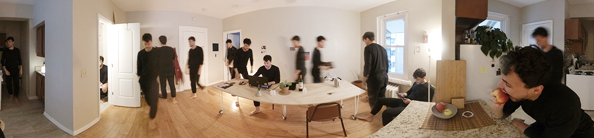
I built a Virtual Reality (VR) software that reconstructs the scene captured in Step 2 and presents the contrasting experiences. I developed the software for use in Oculus Quest 2 headsets. In the virtual scene, the player first enters a black spherical space with only sound. By listening to the sound, the player imagines where they are. Then, by clicking parts of the surrounding black sphere, they can remove the blocking parts and unveil the visual world. The video in Figure 3 demonstrates the VR experiences in four scenes with out-of-place visual and audio cues.
Figure 3. Spatial capture setup using dual-mounted 360° camera and ambisonic microphone in four scenes.
Findings
The main finding from the collected demonstrations of contrasting experiences is that an auditory out-of-place cue (e.g., the sound of seagulls in a parking lot, toilet flushing in a grass yard, and birds singing in an office with no windows) can completely deceive the user where they are, without the presence of visual information. In the first scene of the video (Figure 3), the parking lot could be deceived as a beach with seagulls. In the second scene, an outdoor grass yard could be deceived as a bathroom with toilet flushing. In the third scene, an indoor office could be deceived as a forest with sunshine. In the fourth scene, the incongruence is less so, but a peaceful patio could be deceived as a place with a more imminent threat from angry dogs growling.
On the other hand, a visual out-of-place cue (e.g., the stuffed seal) does not change the perception of where the user is. It makes the user think that it’s odd that the stuffed seal is there, not the other way around.
This highlights the difference in the richness of ambient or peripheral information in visual and auditory channels. As shown in the video (Figure 3), ambient audio is preserved such as the sounds of bugs, birds, people, cars passing by, etc. However, one out-of-place cue with strong characteristics is dominant enough to overshadow other ambient cues. Only until the visual channel becomes available. In the visual channel, the full context of the scene appeals more to the perception of the location rather than a single out-of-place cue — the stuffed seal.
The finding was reinforced by people who experienced VR software. For example, in the reaction video below (Figure 4), the person first thinks he is on the beach given the sound of seagulls (00:13). Later, as he reveals the visual information, he not only realizes he is in a parking lot under a bridge but also now thinks the sound of waves was actually the sound of cars passing by (01:20). He modifies his previous understanding of the auditory cue(sound of waves) to fit the newly obtained visual information. This exemplifies the dominance of visual information in human perception of the world.
Figure 4. Example reaction of a person trying the VR software.
Furthermore, this wasn’t captured in the video, unfortunately, but later while unfolding after the VR experience, the person explained that he first thought it was a seal, but he hesitated to say it (03:40) because it sounded “too stupid to say there’s a seal” even though he did talk about my coat under the seal. This hints at possible differences in the mechanisms of human auditory and visual perceptions. While one strong cue can be dominant in auditory perception, the combination of ambient information might appeal stronger in visual perception.
In summary, this collection of interactive sensory experiences reveals the contrasts between auditory and visual perceptions of humans.
Reflections
Inspirations and Development of the Project
I started the project with a broad interest in capturing one’s experience fully through technology. Then, it triggered my curiosity about how much information spatial sound could carry about one’s experience and memory.
Before designing the specific details of the apparatus, I conducted some initial explorations. I first wanted to feel what it is like to make a digital copy of a real-life experience. I brought the Zoom H3-VR ambisonic microphone to different places such as a public park with people and wild animals, a harbor, an airport, a kitchen, etc. Tinkering with the ambisonic audio, I realized that, unlike my expectations, the ambient sound rarely contains auditory cues that give a clue about the space. Also because these cues are so rare, one distinctive cue could easily deceive a person. Inspired by this, I started designing a VR interactive media where the participants could (verbatim) unveil the discrepancy between our dominant visual channel and supportive auditory channel, which developed into the final design described above.
Self-Evaluation: Challenges, Opportunities, and Learnings
Throughout the process, I encountered several challenges due to my underestimation. Technically, I thought the implementation would take only a brief amount of time since I have some experience in building AR software. However, using new hardware (Oculus Quest 2), software platforms, and new types of data (ambisonic audio and video) was more struggling than I thought, which consumed a lot of my time in building the apparatus itself. Especially, development using a fast-growing platform like Oculus meant a lot of deprecated documents online and having to figure out issues with recent updates through a series of trial and error.
If the apparatus building took less time, I would have explored more diverse scene settings and visual out-of-place cues). More user studies and another collection of people’s reactions to facing the discrepancy would have been insightful as well. Through iterations, the design of the experience itself could be improved too to exhibit the contrasting perception in a more straightforward way.
I personally learned a lot through the execution of the project. I learned the differences in auditory and visual perceptions through the collection of immersive contrasting experiences. Technically, I learned how ambisonics work, how to use 360° visual and ambisonic captures in VR, and VR development in general.
Lastly, I learned that for successful 360° video filming, I always need to find somewhere to hide myself in advance. 🙂
hide_mid
Video Player is loading.
Current Time 0:00
/
Duration -:-
Loaded: 0%
0:00
Stream Type LIVE
Remaining Time --:-
1x
Chapters
descriptions off, selected
captions settings, opens captions settings dialog
captions off, selected
This is a modal window.
The media could not be loaded, either because the server or network failed or because the format is not supported.
Beginning of dialog window. Escape will cancel and close the window.
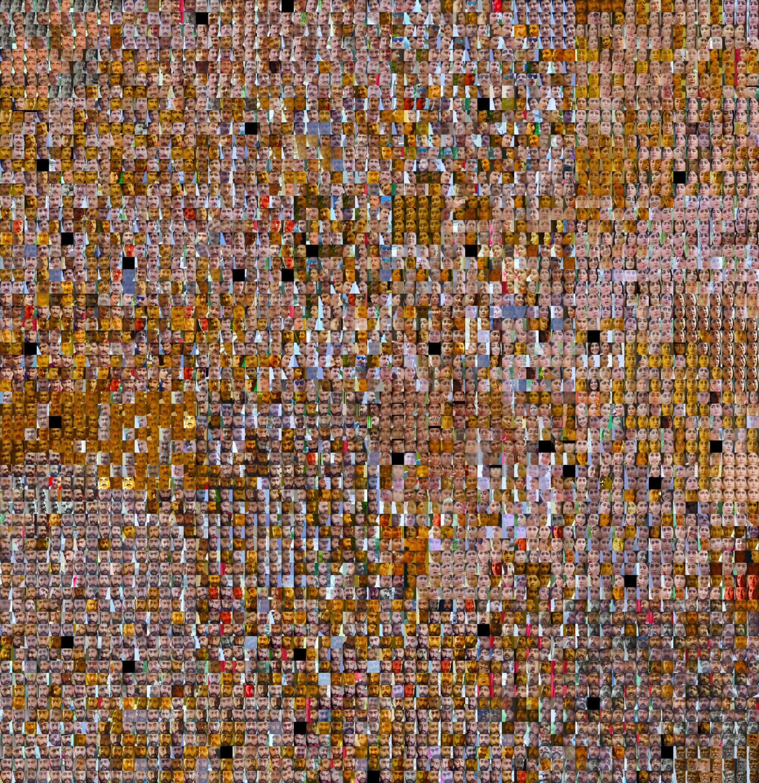
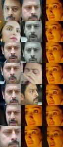
I’m Tamil. India has a huge problem with colorism which disproportionately impacts women. As a result, I’ve seen many ridiculous Tamil movies where the female lead is the same skintone as a Northern European while the male lead looks like someone who is actually from a region with 90 degree weather.
Machine
I wanted to craft a machine to show this trend clearly. I wanted a typology of actors and actresses and their skintones. To do that, I first needed to construct a machine to somehow extract skin tone from film.
downsample footage by extracting frames with ffmpeg
for i in *.mp4; do mkdir "${i/%.mp4/}"; ffmpeg -i "$i" -vf "select=not(mod(n\,30))" -vsync vfr -q:v 2 "${i/%.mp4//img_%03d.jpg}"; done
use python to extract faces from each frame
use face-recognition module to crop faces out automatically with a CNN and then extract a 128 dimensional embedding vector
use UMAP to group the faces into people based on their embedding vector
extract skin tone from each face and average across each person grouping
construct a data visualization to go through the people from lightest to darkest average skintone
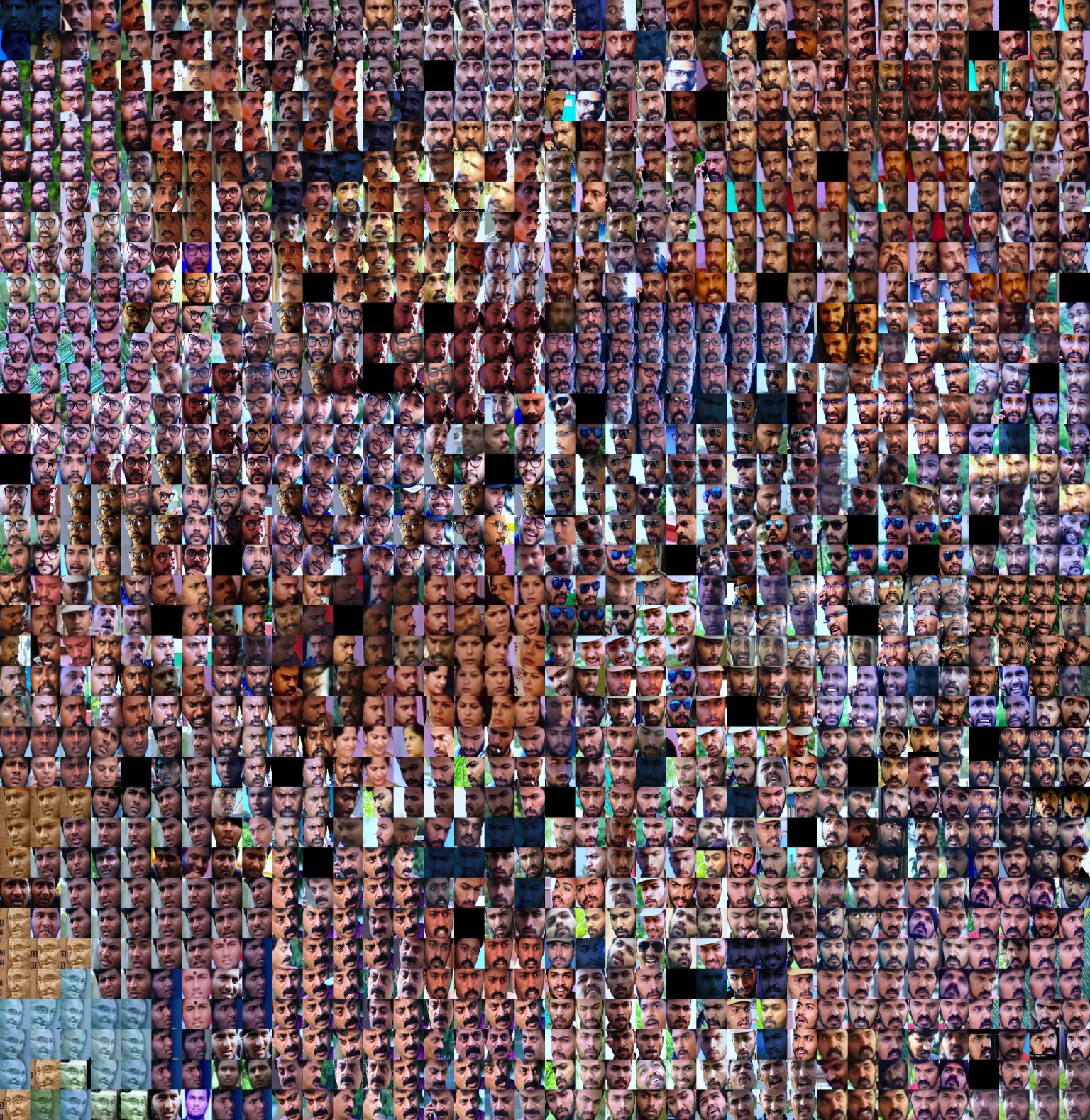
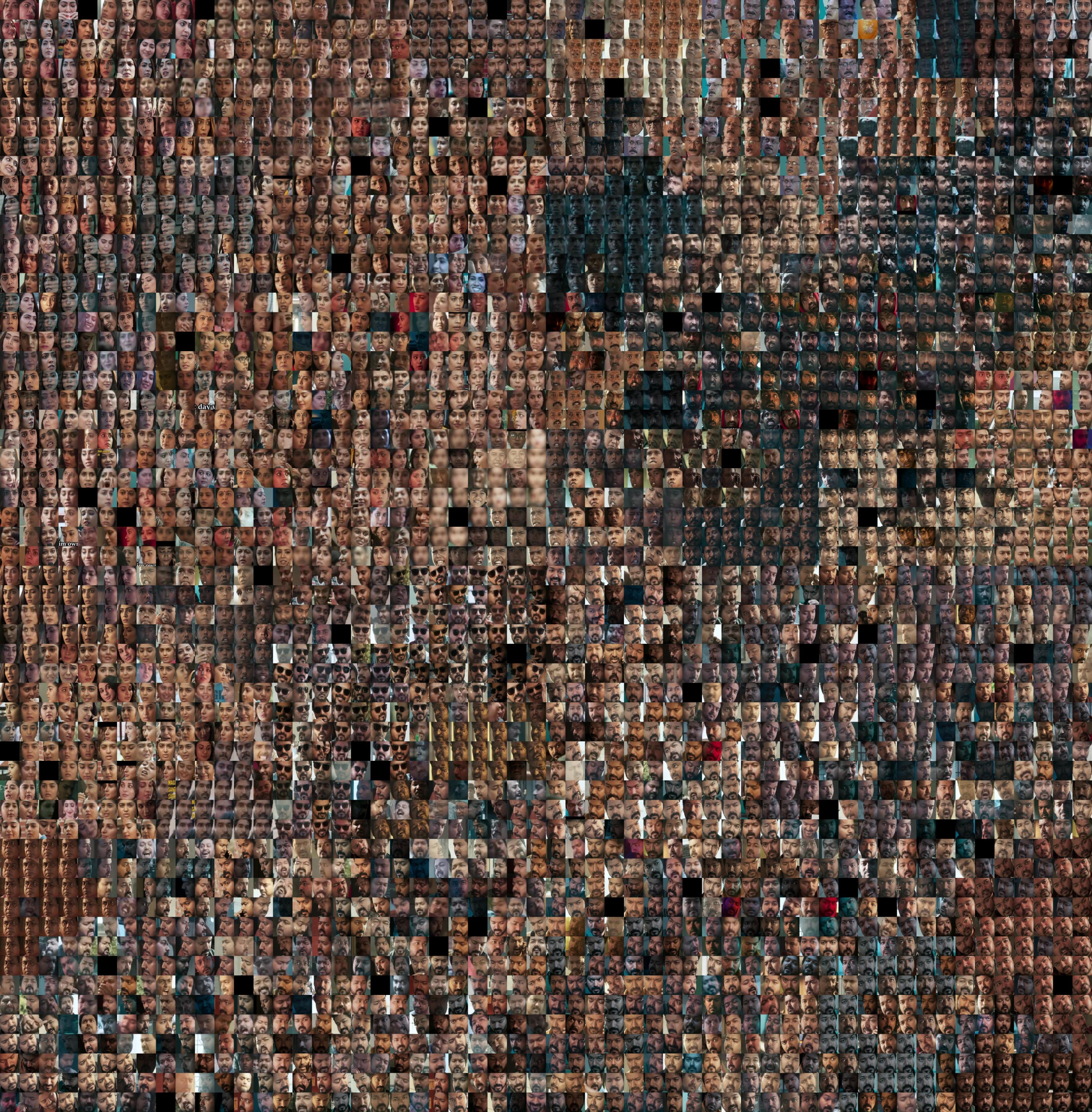
Result
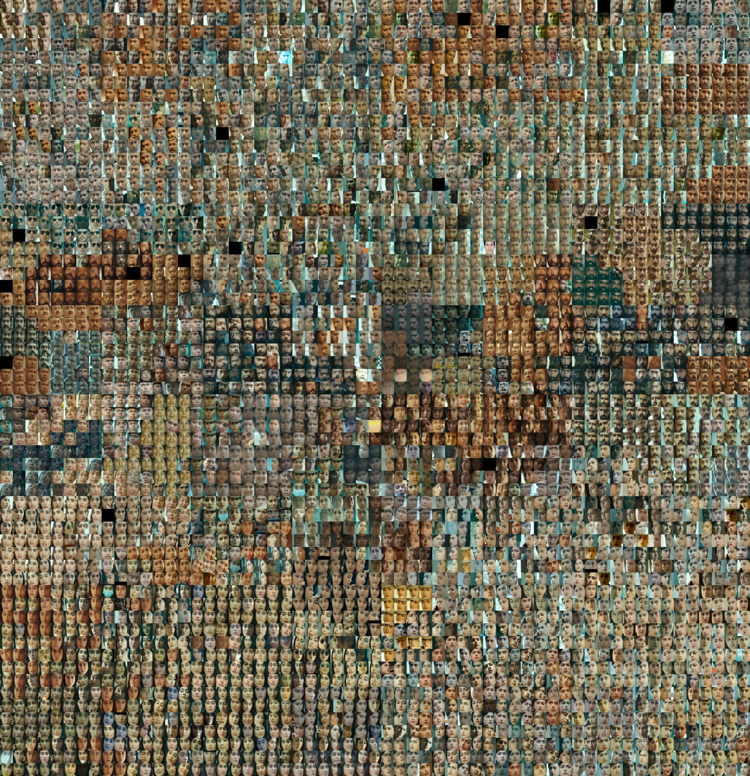
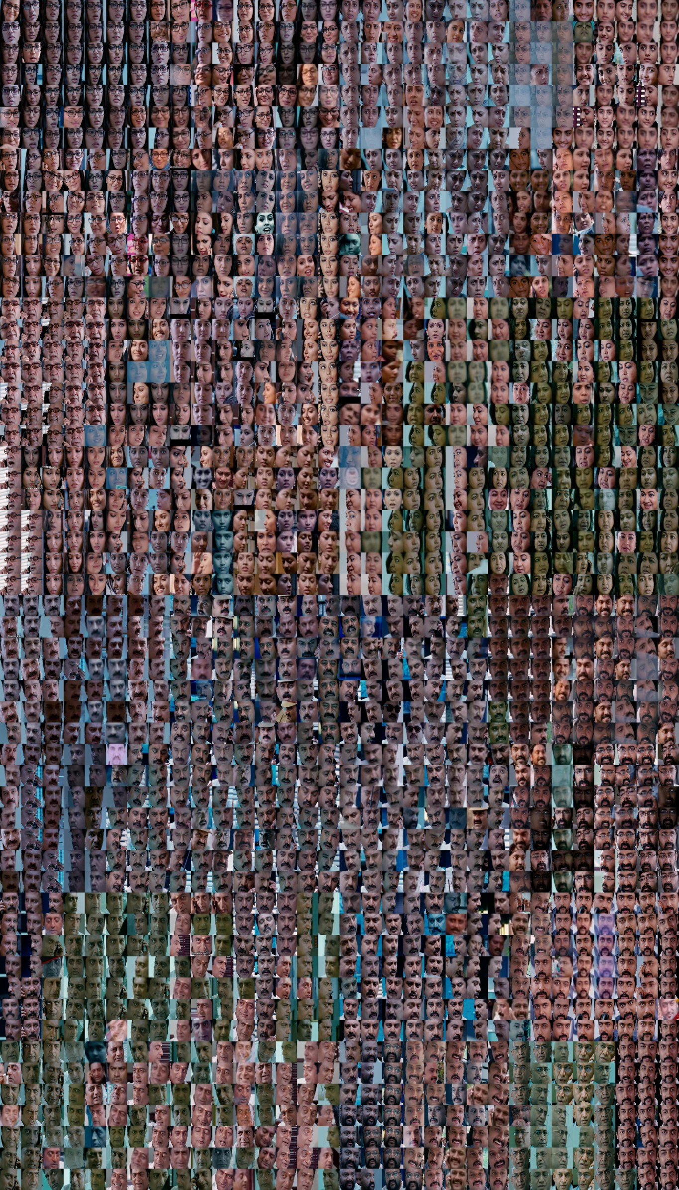
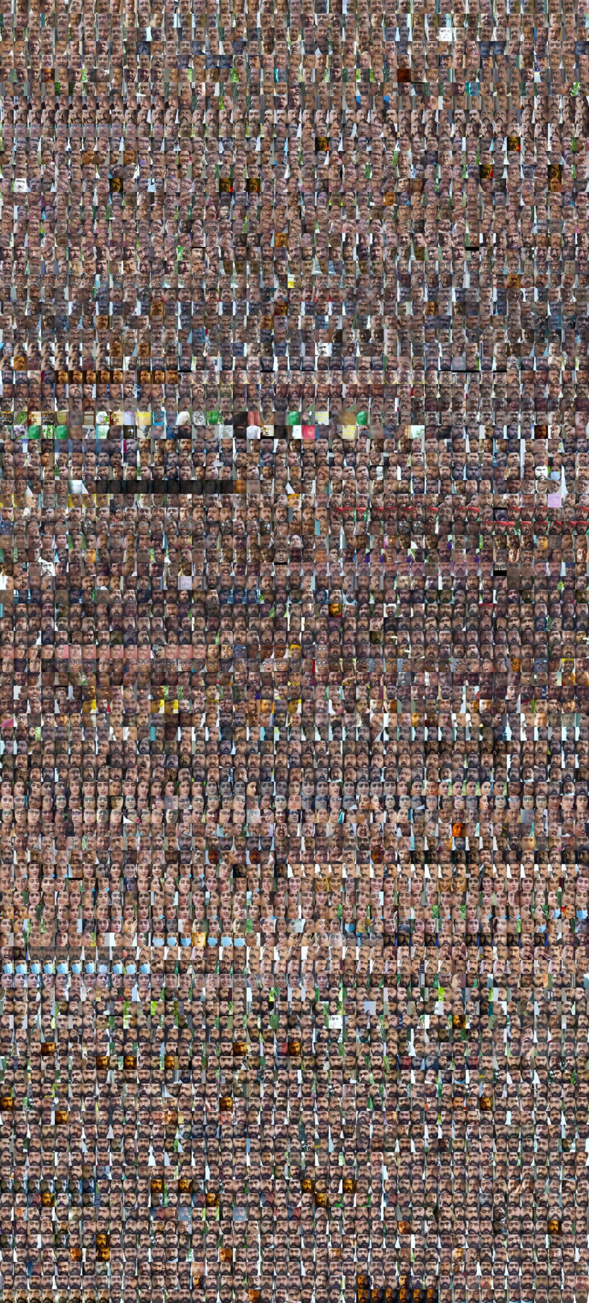
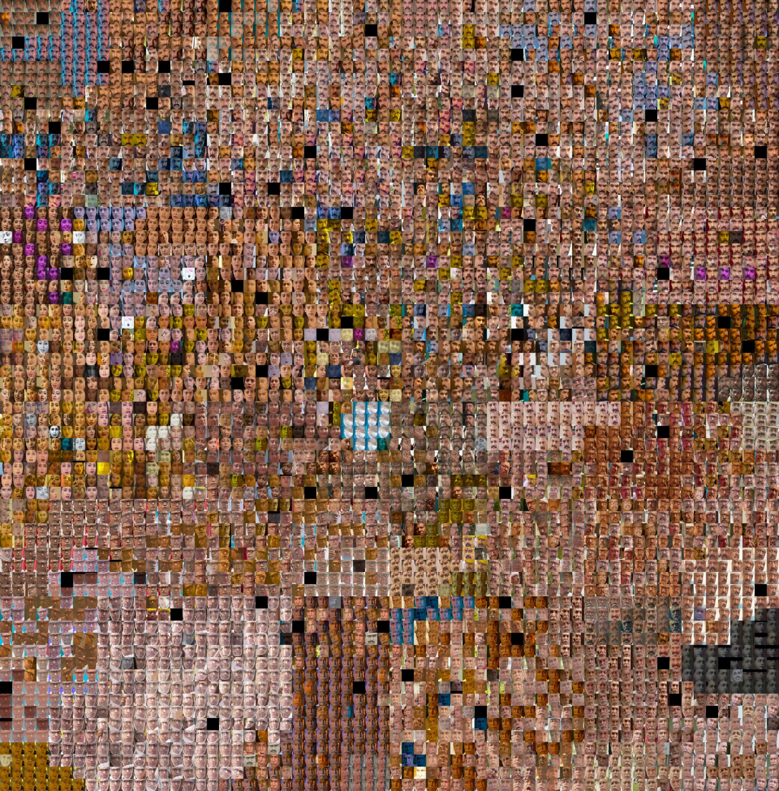
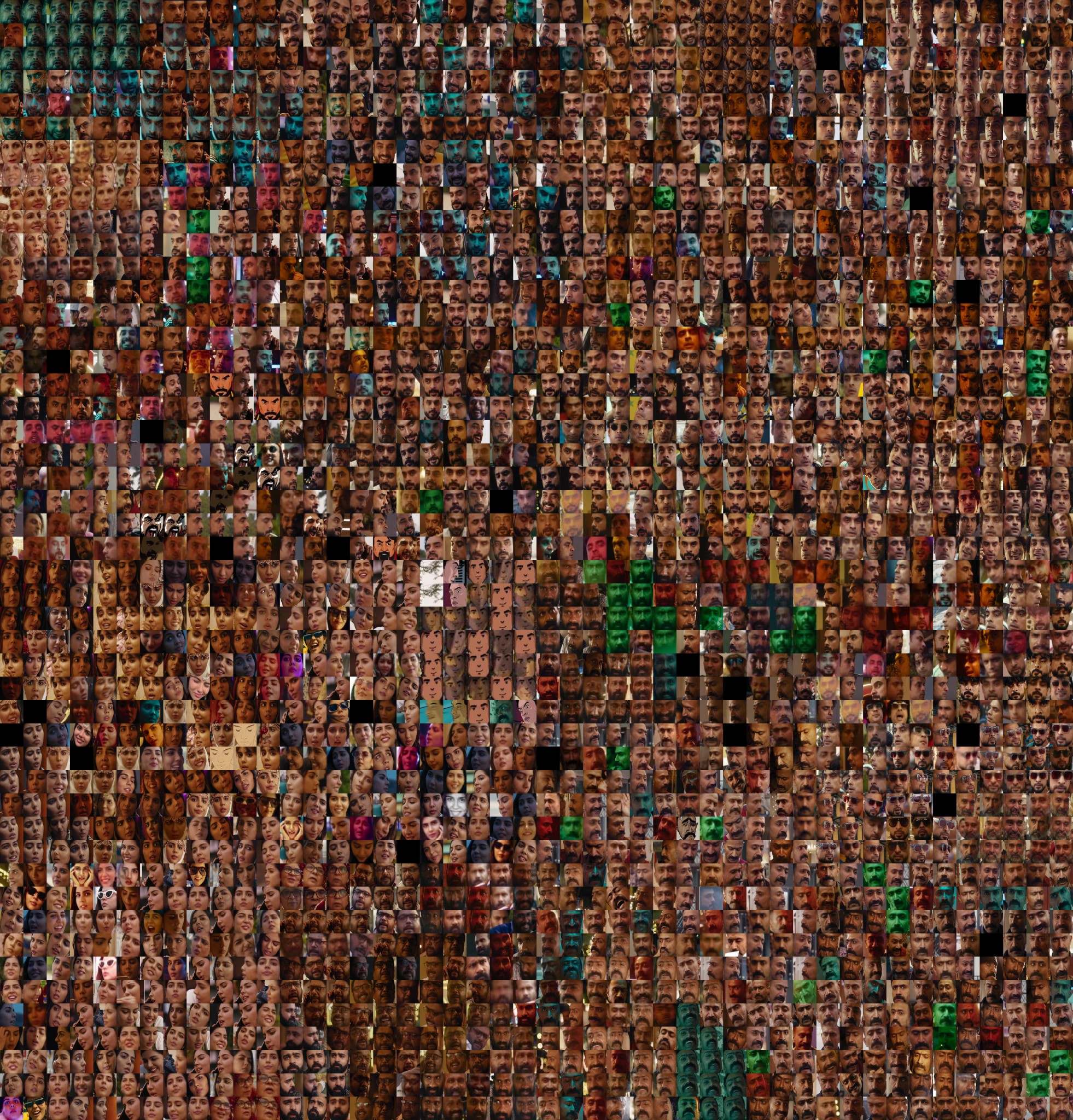
I failed at step 5 and 6. It ended up being more complicated than I anticipated to reconstruct the average skin tone of people and then construct a compelling interactive out of it. As a result, I have a sort of intermediate result instead. In the google drive below is essentially a collection of per movie images. Each image is the clustered faces of the people in that film organized by a reduced version of their embedding vector. The distance and location between faces in this representation is not directly related to skintone, rather it is what the computer decides best represents faces in 2d. That could be skin tone in some ways but it’s less obvious than that.
Result
reflecting on the end result: Though the intermediate product lacks the conceptual backing of my original proposal, in its own right I think it’s a series of compelling images. I do find it pleasurable to sit and scroll across the images and observe some of the dumb faces actors and actresses make.
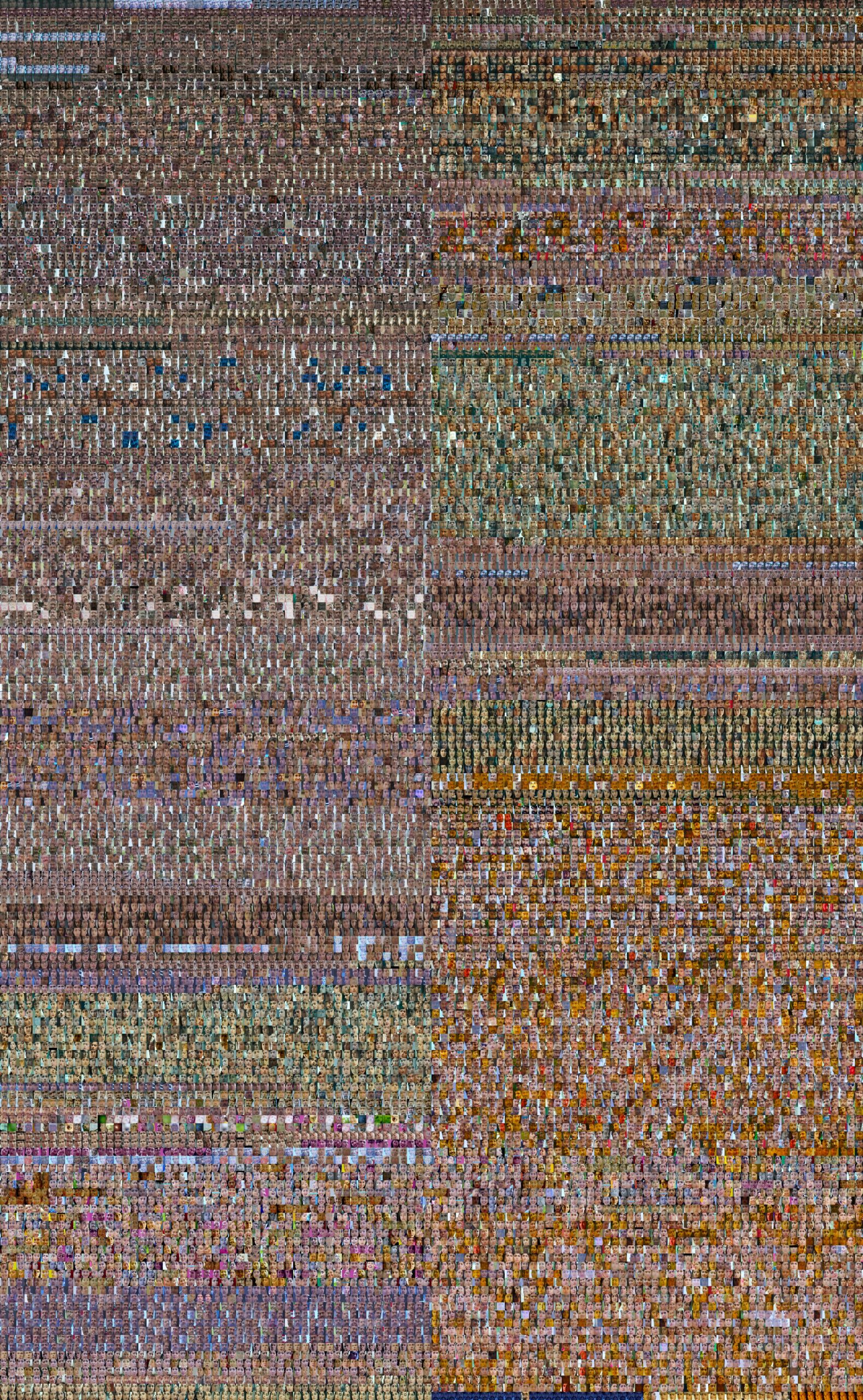
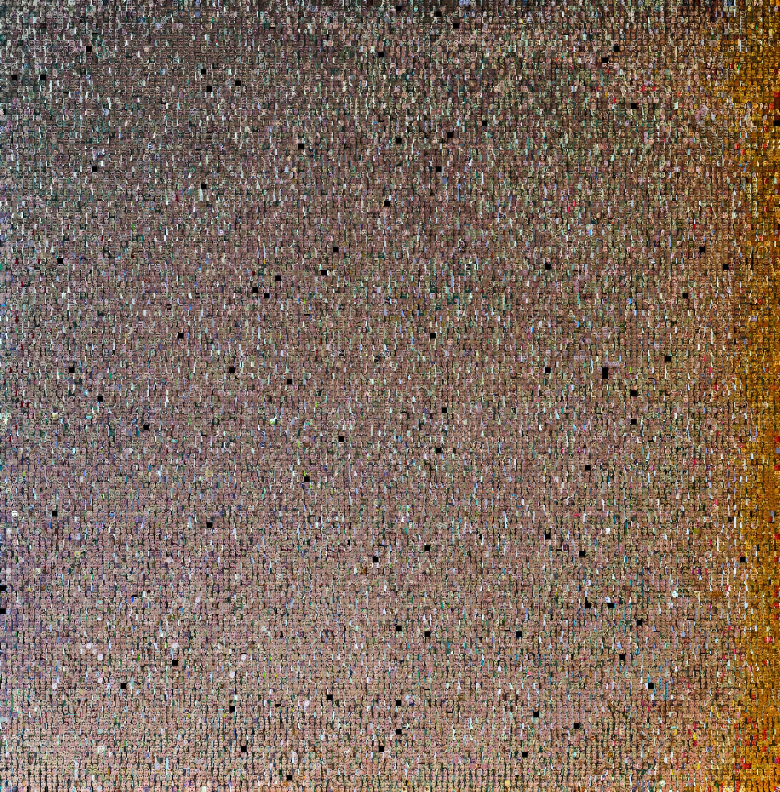
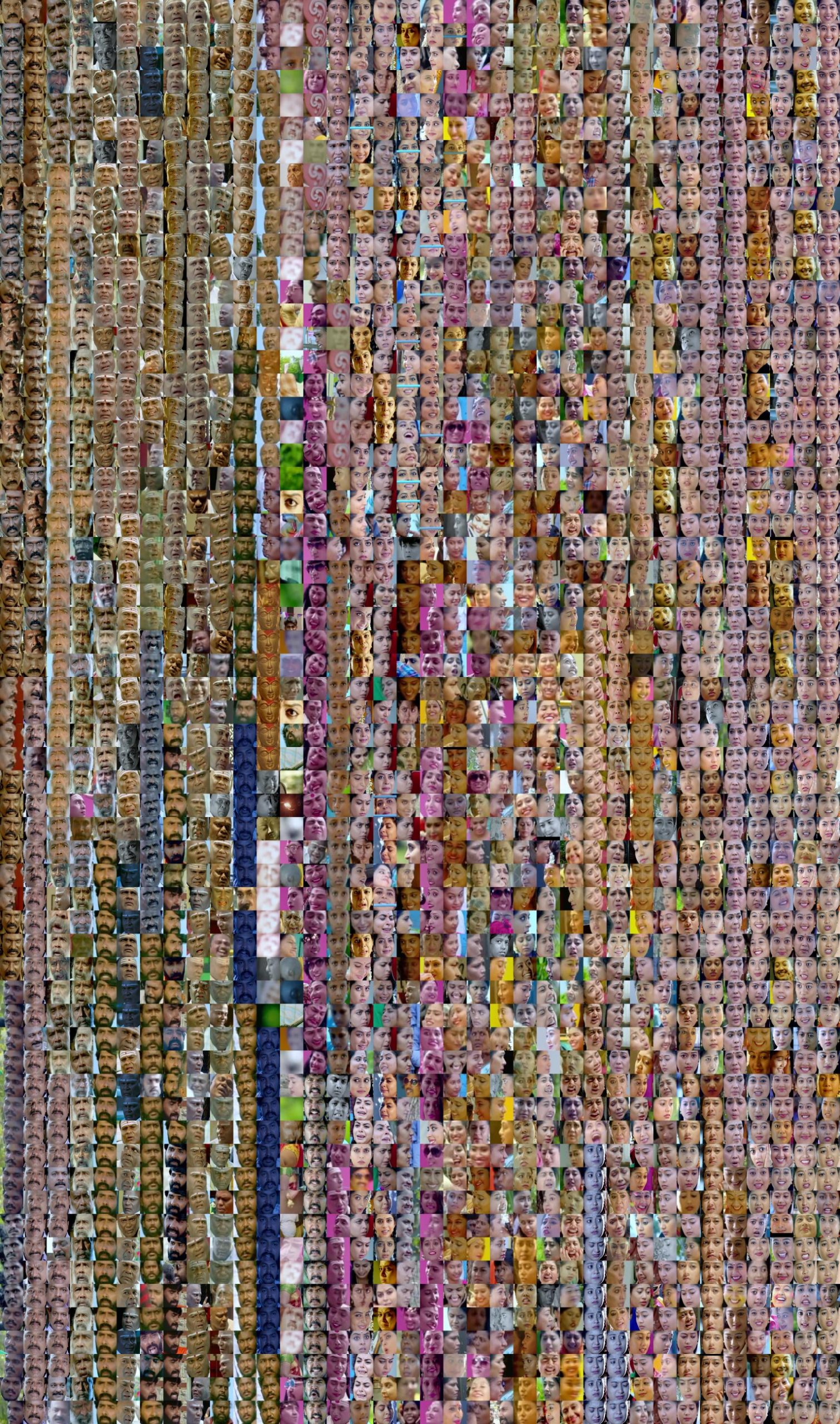
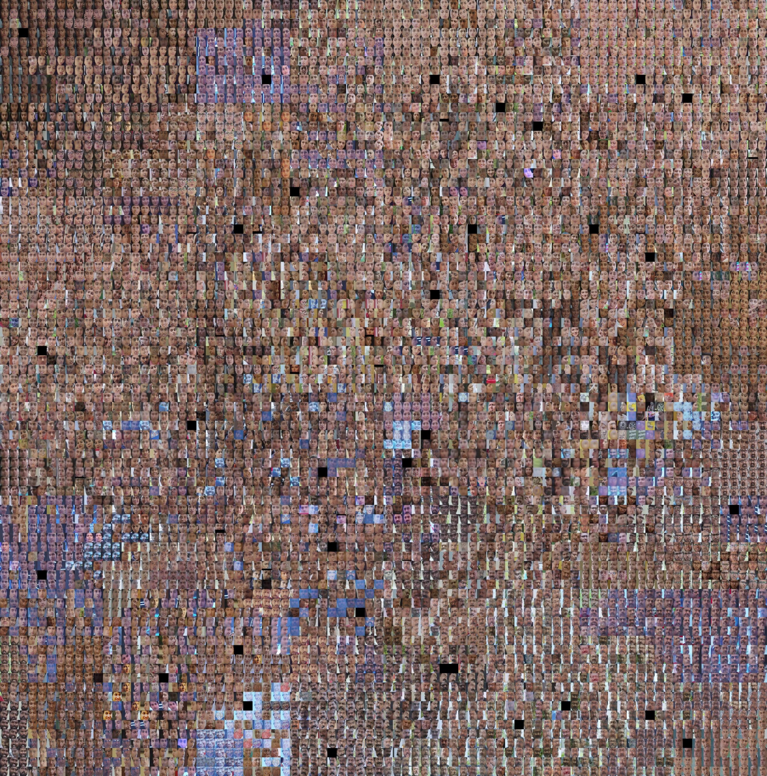
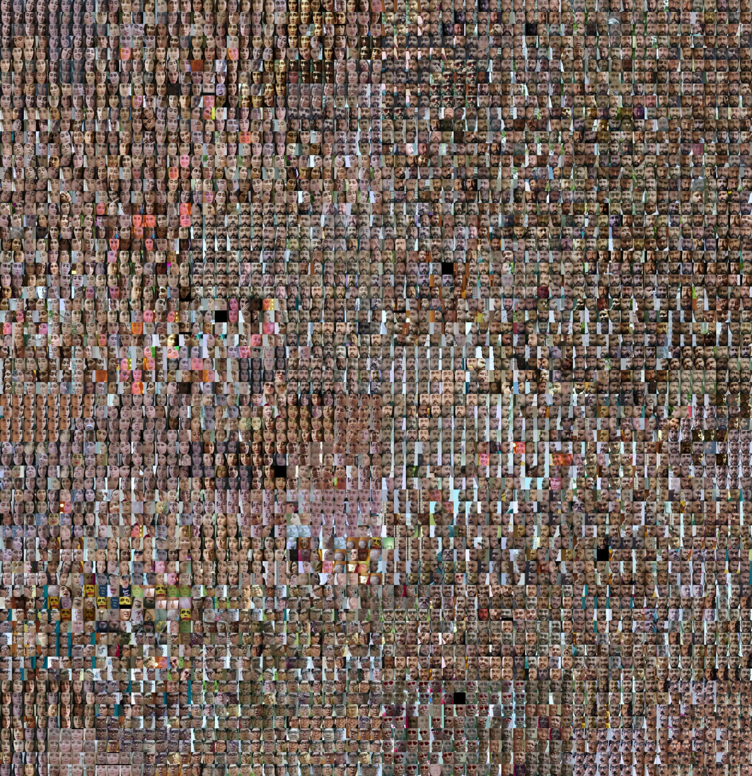
10/3: I’m updating this post as I get better visualizations of skintone. So I’ve included one mega image of all the people across multiple films organized by their average skin tone. Below that are the intermediate results of per movie images. In the Mega image I do see all the darker faces at the top are primarily the male lead while at the bottom they are primarily the female lead.
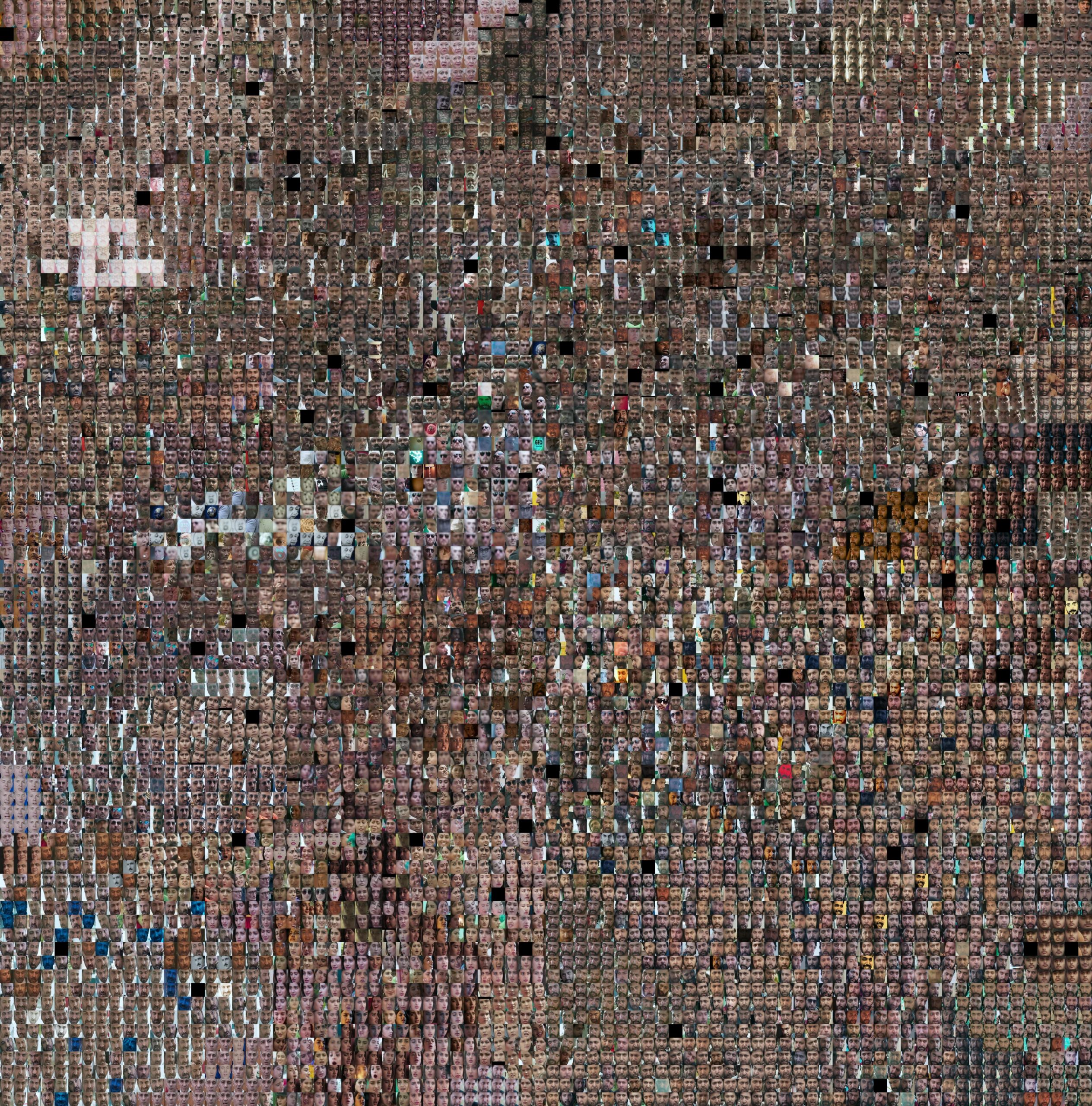
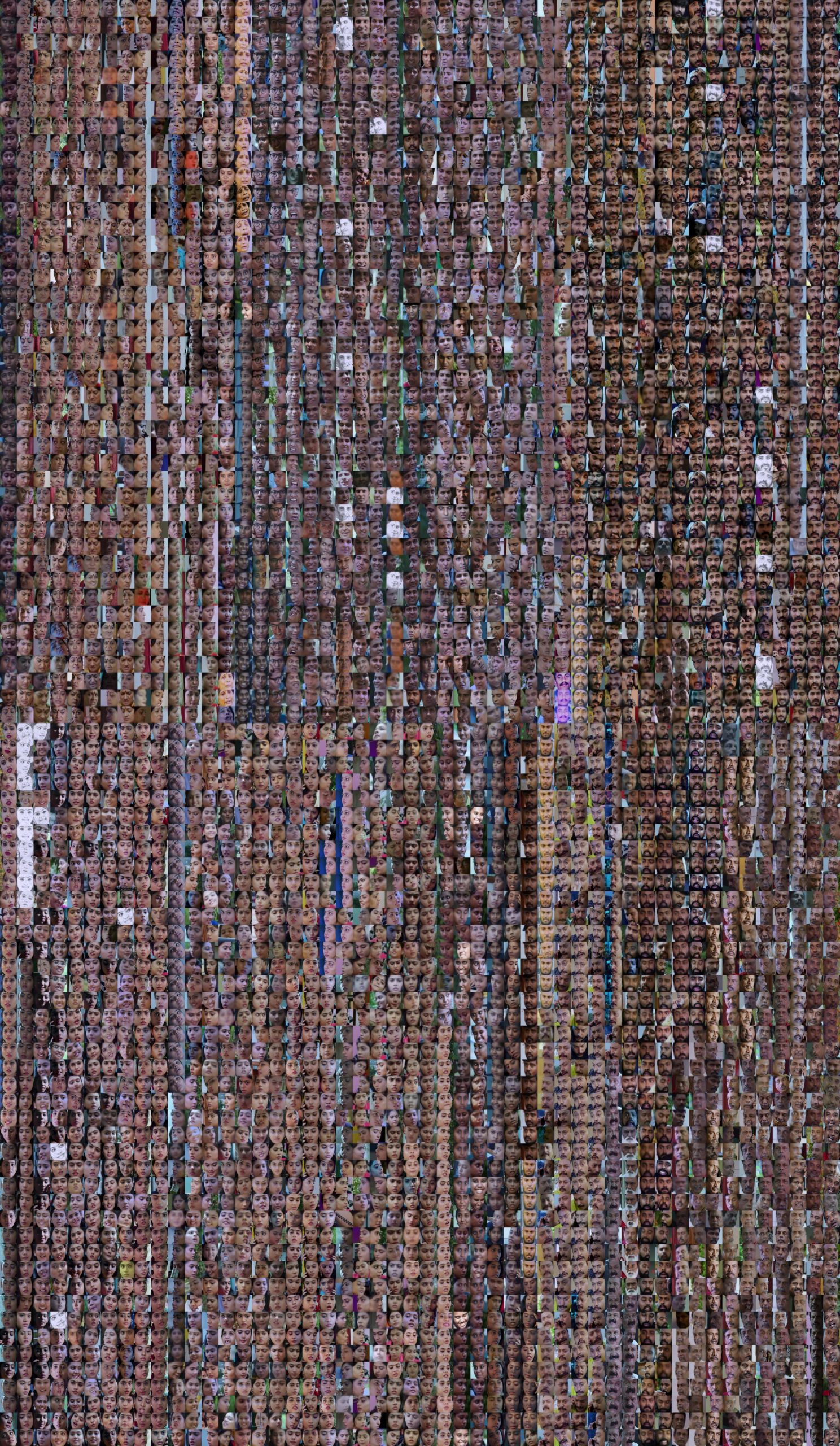
10/4: I’ve added “Better Mega Image” so please ignore “Mega Image”. I also included a video below that showing me scrolling top to bottom zoomed into the grid. I think it demonstrates some of the trends in gender and skin tone I wanted to show. I highly recommend watching the scrolling video to understand that I want the viewer to zoom in and traverse the landscape of the grid.
Mega image
Better Mega Image
Scrolling the Better Mega Image
Untitled (4)
Video Player is loading.
Current Time 0:00
/
Duration -:-
Loaded: 0%
0:00
Stream Type LIVE
Remaining Time --:-
1x
Chapters
descriptions off, selected
captions settings, opens captions settings dialog
captions off, selected
This is a modal window.
The media could not be loaded, either because the server or network failed or because the format is not supported.
Beginning of dialog window. Escape will cancel and close the window.
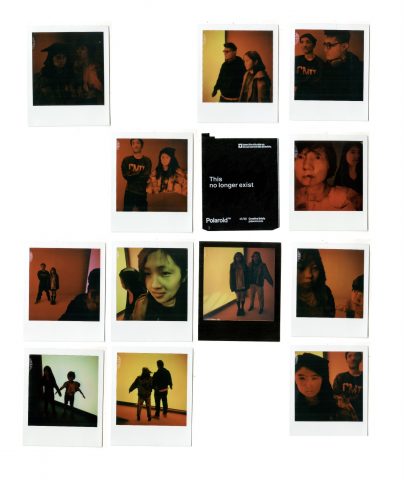
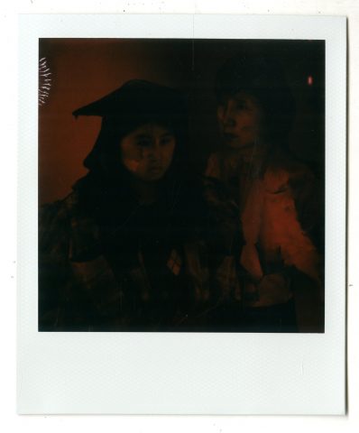
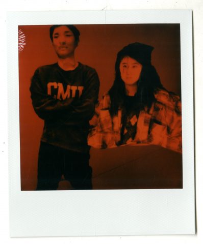
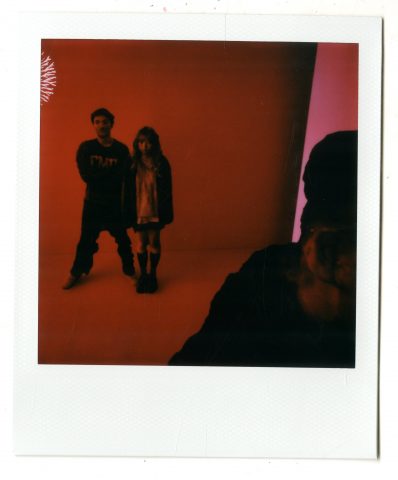
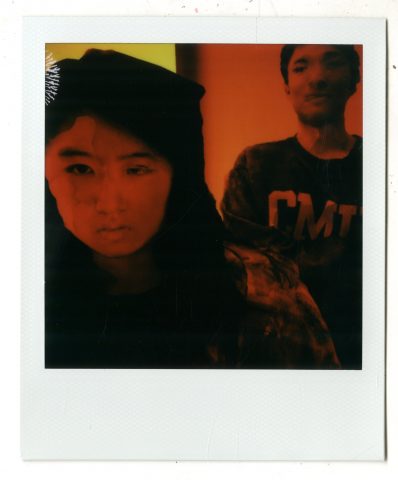
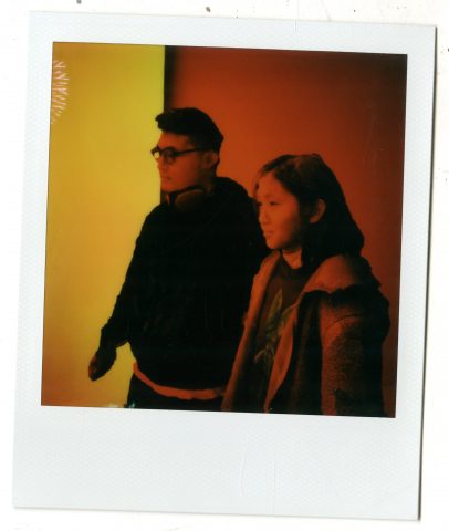
Overview of Typology: Polaroid Real+ (click the image to see in high resolution)
In short, my typology machine generates portraits for two in a virtual environment inside a polaroid photo.
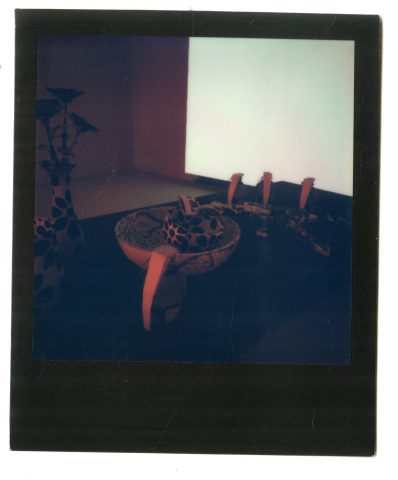
This project was inspired by one of my experimentations with Polaroid Lab: I printed a virtual scene I made in Unity. It turns out to look so real in the frame of polaroids.
Polaroid of my Virtual Installation
It makes me think about how we sometimes just take for granted that what’s in polaroid is real. And, what does “real” mean in the virtual world?
All these questions brought me to the concept of the uncanny valley:
I want to explore: how we decide if a scene is “real”, what that “realness” means to us, and, what we feel from this realness.
Thus, my typology machine generates portraits for two in a virtual environment inside a polaroid photo.
Make them do different postures and motions through Mixamo
Import them into a virtual scene in Unity
Take screenshots!
Print them on Polaroid
What was much more complex than I thought wasimporting the motion and postures from Mixamo to Unity. Those files cannot be directly imported into Unity and need to be processed. And this is where I really got stuck.
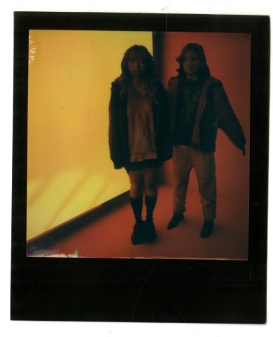
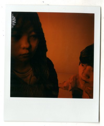
Polaroid Real+ Detailed View 03
Therefore, I changed my plan: Instead of trying to generate motion and postures through Mixamo, I asked my friends to be in specific postures when I scan them using photogrammetry. Also, I switched from capturing full shots to close-ups.
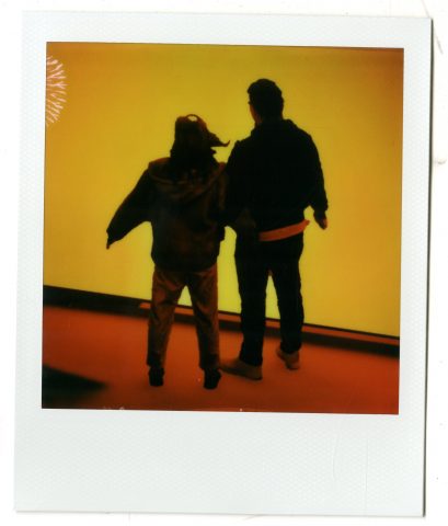
Polaroid Real+ Detailed View 04
What was easier is that the baked lights in Unity helped a lot to blend the characters into the virtual scenes.
Polaroid Real+ Detailed View 05
Evaluating my project, I am satisfied that I did feel things from the polaroids: a sense of strangeness, eerieness, detachment, or simply the feeling that something is going wrong.
Polaroid Real+ Detailed View 06
As for future opportunities, I really want to create virtual avatars of myself in mass: to capture different versions of myself, then put them together and make them meet and interact with each other in my virtual space. Moreover, when working on this typology machine, I kept thinking about where exactly my subjects–these virtual avatars– exist: in polaroids, in virtual worlds, in a vacuum, or nowhere. Thus, I want to explore the existence of the virtual self in loops. For example, I will make a polaroid. In the polaroid, there is my virtual avatar holding a virtual polaroid, and in that virtual polaroid is another portrait of my virtual avatar.
This project is a technical experiment where I attempted to use a polarization camera to separate the reflection on a glass window pane from the light coming from the inside so I can present a 2-channel video of the inside and the outside space side by side.
0
Video Player is loading.
Current Time 0:00
/
Duration -:-
Loaded: 0%
0:00
Stream Type LIVE
Remaining Time --:-
1x
Chapters
descriptions off, selected
captions settings, opens captions settings dialog
captions off, selected
This is a modal window.
The media could not be loaded, either because the server or network failed or because the format is not supported.
Beginning of dialog window. Escape will cancel and close the window.
End of dialog window.
Embed: Start at:
This is a tool-driven project. I was given a very cool camera and thought it would be fun to make something with it (also a good challenge.) It is a polarization camera, which captures the 4 polarizations of light simultaneously with a special sensor that has polarization filters of 0, 45, 90, and 135 degrees on its Bayer filter rather than red pass, green pass, and blues pass filters designed to make a colored image.
I was initially inspired by how polarizers are used to eliminate reflections and glares with water and glass in photography. I thought it would be interesting to capture the duality of windows — that it lets light through while reflecting it at the same time, that it lets us see ourselves and others at the same time, and that it separates (by physically dividing) and unifies (by combining two images on to one surface) two spaces at the same time. By capturing one video clip of one surface and separating it into two channels to be presented side by side, the contrast between these two different yet intermingling images investigates the simultaneity and unity of different moments and spaces.
My workflow:
Find an interesting window.
Set up the camera in front of it in a way that my own reflection cannot be seen.
Record a ~10s clip.
In post-processing, choose 2 channels that capture the outside and the inside with the best separation (usually 0 and 90 degs.)
Enhance the difference between the two frames and adjust them so that they look as similar as possible visually while having the largest achievable separation between the outside and the inside.
Present them as a 2-channel video.
Further work:
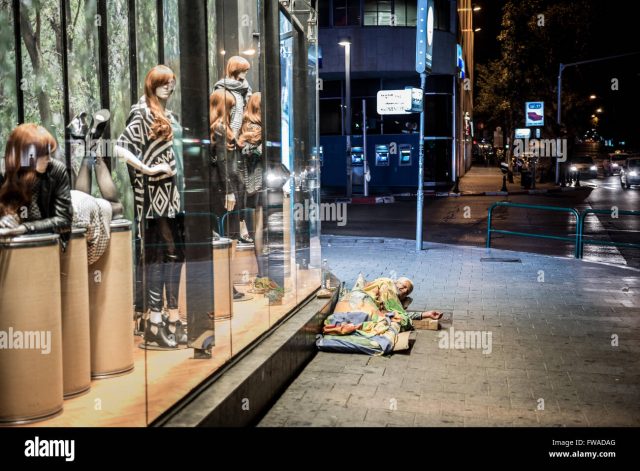
This project focused more on the experimentation of tools and processes rather than the soundness of concepts. It is quite weak as far as typology and content go. I have a few ideas in mind that could make the content more interesting. When I’m in a big city like NYC, I’m always fascinated by the stark contrast between the inside and the outside — the pristine inside of corporate lobbies and the sticky street where the homeless take shelter separated only by a sheet of glass.
A stock photograph to illustrate what I mean: https://www.alamy.com/stock-photo/homeless-man-sleeping-in-shop-window.html
As for the capturing process, I think 2 regular cameras with polarizing filters might work better than the FLIR Blackfly. The black fly does not allow for precise adjustments of the filter angle on the field so it’s hard to gauge the success until I get into cv2. Having two regular cameras would also allow me to capture color.
The main challenge I encountered was the balance of light. If either the inside or the reflection was too bright at any spots, it overpowers the other and wipes out any information from the other side. Essentially, unless the light is very balanced across the frame, at any given pixel, I can only capture one of the sides. One idea I had to combat that was to match the FPS with the grid’s AC frequency. LED lights usually flicker at 120HZ with a 60HZ grid and dip to less than 10% peak luminosity at their dimmest points. So if I can record at 240fps or higher when the ambient light is low (blue hour or later), I can easily pick out all the darkest frames (which would have most of the reflection) and the brightest frames (which would have the most of the inside.) This can also be used in combination with polarization.
I looked through IEEE explore and ACM library but found very little literature on this topic, which was very surprising since glare reduction via polarization filters seems to be a very useful thing to do in the industry. I’m sure there are better algorithms to utilize the data I have than the stuff I came up with. If anyone knows anything about this please let me know:)
Additional information:
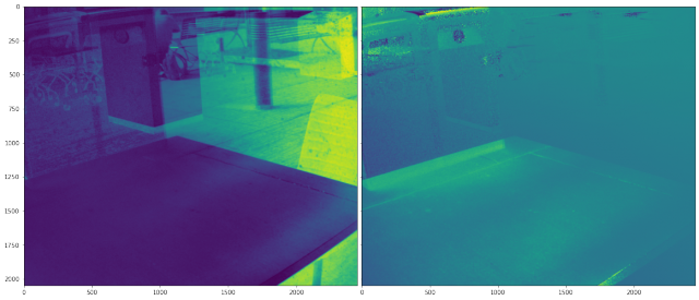
The Degree of polarization map (L) and Angle of polarization map (R) I calculated from the 4 channels using this repo: https://github.com/elerac/polanalyser Didn’t find any good uses for this information.
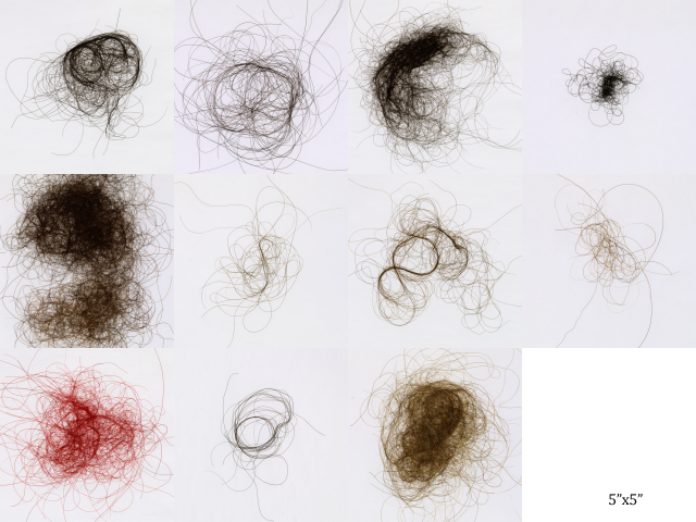
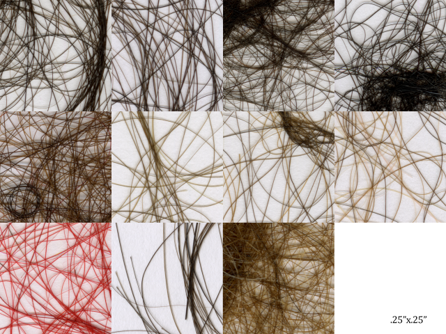
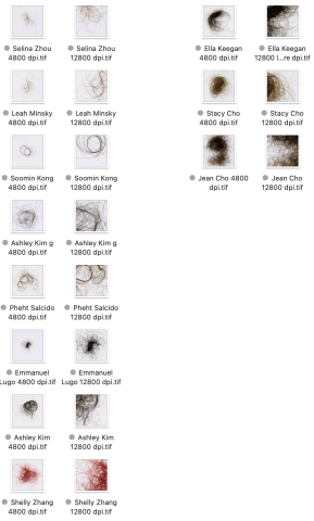
For my typology machine, I sourced 11 clumps of hair from 11 people and scanned them at high resolution to create indirect portraits. I was really interested in how I could capture hair and retain the gross detail but keep an element of readability. Hair is different in it’s inherent structural attributes: the color, thickness, bends, lengths are all varied. But I think what’s interesting about these hair clumps also comes from their overall forms. We can see the result of personal human decisions in the forms each clump takes.
How people treat the hair they collect— if it’s in a mat because they keep hair in their brush, if they don’t have much because they throw much of it away, if the hair was from a shower and super clean/shiny because it doesn’t carry as many oils, or if they collected their hair from their surroundings— are all interesting things to look out for within the forms of the hair clumps.
In general, I was interested in capturing a piece of human bodies that sloughs off, but not in a super gruesome way. Another thing that was important to me was that the samples were not just pieces of hair that were cut off; hair strands hold a lot of historical information about us and I think having whole strands was really important to me. I wanted to present many peoples’ hair clumps (and not just a couple strands) together because we become accustomed to dealing with our own no-longer-attached-to-the-scalp hair but even then, it’s not usually examined so closely.
I was really inspired by Byron Kim’s Synecdoche, and also indirect portraiture as a general concept. I think limiting the field of view with which one can look at a subject is an interesting way to make observations.
I struggled quite a bit with the scanning process, trying to set up parameters that would work for all samples took a very long time. I was also unable to get the format of a web book to work though perhaps in the future if I collect more peoples’ hair and had more time it might be cool to pursue.
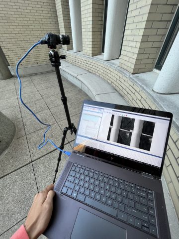
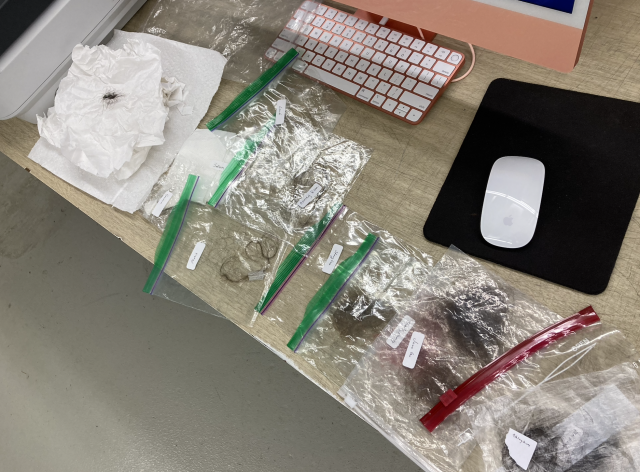
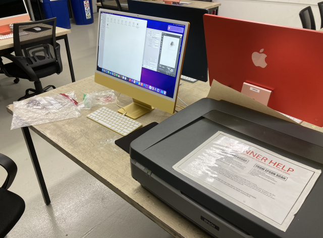
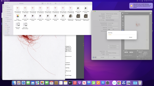
My process was to ask people for any hair they could spare and then scan it. Generally, it was taken from brushes, clothing, or their showers. I received their hair in bags or papers and scanned them at the highest resolution the flatbed scanners could go (12800 dpi at 2″ squares) and at an arbitrary but standard 5″ square (once again at largest resolution possible, 4800dpi) to capture the entire form of each clump of hair. Each file was a tif that was over 1.5GB. I cropped the highest resolution scans to be .25″ squares and then upsized the images by 4 for the final typology.
For anyone interested, here is the link to the unprocessed scans
Thank you to Ashley Kim, Ashley Kim, Ella, Em, Jean, Leah, Pheht, Selina, Soomin, and Stacy for the hair. And thank you to Golan and Nica for assistance and guidance throughout this project.
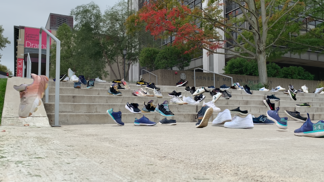
Travel Over Timeseries captures a collection of passerby’s steps observed over time at a location from a low angle in one frame. Each sneakers in the frame once was in that location at some time.
How it started:
Curious of how the observation of the world differ from a viewpoint closer to the floor, I wanted to explore and capture the ‘common’ of the low perspective. I first recorded the small rover’s point of view as it rolls across the road. Not so long after recording, I realized that I made an assumption that all visuals captured would have automatic stabilization like human eyes: All recordings I have made with the phone mounted on a rover had extreme motion blurs, as the rover rolled very close to the floor and doesn’t have any shock absorption feature that would stabilize the camera.
Learnings from the first attempt:
I was surprised to see the number of shoes and feet from the initial recordings. Sometimes the view captured was clear (like the snapshots above), and in these moments, there were shoes or animal feet in focus. Probably the camera autofocus algorithm in iPhone worked better when there’s a clear outline of a target object, but these few snapshots made me wonder how many different sneakers would the camera be able to capture from a low angle at a given location over a defined time.
Choices I made:
I chose sneakers because I personally like wearing sneakers the most and am more interested in seeing diverse designs of sneakers than those of other shoes type. Also, it is a great reference mark to indicate where people once were, as most of the time, everyone’s shoes are located on or near the floor regardless of other personal features like height. I also decided to remove other part of the bodies and belongings other than sneakers to bring attention to the passing of time and diversity in the location where people choose to walk on a given pathway.
Process:
Below describes the steps I initially planned to take to create Travel Over Time.
Typology Machine Workflow:
Setup camera near the floor looking at the people path
Record for however long you’d like to
Extract each frame from the recordings and get the average visual of the frames using OpenCV (Background extraction)
Train ML model to detect and categorize different sneakers
Scrape web to collect different sneakers images using Beautiful Soup
Categorize sneakers into 6 different groups : athletic, design, high-top, low-top, slip-on, street
Annotate each images to indicate where the sneakers are in the image
Use Cascade Classifier in OpenCV and TensorFlow to create/train a model
Extract sneakers from each frame using model
Additively overlay extracted sneakers on its position detected on frame on the background image created earlier
Since this was my first experience using OpenCV and ML models, I couldn’t annotate all data in time to train my own sneakers detection model. I got the general object detection to work using pre-existing model online, but it was too general and wasn’t as accurate to use for the project. Also, I noticed that additively overlaying the shoes detected would not give the clean imagery of multiple shoes walking across the same location all at once, as the sneakers would be detected as a box and overlay could include pieces of background within the detected box.
Instead, I followed steps below to create Travel Over Time:
Setup camera near the floor looking at the people path
Record for however long you’d like to
Extract each frame from the recordings and get the average visual of the frames using OpenCV (Background extraction)
Import frames that have sneakers into Photoshop, delete pixels that aren’t sneakers
Repeat until frames filled with as many sneakers as you want
Evaluation & Reflection:
Last year, I have set myself a goal to learn new skills for each project I work on. I took this project as an opportunity to learn more about OpenCV and Machine Learning, which I’m happy of the knowledge I’ve acquired on them while investigating for this project. Although I didn’t get to fully complete model training section as planned, I know I can use the image labeling service in the future to get all images annotated to feed as training data.
I’m also happy with how the series turned out since each image captures different places the passerby have chosen to step on as they walk through the space. It was also interesting to see different sneakers designs people wear on campus. In the future series, I could further expand to show the path traces of each shoes by adding the combination of shoe movement trajectory instead of individual frame of shoes.
This project stemmed from my continual interest in a common artistic choice of some of my favorite directors, who happen to be male: they chose to use a female voice to narrate their essay films. I’m curious about that choice, especially in the context of the essay film being a highly reflexive medium.
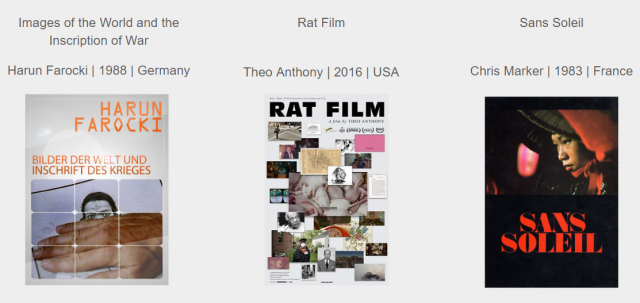
I focused on three films by three directors, which I choose because they are among my favorites:
I was loosely inspired by Omer Fast’s “CNN Concatenated” and used Sam Lavigne’s Videogrep – a python-based tool that allows to automatically create supercuts, based on associated subtitles files. I also used the transcript software Descript to make sure Videogrep doesn’t miss any excerpts since I knew the amateurish subtitles files I’m using might include some glitches.
My rule was to only use supercuts of words that appeared in all three films (not including conjunctions). As a result, I had to let go of several words and supercuts I desperately wanted to use, since they only appeared in one or two of the films.
I edited out clips where Videogrep mistakenly included words that sound similar to those I searched for (although I left the mistakes in if the words were of the same root).
Here are the results arranged by four chosen words from all three films into one sequence:
Here are the results arranged separately for each film:
I see those as primal experimentations, both in terms of the technical framework and the thematic inquiry involved.
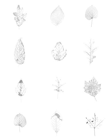
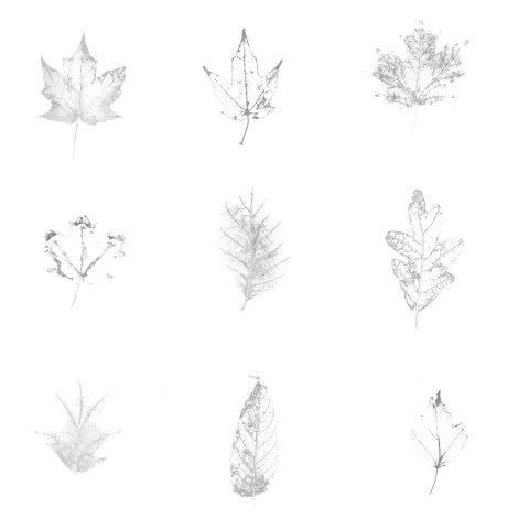
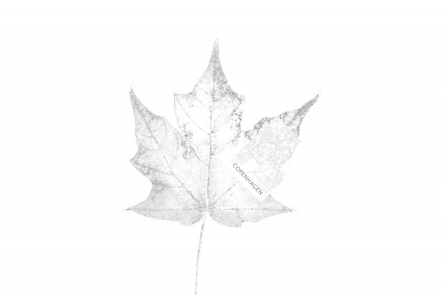
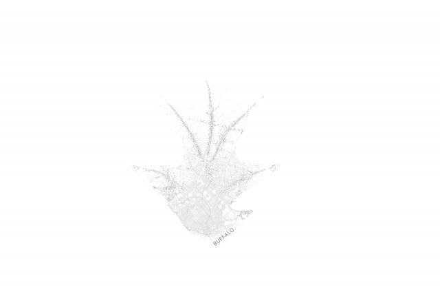
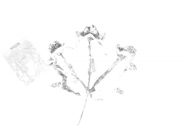
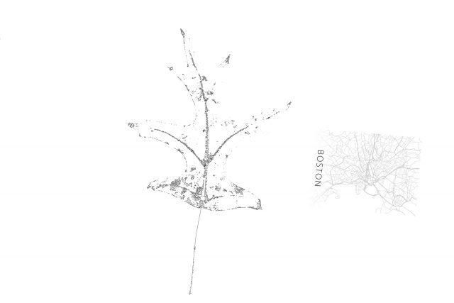
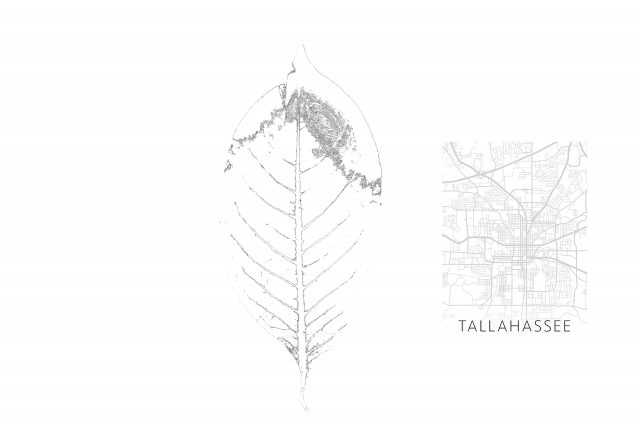
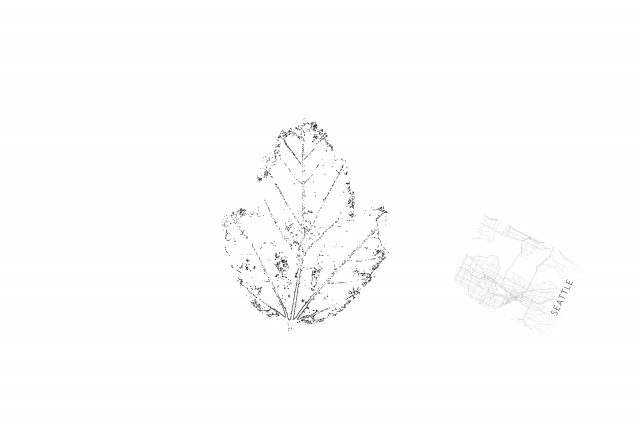
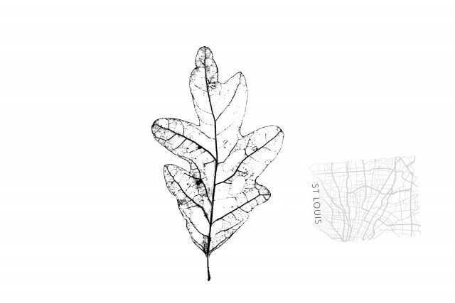
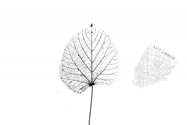
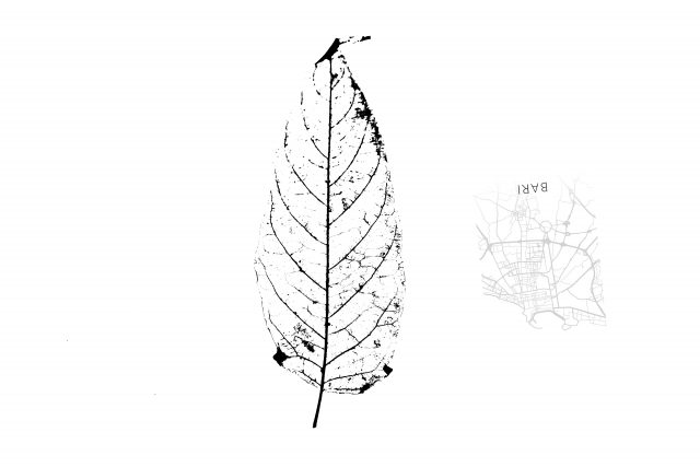
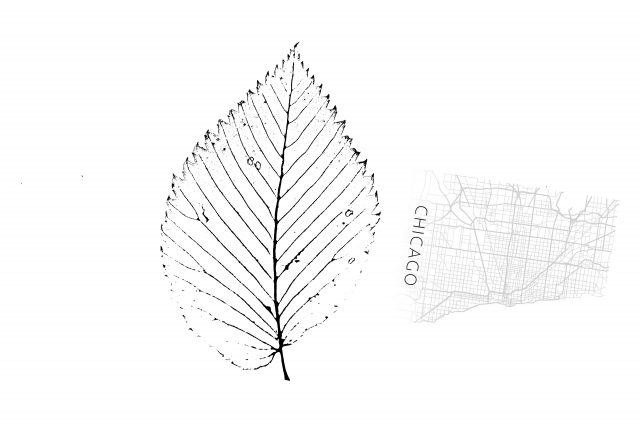
This project is a typology of the extraction of leaf skeletons.
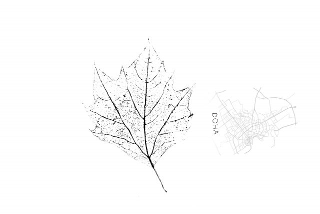
As someone who has always been fascinated by the systematic and complex nature of maps, I somehow found that the skeleton of leaves speaks a similar language to maps. They are all systematic, well-structured, and direct a flow of nature.
In the past few weeks, I’ve collected 70+ leaves from North Oakland, Shadyside, and Squirrel Hill areas as a flaneur to start my project. After that, I put leaves on a LED light board and documented them with a camera to catch more details of them. Then I use photoshop, and imageJ to read the binary information in the image to extract leaves skeletons. I also collected a lot of city maps: sometimes the city maps fit so well into the leaf’s skeleton, and sometimes the city maps show some similarity with the leaf’s structure.
Throughout the process of extracting the skeleton of leaves, the connection between the human-made structured map and the nature-made leaf skeletons is gradually shown. Compared to conventional maps, Leaf skeletons are more organic and invite people to think: where are these branches leading? Does every piece of leaf serve as a mini portrait of the great place where people lived in?
In general, I’m very fascinated by the details that a leaves skeleton has given me and I enjoyed the process of collecting leaves and observing them, which is like a practice of meditation. Sometimes while extracting binary information and skeletonizing the images, some details will surprisingly come out and create a pattern that I cannot read with human eyes.
I also learned how to simplify an art idea and do it well. Extracting leaf skeletons is not as easy as I thought: It indeed needs very careful documentation and processing.
One thing that needs to be put more effort into is the extraction process. I did not make a clean “skeletonized” diagram because the textures and patterns of different leaves are very hard to control, so there were some problems that occurred when I tried to use the “make binary” command: some detailed information was lost and thus lost consistency of the leaves. Due to this reason, even though I’ve collected 70+ leaves, it turns out that only 20+ leaves are successfully extracted.
The multiple video series is a typological self-portrait of the progression of my vogue performance. The overlapping figures embody the five elements of Vogue performance (Hands, Floor, Catwalk, Duckwalk, Spins & Dips), creating a closer inspection of personal style and weakness.
What can I learn about my vogue through a typology? What performance happens when collage creates a new form?
Initially, starting with the idea of using pornography, I thought about overconsumption and body performance. This idea quickly faded out of boredom the idea manifested a new self-referential material. Frequently watching clips of my progression into my vogue has become a sort of ritual. I learn a lot by watching clips and picking up on things not visible within the motion. The figures are isolated from their original context to provide a focal point for the movement. The program RunwayMl aided me in this process by providing a green screen device. The process in which I selected the figures was to be from a single session of practice, and then by close inspection, I categorized each movement into the following element. This process worked best for my project because it allowed me to organize figures easily. I believe I succeeded in creating a typology while also digging deeper into a self-critique. However, these videos are a base that has room for more potential. I am thinking about filters and further distortion that could potentially take place.
Typology Machine:
LPW_DUCKWALK
Video Player is loading.
Current Time 0:00
/
Duration -:-
Loaded: 0%
0:00
Stream Type LIVE
Remaining Time --:-
1x
Chapters
descriptions off, selected
captions settings, opens captions settings dialog
captions off, selected
This is a modal window.
The media could not be loaded, either because the server or network failed or because the format is not supported.
Beginning of dialog window. Escape will cancel and close the window.