Sonogram portraits of heartbeats

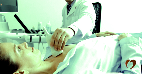
When sonogram is used as a device for portraiture, what nuances in the motion of the heart can be seen across people? When people encounter a sonogram-enabled view of their heart, it’s usually in a scary, small, cold room. Our relationship is a clinical one; terrifying and disembodying.

source: Oklahoma Heart Hospital

However, there is value in re-encountering the heart outside of a medical context. Contact with hidden parts the body can become, as opposed to an experience of fear, can be one of joyful exploration. We can observe our hearts moving with rhythm and purpose; a thing of beauty. Conversely, we can appreciate the weird (and meaty) movement that is (nearly) always there with us. A collection of hearts help us explore the diversity in this motion.

Check out the interactive —> cathrynploehn.com/heart-sonogram-typology

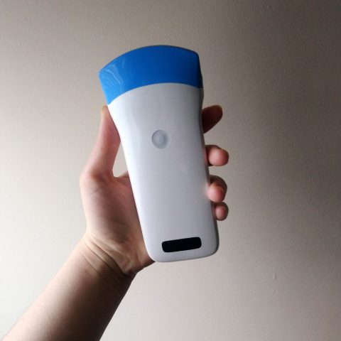
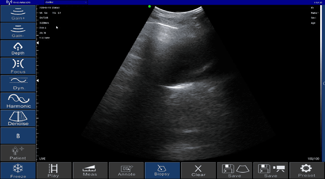
Toolkit: Wireless ultrasound scanner, by Sonostar Technologies Co., Adobe After Effects, Ml5.js

Workflow

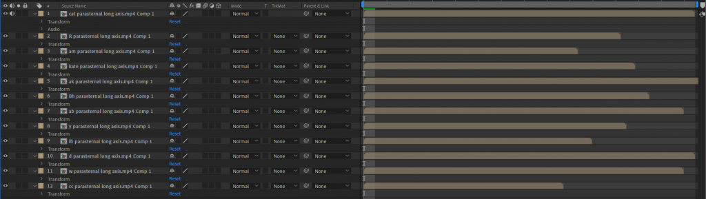
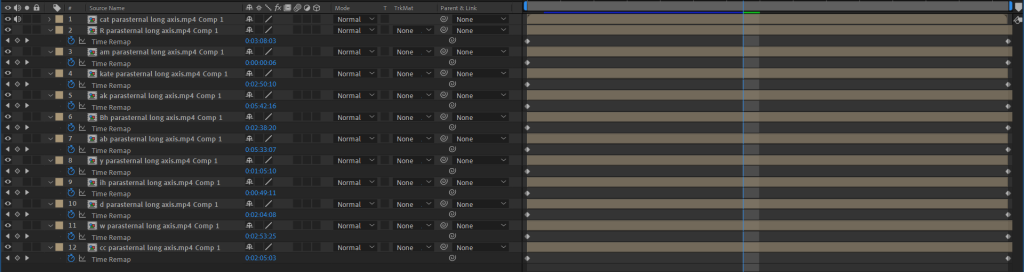
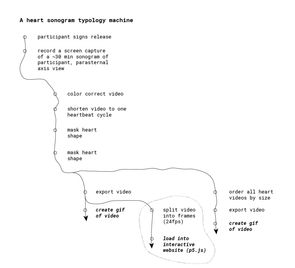
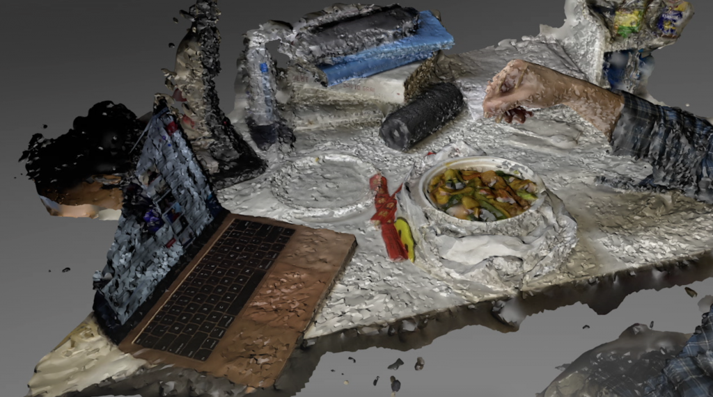
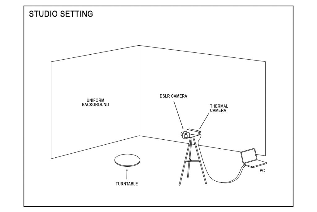
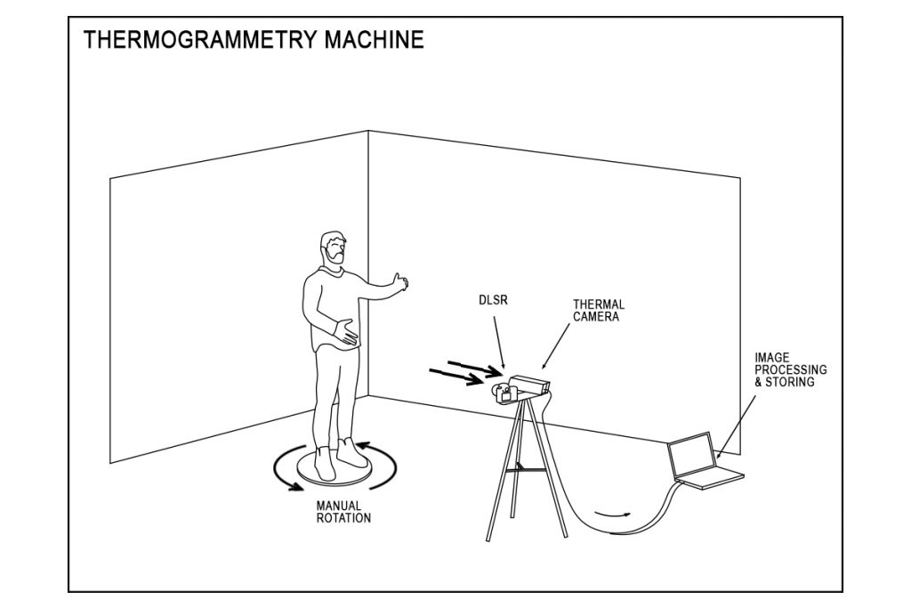
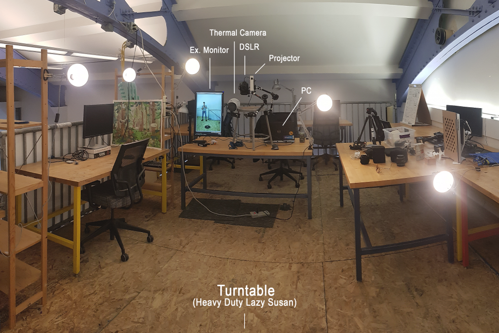
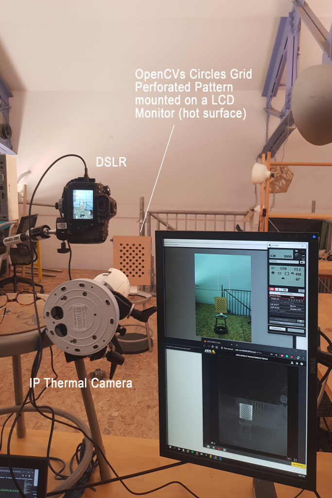
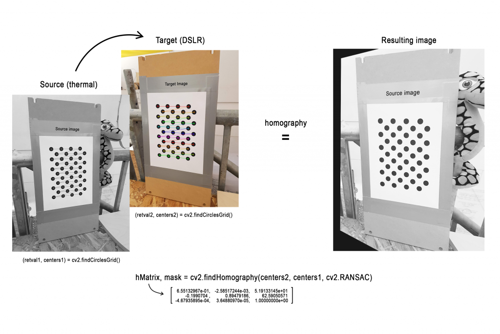
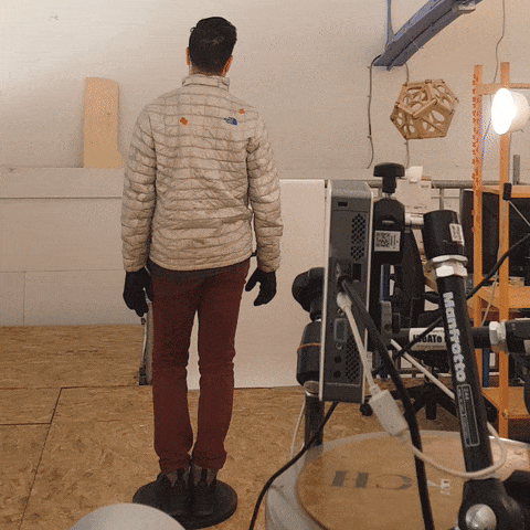
I created three deliverables for this project, using the following machine:

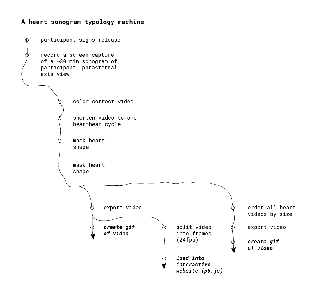
In developing this process, I encountered the following challenges:

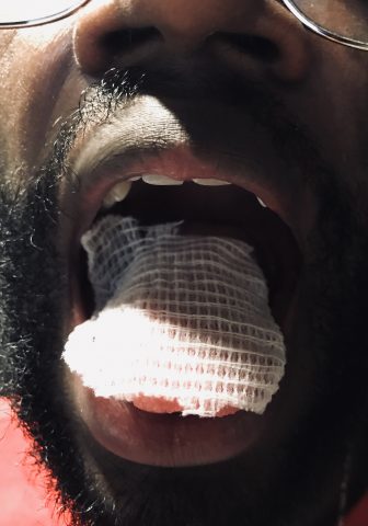
Legibility. Learning how to operate a sonogram and make sense of the output was a wild ride. I spent several hours experimenting with the sonogram on myself. Weirdly, after this much time with the device, I became accustomed to interpreting the sonogram imagery. In turn, I had to consider how others might not catch on to the sonogram images; I might need to provide some handholds.

Consistency. Initially, I was interested in a “typology of typologies,” in which people chose their own view of their heart to capture.  I was encouraged instead to consider the audience and the lack of legibility of the sonograms. I asked myself what was at the core of this idea; relationship with body. Instead of act choosing an esoteric/illegible sonogram view, the magic lie in the new context of the sonogram. Further, I realized it’d be more compelling to make the sonograms themselves legible to explore the motion of the heart across different bodies. That’s where the playfulness could reside.

Reframing the relationship our body. Feedback from peers centered around imbuing the typology with playfulness, embracing the new context I was bringing to the sonogram. Instead of a context of diagnosis and mystery, I wondered how to frame the sonogram images in more playful. One aspect was to shy away from labeling, and to embrace interactivity. Hence, I created an interactive way to browse the typology.

Once I focused on a simple exploration of the motion of the heart, the process of capture and processing of the sonograms became straightforward, allowing me to explore playful ways of interacting with the footage.

Deliverables

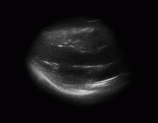
Looping GIF of single hearts


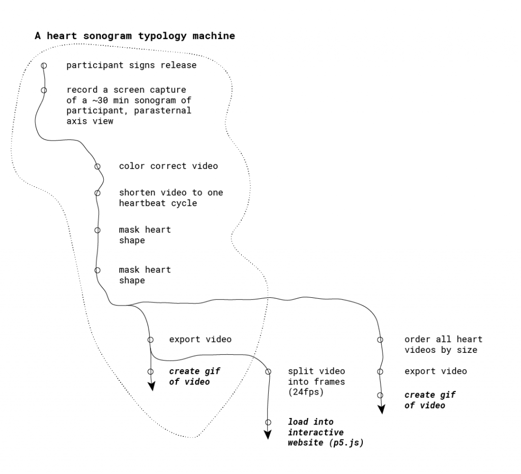
First, I produced looping video for each person’s sonogram. Some considerations at this stage included:

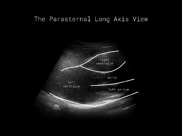
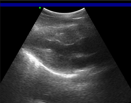
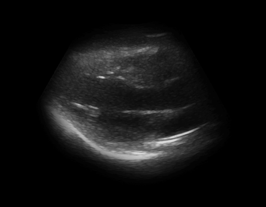
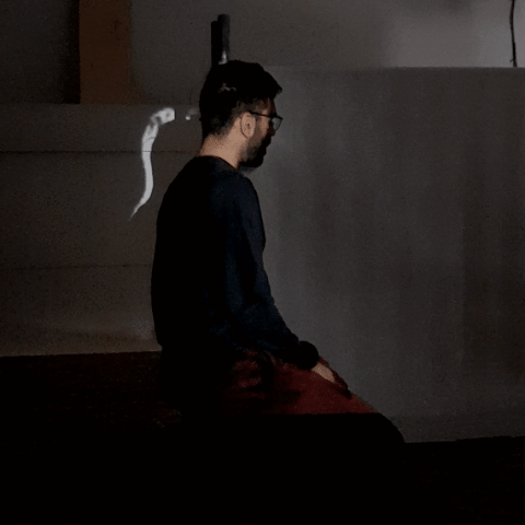
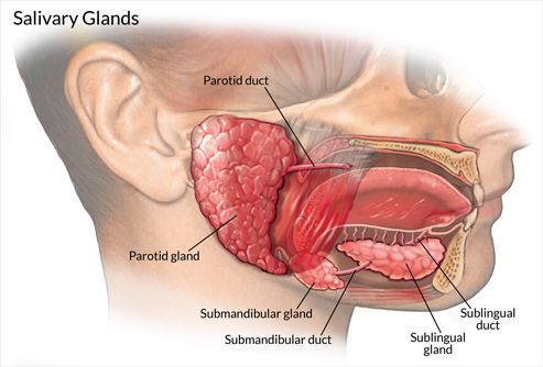
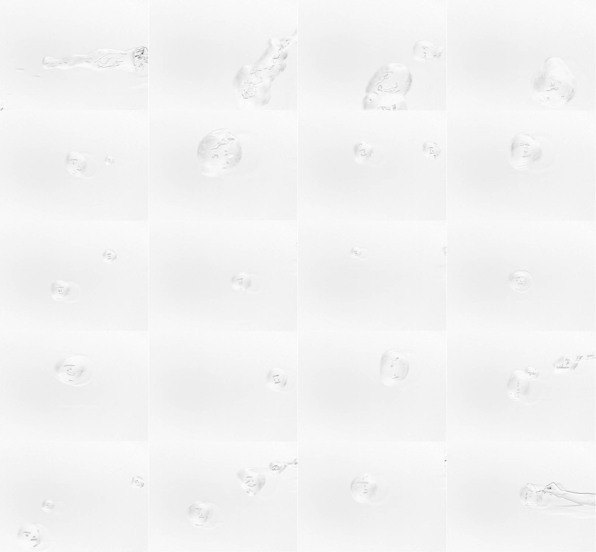
Using a consistent view. In capturing each sonogram, I positioned the sonogram to capture the parasternal long axis view. You can view all four chambers of the heart, can easily access this view with the sonogram, and can see a silhouette of the heart.

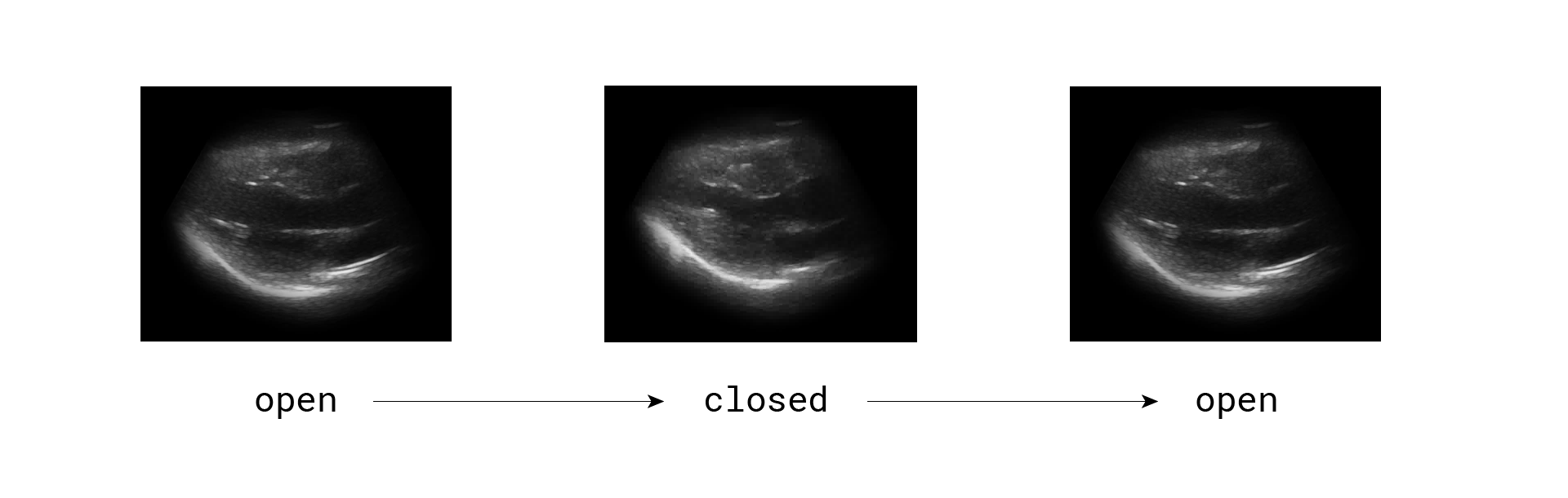
Cropping the video length to one beat cycle. One key to observing motion is to get a sense of it through repetition. In order to create perfect looping gifs, I cropped the video length to exactly one beat cycle. I scrolled through footage frames, searching for where the heart was maximally expanded. Each beat cycle consists of an open-closed-open heart.

one beat cycle

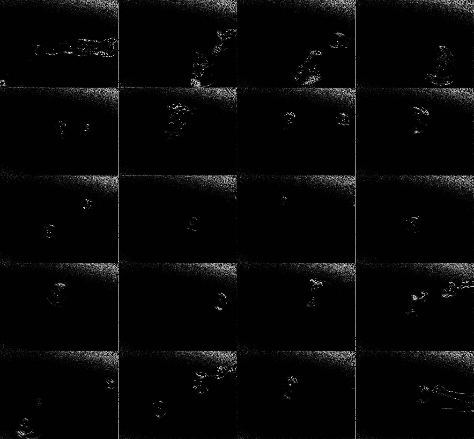
Masking the sonogram to just the heart. Feedback made it clear that the sonogram shape was a little untoward. Meanwhile, the idea of labeling the chambers of the heart for some made the sonograms sterile. For these reasons I masked the sonogram footage to the silhouette of the heart. Thus, the silhouette provided some needed legibility without the need to label the heart. Further, I it was easier to compare hearts to one another by size.

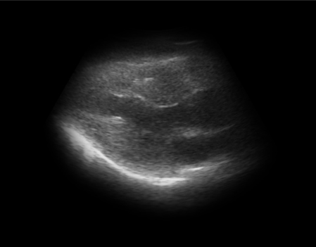
Here’s the final product of that stage:

a complete heart sonogram loop

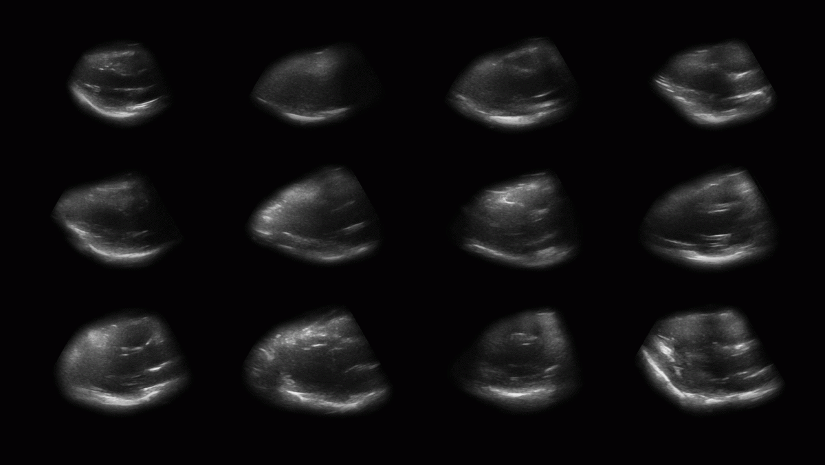
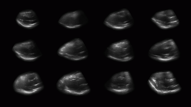
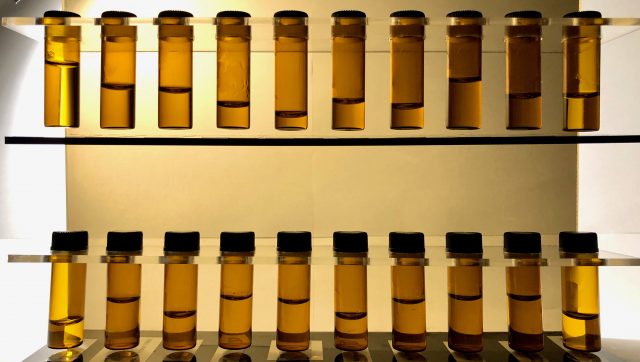
Looping GIF of all hearts, ordered by size

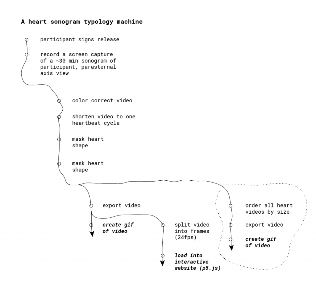
Next, it was time to compare hearts to one another. As I put together a looping video of all the sonograms, I considered the following:

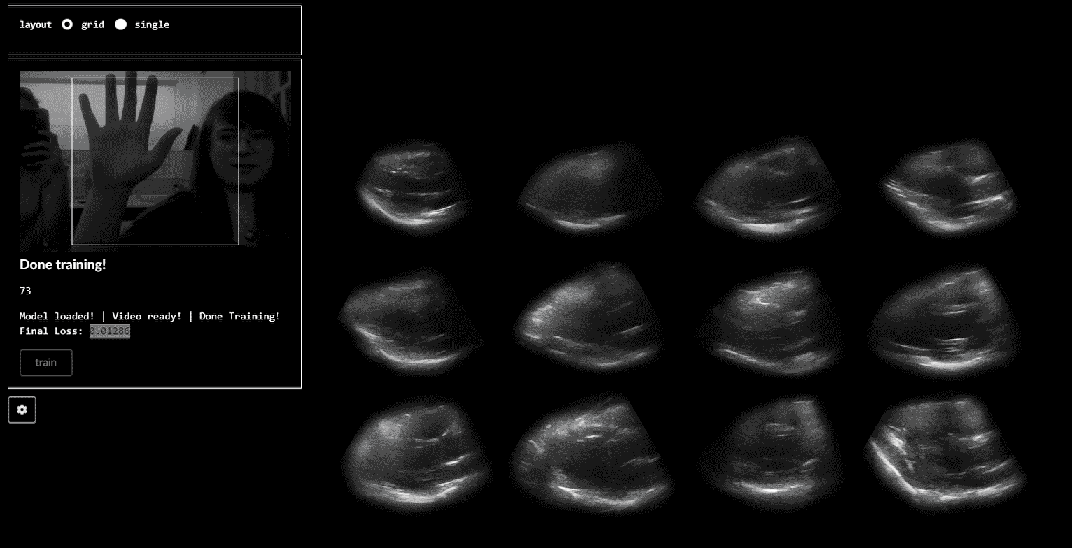
Ordering by size. One cool relationship that emerged were the vast differences in heart size across people. Mine (top left) was coincidentally the smallest (and most Grinch-like).

Scaling all heart cycles to a consistent length. At the time of sonogram recording, each person’s heart rate was different. As I was seeking to explore differences in motion, not heart rate, I scaled all heart cycles to the same number of frames.

remapping all videos to the same length in After Effects

Differences in motion. With all other variables held consistent, neat differences in heart motion emerge. Consider the dolphin-like movement heart in the top row, second column to the jostling movement of the heart in the top row, fourth column.

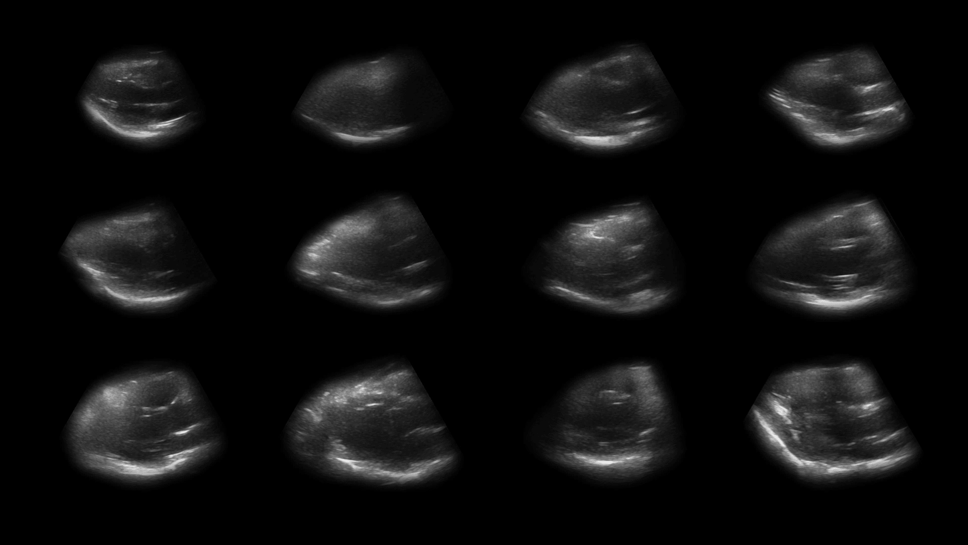
All heart sonograms, synchronized by beat cycle, ordered from left to right and top to bottom by size.

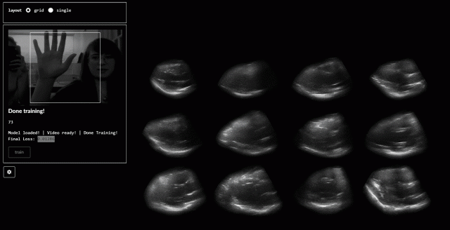
A interactive to explore heart motion

A looping video does the trick for picking out differences in motion. Still, I wondered whether more nuanced and (hopefully) embodied ways of exploring of a heart’s pumping movement existed.

As I edited the footage in After Effects, I found myself scrolling back and forth through frames, appreciating the movement of the heart. The scroll through the movement was compelling, allowing me to speed up/slow down movement. An alternative gesture came to mind: a hand squishing a perfume pump.

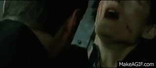
The “squishing” hand gesture was inspired by these scenes from The Matrix: Revolutions, in which Neo resurrects Trinity by manually pumping her heart (I think):

Perhaps because portraiture via sonogram is heavily discouraged by the FDA, sonogram-based inspirations were sparse.

So, after briefly training a neural net (with Ml5; creating a regression to detect hand movements using featureExtractor) with an open/closed hand gesture, you can physically pump the hearts with your hand on this webpage.

I also tried classification with featureExtractor and KNNClassifier, although it seemed to choke the animation of the hearts. The movement can also be activated by scrolling, which is neat when you change speed.

A note about tools

Hearts repeat the same basic movement in our bodies ad infinitum (or at least until we die). Thus, a looping presentation seemed natural. In terms of producing the video loops, using After Effects and Photoshop to manipulate video and create gifs were natural decisions for the sonogram screen capture.

Still, I’m exploring ways to incorporate gesture (and other more embodied modes) in visualizing this data. An obvious result of this thought is to allow a more direct manipulation of the capture with the body (in this case, the hand “pumping”the heart. Other tools (like Leap Motion) exist for this purpose, but the accessibility of Ml5 and the unique use of it’s featureExtractor were feasible paths to explore.

Final thoughts

In general, I’m ecstatic that I was able to get discernible, consistent views of the heart with this unique and esoteric device. Opportunities remain to:

Explore other devices for interaction with heart. Though my project focused making the viewing of the data accessible to anyone with a computer, device-based opportunities for exploring the sonogram data are plenty. For example, a simple pressure sensor embedded into a device might provide an improved connection to the beating hearts.

Gather new views of the heart with the sonogram. What about the motion of the heart can be observed through those new angles?

Explore the change in people’s relationship to their bodies. Circumstances prevented me from gathering peoples reactions to their hearts in this new context. Whereas this project focused on the motion of the heart itself, I would like to incorporate the musings of participants as another layer in this project.

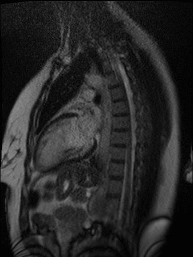
Explore other medical tools. Partnerships with institutions that have MRI or other advanced medical tools for viewing the body would be interesting. MRI in particular is quite good ad imaging heart motion.

MRI of my heart

Typology of Fixation Narratives

A typology of video narratives driven by people’s gaze across clouds in the sky.

How do people create narratives through where they look and what they choose to fixate on? As people look at an image, there are brief moments where they fixate on certain areas of it.

Putting these fixation points in the sequence that they’re created begins to reveal a kind of narrative that’s being created by the viewer. It can turn static images into a kind of story:

The story is different for each person:

I wanted to see how far I could push this quality. It’s easy to see a narrative when there’s a clear relationship between the parts in a scene, but what happens when there’s no clear elements with which to create a story?

I asked people to create a narrative from some clouds. I told them to imagine that they were a director creating a scene, where their eye position dictates where the camera moves. More time spent looking at an area would result in zooming the camera in, and less time results in a wider view. Here are five different interpretations of one of the scenes:


I used a Tobii Gaming eye tracker and wrote some programs to record the gaze and output images. The process works like this:

  1. An openFrameworks program to show people a sequence of images and record the stream of gaze points to files. This program communicates with the eye tracker to grab the data and outputs JSONs. The code for this program can be found here.
  2. Another openFrameworks program to read and smooth out the data, then zoom in and out on the image based on movement speed. It plays through the points in the sequence that they’ve been recorded and exports individual frames. Code can be found here.
  3. A small python program to apply some post-processing to the images. This code can be found in the export program’s repository as well.
  4. Export the image sequences as video in Premiere.

There were a couple of key limitations with this system. First, the eye tracker only works in conjunction with a monitor. There’s no way to have people look at something other than a monitor (or a flat object the same exact size as the monitor) and accurately track where they’re looking. Second, the viewer’s range of movement is low. They must sit relatively still to keep the calibration up. Finally, and perhaps most importantly, the lack of precision. The tracker I was working with was not meant for analytical use, and therefore produces very noisy data that can only give a general sense of where someone was looking. It’s common to see differences of up to 50 pixels between data points when staring at one point and not moving at all.

A couple of early experiments showed just how bad the precision is. Here, I asked people to find constellations in the sky:

Even after significant post processing on the data points, it’s hard to see what exactly is being traced. For this reason, the process that I developed uses the general area that someone fixates on to create a frame that’s significantly larger than the point reported by the eye tracker.

Though the process of developing the first program to record the gaze positions wasn’t particularly difficult, the main challenge came from accessing the stream of data from the Tobii eye tracker. The tracker is  specifically designed to not give access to it’s raw X and Y values, instead to provide access to the gaze position in a C# SDK that’s meant for developing games in Unity, where the actual position is hidden. Luckily, someone’s written an addon for openFrameworks that allows for access to the raw gaze position stream. Version compatibility issues aside, it was easy to work with.

The idea about creating a narrative from a gaze around an image came up when exploring the eye tracker. In some sense the presentation is not at all specific to the subject of the image; I wanted to create a process that was generalizable to any image. That said, I think the weakest part of this project is the content itself, the images. I wanted to push away from “easy” narratives produced from representational images with clear compositions and elements. I think I may have gone a bit far here, as the narrative starts to get lost in the emptiness of the images. It’s sometimes hard to tell what people were thinking when looking around; the story they wanted to tell is a bit unclear. I think the most successful part of this project—the system—has the potential to be used with more compelling content. There are also plenty more possible ways of representing the gaze and the camera-narrative style might be augmented in the future to better reflect the content of the image.


Jú – 局 – Gathering

Digital portraits of meal gatherings–or 局 in Mandarin–where Chinese international students forge a temporary home while living in a foreign place.

Eating is a cultural biological process. For people who live far away from home, food-oriented, communal rituals can serve the purpose of identity affirmation and cultural preservation. In any culture, food is a big deal. In my culture, which is Chinese culture, having meals with friends and families is a quintessential part of social part. When young Chinese people find themselves living abroad for an extended period of time, food gatherings become even more important, since it is our way of creating a sense of home for each other while being so far away.

The word 局 means “gatherings” in general. 饭局, for example, are food gatherings, whereas 牌局 means gatherings where we play cards together.

Image result for 局 汉字

全国茶馆万千,谁能脱颖而出成为百佳?

中国茶馆历史悠久,在漫长的演变中,从一个单纯的饮食场所,发展为近代市民独特的社会公共空间。图为中国茶馆一景。

In my life, we use this word a lot, almost every day when we ask each other to get food together again. It highlights a communal feeling, and emphasizes that food is always about coming together–“family-style,” using the American term here, is the only style. We rarely split portions before we eat. Even strangers would reach into the same dish with their chopsticks. Perhaps it is because this type of etiquette and implied trust that I reply so much on these food gathering to find a sense of safety and comfort.

I want to explore ways to capture these feelings of togetherness and comfort in these food gatherings.

Process

I want to experiment with photogrammetry because I was drawn to the idea of digital sculptures–freezing a 3-dimensional moment in life, perhaps imperfectly. There was a lot of other open questions that I didn’t know how to approach as I started the process, however. How would I present these sculptures? How should I find/articulate the narrative behind this typology? Would my Chinese peers agree with my appreciation and analysis of our food culture? I carried these questions into the process.

My machine/procedure:

  • on-site capture
    • I asked many different groups of friends whether I can take 5 minutes during their meals to take a series of photos. Everybody, even acquaintances whom I didn’t know so well said yes!
    • During the meals, I asked them to maintain a “candid” pose for me for 2 minutes as I went around to take their photos.
    • (I also recorded 3d sound but didn’t have time to put it in)
  • build 3D models in Metashape

  • Cinema 4D
    • After I built the models,  I experimented with the cinematic approach to present them. I put them into cinema 4D and created a short fly-threw for each sculpture.
    • I recorded ambient, environmental sounds from the restaurants where I captured the scenes
Media Objects

Reflection
  • On the choice of photogrammetry
    • The sculptures look frozen, messy, and fragmented. I see bodies, colors, suspense, a kind of expressionist quality (?). What I don’t see are details, motion, faces, identity.
      • Embrace it or go for more details?
    • I need to be more careful with technical details. A lot of details are lost when transferring from MetaShape to cinema 4D.

  • On presentation
    • Am I achieving the goal of capturing the communal feeling?
    • What if I add in sound?
    • The choice of making this cinematic? Interactive?
  • On more pointed subject matters
    • What if I capture special occasions, like festivals, not just casual, mundane meals?


Remnant of Affection

‘Remnant of affection’ is a typology machine that explores the thermal footprint of our affective interactions with other beings and spaces.

For this study, I have focused on one of the most universal shows of affection: a hug. Polite, intimate, or comforting; passionate, light, or quick; one-sided, from the back, or while dancing. Hugs have been widely explored compositionally from the perspective of an external viewer, or from the personal description of the subjects that intervene in its performance (‘Intimacy Machine‘ Dan Chen, 2013). In contrast, this machine explores affection in the very same place where it happens: the surface of its interaction. Echoing James J. Gibson, the action of the world is on the surface of the matter, the intermediate layer between two different mediums. Apart from a momentaneous interchange of pressure, a hug is also a heat transfer that leaves a hot remnant on the surface once hugged. Using a thermal camera, I have been able to see the radiant heat from the contact surface that shaped the hug and reconstruct a 3d model of it.

The Typology Machine

Reconstructing the thermal interchange of a hug required a fixed background studio setting due to the light conditions and the unwieldy camera framework needed for a photogrammetry workflow.  After dropping the use of mannequins as ‘uncanny’ subjects of interaction in the Lighting Room at Purnell Center, the experiment was performed on the second floor of the CodeLab at MMCH.

First, I asked a different couple of volunteers if they would like to take part in the experiment. Although a hug is bidirectional, one of the individuals had to take the role of the ‘hugger,’ standing aside from the capture, while the other played the role of ‘hug’ retainer. The second one had to wear their coat to mask their own heat and allow more contrasted retention of the thermal footprint (coats normally contains normally synthetic materials, such as polyester, with a higher thermal effusivity that stores a greater thermal load in a dynamic thermal process).  Immediately after the hug, I took several pictures of the interaction with two cameras at the same time: a normal color DSLR with a fixed lens, and a thermal camera (Axis Q19-E). Both were able to be connected to my laptop through USB and Ethernet connection, so I could use an external monitor to visualize the image in real-time and store the files directly on my computer.

Studio setting

Camera alignment

One of the big challenges of the experiment was to calibrate both cameras so the texture of the thermal image could be placed on top of the high-resolution DSLR photograph. To solve this problem, I used an OpenCV’s circles grid pattern laser cut onto an acrylic sheet that showed every circle as a black shadow for the normal camera, and simultaneously, placed on top of an old LCD screen with a lot of heat radiation, showed every circle as a hot point for the thermal camera.

Calibration setting with OpenCV Circles Grid pattern

After that, the OpenCV algorithm finds the center of those circles and calculates the homography matrix to transform one image into the other.

OpenCV homography transformation

The subsequent captured images were transformed using the same homography transformation. The code in Python to perform this camera alignment can be found here.

Machine workflow

The typology machine was ultimately constituted by me. Since the Lazy Susan was not motorized, I had to spin the subject to obtain a series of around 30 color and thermal images per hug.

Capture workflow (Kim and me)

I also had to placed little pieces of red tape in the subject’s clothes to improve the performance of the photogrammetry software to build a mesh of the subject out from the color images (the tape is invisible for the thermal camera).

Yaxin and Yixiao
Kim and Kath

Thermogrammetry 3d reconstruction

Based on the principles of photogrammetry and using Agisoft Metashape, I finally built a 3d model of the hug. Following Claire Hentschker‘s steps, I built a mesh of the hugged person.

3D Reconstruction out of color images

Since the thermal images have not features enough to be used by the software to build a comprehensible texture I used first the color images for this task. Then, I replaced the color images with the thermal ones and reconstruct the texture of the model using the same UV distribution of the color images.

Photogrammetry workflow

Finally, the final reconstruction of each hug is processed to enhance the contrast of the hug in the overall image with Premiere and Cinema 4D. Here the typology:

A real-time machine

My initial approach to visualize the remnant heat of human interaction was to project on top of the very same surface of the subject a thresholded image of the heat footprint. The video signal was processed using an IP camera filter that transformed the IP streaming into a Webcam video signal, and TouchDesigner, to reshape the image and edit the colors.

Initially, that involved the use of a mannequin to extract a neat heat boundary. Although I did not use this setting at the end due to the disturbance that provokes to hug an inanimate object, I discovered new affordances to explore thermal mapping.

I hope to explore this technique further in the future.

Breath

Port Explorer: Macro photogrammetry of personal electronics

Port Explorer is a typology of personal electronics utilizing macro photogrammetry to capture and model unseen spaces that we carry with us daily. The collection presented is comprised of the charging ports of people’s personal devices: USB-C, Apple Lightning, and USB-A.

Rather than a reflection of an individual, I believe these captures to be a refracted representation. Not much personal information may be derived from these images, but the use and collected grime, lint and dust found in these spaces has unique personal ties and presented as a typology they become the personality of the images.

It was my aim to capture and represent these spaces as micro-verses that the viewer could navigate and explore. Using the Bebird otoscope and compiling into Agisoft’s Metashape, I brought the resulting 3d models into TouchDesigner to create a gallery of 3d responsive models. The viewer can control and navigate each model by clicking and dragging with a 3 button mouse.

Macro Photogrammetry is quite difficult. The Bebird Otoscope has a very narrow depth of field, and I was also trying to capture cavities externally given the size of the Otoscope. Below is a picture of the set up I used, which did stabilize and to a certain extent mechanize the capture so that I can adjust and line up my next shot somewhat accurately. A more precise rig that could hold the subject and Camera, while also having full 3 axis manipulation of both,  as well as controlling distance would have been the most ideal. Given the challenges of this type of capture I did scale up from phone ports to USB ports, which proved less challenging given the extra space and larger cavity.

I believe there is more to explore around this project. By understanding the limitations of my set up and my methodology, and was there more time, I would have liked to further investigate computer cables (DVI, VGA, etc.) as a typology that presents and abstracts their various topographies as micro-verses. There is a gendered component to this work that I am also interested in further exploring. Specifically investigating, colloquially termed “Male” cables that at macro scale are unique bodies and cavities that are not dis-similar from their “female” counterparts.


Typology Project- Salivation of Salvation

Salivation of Salvation is an experimental capture of the amount of saliva produced while performing songs created during periods of black oppression to uplift or bring attention to wrongdoings. The 20 songs span from 1867 to 2018 through american slavery, the Jim Crow era, black power movements, the civil rights movement, and the black lives matter movement. The chosen songs include the genres of slave songs, gospel, jazz, pop, and hip hop. Inspired by Reynier Leyva Novo’s The Weight of History, Five Nights, “Salivation of Salvation” combines black DNA with black history.

Featured Songs:

      1. Nobody Knows the Trouble I’ve Seen (published 1867)                              – African American Spiritual originating from slavery
      2. Oh Let My People Go (published 1872)                                                                – Song of the Underground Railroad
      3. Wade In the Water (published 1901)                                                                     – Song of the Underground Railroad
      4. Swing Low Sweet Chariot (1909)                                                                           – Popularized as a Negro Spiritual by the Fisk Jubilee Singers
      5. When the Saints Go Marching In (1923)                                                             – Negro Spiritual
      6. Follow the Drinking Gourd (published 1928)                                                   – Song of the Underground Railroad
      7. Strange Fruit (1939)                                                                                                     – In response to lynching in Indiana
      8. This Little Light of Mine (written 1920/popularized 1950)                       – Popular Song of the Civil Rights Movement
      9. We Shall Overcome (1959)                                                                                        – Anthem of the Civil Rights Movement
      10. Oh Freedom (1963)                                                                                                       – Song of the American Civil Rights Movement
      11. Respect (1967)                                                                                                                – Civil Rights, Equal Rights, and Black Panthers movement anthem
      12. Say It Loud! I’m Black and I’m Proud (1968)                                                   – Unofficial anthem of the Black Power movement
      13. Black Is (1971)                                                                                                                 – Hip hop fore fathers popularizing modern pro black poetry as music
      14. Get Up Stand Up (1973)                                                                                               – About taking action oppression, written in observation of Haiti
      15. They Don’t Care About Us (1995)                                                                           – Protest song made by one of the biggest icons of black music
      16. 99 Problems (2003)                                                                                                      – Known for illustrating Stop and Frisk and driving while black incidents
      17. Be Free (2014)                                                                                                                 – Response to Michael Brown shooting
      18. Alright (2015)                                                                                                                  – Unifying soundtrack of the Black Lives Matter Movement
      19. Freedom (2016)                                                                                                              – Song of the Black Lives Matter Movement dedicated to black women
      20. This Is America (2018)                                                                                                – Chart topping song against gun violence, racism, and police brutality

Salivation of Salvation is based on the study of sialometry, the measure of saliva flow. Sialometry uses stimulated and unstimulated techniques to produce results from pooling, chewing, and spitting. Although the practice is more commonly used to investigate hypersalivation (which would be easier to measure due to the excess of non-absorbed liquid), I realized I would need a more sensitive system to record the normal rate of saliva production.

In the mouth there a three salivary glands: Sublingual, Submandivular, and Parotid. The Sublingual glands are the smallest glands and on the floor of the mouth; they constantly excrete. The Submandivular glands are at the triangle of the neck, below the floor of the mouth and also constantly produce saliva. The Parotid glands are largest glands located in front lower molars parallel to the front of the ear. These glands produce through stimulation.

A majority of saliva gets absorbed into the gums and tongue, the remaining fluid rolls back down your throat. Thus making the tongue the target area for my project since it is the pathway to the throat and makes contact with the gums.

The system developed was an artificial tongue that could be weighed dry then weighed wet, the difference in values would be the weight of the saliva collected. This process was simply and effectively produced by laying a strip of gauze the covered the entirety of the tongue (the foreign object also helped trigger the Parotid Glands). The gauze was weighed with a jewelry scale which can display weight to the milligram. The conversion from weight to volume was simple since 1 mg = 1 ml. The recorded weight difference was then transferred in 5 ml vials through drooling, which had to be produced after measurements were taken.

The purpose of Salivation of Salvation was to make a tangible representation of history. Saliva holds our genetic composition and by tying together this constantly self-producing liquid with a song that marked a specific moment, a general and personal “historical” object is developed. Collaterally, patterns of history became shown through the collected data, as well. Below is a list of observations:

      • The trend of black music went from gospel to jazz to pop to hip hop.
      • Songs with more words produced higher volumes of saliva, thus jazz songs with breaks produced way less than rapping.
      • Performances with the mouth mostly open did not enable the Parotid Gland as much.
      • Orientation of the tip of the tongue influenced the pooling of saliva; therefore words starting with “t” would cause saliva to roll back, while a “b” word would pool underneath the tongue.
      • The songs appear to become more direct and aggressive over time.

Reference:

https://www.hopkinssjogrens.org/disease-information/diagnosis-sjogrens-syndrome/sialometry/

Typology – Population Flux

Population Flux is a typology machine that measures the different population trends of people in rooms and how people tend to move in and out of rooms (individual/group) in order for viewers to see how busy rooms are at certain times. I built a machine that would save the relative times when people would enter a given room, and use a graphics API to visualize the data.

Check out the GitHub Repo here.

– Setup – [TLDR Shorter Setup Description in Discussion Section]

The entire operation only requires 3 terminal launches! (serial port reader, web socket connection, localhost spawning). A roadmap of the communication layout is provided below.

Layout of the data-transfer operations. Terminals need to be set up to listen from the serial port, transmit data over a web socket, and launch a localhost to view the visualization. The serial port terminal can be run independently to first capture the data, while the other two terminals can be run to parse and visualize the results.

The involved setup was a Hokuyo URG Lidar connected to a laptop. The Lidar provided a stream of ~700 floats uniformly around 270 degrees at a rate of 10 times a second. In order to capture the data, I used the pyURG library to read directly from the serial port of the USB-hub where the Lidar was connected to. Unfortunately the interface is written for python2 and required substantial refactoring for python3 (the serial library that pyURG uses requires users to send bit-encoded messages with python3, which requires additional encoding/decoding schemes to get working with python3).
On startup, the program averages 10 captures in order to capture the room’s geometry. While the program reads from the Lidar, any data captured will have the initial room’s geometry subtracted from it so that all distances are negative (this is based on the assumption that the scene’s geometry does not change over time).

When a person walks at degree angle d in front of the Lidar, then region around d will return closer distances than before, and the resulting data after subtracting the scene’s geometry will be a wide negative peak at degree d. In order to get this exact location d, the data from each frame is sequentially parsed in an attempt to find the widest peak. Thus, at each frame, we can capture the location (in degrees) of any person walking in front of the Lidar.

Field of View of Lidar. EnAA and ExAA add the current timestep to the respective enter and exit queue when a person walks by. EnBA and ExBA prevent multiple writes to each queue when a person stands in the corresponding active area by preventing any additional writes to either queue until the person leaves the bounding area.

The next step is to determine the direction of movement, as it can be used to determine whether a person enters or exit a room. The Lidar’s view was discretized into 2 regions: the Entrance Active Area (EnAA) and Exit Active Area (ExAA), each containing a range of valid degrees that the area encased. When the user walked into EnAA, the program would push onto an entrance queue the timestamp of the detection, and when the user walked into ExAA, the program pushed the timestamp onto the exit queue. When both queues had at least one value on them, the first values were popped off and compared. If the enter timestamp was less than the exit timestamp, then the program would write the action as an “enter”. Otherwise, it would be written as an “exit”, along with the most recent timestamp of the two.
The biggest errors that would arise from this is getting multiple entrance timestamps added to the queue everytime a person stood in EnAA. To resolve this, a few steps were taken:

    • Include booleans indicating if you are in EnAA or ExAA. The boolean would be turned on when first entering the area, and kept on to prevent multiple timestamps to be added to the queue.
    • Add an Entrance Bounding Box (EnBA) Exit Bounding Box (ExBA) that were wider than EnAA and ExAA respectively. The booleans would only turn off when you exit these areas as to prevent multiple timestamps from being added to the queue if you’re on the edge of EnAA.
    • Clear the queues once a person leaves the field of view of the Lidar. Originally if a person walks into EnAA, but turns around and leaves before reaching ExAA, then another person walks from the ExAA towards EnAA, then the program would misclassify it as an “enter” since it would compare the first EnAA timestamp of the person who turned around to the ExAA timestamp. Resetting the queue would prevent this issue.
Physical setup of device. Active and Bounding Areas are visualized to show the detective region. These regions are intentionally made wide so that fast movement can still be picked up by the sensor. Each room has a unique geometry, and the span of each area can be adjust per room (if room entrances are more narrow or wider than others).

The resulting data was written to a text file in the form “[path,timestep]” where path was a boolean [0,1] indicating an enter or exit, and timestamp was the frame number in which the detection was made. Another python file would then read from the text file. It would then connect over web socket to the javascript visualization file and send over a series of bits denoting the number of enter and exit movements at any given timestep. The python script would do this by keeping track of the time of execution of the program, and anytime the timestamp of a particular datapoint was surpassed by the program’s time, then that point (0 for enter, 1 for exit) was added to the data stream and sent over web socket to the javascript file. This would allow users to replay pre-captured data in realtime, or speedup the playback by scaling up/down timesteps.
The javascript visualization was done in Three.js. Using a web socket listener, any incoming data would trigger the generation of new spheres that would be animated into the room. This way, viewers could see not only the number of people, but at what points people enter/exit the room, and if they move individually or all at once.

– Data –

The following data was captured over ~1-1.5 hour periods to measure the population traffic of rooms at different times.

Dorm Room [30x speedup]

Studio Space (Class-time) [30x speedup]

Studio Space (Night-time) [30x speedup]

– Discussion –

  • What was your research question or hypothesis?
    • What is the population density of a specific room at any given time? Do people tend to move in groups or individually? When are rooms actually free or available?
  • What were your inspirations?
    • This project was inspired by many of the building visualizations in spy movies and video games where you could find how dense certain rooms were at certain times.
  • How did you develop your project? Describe your machine or workflow in detail, including diagrams if necessary. What was more complex than you thought? What was easier?
    • The setup involved parsing incoming Lidar data to detect peaks, which would indicate the location of any passing people. The Lidar’s field of view was divided into an entrance and exit side, where if any peak passed through the entrance first, then it would classify the result as an “entrance”, otherwise an “exit”. The resulting data was stored in a text file and parsed by another python file before transferring over to a javascript visualization built on Three.js. The complex part was trying to get the data, as I was never able to get the OSC data outside of the receiver, so I ended up building my own layout for reading and transmitting the data. The easier part was getting the web socket set up considering it worked on the first try.
  • In what ways is your presentation (and the process by which you made it) specific to your subject? Why did you choose those tools/processes for this subject?
    • Determining if a person walks by isn’t very difficult, but determining the direction requires at least two datapoints. Luckily, Lidar offers more than 700 datapoints that can be divided into an entrance/exit region. This provides multiple points for each region, so if the subject moves quickly, the Lidar has a large field of view to detect the person. Three.js was used as the visualization scheme since it was easy to set up and convert to a web app.
  • Evaluate your project. In what ways did you succeed, or fail? What opportunities remain?
    • The project succeeded in being able to communicate the data from the Lidar all the way to the visualizer (and in real time!). This was overall tricky since there was a lot of processing done to the data, yet in the end there was a continuous stream of data with low latency being provided to the visualizer. One of the hardest part of the project was getting clear data from the Lidar. The device itself is very noisy, and I spent a lot of time trying to de-noise the output, but noise would still remain. One opportunity that still remained is advancing the visualization aspect. If I had more time, I would make a more complex room layout that would be more representative of the room geometry than just a green rectangle. This wouldn’t be difficult to do, just time consuming since it would require modeling.

Bubble Faces

Photographing bubbles with a polarization camera reveals details we don’t see when we look at them with our bear eyes, details including strong abstract patterns, many of which look like faces.

I wanted to know what bubbles looked like when photographed with a polarization camera. How do they scatter polarized light? I became interested in this project after realizing that the polarization camera was a thing. I wanted to see how the world looked when viewed simply through the polarization of light. The idea to photograph bubbles with the camera came out of something I think I misunderstood while digging around on the internet. For some reason I was under the impression that soap bubbles specifically do weird thing with polarized light, which is, in fact, incorrect (it turns out they do interesting things but not crazy unusual things).

To dig into this question, I took photographs of bubbles under different lighting conditions with a polarization camera, varying my setup until I found something with interesting results. As I captured images, I played around with two variables: the polarization of the light shining on the bubbles (no polarization, linear polarized, circular polarized), and the direction the light was pointing (light right next to the camera, light to the left of the camera shining perpendicular to the camera’s line of sight).

I found that placing the light next to the camera with a circular polarization filter produced the cleanest results, since putting the camera perpendicular to the camera resulted in way too much variation in the backdrop, which made a ton of visual noise. The linear polarization filter washed the image out a little bit, and unpolarized light again made the background a bit noisy (but not as noisy as the light being placed perpendicular to the camera).

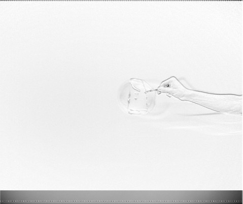
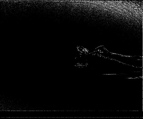
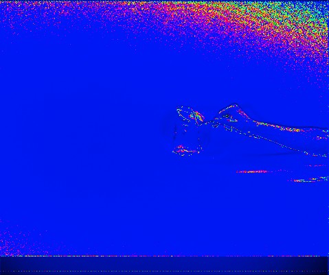
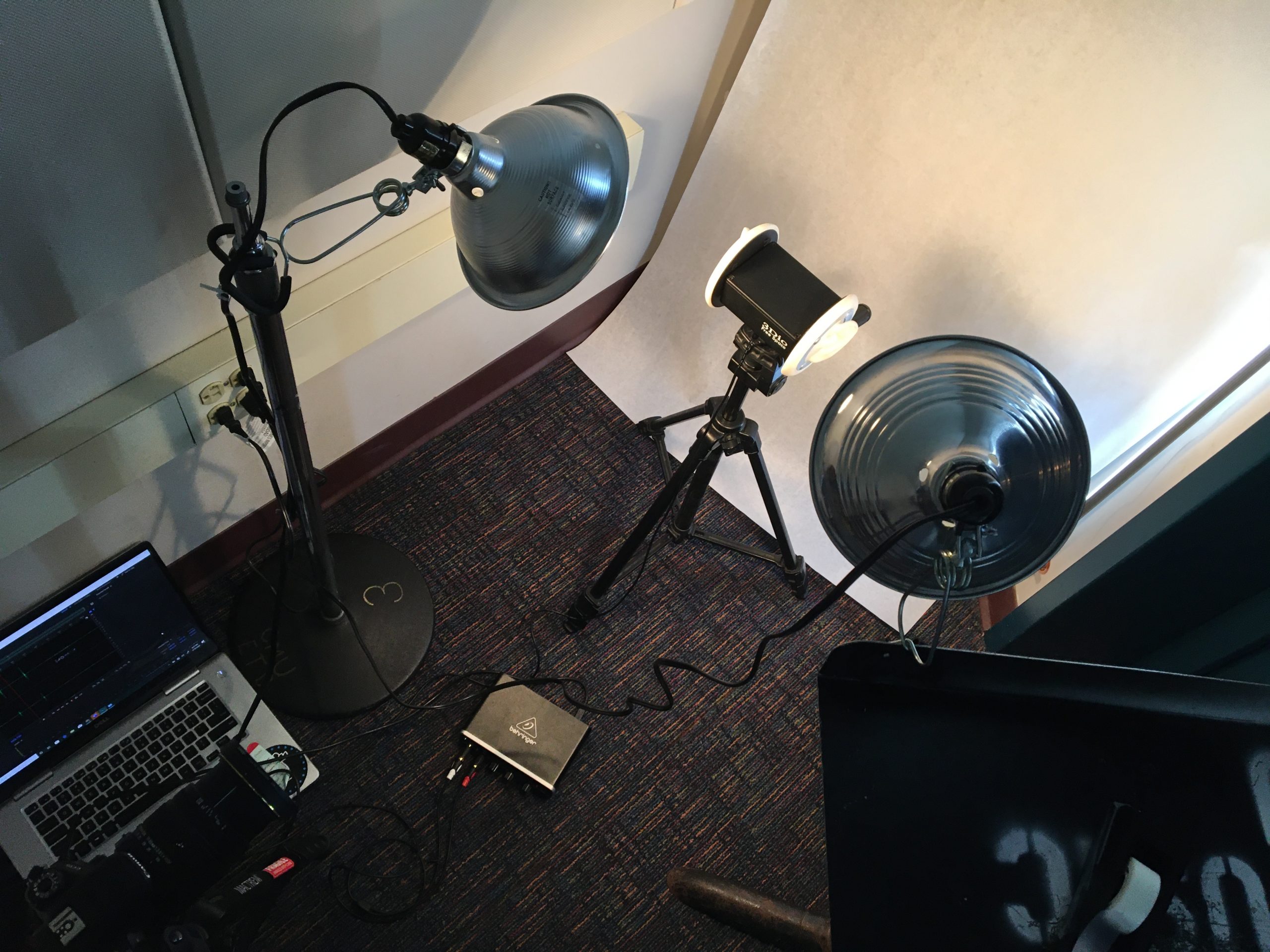
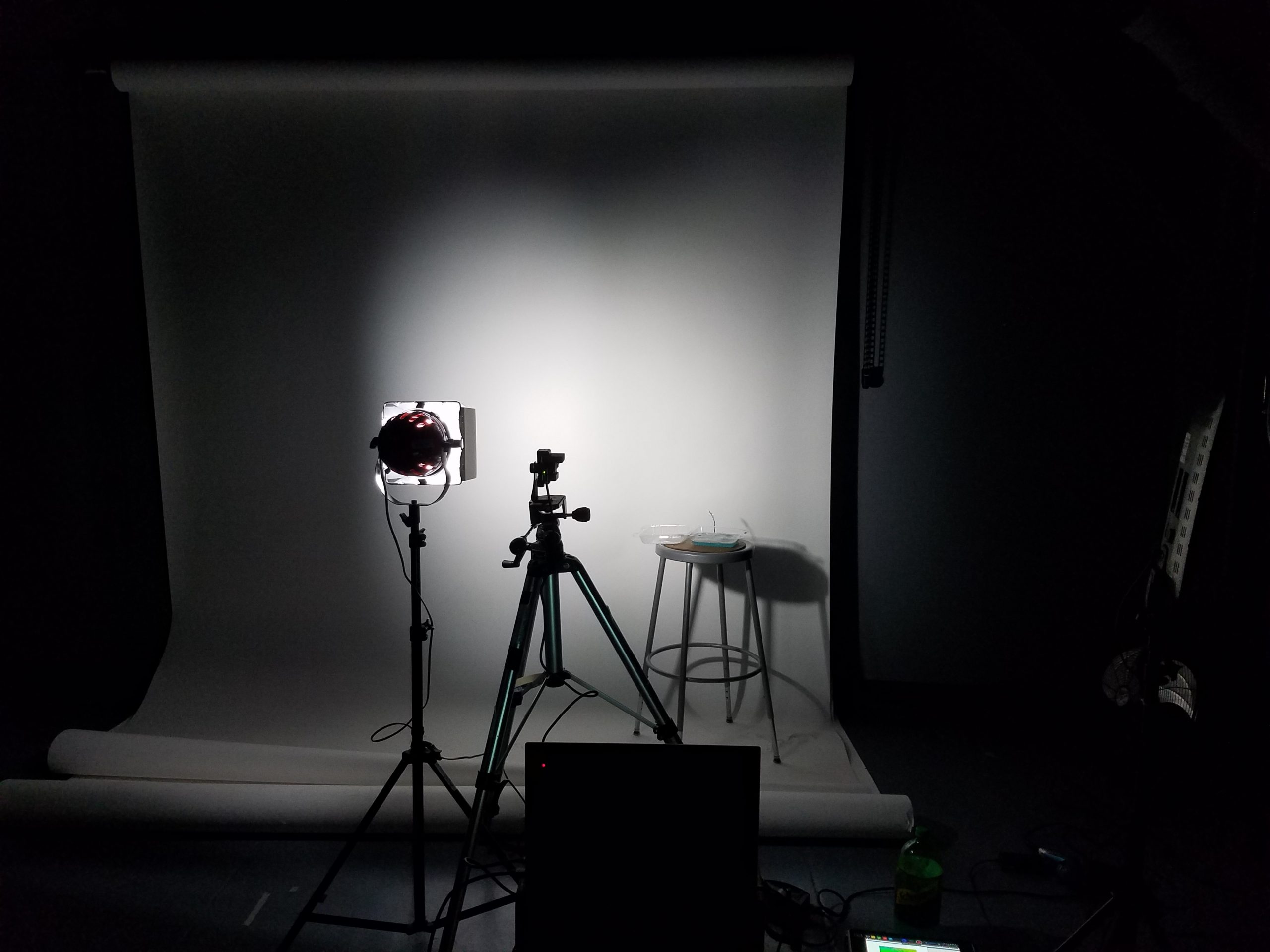
The photo setup I ended up using with the polarization camera, light with circular polarization filter, and my bubble juice.

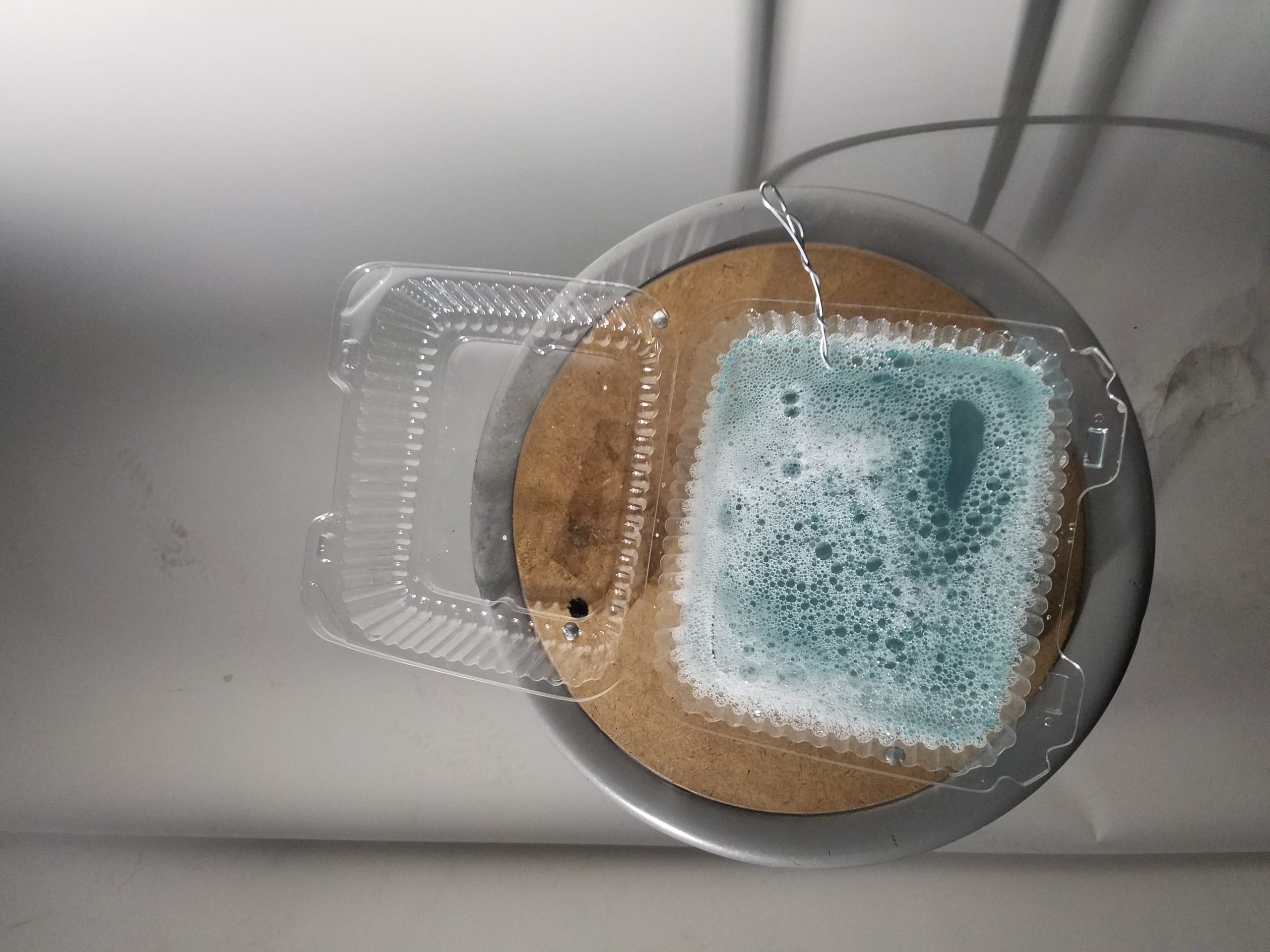
My bubble juice (made from dish soap, water, and some bubble stuff I bought online that’s pretty much just glycerin and baking powder)

I recorded a screen cap of the capture demo software running on my computer (I didn’t have enough time to actually play with the SDK for the camera). I viewed the camera output through a four plane image showing what each subpixel of the camera was capturing (90, 0, 45, and 135 degrees polarized).

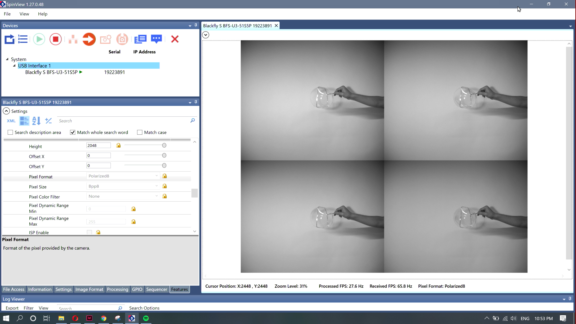
An image of my arm I captured from the screen recording.

I grabbed shots from that recording and then ran those shots through a Processing script I wrote that cut out each of the four planes and used them to generate an angle of polarization image (black and white image mapped to the direction the polarized light is pointing), degree of polarization image (black and white image showing how polarized the light is at any point), and a combined image (using the angle of polarization for the hue, and mapping the saturation and brightness to the degree of polarization)

degree of polarization image of my arm

angle of polarization image of my arm

combined image of my arm

It ended up being a little more challenging than I had anticipated to edit the images I had collected. If I was actually going to do this properly, I should have captured the footage with the SDK instead of screen recording the demo software, because I ended up with incredibly low resolution results. Also, I think the math I used to get the degree and angle of polarization was a little wacky because the images I produced looked pretty different from what I could see when I looked at the same conditions under the demo degree and angle presets (I captured the four channel raw data instead because it gave me the most freedom to construct different representations after the fact).

While I got some interesting results (I wasn’t at all expecting to see the strange outline patterns in the DoLP shots of the bubbles), the results were not as interesting or engaging as they maybe could have been. I think I was primarily limited by the amount of time I had to dedicate to this project. If I had had more time, I would have been able to explore more through more photographing sessions, experimenting with even more variations on lighting, and, most importantly, actually making use of the SDK to get the data as accurately as possible (I imagine there was a significant amount of data loss as images were compressed/resized going from the camera to screen output to recorded video to still image to the output of a Processing script, which could have been avoided by doing all of this in a single script making use of the camera SDK).

Small Spaces

Small Spaces is a survey of micro estates in the greater Pittsburgh area as an homage to Gordon Matta-Clark’s Fake Estates piece.

Through this project, I hoped to build on an existing typology defined by Gordon Matta-Clark when he highlighted the strange results of necessary and unnecessary tiny spaces in New York City. These spaces are interesting because they push the boundary between object and property, and their charm lies in their inability to hold substantial structure. It’s interesting that these plots even exist—one would assume some of the properties not owned by the government would be swallowed up into surrounding or nearby properties, but instead they have slipped through bureaucracy and zoning law. To begin, I worked from the WPRDC Parcels N’ At database and filtered estates using a max threshold a fifty square feet lot area. After picking through the data, I was left with eight properties. I then used D3.JS and an Observable Notebook to begin parsing data and finding the specific corner coordinates of these plots. At this point I reached the problem of representation. The original plan was to go to these sites and chalk out the boundaries, then photograph them. As I looked through the spaces, I realized many of them were larger than the lot area listed on the database. They were still small spaces, but large enough that the chalking approach would be awkward, coupled with some existing on grass plots, and one being a literal alley way. Frustrated, I went to the spaces and photographed them, but I felt that the photos failed to capture what makes these spaces so charming. Golan suggested taping outlines of these spaces on the floor of a room to show that they could all fit, which would definitely include some of the charm, but also lose all of the context. In an attempt to get past this block, I made a Google map site to show off these plots, hoping to strike inspiration from exploring them from above. Talking with Kyle led to a series of interesting concepts for how to treat these plots. One idea was to take a plot under my own care. What seemed to be a good fit was drone footage zooming out, so one can see these plots and their context. By the time I reached this conclusion, Pittsburgh had become a rainy gloom, so as a temporary stand in, I also made a video using Google Earth (as I was not able to get into Google Earth Cinema). Overall, I would call this project successful in capturing and exploring the data, but I have fallen short in representation. I hope to continue exploring how best to represent these spaces, and convey why I find them so fascinating using visual expression.

Website Map

0 South Aiken Street
0 Bayard Street
0 South Millvale Avenue

POST CRITIQUE FOLLOW UP:

As something Kyle and I discussed earlier, the question of what lots have the address of zero is an interesting one, given all of these spaces bear that address. I decided to make a small change to my filter script to find out the answer. Below is the result. Feel free to check out the Observable notebook where I filter this data.

An Exploration of Grima – Typology Project

A audio and video exploration into the popular phenomenon of grima (the creeps) which is sounds combined with textures that create repulsion and disgust unique to an individual.

My goal was to try to offer a more tangible definition to the phenomenon of grima to see if see if there can be some joy found in this shared disgust. Grima is related to misophonia, but it is a different experience. Not everyone experiences the same reaction to the same grima triggers; however, there are certain experiences which many people claim as a trigger which are the experiences documented in the video. So my goal was to make a video to document these grima inducing sensations and then also use the video to see who is affected by what sounds/textures.

This project was inspired by the trend of ASMR, research by Francis Fesmire, and several projects discussed in class about unspoken phenomenon that humans share such as Stacy Greene’s lipstick photography.

First, I collected a list of grima inducing sensations via social media, word of mouth, and online websites such as Reddit. I gathered all the materials and tried to group them into similar groups while recording (such as all fork videos). It was important to record these sounds as realistically as possible, so I used the binaural microphone in the recording studio to capture the best sound quality. Capturing texture was also important, but I struggled with lighting so the color correction is a little off.

I wanted to compile these sensations into a format that was easily shareable, since this bonding experience is important to the foundation of the project. Being able to use this as a fun game to test yourself or see others who share the same triggers I think is a unique experience that should be talked about more. Additionally, having it in such a format will make it easier to conduct further research on what triggers affect people in the future. This was the final result: An Exploration of Grima

The next steps of the project are still in the drafting phase. Using the video created, I wished to capture data from people watching the video. I did a couple of tests and created some mockups but they are not great yet. I tried to capture users heartbeats while watching the video to see if heartbeats increased while watching their own triggers; however, I ran into some technical issues using the stethoscope and translating that data into visuals.

HEARTBEAT MOCKUP:

Next, I tried having people watch the video and tap on a microphone whenever they disliked a noise. They were suppose to tap faster the more they did not like a noise. I took the data from 2 people and compiled it in a visual alongside the video.

PHYSICAL TAPPING MOCKUP:

There is definitely more to be improved on regarding lots of aspects of this project. Technically, I would like to improve lighting conditions, keep these conditions consistent, and highlight the textures of the objects better. I think the execution and format of the project worked well for my goal, but I think increasing the scale in both experiences and participants would be ideal. Lastly, I would love to solidify a participatory aspect to this project where people can record their data while watching the video, whether that be figuring out the heartbeat monitor, updating a counter of sensations disliked in real-time etc.