![[OLD FALL 2019] 15-104 • Introduction to Computing for Creative Practice](https://courses.ideate.cmu.edu/15-104/f2019/wp-content/uploads/2020/08/stop-banner.png)
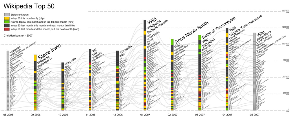
For this week’s Looking Outward on informational visualization, I looked at a chart developed by CMU professor Chris Harrison on Wikipedia article popularities over a 10-month span. Wikipedia has long been an infamous news source, but the influence it’s had on information gathering and research is undeniable. Thus, Professor Harrison saw Wikipedia as a way to better understand how users browsed the internet in 2006. As he described it, visualizing this information allowed us to get a better read on the internet’s “pulse” and what activity was trending at the time.
The graph is organized by month for every month from August 2006 to May 2007. Each month is organized into its top 50 search categories/results, sorted by descending order of frequency. In total, each of these bars represents all the traffic to Wikipedia for top 50 pages. For example, in September 2006, the top Wikipedia search result was “Steve Irwin” (the Crocodile Hunter sadly passed away during this month), while the 50th most popular result was “Podcasting” (huh!).
Prof Harrison’s information visualization does an excellent job utilizing design principles to convey meaning. He uses visual hierarchy, both through font size and bar size, to show which search results were prominent each month. He uses color to help differentiate “blips” from “mid-life,” “new,” and “end.” He also uses gray trend-lines to showcase which search results are common across months to show changes in activity. And finally, he utilizes a consistent scale with clear labels and axes to indicate the magnitude of the different search results. Overall, Prof Harrison’s information visualization display utilizes both design principles and data-management strategies that make it a compelling and power piece of information.
SOURCE:
http://www.chrisharrison.net/index.php/Visualizations/WikiTop50