Fallon Creech-LookingOutwards-07

Video portrays the public art piece in the context of its place (Calgary, Alberta)

Twenty-two thousand years ago, the Bow Glacier slowly carved its way east from the Rocky Mountains, briefly sculpting the land on which the city of Calgary sits upon today. Today, the glacier melts into Bow Pond before finding its way to Bow Lake, leaving waterfalls at many of these intersections. Drinking water in Calgary commonly originates from the melted ice of the glacier, so the glacier quite literally resides in the residents of the city.

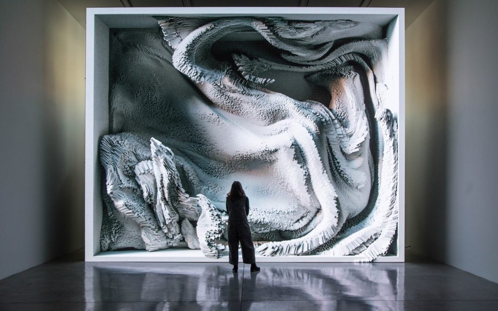
Collaborators Ben Rubin, Shah Selbe, and Dr. Jeffrey Kavanuagh curated a data visualization of the interrelationship between the Bow Glacier’s everchanging physical transformations and human activity in Calgary. The visualization connects the urban fabric with nature, suggesting that humans are never actually without it. 

To visually represent the “heartbeat” of the glacier, the collaborators wrote programs that produced a cardiotocograph, turning live seismic feed recorded at the glacier into crisp lines against a white background. 

This public piece is compelling because it demonstrates the record of data in a style that appears much less crisp and neat than is typically in data visualizations; it aims to suggest a correlation.

looking outwards – 07- ilona altman

edit (forgot to put this earlier) – I am using 1 of my grace days for this late submission.

The project “Melting Memories” by  Refik Anadol Studio created in 2017 is a beautiful series of artworks created from visualizing different EEG data collected. By representing the EEG data gives it a tactility that emphasizes the materiality of memory.  The EEG data collected was based off of the prompt to focus on recalling specific moments of childhood.

I think it is beautiful and admirable that the project has this large scale, and this sense of having an organic life of itself. It is interesting to me how the data was able to have such a sculptural form. This sculptural form makes me think about how all EEG data is collected from the flesh of our being, and that the integration of data into this piece allows one to understand this generated sculpture as part of one’s own personal world. 

I suppose the algorithms that generated this work broke down the EEG data into several characteristics like the amplitude of the wave, the duration of the spikes, and used these broken down variables in order to also cue the drawing for the moving image.

The artist’s sensibilities for simplicity and emotional impact are clear through the clean documentation for this piece in the photographs and the video of this work.

Capturing EEG data, process image
data visualization process
image of person standing in front of EEG data map

Danny Cho – LookingOutwards 7 – The Architecture of Radio

The Architecture of Radio _ Richard Vijgen 2015

The Architecture Radio shows the user a visualization of the network traffics of cell phone towers, wifi routers, navigation and observation satellites, and their signals. We currently live in a world where our visual experience is generated through invisible transfers that takes place without us understanding them.

I have no idea how it sees different networks and visualizes them. The only way that I can imagine is having a predetermined location and data about different sources of network signals and just showing them on the display. I wonder if this visualization process happens realtime or not.

This application is available on App Store for iPads and can be downloaded easily and brings to the user’s fingertips an entrance to a world unseen.

Nadia Susanto – Looking Outwards – 07

The Rhythm of Food is a visualization project led by creative director Moritz Stefaner in collaboration with Google News Lab. It takes 12 years of google search data and analyzes food seasonality. They developed a radial “year clock” chart to reveal season trends for specific food items like an apricot. The distance from the center shows the relative search interest and the different colors indicates a specific year. By having this, it allows an easier visualization of the year by year trends and rhythms.

Closer look into an example of a “clock” for apricots in which the years are shown through the various colors and the radius is clearly visible.
Video that demonstrates how the chart/”clock” should be read. It answers the question of how to go from simple bar charts to the radial chart.

In order to make this project, Moritz used many different softwares like ES2015, webpack, react, Material UI, and d3 v4. What I admire is that Moritz took something usually boring and difficult to read in chart data, but now it is very aesthetically pleasing and easy to understand.

If you want to learn more about this amazing project, click this link:

http://truth-and-beauty.net/projects/the-rhythm-of-food


William Su – Looking Outwards 07 – Data Visualization

http://fontmap.ideo.com/

This is a data visualization made by IDEO for mapping a wide variety of fonts. It’s really interesting to see a spectrum of typography laid out in front of you. From calligraphic and more abstract letters to more orderly and well recognized stuff like Roboto or Helvetica, I can imagine this being somewhat useful in helping designers or people working with type to visually see what kinds of fonts they can use. Whats also interesting to note is that the designers at IDEO used an AI that is trained on all kinds of fonts and used it to categorize them in this visualization. While it might be hard for humans to define something mundane like a letter “A”, an artificial intelligence can come up with its own definitions and generate an easy to understand visual for us.

Austin Garcia – Project 07 – Section C


sketch

/*		Austin Garcia
		Section C
		aegarcia@andrew.cmu.edu
		Project 07
*/
var pointsN = 100;

function setup() {
    createCanvas(480, 480);
}

function draw() {
    background(0);
    stroke(mouseX / 2, mouseY / 2, 0);
    noFill();

    //map to mouse
    strokeWeight(.5);
    push();
    var xMouse = mouseX;
    var yMouse = mouseY;
    translate(xMouse, yMouse);
    drawHypocycloid();
    pop();

  }

function drawHypocycloid() {
  //set variables
  var x;
  var y;
  var mX = map(mouseX, 0, width, 0, width / 2);
  var mY = map(mouseY, 0, height, 0, height / 2);

  //draw lines
  beginShape();
  for (var i = 0; i < pointsN; i++) {
      var m = map(i, 0, pointsN, 0 ,PI / 2);
      vx = (mX - mY) * cos(m) - mX * cos((mX - mY) * m);
      vy = (mX - mY) * sin(m) - mX * sin((mX - mY) * m);
      vertex(vx, vy);
  }
  endShape();
}

SooA Kim – Looking Outwards – 07

Image of theyrule.net

They Rule is a data visualization site where you are able to browse and identify the relationships of the US ruling class. It shows you the boards of the most powerful U.S. corporate companies, such as Google, Yahoo, and Amazon. If you click one of the board members in one of the companies, it will show the connections the individual has to different companies that he/she is involved in. Through the process, the data visualization expands from one to multiple connections of people and companies. It shows you how everything is connected to one another. This information design shows the structure of large corporations and distribution of power in U.S economy.

Website: Theyrule.net

Jacky’s LookingOutwards 07

a slient place — jonathan harris

Mix Media Photography by Jonathan Harris

For this art project, Jonathan’s initial idea was to make a project that incorporates ideas of ancient language. He thought that since drawings and photographies would be presented wordlessly, therefore viewers would be free to integrate their own interpretations.

Moreover,  Jonathan felt that the Internet has become a cacophony, where its promise of informational omniscience no longer feels plausible and desirable. Since he has always fascinated by the concept of “oracles” in shaping human thoughts. He referenced some of the ancient work in different countries — augury (in ancient Rome), the I Ching (in China), the Tarot (in Europe), and Rorschach tests (in western psychology). Jonathan wants to create ambiguity in the rational mind in order to unlock views subconscious, stimulating their own insights to arise.

Rachel Shin – LO 7

“Flight Patterns” by Aaron Koblin is a computation information visualization composed by a history of air traffic. Data was collected from FAA data, and it was put together and computed via Processing programming. Koblin used Adobe After Effects and Maya to put together this visual. I personally admired the cohesive nature of this visual. While it showed chaos of air traffic, it portrayed a simple, calm, and unified visual. I personally never considered air traffic like the way I thought about road traffic, so it was an interesting outlook for me to see Koblin’s creation. I suppose that the algorithms used were tracking the departure and destination location and creating curves with those points and using a specific color for each one to specify which curve represented which flight. The creator’s artistic sensibilities were manifested in portraying a unity of air traffic with a variety of curves and color.

Yoshi Torralva-Looking Outwards-07

The glasses are the product to visualize the data on air quality.
Pattern created through data provided by air quality sensors.

Air Transformed: Better with Data Society Commission is a project by Stefanie Posavec and Miriam Quick in 2015 to use data visualization techniques to communicate air quality. In this looking outwards post, I will be focusing on the aspect of this project called Seeing Air. These are physical acetate glasses that people wear to visualize large particles, small particles, and nitrogen dioxide in Sheffield, UK. These elements were assigned specific icons that are etched onto a layer of the lense. Data is provided through air quality sensors owned by the Sheffield City Council. Stefanie Posavec and Miriam Quick most likely created an algorithm that interprets the data and assigns the scale in which the patterned icons would be set. What I admire is how this data visualization piece is how immersive it is. One can view the designs when not worn but truly experience what it’s like to see out of metaphorical air quality. People may not understand how severe air quality is. Through visualizing this data, people can see the world through a lens that makes people aware of the importance of taking action on climate change.