Fallon Creech-LookingOutwards-05

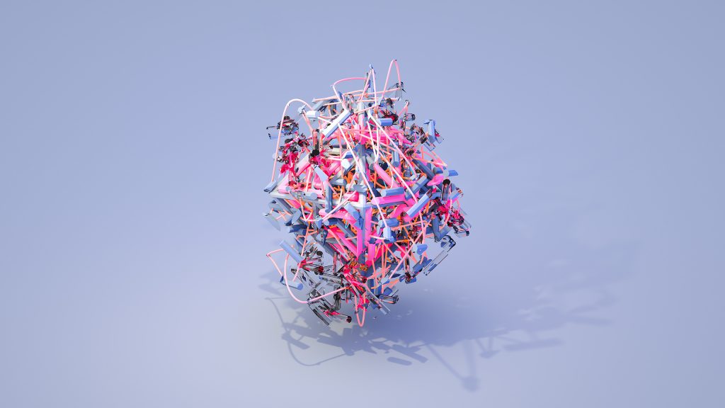
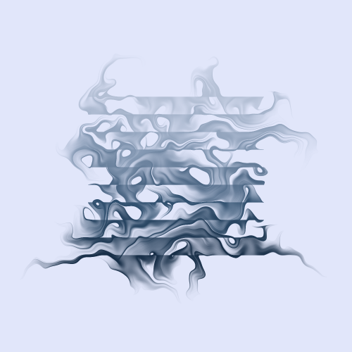
“genesis4321” belongs to Pedersen’s Generative Art collection.

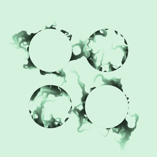
Generative artist Thomas Lin Pedersen explores the quality and beauty of dynamic systems. He writes about the process of designing a system that is familiar and the positive surprise that unfolds as he uncovers new information in highly complex systems. He believes “the process of generative art is dual,” meaning both system development and visualization method are required.

Pedersen uses R to program his generative art and has even developed his own tools that fit into his process, including ggplot2, ggforce, ambient, particles, tidygraph, and ggraph. Though some generative artists choose to share their code with internet users in order to transparently showcase their workflows, Pedersen believes in keeping his code unrevealed; to him, the code is as important as the resulting visualization, and every artist has their own style and method.
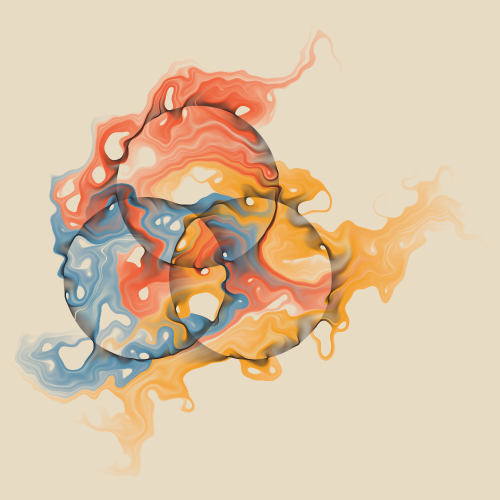
“genesis4653” belongs to Pedersen’s Generative Art collection.
“genesis39672” belongs to Pedersen’s Generative Art collection.

Danny Cho – LookingOutwards-5

Lungs in Silico 2019 – Alexey Kashpersky

Alexey Kashpersky animated the transaction process different components of our respiratory system. As I was watching this animation, though I knew that this is not a literal representation of how the system works, I was greatly mesmerized. This beautiful abstraction of how our body works allows us to broaden our perspective towards it and remind us the wonders of each of us being some kind of a universe.

I think Alexey Kashpersky did a great job of not visually articulating the system, but also doing it in such way that grabs the viewers and takes them on an immersive tour.

It seems like he used a type of 3D rendering tool such as Cinema 4D, which is a very desirable software that I am really looking forward to learning. It really amazes me how much the software can do.

Zee Salman Looking Outwards 05


https://www.artstation.com/artwork/k4BP6l

Hirokazu Yokohara

What I admire about this project is how hyperrealistic it looks. It also has this fantasy vibe that i get when I look at it, The skull is intruging and there are different parts of this project that makes it really intricate asw a whole. There are different vines crossing the screen and the rusty metal look is encorporated all over the skull and the body. I dont know the exact algorithms to create piece like this but it definetly tooks some for loops and some basic adrawings in the draw function of simple shapes that get more and more complicated. This piece was made by an artist named Yokohara in Tokyo, I would like to see more of his/ her pieces because they are pretty facinating and I could possibly draw inspiration

Claire Yoon -Looking Outwards 05 – 3D Computer Graphics

Model after the color is fully applied
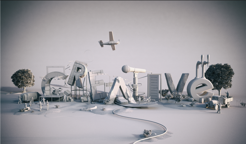
Model before the color is applied

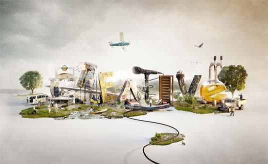
From the start the concept of this art piece by Jan Reeh really intrigued me because of the mix of objects and objects shaped as letters. This image explains the word “creative” in a literal way. Close up there are objects surrounding the each letter and people interacting it and seems to tell a story.

Watching the video of the color helps me further understand the author’s intention of explaining the word in a literal way. As the colors slowly fills the page it mimics the way one would read a word and gives “life” to the word as the objects surrounding it move as well. This work was created was made in 3ds max and rendered in Vray.

William Su – Looking Outwards – 05

Justin Maller – Australian Digital Artist based in LA.

Justin Maller’s body of work is something i’ve always admired since high school. He is most well known for creating intricate digital 3d pieces of art that just look stunning and sophisticated in any setting like a wallpaper or profile picture. In short, his stuff just looks cool as hell. One of his projects, “Facets”, was a yearlong body of work where he makes one of these pieces of art everyday. I’m not exactly sure how he’s able to make such intricate pieces of art but I know he goes back in and touches them up in photoshop or other photo editing tools to give it a bit more flare. His work is very diverse but also very uniform as well. Some of his pieces are for products, athletes, or companies like Microsoft, LG, Steph Curry, and Nike. Others might have a nature theme or a twisted but awesome view of reality.

Fanjie Jin – Looking Outwards – 05

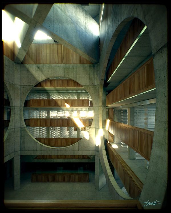
Phillips Exeter Academy Library Vray Render by Alex Roman

This image is rendered by Vray which is a computer based rendering software. The level of details and nuances rendered in this picture has made it just like a realistic photo. Alex Roman is really interested in using computer based render software to create some atmosphere in a building that we can’t really perceive by eyes in the real world. For example in this image, the lighting beam has casted a really dramatic light to the corner of the building and yet in the real world, this type of lighting condition can never really occurs. I really admire him in that he has used the computer based render software to portrait and visualize some dramatic and illusional lighting quality. In the rendered image, the boundary between real and unreal is blurred., I am incredibly impressed by the realistic attributes of this piece and as an architecture student, I wish I can create some renders as astonishing as this.

CJ Walsh – Looking Outwards 05 – 3D Computer Graphics

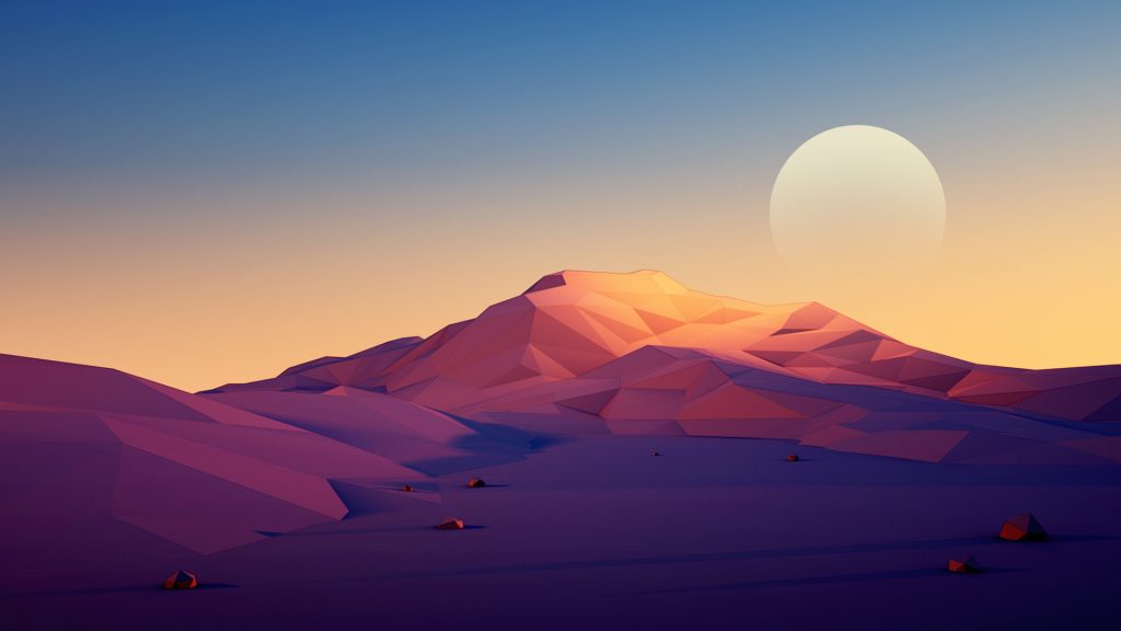
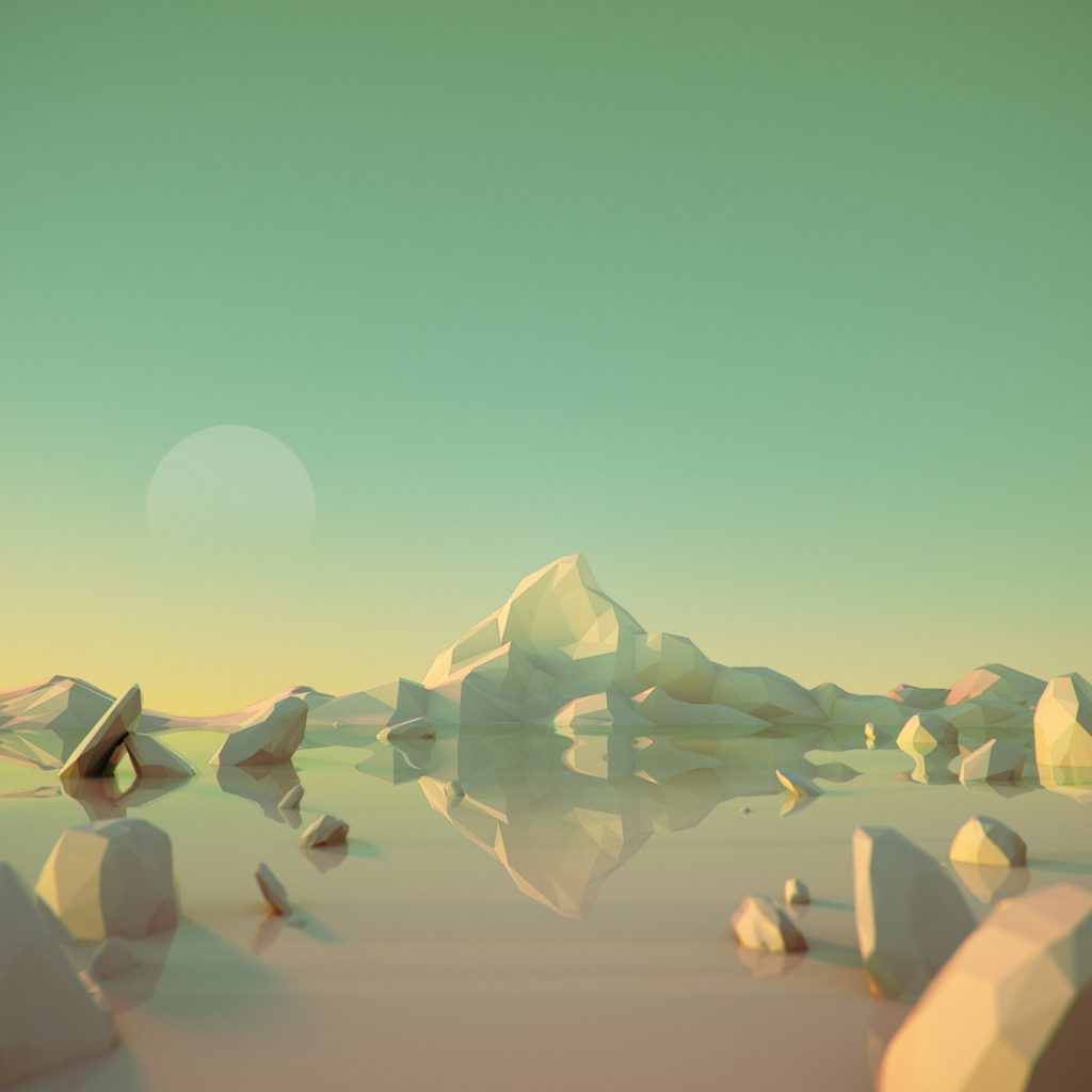
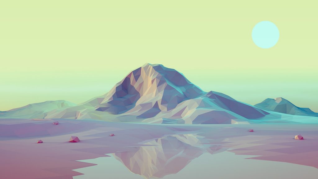
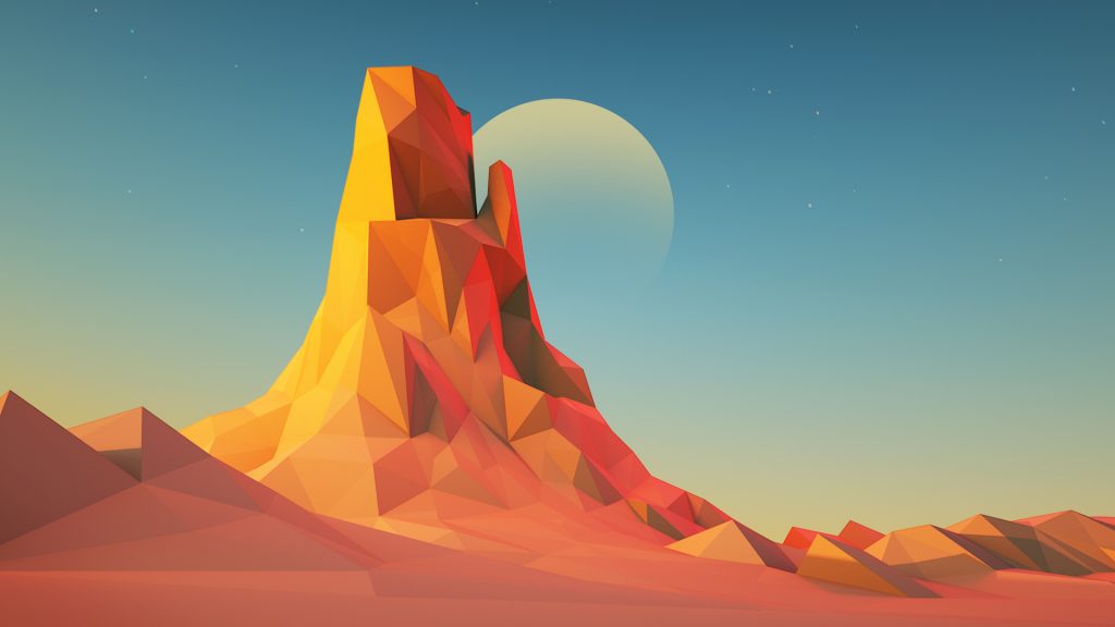
For this week’s Looking Outwards I decided to focus on a series of works by Mark Kirkpatrick, a digital artist and designer. What really caught my attention in these pieces was the cohesion of the color palettes. Each piece has a really unique and calming vibe that comes from the combination of the scenery and the color palette. In creating this series of works, he stated that he enjoyed the idea of solitude within the image of the barren landscape.

This series of works is produced using Cinema4D and ZBrush, and then was rendered in Octance Render. He also goes in and adds details after rendering using Photoshop.

I think that an interesting part of his work is that almost all of his professional design and artistic knowledge is self-taught. He went to school for business so he received no formal training with these mediums and practices. He states that as he continues to gain knowledge within these programs, he can create more interesting and complicated works. His practice seems to work well in this environment, the process of experimenting with the software and rendering enables him to create images that have a sense of being both planned and unplanned.

Website: https://mkcreative.co/projects

Interview: https://create.adobe.com/2015/9/15/interview_with_adobe_stock_contributor_mark_kirkpatrick.html?scid=social52542336&adbid=644189459215347712&adbpl=tw&adbpr=282130196

Angela Lee – Looking Outwards – 05

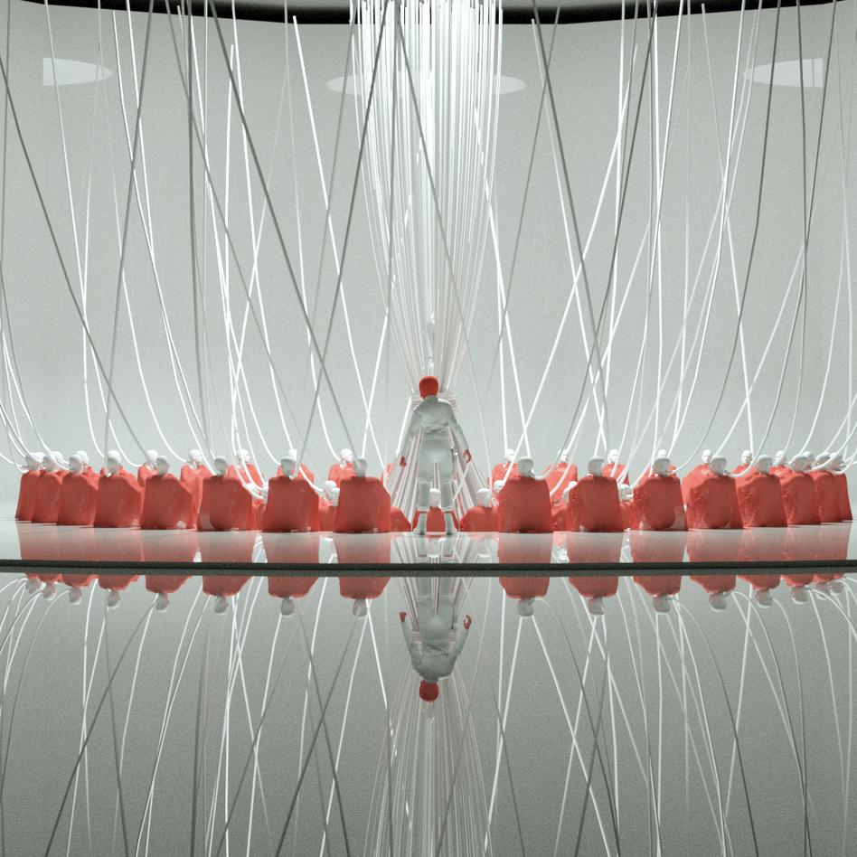
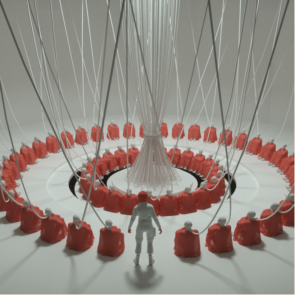
A part of his Ghost in the Shell inspired 3D artwork, can be found: https://www.zolloc.com/gits
Another angle of the same subject inspired by Ghost in the Shell. Again, found this at: https://www.zolloc.com/gits

His images were unable to be embedded, so I screenshotted them and pasted the link below.

I have always been intrigued by Hayden Zezula, @zolloc on Instagram, whose work often warps humanoid figures with 3D abstract objects. On his portfolio, I particularly enjoyed his work inspired by the famous manga “Ghost in the Shell.” In this project, I admire his use of a minimal color palette—every hue he uses is very intentional and creates a thoughtful contrast against other objects. Additionally, his humanoid forms are recognizable and relatable as a human, but also not specific enough to alienate viewers. In general, I think that his graphic style is very thought-provoking and allows viewers to use their imagination to build a story around his work. While I’m not sure about the algorithms used to generate his work, I think that he must have used some centering functions and loops to create the circular formation of the humanoids.

Julia Nishizaki – Looking Outwards – 05

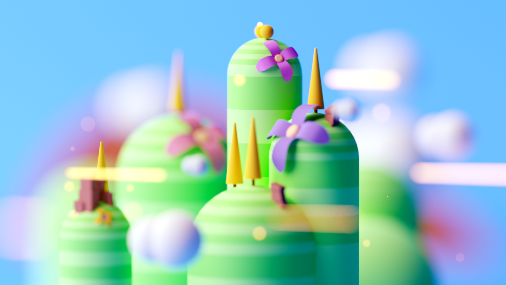
Gustavo Henrique – from his series, “Scenes #1,” some scenes he did for fun

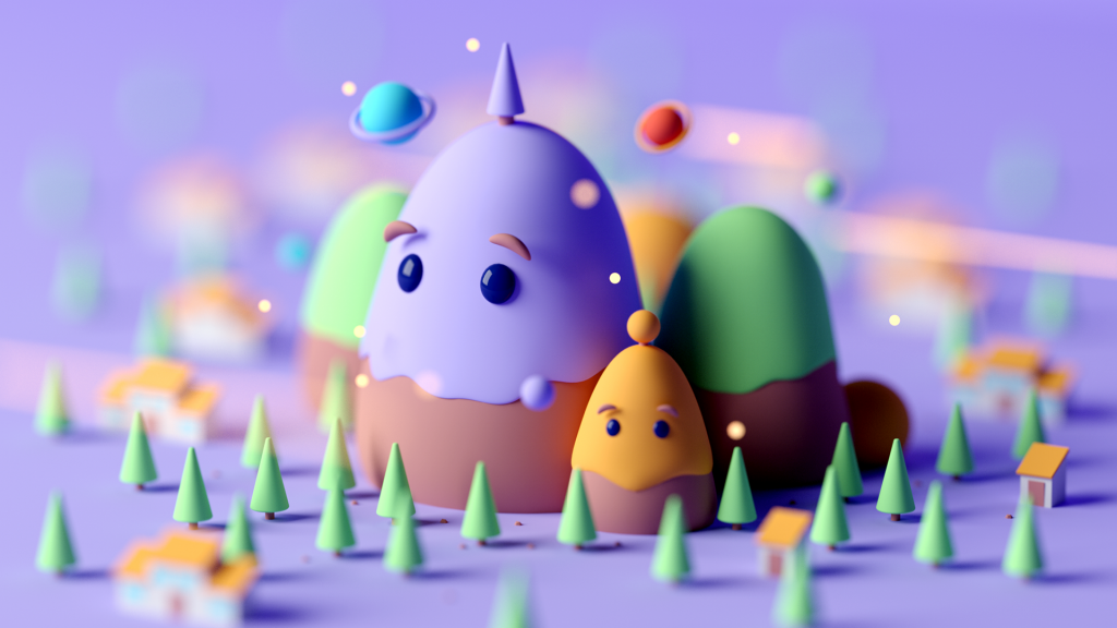
The artist I chose to write about this week is Gustavo Henrique, a 3D artist and freelancer from Brazil. I really admire not only his use of color and how he frames his work, but also the playfulness and movement he captures. Through his use of a matte finish, his forms come off as organic, friendly, and fluffy, almost as if you could make them out of clay or reach into the illustration to squish them. Moreover, by blurring the edges and forms that aren’t the main focus, his creations look like they’re miniatures, as if you took a picture of them using a high aperture on your camera. Henrique uses Cinema 4D and Octane Render to create his illustrations.

Gustavo Henrique – another illustraion from his series, “Scenes #1,” some scenes he did for fun

Jacky’s LookingOutwards 05

Virtual Reality and Architecture

The Dawn of the Virtual Reality in Architecture | Gunita Kulikovska | TEDxRiga

With the advancement of technology, the field of architecture has revolutionized and buildings no longer need to be physically built in order for architects to experience the space. With the help of virtual reality, architects are able to design and feel the space in real time in three dimensional virtual world.

In the Ted Talk, Gunita Kulikovska shared her experience as well as he research in how the virtual reality technologies can be used in the fields of architecture. Coherently involved in both architecture and fostering technology startups, Gunita Kulikovska believes that it is an revolutionary mission. She envisions to break the constrains of knowledge and limits of communication between client and architect, with the help of straightforward visual support from virtual reality.