Ghalya Alsanea – LO – 12

Project 1: Turning biometric data into art by The Mill+

The Lush Spa Experiment was designed to capture biometric data. This data drove a series of unique and meditative visualisations, which mirror the multisensory experiences of a Lush Spa treatment.

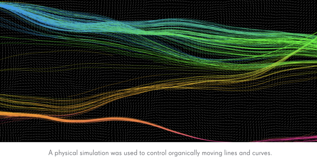
The Mill+ joined forces with Lush to create a 2-minute film created via biometric data visualization – the aim being to visualize the physical response someone has to a Lush spa treatment. Essentially, turning biometric data into art.

The film is an artistic rendition of the body’s response to the spa treatment.

Mill+ Creative Director Carl Addy comments, “The data captured was fascinating. It shows a clear correlation between the treatment and the subject’s biometric response. You can actually see the moments when a sound or touch elicited a shift in brain wave which then triggers a reaction in breath and heart rate.”

Find more here(credits) & here(behind the scenes).

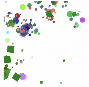
PROJECT 2: Visualization Techniques to Calm Your Anxious Mind by Barbara Davidson

This post shows 7 visualization techniques to help ease your anxiety. For my final project I am looking at how visual queues can trigger emotional calming responses, and I was using this project as a study point. Here are some examples:

The stop sign technique is best used when you have an unwanted thought.
This technique is best used when you feel overwhelmed by your chattering mind .

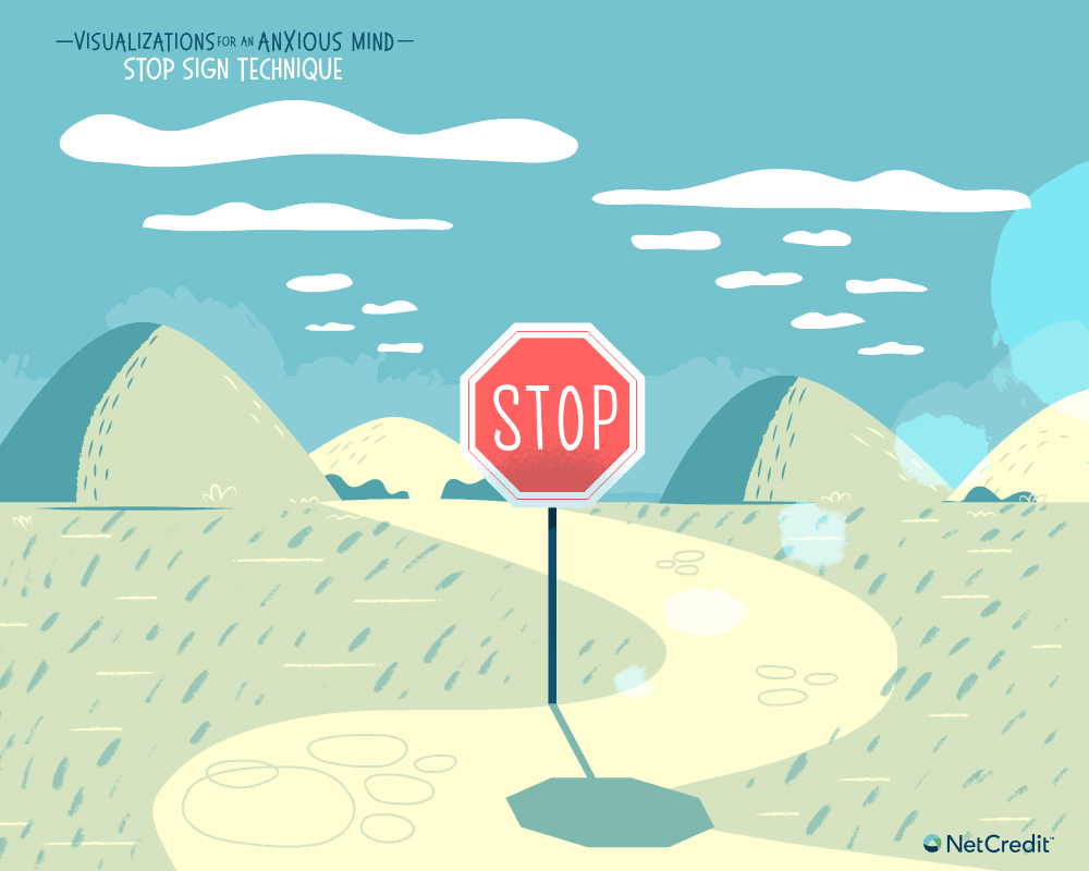
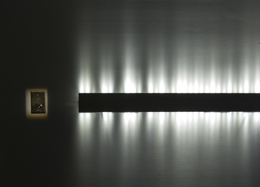
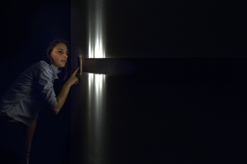
I love the how coherent and consistent the graphics are. Something that I wouldn’t necessary do is put people in the visualization, unless they’re vague enough figures, because I worry when something is as personal as your mind, you wouldn’t want someone to feel like they can’t relate to the visualization because “it doesn’t look like them”.

Read more here.

Concolusions..

When comparing the two, I admire both the visual coherency that exists within each project. The first one is interesting because it is a visualization the takes inputs and does not necessarily have a specific output in mind. The second one is the opposite in the sense that it has a highly specific output it is trying to achieve through the visualization. For my final project, I want to find a way to do both and play with the two balances based on what’s needed.

Nawon Choi— Looking Outward 12

“Strength” by Field for Deutsche Bank

I was really inspired by a studio called Field. They are a creative studio that creates immersive artistic experiences using technology. In particular, a project called “Evolving Environments” was very interesting to me. I really admire the beautiful motion graphics combined with and auditory component that creates a truly immersive and captivating experience. They used real-time code that reflects something happening in nature.

Light and motion graphics for a project for the car company Infinity

I was also inspired by the works of a studio called Nand. For this project, they tried to capture the experience of driving through data, light, and motion. I love the idea of taking data points such as speed, acceleration, heart rate, etc to incorporate into the visualization. I also like how they tried to evoke or emulate emotion through an abstract visualization.

Both projects take data points from “real life” and abstract them in a way to visualize motion and emotion. I really like this idea of creating computational art by incorporating data.

Julia Nishizaki – Looking Outwards – 12

I am taking my second late day for this looking outwards post. Because I’m considering visualizing type as a part of my project, the two works I chose to look at explore type, one through sound, and the other through visuals.

A demonstration of typatone.com, an online instrument

The first work is typatone.com, by Lullatone and Jono Brandel, the same individuals who created patatap.com. I really enjoyed the visuals of patatap.com, but I like typatone’s direct connection between the user’s thoughts and what they see. It gives the sounds more meaning, and makes the interaction more personal.

“A Flowering Theory,” a visual depiction of the grammar structure of Darwin’s last lines in “On the Origin of Species”

The other work I decided to look at is called “A Flowering Theory,” by Stefanie Posavec and Abbie Stephens, and commissioned by Protein as a part of “Channel 4 Random Acts.” I was intrigued by this work, because rather than associate a sound or a visual with a single letter, Posavec analyzed the text’s grammatical structure, and the Stephens used that data to construct the growing plants and forms. I am interested in combining typatone.com’s more experimental approach and interactions, with visuals of flowers or smog that grow or change, like Posavec and Stephen’s interpretations.

Danny Cho – LookingOutwards 12

I looked at two people’s projects, Hannah Cai (2018 Fall) and Supawat Vitoorapakorn (2017 Fall). Hannah created an experience where you can select stars and connect them with different shapes, while Supawat created an environment to test out the process of evolution.

Above is Supawat’s evolution simulation

Above is Hannah’s interactive constellation

What I find very interesting in these two people’s projects is that they took completely different routes about what they want to convey. Hannah created a visually pleasing interaction while Supawat created a highly data-based visualization of constantly morphing information.

I wonder if I can take the middle ground of balance between these two. 

Crystal Xue-LookingOutwards-12

For my final project, I want to do sound visualization. And here are two projects that I found particularly interesting.

This first project is called WAVES is created by students from OPENLIGHT: the creative lab of Intelligent Lighting Institute of the TU Eindhoven. Using a “sound camera”, a device with 1024 microphones which can very precisely locate a sound in space, students place it in an industrial place and visualized waves. People can interact with the device by making sounds, whistles, stomping their feet etc.

The next project is VOICE ARRAY. by Rafael Lozano-Hemmer. The LED light blinking gives a visual representation of the recorded sound

Rafael Lozano-Hemmer, “Voice Array, Subsculpture 13”, 2011. “Recorders”, Museum of Contemporary Art, Sydney, 2011. Photo by: Antimodular Research

Both of them showed different techniques and interactions that might happen in sound visualization. And I hope my project can have similar achievement like them.

Cathy Dong-Looking Outwards-12

de stijl drawing
de stijl drawing

I am inspired by de stijl movement. It’s a Dutch art movement founded in 1917. It emphasizes on pure abstraction and universality through a reduction to essentials of form, vertical and horizontal compositions, and color, black, white, and primary colors. The name of De Stijl comes from critic Theo Van Doesburg, and the most well-know artists are Piet Mondrian, Bart van der Leck and Vilmos Huszar. Architects such as Gerrit Rietveld, Robert van’t Hoof and JJP Oud applies this art concept to their architectural design. The projects that I admire the most are Rietveld Schroder House by Rietveld, and Eames House by Charles and Ray Eames.

Angela Lee – Looking Outwards – 12

I am using 1 of my grace days for this late submission.

For my final project proposal, I’m planning to make a short animation illustrating rising water levels of a personified earth. One project that inspired my idea is 🔥👶🔥 by Joona Leppanen. This gif shows a still figure being partially masked by some smoke. I was particularly inspired by the different textures that Leppanen used in her illustration, but also the naturalness of that smoke. Using simple stroke and fill, she created a convincing air-like substance that communicates her message.

🔥👶🔥 by Joona Leppanen.

The second piece I’d like to talk about is a gif by Yukai Du. Using similar colors as Leppanen (which is coincidental), she’s able to capture water ripples in a simple yet elegant way. I am particularly inspired by how she represents depth through decreasing sizes of the eyes and the ripples. Her work has also made me consider putting material objects in the rising sea levels for my animation and how they can contribute to the story.

A gif from Yukai Du’s website: https://www.yukaidu.com/gifs

Looking Outwards 12 – Austin Garcia – Group C

In regards to my Final Project, I have found two inspirations for the program I would like to make. I have decided I want to try my hand at creating an “avoid ’em-up videogame similar to the indie game Puss (link) in which a cat avatar follows the mouse as you attempt to avoid colliding into the walls of the mazes you are navigating. Puss also has very psychedelic style and colors, part of which I would also be interested in experimenting with in order to make the game more visually complex.

The second inspiration I have is a throwback to our first assignment with Mondrian. For this project though, I am more interested in something like Mondrian’s “Broadway Boogie-Woogie

Broadway Boogie-Woogie | by Piet Mondrian

I like the implied movement and chaos created by the roadways of yellow and the larger interrupting squares. I feel like this aesthetic and sensibility for design could work well for the creation of a visually interesting and distorted puzzle game.

CJ Walsh – Looking Outwards 12 – Precedent Projects

The two artists I have chosen to highlight for this Looking Outwards are Roz Dimon and Claudia Hart. Both are digital artists with work mainly in the areas of computation and graphic design. I found that their work relates well to the pieces that I want to create through a series of programs in my final project, which will explore collage, prints, and patterns.

Frog Pledge by Roz Dimon

I found the collage element of this project to be really intriguing. Dimon takes imagery from archive collections and uses custom programming to develop digital collaged elements that tell the story of the collections she has pulled from. In addition to being visual, these pieces also have audio and motion elements. I think as a standalone image and with the full experience the project is powerful and really fun.

Dimon’s work: https://www.rozdimon.com/

Augmented Reality Wallpaper by Claudi Hart

I thought this project was also very close to my goals for the final project. I really enjoy the combination of images and textures to create really dynamic prints. The other fun thing about this project was that it utilized augmented reality to create a user experience of viewing the wallpapers. As, with Dimon’s work, I really appreciate the fact that this project is a visual product and an experience.

Hart’s Work: https://claudiahart.com/

Overall I feel really inspired by these two pieces because of the extended element of designing an experience. It makes me consider what I could do with the programs that I generate to make them into more of an experienced piece of artwork. Both artists have a very distinct style and method, but at the heart the are both combining imagery and objects to create unique visual patterns and compositions.

Xu Xu – Looking Outwards – 12

I am using 1 of my grace days for this late submission.

For this looking outwards, I found two interactive art projects that are relevant to the project I have in mind: Hershman Leeson’s Lorna in 1984 and John Lennon’s The Bermuda Tapes in 2015. The first project is the first artwork that used laserdisc technology. Using this medium to explore the possibilities and extent of interactiveness, the artist enables users to explore and intervene in the world of an agoraphobic woman named Lorna. Lorna’s actions can be controlled using a remote control, and three outcomes are possible: Lorna remains trapped by her apartment and her insecurities; she commits suicide; or she shoots the television instead, in a sense ’murdering’ the medium. The second project is an interactive Album App that tells the story of John Lennon’s journey, sailing through a mid-Atlantic storm to Bermuda in June 1980. Through the screen of an iPad or iPhone, you are able to interact with the narrative, moving, swiping and tilting, to give the story a sense of personal touch. 

Both of these projects relate to the final project I have in mind, which is an interactive game composed of choices that eventually leads to an ending. I chose the first project to discuss it because it is one of the earliest works of interactive game/film, with a really similar game structure that makes the players feel relatable (because they are the ones making the choices). The second one is graphically more developed. However, I think it has more room to grow in terms of interactivity. Players can only interact with certain things in the story, but don’t necessarily have the ability to change the story.

LORNA 1984: https://zkm.de/en/artwork/lorna

THE BERMUDA TAPES 2015: https://www.design-io.com/projects/lennonbermudatapes