![[OLD FALL 2019] 15-104 • Introduction to Computing for Creative Practice](https://courses.ideate.cmu.edu/15-104/f2019/wp-content/uploads/2020/08/stop-banner.png)
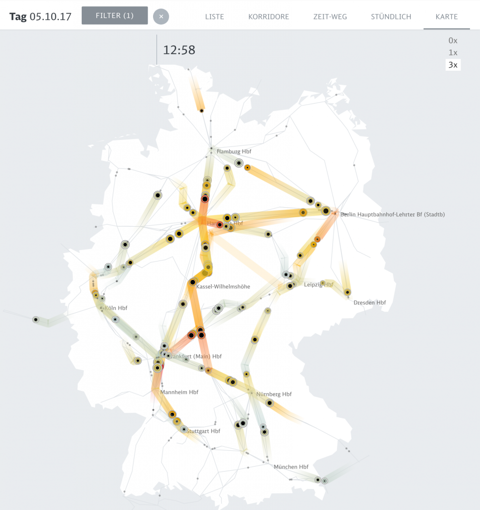
The computational information visualization that I looked at is “Peak Spotting.” This is a means to combine machine learning and visual analytics methods to help manage the passenger loads on trains in Germany. It has a futuristic elements in the web application that integrates millions of datapoints over 100 days in the future to make predictions, and custom developed tools such as animated maps, path-time-diagrams, and stacked histograms create a vast range of types of data. The clearly color-coded visualizations point out what the critical bottlenecks are within the traffic difficulties. I think that the overall aesthetics is very helpful for understanding the data because it is subtle and readable with highly effective key colors. I can immediately know what kind of data I am looking at, and what time period the data are relevant to. Navigation also gives a good guidance.