![[OLD FALL 2019] 15-104 • Introduction to Computing for Creative Practice](https://courses.ideate.cmu.edu/15-104/f2019/wp-content/uploads/2020/08/stop-banner.png)
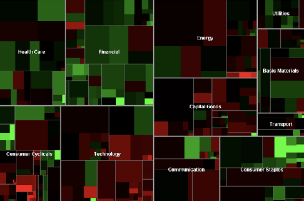
Project 1: The Map is divided into rectangular tiles that represent publicly traded companies. The area of a rectangle corresponds to the market capitalization of the company, and the color tells you how the stock price has changed since the previous market close. Unlike a traditional treemap, the Map of the Market introduced a new algorithm designed to create tiles that were close to square.
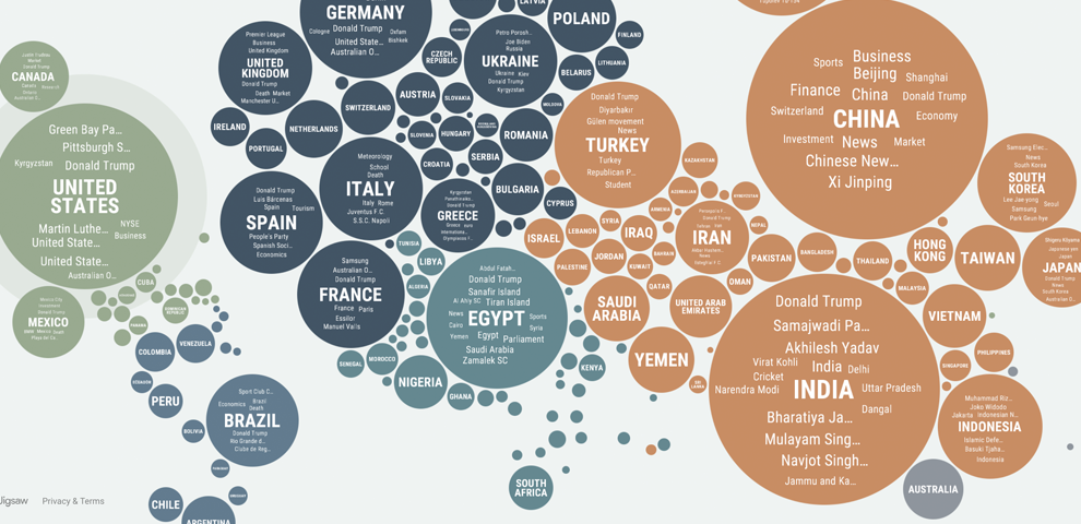
Project 2: Based on Google News data and state-of-the-art translation technology, the site identifies and displays which subjects are disproportionately covered in the news in each country. Users can explore the relative coverage of any particular subject across the globe. They also can see a view that emphasizes exactly the news that is not being published widely in their own country.
Comparisons: I admire the projects because both of them represent data in a visual and artistic form. However, the data they took is different, which results in different analysis and forms of expressions. They might overlook the progression of data over time and reasons behind layouts of the data.