Looking Outwards 11–Section A

I read the article “Women in Media Arts: Does AI think like a (white) man?” by Anna Grubauer. AI is becoming more and more prevalent in our lives. However, this article brings up the societal issue that AI algorithms may be biased even though computers are supposedly supposed to be objective and fact-based. One explanation for this bias discussed could be because algorithms are only as unbiased as the coders who them. But, due to the lack of representation of women as programmers, the algorithms might be biased.

This is important because, as AI starts to be used more and more, we start to trust it with serious matters. In some cases, we cannot afford minor biases, such as when AI is used in predictive studies so AI is used to determine who is hired, offered loans, and make other important decisions (as brought up in the Gender Shades video in the article). AI is starting to be used in serious matters that have the ability to drastically impact people’s lives. If the AI is biased, it could have negative consequences on real people’s lives.

URL:
https://ars.electronica.art/aeblog/en/2020/04/10/women-in-media-arts-ai/

Looking Outwards 09- Section A

I was inspired by the work of Mouna Andraos and Melissa Mongiat. I specifically was intrigued by the Musical Swings project. I like how it is interactive and different notes are played based on the swing. I have always loved swings and so I think it would be so fun to go to one of these swings. Not only are the swings fun but they create a lively atmosphere for the surrounding area.

Additionally, I really like how the swings create a musical composition when they are moving together. It is cool how, when people swing in sync, more complex melodies are triggered; so when people are swinging together, the music sounds nicer.

As mentioned before, there are two creators. Andraos recieved a Master’s degree from New York University’s Interactive Telecommunications Program (ITP) and a Bachelor degree from Concordia University. Mongiat has a Master’s degree in Creative Practice for Narrative Environments from Central Saint Martins College of Art and Design, London, UK.

Both women now work at Daily tous les jours where they make these interactive art pieces.

Here is the link to their work:

Mouna Andraos and Melissa Mongiat, 2011, Musical Swings.

Looking Outwards-08-SectionA

I liked Mike Tucker’s work. He spoke at the 2019 EYEO conference. Tucker is an Interactive Director at Magic Leap. Magic Leap is “focused on creating the future of Spatial Computing.” He is based in Los Angeles, California which is really cool because I am from California.

I really liked how he his pieces look magical. I love his use of color and how his pieces are interactive. For example, in one of his pieces at a science museum, visitors could draw something on their phone app and it would become part of the exhibit. Even with using visitors’ drawings, the exhibit was stunning because how his technology would integrate their drawings; this makes his art engaging for viewers but is also cool how he can still tie all the drawings together. Additionally, I love how all his works revolve around perception. Perception is interesting because everything we see and know is just our perception of something. I like how his art really gives a magical experience and plays on our perception.

His talk was engaging because he showed all the pieces he made. Seeing demos opposed to just photos, really adds to the speech because videos help us understand his pieces for ourselves instead of just listening to him.

Here is the link to his website: https://mike-tucker.com/

Here is the video:

The video of Mike Tucker’s talk.

Looking Outwards-07- Section A

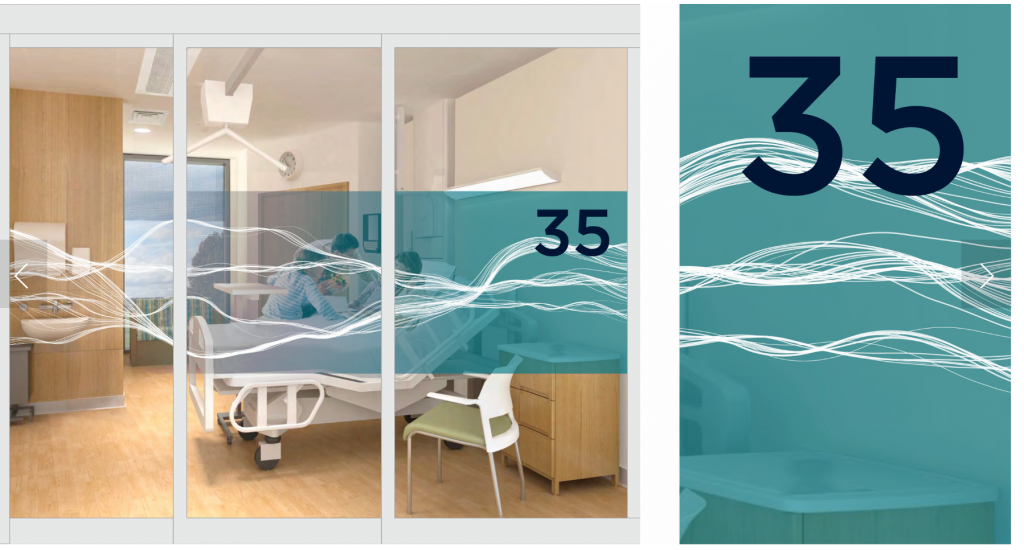
I was inspired by a piece by Stefanie Posavec that was made for the Papworth Hospital Inpateints Ward. Specifically, I thought the her “Flows” piece was super pretty. I liked the piece because of how she connected the hospital’s specialty on that floor (relating to blood and vessel) to a calming element found in nature. Not only did she include all these connections behind why she chose the design she did, I was inspired by how the piece was designed to calm patients who had just come out of surgery. I think this is really important because hospitals can be a scary place and it’s cool how she was able to create something really nice from data. I admire these aspects because art has the ability to make places seem less scary and help people though the tough time they are going through.

To generate this work, Posavec used data points from echocardiograms. The, she probably drew many curves connecting the point but had the height of the curves fluxuate a little bit (maybe using something similar to noise) so that it seemed like the lines were flowy.

Stefanie Posavec, Papworth Hospital Inpatients Ward, 2019

Here is the link and here is the image:

Stephanie Posavec’s piece is on each door of level 3 at the Royal Papworth Hospital. This is a sample of what it looks like.

Looking Outwards 06- Section A

Kaitlyn Chow

I was inspired by Tyler Hobbs’s watercolor paintings that I found in his article “How to Hack a Painting.” I specifically looked at his piece Linear II (Welcome Back) which looks like watercolor. I thought his piece was really cool because he had to use a lot of intentional layering and calculations to get that watercolor effect but he also used a bit of randomness to keep it interesting.

His artistic senses are really shown because watercolor is very flowy. This contrasts from coding on a computer where everything is defined and it seems hard to get it flowly. However, watercolor is usually slightly random because the paint flows and spreads based on the water and the paper.

For the main shape, he makes rough edges by including very tiny details. So, it appears to be textured. Combining these with a low opacity, it creates the edges that give the signature watercolor effect.

It is interesting because he described how there is, “a lot of carefully applied randomness in these [pieces].” So, he artfully sprinkles randomness in his paintings so that we would see something different each time.

Here is the link to the piece:
Linear II (Welcome Back), 2017, Tyler Hobbs

LookingOutwards05 (Section A)

I was interested by one Santi Zoraidez’s pieces on Instagram. I find it fascinating how you have to look twice to see if it is a photo of physical objects or if he generated it on a computer. I particularly like this piece because he is able to create the illusion of a light. However, he is able to make it look like a soft light almost instead of just a harsh normal light.

Zoraidez’s artistic sensibilities are really shown hear because of how he is able to create a certain ambiance through the colors he uses. Additionally, it is amazing how he created things that look like see through objects. To do so, you can tell that he definitely knows how to use shadows and highlights really well. His piece is aethetic but also very artistic as I have no idea how he created it but I know he definitely uses lots of layers of highlights and shadows.

I’m not sure the title of the work but it was posted on June 6th, 2021.

Here is the link to the photo

Project 04: String Art Pizza

I made a pizza, a box, and a sun. I’m not really sure where I was going with this but I ate pizza.

sketch
//Kaitlyn Chow
//kachow
//Section A

var dx1;
var dy1;
var numLines= 20;
var starLines= 8;
var angle=0;
var boxLines=40;


function setup() {
    createCanvas(400, 300);
    background(220);
    dx1= (30-50)/ numLines;
    dy1= (150-50)/ numLines;
    dyBox= (100)/ boxLines;


}

function draw() {
    //Shape 1 pizza: Lines from pizza left to the point (200, 170)
    stroke(250, 245, 202);
    line(50, 50, 30, 150);   //pizza left side
    line(30, 150, 200, 160); //pizza right bottom
    line(200, 160, 50, 50);  //pizza right top
    var x1= 50;
    var y1= 50;
    for(var p=0; p<= numLines; p+=1){
        line (x1, y1 , 200, 160);
        x1+= dx1;
        y1+= dy1;

    }
    //crust & toppings
    stroke(183, 137, 70);
    strokeWeight(5);
    line(50, 50, 30, 150);

    noStroke();
    fill(255, 0, 0);
    circle (75, 100, 20);
    circle (75+20, 140, 20);
    circle (75+20+30, 120, 20);


    //shape 2 sun: each time, line x and y position changes
    stroke(1);
    strokeWeight(1);
    var xStar= 300;
    var yStar= 50;
    for(var s=0; s<=starLines; s+=1){
        push();
        translate(300, 50);
        rotate(radians(angle));
        angle+=2
        line(s, 0, s, 50);
        pop();
    }


    //shape 3 pizza box:
    noFill();
    push();
    translate(200, 175); //location of box
    rect(0, 0, 100, 100);
    //left side(0, 0, 0, 100);
    //right side(100, 0, 100, 100);

    //box design
    stroke(78, 52, 46);
    var x1Box=0;
    var y1Box=0;
    var x2Box=100;
    var y2Box=100;
    for(var a=0; a<=boxLines; a+=1){
        line(x1Box, y1Box, x2Box, y2Box);
        y1Box+=dyBox
        y2Box-=dyBox

        //line colors
        if(a%2==1){
            stroke(78, 52, 46); //dark brown
        }
        else{
            stroke(156, 90, 5); //caramel brown
        }

    }

    pop()


}

LookingOutwards-04 (Section A)

I was interested by the “Mozart style Sonata 3-3” by David Cope. I find it interesting how a computer can create music that actually sounds like music to people– opposed to just having random notes played. Originally, I thought Cope had coded all the of the music just through code and I was really impressed. Cope’s artistic sensibilities are revealed because he would have to understand music theory to be able to produce music. At the same time, he would also have to understand Mozarts style very well to be able to create code that produced music that was similar.

However, I as was looking into how it was made, I read comments that said that it seemed like just a mash up of many of Mozart’s Sonatas. In this case, his code may just be taking parts of Mozart’s Sonatas and having the computer put it togther. If this is the case, this is not quite as advanced as I thought but I still think the music is pretty cool!

I’m not sure which one it is. If Cope was really able to code all of the music to sound like Mozart and the computer generated all of it, that is really impressive but either way, it is interesting how computers can create music which is usually thought to be very human.

Here is the link by David Cope. 2013. “Mozart style Sonata 3-3.”

Looking Outwards-03, Section A

I thought the piece by David Bizer was particularly inspirational. He used the timeline of an audiofile and then 3D printed it to create a jewelry piece for someone saying, “I love you.” I thought this piece was really cool because of how Bizer captures something that is typically thought to not be tangible. I just think it is a neat way to convey a message.

The algorithms must be able to pick up sound and then return different lengths of lines based on the sound.

The creator’s artisitic vision is shown in this piece because of the materials he chooses to make. Even though the shape of the piece is determined by the sound file, he chooses the material used.

Here is the link to the piece by David Bizer (2015).