![[OLD SEMESTER] 15-104 • Introduction to Computing for Creative Practice](wp-content/uploads/2023/09/stop-banner.png)
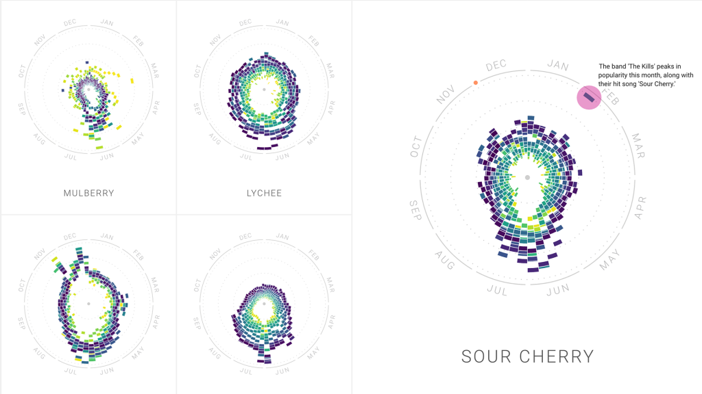
For this week’s blog post about information visualization, I picked the work by Moritz Stefaner “The Rhythm of Food”. It is a project that analyzes different food seasonality. He gathers the information we learn about food culture by looking at Google search data. The project collaborates with Google News Lab, and sheds light on the many facets of food seasonality, based on twelve years of Google search data. In order to investigate seasonal patterns in food searches, the team developed a new type of radial “year clock” chart to reveal seasonal trends for food items. The way it works is each segment of the chart indicates the search interest in one of the weeks of the past 12 years, with its distance from the center showing the relative search interest, and the color indicating the year. I admire the way Stefaner turns a huge amount of data into an easily visualizable graph. It was interesting to see how cultural and social influence has on the data result.
Creative direction, data visualization, design: Moritz Stefaner
Design and development: Yuri Vishnevsky
Illustration: Stefanie Weigele