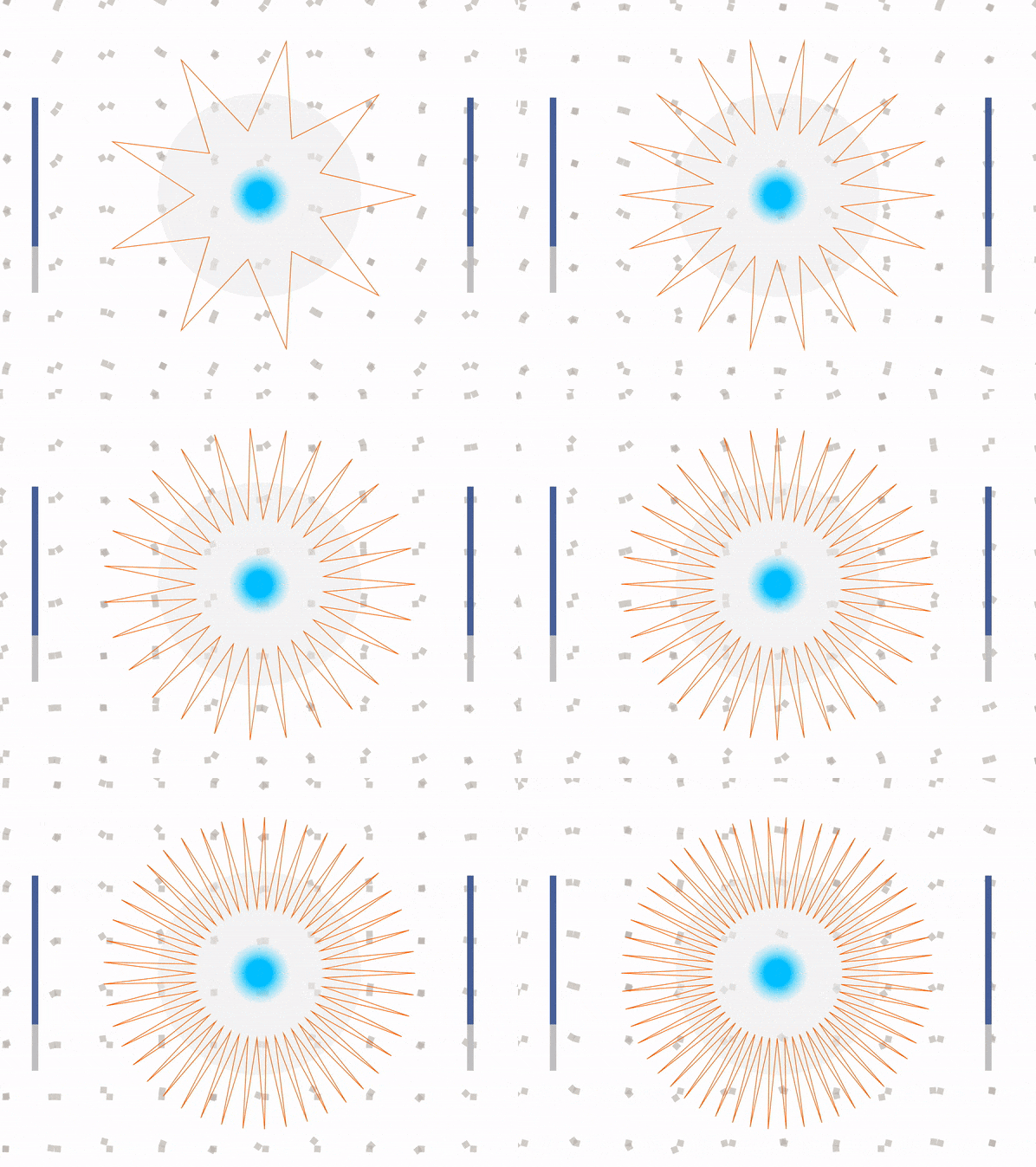
mokka – clock

fixed version!

I have already said this in my “Timekeeping” post but I feel it is very relevant to what I serve here. I am sure, once the pandemic started, most of us felt that our perception of time has changed. We, as humans, have this temporal agency where we can alter our view of the structure or management of time based on our experiences, how we spend our time, or our environment.

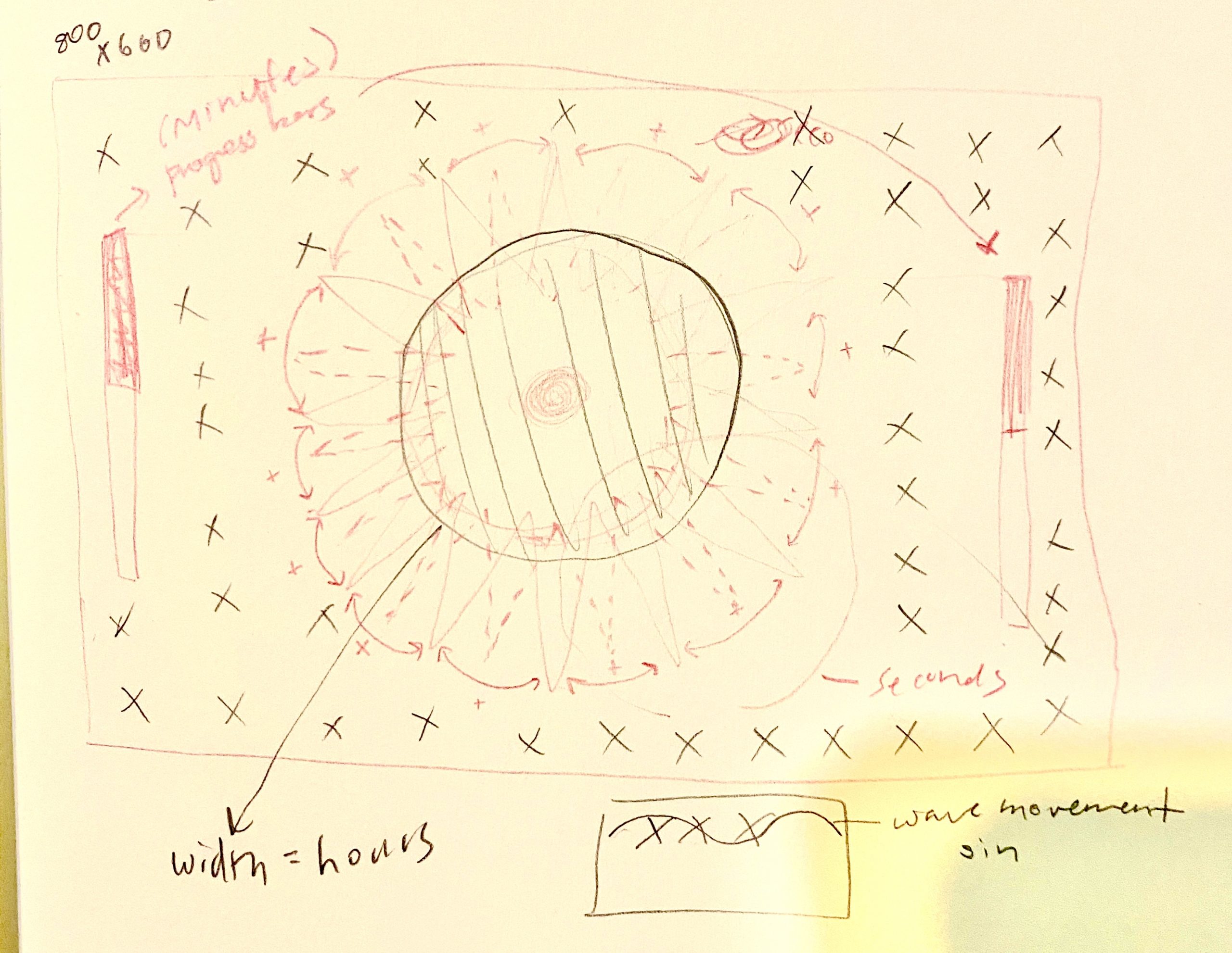
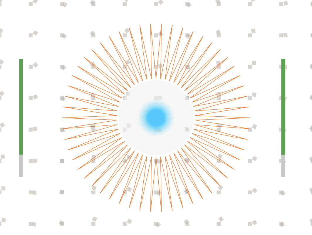
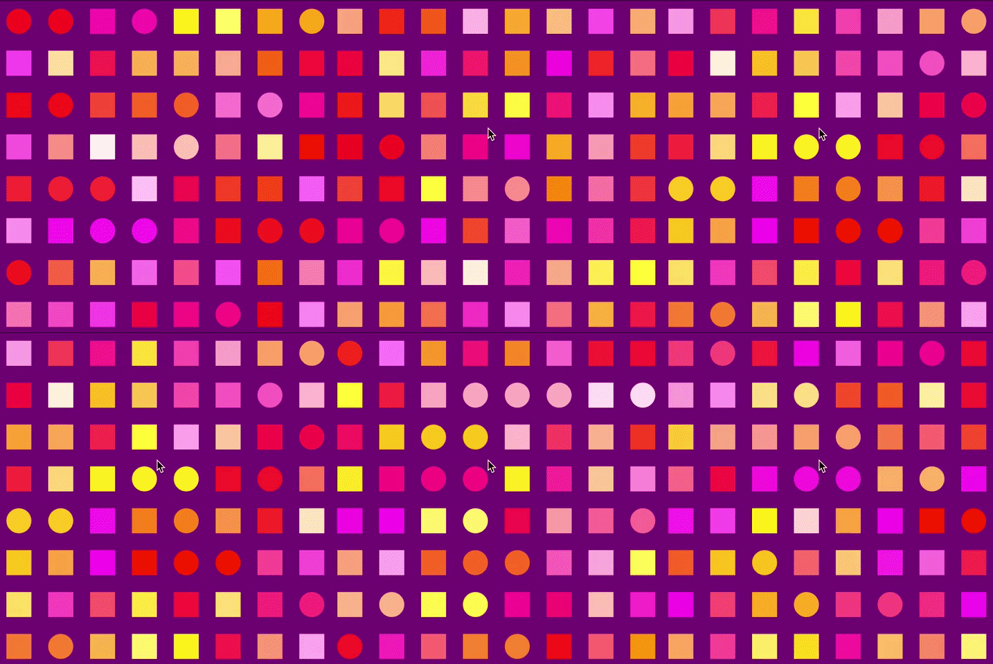
For this assignment, I responded purely visually. There’s no story, there’s no theme. Just my raw, visual response to when I hear the words “abstract” and “clock”. Time to me is progression; an item that is constantly additive.

The hardest part for me about this project was really trying to manifest the visual I had in my head onto my sketches AND into a computational design. There are moments where I feel the transfer of information from my brain to this design has lost some of its elements, but a part of me was glad that it did miss some components or else it would have been way too complicated to look at.

Link to code

Sketch:

Day: 

11:48:06AM

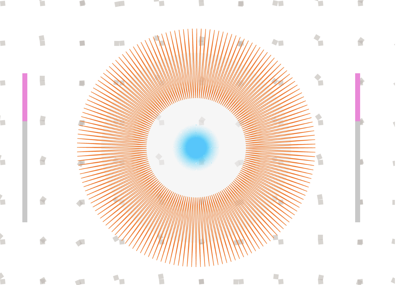
Night:

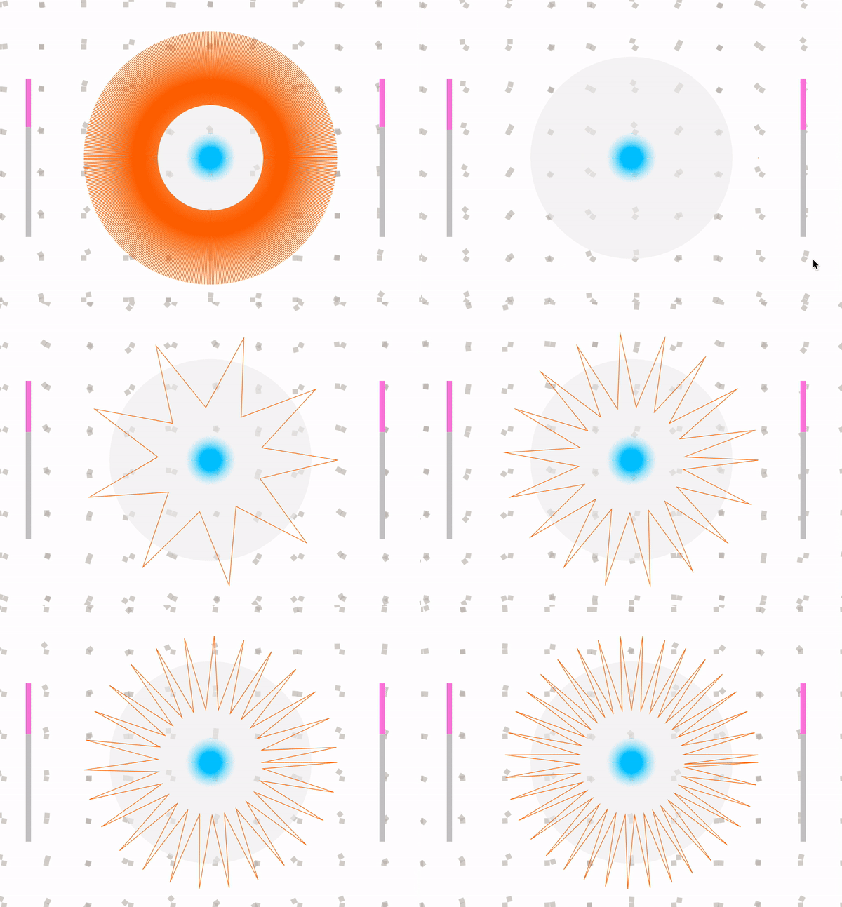
shows how seconds are moving(not all seconds are shown)
10:19:19 PM

mokka – Timekeeping

The readings made me think about how I never think of time technically or quite literally anymore. Especially once the pandemic started, my perception of time itself has changed. We, as humans, have this temporal agency where we can alter our view of the structure or management of time.

mokka – Meander

While looking at this work, I was reminded of another work from Meandering River is an audiovisual art installation created by onformative and FunkHaus Berlin Sound Chamber. To see an alternative way to create land was very fascinating to me.

mokka – Reading 02

First-word art vs. Last Word art: One is about exploration and the unexpected, the other is about accepting what has been done and respecting such through practice. I think of the first-word art as a practice that requires acceptance of risk, experimenting, problem-seeking, while the last-word art requires discipline, knowledge-seeking, and respect to culture and legacy.

In my practice, I find it important to be exploring in both ways by experimenting constantly whether it be through concepts or materials, and also find it important that I know where these ideas may have originated and understood the culture and past usages of the materials I am interested in. The main point that stuck with me in Naimark’s article, “First Word/Last Word Art” is the struggle of finding the permanent in-between with these two spectrums especially in the qualities of real-time. There is no doubt that technology is constantly evolving and as creators, we become very aware of how it affects the durability or importance of the things we make as time passes by.

mokka – Living Wallpaper


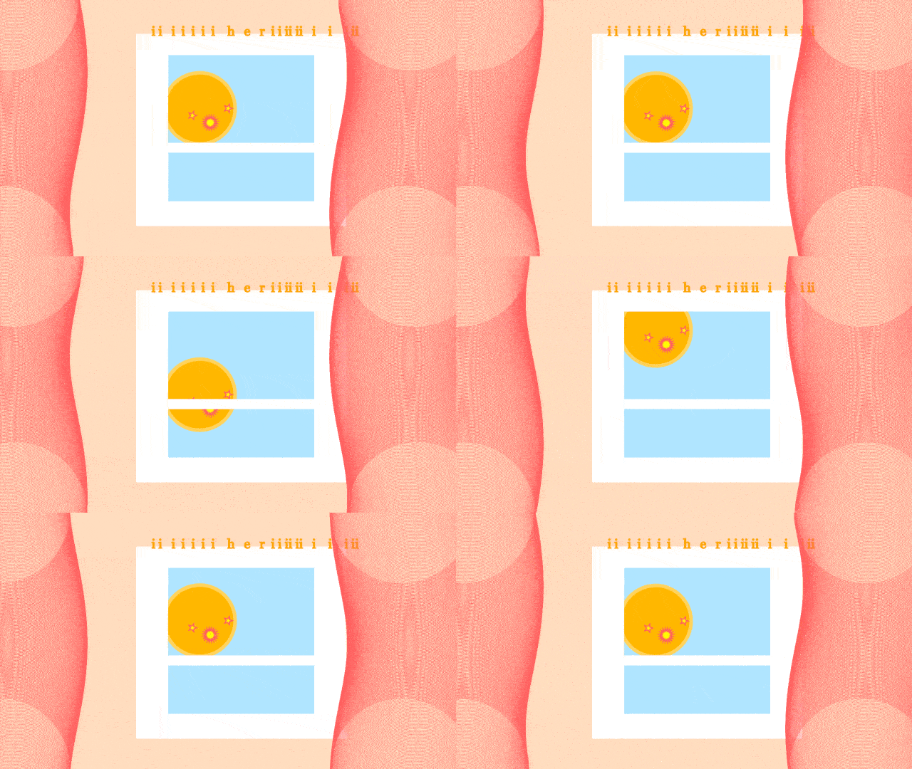
i’m still here – iiiiiii her iiiiiii i i ii

i'm still here, mokka 2020

In these times, I miss being in the studio the most and seeing people work near me while we struggle silently or maybe excitedly together. Lately, instead of playing through my Spotify playlists, I’ve been drawn to listening to Youtube Live Music playlists as they normally have animated visuals to go along with the music and they make me feel as though someone/something is existing beside me. Since I have this intense feeling of stillness in my home that sometimes buffers my productivity for school, I decided to make something that emulates the same feeling as those live playlists that help me feel a little more comfortable in the space that I currently work in.

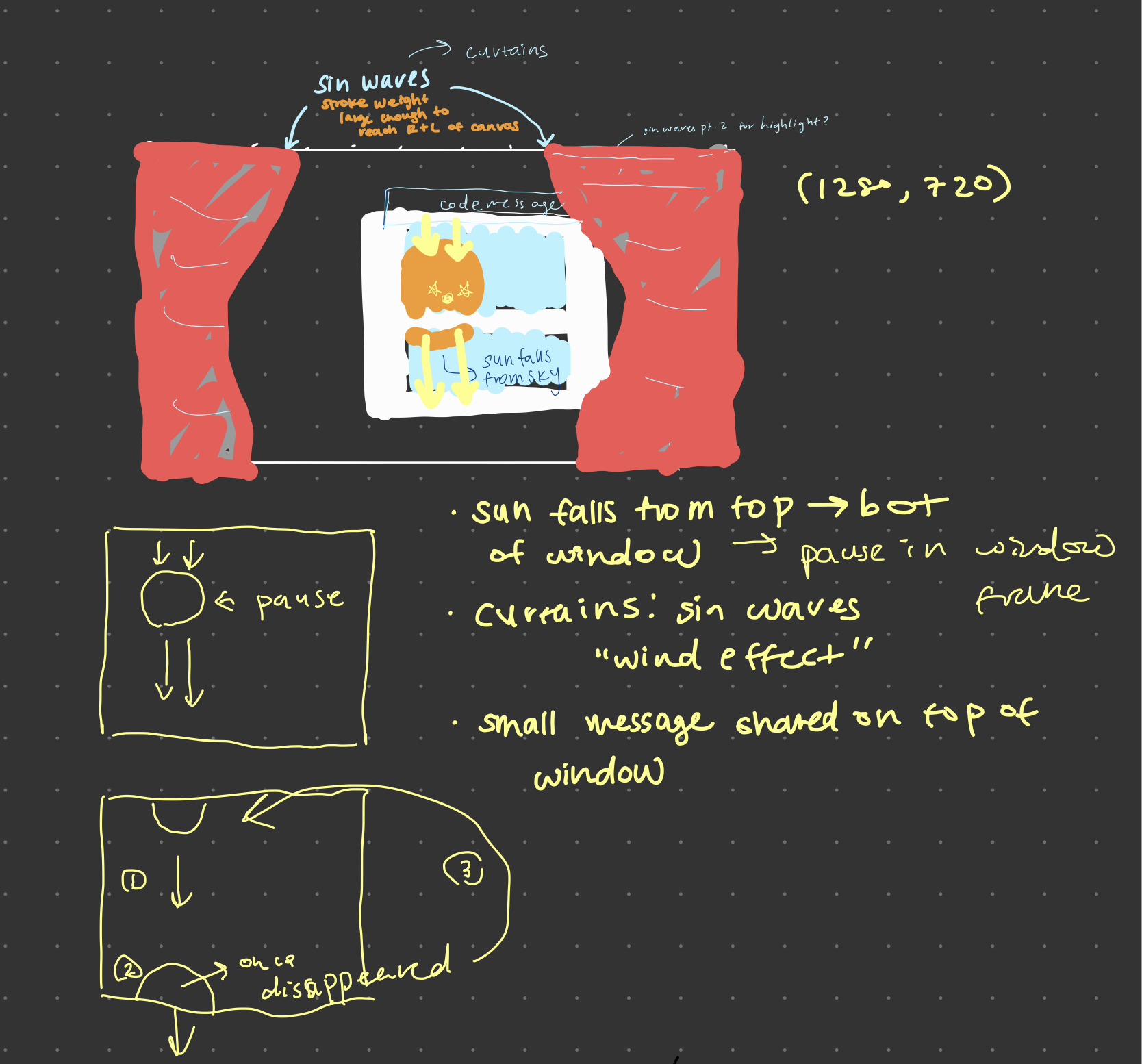
This assignment most definitely taught me many different things to consider whether it was the code itself or the process of exporting files and documenting this type of work. I used the Double-Exponential Sigmoid easing function to have the sun be able to pause and have its moment in the window frame and then continue on its merry way. The text above the window frame is something very personal to me and my best friend who I have known since I was 4 yrs old. It transcribes to “I am still here”; it’s something we know want to say to each other often but find it cringy and uncomfortable typing in a normal manner. The more “i”s there are, the more emphasis and eagerness in the message.

Visually, I am not all that satisfied with how it turned out. In fact, it irks me because I’m not sure what else to do with it. Although the curtains look complicated enough as they are right now, I wish I utilized a different technique to try and add dimension to them.

Despite my unsatisfactory, I’m glad to have fulfilled what I planned in my sketch below.

mokka – Looking Outwards 02

Adaptations

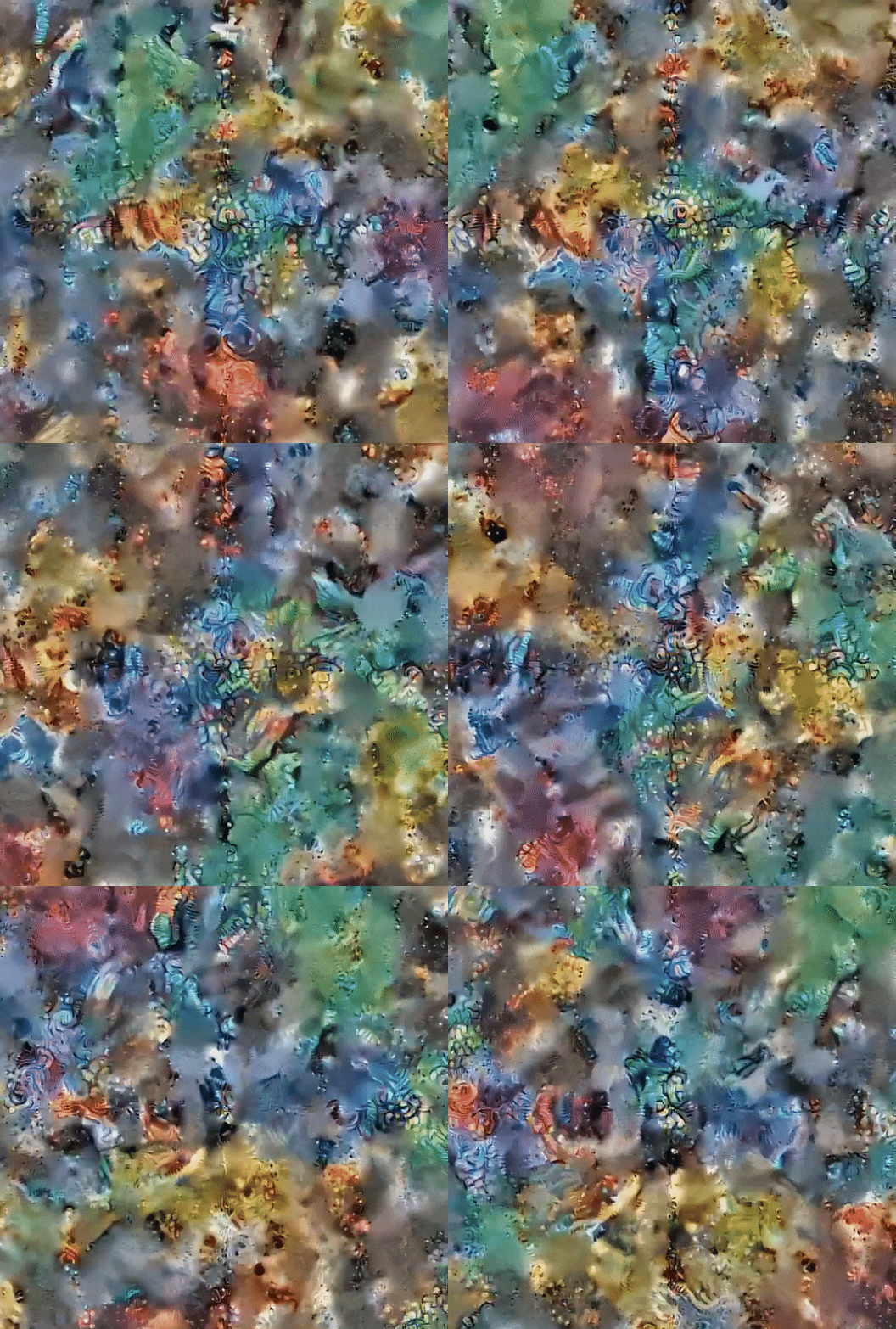
Any visual that can make my mind wonder all the things that it could be always will have a special place in my heart. It makes me think: what is what is adapting? Is it my eyes or is it the artwork? I truly enjoy watching Sophia’s exploration of artificial lifeforms and nature itself.

Adaptations by Sophia Crespo(@sophicrespo91 on IG)

mokka – where the mouse travels

mokka – where the mouse travels


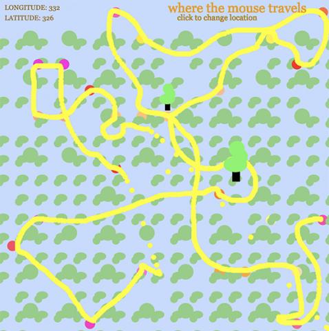
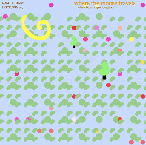
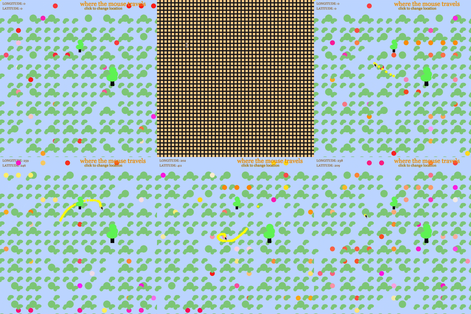
yellow is where the mouse traveled, where you started is marked on the top left

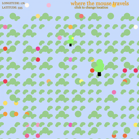
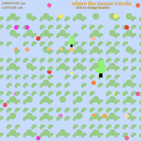
About my territory: As a kid, I remembered how my parents would always print out a google map sheet for GPS. I utilized that map to manifest my own imaginary world. There were plenty of red, orange, and green dots scattered across each map and I imagined treasures or places worth exploring.

Process: Thus, I made treasure maps for this assignment! I wanted to keep an almost child-like quality to it as I wanted to reminisce about my imagination when I was much younger. I utilized nested loops and played around with the placement of shapes to illustrate a simple landscape and kind of natural-looking dynamic utilizing randomness. I also tried providing information for the user indicating where they start once the canvas is open so that when they “get lost” they will at least know their starting point. This starting point is indicated in the top left corner where both the longitude and latitude are recorded once they start moving their mouse. I did this by abling the code to indicate where the mouse is on the canvas at all times. Also, the user’s mouse would leave a trace of its movements utilizing an ellipse that is constantly being drawn. I incorporated this because it resembles how I would immerse myself by using a pen and tracing how I would explore the world that I had in my hand. Once the user clicks the mouse a new starting point is recorded and the treasure items/areas are reset in a random, new area of the map giving the user a whole other map to explore. Due to the number of shapes I had to make, I also created my own functions to make my code a little cleaner for my own sanity.

via GIPHY

mokka – Reading #01


Compton’s “10,000 Bowls of Oatmeal Problem” illustrates the possible problems a creator can run into while utilizing generativity into their work. The problems can be faced is when the creator constructs so many artifacts making each of them unique in their own way but it can become difficult to be perceived the same way by the user/audience.

We can look at this idea as we look at the construction of violins. Each crafted violin may produce a different or unique sound. However, on the outside, they are all designed the same way and are utilized the same way. Here comes Compton’s concern where the unique qualities of a generated object will remain unknown without acknowledging its good/bad attributes. In this case, depending on the user, an individual violin can maybe produce more richer, deeper tones than the violin next to it. Whether that is a good/bad attribute will be determined by both the user and the maker but either way it will help identify perceptual differences within the clutter of instruments.

In order for the artist to overcome this and generate a copious amount of artifacts that truly vary from each other, they must be able to recognize the different types of perceptual differentiation that can be experienced by the user and enhance them until the users find it recognizable.

mokka- Looking Outwards 01

Mintabox

Mintabox is a user-collaborative, generative website created by the artist Joe Hedges. His intention with this website was to explore the idea of information stored within the internet space or as he calls “the information page”. Any user is able to generate a digital box that contains a user-submitted text and/or image. Hedges created this system using PHP, CSS, HTML, Javascript, digital photography, oil painting while directly observing and utilizing digital photography and image manipulation.

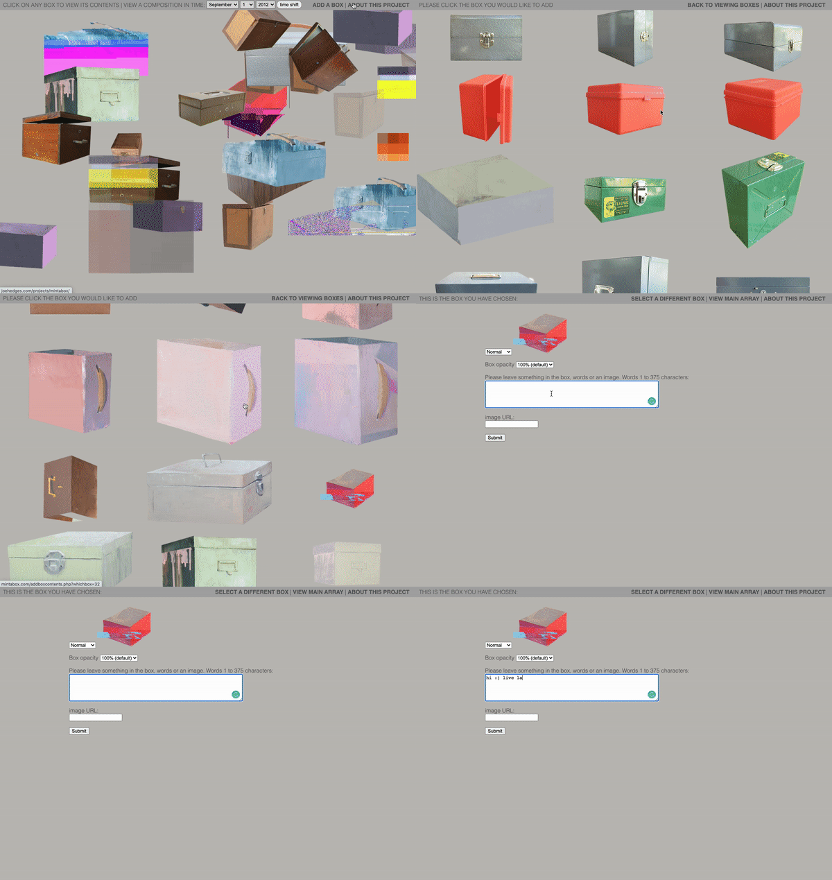
How to Mintabox

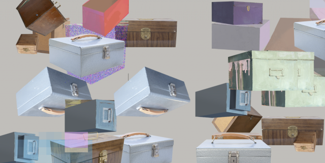
What really drew me in about this project is the way it is so simple, yet so flavorful and thoughtful. It acts as both a time capsule and a simple platform for people around the globe to interact with each other by sending messages that are not even directed at them but are meant for them at the same time(and in form of a 2D digital box). Something so small and odd can easily bring a smile to my face such as this and I am here for it. You can choose the pixel size, color, size, glitch/no glitch effect on the box as you can see below with the various display of boxes.

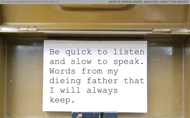
A message from 2012, Joe Hedges
Mintabox, Joe Hedges

The process of having to choose the character of the box seems like such a fun way to somehow personalize the way that you enter yourself into this net space along with many others.

This website has been occupied by many different users since the year 2012 and is still a place where people visit time to time to leave messages even today.

Watch Joe go through different time boxes: