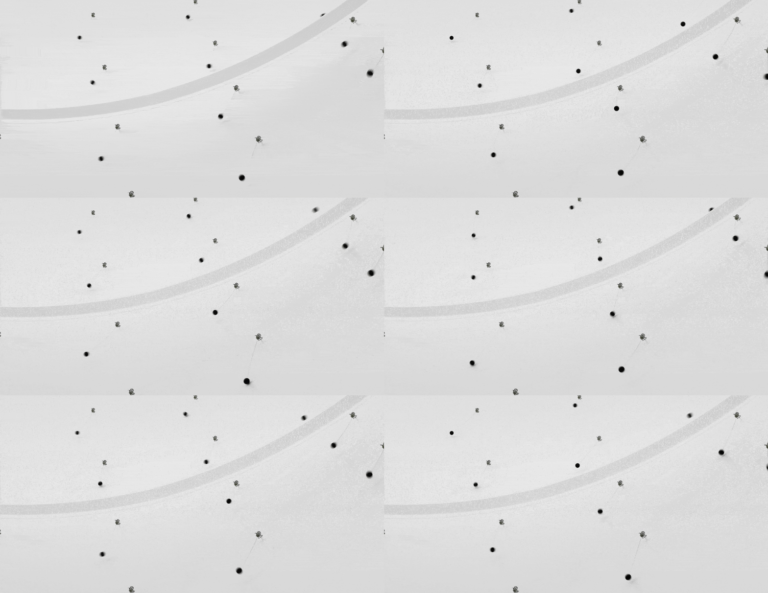
I think this work by Zimoun is really cool. I spent a lot of time on his website and I think this work really stood out relative to his other work. Inside this old water tank, Zimoun created a sound installation which gives a very other-worldly sensation. The installation uses hundreds of motors DC motors and cotton balls to create a unique, repeating sound. The sounds are asynchronous, which allows randomness to arise out of order. Zimoun's ability to create nuanced environments with repeating elements is fantastic. Computationally, none of it is difficult (ie. it's just some motors spinning). However, being able to translate a simple computation into a dynamic environment is fascinating to me.
Author: lampsauce
lampsauce-CriticalInterface
Tenet 9. Can we make the invisible visible? The more present interfaces are in our lives, the less we perceive them.
- Don’t use emoticons: just send oral-spoken messages to say you hate it! “I’m blind cos I see images” (Mahmud Shabistari) (1>)(P)(W)(+c)
- How many times do you remember you’re shifting gears when driving? Speak the gear number loud every time you do it.(P)(1)(-c)
- Use your smartphone with your toe (or your tongue) https://vimeo.com/104791815 (A)(+c)(1>)
I found this tenet interesting because the pervasiveness of interfaces. Often times great video editing goes unnoticed because it allows the view to be engrossed in the video. By contrast, glaring discontinuities (bad jumpcuts, etc) are very easily noticed. I think interfaces are similarly invisible, and only really noticeable when you look for it. Something as simple as the way someone organizes their files or their IDE preferences are all invisible to us, till we go to someone else's computer. I think this tenet is interesting because it considers interfaces which are so universal, such as gear shifts. Some other examples of invisible interfaces include literal interactions like Bluetooth and forks and knives and writing utensils. Other examples that support this tenet include checking out at a grocery store. While the latter example may be evolving due to COVID and self-checkout, the idea of a conveyor belt to move groceries four feet forward often goes unnoticed.
lampsauce-Exercises5
lampsauce-Exercises
Exercises
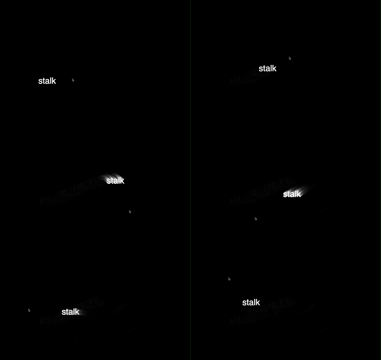
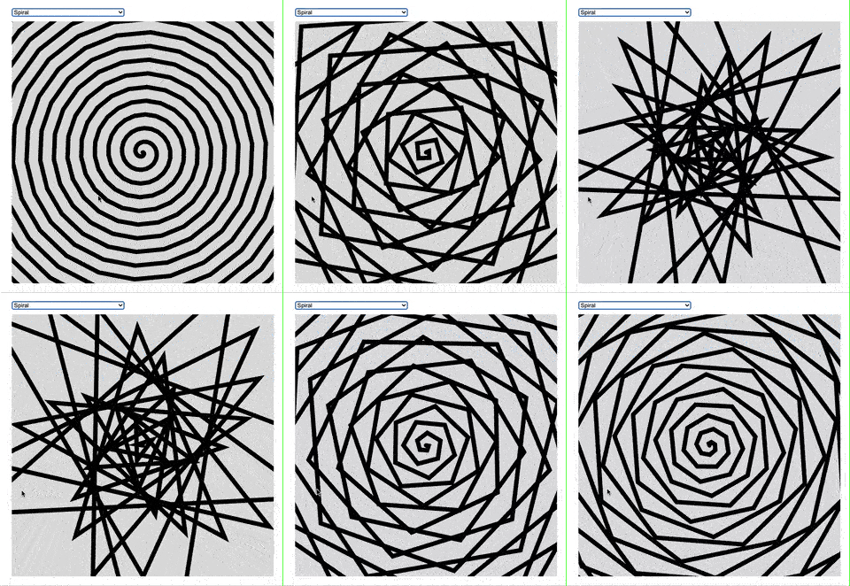
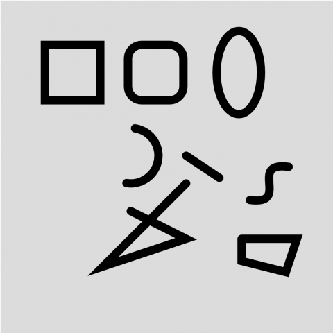
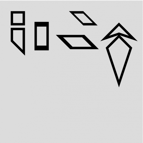
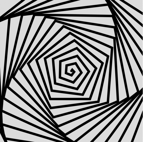
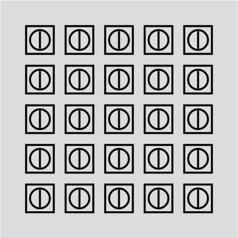
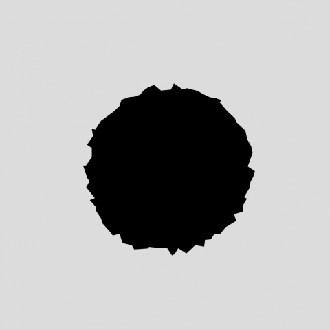
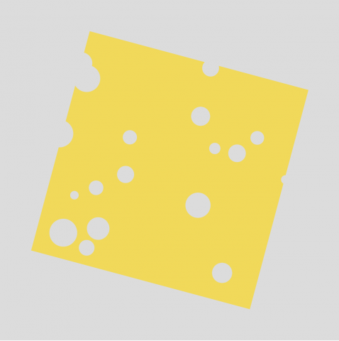
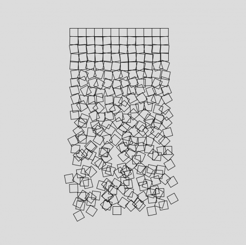
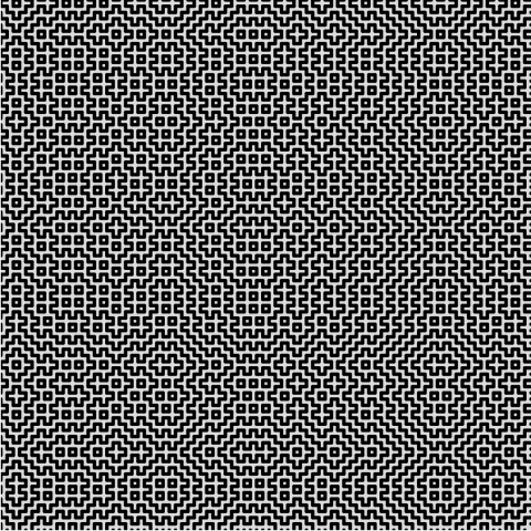
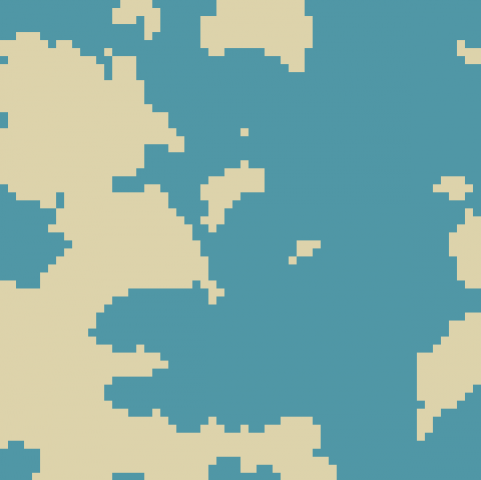
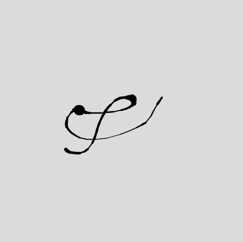
I had already started before I realized we were supposed to make 20 different sketches. I put all of mine in one sketch and implemented a function switcher instead ¯\_(ツ)_/¯ (CODE)
- One with Everything
- Quadrilateral Zoo
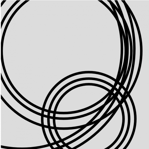
- Spiral
- Transitioning Rectangles
- Iteration with Functions
- Random Splat
- Stochastic Elements
- Recoding Schotter
- Billiard Ball
- 1-Player Pong
- Hitomezashi Sashiko Stitching
- Imaginary Islands
- Drawn Line, Three Ways
- Calligraphic Polyline
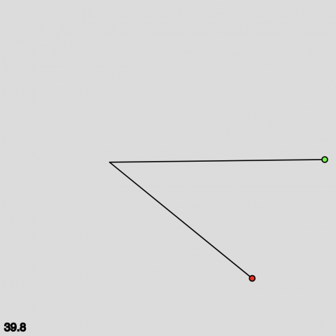
- Longest Line Search
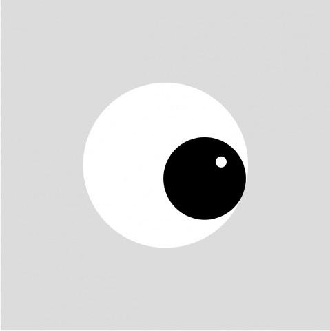
- Eyes Following Cursor
- Ripples in a Pond
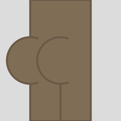
- Butt Generator
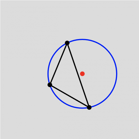
- Angle between Three Points
- Circumcenter
lampsauce-Clock
Creature Clock
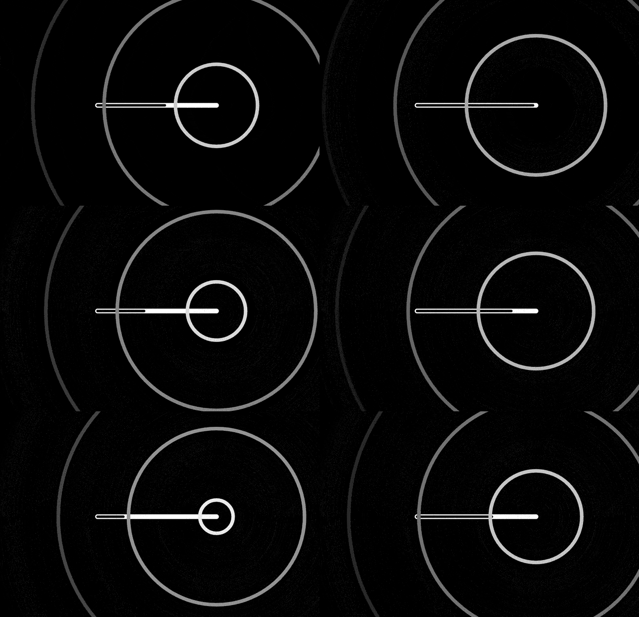
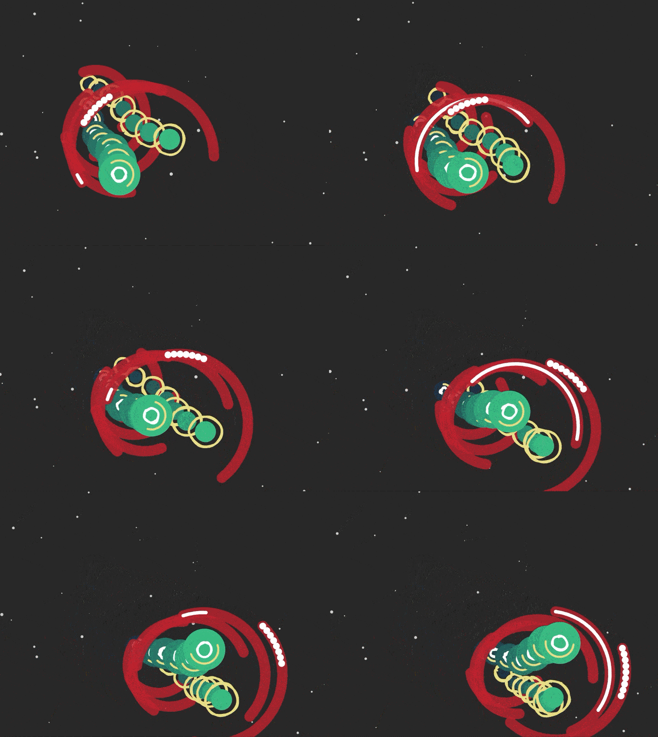
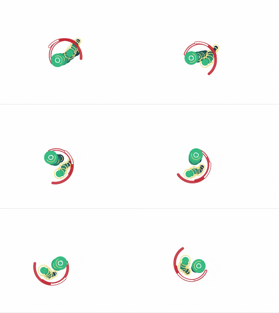
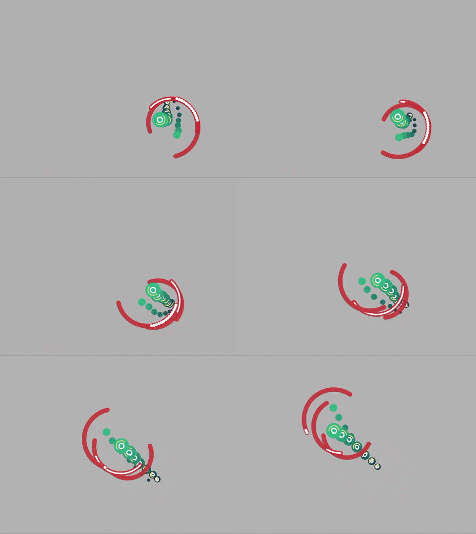
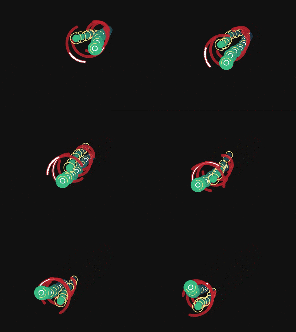
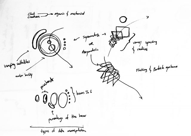
Through my clock, I wanted to combine the mechanical mechanisms we use to measure time with organic and biological measures of time. I decided that my clock should be a creature that resembles ocean microorganisms. I intended for the clock to not be readable, rather I wanted to make a clock that would be mesmerizing to look at. However, it does count 15 seconds and has a sort of biological rhythm. CODE
EDIT NOTES: The newest version of this clock creature has debris in the background to situate the creature in an environment. Additionally, the framing of the "camera" zooms in and out throughout the hour. I also fixed several bugs I found with jarring discontinuities between certain time intervals.
Clock at Several Times*
*These GIFs are from version 2
Ideation
My major struggle with this work was creating an organic feel. My initial design (see v1) felt too mechanical and were not what I had envisioned. I eventually settled for the creature I currently have. I think that my goal for it to "evolve" over days, months, years may have been a bit too ambitious. Perhaps I could have played around with the creature's behavior more than I did. Version 3 | Version 2 | Version 1
lampsauce-Timekeeping
Something that struck me about the readings was that you can represent terms like after, before, starts, meets, etc. as a relation between times i and j. It’s not that surprising, but the diagram in the Drucker pdf puts it very cleanly. I also thought it was interesting how being able to precisely measure time allowed ancient civilizations to accurately measure the size of the Earth.
lampsauce-Meander
I learned several things from reading Robert Hodgin’s documentation of Meander. Firstly, the documentation of the mechanism for the river’s movement and the road generation was really insightful; I had never considered that to create novel motion, each point can be assigned a direction vector (I think learning to think in terms of vectors and vector fields may prove fruitful for my future work). Also, Hodgin’s solution for generating unique placenames by referencing actual geographical data is brilliant.
lampsauce-LivingWallpaper
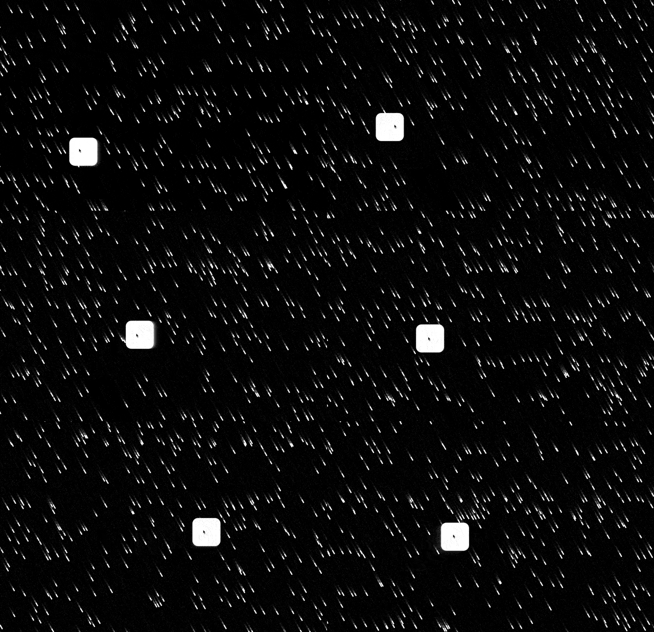
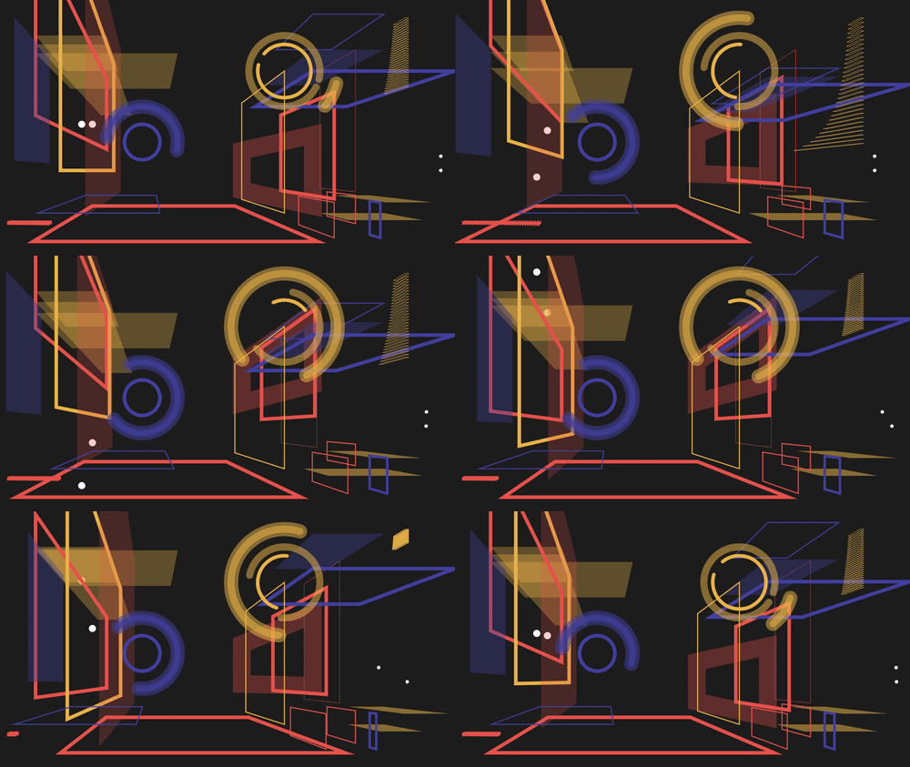
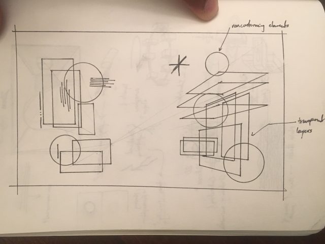
For my living wallpaper, I selected several easing functions because I liked how they made it easy to hide the beginning and end of the loop. I kept the doubleExponentialSigmoid from the starter code and used hermite and hermite2 for the moving dots. I also used the cubicBezier and doubleCubicOgeeSimplified for a few of the groups of planes. (CODE)
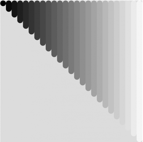
I think that I succeeded in creating depth and abstracting the notion of a room and walls. I also think the color palette is particularly satisfying. I think there could have been some better use of the negative space and the layering might have been overdone. Perhaps, I also could have diversified the variety of shapes.
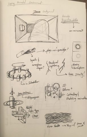
SKETCHES
lampsauce-LookingOutwards02
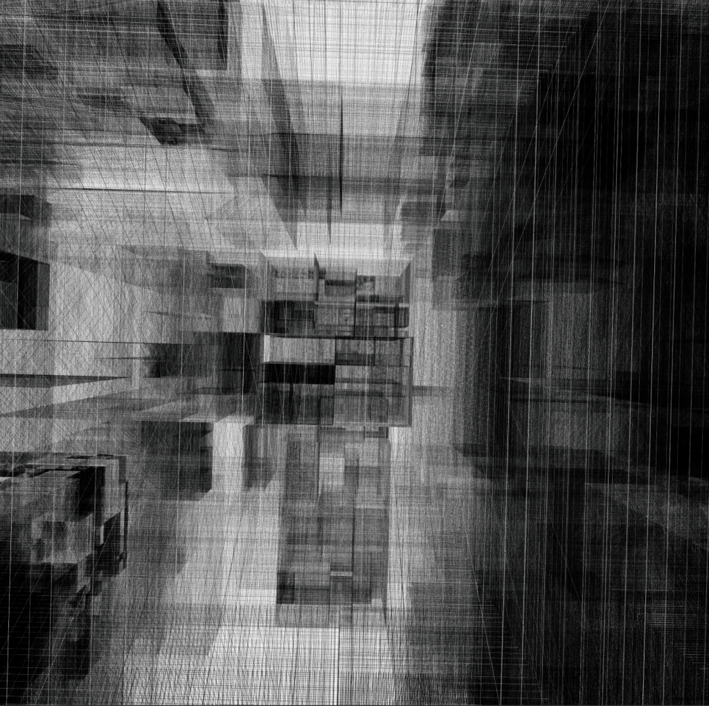
hhmbrrs by Manolo Gamboa Naon is really interesting to me because the works create planes seemingly out of nothing; it’s made purely out of intersecting lines. The resulting forms create a sense of depth which I find very cool.
lampsauce-Reading02
Micheal Naimark’s “First Word Art / Last Word Art” details the differences between groundbreaking, novel work and practiced excellence in existing forms. I think technical novelty does not necessarily fit within these two categories, rather it encompasses them.
Consider the vastness of the internet and new media arts. The internet is a unique instance of both being an art media and an art platform. The technology allows for both the distribution of more traditional work as well as creating a vast space for new types of work such as generative art, interactive art, live performance art (over large distances), etc.
Technology is deeply intertwined with culture. Therefore, technical innovations create an incredible opportunity to shape culture on the part of the artists, engineers, designers who explore the first word art of the new innovation. Generally speaking, the average user of new technologies does not want to figure out what “could be,” rather be handed something that has already been figured out for them. This is more commonly referred to as overchoice.
While the technology itself may not be subject to the “first world / last word” dichotomy, the way in which we use it is. Consider the mobile game industry; first you get games like Angry Birds, Cut the Rope, Doodle Jump, which set the tone for the next decade. Now the market is flooded with games that are way too similar, to the point where each cannot really stand out.