pinkkk-02-LivingWallpaper

Computationally exported gif. Super pixelated 🙁 Loses all the details and subtleties 

Screen Capture (Better quality) 

Sketch

I am not satisfied with what I have, but it is due to my inefficient time management skills this week .. :/ I couldn’t get my smoke to look nicely with the fire. Also, I really felt my lack of basic skills in constructing very foundational shapes. It takes me forever to create a really simple shape.

I used the exponentialInOut, sineIn and sineOut from p5.func to animate the movement of the fire.

CODE


axol-LivingWallpaper

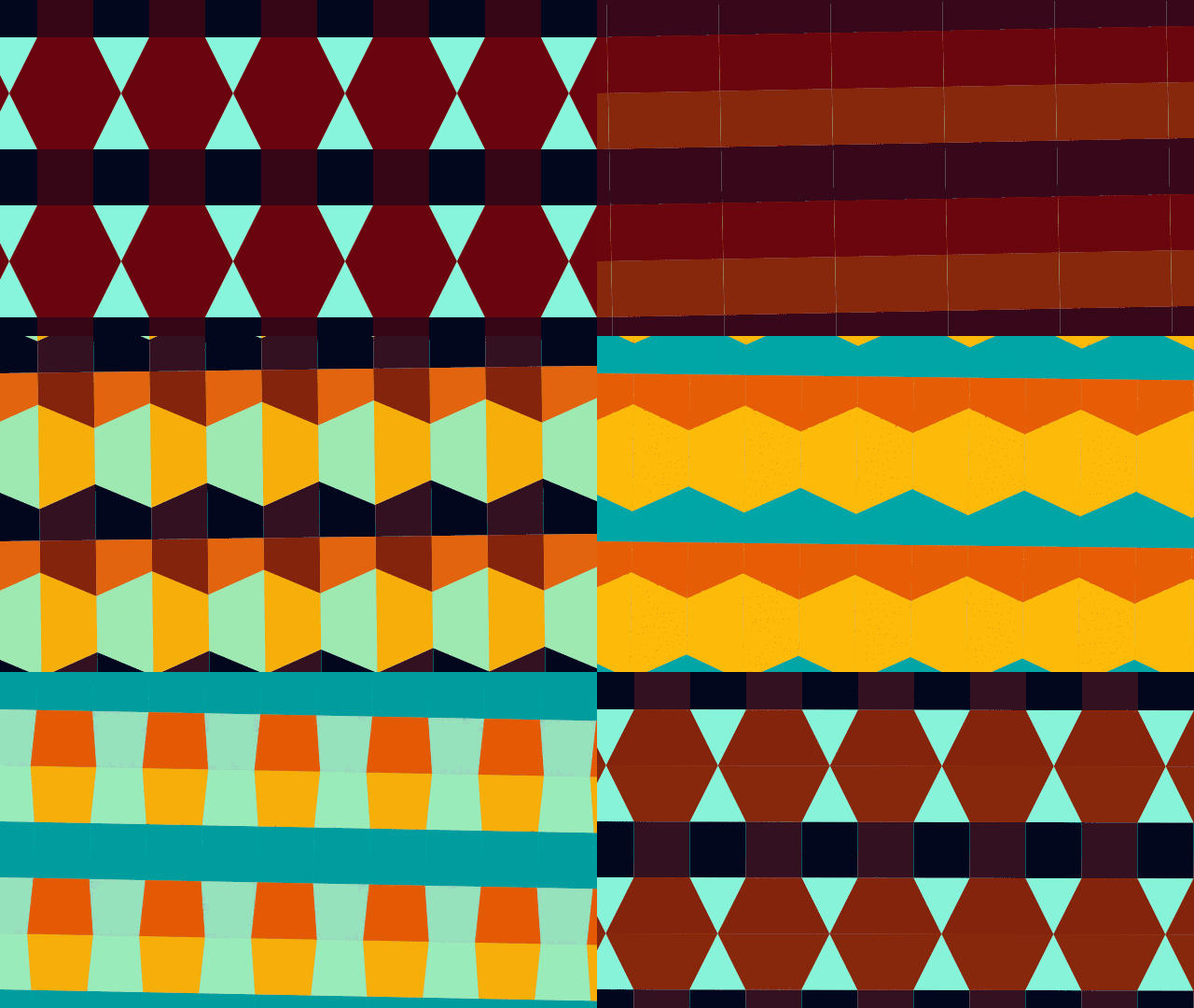
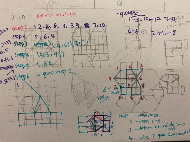
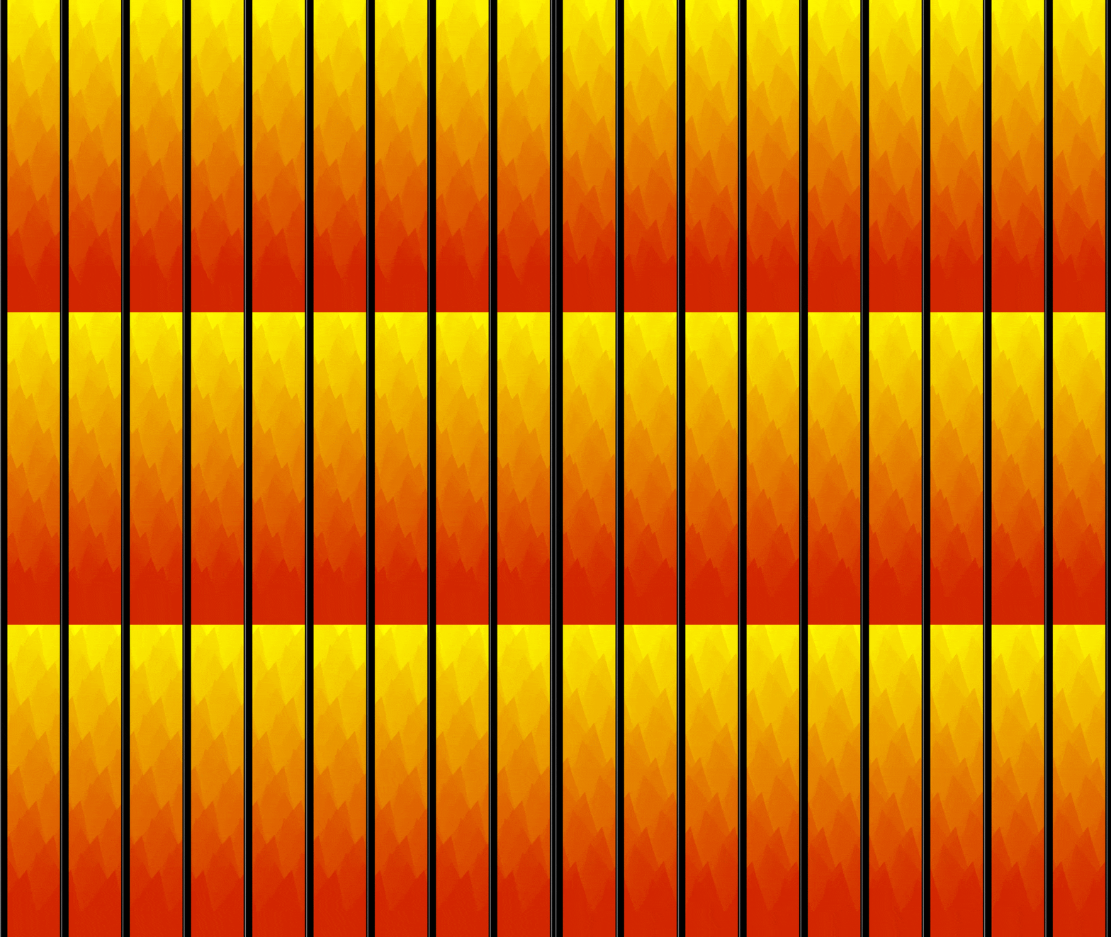
I wanted to make a transforming tiling pattern that continuously transforms into different shapes. With a little more research I realized it’s actually kind of hard to transform between tiling patterns. I am not very satisfied with the end product because I really don’t like the colors. But this was my best attempt after trying many color palettes so I had to stick with it 🙁

The shapes are described as a series of points, and I used multiple transformation functions to go between shapes and colors, such as exponentialIn, circularInOut, normalizedInverseErf, etc.

junebug-LivingWallpaper

The concept behind my design is replicating my current environment and feelings. I’m living by myself and working remotely, so I always feel alone, especially now since school started and the campus reopening. In my original design, I had the speed of the seaweed contrast the speed of my fish because it felt like the seaweed represented my anxiety and the multitude of anxieties I have been feeling recently. The fish’s easing speed represented the change of mood I usually have during the day, with an up and down. I used the “Double-Exponential Sigmoid” easing function for that reason. With my final design, I decided to decrease the number of seaweed and slow down the animation to instead represent how I feel when I’m stuck in my current location/environment. Everything is very still, quiet, and lifeless.

I am very frustrated and disappointed about my work because my original design and code didn’t work as an endless loop of animation no matter how much I tried to tweak it. The animation of the seaweed just didn’t match the animation of the fish so I had to simplify the seaweed animation. Critiquing myself, I find my final design a little too simple.

My original code and design
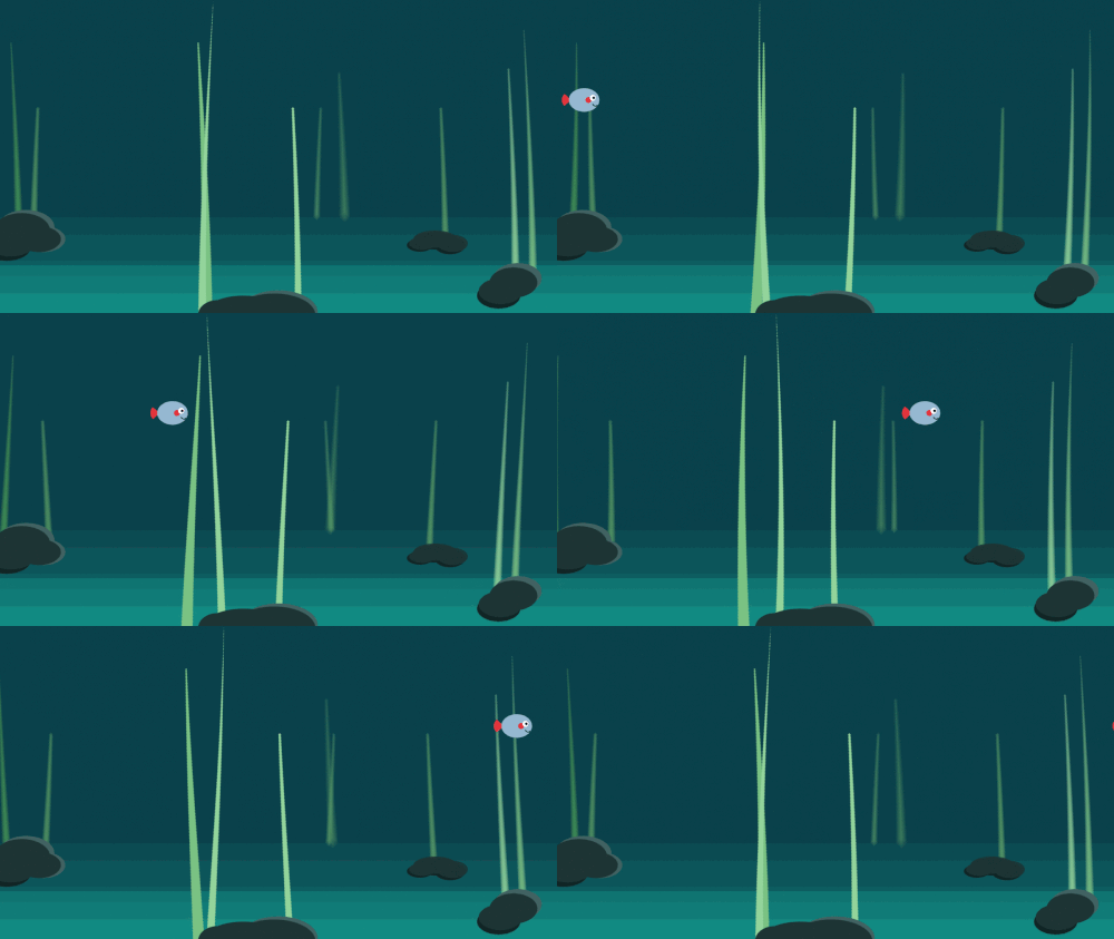
Final code and design
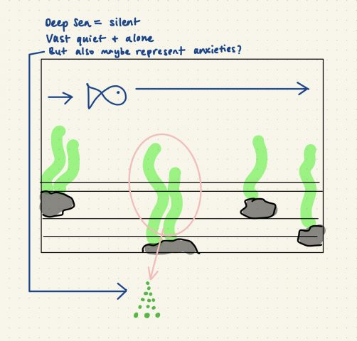
Sketch
thumbpin-LivingWallpaper

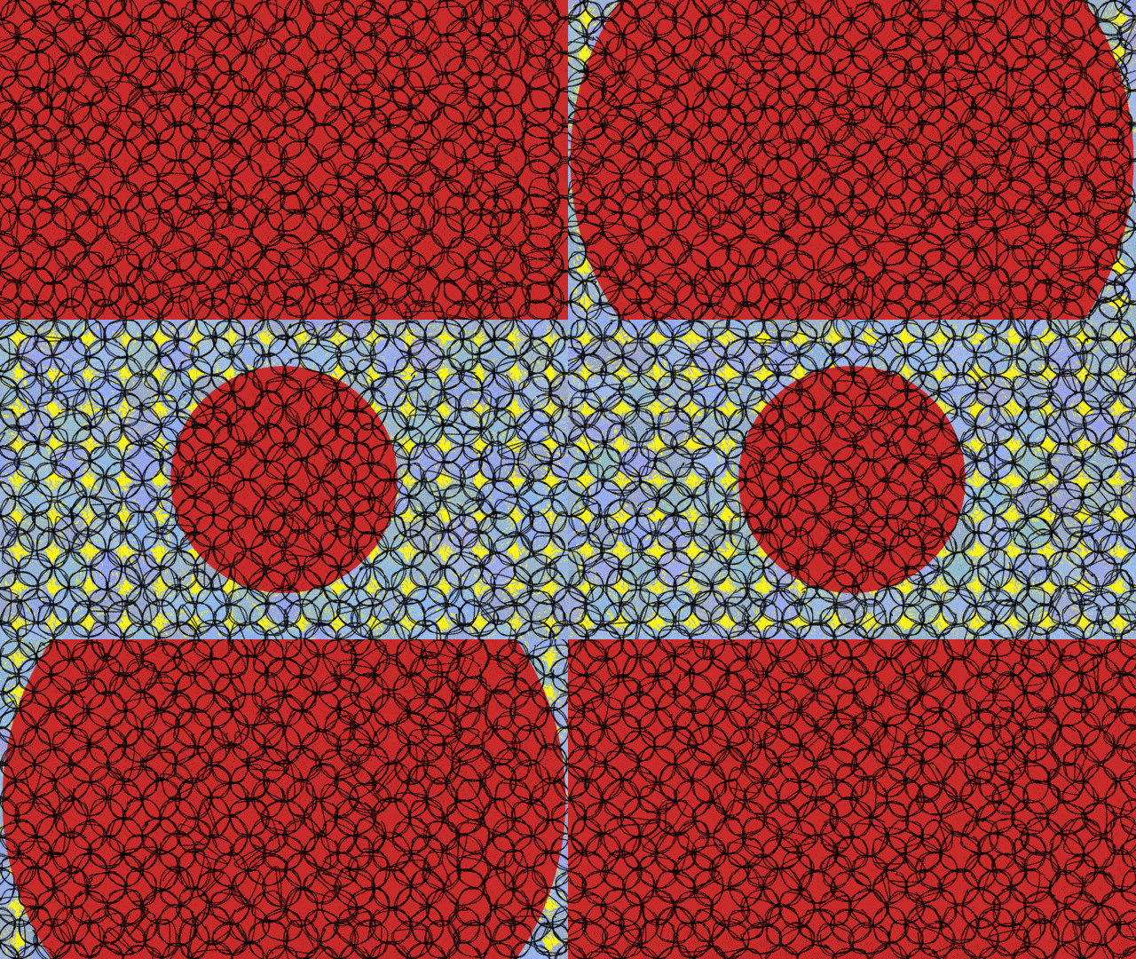
I kept the moving/looping portion of the animation simple so I could focus more on the graphics. To shape the way the red circle in my animation changed size, I used the double Quadratic Sigmoid easing function. The double Quadratic Sigmoid has a swinging, breathing momentum to it and it does not appear distracting or busy. I think that my use of the Scribble library was successful because it added the most character to my project. I also think my piece is more successful as a background on Zoom than as a gif because it becomes very busy as a small gif. My piece is still a bit cartoonish and crude and lacks the emotional weight of my original concept (which was to create a piece that reflects my anxiety and recent emotions).

lampsauce-LivingWallpaper


click on image to download

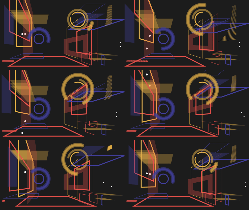
For my living wallpaper, I selected several easing functions because I liked how they made it easy to hide the beginning and end of the loop. I kept the doubleExponentialSigmoid from the starter code and used hermite and hermite2 for the moving dots. I also used the cubicBezier and doubleCubicOgeeSimplified for a few of the groups of planes. (CODE)

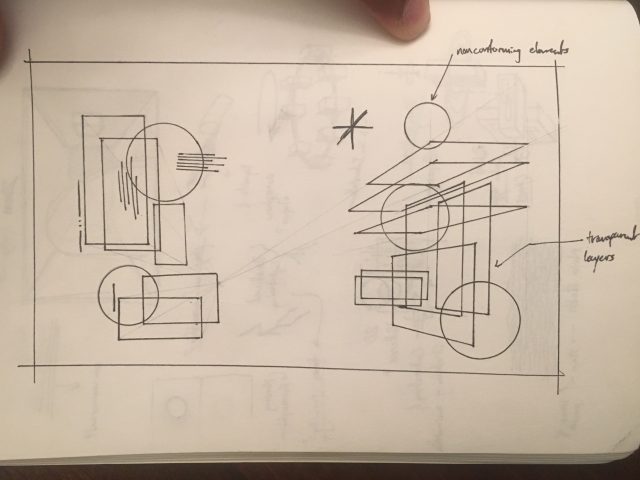
I think that I succeeded in creating depth and abstracting the notion of a room and walls. I also think the color palette is particularly satisfying. I think there could have been some better use of the negative space and the layering might have been overdone. Perhaps, I also could have diversified the variety of shapes.

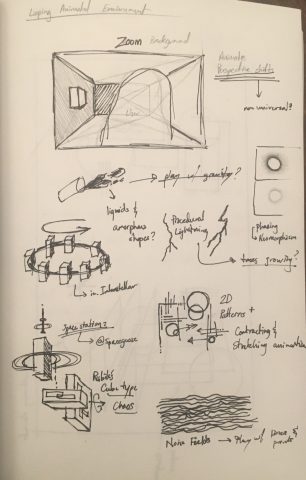
SKETCHES