Student Area

mokka – Soli Sketches


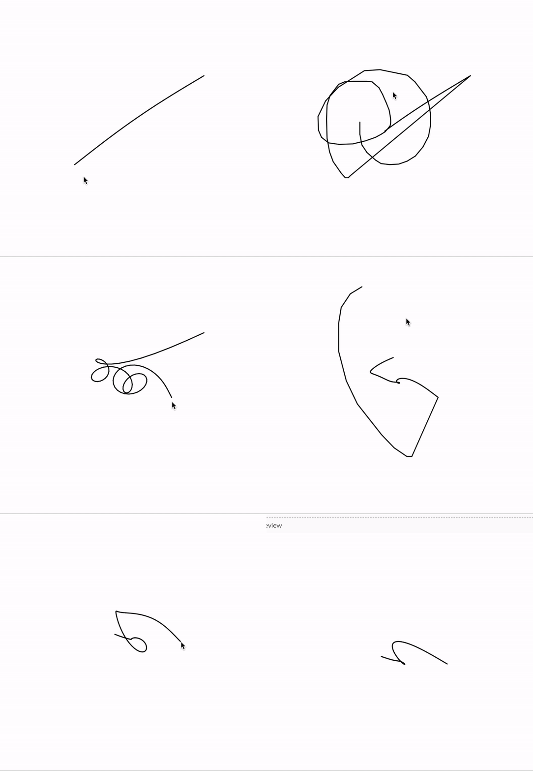
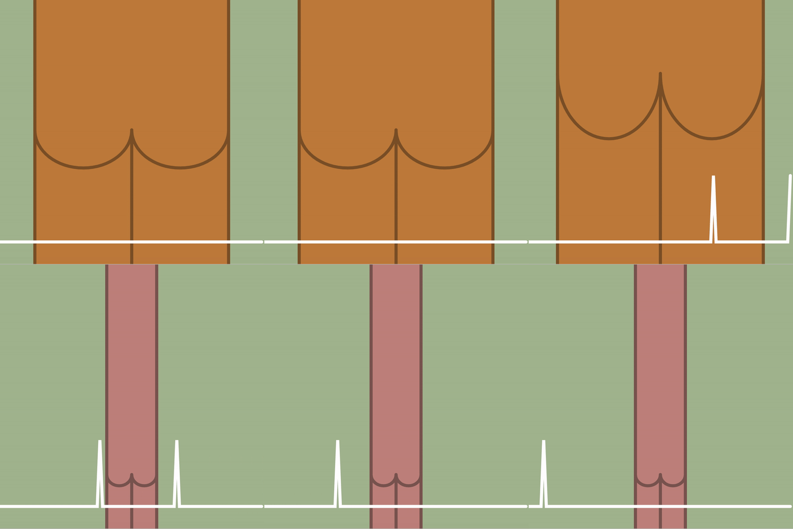
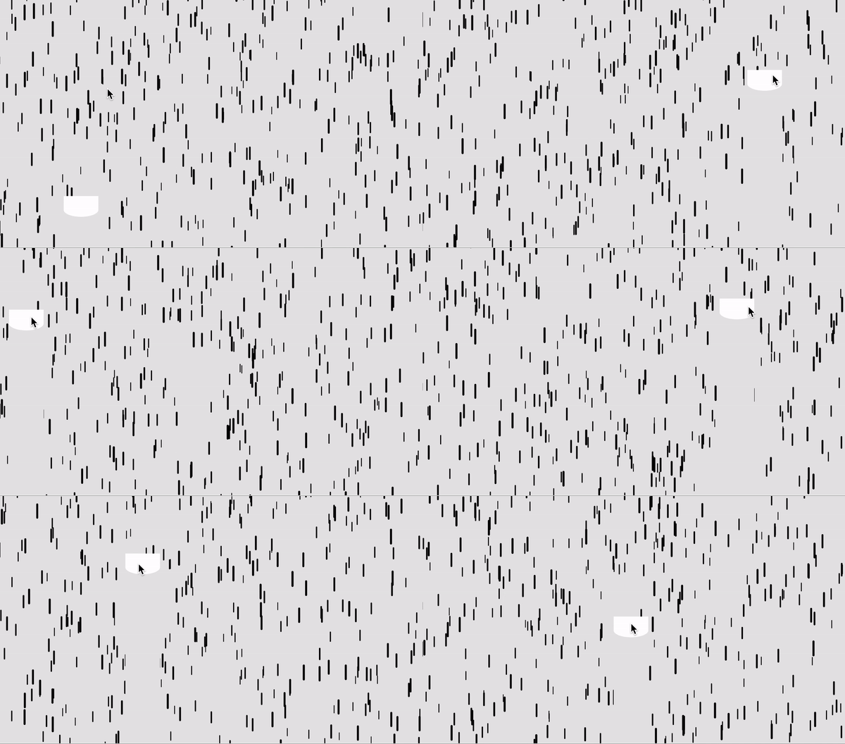
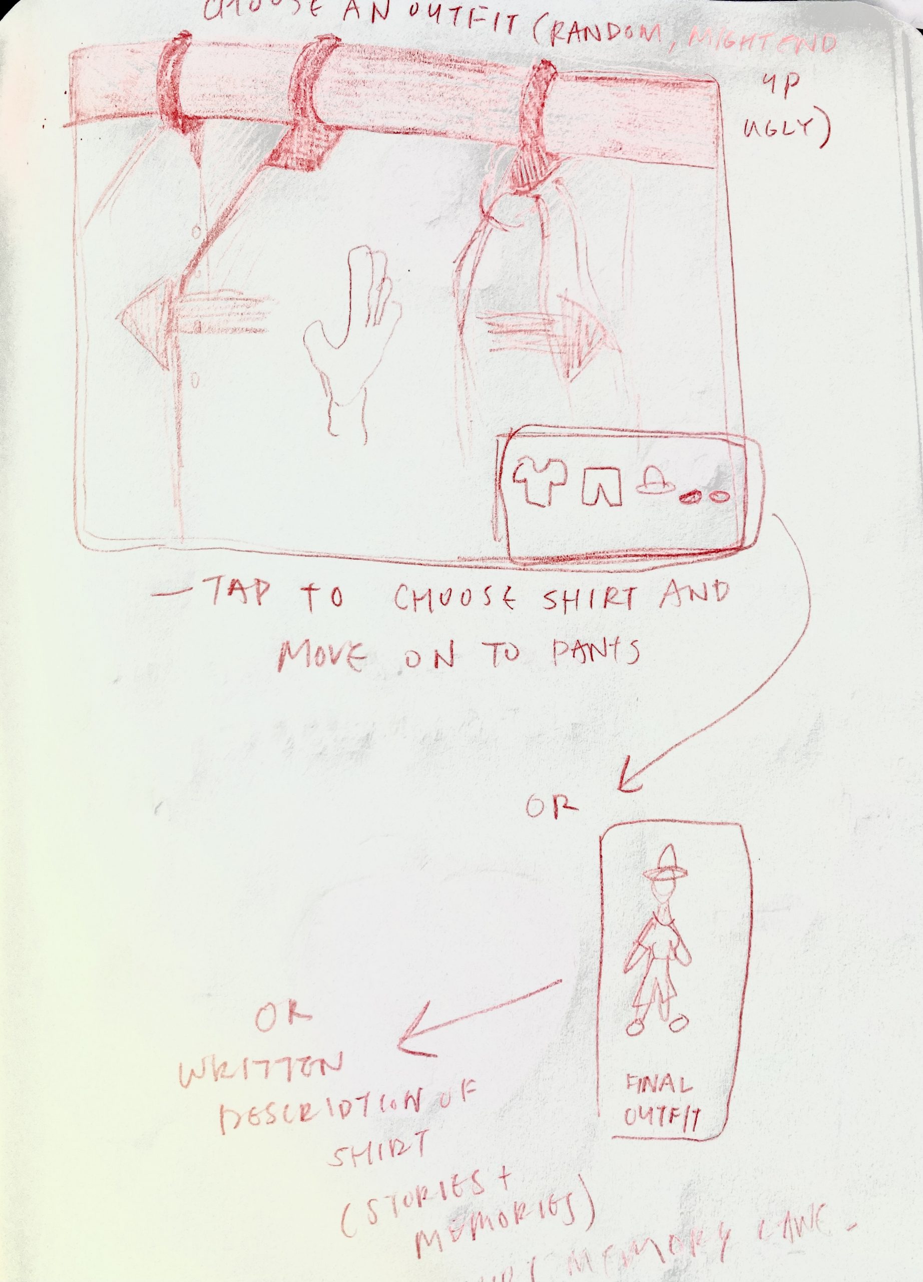
  1. Clothing Rack Simulator/Shirt Memory Lane: The user will able to swipe right and left to simulate them going through clothes in a closet. It is a mundane action but a common one. On the bottom right corner, I initially wanted to have a space on the page where the user can see what they selected(by tapping). Then I thought of another idea where I wanted it to show either a ridiculously, deep description of that particular clothing  OR share stories, memories, and where it came from(this last part I like the most).
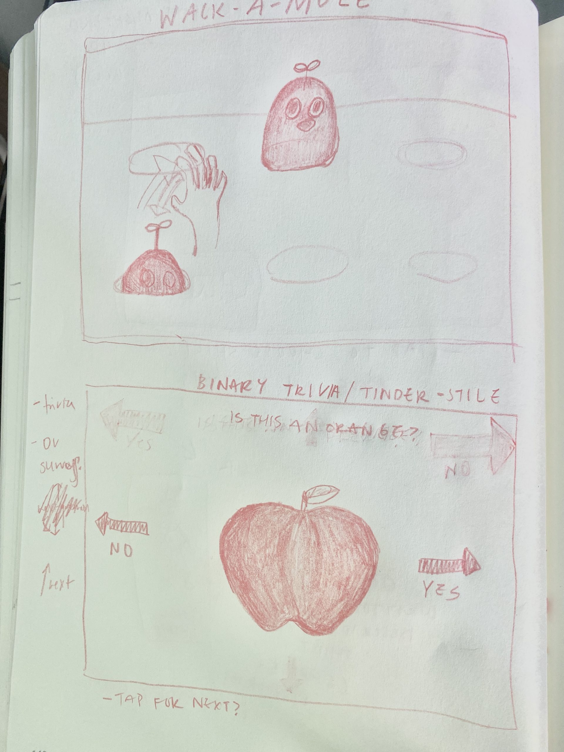
  2. Wack-a-Mole: Might be pretty self-explanatory but I wanted the tap movement to be able to emulate this idea of “wacking” the mole. Or, perhaps I may use this concept of wack-a-mole but metaphorize it into something else. Like maybe wack a cockroach/bug.
  3. Yes or No Trivia!: Now this may be too much of a stretch but I would still like to share. For this idea, users are able to answer random trivia questions via just swiping left for “No” and right for “Yes”.  So, for the question in the sketch below, the user should correctly swipe left(No, an apple is not an orange) and receive a number of points(not sure how I should do that yet). Should they swipe right(Yes, an apple is an orange) then they will lose that round of trivia. Once a user gets a question wrong, they are sent to a page which(maybe) shows a high-score board of all the players that have played and the option to retry and redeem themselves to beat their previously high score. I am not even sure how to implement this.

Toad2 – LookingOutwards-03


Madeline Gannon – Tactum

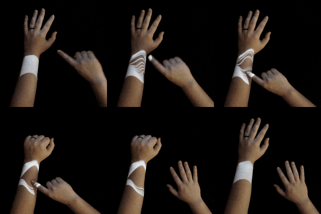
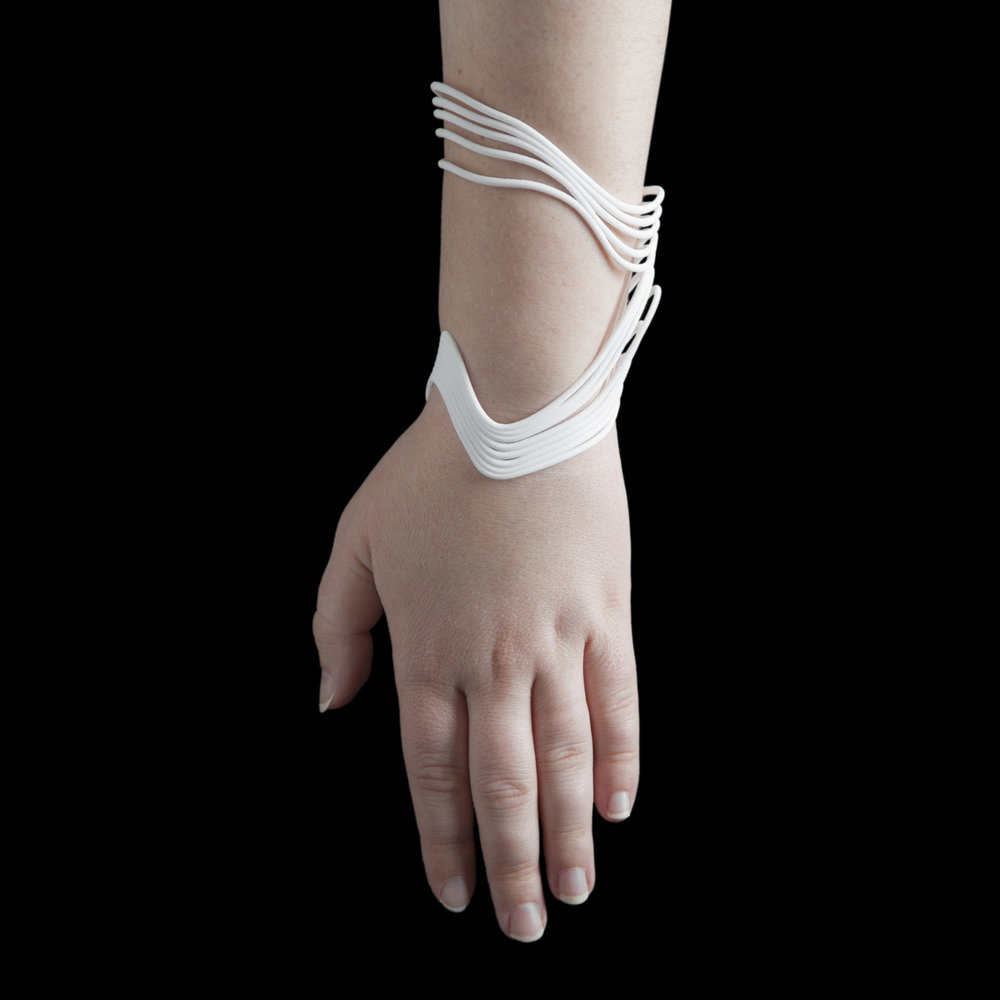
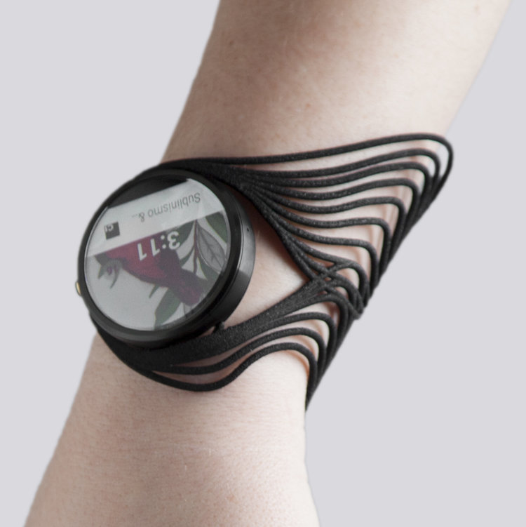
Tactum is an augmented modeling system developed by Madeline Gannon that allows the user to create 3D wearables by interacting with an image projected onto their arm create ready print wearables. As a result, each design created by Tactum is designed to exactly fit the user’s body. Furthermore, this project focuses upon creating a naturalistic designing experience by using intuitive gestures such as pinch, poke, rub and touch. This project was interesting to me because of its use of augmented reality as well as by how user focused the project was. I found the idea of designing in augmented reality just very appealing.

Toad2 – Critical Interface

9. Can we make the invisible visible? The more present interfaces are in our lives, the less we perceive them.

Don’t use emoticons: just send oral-spoken messages to say you hate it! “I’m blind cos I see images”

Use your smartphone with your toe

What stood out to me about this proposition is how true it is especially considering what we would consider an interface. All of my household appliances include an interface regardless if its the smart washing machine or the toaster oven. Each of the devices contain a means of facilitating human and machine interaction; however, considering how ordinary and common these objects are they normally wouldn’t be considered to have an interface. Additionally, the idea of emoticons as interfaces also stood out to me as they are a means of enabling better human conversation via text. This made me think of texting etiquette as whole such as capitalization and punctuation as means of interface. However, instead of being decided upon by a designer, this form of interface was developed organically over time.

yanwen-CriticalInterface

2 – Interfaz es un verbo (I interface, you interface…). La interfaz ocurre, es acción. (Translation: Interface is a verb. The interface happens, it is action.)

  • 1 – Be aware that as a verb, ‘interface’ affects the substantive and the space and time (1-cA)
  • 3 – Change the keyboard settings to one that doesn’t match the images printed on your keys. Once you get used to it, change again. (1+cH)

Interfaces and interactions exist together, and the moment interactions happen the interface would for sure apply changes (whether momentary or accumulative) to the surrounding space and people who are using it. The 3rd quote reminds me of a work about reinterpreting screen interaction gestures. The artist created a daily exercise based on the common interaction movements we would do with our smartphones (e.g. swiping, tapping, pinching…). The current existing interfaces for products are mainly made for users to adapt to them, the idea of adapting and changing the interface suggests an active relationship with the interface itself. It also suggests that instead of following the default there might be new insights when we alter the preset interface. 

Toad2 – Sketches

Shy Pet

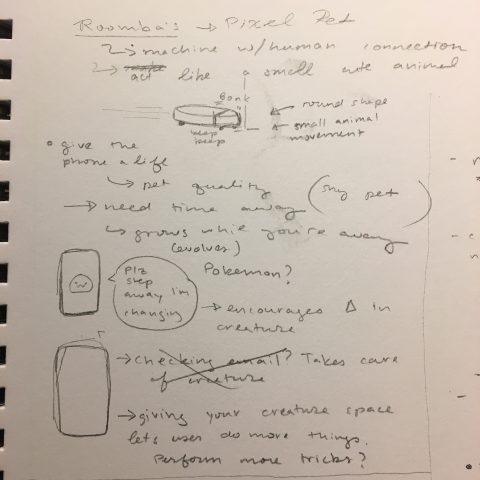
I was thinking about what makes people attached to inanimate objects such as in the case of Roombas, so I wanted to create a program that would cause people to treat their phone like a pet. Additionally, I wanted to create program that encouraged the user to spend less time on their phone as I often find myself wasting time on my phone. I want to create a creature that would require alone time and that user could interact with. In order to achieve this, the creature would state when it needs intervals of alone time because it would use that time to transform (i.e grow legs, horns, get bigger, ect.). Using your phone during the transformation period would make the creature upset and cry. To reward the player for using their phone less during certain intervals, the creature could be willing to do more ‘tricks’ with the player. For example, the creature can jump but if given enough alone time, the creature could jump even higher.

Presence – creature will cry if you are there during it’s alone time; Swipe (L/R) – rolls over; Swipe(U) – jump; Reach(In) – makes noise?
Nearsightedness

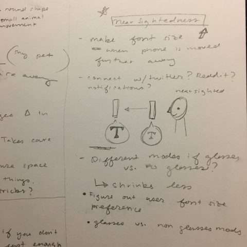
A problem I often have with using devices is that the font size is often too small and have to literally hold the phone two inches away from my face. I would like to create a tool to help near sighted people such as myself view the phone at healthy distance. As the user’s face moves further away the font size on screen would increase in size. I would like program to learn how far away the phone should be ideally in order to maintain eye health. The program perhaps could interact with certain apps like Twitter or Gmail.  Additionally, there could be certain modes for when the user is wearing glasses or contacts so that the program could adjust accordingly. This program could also be used to encourage people to hold the phone a healthy distance away from the face as we often hold the phone too close to our faces.

Presence – change font size
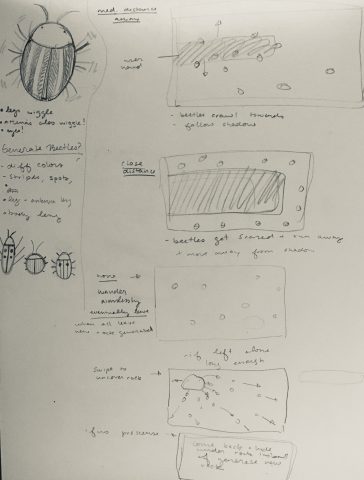
Beetles

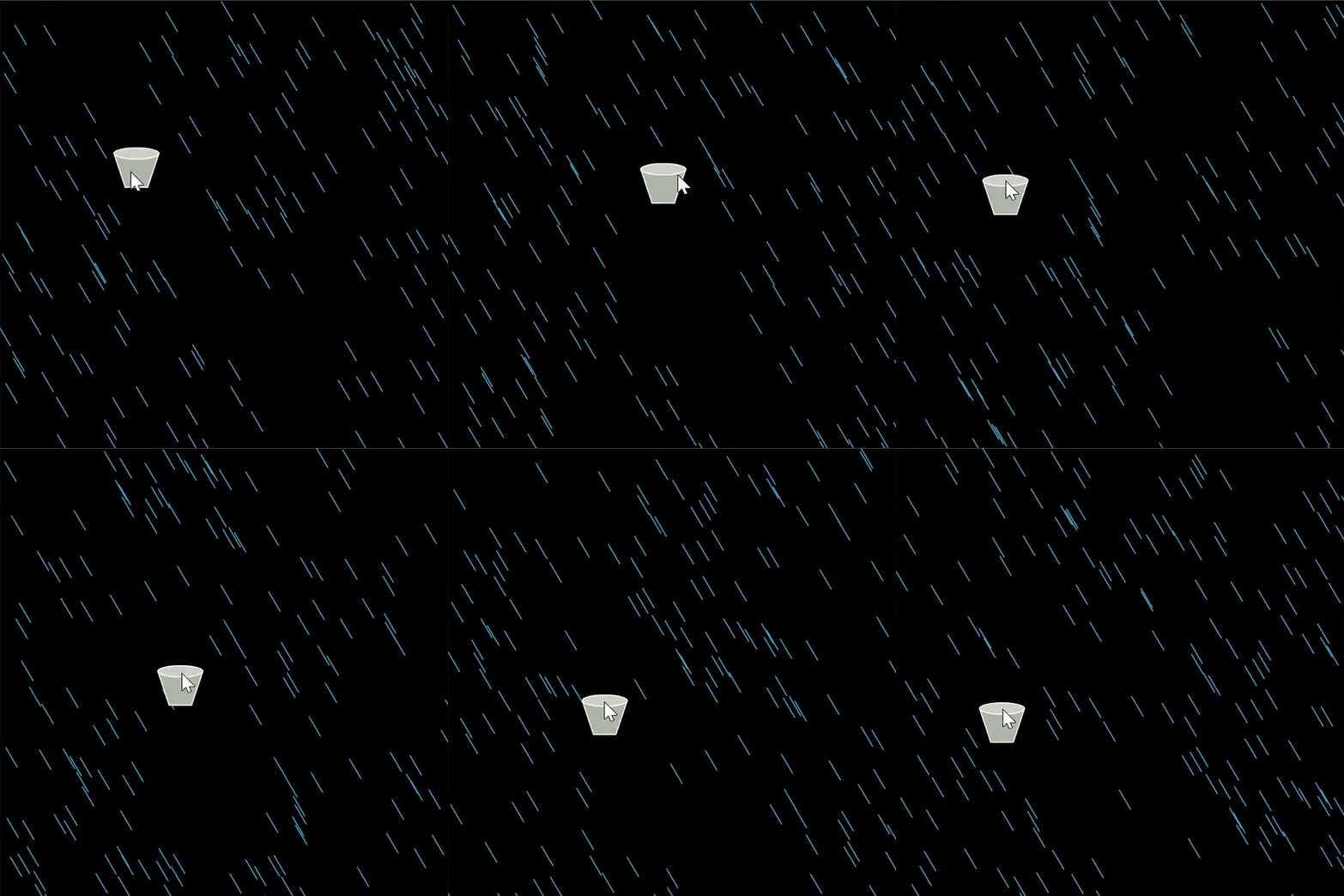
The user would be able to swipe to turn over a rock. When a rock is turned over the beetles beneath the rock would scrabble to find the next shadow to hide under which would be the user’s hand. If the hand is too close the beetles would become too scared and run away. If they do not feel a nearby presence the beetles would scatter. I would like to create beetles are procedurally generated.  Additionally, the user could tap to squish the beetles.

Reach In – bugs get scared if you’re too close otherwise hide undershadow and follow hand; Swipe – turn over rock; No presence – scuttle aimlessly;
 

OodBird-CriticalInterface

  • Try to talk with a plant. You need something to help to translate. But the plant will keep on growing without your voice, Do not pay attention to those who stand for speaking to the plants. (1-cP)

I really liked this sentence, pertly because of the strange grammar and partly because I think it says a lot about the importance of the individual when it comes to interaction with art and the interface.

Like a plant, interactive art can live and grow and exist without the use of a human being, and sometimes the impact of human interaction on a piece is simply what the human gains from it, but it can have no effect on the actual piece itself. When creating interactive interfaces it is important to consider and rethink what our interactions actually mean and how they exist in relationnickname-CriticalInterface  to the people who use it.

gregariosa-sketches

My main goal was to think of the implications behind natural gestures and derive experiences out of it.

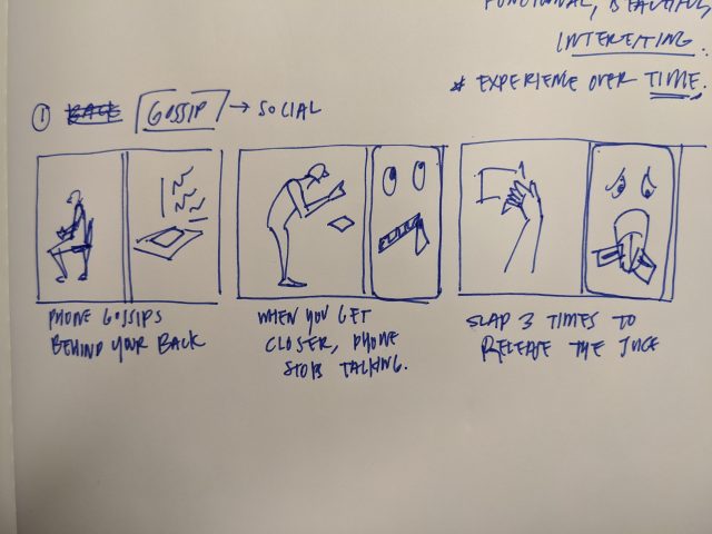
  1. Gossip (Social experiment)

The phone gossips behind your back, when you’re not nearby. When you come closer, the gossip dies down. Slap three times to make the phone “spill the beans.”

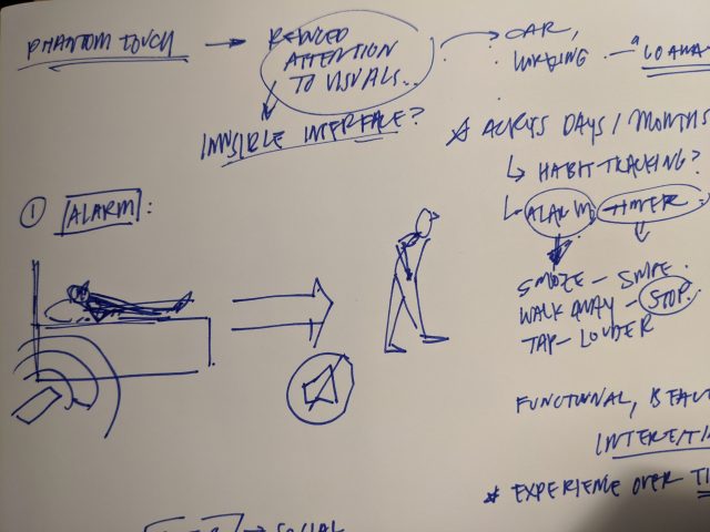
2. No touch alarm (Walk away to leave.)

Wake up at ease, with natural gestures. Swipe to snooze, walk away to kill the sound.

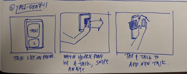
3. All Done! (Swipe to shove away)

Swipe away each task on your list, without having to touch the screen at all times.

axol-sketches

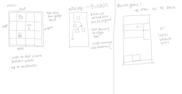
  1. garage band had that “smart drums” thing, where you’re making music from premade sequences– basically the idea here, but you’re controlling the sequences from you jesters.
  2. something similar to https://aidn.jp/mikutap/ but controlled with reach
    1. alternatively, https://tangible.media.mit.edu/project/venous-materials/ and explore more interesting interactions but fueled with reach or swipes. (To trigger music!)
  3. a series of small puzzle games.
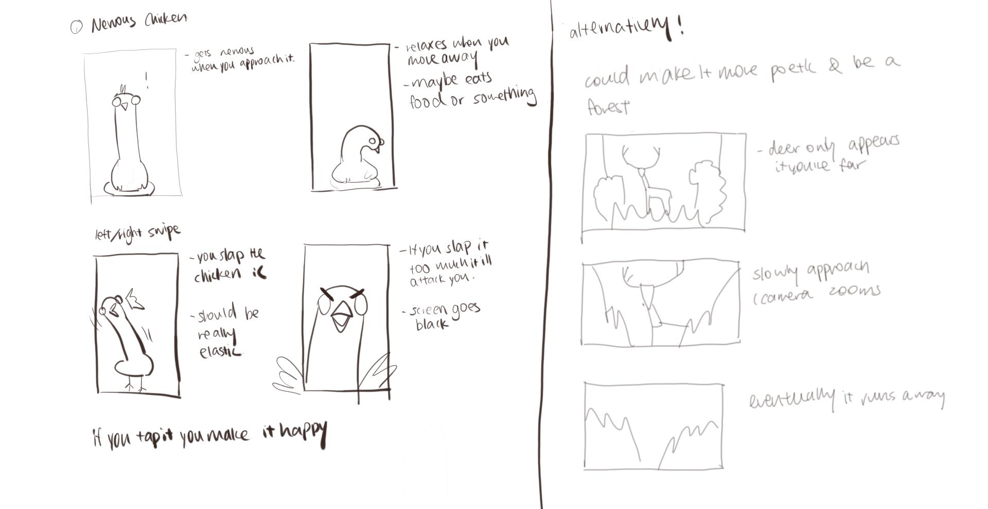
  4. a convincing character that responds to distance