Student Area

marimonda – LivingWallpaper

link to project!

link to the GIF in case the one above breaks!

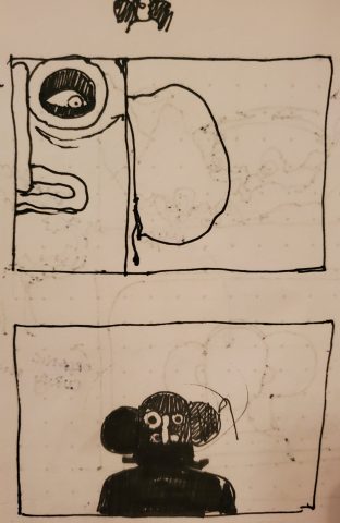
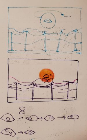
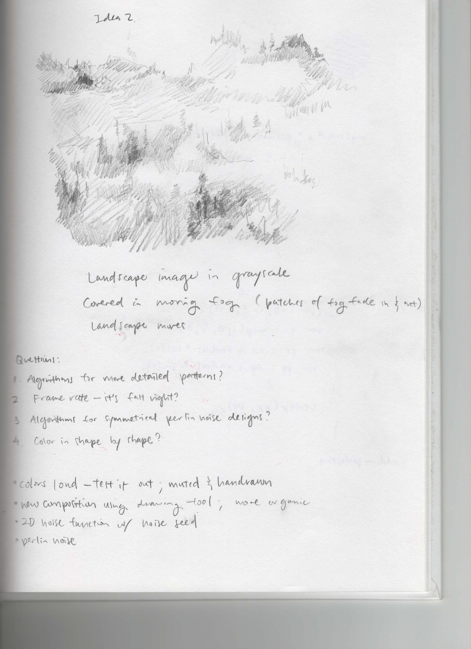
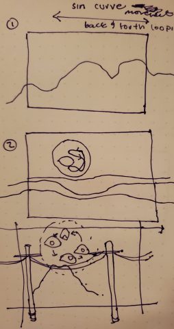
I had a lot of pain making this, in part because I had issues in trying to figure out what it was that I wanted to make. I went through a lot ideas surrounding type and marimonda masks but I eventually decided in doing something more representational as I approached the prompt. I have been thinking a lot about the internet as a sort of panopticon and the whole bunch of privacy concerns that zoom brings in. So it seemed fitting to do something related to this as the background I’d be wearing on Zoom. In terms of technical elements, I used mainly gradients, blends and and simple trigonometric motion while making my objects loop. In terms of motion specifically, I used Lissajous figures in terms of tracking the movement of the eye and I used the Double-Exponential Sigmoid for the camera movement of the poles! I really liked making the eye specifically, especially since I was able to make it seem like the eye got bigger and smaller by resizing different parts of it. Overall, I really wish I had figured out a better way to shift the mountains (like a motion parallax effect) on the background while maintaining noise and randomness. As it is, the mountains are not moving and are made very simply with noise. My colors are a bit different on my monitor than in other displays so I wish I had taken that into consideration while picking colors.
pinkkk-02-LivingWallpaper

Computationally exported gif. Super pixelated 🙁 Loses all the details and subtleties 

Screen Capture (Better quality) 

Sketch

I am not satisfied with what I have, but it is due to my inefficient time management skills this week .. :/ I couldn’t get my smoke to look nicely with the fire. Also, I really felt my lack of basic skills in constructing very foundational shapes. It takes me forever to create a really simple shape.

I used the exponentialInOut, sineIn and sineOut from p5.func to animate the movement of the fire.

CODE


axol-LivingWallpaper

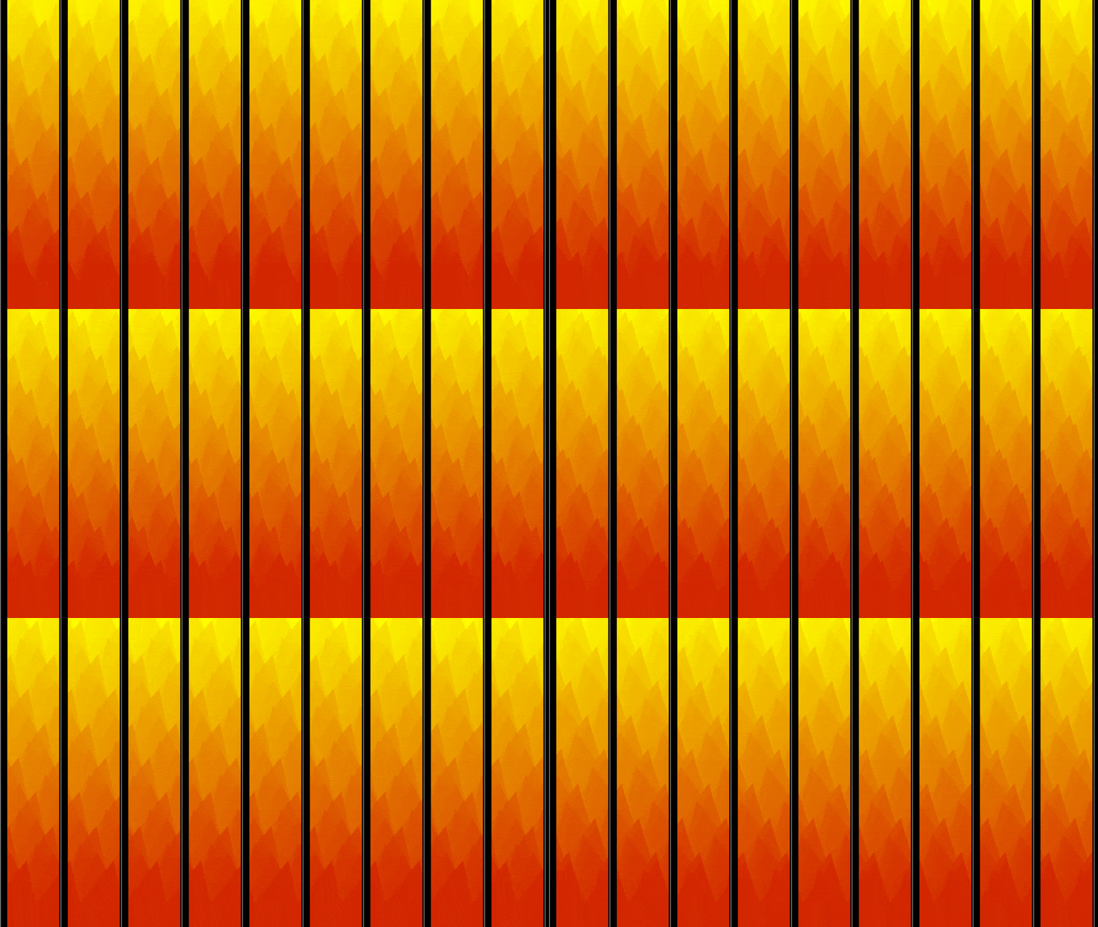
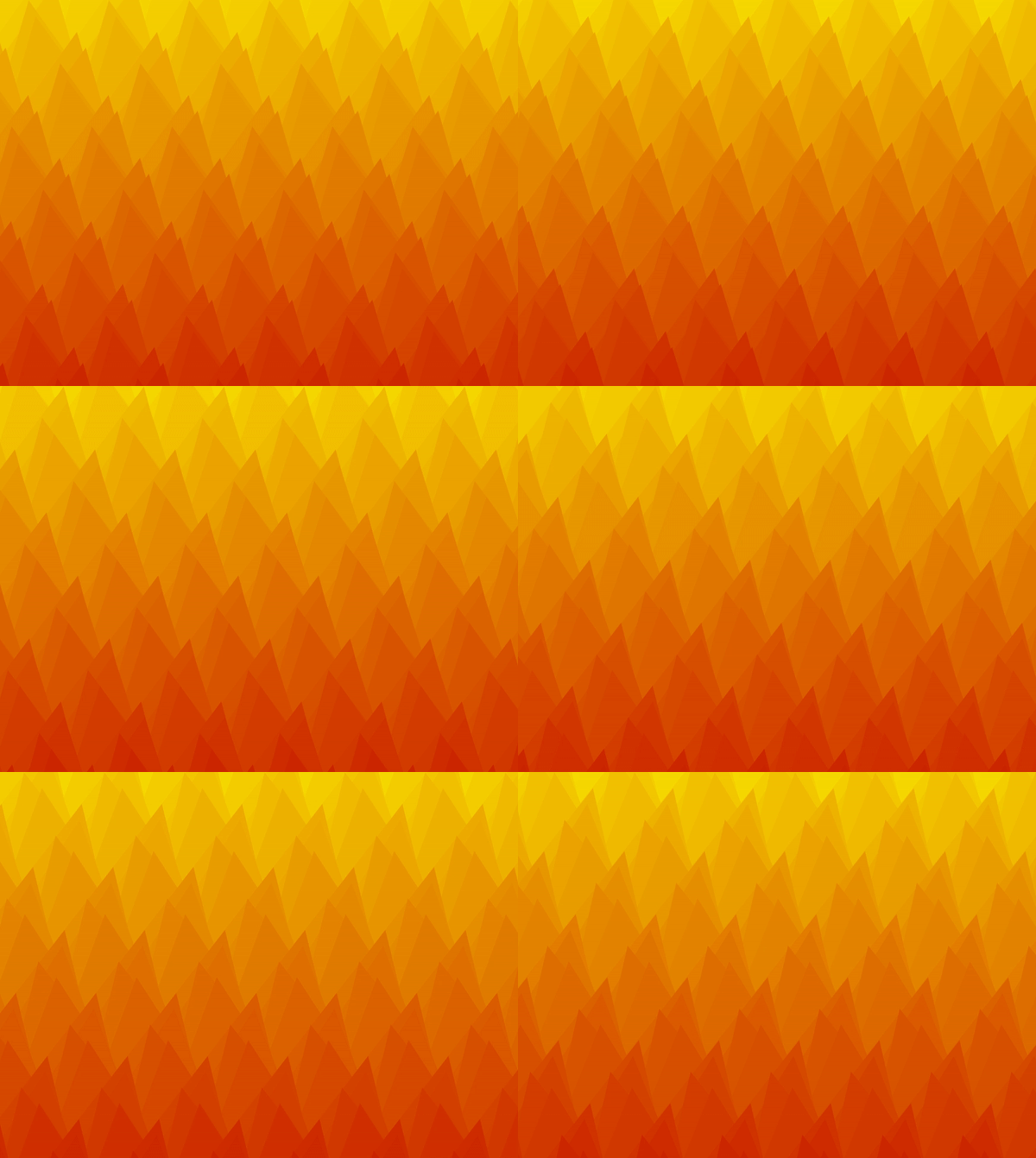
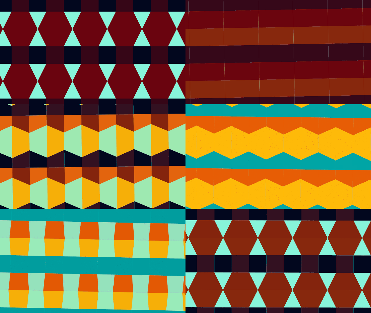
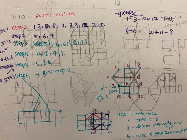
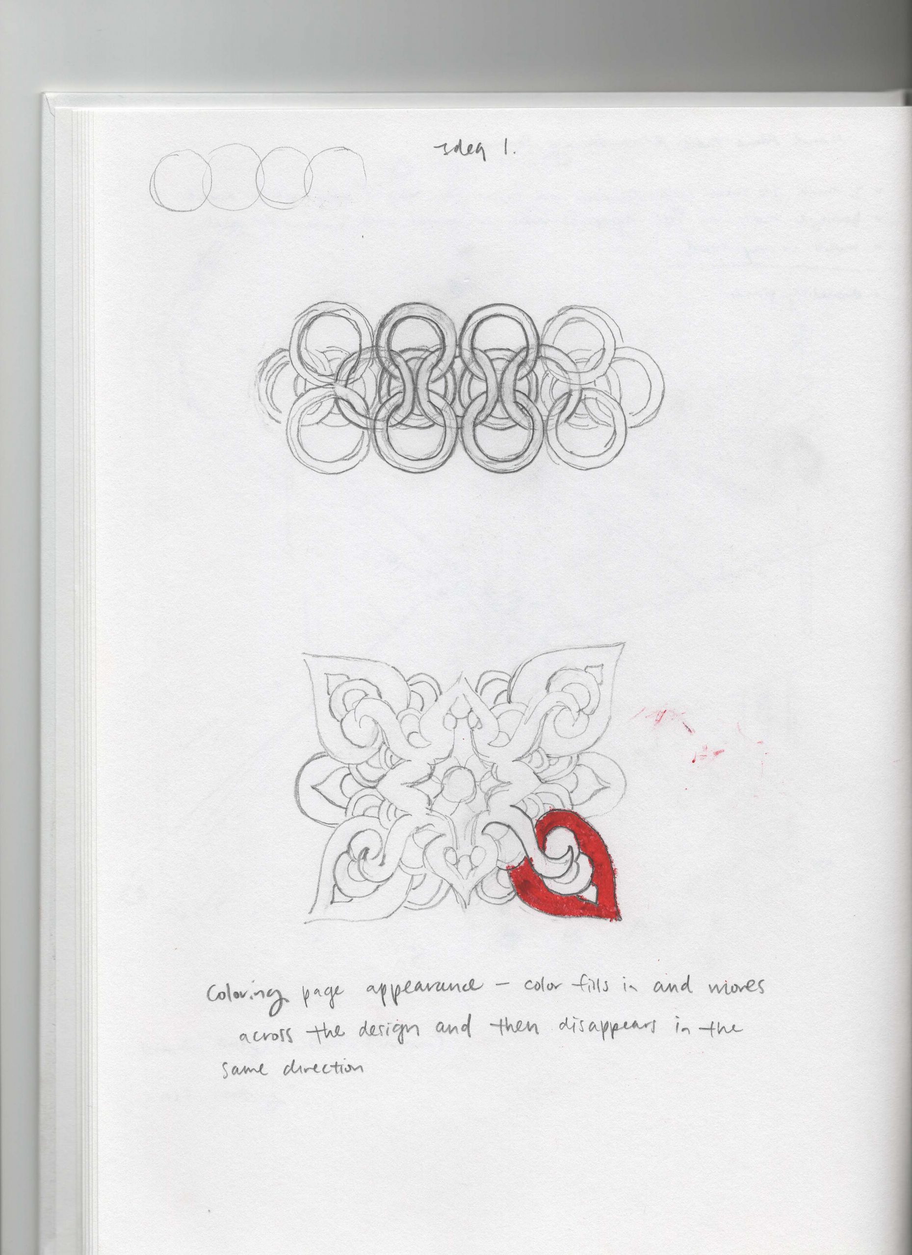
I wanted to make a transforming tiling pattern that continuously transforms into different shapes. With a little more research I realized it’s actually kind of hard to transform between tiling patterns. I am not very satisfied with the end product because I really don’t like the colors. But this was my best attempt after trying many color palettes so I had to stick with it 🙁

The shapes are described as a series of points, and I used multiple transformation functions to go between shapes and colors, such as exponentialIn, circularInOut, normalizedInverseErf, etc.

junebug-LivingWallpaper

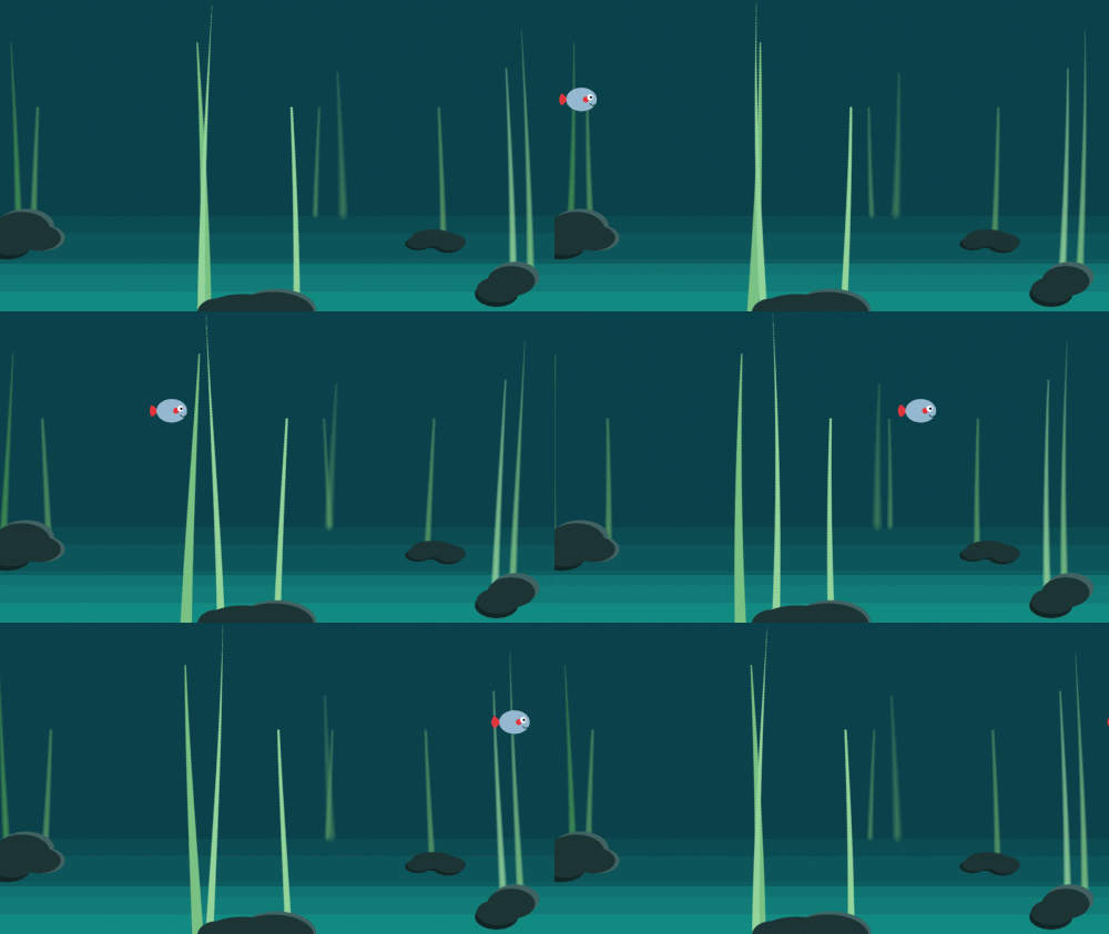
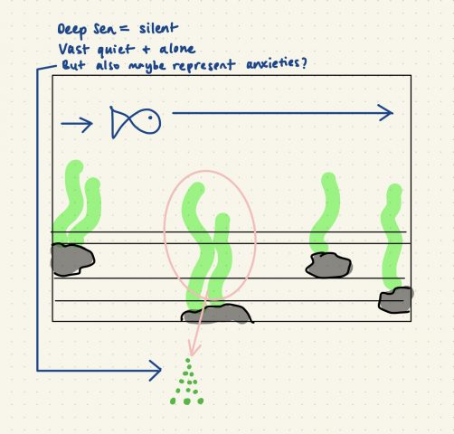
The concept behind my design is replicating my current environment and feelings. I’m living by myself and working remotely, so I always feel alone, especially now since school started and the campus reopening. In my original design, I had the speed of the seaweed contrast the speed of my fish because it felt like the seaweed represented my anxiety and the multitude of anxieties I have been feeling recently. The fish’s easing speed represented the change of mood I usually have during the day, with an up and down. I used the “Double-Exponential Sigmoid” easing function for that reason. With my final design, I decided to decrease the number of seaweed and slow down the animation to instead represent how I feel when I’m stuck in my current location/environment. Everything is very still, quiet, and lifeless.

I am very frustrated and disappointed about my work because my original design and code didn’t work as an endless loop of animation no matter how much I tried to tweak it. The animation of the seaweed just didn’t match the animation of the fish so I had to simplify the seaweed animation. Critiquing myself, I find my final design a little too simple.

My original code and design

Final code and design

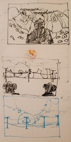
Sketch

thumbpin-LivingWallpaper

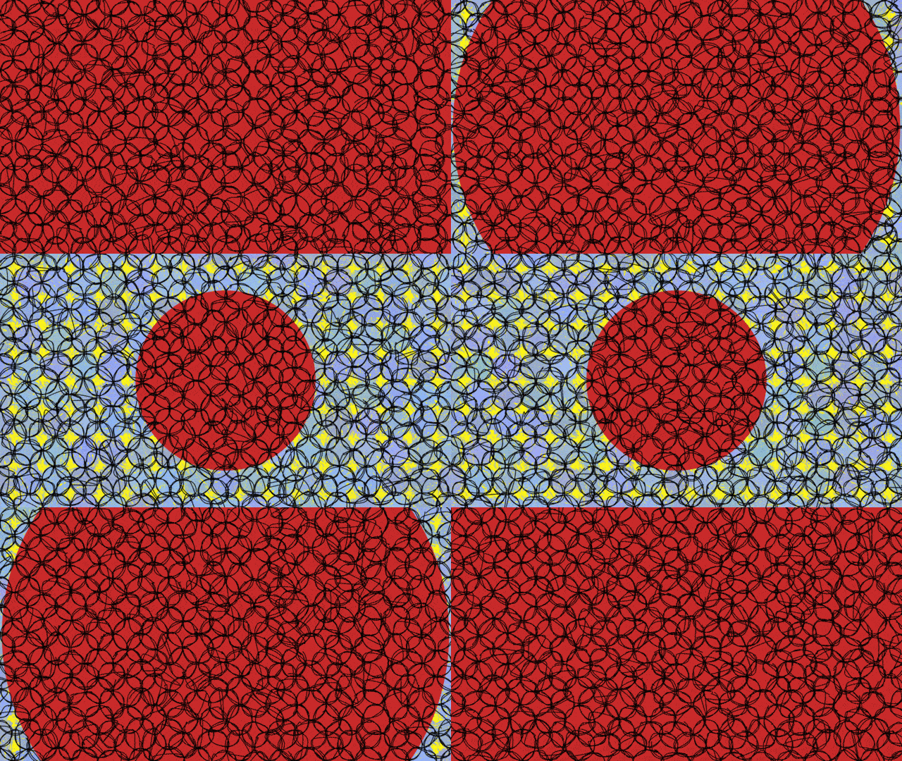
I kept the moving/looping portion of the animation simple so I could focus more on the graphics. To shape the way the red circle in my animation changed size, I used the double Quadratic Sigmoid easing function. The double Quadratic Sigmoid has a swinging, breathing momentum to it and it does not appear distracting or busy. I think that my use of the Scribble library was successful because it added the most character to my project. I also think my piece is more successful as a background on Zoom than as a gif because it becomes very busy as a small gif. My piece is still a bit cartoonish and crude and lacks the emotional weight of my original concept (which was to create a piece that reflects my anxiety and recent emotions).

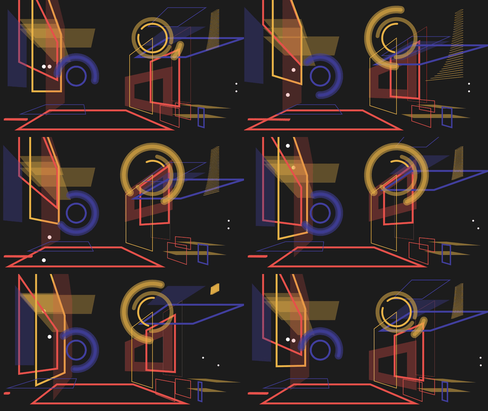
lampsauce-LivingWallpaper


click on image to download

For my living wallpaper, I selected several easing functions because I liked how they made it easy to hide the beginning and end of the loop. I kept the doubleExponentialSigmoid from the starter code and used hermite and hermite2 for the moving dots. I also used the cubicBezier and doubleCubicOgeeSimplified for a few of the groups of planes. (CODE)

I think that I succeeded in creating depth and abstracting the notion of a room and walls. I also think the color palette is particularly satisfying. I think there could have been some better use of the negative space and the layering might have been overdone. Perhaps, I also could have diversified the variety of shapes.

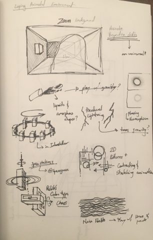
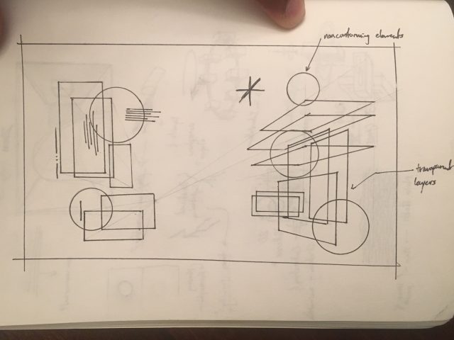
SKETCHES


Toad2 – Reading02

“First Word Art / Last Word Art” by Michael Naimark identifies two types of art first word art – exploratory experimental art, and last word art – art that strives to achieve peak excellence within its defined genre.  After this reading, I realize I often strive to create Last Word art. This probably stems from my foundations in traditional media. However, as I work create work using digital tools, I can’t help but feel like I’m automatically creating First Word Art since these digital tools are all relatively new and so the rules of its medium are relatively new or undefined. However, I feel like the lack of rules and definitions for First Word art lead to the rules of other forms art being applied to the new form of art being created.

The idea of technology shaping culture makes me think about how music streaming platforms have changed the way artists create music and release albums as they strive to create content that will be promoted by the algorithm as well as take advantage of the platforms structure. The most notable examples of this is how shorter songs are favored and songs that introduce the chorus early. The introduction of this new technology changing what can end up as Last Word art since the music most paid attention to will be the art immortalized the public mind.

tale-LookingOutwards02

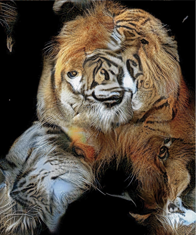
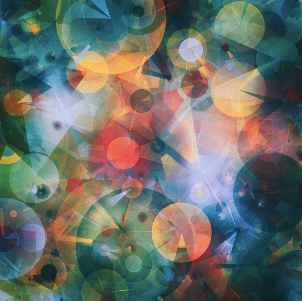
This is an art piece made by Manolo Gamboa Naon, titled CUDA.

Among many of Manolo Gamboa Naon’s generative artworks, I found this piece mesmerizing in such way the geometric shapes and soft yet distinctive colors blend so well. There isn’t a specific pattern unlike many of other works he has done, yet this piece exerts its own unique character and mood that makes me feel comfortable looking at the work. I also like the co-existence of the bigger smooth circles & curves and the smaller/shorter crisp lines & angles.

sticks-Reading02

“First Word Art/ Last Word Art”, by Michael Naimark, highlights an interesting concept that categorizes and separates art into either newfound and original artwork (First Word Art) or mastery and skillful artwork that has been seen before(Last Word Art). This idea that art can be invented and reinvented allows for the world of artists to create and invent new and fresh art, while having other artists develop and expand off those discoveries at the same time.

The development in art that we see in the world today is like a cycle, where old artwork (last word art) cannot exist without new artwork (first word art), and new work similarly cannot exist without old-work. When looking at art movements from hundreds of years in the past, we see how necessary “last word art” is in the development of great classics, where artists needed to learn from each other in their traditional fashions to create masterful and impressive art. Artists had to learn traditional ways of creating artwork, such as sketching and painting to develop and master skills so they can create quality and impressive art. This is where “last word art” becomes important, where artists learn from previous works and improve the medium of art through their own iterations and creative processes.

Since art is forever evolving and changing, “first word art” has its purpose in expanding and redefining what art can be. While newfound artwork and trends may be considered “original”, the idea of originality doesn’t exist, as artists and humans in general create the idea of originality through combining elements and morphing ideas together to create something new. The ability to create art that is considered original depends on collective knowledge and experiences.

I think that in today’s society, we put a higher emphasis on originality and ultimately “first word art”, where creating original and fresh renditions of art is more important than creating impressive artwork that has already been seen or done. However, artwork that have been deemed worthy and so tremendous turn into classics, that will remain as classics for generations.  In a sense, most of the greatest art classics that still remain famous and renowned today are “first word art” that achieved such a high level of mastery and appreciation that it will never be able to be recreated or comparable.