60-212: Interactivity and Computation for Creative Practice
CMU School of Art / IDeATe, Fall 2020 • Prof. Golan Levin
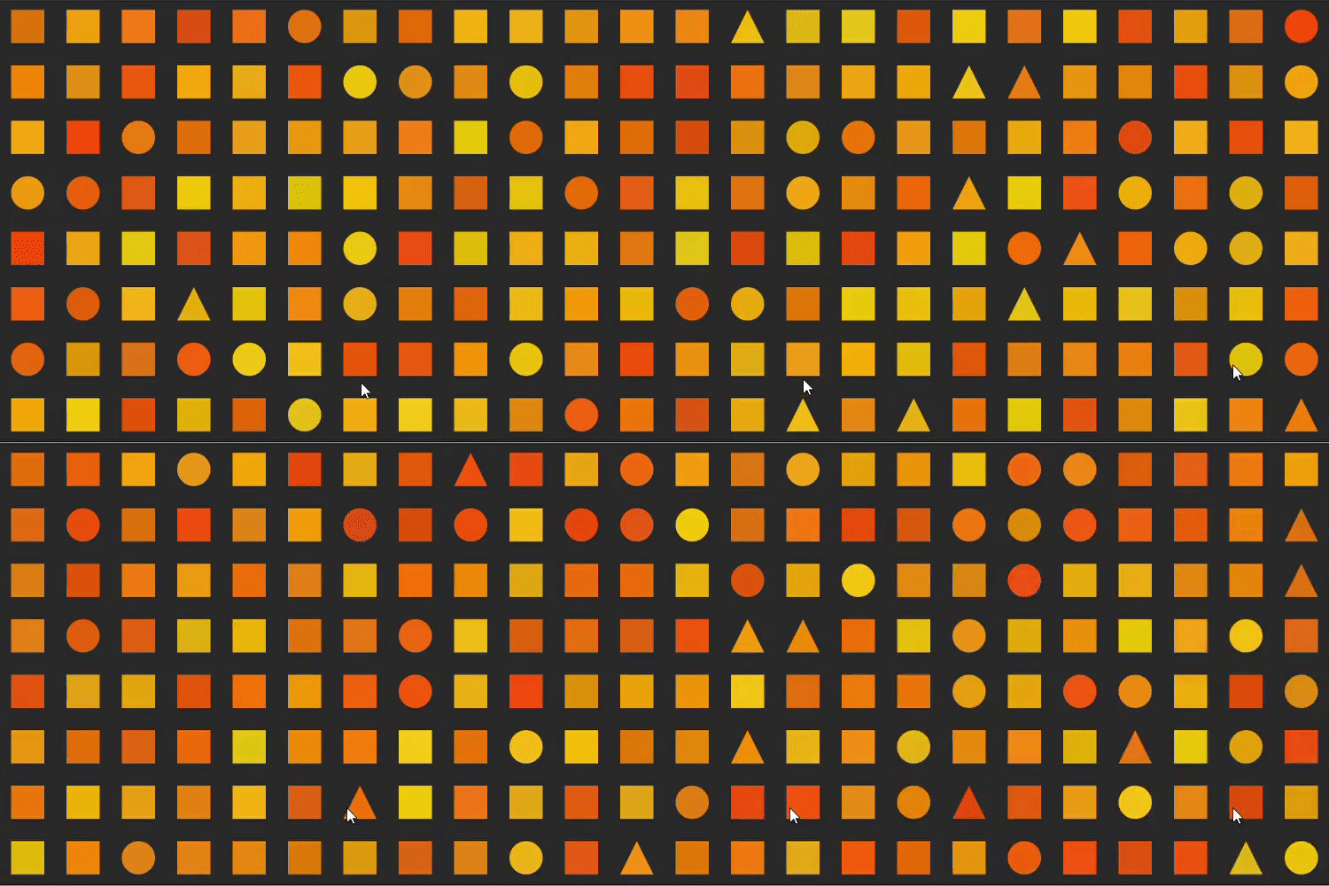
Link to orange board !
Hello!
I tried a lot of things for this exercise, including things as chaotic as this:

And my final version, much different:

Here is the link to my project!
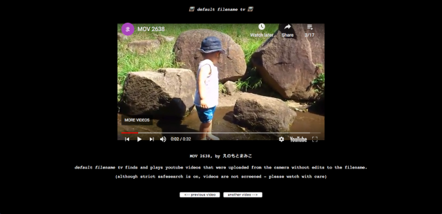
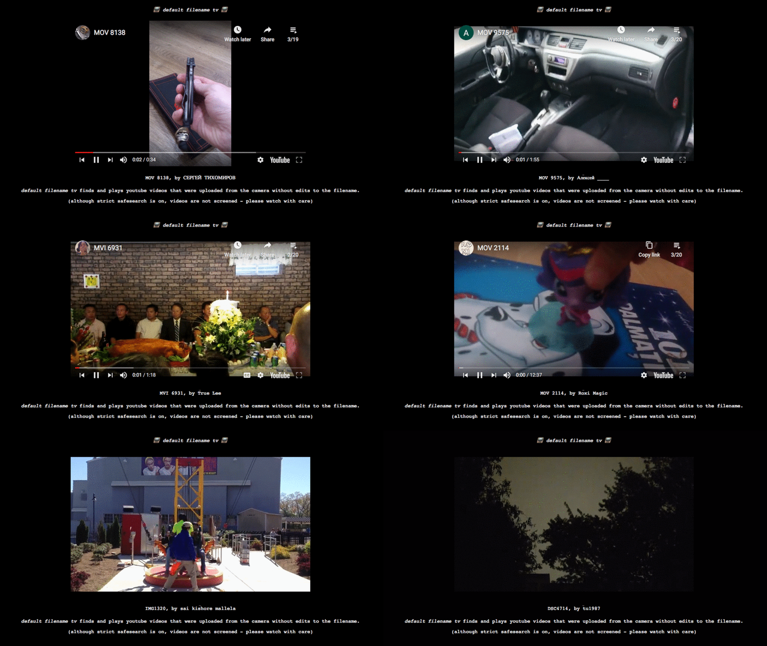
Partially because it was a useful tool for finding videos I needed for projects but mostly because it is very entertaining, I often found myself watching Everest Pipkin’s default filename tv last semester. In the words of the artist, it “finds and plays youtube videos that were uploaded from the camera without edits to the filename.” Because of its generativity, it may not have as strict of a cohesion as other video compilations like The Clock by Christian Marclay, but there is a certain sincerity, humor, and homeliness found throughout the videos. This is especially apparent when comparing these videos to the content normally on YouTube, usually designed strictly for that platform and often exaggerate experiences in hopes of more views and interactions. This work points to generative art as a method of creating collections without the inherent bias of a person selecting the videos, images, objects, or whatever else.
The 10,000 Bowls of Oatmeal problem talks about when generated objects are mathematically unique versus perceptually unique. One idea that is closely related to perceptual uniqueness is perceptual differentiation.
Perceptual differentiation is when users identify the 2 object, the current and the last object as different objects at a glance. They just have to be visually different, but users may not remember them. On the other hand, perceptual uniqueness is when each artifact has their own personality which the viewers can recognize and remember.
In cases where the artists is building a dynamic background, perceptual differentiation of the background objects might be sufficient. For generative artifacts that are the center of a piece, perpetuation uniqueness shall be explored extensively.
This relates to building artifacts with readable traits that humans can relate to and identify with. This reminds me of a book I read on architecture, and it showcases how a slightly bent curve and convey a completely different feeling, and sometimes may constitute parts of a human representation, giving furnitures and architecture humanness. This applies to the plant project the author talks about, or essentially any artifact we generate. The closer it looks like human related objects, the more likely we are to identify and remember it.
Casey Reas’ “KNBC” // Dec. 2015
This project is a continuous, generative collage created through an audio and visual distortion of television signals that are looped continuously as the data is extracted, amplified, and composed into a new stream. This installation combined coding, art, and sound into a unified piece of work. What I find interesting about this work is his unique artistic expression with a visual experience that builds upon conceptual art, experimental animation, and generative software technology. It’s full of chaos yet is somehow still kind of uniform by the symmetry of the visual distortion of the television broadcast signals. The audio played with the visual fits beautifully with the portrayed imagery by immersing the viewers with a haunting and eerie feel.
Reas wants to depict through his work that writing code is a versatile way of thinking of design, and not just another tool. Reas created his own called Processing, in hopes to inspire others, including his students at UCLA, to use code not only for STEM but also for visual arts. This project was inspired by his previous work that also focused on distorted, television-static imagery, such as “Tox Screen”, “Ultraconcentrated”, “100% Gray Coverage”, and others.
Video recording of the audio and visuals for Casey Reas’ “KNBC”.
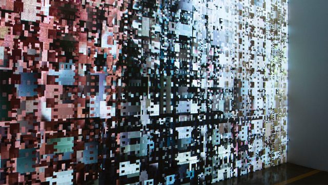
Close-up picture of a generative visual for Casey Reas’ “KNBC”.
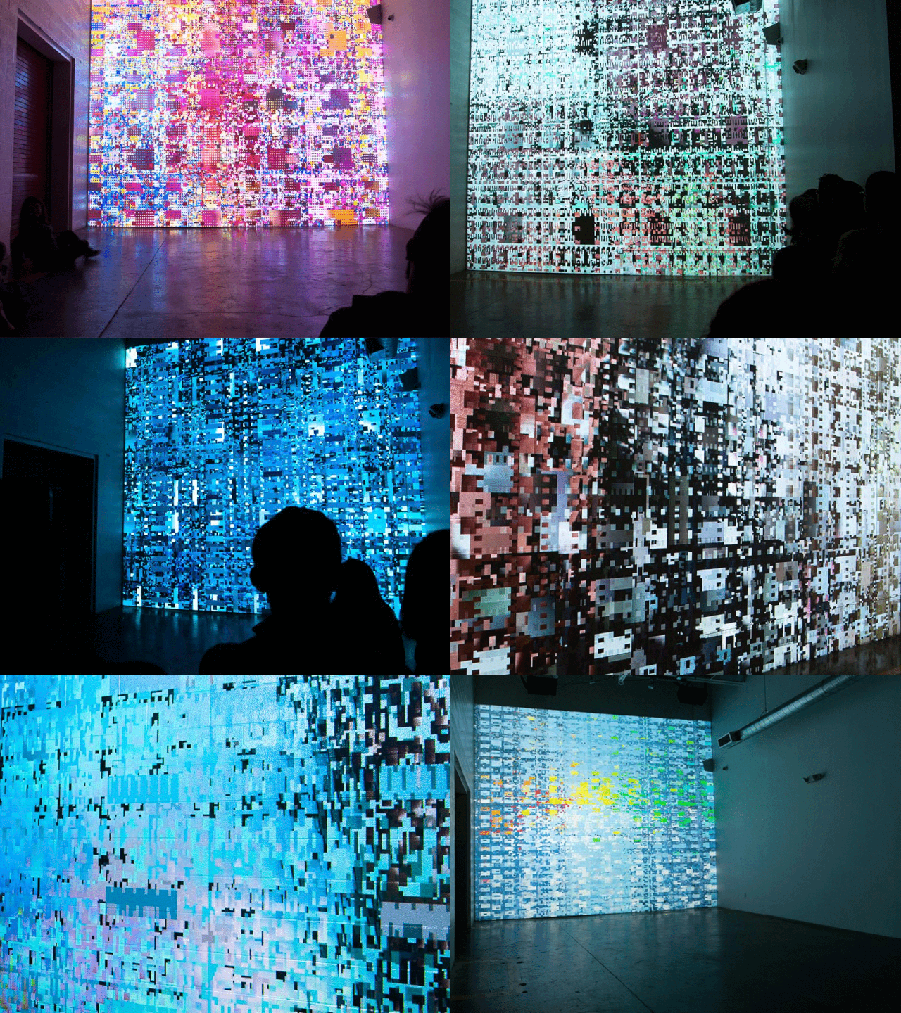
Animated gif of various images of Casey Reas’ “KNBC”.


These are visualizations of eight different ways of shuffling 64 cards created by Roger Antonsen. I find concrete visualizations of rather complex mathematical concepts to be intriguing, and the output is splendid. The author created the project alone, and I wasn’t able to find a reliable source about his work process. Antonsen was inspired by Perci Diaconis, and wanted to experiment with exploring the various permutations underlying the shuffling methods. This art is also a complement to an academic paper he wrote Card Shuffling Visualization
This work resonates with me in particular because of my own interest in mathematics and pattern-finding. Visualizing abstract ideas to give tangibility and accessibility to daunting concepts intrigues me.
I found him through his compelling TedTalk: Math is the hidden secret to understanding the world | Roger Antonsen
Link to work: https://rantonse.no/en/art/2018-07-25
Some of his other beautiful generative art:
