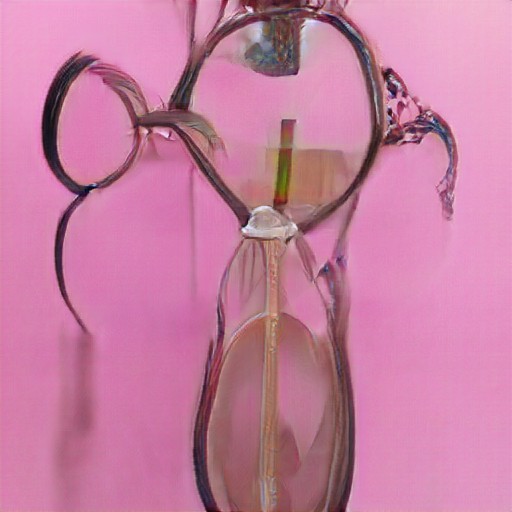
Artbreeder generally seems to create images that fit into the uncanny valley. They seem like any second I’m going to be able to interpret what is happening in the picture but it never quite happens.
Interactivity and Computation • 60-212
CMU School of Art / IDeATe, Spring 2022 • Prof. Golan Levin

Artbreeder generally seems to create images that fit into the uncanny valley. They seem like any second I’m going to be able to interpret what is happening in the picture but it never quite happens.
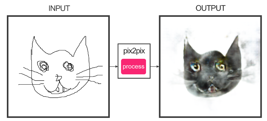
I have never seen more cursed cats in my life than this and I love it. I wonder if it’s possible to create a normal looking cat if the drawing is good enough.
https://mlart.co/item/generate-a-logo-from-a-drawing-using-pix2pix-hd
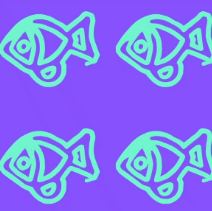
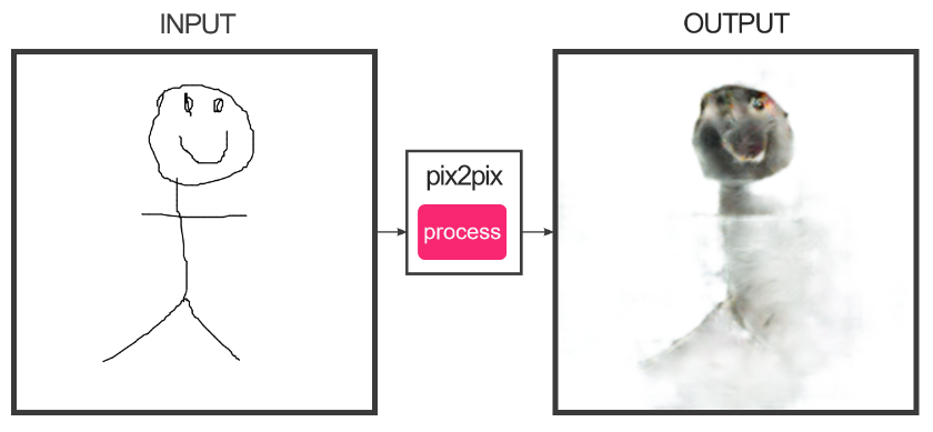
This piece really caught my attention because I took a class in high school on how to create logos and the amount of iterations that go into creating such simple shapes and typography. I feel like a future version of this technology could be used by graphic designers to more rapidly prototype logos. This piece takes in a hand-drawn image and using p2p smooths and subtly changes the picture to make it into a logo.
My original idea for this piece was to create a single mega-creature made out of a large quantity of identical “cells”, much in the way that mold grows, where each individual cell functions mostly independently of its neighbors but end up in large groups due to each new cell growing directly next to its “parent”. I followed this idea directly into my final piece, where I tried to describe a three dimensional “mold” through its two dimensional growth and the intensity of the mold at any given point. The relationship that the user has to my monster is one of a cultivator and artist. I tried to create the type of control that a landscaper would have over their trees – not complete control but still a high level of ability to shape the growth of their plant. One can create a mold that grows in only a few directions, one with many interweaving branches or a very dense and “tall” one. I believe that I was generally successful in what I set out to achieve, but an issue that I was not able to solve are the random very intense bits of mold that sometimes appear along the edge of the screen. I also wish that the mold grew in a more random/independent of mouse way.
The name of my mold is quadrata cellularum.
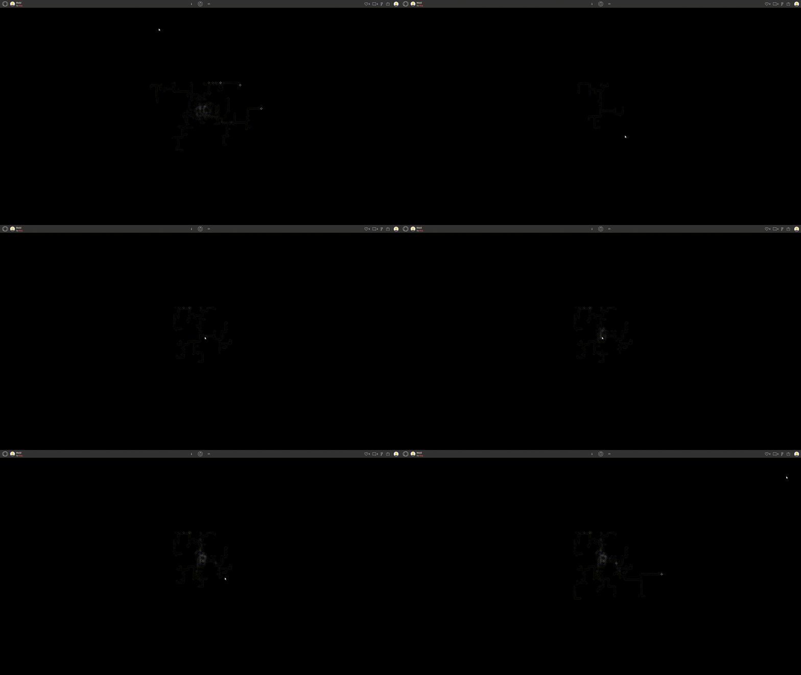
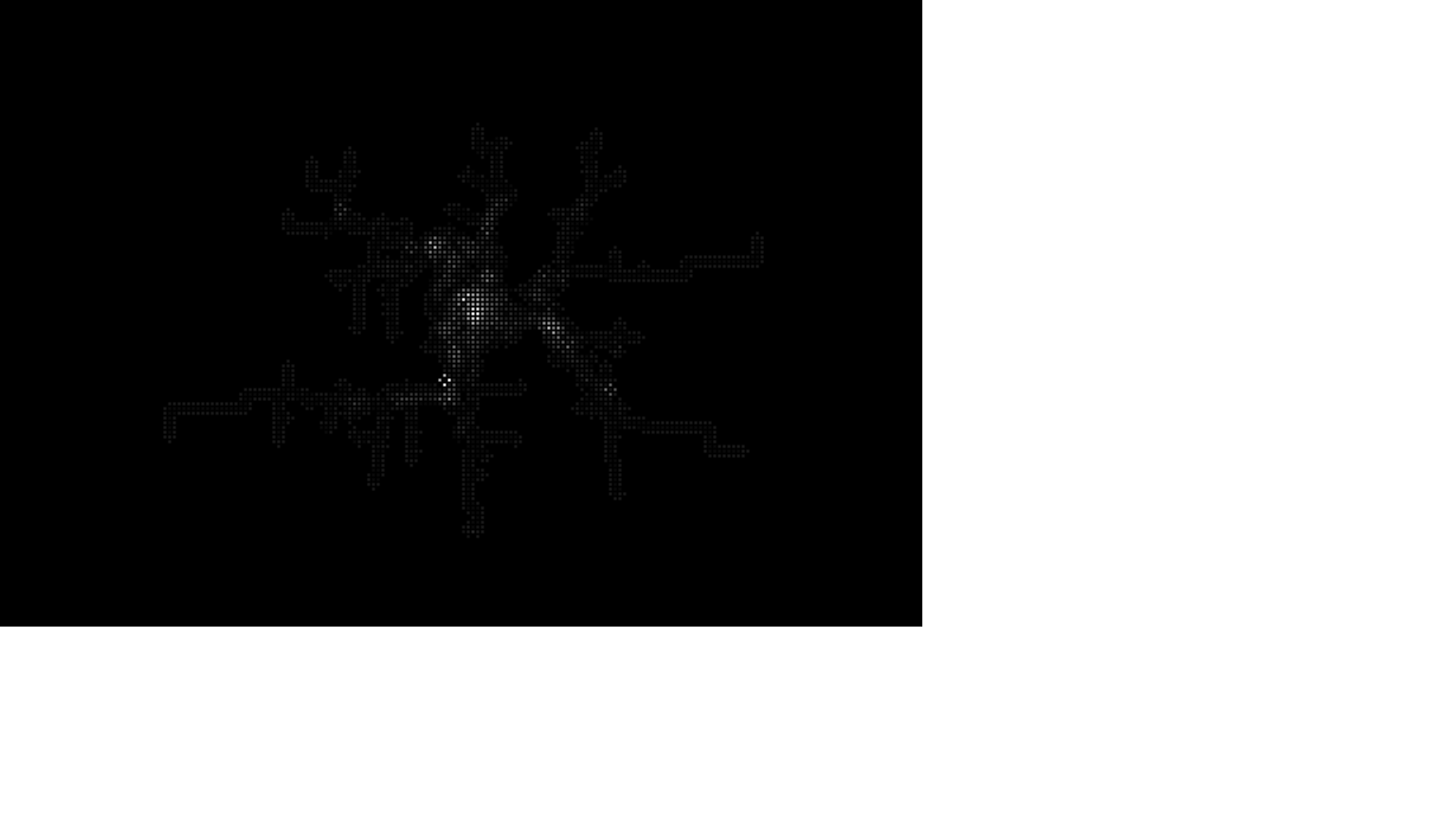
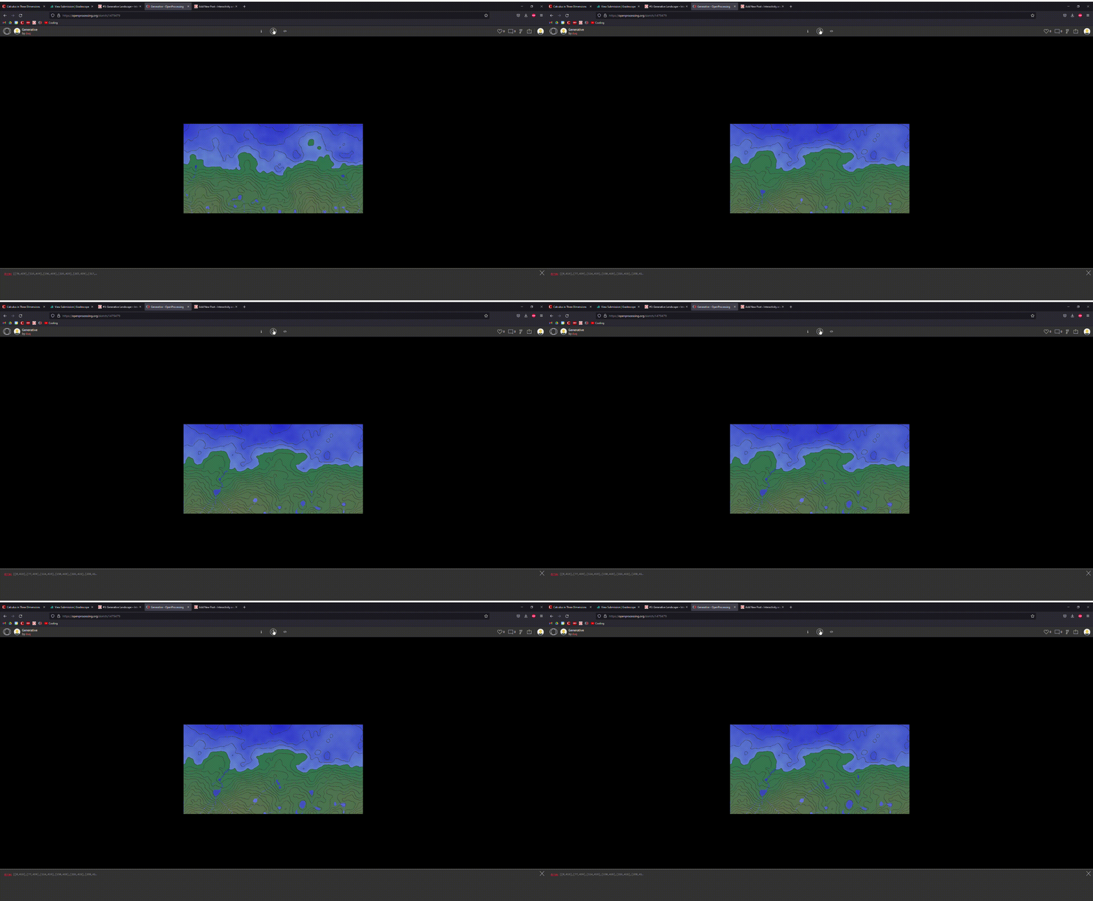
https://openprocessing.org/sketch/1479479
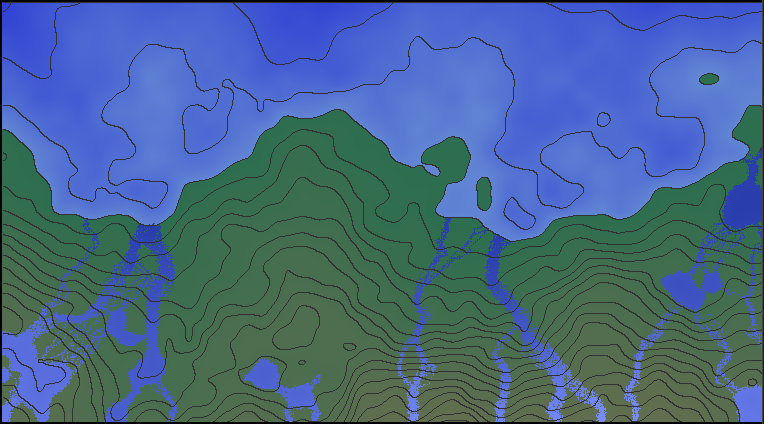
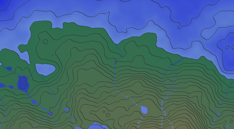
My piece is a seaside topography generator that calculates the manner in which rivers would navigate down the terrain. Each lowest point on the bottom of the screen generates a river by default and you can add more by clicking. It works by creating a massive 2d array the contains every height at every point and then (with some randomness) determining the path of least resistance for water.
I feel like my piece is generally successful – it is aesthetically pleasing to me and I feel like I succeeded in creating something different and challenging. I feel like I struggled to make the rivers feel completely realistic. I don’t feel like the depth of the piece is fully communicated in the water, and it seems like there is often an unrealistic amount of water flowing down the hills relative to their size.

The game Noita has a relatively low effective complexity. The game is a single physical map but it is separated into different areas that follow different sets of rules. Though every pixel in the game is simulated and can have an enormous quantity of physical effects applied to it, little of that can happen without some sort of direct or indirect action from the player. Therefore the environment itself, while topographically randomized is still relatively consistent from one generation to the next.
The Problem of Creativity:
I think that generative art pieces are absolutely creative. Far more so than much of photography in my opinion. With generative art pieces, you have to start with a completely blank slate and come up with something entirely new, while with much of photography you are already given the infinity varied masterpiece that is the world at large. Even if you are not drawing the art itself, you are still responsible for the machine, the virtual robot, that creates that art and you have an intent for what that art should look like. Therefore, generative art pieces are creative as without someone with vision to create the piece, there would be nothing to look at.
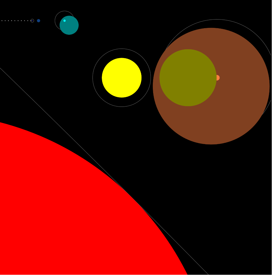
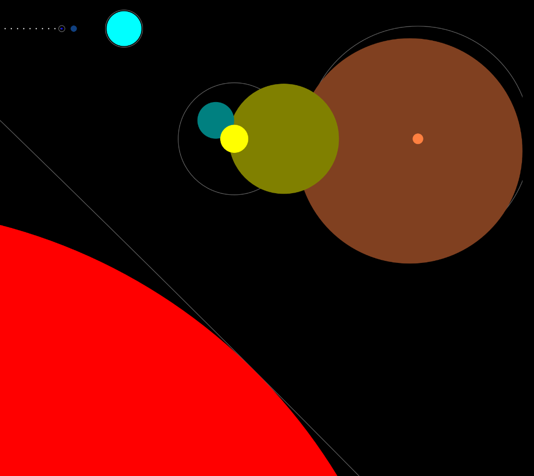
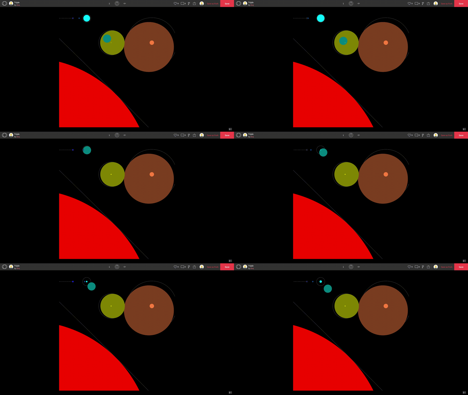
https://openprocessing.org/sketch/1475212
Triple is meant to be experienced first as a triple star system and second as a clock. The large, red star to the bottom left is a sun-like star that has entered it’s supergiant phase . Near the middle, a second sun-like star is earlier in its life and therefore still has its signature yellow color and smaller size. Finally, further away is the center of the triple system. A rapidly spinning blue giant that pulses as its magnetic poles intersect with the camera and then move away. The other, less bright circles are planets and moons trapped in the chaotic motion created by a three-body equation (as seen here: https://www.goodreads.com/book/show/20518872-the-three-body-problem). Furthermore, a small asteroid belt is visible in the upper left. As a clock, each fast moving white dot is a tenth of a second, each time the small blue dot fills or the small pale blue dot completes its motion is one second, each time the larger blue dot fills, or the larger pale blue dot completes its motion is one minute, each time the yellow dot completely fills or the pale yellow dot completes its motion is one hour. Each time the orange dot fills or the dark orange dot completes its motion is one day, and each time the red circle completely fills is one year.
I feel like my work was successful in not immediately giving away the fact that it keeps to the human constructs of time units (hours, days, seconds, etc) and instead looking like it reflects a natural phenomenon. This begins a dialogue between the raw nature and physics that this piece denotes, both of which are completely independent of human constructs, and our quanta of time, something completely created and perpetuated by our shared belief in it. It is also successful in relatively clearly denoting time once one knows how to read it. It is however lacking in being able to read how much of a year has been completed as we cannot see the entire circle. I think that I could have also added more interesting motion such as actual orbits instead of just straight lines. Given more time, this is the direction that I would take this project in.
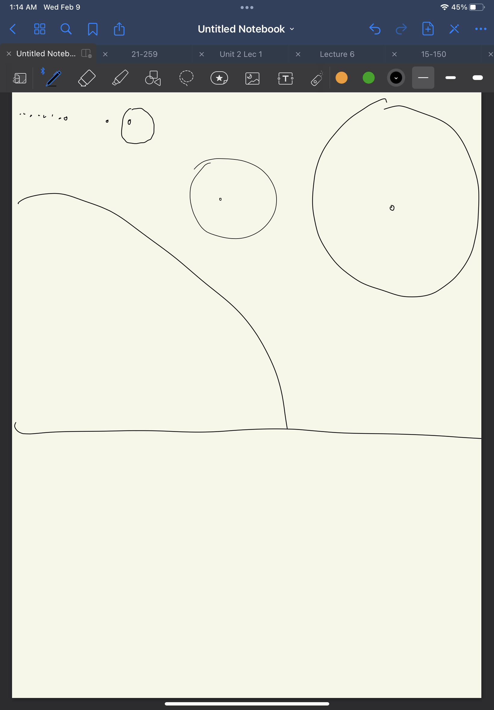
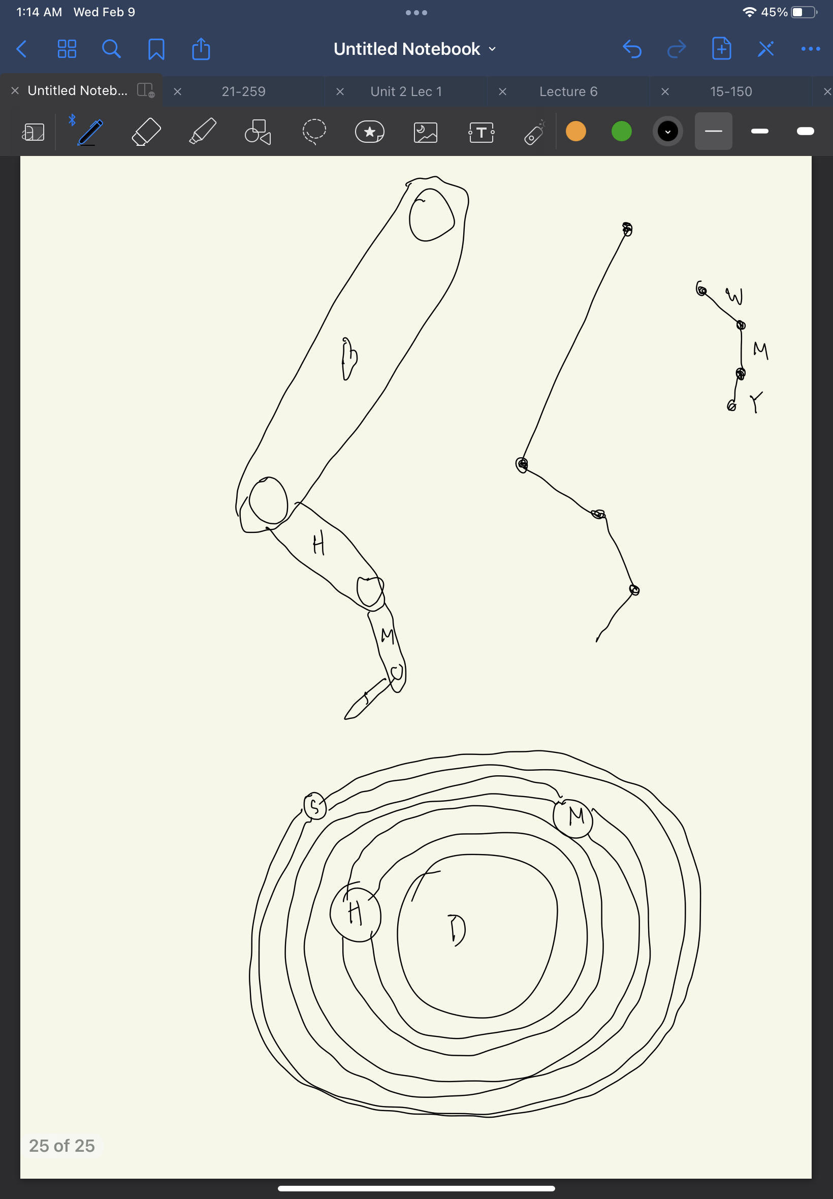
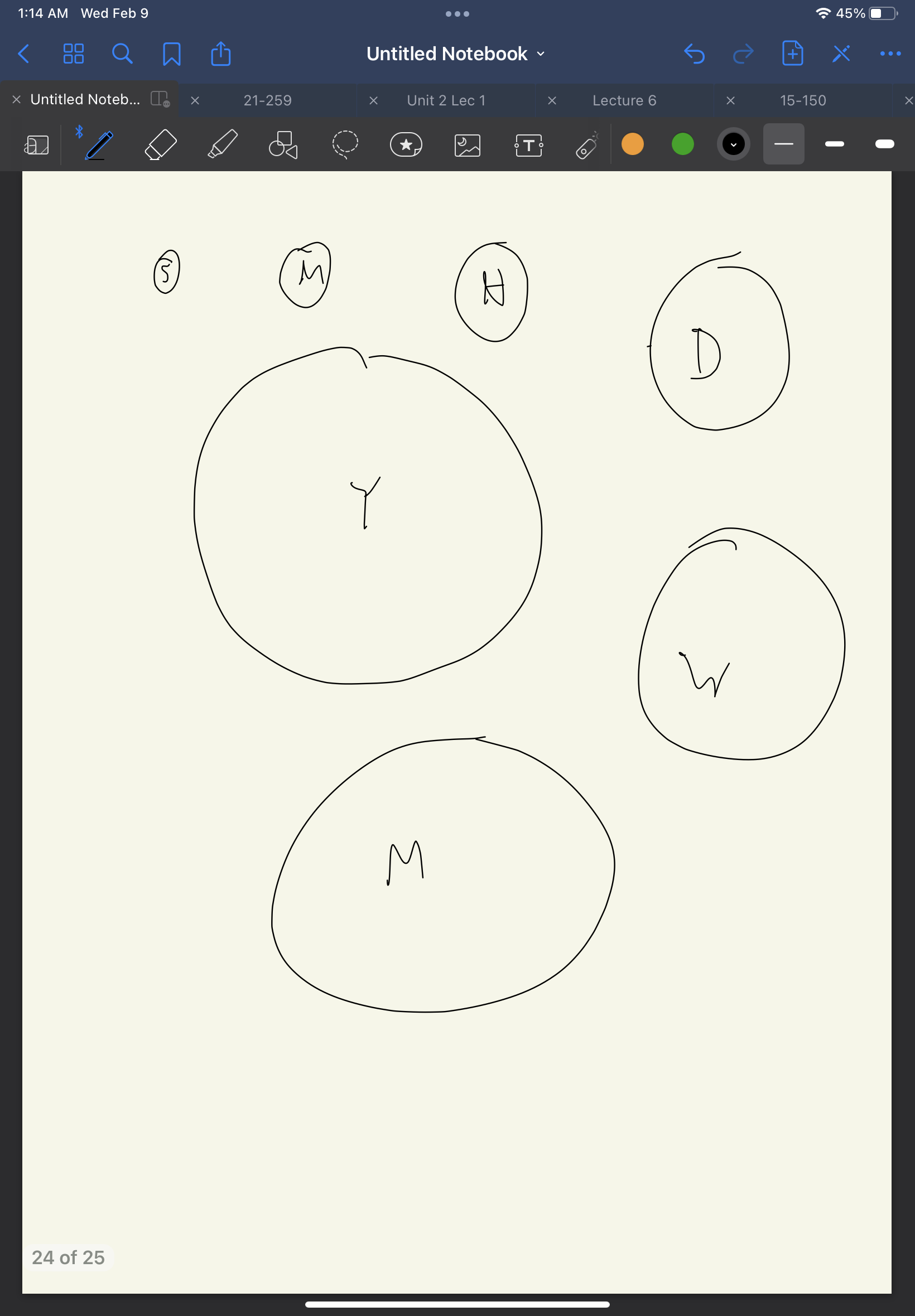
I found it interesting that the idea of the seven day week came from the lunar month. I hadn’t realized that all other large divisions of time (days, months, seasons, years) all directly track to a natural event, but weeks have drifted from their original meaning.
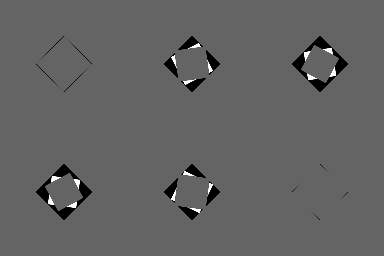
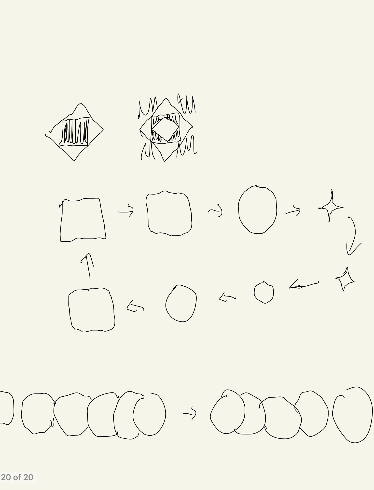
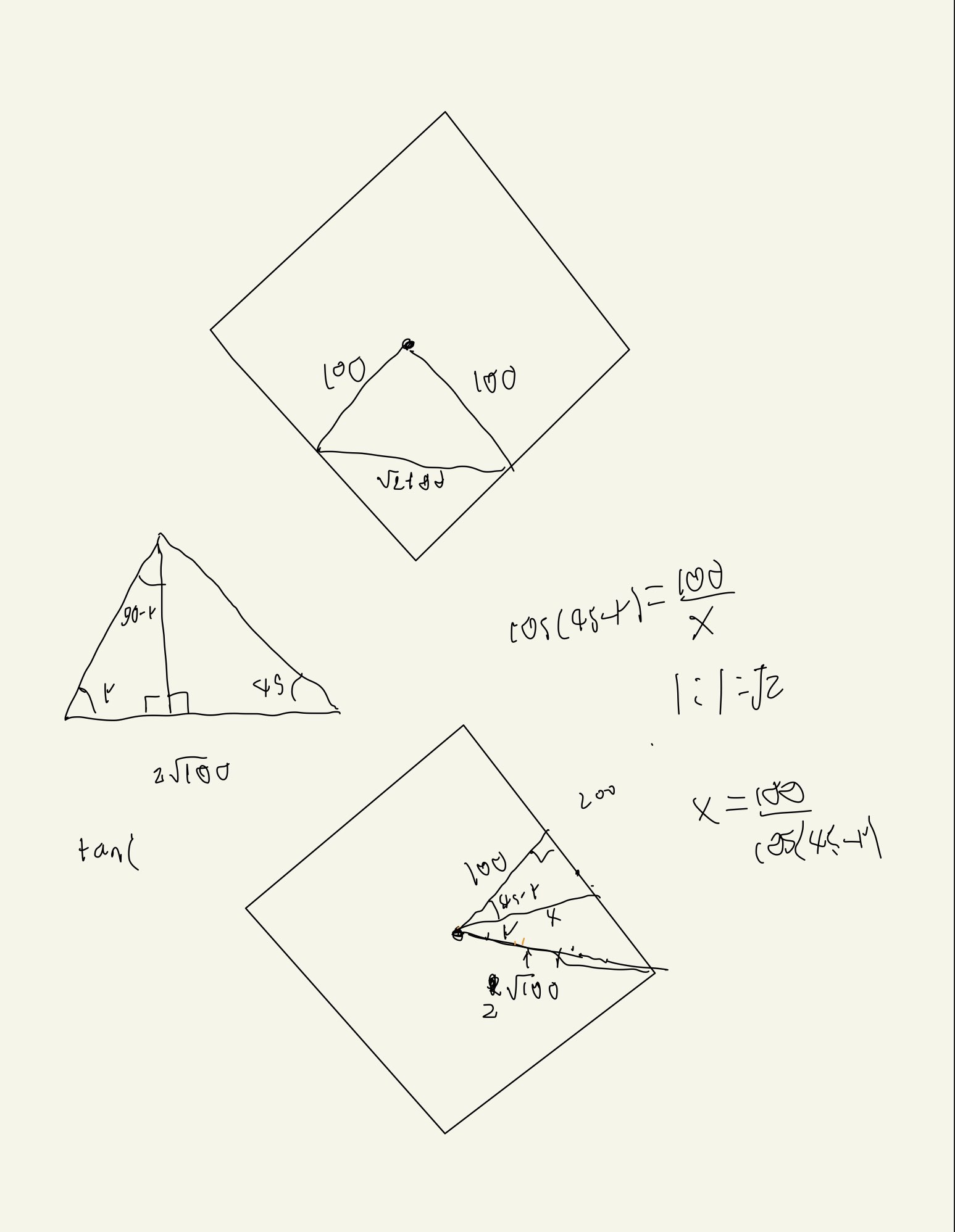
I feel like I did a good job of achieving my overall goal, to create a series of nested, rotating squares that intermittently blend into the background. I do feel however, I did a poor job on the details of my piece. I wanted to keep the piece monochromatic, but I think a brighter grey might have worked better and not made the piece feel sad. I think I should have also increased the size of the animation relative to the frame. Overall I feel like I achieved making a piece that is confusing to look at, a hope that I had after looking at the sample pieces by David Whyte, but I did not make it interesting enough to look at.
https://openprocessing.org/sketch/1471758
