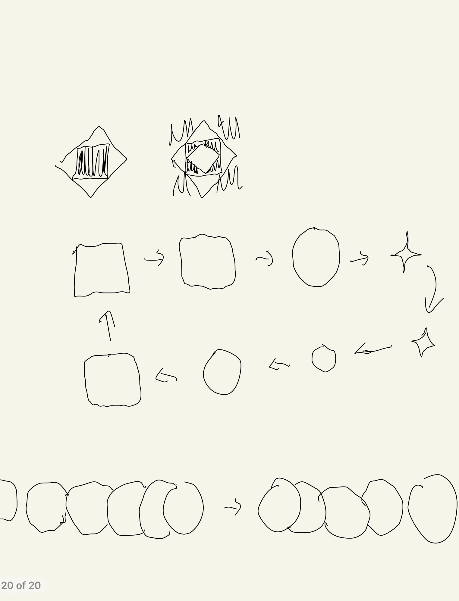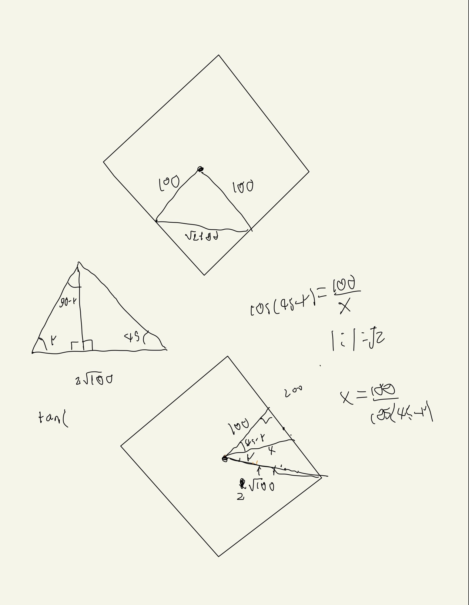
I feel like I did a good job of achieving my overall goal, to create a series of nested, rotating squares that intermittently blend into the background. I do feel however, I did a poor job on the details of my piece. I wanted to keep the piece monochromatic, but I think a brighter grey might have worked better and not made the piece feel sad. I think I should have also increased the size of the animation relative to the frame. Overall I feel like I achieved making a piece that is confusing to look at, a hope that I had after looking at the sample pieces by David Whyte, but I did not make it interesting enough to look at.
https://openprocessing.org/sketch/1471758


