![[OLD – FALL 2016] 15-104 • COMPUTING for CREATIVE PRACTICE](https://courses.ideate.cmu.edu/15-104/f2016/wp-content/uploads/2020/08/stop-banner.png)
This week for my Looking Outwards, I found a visualization of information of relations in the Middle East created by David McCandless, developed in collaboration with Univers Labs. David McCandless is the creator of informationisbeautiful.net.
Below is a screenshot of what this infographic looks like (You can click directly on the image or use the “Middle East” hyperlink above to use the infographic—it was not directly embeddable).
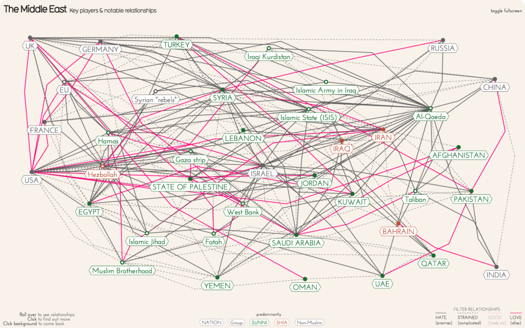
I really liked this graphic because it displays a variety of complex information and relationships, and being an international relations primary major, this information especially interest me personally. Not only is the graphic beautiful to look at, but it also has a very functional purpose too.
There was no information available on how this was made, other than the fact that this infographic is powered by VizSweet. I suppose that there would have been algorithms used to repeat the same behavior of expanding one dot into a “web,” but I do not think any algorithms would have been used to come up with the data that this infographic displays.